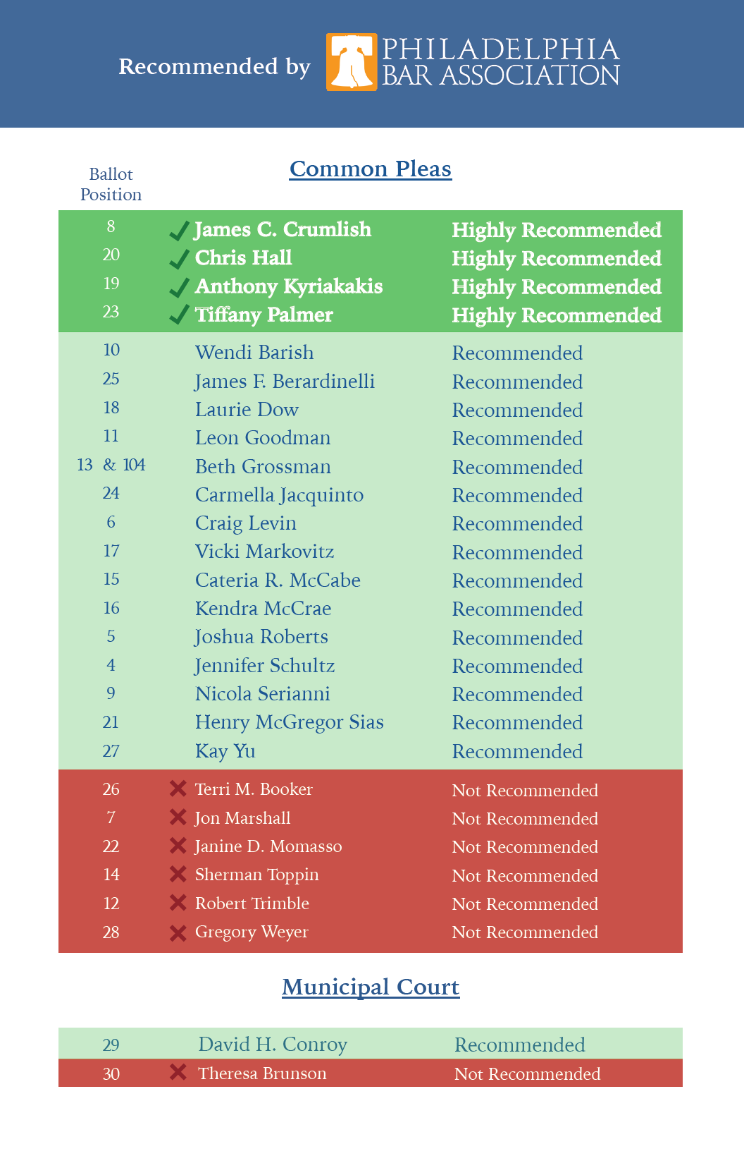
Let’s lay out some evidence for each (out of order).
First, the evidence for mediating factors. Notice that having a High Recommendation was not sufficient for overperforming. Kyriakakis and Palmer did overperform, but Crumlish and Hall didn’t. That also matches with the timing of the High Recommendations: Kyriakakis and Palmer got theirs early on, Palmer and Hall much later. [The Bar recommendations come in on a rolling basis, depending on when the candidate submits their application and the timing of the investigative committee.]
This suggests to me that Kyriakakis and Palmer had time to milk that recommendation for other endorsements and to gain momentum in fundraising to spend on wealthy-neighborhood advertising. The mechanism was not, as a counterexample, just people looking up who was Highly Recommended. Otherwise Hall and Crumlish would have done better.
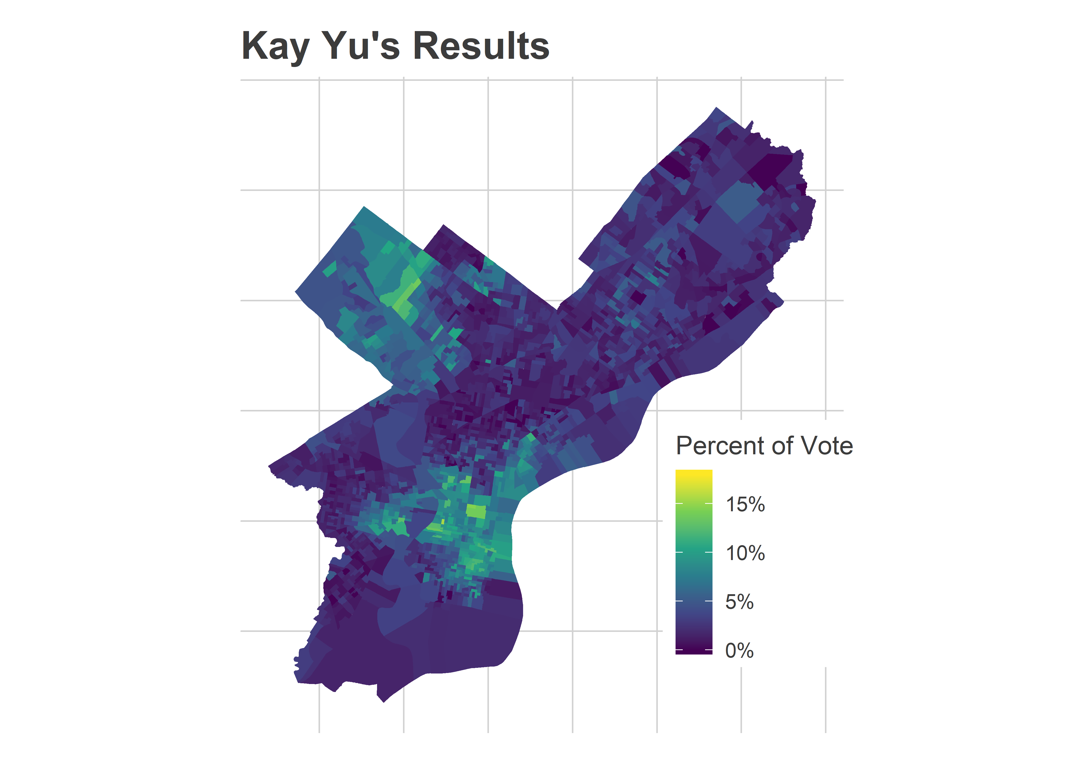
Second, it may have been that the High Recommendation just responded to factors that would have made Kyriakakis and Palmer do better anyway. Here are the results for Kay Yu, who also overperformed what I predicted. Her map looks a lot like theirs, maximizing the vote in Center City and its ring:
Yu presumably exploited the same strategies as Palmer, and Yu’s map might be what Palmer’s map would have looked like without the High Recommendation: a surprisingly strong showing that just falls short.
Finally, what is the direct effect of being Highly Recommended? How many people look that up before entering the booth, or grab the Inquirer, which listed the results? I don’t have a good way to know that, to disentangle that from the mediating, indirect pathways. And frankly, the winners probably don’t care whether their wins came from direct or mediating pathways, a win’s a win.
The effect of Sample Ballots, Part 2
Two years ago, I partnered with the Bar Association to measure the effect of handing out their recommendations at polling places. This year, we decided not to randomize, but they still sent out nearly 100 volunteers to hand out recommendations outside of polling places. The Bar targeted polling places with high turnout, and allowed volunteers to self-select.
These are the flyers:
View code
knitr::include_graphics("PBA-Flyer-6.PNG")
 The flyer is more aggressive than two years ago, with some serious UX design. How much effect did it have? The folks at the Bar sent me their assignments, so let’s dig in.
This analysis is more challenging than two years ago because we didn’t randomize polling place assignments. We might worry, for example, that the Bar Association’s volunteers would want to go close to their houses, and that those houses would be in places where the Highly Recommended candidates would already do well. Did that happen?
View code
vols <- read_csv("../../data/common_pleas/bar_assignments_2019.csv")
polling_places_to_divs <- read_csv("../../data/common_pleas/2019_Primary_Polling_Places.csv")

names(vols) <- tolower(names(vols))
names(polling_places_to_divs) <- tolower(names(polling_places_to_divs))

polling_places <- polling_places_to_divs %>% select(location, address) %>%
  unique %>%
  mutate(place_id = 1:n())

polling_places_to_divs <- polling_places_to_divs %>%
  mutate(warddiv = sprintf("%02d-%02d", ward, division)) %>%
  left_join(polling_places)

divs <- st_read("../../data/gis/2019/Political_Divisions.shp",quiet=TRUE) %>% st_transform(2272)
polling_places_sf <- divs %>%
  mutate(warddiv = paste0(substr(DIVISION_N, 1, 2), "-", substr(DIVISION_N,3,4))) %>%
  left_join(polling_places_to_divs) %>%
  group_by(place_id) %>%
  summarise(geometry = st_union(geometry))

vols_to_divs <- vols %>%
  left_join(polling_places_to_divs)
if(any(is.na(vols_to_divs$ward))) stop("Missing Polling Place")

polling_places <- polling_places %>%
  left_join(vols %>% select(location, address, shift) %>% mutate(has_vol=TRUE)) %>%
  mutate(has_vol=ifelse(is.na(has_vol), FALSE, has_vol))

polling_places <- polling_places %>% left_join(polling_places_sf)

ggplot(polling_places) +
  geom_sf(aes(fill = has_vol), color="grey78") +
  scale_fill_manual(values=c("TRUE"=light_purple, "FALSE"="grey70"), guide=FALSE) +
  theme_map_sixtysix() +
  ggtitle("Where Bar volunteers went")
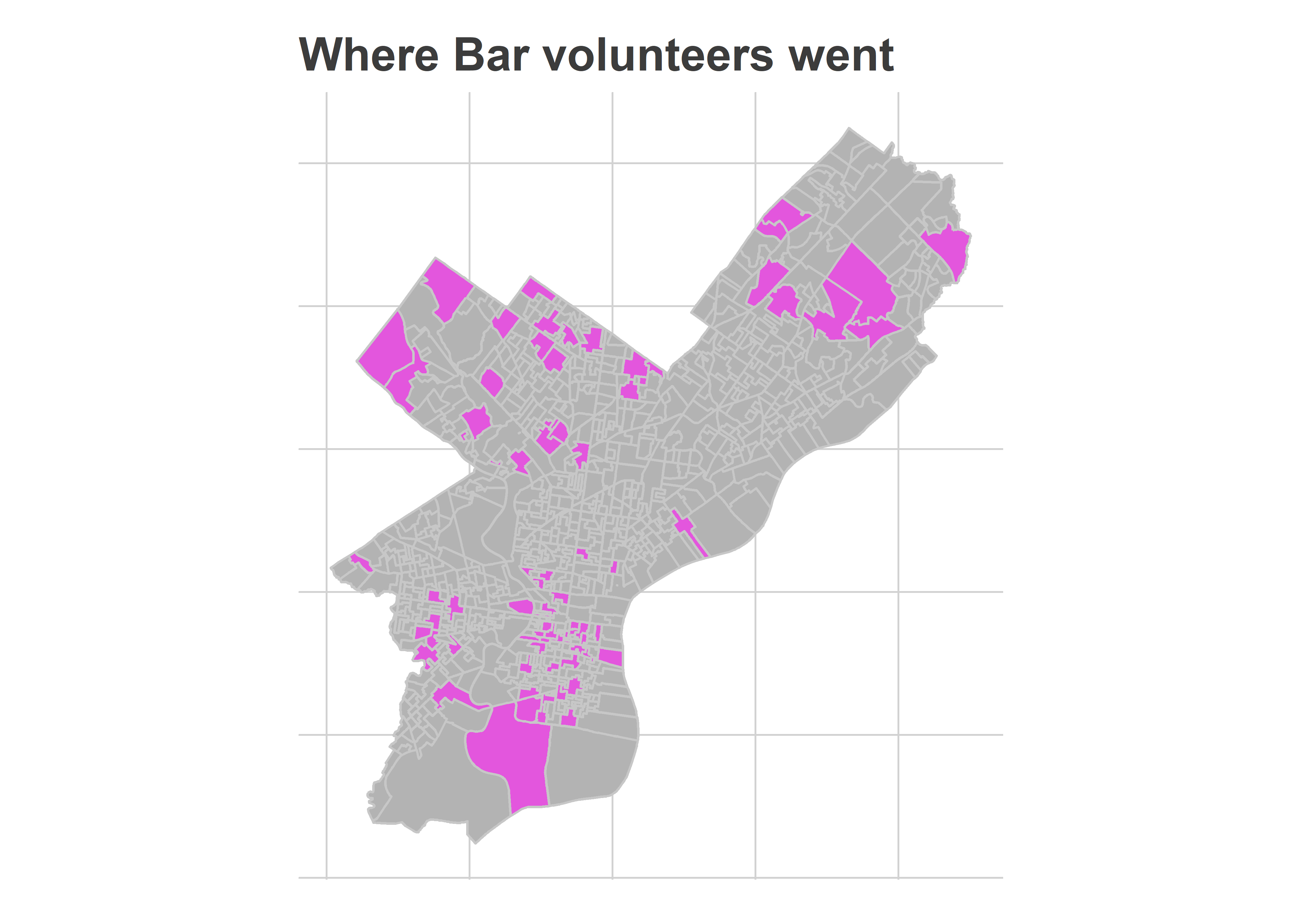
Yes and no. It’s not exactly a representative sample (vast sections of North Philly and the lower Northeast are missing), but it’s also not entirely Center City and its ring, which I worried. It was in the high-income wards that two years ago we found the lowest effect, because voters were already voting for Recommended candidates.
The divisions where they went were slightly non-representative: Highly Recommended candidates received 6.3% of the votes in Divisions that neighbored the volunteers, compared to 6.0% citywide. But that’s smaller than I might have worried.
View code
df_cp_pp <- df_cp %>%
  left_join(polling_places_to_divs %>% select(warddiv, place_id)) %>%
  group_by(candidate, place_id) %>%
  summarise(votes = sum(Vote_Count))

neighbors <- st_intersection(
  polling_places_sf,
  polling_places_sf %>% rename(place_id2 = place_id)
) %>%
  filter(place_id != place_id2)

neighbors <- neighbors %>%
  mutate(geometry_type = st_geometry_type(geometry)) %>%
  filter(!geometry_type %in% c("POINT", "MULTIPOINT")) %>%
  as.data.frame %>% select(place_id, place_id2)

df_neighbor <- neighbors %>%
  left_join(
    polling_places %>% select(place_id, has_vol),
    by = c("place_id2" = "place_id")
  ) %>%
  rename(nb_has_vol = has_vol) %>%
  left_join(df_cp_pp, by=c("place_id2"="place_id")) %>%
  group_by(place_id, candidate) %>%
  summarise(
    votes_neighbor = sum(votes),
    neighbors=c(list(place_id2)),
    votes_neighbor_novol = sum(votes * !nb_has_vol)
  ) %>%
  group_by(place_id) %>%
  mutate(
    # pvote_neighbor = votes_neighbor / sum(votes_neighbor),
    pvote_neighbor_novol = votes_neighbor_novol / sum(votes_neighbor_novol)
  )

df_neighbor <- df_neighbor %>%
  left_join(df_cp_pp) %>%
  group_by(place_id) %>%
  mutate(pvote = votes/sum(votes))

df_neighbor <- df_neighbor %>%
  left_join(polling_places %>% as.data.frame() %>% select(place_id, has_vol, shift))

df_neighbor <- df_neighbor %>% left_join(ballot)

## Neighbor votes, for number above
test_summary <- df_neighbor %>%
  filter(has_vol) %>%
  group_by(candidate, philacommrec) %>%
  summarise(votes = sum(votes)) %>%
  group_by() %>%
  mutate(pvote = votes/ sum(votes)) %>%
  group_by(philacommrec) %>%
  summarise(`% Vote in volunteer divisions` = 100*mean(pvote))

control_summary <- df_neighbor %>%
  filter(has_vol) %>%
  group_by(candidate, philacommrec) %>%
  summarise(votes = sum(pvote_neighbor_novol)) %>%
  group_by() %>%
  mutate(pvote = votes/ sum(votes)) %>%
  group_by(philacommrec) %>%
  summarise(`% Vote in neighboring divisions` = 100*mean(pvote))

overall_summary <- df_cp %>%
  group_by(candidate, philacommrec) %>%
  summarise(votes = sum(Vote_Count)) %>%
  group_by() %>%
  mutate(pvote = votes/ sum(votes)) %>%
  group_by(philacommrec) %>%
  summarise(`% Vote citywide` = 100*mean(pvote))

knitr::kable(
  test_summary %>%
    left_join(control_summary) %>%
    left_join(overall_summary) %>%
    mutate(
      philacommrec = c("Not Recommended", "Recommended", "Highly Recommended")[philacommrec + 1]
    ) %>% rename("Recommendation" = philacommrec),
  digits=1
)
| Not Recommended |
1.7 |
1.8 |
1.9 |
| Recommended |
4.2 |
4.3 |
4.3 |
| Highly Recommended |
6.8 |
6.3 |
6.0 |
What was the effect of those volunteers? Let’s compare the highly-recommended candidates’ performance in volunteer divisions to their performance in neighboring divisions without volunteers.
View code
ggplot(
  df_neighbor %>%
    filter(philacommrec == 2 & has_vol),
  aes(x = 100 * pvote_neighbor_novol, y=100*pvote)
) +
  geom_point(
    alpha = 0.5,
    pch=16,
    size=2,
    color=strong_purple
  ) +
  facet_wrap(~candidate) +
  coord_fixed() +
  geom_abline(slope=1, intercept=0) +
  scale_x_continuous("Percent of vote in neighboring polling places") +
  scale_y_continuous("Percent of vote in volunteer polling place") +
  expand_limits(x=0, y=0) +
  geom_smooth(method = lm, color="grey10")+
  theme_sixtysix() +
  ggtitle("Highly Recommended Candidates' performance\nwhere volunteers handed out recommendations")
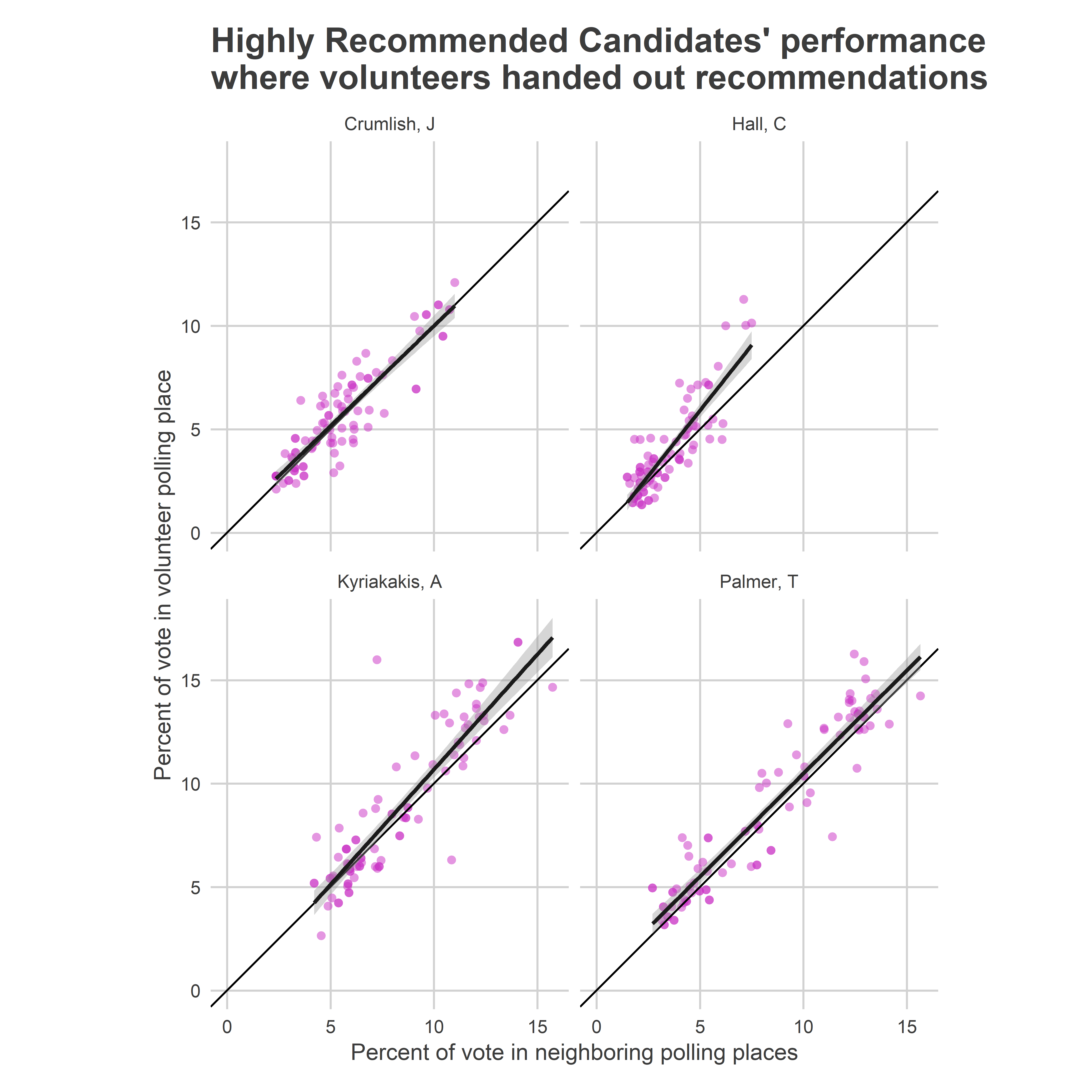
Each of the candidates did better in the polling places with volunteers than without them, with some evidence that the gap actually was bigger in places where they already were doing well.
On average, the difference between the percent of the vote earned in the volunteer divisions and the vote earned in neighboring divisions was half a percentage point for three of the candidates.
View code
df_neighbor %>%
  filter(philacommrec == 2 & has_vol) %>%
  group_by(candidate) %>%
  summarise(
    pvote = 100 * mean(pvote),
    pvote_neighbor_novol = 100 * mean(pvote_neighbor_novol)
  ) %>%
  mutate(diff = pvote - pvote_neighbor_novol) %>%
  knitr::kable(
    digits = 2,
    col.names = c("Candidate", "% Vote in volunteer divisions", "% Vote in neighboring divisions", "Difference")
  )
| Crumlish, J |
5.67 |
5.53 |
0.15 |
| Hall, C |
3.90 |
3.41 |
0.49 |
| Kyriakakis, A |
8.75 |
8.26 |
0.49 |
| Palmer, T |
8.56 |
8.07 |
0.50 |
We can use regression (with candidate random effects) to measure the average effect of volunteers. Notice that since the target is itself a paired difference, the candidate random effects represent heterogeneous volunteer treatment effects: listings may effect candidates differently.
On average, the volunteers increased the gap between Highly Recommended and Not Recommended candidates by 0.48 percentage points versus neighboring divisions.
View code
library(lme4)
lmer_fit <- lmer(
  I(100 * (pvote - pvote_neighbor_novol)) ~ philacommrec + (1 | candidate),
  df_neighbor %>%
    filter(has_vol) %>%
    mutate(philacommrec = as.character(philacommrec))
)

# summary(lmer_fit)
knitr::kable(
  broom::tidy(lmer_fit) %>%
    select(-group, -statistic) %>%
    mutate(term = c(
      "(Intercept)" = "Intercept (Effect of Volunteer on Not Recommended candidates)",
      "philacommrec1" = "Additional effect on Recommended candidates",
      "philacommrec2" = "Additional effect on Highly Recommended candidates",
      "sd_(Intercept).candidate" = "S.D. of candidate effects",
      "sd_Observation.Residual" = "S.D. of residual"
    )),
  digits=2,
  col.name = c("Estimand", "Estimate", "Std. Error")
)
| Intercept (Effect of Volunteer on Not Recommended candidates) |
-0.07 |
0.09 |
| Additional effect on Recommended candidates |
-0.01 |
0.11 |
| Additional effect on Highly Recommended candidates |
0.48 |
0.15 |
| S.D. of candidate effects |
0.20 |
NA |
| S.D. of residual |
1.12 |
NA |
Note that this estimate is the average effect among the divisions where the volunteers actually went. If they are not representative of the city as a whole, then this wouldn’t estimate the average effect if we were to send volunteers everywhere. Specifically, if we were to send volunteers everywhere, we might expect the overall average effect to be higher, since these were the divisions
Is this effect comparable to our estimate two years ago? It’s hard to say. First, in the last election there were no Highly Recommended candidates. We found that Recommended candidates received no benefit from volunteers in wealthy divisions, largely because residents were voting for them already. We replicated that finding this time, but actually did find a statistically significant boost for Highly Recommended candidates.
Second, the size of 0.5 percentage points likely would have been smaller two years ago, just because of the number of open spots. This year, voters were selecting 6 judges, in 2017 they elected 9. The raw math of that means that winners receive less of the vote, so the same treatments will probably have smaller raw effects. In this analysis, the 0.48 percentage point effect was 1/11th of the 5.3% it took to win. In 2017, listings increased the gap between Recommended and Not Recommended candidates by 0.41 percentage points, which was about 1/10th of 4.1% needed to win.

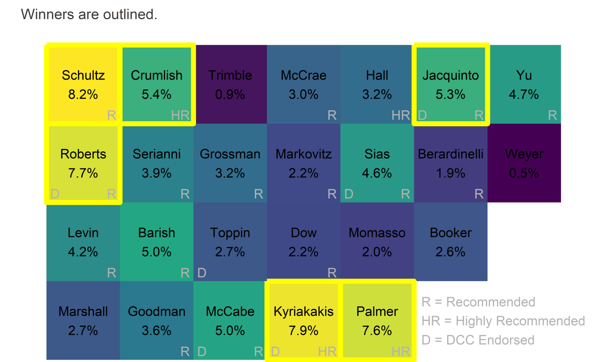
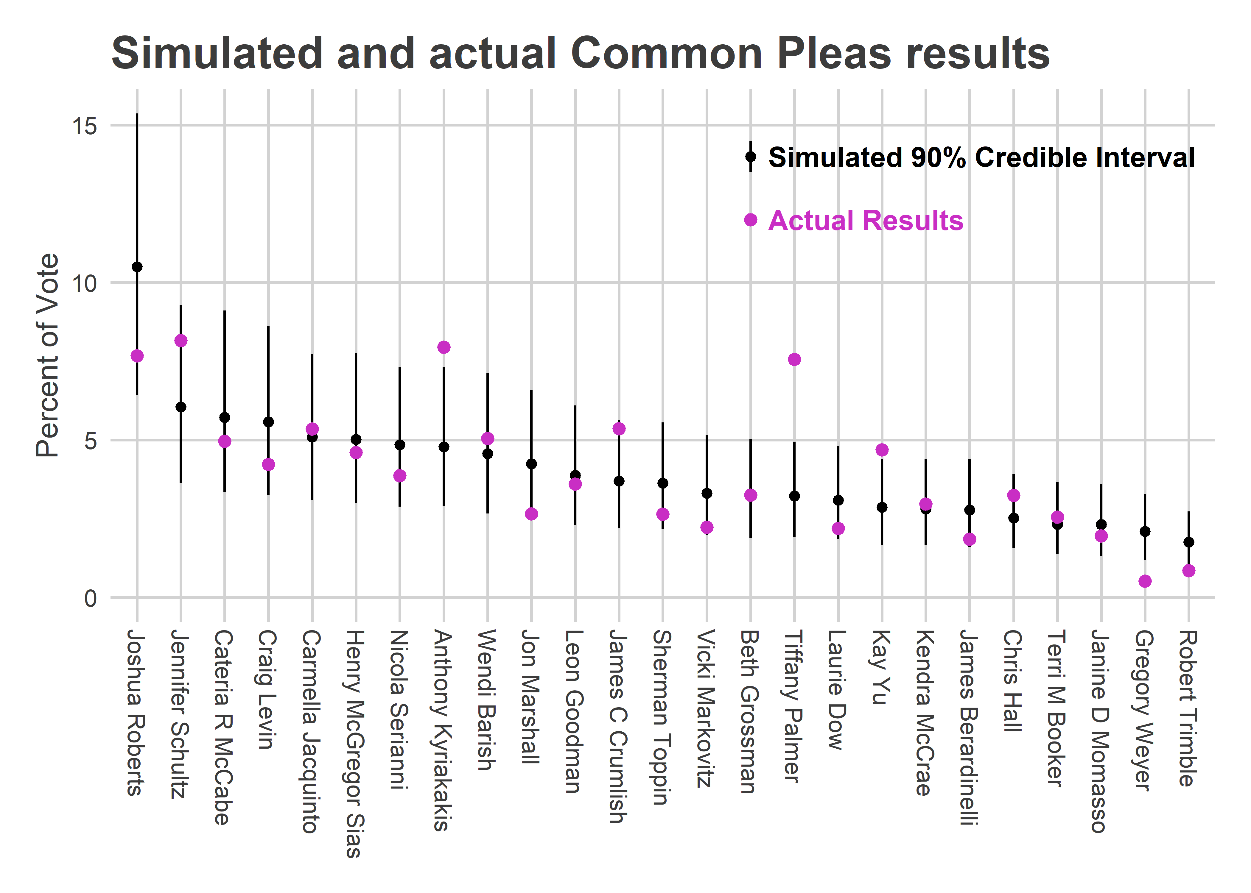 Kyriakakis and Palmer greatly exceeded the 90% credible range, and James Crumlish was at the top of it. Those three Highly Recommended candidates were all in the top four candidates who most overperformed my prediction (Kay Yu was the other).
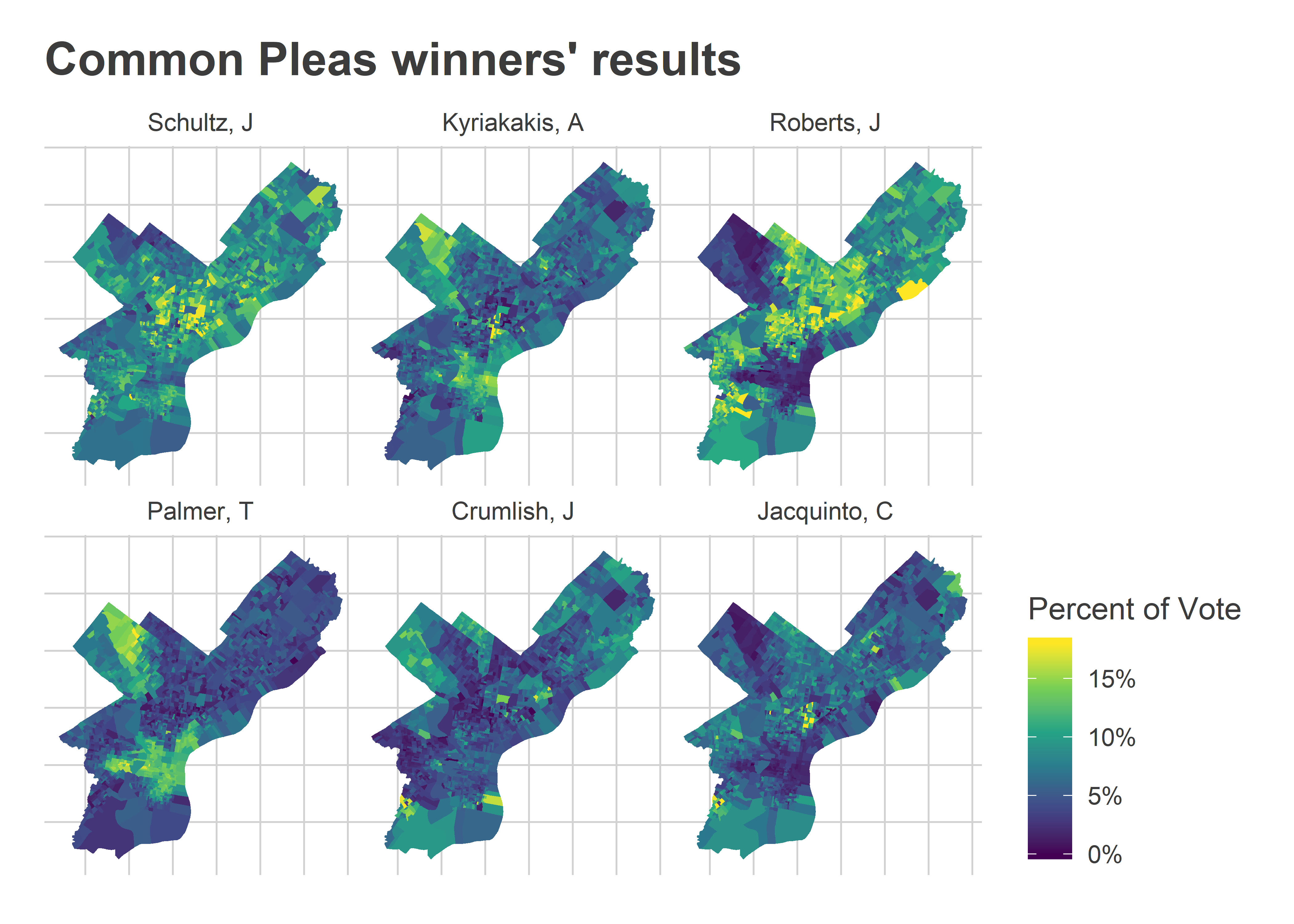