Announcing the Live Election Tracker!

Philadelphia’s 2018 Primary elections are coming on May 15th. I’m excited to announce that Sixty-Six Wards will be *live tracking* turnout on election day. And I need help from you!

What I need from you
On election day, vote! When you sign in to vote, you can see what number voter you are in your division. After voting, log in to at bit.ly/sixtysixturnout and share with me your (1) Ward, (2) Division, (3) Time of Day, and (4) Voter Number. Using that information, I’ve built a model that estimates the turnout across the city (see below).

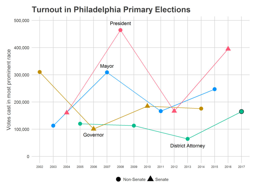
You’ll then be able to track the live election results at jtannen.github.io/election_tracker. Will turnout beat the 165,000 who voted in 2014, even with a non-competitive Senate and Governor primary? Will the surge seen in 2017 continue?

This estimation can only get better with more data points. So encourage your friends to vote, and share their voter number too!

Some note about the data collection: I only collect the four data points above (Ward, Division, Time, and Voter Number), and no identifying information on submitters. I *will* share this data publicly–again, only those four questions–in hopes that it can prove useful to others. And I am only using Democratic primary results (sorry Republicans, but there are simply too few of you, especially in off-presidential years, for me to think I could make any valid estimate).

The Model
Now for what you really care about: the math.

Estimating turnout live requires simultaneously estimating two things: each Division’s relative mobilization and the time pattern of voters throughout the day. The 100th voter means something different in a Division that had 50 voters in 2014 than it does in a Division that had 200, and it means something different at 8am than it does at 7pm. Further, Philadelphia has 1,686 Divisions, and I don’t think we’ll get data on every Division (no matter how well my dedicated readers blast out the link). I use historic correlations among Divisions to guess the current turnout in Divisions for which no one has submitted data.

To estimate turnout, I model the turnout X in division i at time t, in year y, as
log(X_ity) = a_y + b_ty + d_iy + e_ity

The variable a represents the overall turnout level in the city for this year. b_t is the time trend, which starts at exp(b_t) = 0 and finishes at exp(b_t) = 1 so the time trend progresses from 0% of voters having voted at 7am to 100% having voted at 8pm. d_i represents Division i‘s relative turnout versus other divisions for this year, and e_it is noise.

Modeling Divisions
To best estimate d_i, especially for Divisions with no submitted data, I use historical data. Using the Philadelphia primaries since 2002 (excluding 2009, where something is weird with the data), I estimate each Division’s average relative turnout versus other Divisions (its “fixed effect”), and the correlation among Divisions’ log turnout across years. Divisions are often very similar to each other: when one Division turns out strongly in an election, similar Divisions do too.

Here are the estimated average relative turnouts (the fixed effects):

We see a familiar pattern. Center City, Germantown and Mount Airy, and Overbrook all vote at disproportionately high rates, while the universities, North Philly, and the northern River Wards vote at disproportionately low rates.

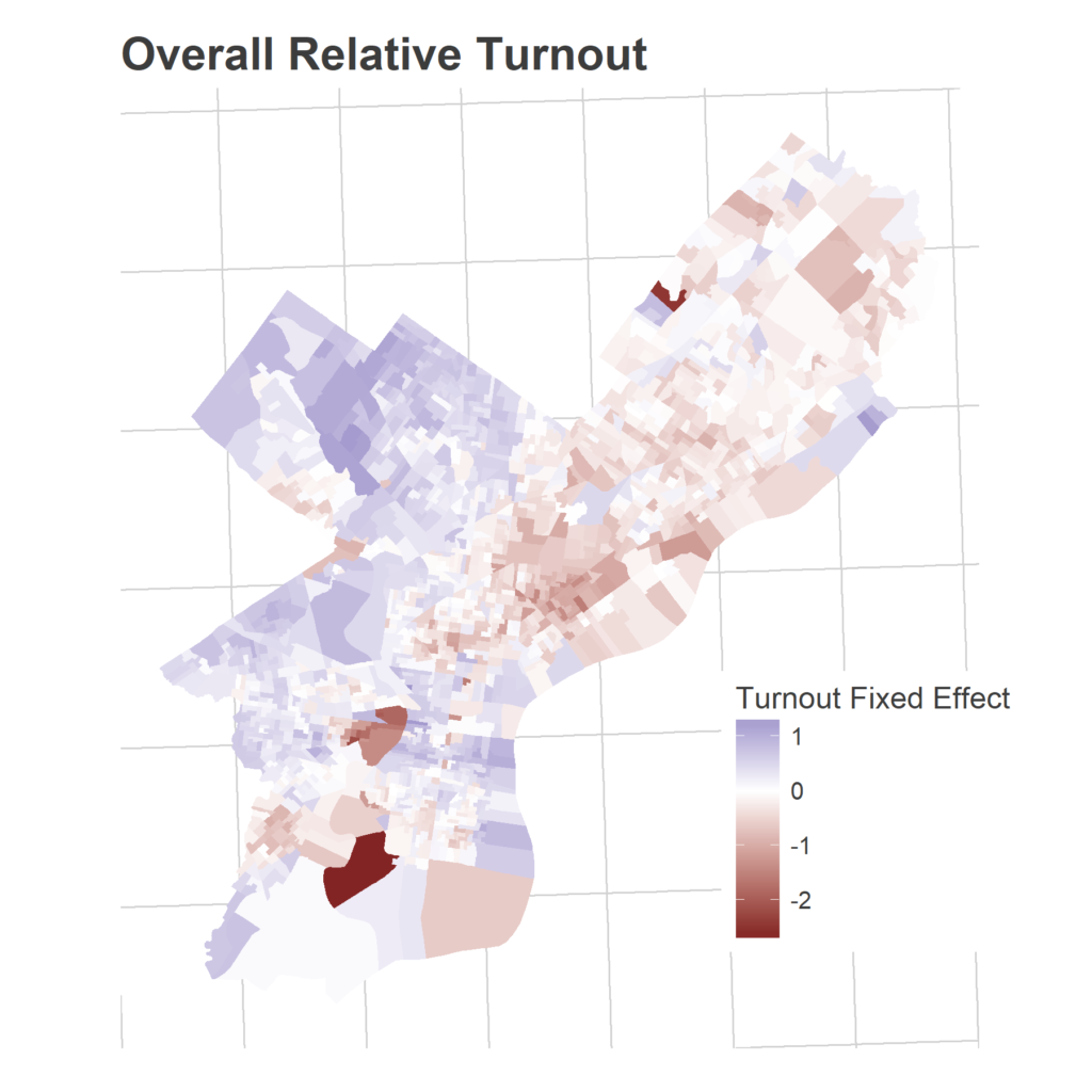
That’s across all years. But the way Divisions over- or under-perform these averages in a given year creates patterns as well. Divisions’ turnouts are correlated with each other.

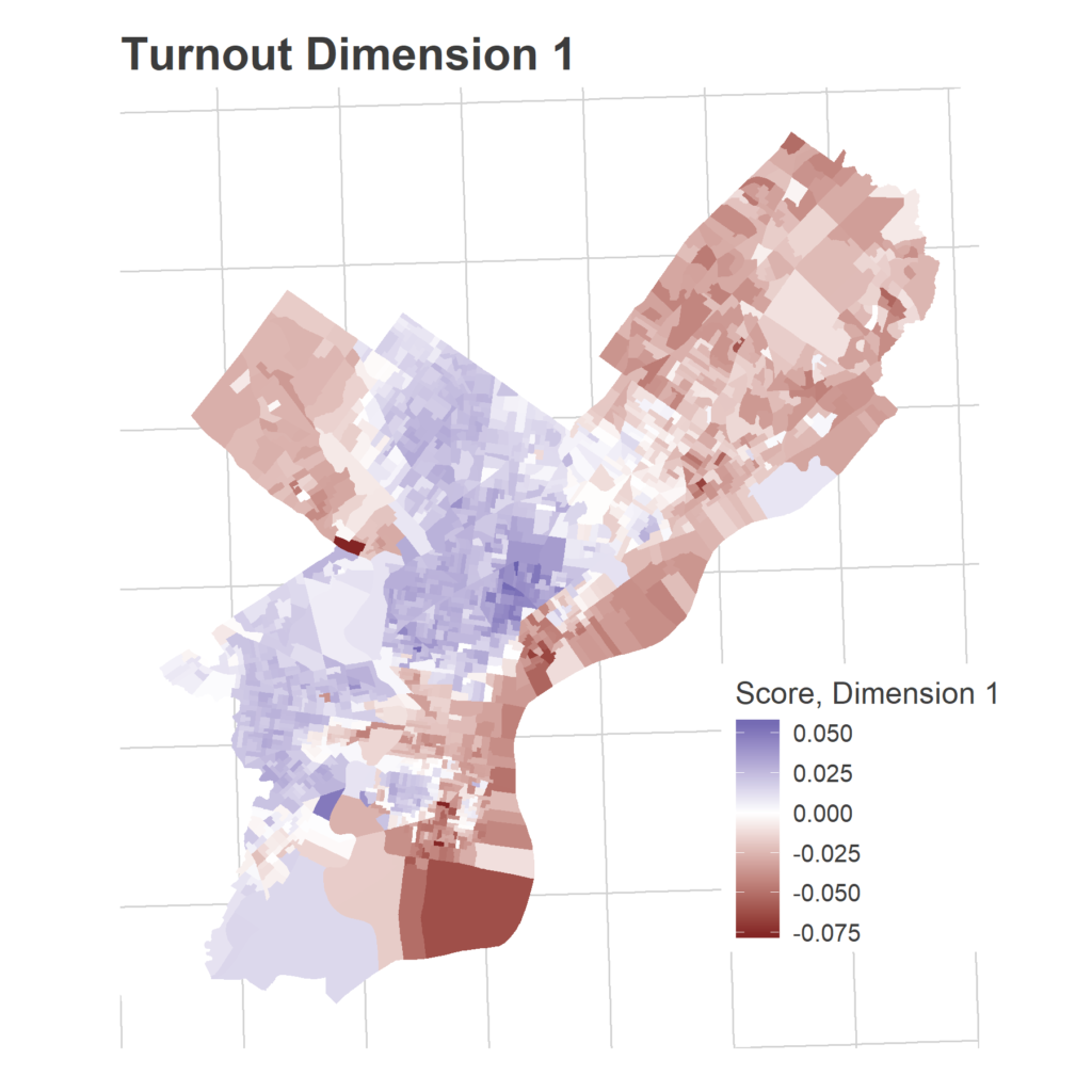
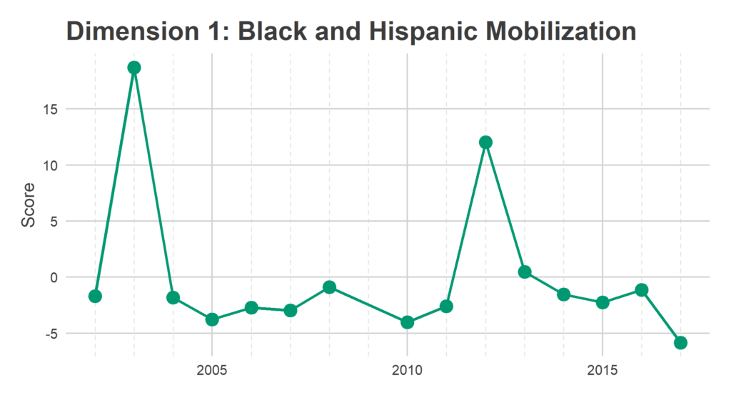
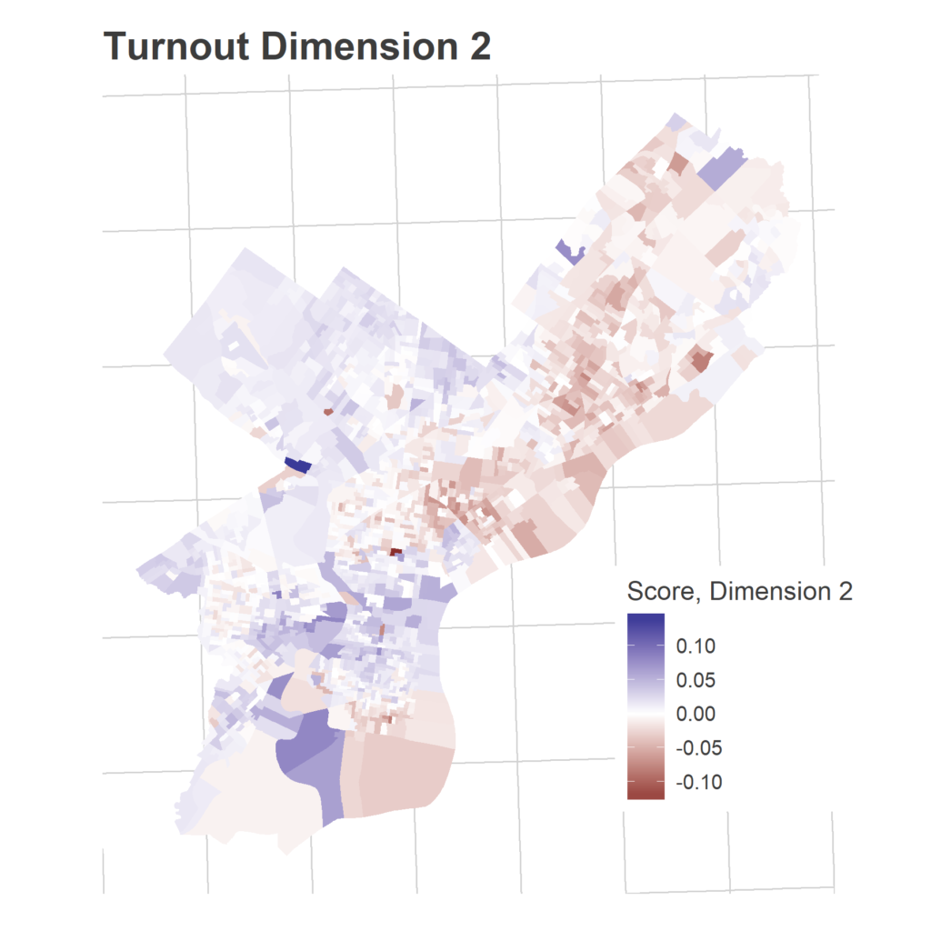
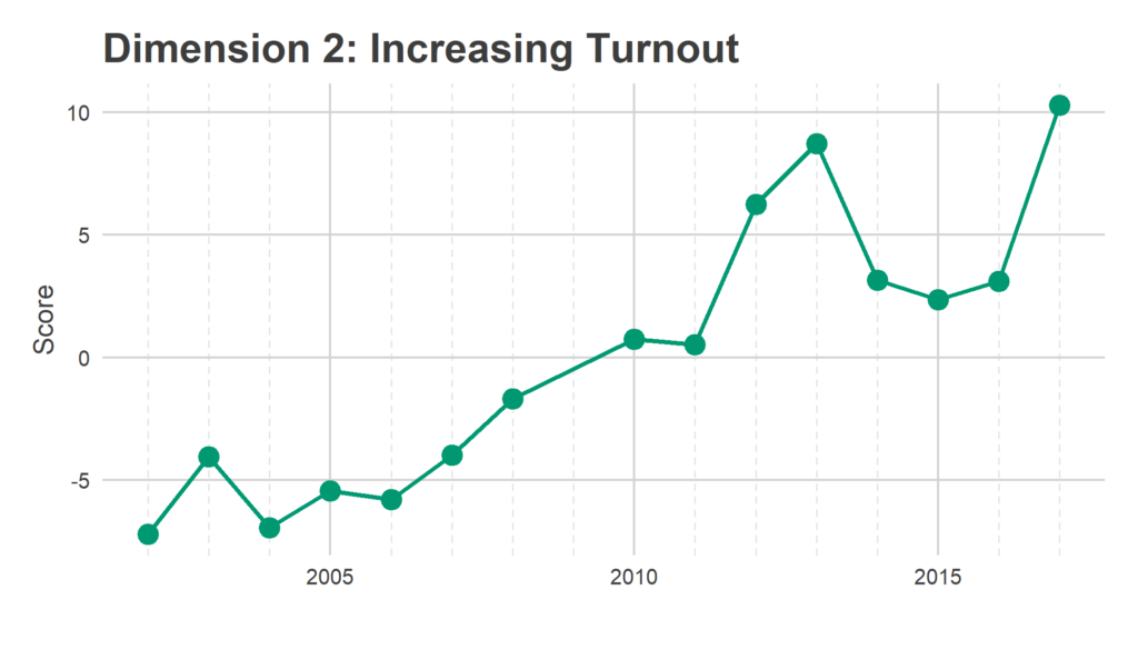
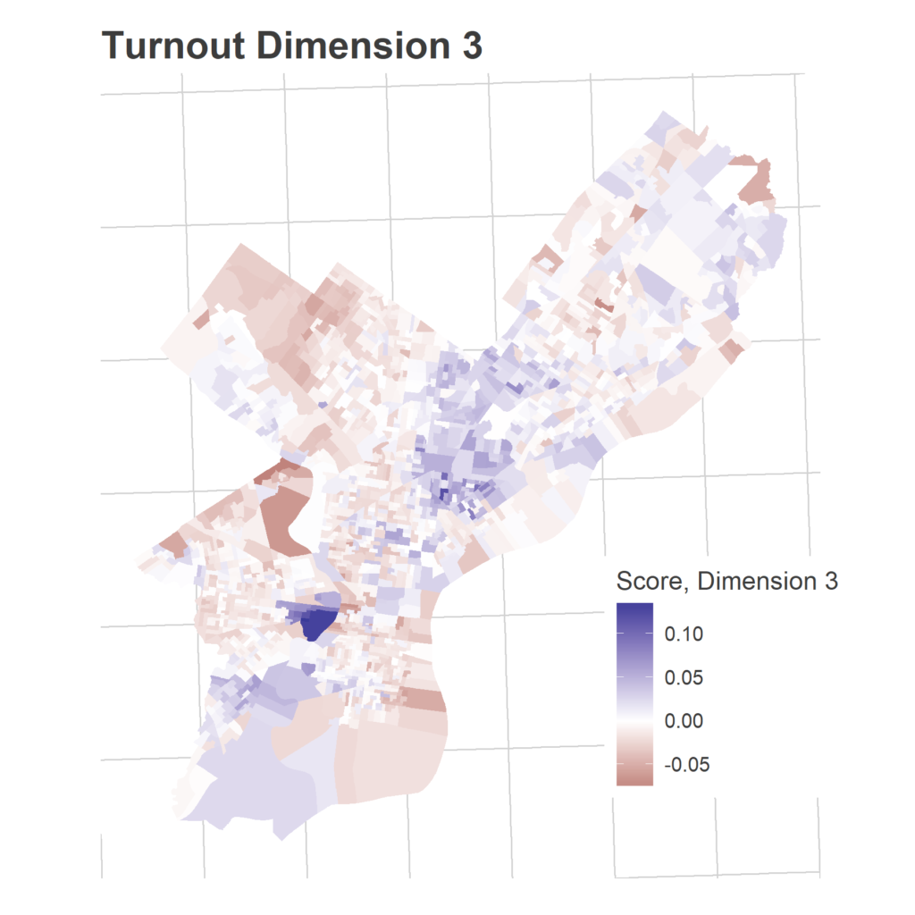
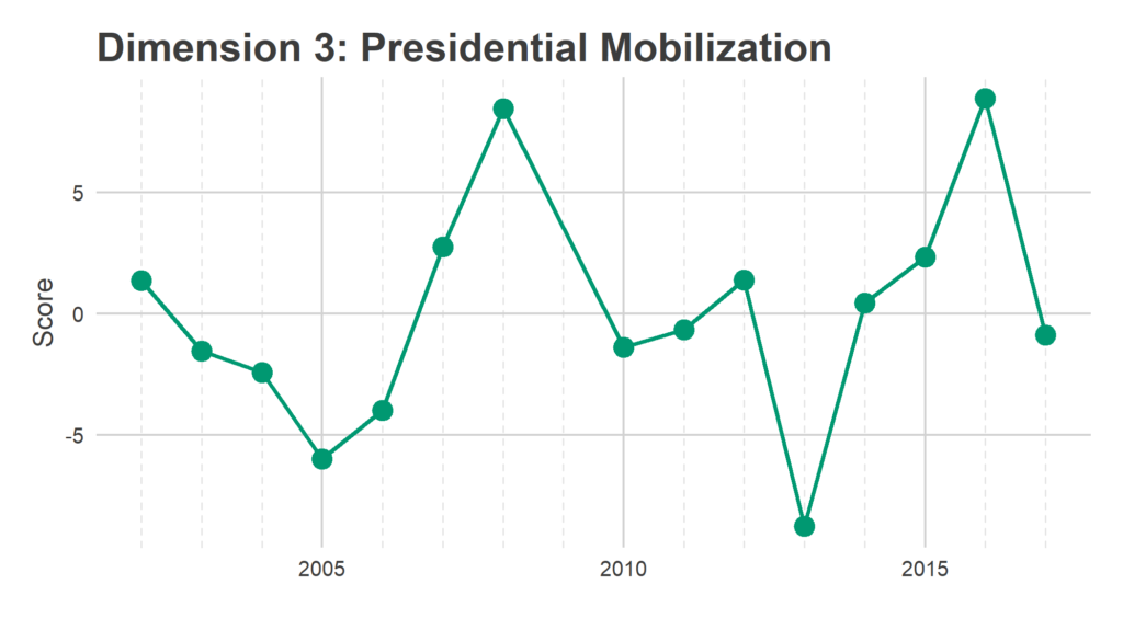
We have 1,686 Divisions and only 16 years, so we need to simplify the covariance matrix to estimate covariance among Divisions. To do that, I use Singular-Value Decomposition to identify three dimensions of turnout. These dimensions represent groups of Divisions that swing together: when one Division in the group turns out higher than usual, the others do to. The signs are not meaningful; some years the Divisions with a positive sign turn out higher, other years those with negative signs. What’s important is that the positive and negative signs move oppositely​.

SVD assigns a score in each dimension for the dimensions and for the years. Divisions with a positive score in a dimension turn out more strongly in years with positive scores, Divisions with a negative score turn out more strongly in years with negative scores.

Eyeballing the score maps together with the years’ scores serves as a sanity check for years, and provides intuition to the underlying story. The dimensions are ordered from the strongest separation to the weakest. I’m not going to pay too close attention to the specific values of the scores, what matters most is the relative values.

Dimension 1 has clearly identified the racial divide in the city. Divisions with positive scores are predominantly Black and Hispanic, while divisions with negative scores are predominantly White (again, the signs are not meaningful). Divisions with positive scores voted disproportionately in 2012 and 2003 (President Obama’s and Mayor Street’s reelections, respectively), while divisions with negative scores turned out particularly strongly in 2017.  Interestingly, the year with the lowest score, meaning the greatest disproportionate turnout in non-Hispanic White neighborhoods, was the 2017 DA’s race won by Larry Krasner.
It’s less obvious from the map what Dimension 2 captures, but the time series is clear: Dimension 2 identifies Divisions where relative turnout has steadily increased over the 16 years. This also lines up with the neighborhoods that have gentrified: Powelton, Fishtown, Fairmount, and Girard Estates have seen the strongest trends up, while broad swaths of North Philly and the Greater Northeast have seen relative decreases over time.
Dimension 3 identified Divisions that surge in turnout specifically for Presidential primaries. Penn and Drexel obviously see the strongest swings, though Southwest Philly and Hispanic sections of North Philly also have positive scores: these neighborhoods voted strongly in 2016 and 2008, relative to their typically low overall turnout.

These dimension allow me to calculate the smoothed covariance matrix Sigma, among divisions. In a given year, then, the vector of Division effects, d, is drawn from a multivariate Normal:
d ~ MVNormal(mu, Sigma),
with mu the Division fixed effects.

Time Series
The time series of voting throughout the day is currently completely unknown. What fraction of voters vote before 8am? What fraction at lunch time? Knowing how to interpret a data point at 11am hinges on the time profile of voting. For this model, I assume that all Divisions have the same time profile: all divisions have the same fraction of their voters vote before time t, with possible noise. Since I don’t have historical data for this, I will estimate it on the fly.

I model the total time effect including the annual intercept, a_y + b_t, using a loess smoother.

The full model
Having specified each term in
log(X_ity) = a_y + b_ty + d_iy + e_ity,
I fit this model using Maximum Likelihood.

The output is a joint modeling of (a) the time distribution across the city and (b) the relative strength of turnout in neighborhoods. Come election day, you’ll be able to see estimates of the current turnout, as well as how strong turnout is in your neighborhood!

See you on Election Day!
2018 could be an exciting moment for Philadelphia elections. The primary will give us an important signal for what to expect in November. Please help us generate live elections by voting, sharing your data, and getting your friends to do the same. See you May 15th!

The Committeepeople candidates are in!

Back in December, I looked at how many votes it takes to become a Democratic Party Committeeperson. Philadelphia’s Committeepeople are the foot soldiers of the Party, responsible for getting out the vote and organizing the party in the 1,686 Divisions. Each Division has 2 committeepeople, so every four years a potential 3,372 Philadelphians are elected to the post (I focus on Democrats here, though the same is true for Republicans).  In 2014, 348 (10%) of those positions went completely unfilled, while another 275 of the positions were won by Write-In candidates, usually in districts with less than two candidates on the ballot.

An open question for the upcoming May Primary is whether Democrats’ newfound energy will translate to the rank-and-file positions of local the local Party. Well, applications have been filed and the Commissioner’s office released the official slate of candidates.. How do the numbers bode for that trickle-down energy?

The hypothetical surge in Committeeperson candidates definitely did not materialize.

The surge in candidates didn’t happen
In total, there are currently 3,204 candidates on the Democratic ballot, after a number of applications were contested and rejected. That compares to 3,098 that survived to the election in 2014. The counts are from slightly different points in the process. The 2014 data uses election results of non-write-in candidates, while the 2018 uses the recently released Commissioner’s data on candidates who survived potential challenges.
There are currently a total of 558 seats that have no candidate on the ballot, 61 fewer than four years ago.

Some 1,615 of those candidates are incumbents. To calculate incumbent candidates, I use fuzzy text matching on candidate names between 2014 and 2018. This tests whether two names are the same based on the fraction of characters that are different. Matching is harder than it may seem because of variability of how candidates write out their names: spellings may change, a candidate may identify as Junior in one but not another, Elizabeth may change her listed name to Betsy. Rather than manually assign incumbency, I automate the process; ‘ve spot checked the fuzzy matching on 40 borderline matches and think I’ve got a good first-order approximation to incumbency assignments.

The wards with the highest number of candidates per division are in Wards 1 and 2 in Queens Village, 55 in the lower Northeast, and 46 in West Philly. The wards with the lowest include 27 and 20, which include Penn and Temple, respectively.

The most astonishing increase is in the 58th Ward in the Northeast, which has 66 more candidates in 2018 than it did in 2014. Ward 42 saw the the greatest decrease
There has not been an obvious surge in energy across the city. 34 of the 66 wards saw increases in the total number of candidates, while 29 saw a decrease.
Which Wards have the energy?

Maybe to see the energy, we need to look in specific places in the city. I often find two useful ways to break up the city: by race, and by vote in the 2016 primary. Race often captures an important axis for identity and experience in the city, while vote in the 2016 primary does two things: differentiates White wards between more establishment (Clinton voters) and less establishment voters (Sanders), and differentiates predominantly Black wards that nonetheless are in the process of gentrifying. Wards 46 and 47 neighbor Penn and Temple, respectively, and are predominantly Black Wards that voted relatively strongly for Sanders, largely because of the sizeable young White population.

There is one dimension that is not captured by the Race x 2016 primary distinction, and that is the Trumpiness of White voters. For example, many White Northeast Wards voted for Sanders, but then also swung towards Trump in the general election. This suggests that their Sanders votes may not have been a declaration of progressivism, but a vote against Clinton. Looking at Sanders-voting White wards will conflate the young progressives in the center of the city with the anti-Clinton voters of the Northeast.

For reference in the upcoming discussion, here is a map of wards’ predominant race and ethnicity, calculated using the 2012-2016 American Community Survey.


Below is a plot of the average number of 2018 committeeperson candidates per division, plotted by predominant race and 2016 Primary vote. For the most part, White wards have the most candidates, followed by Black wards and then last Hispanic wards. The Black ward with the most candidates is ward 46, which is actually a rapidly gentrifying ward that Bernie almost won.
The most interesting trend is within Hispanic wards, where the trend in White and Black wards is reversed: the number of candidates on the ballot increases with vote for Clinton. Wards 7, 19, and 43 voted strongest for Clinton in the city, and have around 2 candidates per Division. I read this reversal as demonstrating that political organization is different within Hispanic wards from the others. In Hispanic wards, party organization is correlated with establishment votes, while the connection is less clear in other types of wards.

So how about the change in the number of candidates? Did this newfound energy make Bernie-loving wards mobilize committeepeople en masse?

Finally, those changes in candidates running also mean that White wards have the most non-incumbents running. Some 42% of candidates in White wards are incumbents, compared to 53% in Hispanic wards and 57% in Black wards.
What to look for in the Primary
The May 15th primary will see many new Committeepeople be seated, and decide the which Democrats run for all of the important (newly-redistricted) U.S. House and the PA State House and Senate races. The surge in energy that many predicted didn’t seem to materialize in residents running for committeeperson, but the primary will give us a much better sense of who is energized where, ahead of the national November midterms (and race for governor).

I’ve got some exciting news planned for the primary. Stay tuned!