One question I get a lot is what we should expect for turnout in this primary. We have a lot of mixed signals, and it can be hard to intuit what they all mean together.
The signals include:
- This is a Primary with an incumbent mayor, which typically sees a low 140,000 voters.
- But turnout has soared after 2016. It was was 66% higher for the 2017 primary than the prior three DA primaries, and 35% higher for the 2018 general than the prior three Gubernatorial generals.
- The turnout surge was especially large in neighborhoods that voted for Krasner.
- The Democratic Primary is currently at 29 Council At Large and 13 Commissioner candidates, versus 16 and 6 in 2015.
- We have contested primaries in 5 of 10 council districts: 1, 2, 3, 4, and 7. In 2015, the only contested districts were Kanyatta Johnson’s 2nd and Maria Quiñones-Sánchez’s 7th.
What does it all mean? In this post, I’ll sort through the recent trends, and make a prediction (or really, two) for what turnout will look like.
View code
library(ggplot2)
library(dplyr)
library(ggthemes)
library(scales)
library(colorspace)
library(tidyr)
library(sf)


setwd("C:/Users/Jonathan Tannen/Dropbox/sixty_six/posts/turnout_2019_primary/")

load("../../data/processed_data/df_major_2017_12_01.Rda")

source("../../admin_scripts/util.R")

turnout <- df_major %>%
  filter(OFFICE %in% c(
    "PRESIDENT OF THE UNITED STATES",
    "GOVERNOR",
    "MAYOR",
    "DISTRICT ATTORNEY"
  )) %>%
  group_by(WARD16, DIV16, year, election) %>%
  summarise(VOTES = sum(VOTES))


df_2018 <- read.csv("../../data/raw_election_data/2018_general.csv")
names(df_2018)<- c(
  "WARD16", "DIV16", "TYPE", "OFFICE",
  "CANDIDATE", "PARTY", "VOTES"
)
df_2018$WARD16 <- sprintf("%02d", df_2018$WARD16)
df_2018$DIV16 <- sprintf("%02d", df_2018$DIV16)

df_2018 <- df_2018 %>%
  filter(OFFICE == "GOVERNOR AND LIEUTENANT GOVERNOR") %>%
  group_by(WARD16, DIV16) %>%
  summarise(VOTES = sum(VOTES))

df_2018$election <- "general"
df_2018$year <- "2018"

df_2018_primary <- read.csv("../../data/raw_election_data/2018_primary.csv")
# head(df_2018_primary)
names(df_2018_primary)<- c(
  "WARD16", "DIV16", "TYPE", "OFFICE",
  "CANDIDATE", "PARTY", "VOTES"
)
df_2018_primary$WARD16 <- sprintf("%02d", df_2018_primary$WARD16)
df_2018_primary$DIV16 <- sprintf("%02d", df_2018_primary$DIV16)
df_2018_primary <- df_2018_primary %>%
  filter(PARTY == "DEMOCRATIC") %>%
  mutate(OFFICE = gsub("(.*)-DEM", "\\1", OFFICE)) df_2018_primary <- df_2018_primary %>% filter(OFFICE == "GOVERNOR") %>% group_by(WARD16, DIV16) %>% summarise(VOTES = sum(VOTES)) df_2018_primary$election <- "primary" df_2018_primary$year <- "2018" turnout <- bind_rows(turnout, df_2018) turnout <- bind_rows(turnout, df_2018_primary) turnout_wide <- turnout %>% unite(key, election, year) %>% spread(key = key, value = VOTES) cycles <- data.frame( year = 2002:2021, cycle = rep(c("Governor","Mayor","President","District Attorney"), 5), senate = rep(c(FALSE, FALSE, TRUE, FALSE, TRUE, FALSE), 4)[1:20] ) turnout_total <- turnout %>% group_by(year, election) %>% summarise(VOTES = sum(VOTES)) turnout_total <- turnout_total %>% left_join( cycles %>% mutate(year = as.character(year)), by = "year" )
The Typical Turnout in an Incumbent Mayoral Primary
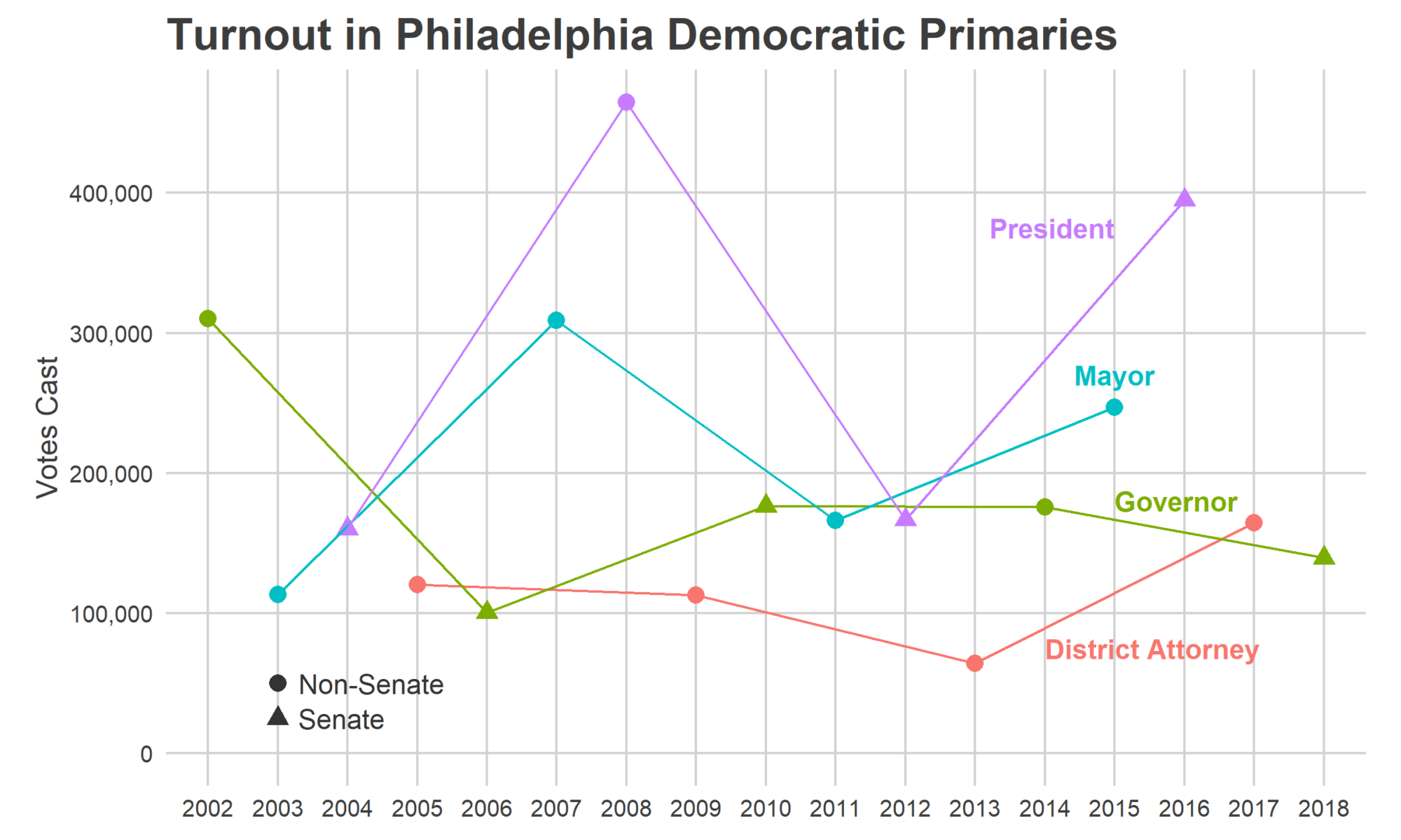
First, let’s consider the boring historical, pre-2016 baseline. Mayoral primaries have the second highest turnout in the city, second only to Presidential ones, but much lower turnout when there’s an incumbent mayor.
View code
annotation_df <- list(
  primary = tribble(
    ~year, ~VOTES, ~cycle, ~hjust,
    13, 75e3, "District Attorney", 0,
    14, 375e3, "President", 1,
    14, 180e3, "Governor", 0,
    14, 270e3, "Mayor", 0.5
  ),
  general = tribble(
    ~year, ~VOTES, ~cycle, ~hjust,
    13.5, 120e3, "District Attorney", 0,
    12, 675e3, "President", 0,
    14.2, 400e3, "Governor", 0,
    14.3, 248e3, "Mayor", 0
  )
)


senate_label_pos <- list(
  primary = tribble(
    ~year, ~VOTES, ~senate, ~label,
    2.3, 25e3, TRUE, "Senate",
    2.3, 50e3, FALSE, "Non-Senate"
  ),
  general = tribble(
    ~year, ~VOTES, ~senate, ~label,
    2.3, 37.5e3, TRUE, "Senate",
    2.3, 75e3, FALSE, "Non-Senate"
  )
)


turnout_plot <- function(use_election){
  ggplot(
    turnout_total %>% filter(election == use_election),
    aes(
      x = year,
      y = VOTES,
      color = cycle,
      group = interaction(cycle, election)
    )
  ) +
    geom_point(size = 3, aes(shape = senate)) +
    geom_line() +
    expand_limits(y = 0) +
    scale_y_continuous("Votes Cast", labels = comma) +
    theme_sixtysix() +
    theme(axis.title.x = element_blank()) +
    geom_point(
      data = senate_label_pos[[use_election]],
      x = 2,
      aes(shape = senate),
      color = "grey20",
      group = NA,
      size = 3
    )+
    geom_text(
      data = senate_label_pos[[use_election]],
      aes(label=label),
      color = "grey20",
      group = NA,
      size = 4,
      hjust = 0
    )+
    geom_text(
      data = annotation_df[[use_election]],
      aes(label=cycle, hjust=hjust, color=cycle),
      group = NA,
      size = 4,
      fontface="bold"
    )+
    scale_shape_discrete(guide = FALSE)+
    scale_color_discrete(guide = FALSE)+
    ggtitle(sprintf(
      "Turnout in Philadelphia %s",
      ifelse(use_election == "general", "Generals", "Democratic Primaries")
    ))
}
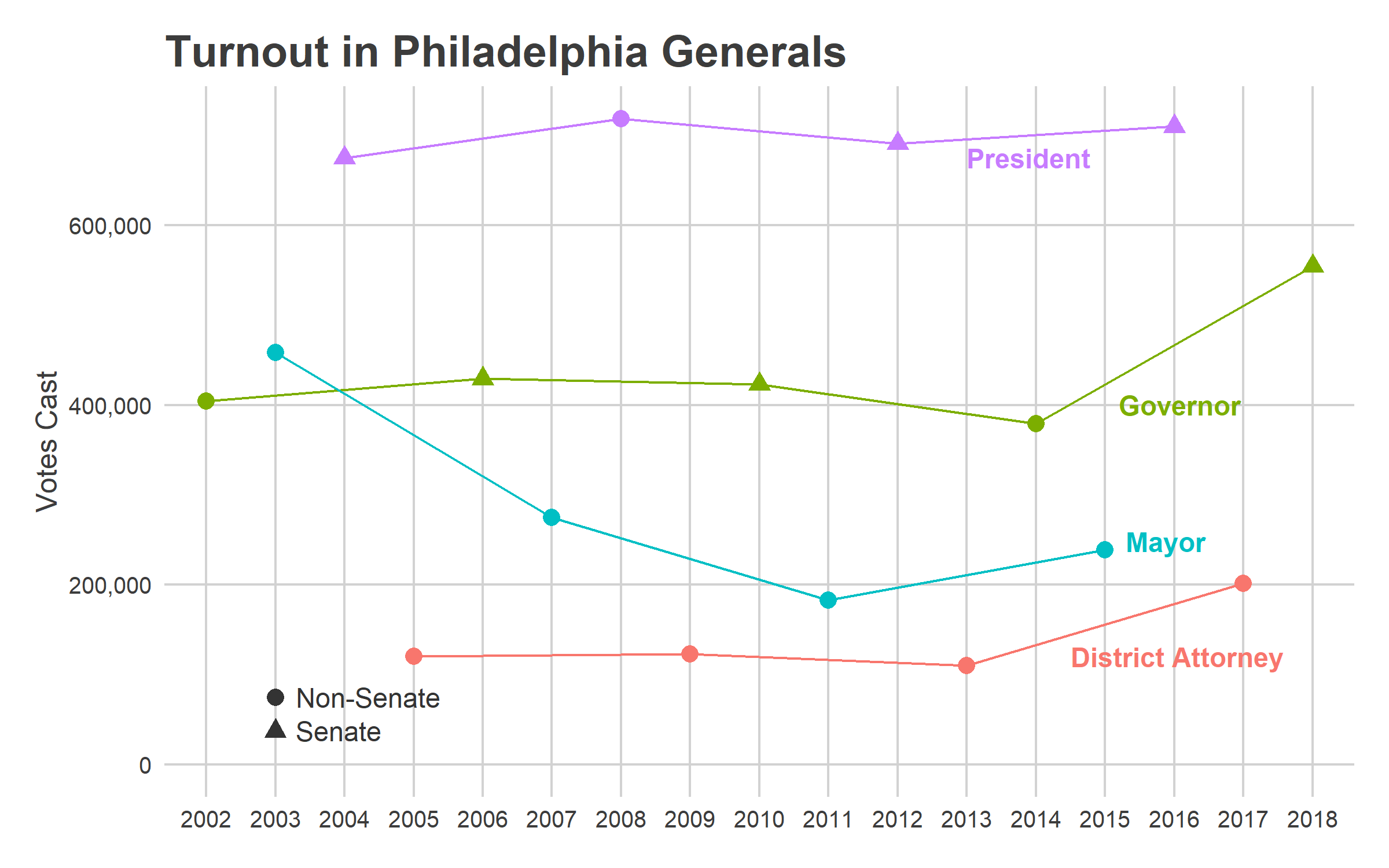
In the 2011 primary, with Nutter running for reelection, 166,000 Philadelphians cast a vote. In 2003, a year in which Street ran unopposed in the primary but was divisive enough to draw a strong challenge in the general, 113,000 voted in the primary.
View code
turnout_plot("primary")

We might start with a baseline guess of the average: 140,000 votes. We might, that is, if we hadn’t seen the last two years.
The post-2016 surge
Turnout since 2016 has fundamentally changed from the years before. In the plot above, notice that 165,000 Philadelphians voted in the 2017 District Attorney primary, 2.6 times the turnout of four years before (and 1.7 times the average turnout of the prior three DA primaries). Then the 2018 general turnout was astromical, approaching Presidential election numbers. The 554,000 votes cast was 36% higher than the 409,000 average of the four prior Gubernatorial generals.
View code
turnout_plot("general")
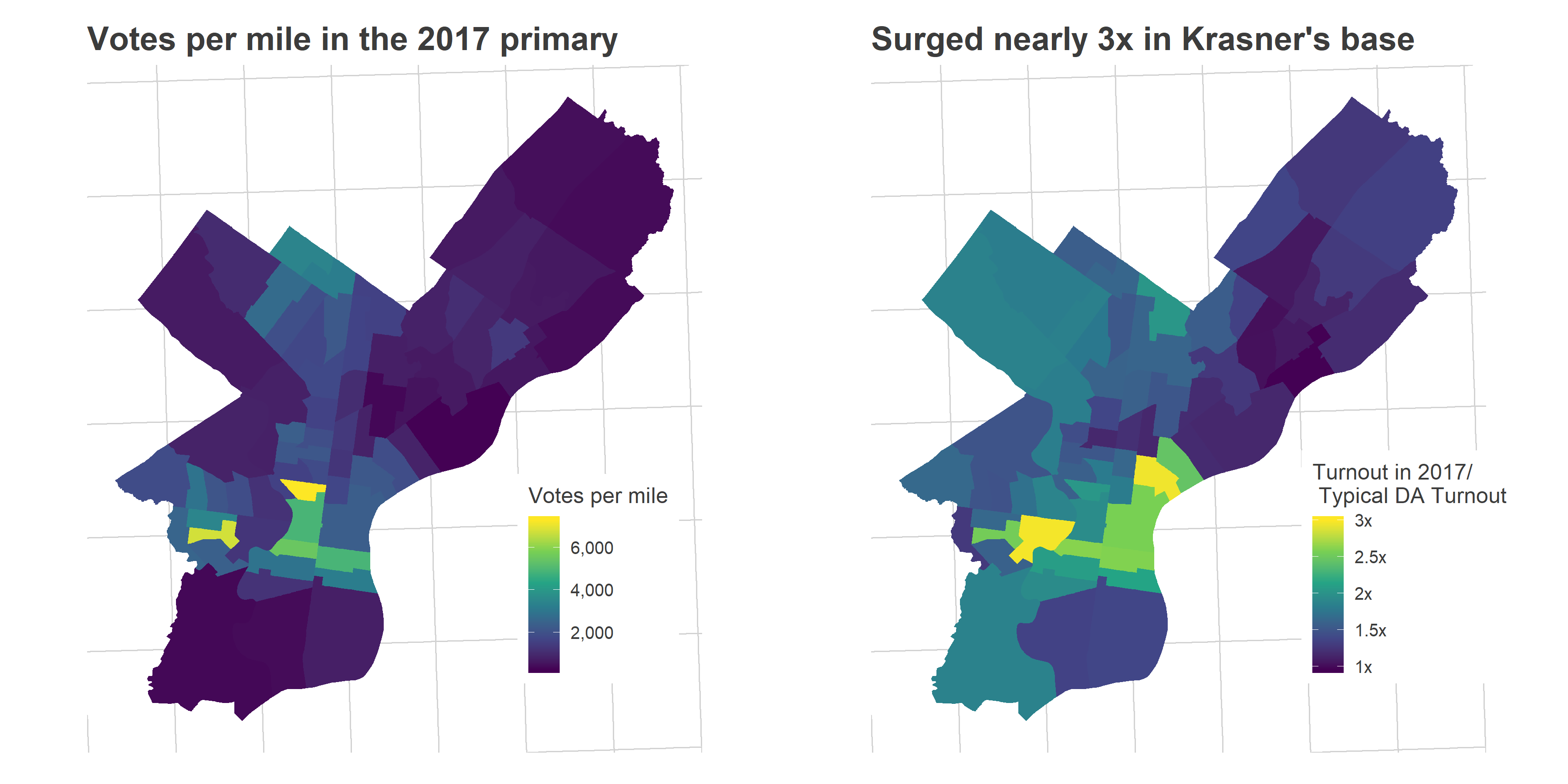
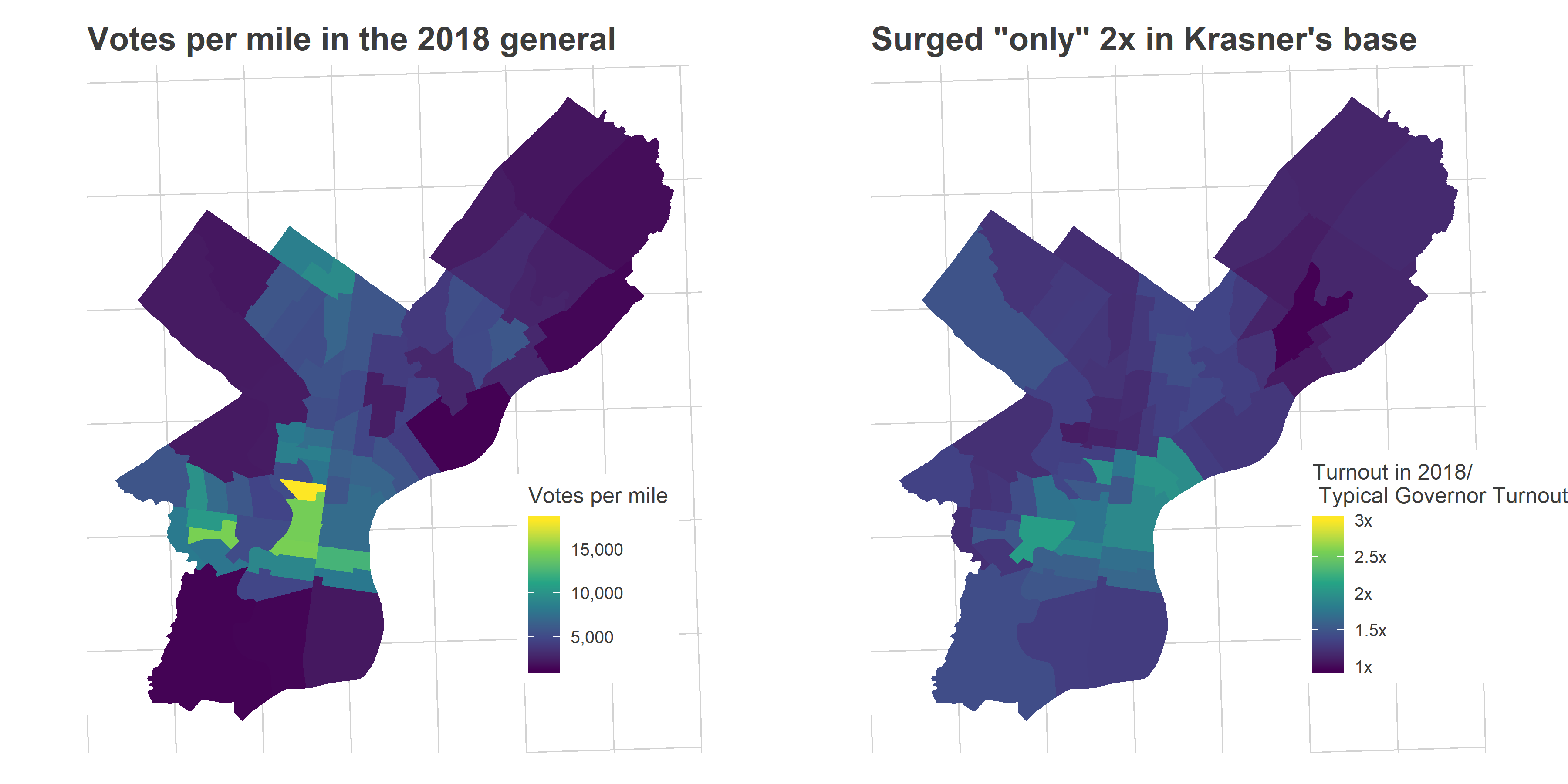
That turnout surge wasn’t uniform, but disproportionately occured in the gentrifying ring around Center City: University City, South Philly, and the River Wards (which I’ll call Krasner’s Base, as we’ll see later). Turnout was 3x the typical turnout for a DA election in those wards in 2017, and 2x the typical Gubernatorial turnout in 2018.
View code
da_results <- df_major %>%
  filter(
    election == "primary" & PARTY == "DEMOCRATIC" & OFFICE == "DISTRICT ATTORNEY"
  ) %>%
  group_by(year, WARD16, DIV16, CANDIDATE) %>%
  summarise(VOTES = sum(VOTES)) %>%
  group_by(year, WARD16, DIV16) %>%
  mutate(
    total_votes = sum(VOTES),
    pct_vote = VOTES / total_votes
  )

da_results$candidate_name <- format_name(da_results$CANDIDATE)

turnout_wide <- turnout_wide %>%
  mutate(
    typical_turnout_da = (primary_2013 + primary_2009 + primary_2005)/3,
    typical_turnout_governor = (general_2014 + general_2010 + general_2006 + general_2002)/4
  )

krasner_results <- da_results %>%
  filter(candidate_name == "Lawrence S Krasner") %>%
  left_join(turnout_wide)
View code
library(sf)

divs <- st_read("../../data/gis/2016/2016_Ward_Divisions.shp", quiet = TRUE)
divs <- divs %>% st_transform(2272)
wards <- st_read("../../data/gis/2016/2016_Wards.shp",  quiet = TRUE)
wards <- wards %>% st_transform(2272)

divs$area <- as.numeric(st_area(divs$geometry)) / (5280^2)
wards$area <- wards$AREA_SFT / (5280^2)

divs <- st_simplify(divs, 500)
divs <- divs %>% mutate(
  WARD16 = sprintf("%02d", WARD),
  DIV16 = sprintf("%02d", DIVSN)
) %>% select(-WARD, -DIVSN)
wards$WARD16 = sprintf("%02d", asnum(wards$WARD))
View code
krasner_results_wards <- krasner_results %>%
  group_by(WARD16) %>%
  summarise(
    turnout_2017 = sum(primary_2017),
    typical_turnout_da = sum(typical_turnout_da),
    pct_vote = weighted.mean(pct_vote, w=total_votes)
  )

turnout_wide_wards <- turnout_wide %>%
  group_by(WARD16) %>%
  summarise_at(
    .funs = funs(sum(., na.rm = TRUE)),
    vars(
      starts_with("primary_"),
      starts_with("general_"),
      starts_with("typical_turnout_")
    )
  )

krasner_turnout_per_mile <- ggplot(
  # divs %>%
  #   left_join(turnout_wide)
  wards %>%
    left_join(turnout_wide_wards)
) +
  geom_sf(
    aes(
      fill = pmin(primary_2017 / area, 10e3)
    ),
    color = NA
  ) +
  scale_fill_viridis_c(
    "Votes per mile",
    labels = scales::comma
  ) +
  theme_map_sixtysix() +
  ggtitle("Votes per mile in the 2017 primary")

krasner_turnout_change <- ggplot(
  # divs %>%
  #   left_join(turnout_wide)
  wards %>%
    left_join(turnout_wide_wards)
) +
  geom_sf(
    aes(fill = pmin(primary_2017 / typical_turnout_da, 4)),
    color = NA
  ) +
  expand_limits(fill = c(1,3)) +
  scale_fill_viridis_c(
    "Turnout in 2017/\n Typical DA Turnout",
    # breaks = 0:5,
    labels = function(x) paste0(x, "x")
  ) +
  theme_map_sixtysix() +
  ggtitle("Surged nearly 3x in Krasner's base")

gridExtra::grid.arrange(
  krasner_turnout_per_mile,
  krasner_turnout_change,
  nrow=1
)
View code
votes_per_mile_2018 <- ggplot(
  # divs %>%
    # left_join(turnout_wide)
    wards %>% left_join(turnout_wide_wards)
) +
  geom_sf(
    aes(
      fill = pmin(general_2018 / area, 20e3)
    ),
    color = NA
  ) +
  scale_fill_viridis_c(
    "Votes per mile",
    labels = scales::comma
  ) +
  theme_map_sixtysix() +
  ggtitle("Votes per mile in the 2018 general")

turnout_change_2018 <- ggplot(
  # divs %>%
  #   left_join(turnout_wide)
  wards %>%
    left_join(turnout_wide_wards)
) +
  geom_sf(
    aes(fill = pmin(general_2018 / typical_turnout_governor, 4)),
    color = NA
  ) +
  expand_limits(fill = c(1, 3)) +
  scale_fill_viridis_c(
    "Turnout in 2018/\n Typical Governor Turnout",
    labels = function(x) paste0(x, "x")
  ) +
  theme_map_sixtysix() +
  ggtitle(
    'Surged "only" 2x in Krasner\'s base'
  )

gridExtra::grid.arrange(
  votes_per_mile_2018,
  turnout_change_2018,
  nrow=1
)
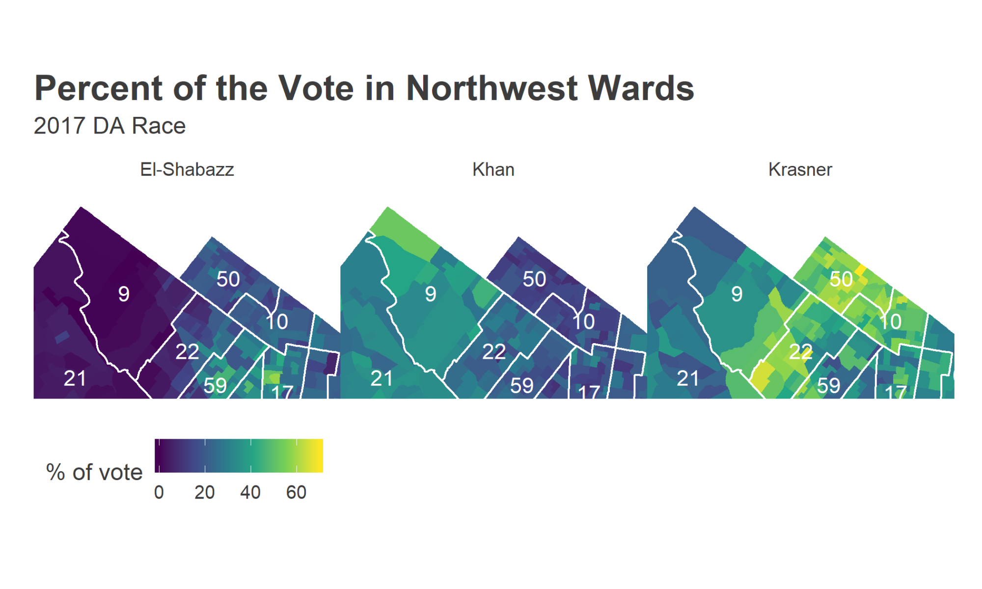
Why do I label those wards as Krasner’s base? Because they’re exactly where Krasner did strongest, winning over 60% of the votes (in a multi-candidate race!). Here’s the map of the District Attorney’s votes (mapped by Division).
View code
krasner_pct_map <- ggplot(
  divs %>% left_join(krasner_results)
  # wards %>%
  #   left_join(krasner_results_wards)
) +
  geom_sf(aes(fill = 100 * pct_vote), color = NA) +
  scale_fill_viridis_c("Percent\n of vote") +
  theme_map_sixtysix() +
  ggtitle("Percent of vote for Krasner")

print(krasner_pct_map)
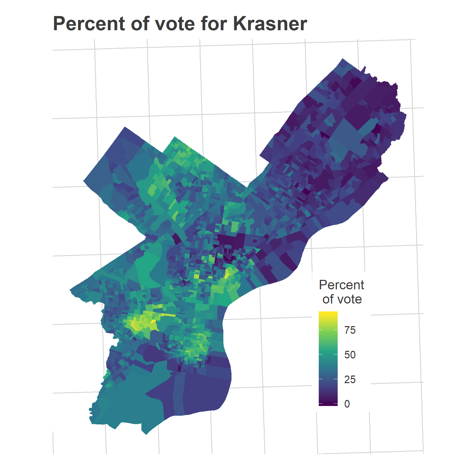
The story is clear: there is a specific population that used to never vote that’s been activated by 2016. These are the predominantly young, predominantly White residents of rapidly gentrifying wards. The votes in those neighborhoods are converging to the high-turnout behaviors regularly seen in core Center City and the Northwest.
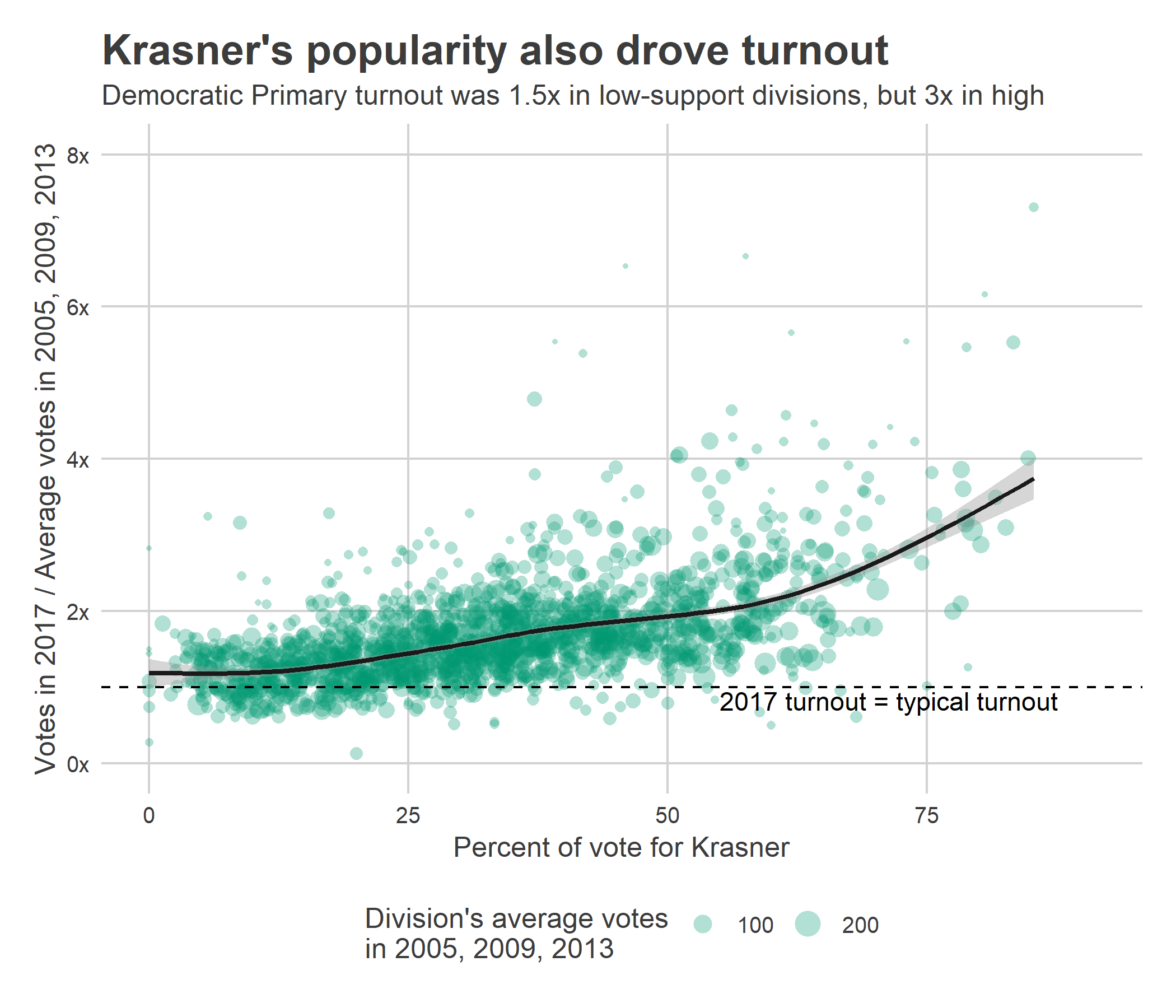
Plotting the increase in turnout in 2017 versus Krasner’s percent of the vote shows that divisions everywhere voted at least 1.5x as much as the prior three DA races, but over twice as much where Krasner won more than 50% of the vote.
View code
ggplot(
  krasner_results,
  aes(
    y = primary_2017 / typical_turnout_da,
    x = 100 *pct_vote
  )
) +
  geom_point(
    aes(
      size = typical_turnout_da
    ),
    alpha = 0.3,
    color = strong_green,
    pch = 16
  ) +
  geom_smooth(
    aes(weight = typical_turnout_da),
    color = "grey10"
  )+
  scale_size_area("Division's average votes\nin 2005, 2009, 2013") +
  scale_y_continuous(
    labels = function(x) return(paste0(x, "x")),
    limits = c(0, 8),
    breaks = seq(0, 10, 2)
  ) +
  geom_hline(yintercept = 1, linetype="dashed") +
  annotate(
    "text",
    x=55, y=0.95,
    label="2017 turnout = typical turnout",
    hjust=0, vjust=1
  ) +
  labs(
    title = "Krasner's popularity also drove turnout",
    subtitle = "Democratic Primary turnout was 1.5x in low-support divisions, but 3x in high",
    y = "Votes in 2017 / Average votes in 2005, 2009, 2013",
    x = "Percent of vote for Krasner"
  )+
  theme_sixtysix()
District Council Races
Finally, what do the competitive Council races imply?
I don’t know what to do with the increase in candidates for At Large races, which clearly represents something but is such an outlier that there’s no responsible way to use it. But the increase in competitive district races will have a clear impact on the election, which we can measure.
View code
load_council_races <- function(year){
  df_year <- read.csv(
    paste0("../../data/raw_election_data/",year,"_primary.csv")
  )

  df_year <- df_year %>%
    mutate(
      WARD16 = sprintf("%02d", asnum(WARD)),
      DIV16 = sprintf("%02d", asnum(DIVISION))
    ) %>%
    group_by(WARD16, DIV16, OFFICE, CANDIDATE, PARTY) %>%
    summarise(VOTES = sum(VOTES)) %>%
    group_by()


  district_regex <- "DISTRICT COUNCIL(-|\\s)([0-9]+)[A-Z]+ DIST(RICT)?-D(EM)?"
  council_districts <- df_year %>%
    filter(grepl(district_regex, OFFICE)) %>%
    mutate(
      district = asnum(gsub(district_regex, "\\2", OFFICE))
    ) %>%
    mutate(
      candidate_name = format_name(CANDIDATE),
      last_name = get_last_name(candidate_name),
      year = year
    )
  return(council_districts)
}

council_2015 <- load_council_races(2015)
council_2011 <- load_council_races(2011)
council_2007 <- load_council_races(2007)
council_2003 <- load_council_races(2003)

council_df <- bind_rows(
  council_2015, council_2011, council_2007, council_2003
)

council_totals <- council_df %>%
  group_by(year, candidate_name, district) %>%
  summarise(votes = sum(VOTES)) %>%
  arrange(year, district, desc(votes))

council_races <- council_totals %>%
  group_by(year, district) %>%
  summarise(
    winner = candidate_name[which.max(votes)],
    pct_winner = max(votes) / sum(votes),
    is_competitive = pct_winner < 0.9
  ) %>%
  group_by()

council_turnout <- turnout %>%
  rename(total_votes = VOTES) %>%
  group_by() %>%
  filter(
    election == "primary" &
      year %in% seq(2003, 2015, 4)
  ) %>%
  mutate(year = asnum(year)) %>%
  left_join(
    council_df %>%
      select(WARD16, DIV16, district) %>%
      unique()
  ) %>%
  left_join(council_races)

## FYI: 2015 did not have a Dem Primary in the 10th

council_turnout$is_competitive <- with(
  council_turnout,
  replace(is_competitive, is.na(is_competitive), FALSE)
)

council_turnout <- council_turnout %>%
  mutate(WARD_DIVSN = paste0(WARD16, DIV16))

council_turnout <- council_turnout %>%
  mutate(competitive_mayor = year %in% c(2015, 2007))


fit_competitive <- lm(
  log(total_votes + 1) ~
    as.character(year) +
    WARD_DIVSN +
    is_competitive * competitive_mayor,
  data = council_turnout
)

coef_council_is_competitiveTRUE <- coef(fit_competitive)['is_competitiveTRUE']

coef_council_mayor_is_competitive_interaction <- coef(fit_competitive)['is_competitiveTRUE:competitive_mayorTRUE']

# ncoef <- length(fit_competitive$coefficients)
# fit_competitive$coefficients %>% tail(4)
# vcov <-vcov(fit_competitive)
# vcov[(nrow(vcov)-2):nrow(vcov), (nrow(vcov)-2):nrow(vcov)] %>% diag %>% sqrt
In an incumbent Mayoral election, the competitive Council districts have turnout 15.3% higher than the non-competitive districts (this estimate includes year and division fixed effects, to control for divisions’ individual turnouts and overall annual swings). Competitive districts only have 3.8% higher turnout when the Mayor’s seat is open, since everyone votes anyway.
Tying it all together
What does this all mean? I’ll make two projections: Low, the pre-2016 typical turnout; and High, assuming the post-2018 surge continues.
Low:
- Each division’s average turnout for incumbent Mayoral Elections (2003 and 2011)
- with the 1, 2, 3, 4, and 7th Council Districts contested
- using typical pre-2016 turnout.
High:
- Each division’s turnout for only 2011 (since 2003 was distinctly low)
- with the 1, 2, 3, 4, and 7th Council Districts contested
- using each division’s proportional surge in 2018.
I’ll only use the 2018 proportional surge (and not the higher 2017 primary surge) because a mayoral race has baseline turnout more similar to a gubernatorial general than a DA primary, so the DA’s race just had much more room for turnout to grow.
For the high-turnout projection I only use 2011 as the baseline, because 2003 had particularly low turnout even for an uncontested primary. This was probably due to relative discontent with incumbent Street, the same sentiment that led to Republican Katz’s strong (but still not close) performance in the general.
View code
projected_turnout <- turnout_wide %>%
  left_join(
    council_df %>%
      filter(year == 2015) %>%
      select(WARD16, DIV16, district) %>%
      unique()
  )

projected_turnout <- projected_turnout %>%
  mutate(
    is_contested_2019 = district %in% c(1,2,3,4,7)
  ) %>%
  left_join(
    council_races %>%
      select(year, district, is_competitive) %>%
      filter(year %in% c(2011, 2003)) %>%
      mutate(year = paste0("was_contested_", year)) %>%
      spread(year, is_competitive, fill=FALSE)
  )

projected_turnout <- projected_turnout %>%
  mutate(
    baseline_turnout_avg = 0.5 * (
      primary_2003 / ifelse(
        was_contested_2003, exp(coef_council_is_competitiveTRUE), 1
      ) +
        primary_2011 / ifelse(
          was_contested_2011, exp(coef_council_is_competitiveTRUE), 1
        )
    ),
    baseline_turnout_2011 =
      primary_2011 / ifelse(
        was_contested_2011, exp(coef_council_is_competitiveTRUE), 1
      )
  )

projected_turnout <- projected_turnout %>%
  mutate(
    competitive_scaling = ifelse(
      is_contested_2019, exp(coef_council_is_competitiveTRUE), 1
    )
  )

projected_turnout <- projected_turnout %>%
  left_join(
    turnout_wide %>%
      select(
        WARD16, DIV16, primary_2017,
        general_2018, typical_turnout_da, typical_turnout_governor
      ) %>%
      mutate(
        scale_2017 = primary_2017 / typical_turnout_da,
        scale_2018 = general_2018 / typical_turnout_governor
      )
  ) %>%
  mutate(
    high_projection = baseline_turnout_2011 *
      competitive_scaling *
      # (scale_2018 + scale_2017)/2
      scale_2018,
    low_projection = baseline_turnout_avg *
      competitive_scaling
  )

baseline_turnout <- sum(
  projected_turnout$low_projection,
  na.rm = TRUE
)
surged_turnout <- sum(
  projected_turnout$high_projection,
  na.rm = TRUE
)

turnout_2019 <- tribble(
  ~year, ~election, ~cycle, ~senate,
  '2019', "primary", "Mayor", FALSE
) %>% full_join(
  data.frame(
    year = '2019',
    sim = c("Low", "High"),
    VOTES = c(baseline_turnout, surged_turnout)
  )
)

turnout_plot("primary") +
  geom_point(
    data=turnout_2019,
    size=3
  ) +
  geom_segment(
    data=turnout_2019,
    aes(
      xend=year,
      yend=VOTES,
      color=cycle
    ),
    x=14,
    y=turnout_total %>%
      filter(year == 2015 & election == "primary") %>%
      with(VOTES),
    linetype="dashed"
  ) +
  geom_text(
    data=turnout_2019,
    aes(label = sim),
    vjust = -1
  ) +
  labs(subtitle = "Projections under pre- and post-2016 assumptions.")
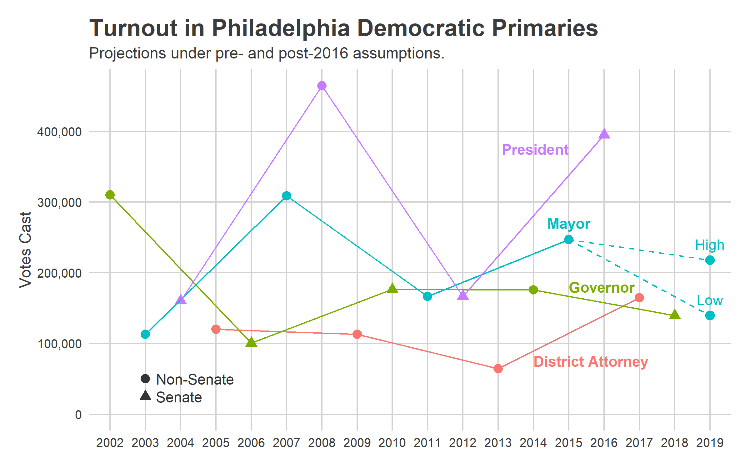
Under typical, pre-2016 assumptions, we would expect 140,000 votes. A surge proportional to the 2018 general would lead to 218,000 votes. Both of these are lower than 2015’s 247,000, because it’s just so hard to match the energy of a competitive Mayoral race, even post-2016. The surging divisions of Krasner’s Base will probably come out strong, but their turnout numbers aren’t strong enough to overcome the presumably typical turnout in the rest of the city.
If you pinned me down, my guess is turnout will be somewhere closer to the High projection. I doubt we’ll reachieve the surge of the 2018 general because that was fueled by huge national attention, and the first post-Trump national race. But there’s certainly something different from 2011, just given the number of candidates alone.
You can download the division-level projections from github. (NOTE: the division-level projections are super noisy, and a few divisions have missing values because of boundaries that don’t line up with any available boundary file (in the 5th Ward). The ward-level sums should be largely right, but read the individual divisions with some caution.)
View code
write.csv(
  projected_turnout %>%
    select(
      WARD16, DIV16, district,
      high_projection, low_projection,
      primary_2011, primary_2015,
      typical_turnout_governor, general_2018,
      typical_turnout_da, primary_2017
    ),
  file = "turnout_projections_2019.csv",
  row.names=FALSE
)
Will this happen? We’ll find out when the Turnout Tracker returns on election day!