I’ve spent the last few months trying to see if there’s a way I could plausibly predict November. Sites like FiveThirtyEight do a plenty good job of national races, but what can we say about state races? Could Democrats win the Pennsylvania House? The PA Senate?
Well, I finally think I’ve got a model that does a plausible job.
Soon, I’ll publish some predictions for the winners. But first, let’s look at turnout.
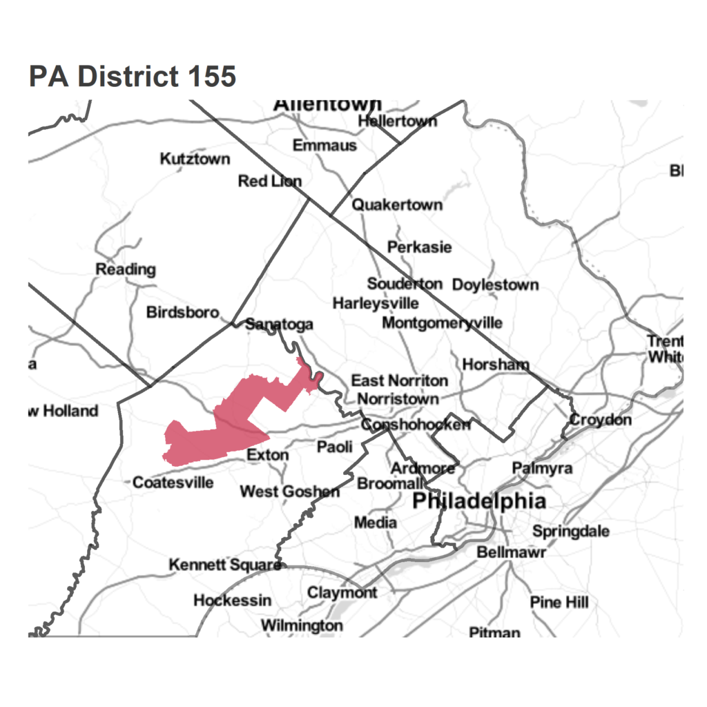
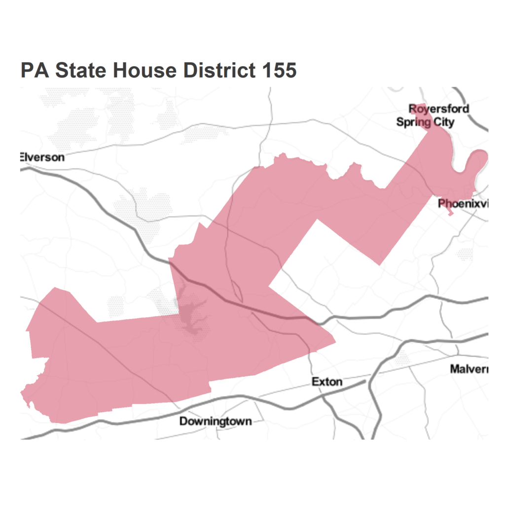
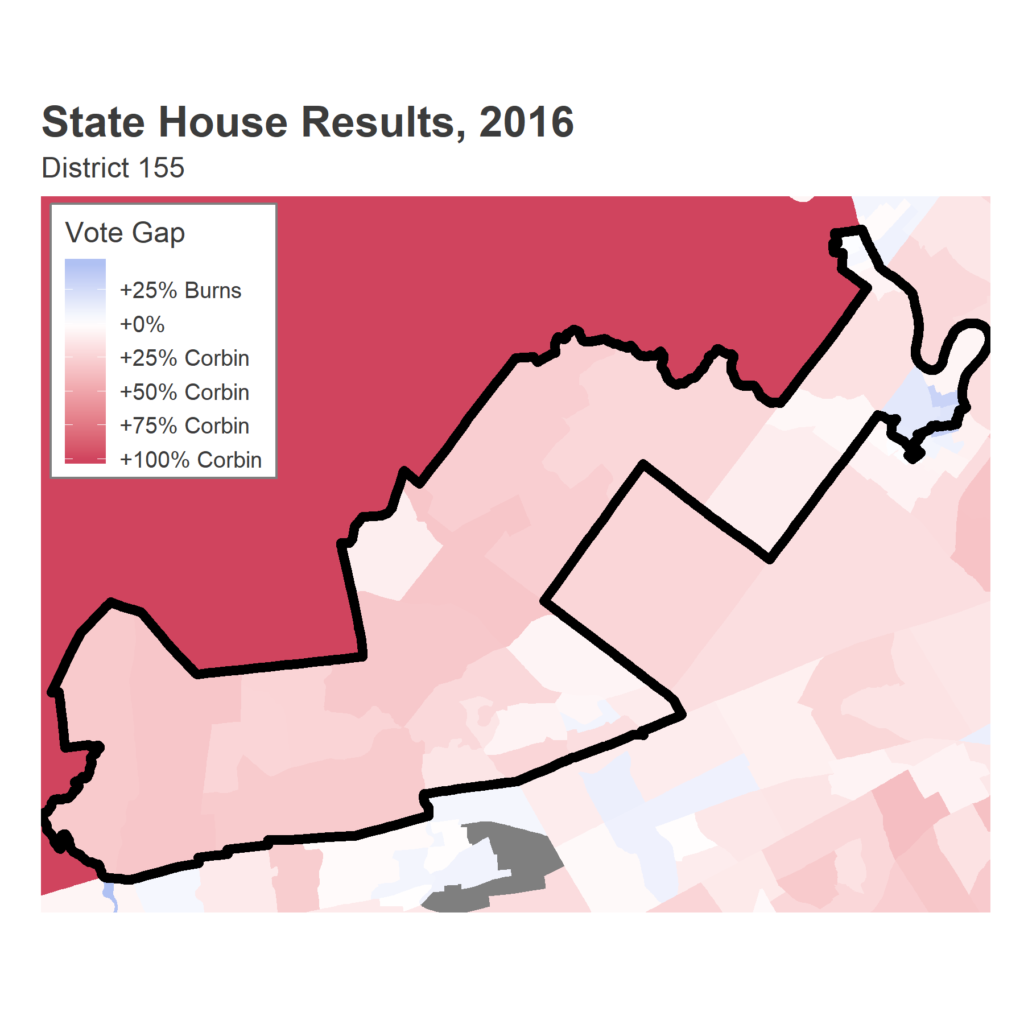
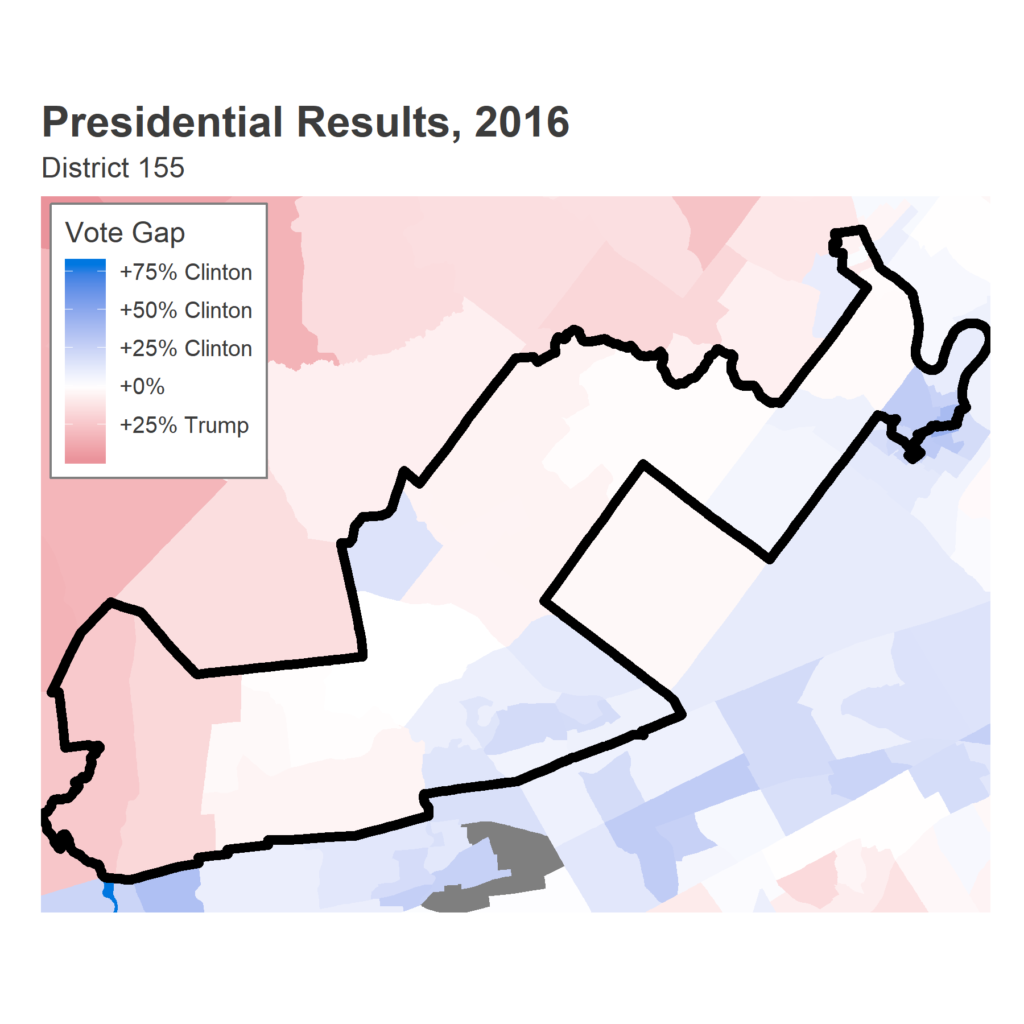
Trends in PA Turnout
Today, I’m focusing on the turnout in even-year general elections (so all Presidential or Gubernatorial races) since 2002. I’m going to only use the two-party vote and use the total votes for President or Governor as turnout, rather than the actual turnout. This ignores third party voters and people who skipped the topline election altogether. The difference between this and actual turnout won’t be large, and this makes the predictions later easier
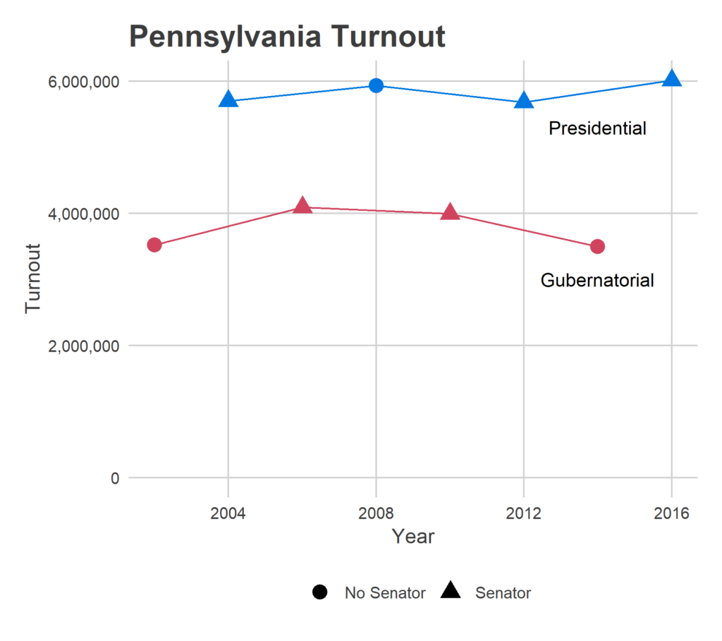
What’s a good guess for turnout this year? 2006 seems like an obvious benchmark. In that year, an incumbent Democratic Governor and Senate candidate Bob Casey, Jr capitalized on a national Democratic surge against an unpopular president. Sounds familiar. In that election, 4.09 million Pennsylvanians voted for governor. The other high was from the other wave election in the period: Republicans’ sweep of 2010.
The Model
I’ve built a model that predicts turnout of every precinct using data from even years from 2002 – 2016. The model uses information on the election (if it’s a midterm, the party in the presidency, whether local races are contested, the incumbency of local races, the presence of female candidates, and district population), and allows for different precinct-level responses to midterm elections, presidential party, and turnout growth or shrinkage over times.
The thing that makes predicting state races so hard is that there aren’t surveys. Without them, it’s really hard to find good proxies for voter excitement and disproportionate interest. Instead, I’ve built the model to simulate the full distribution of types of elections, from very Democratic to very Republican, and then give the entire range of possible results. We can then use that to either (a) examine the full range of possible outcomes, or (b) plug in specific values and see the results, for example “what if the election looked like 2006?”
To achieve this, I’ve modeled the correlations in turnout among precincts, to identify groups of precincts that all turn out together. Some precincts all come out disproportionately in midterms, others come out only in Democratic wave years. It’s this factor that is the biggest unknown moving into November: what type of election will it be. These correlations create a lot of uncertainty: you can’t rely on the Law of Large Numbers to cancel out all of the districts’ indiosyncracies.
So, does the model work?
Testing the Model: 2016
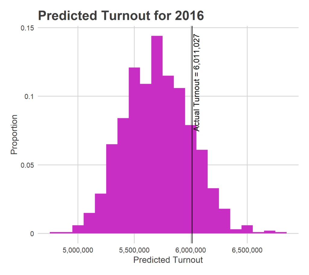
To test the model, let’s pretend its September 2016. Using only data from 2002-2014, and I fit it, and then generate predictions for 2016 turnout.
In 2016, I would have estimated 5.68 million votes cast statewide, with a 95% credible interval of 5.16M – 6.29M (the uncertainty is huge, but listen, science is hard, and I’m a serious person). In reality, 6.01 million votes were cast for President. I undershot it by a little bit, but the result is well within the interval.
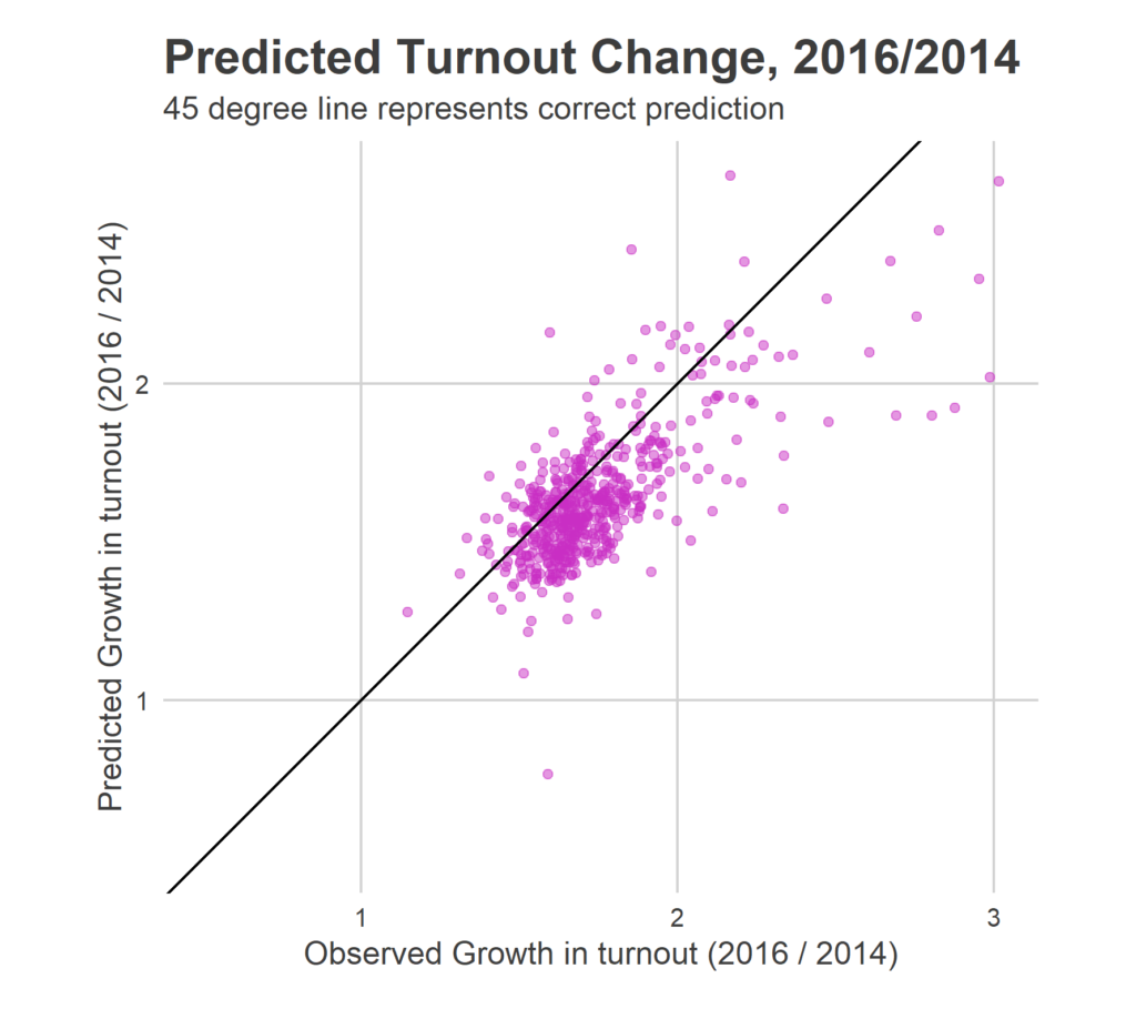
There maybe exists correlation between my predicted growths and the observed results, but it’s weak. It turns out that the growth depends heavily on the partisanship of the election; the correlation factors that I discussed above. Since I don’t know what that is ahead of time, I have to simulate them from all of the possibilities, resulting in the elliptical blob above. The model easily identifies these factors retrospectively–I can say for example that 2006 was a very strong Democratic year–but I don’t in general have a way to predict that for an upcoming election.
The Predictions
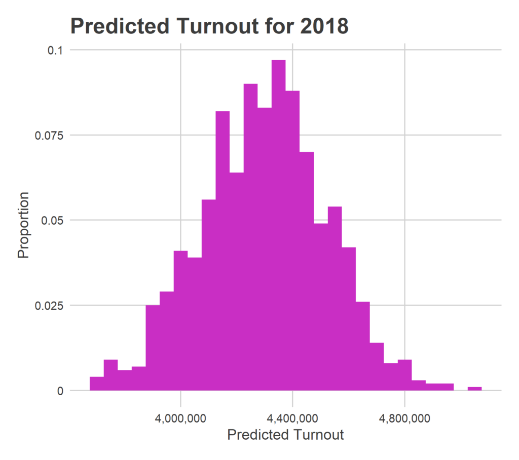
Enough delay. What do I predict for turnout in 2018?
There will be 4,295,981 votes for Governor.
This strikes me as high. It’s higher turnout than any midterm in my dataset. But the model did relatively well in the holdout test of 2016, and I don’t want to commit the sin of post-hoc adjusting. So this is my prediction, and I’m sticking to it.
What are the arguments for this astronomical number? You, a person who somehow reads this blog and thus are well down the elections analysis rabbit-hole, might have noticed unprecedented excitement for a midterm, and be unsurprised by a high prediction. But the model doesn’t have that info. Instead, it does see that (a) a Republican is president, which increases midterm turnout more in Democratic precincts than a Democratic president increases in Republican ones, (b) many more races are contested, including in the newly-redrawn congressional districts and a ton of contested state house seats, and (c) after all of the adjustments, turnout has been steadily increasing since 2002. All of these combine to create a prediction for midterm turnout that is unprecedented in the dataset. And some of those features, particularly the contested races, are probably serving as proxies for voter enthusiasm.
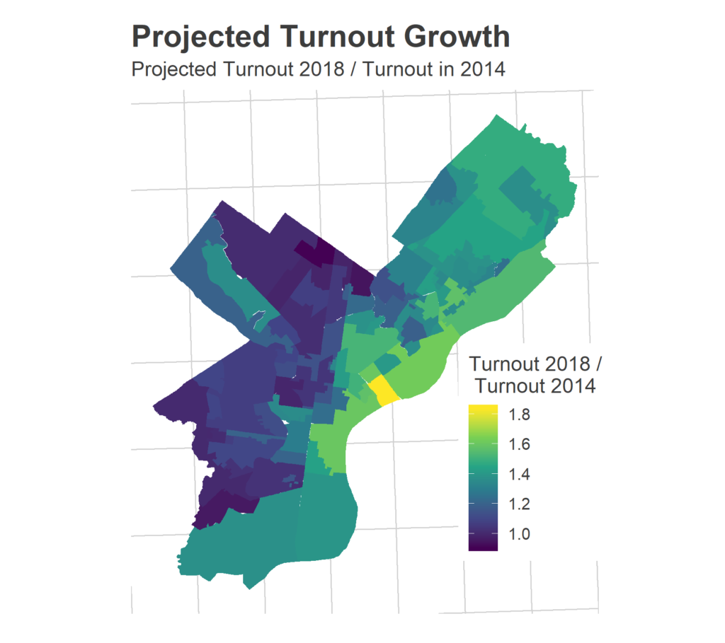
Within Philadelphia, I project 460,000 voters, with a 95% CI of (410,000, 517,000). Even at the lower end, that would beat out the 2006 and 2010 turnout highs.
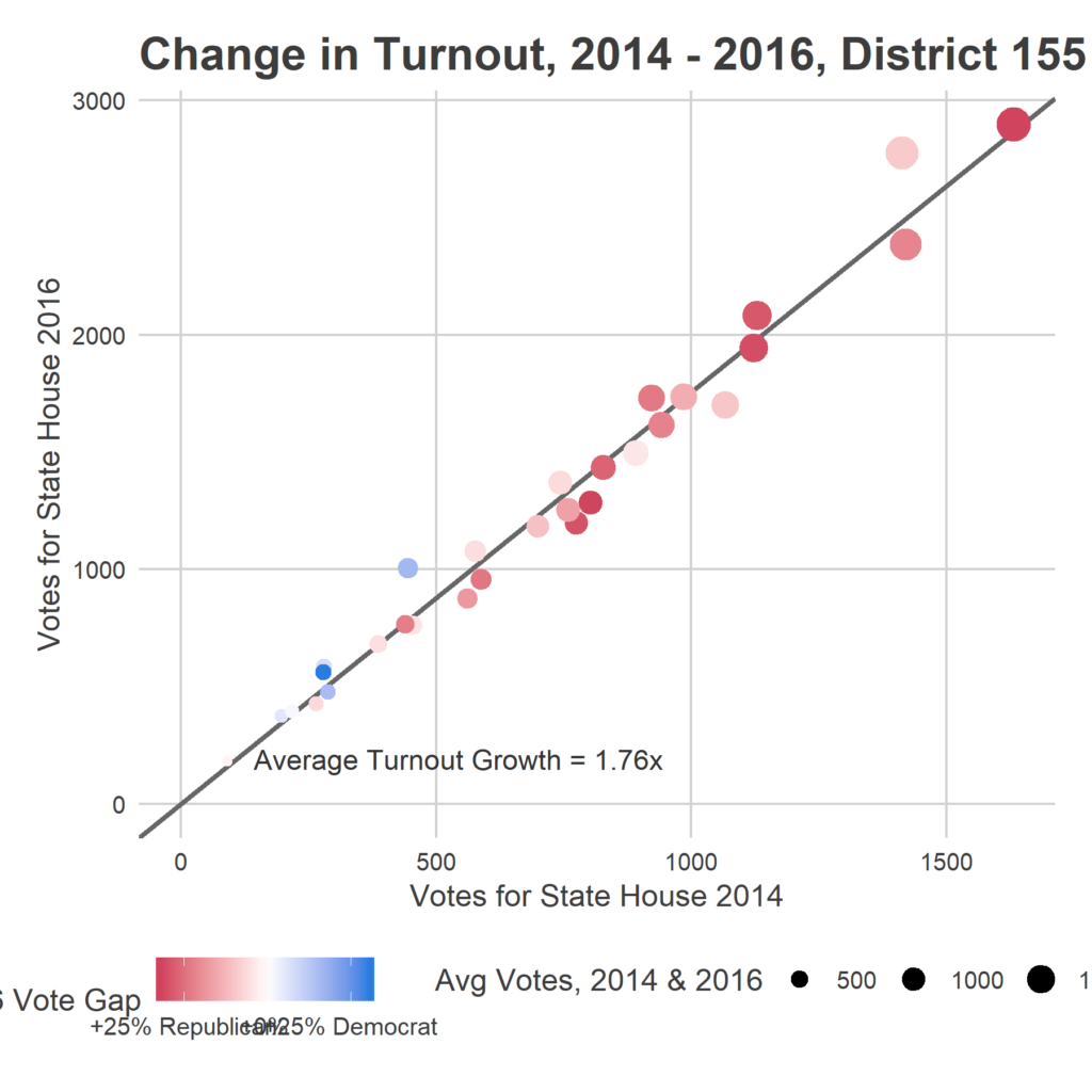
What does the model have to say about precinct-specific changes? Below is a plot of its predictions in Philadelphia, relative to turnout in 2014. Keep in mind that these predictions are equivalent to the blob plot above: there’s a loose predictive power, but a ton of noise based on what type of election this ends up being.
Coming Soon
So I tentatively expect record turnout, at least among election since 2002. Will it happen? I’ve over-predicted turnout before. We’ll see if I learned my lesson.
Until that test comes, let’s brazenly barrel forward and predict the actual results. Coming soon.
Sources
Data comes, as always, from the amazing Open Elections Project.
I also leaned heavily on Ballotpedia to complement and extend the data.
GIS data is from the US Census.