For the last few weeks, I’ve been posting District Profiles of the hot races in the lower chamber of PA’s General Assembly, aka the State House. One cool aspect of being able to generate plots systematically is it provides a compelling way to compare data
across districts, once you’ve oriented yourself to a given plot.
Today, I present those Multiple Minis.
The Bar Plot
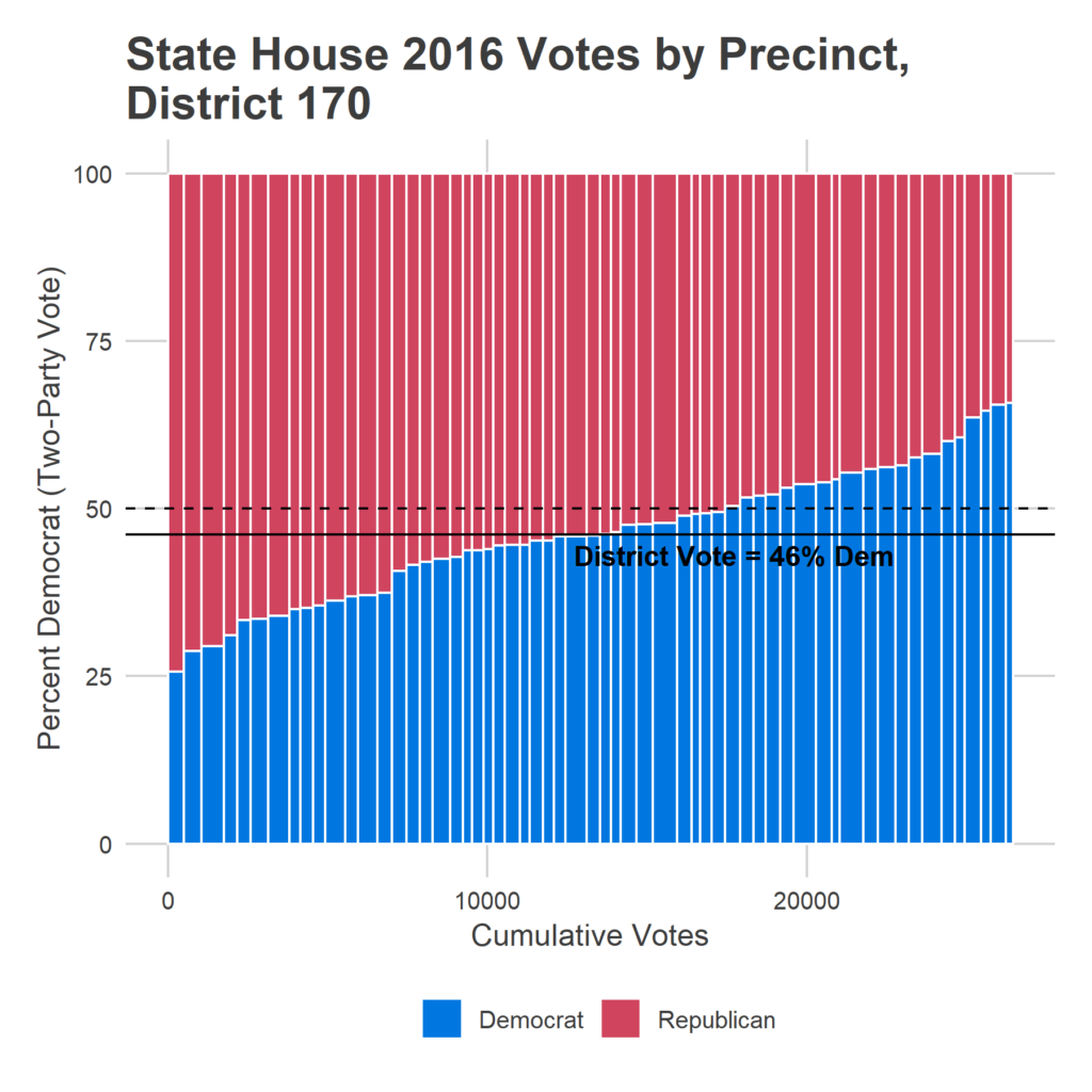
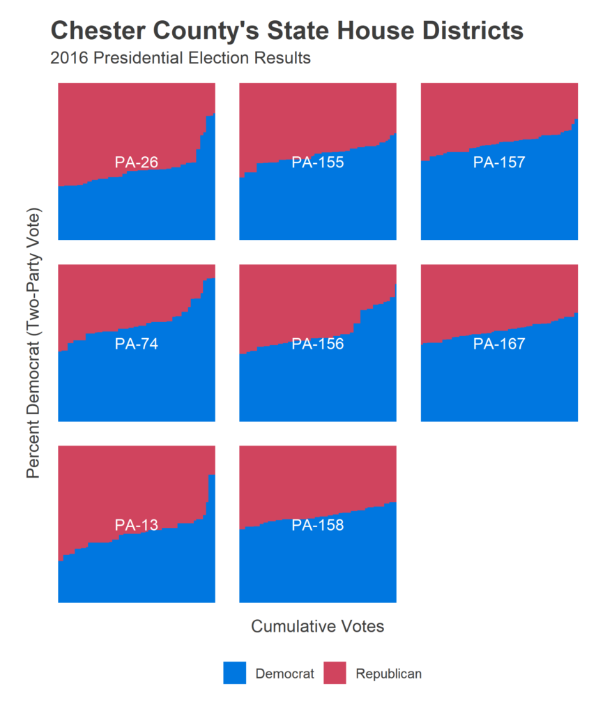
Maps are great, but sometimes organizing data in a non-geographic plot lets you emphasize a different relationship. One useful way to visualize all of the precincts in a district is by lining them up in order of democratic result. Below is that bar plot from last week’s post on Northeast Philly’s District 170:
Each vertical bar is a precinct, divided into its Republican and Democratic votes. The width of the bars is proportional to the votes in that precinct, so the total red and blue area represents to total outcome in the district.
This plot is useful to see the overall outcome in the district, the diversity of the precincts in the district (the slope of the change), as well as any skew in the tails. PA-170, for example, has precincts whose votes ranged from 75% Republican to 66% Democratic.
To get a sense of an entire county, I’ve generated this plot for every district, for the 2016 Presidential results (since a bunch of State House races were non-competitive. I’ve laid out the districts in relatively geographic order (for a full map of the districts, see the Appendix at the bottom).
I’ll move North to South through the suburbs. Here’s Bucks County, with super competitive districts, and a lot of districts with urban-ish cores that create Democratic skews:
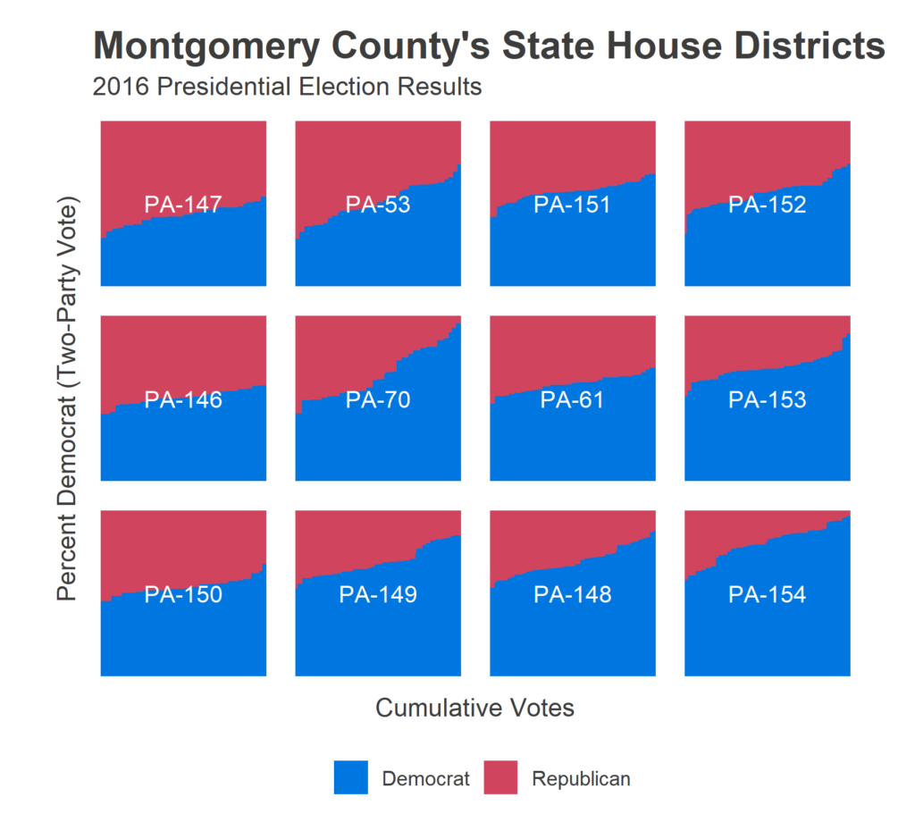
Comparatively, here’s Montgomery County, which was much more Democratic, especially in the south east corner closer to Philadelphia:
Chester is almost as competitive as Bucks, though four districts have intense skews at Democratic cores, especially out West.
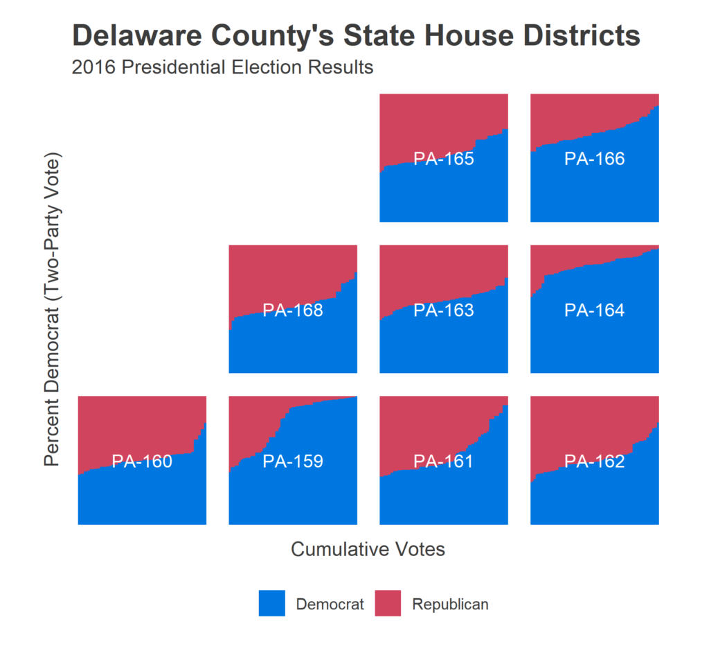
In Delaware county, five districts are competitive. Four were overwhelmingly Democratic, including Chester City and Upper Darby.
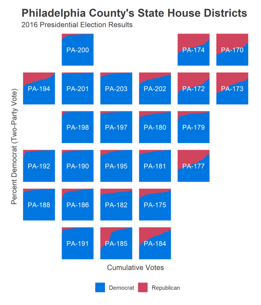
Finally, gigantic Philadelphia shows its diversity, with much of the city voting overwhelmingly for Clinton, but the Northeast, Manayunk, the Riverwards, and parts of South Philly housing significant Trump votes.
The Scatter Plot
The other plot that I’ve generated for each district is a scatter plot of the 2016 Presidential vote versus State House vote. Below is the plot for PA-170.
This plot contains a ton of information. Each dot is a precinct, sized by its total votes. Moving left-to-right represents more Democratic votes in the presidential election, and moving bottom-to-top more Democratic votes in the State House. In the top right quadrant are precincts that voted for Clinton and the Democratic Representative, in the bottom left are precincts that voted for Trump and the Republican.
Precincts along the 45-degree line voted for Trump exactly as much as they voted for their representative; points below the line voted more for the Republican rep than for Trump, points above the line voted more for Trump than for their Republican rep. In PA-170, the most points are below the line, indicating that the District voted more for Martina White, the Republican State House candidate, than for Trump. That imbalance was just enough that White won the district and Trump lost it.
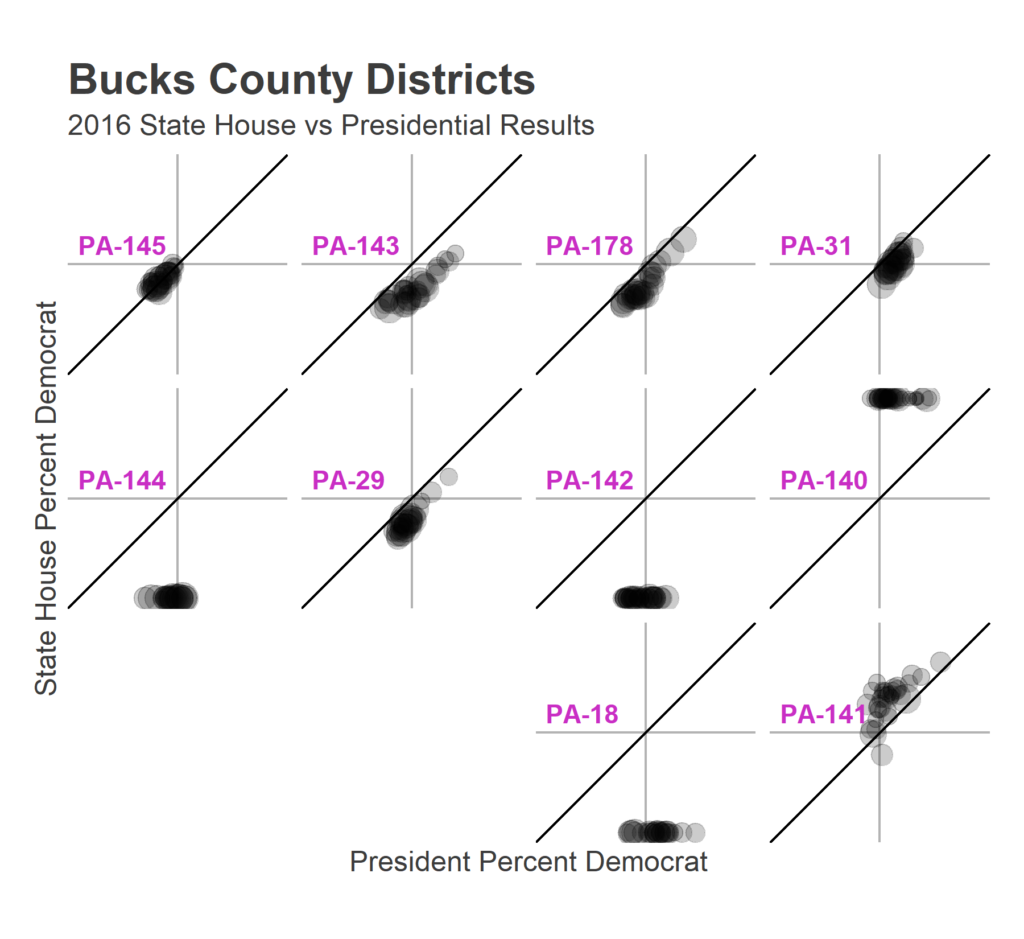
In multiple mini fashion, here are those results for every district in Bucks County:
Districts PA-144, 142, and 18 all had uncontested State House Republicans, and PA-140 an uncontested Democrat, explaining the 100% results. PA-145 voted for both the Republican rep and Trump, and showed no anti-Trump shift: the districts all lie right on the 45-degree line. PA-143, 178, 31, and 29 show anti-Trump skews that we’ll become familiar with in later plots, and PA-141 exhibits a rare pro-Trump skew: Democrat Tina Davis far outpaced Clinton.
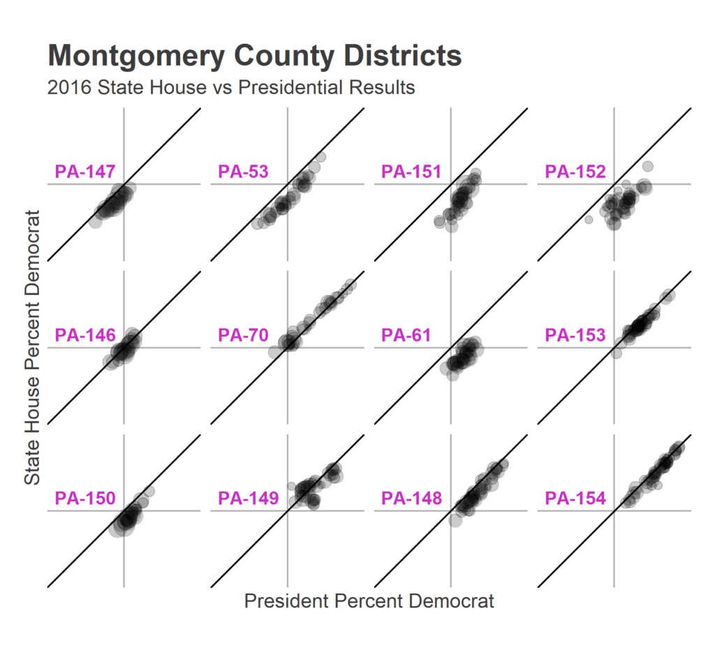
Here is Montgomery County:
Districts PA-70, 149, 148, 153, and 154 voted almost entirely for Democrats. The others were more balanced, but with serious anti-Trump shifts. This includes PA-61, 151, and 152, in which vast majorities of the precincts voted for Clinton but for the Republican representative.
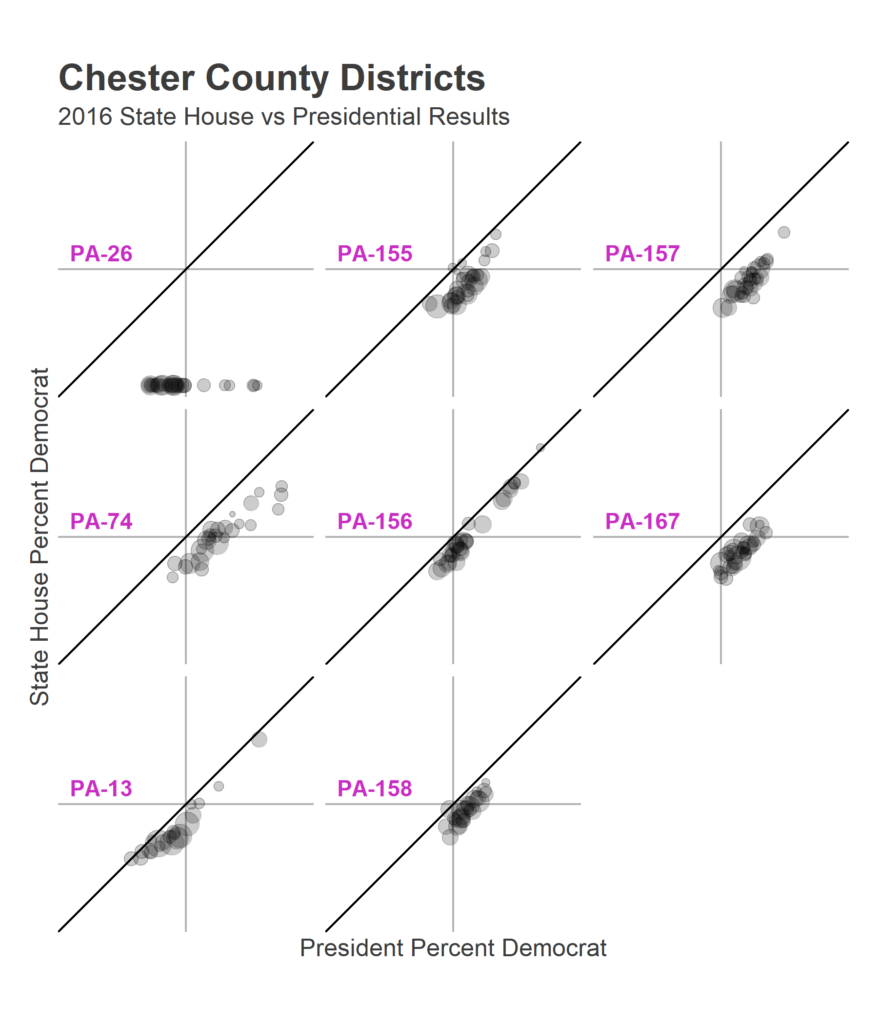
Here’s Chester County:
PA-26 had an uncontested Republican, and all of the other districts showed significant anti-Trump shifts. You can see the skew that visible in the bar charts above: PA-13, 74, and 26 all have precincts that are stretched far more Democratic than the others.
Delaware County:
PA-160 was uncontested, and PA-166, 164, and 159 overwhelmingly Democratic. The others all show anti-Trump shifts.
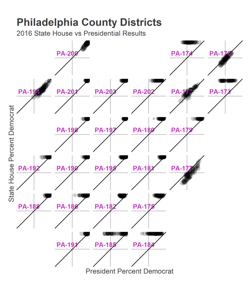
Finally, Philadelphia:
Most of the districts had un-contested Democrats. The two competitive races, 177 and 170, had typical anti-Trump shifts.
These plots give us a nice lay of the land. Philadelphia, as a whole, is a strong Democratic city with swing-y suburbs, and those suburbs had significant anti-Trump shifts. It remains to be seen if those incumbents will do even better in 2018, when Trump isn’t on the ballot, or if the intervening two years have caused the Trump antipathy to seep down to the rest of the Republican party.
Sources:
Election data from the Open Elections Project
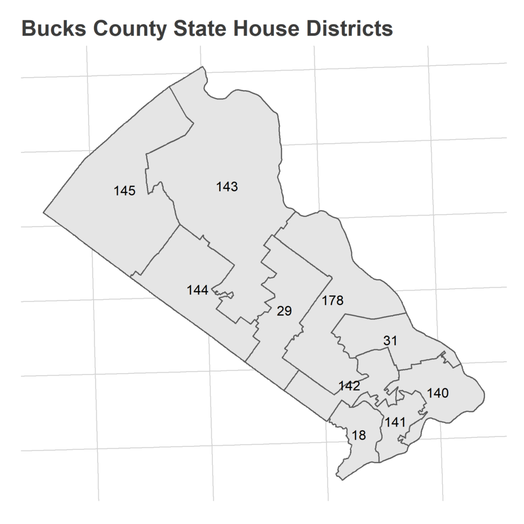
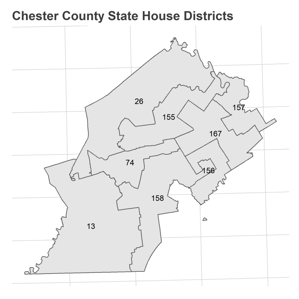
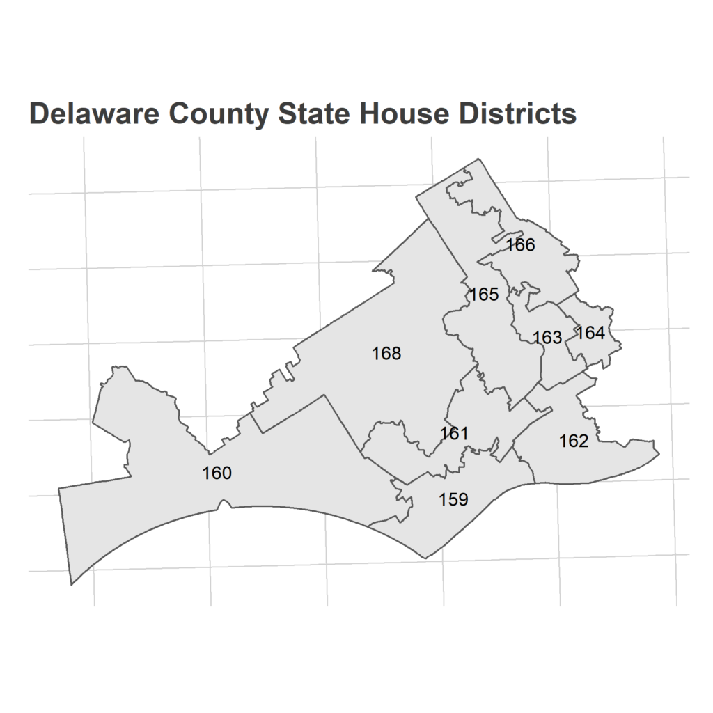
Appendix: Maps!
Here are the full district maps, in their gerrymandered glory.
Related