In the aftermath of the big midterm election, I thought I’d look at Philadelphia’s turnout. What Wards were high, what low, and how did that ladder up to the statewide win?
Note: I’ve updated the data as of 2022-11-17. Some exact numbers have changed, the substantive findings have not.
View code
library(dplyr)
library(ggplot2)
library(glue)
library(jsonlite)
library(tidyr)
library(sf)

source("../../admin_scripts/theme_sixtysix.R")

fetch_election <- function(office_id, election_id){

  url <- glue(
    "https://www.electionreturns.pa.gov/api/ElectionReturn/GetCountyBreak?officeId={office_id}&districtId=1&methodName=GetCountyBreak&electionid={election_id}&electiontype=G&isactive=undefined"
  )

  raw_json <- readLines(url)
  raw_data <- fromJSON(fromJSON(raw_json), simplifyVector = TRUE)

  statewide_name <- ifelse(election_id <= 27, "StateWide", "Statewide")
  raw_data$Election[[statewide_name]] %>%
    lapply(\(df) df[[1]]) %>%
    bind_rows()
}

state_dfs <- list()
state_dfs[["2022"]] <- fetch_election(2, "undefined")
state_dfs[["2020"]] <- fetch_election(1, 83)
state_dfs[["2018"]] <- fetch_election(2, 63)
state_dfs[["2016"]] <- fetch_election(2, 54)
state_dfs[["2014"]] <- fetch_election(3, 41)
state_dfs[["2012"]] <- fetch_election(2, 27)
state_dfs[["2010"]] <- fetch_election(2, 19)

state_df <- bind_rows(state_dfs) %>%
  mutate(Votes = as.numeric(as.character(Votes))) %>%
  select(ElectionYear, CountyName, PartyName, Votes) %>%
  group_by(ElectionYear, CountyName) %>%
  mutate(CountyVotes = sum(Votes)) %>%
  filter(PartyName %in% c("DEM", "REP")) %>%
  pivot_wider(names_from = PartyName, values_from = Votes) %>%
  mutate(twoway = DEM / (DEM + REP))

county_votes <- state_df %>%
  mutate(
    county_group = case_when(
      CountyName == "PHILADELPHIA" ~ "Philadelphia",
      CountyName %in% c("MONTGOMERY", "DELAWARE", "CHESTER", "BUCKS") ~ "Philadelphia Suburbs",
      TRUE ~ "Rest of PA"
    )
  ) %>%
  group_by(ElectionYear, county_group) %>%
  summarise(Votes = sum(CountyVotes), DEM = sum(DEM), REP = sum(REP)) %>%
  group_by(ElectionYear) %>%
  mutate(
    year = as.numeric(as.character(ElectionYear)),
    prop_of_state = Votes / sum(Votes)
  )

county_colors <- c("Philadelphia" = strong_purple, "Philadelphia Suburbs" = strong_green, "Rest of PA" = strong_orange)

p_phila <- county_votes %>%
  filter(ElectionYear == 2022, county_group=="Philadelphia") %>%
  with(prop_of_state)

ggplot(
  county_votes %>%
    filter(county_group %in% c("Philadelphia", "Philadelphia Suburbs")),
  aes(x=year, y=100*prop_of_state, color = county_group)
) +
  geom_point(size=4) +
  scale_color_manual(
    values=county_colors,
    guide=FALSE
  ) +
  geom_text(
    data=tribble(
      ~county_group, ~prop_of_state,
      "Philadelphia", 0.07,
      "Philadelphia Suburbs", 0.20
    ),
    aes(label=county_group),
    x=2021.9,
    hjust=1.0,
    fontface="bold"
  ) +
  geom_line(aes(group=county_group), size=2) +
  theme_sixtysix()  +
  scale_x_continuous(breaks = seq(2010, 2022, 2))+
  expand_limits(y=0) +
  labs(
    y = "Percent of State",
    x = NULL,
    title = glue("Philadelphia constituted only {round(100*p_phila, 1)}% of state votes"),
    subtitle = "Votes cast for Senate (or Governor, if no Senate). 2022 votes as of 11/15/2022."
  )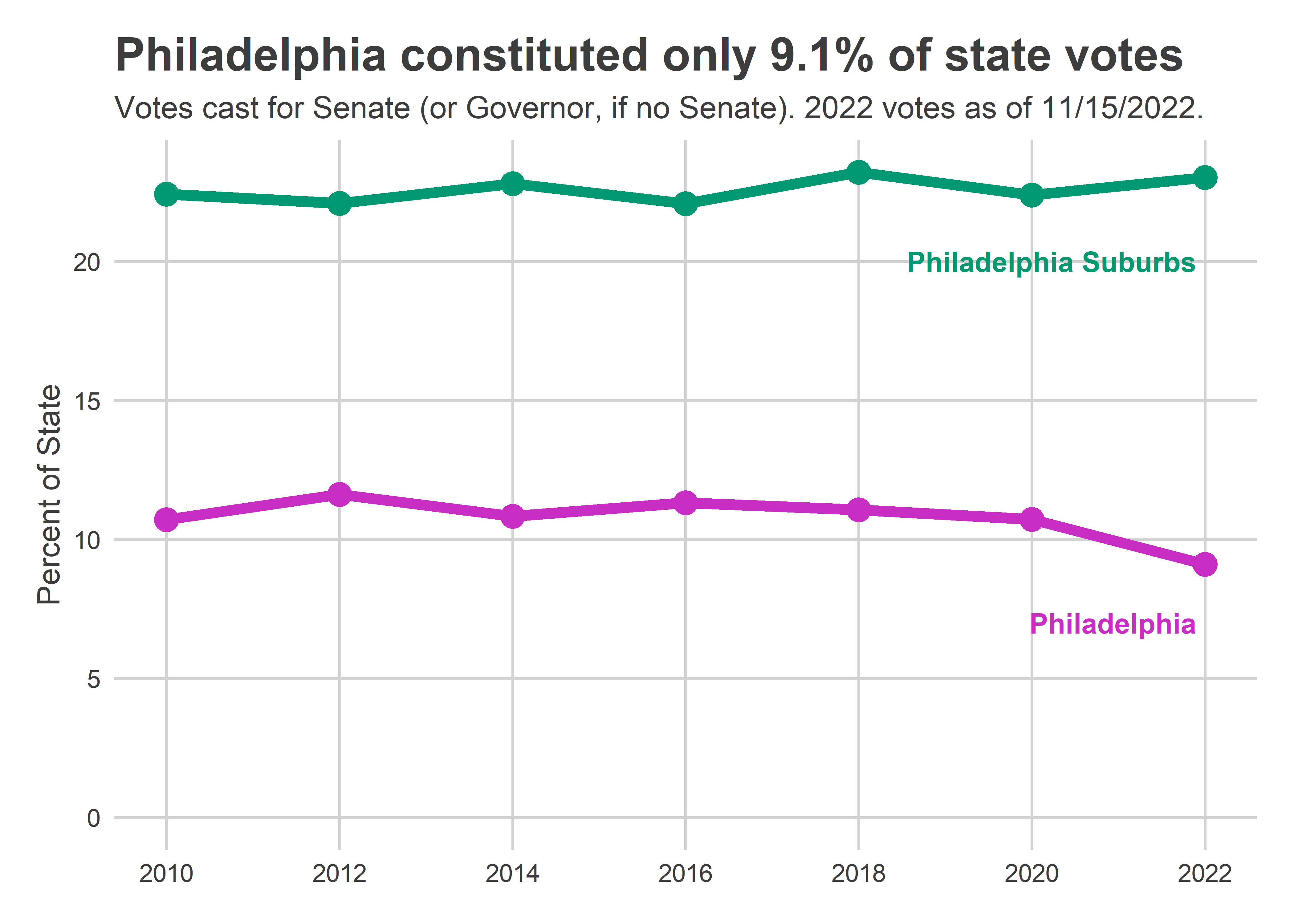
Philadelphia’s 487,000 votes cast for Senate were less than the astronomical 554,000 cast in 2018, but more than the 379,000 cast for Governor in 2014. The state as a whole cast more votes than 2018 though, (5.3M vs 5.0M) meaning that Philadelphia cast its lowest share of the state’s votes since at least 2002 (when I have data).
Philadelphia’s four suburban counties–Bucks, Chester, Delaware, and Montgomery–continued to show strong midterm performance, with 23% of the votes cast.
View code
gap_labeller <- function(x) glue("+{abs(x)}pp {ifelse(x < 0, 'R', 'D')}")

ggplot(
  county_votes,
  aes(x=year, y=100*(DEM - REP) / Votes, color = county_group)
) +
  geom_hline(yintercept = 0) +
  geom_point(size=4) +
  scale_color_manual(
    values=county_colors,
    guide=FALSE
  ) +
  geom_text(
    data=tribble(
      ~county_group, ~y,
      "Philadelphia", 58,
      "Philadelphia Suburbs", 28,
      "Rest of PA", -5
    ),
    aes(label=county_group, y=y),
    x=2021.9,
    hjust=1.0,
    fontface="bold"
  ) +
  geom_line(aes(group=county_group), size=2) +
  theme_sixtysix()  +
  scale_x_continuous(
    breaks = seq(2010, 2022, 2)
  )+
  scale_y_continuous(
    labels = gap_labeller
  )+
  expand_limits(y=0) +
  labs(
    y = "Top-line Results for Senate\n(or Gov/Pres if no Senate)",
    x = NULL,
    title = "Fetterman won Philadelphia by over 66pp",
    subtitle = "But that was relatively low for a midterm."
  )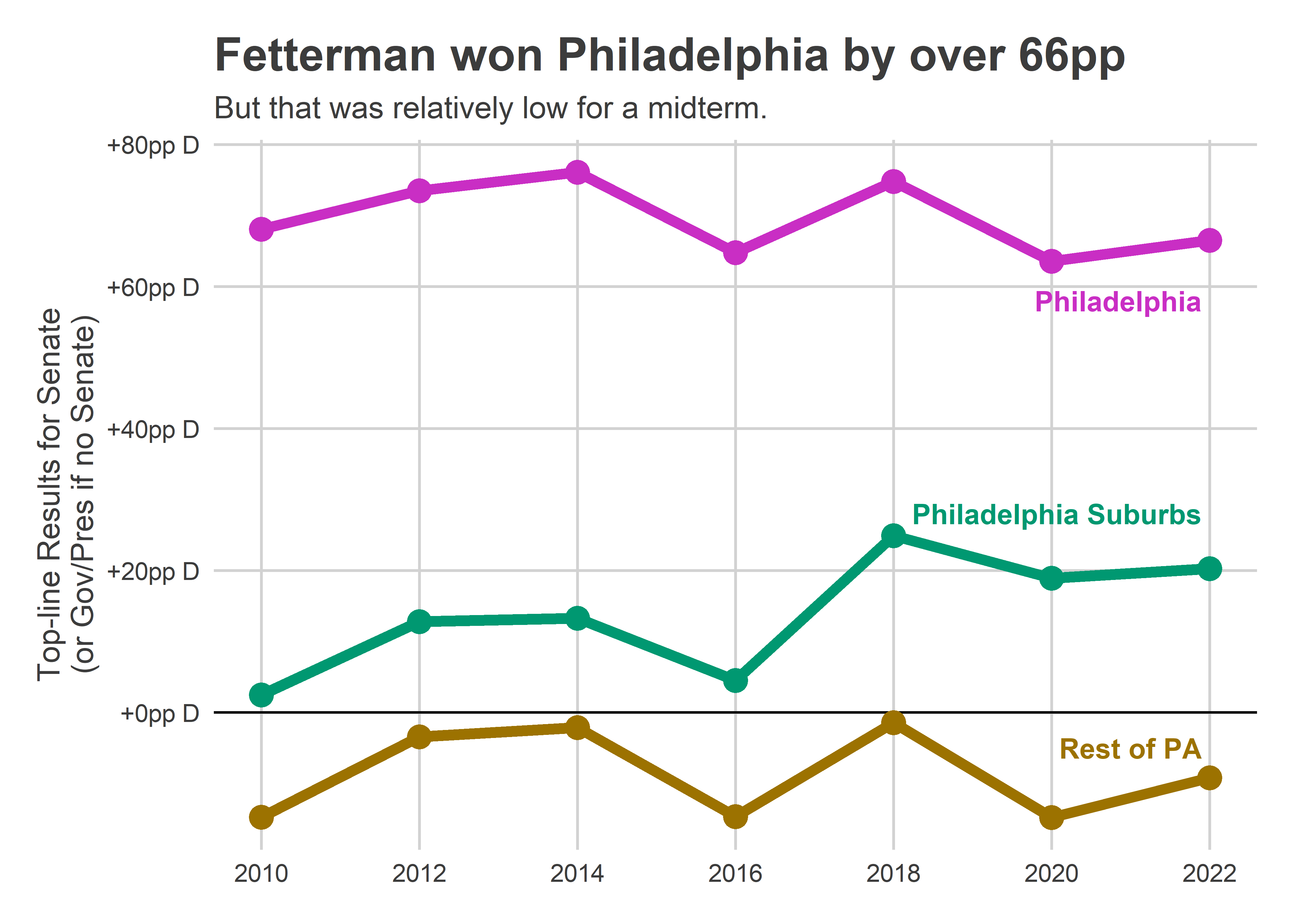
Philadelphia continues to be far more Democratic than the state, with Fetterman winning 82% of the vote to Oz’s 16%. That gap was down slightly from the city’s typical midterm, but up from 2020 and still enough to win the state.
Within Philadelphia
Within Philadelphia, changes from 2018 and 2020 weren’t uniform.
View code
wards <- st_read("../../data/gis/warddivs/201911/Political_Wards.shp") %>%
  mutate(ward = sprintf("%02d", as.numeric(as.character(WARD_NUM))))res_22 <- readxl::read_xlsx(
  "../../data/raw_election_data/STW Results Precinct 20221117.xlsx",
  skip = 6
) %>% filter(Precinct != "TOTALS")

df_major <- readRDS("../../data/processed_data/df_major_20220523.Rds")
df_major <- df_major %>%
  filter(
    case_when(
      as.numeric(year) %% 6 == 4 ~
        office %in% c("GOVERNOR", "PRESIDENT OF THE UNITED STATES"),
      TRUE ~ office == "UNITED STATES SENATOR"
    )
  )

ward_df <- df_major %>%
  mutate(year = as.numeric(as.character(year))) %>%
  mutate(party = case_when(
    party == "DEMOCRATIC" ~ "DEM",
    party == "REPUBLICAN" ~ "REP",
    TRUE ~ "OTHER"
  )) %>%
  filter(election_type == "general") %>%
  group_by(ward, year, party) %>%
  summarise(votes = sum(votes)) %>%
  group_by(ward, year) %>%
  mutate(ward_votes = sum(votes)) %>%
  pivot_wider(
    names_from = party,
    values_from = votes
  )

ward_df_22 <- res_22 %>%
  mutate(ward = substr(Precinct,1,2)) %>%
  pivot_longer(
    `JOHN FETTERMAN DEM`:`Write-In`,
    names_to = "candidate",
    values_to = "votes"
  ) %>%
  group_by(ward) %>%
  mutate(
    ward_votes = sum(votes),
    year=2022,
    party = case_when(
      candidate == "JOHN FETTERMAN DEM" ~ "DEM",
      candidate == "MEHMET OZ REP" ~ "REP",
      TRUE ~ "OTHER"
    )
) %>%
  group_by(ward, year, ward_votes, party) %>%
  summarise(votes = sum(votes)) %>%
  pivot_wider(names_from=party, values_from=votes)

ward_df <- bind_rows(ward_df, ward_df_22)

ggplot(
  wards %>%
    left_join(ward_df %>% filter(year == 2022), by = "ward")
) + geom_sf(aes(fill = 100 * (DEM - REP) / ward_votes), color="grey80") +
  scale_fill_gradient2(
    "Senate 2022 Result",
    low = strong_red,
    high=strong_blue,
    mid="white",
    midpoint=0,
    breaks=seq(-100,100,20),
    labels=gap_labeller
  ) +
  expand_limits(fill = 100) +
  labs(
    title = "US Senate Results, 2022"
  ) +
  theme_map_sixtysix()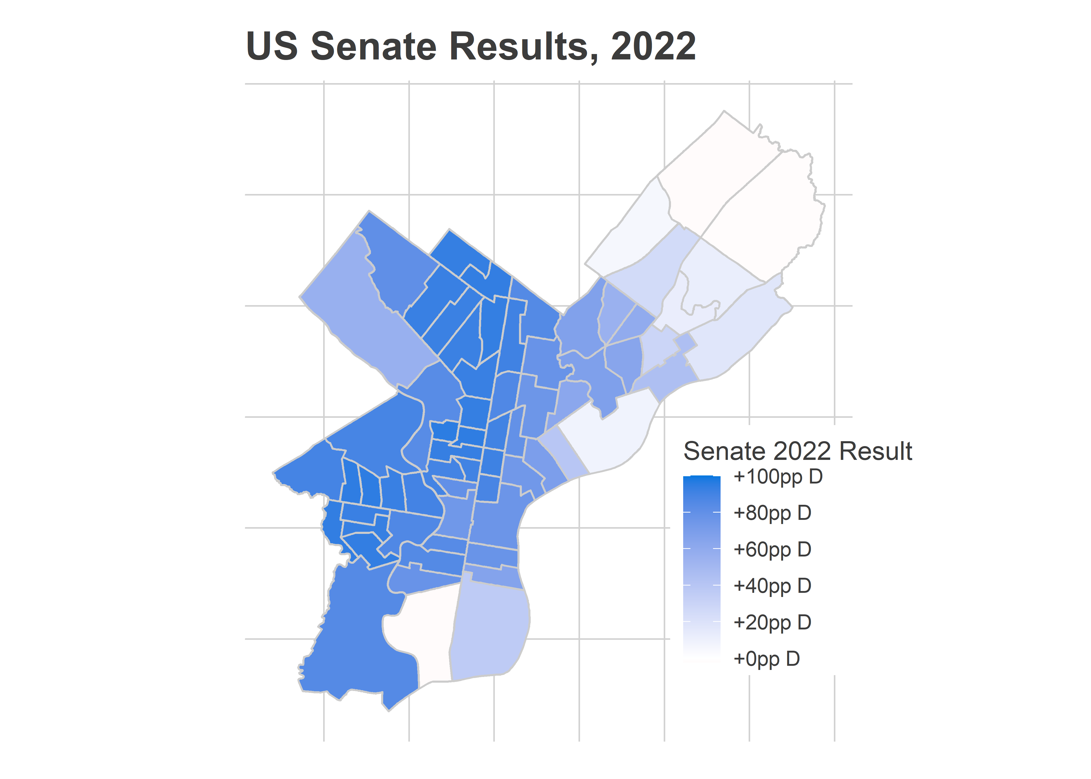
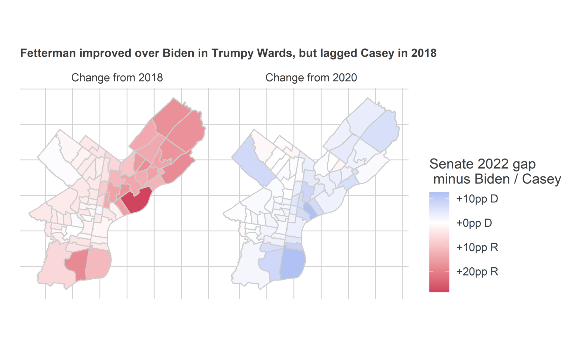
Philadelphia’s Black Wards in West and North Philly voted for Fetterman at a gap of over +90 percentage points. And the whole city was Democratic, with even the Trumpiest Wards in the Northeast basically dead even.
View code
ggplot(
  wards %>%
    left_join(
      ward_df %>%
        filter(year %in% c(2022, 2020, 2018)) %>%
        mutate(gap = (DEM - REP) / ward_votes) %>%
        select(ward, year, gap) %>%
        pivot_wider(names_from = year, values_from=gap) %>%
        pivot_longer(
          c(`2020`, `2018`),
          names_to = "comp_year",
          names_transform = \(y) glue("Change from {y}"),
          values_to="comp_gap"
        ),
      by = "ward"
    )
) + geom_sf(aes(fill = 100*(`2022` - comp_gap)), color="grey80") +
  scale_fill_gradient2(
    "Senate 2022 gap\n minus Biden / Casey",
    low = strong_red,
    high=strong_blue,
    mid="white",
    midpoint=0,
    # breaks=seq(-100,100,20),
    labels=gap_labeller
  ) +
  facet_grid(~comp_year) +
  labs(
    title="Fetterman improved over Biden in Trumpy Wards, but lagged Casey in 2018"
  ) +
  # expand_limits(fill = 100) +
  theme_map_sixtysix() +
  theme(legend.position = "right", plot.title = element_text(size=10))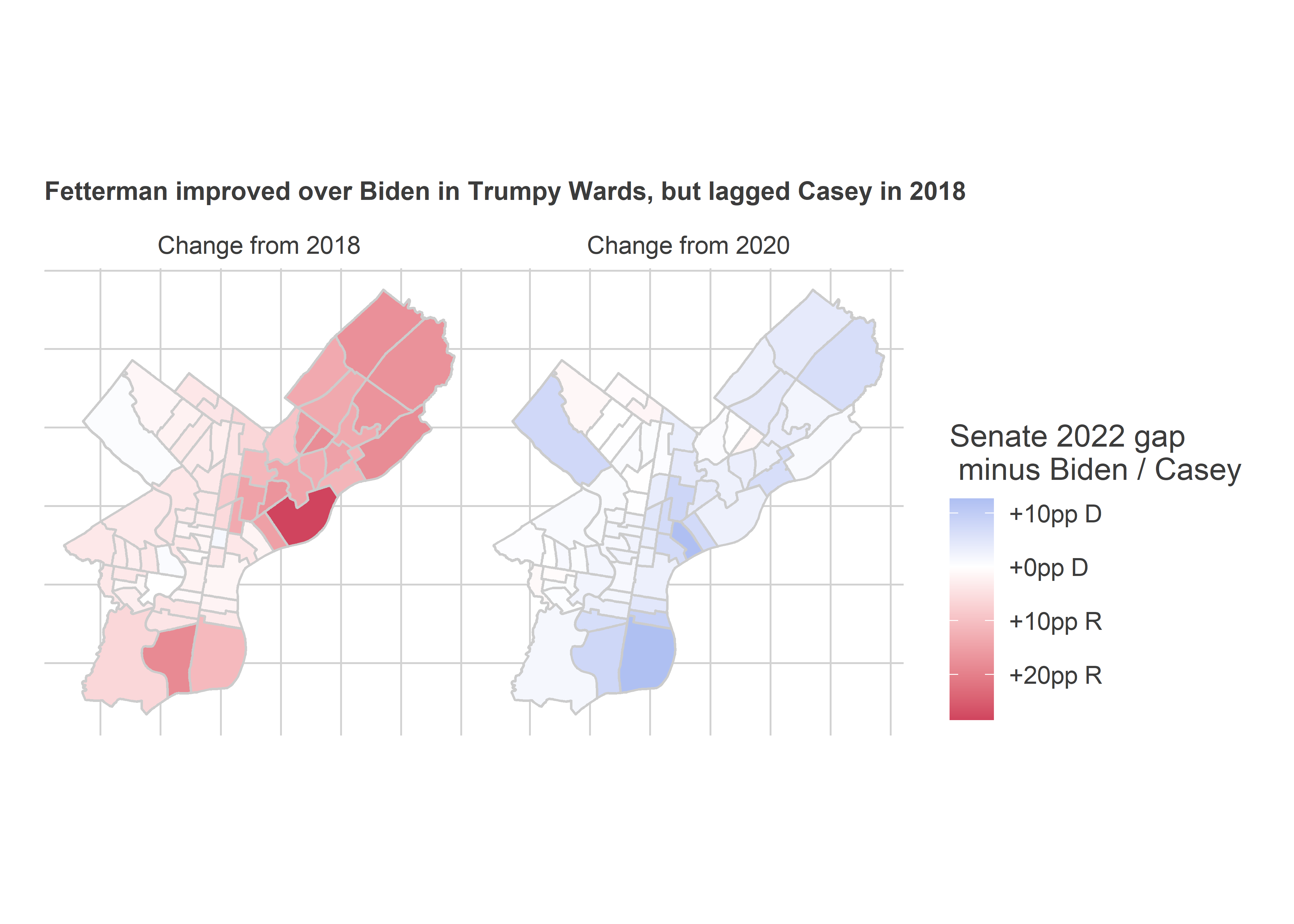
Turnout tells a bigger story though. Overall, Philadelphia’s votes cast declined vs 2018, even while the state overall increased.
View code
ggplot(
  wards %>%
    left_join(
      ward_df %>%
        filter(year %in% c(2022, 2018, 2014)) %>%
        select(ward, year, ward_votes) %>%
        pivot_wider(names_from = year, values_from=ward_votes) %>%
        pivot_longer(
          `2018`:`2014`,
          names_to = "comp_year",
          values_to = "comp_votes",
          names_transform = \(y) glue("Change from {y}"),
        ),
      by = "ward"
    )
) + geom_sf(aes(fill = (`2022` - comp_votes) / comp_votes), color="grey80") +
  scale_fill_gradient2(
    "Votes cast in 2022\n vs prior midterm",
    low = strong_orange,
    high= strong_green,
    mid="white",
    midpoint=0,
    labels = \(x) glue("{round(100*x)}%")
    # breaks=seq(-100,100,20)
  ) +
  facet_grid(~comp_year) +
  labs(
    title="Philadelphia cast fewer votes than 2018",
    subtitle="Even while the state cast more 5% more"
  ) +
  expand_limits(fill = -0.4) +
  theme_map_sixtysix() +
  theme(legend.position = "right")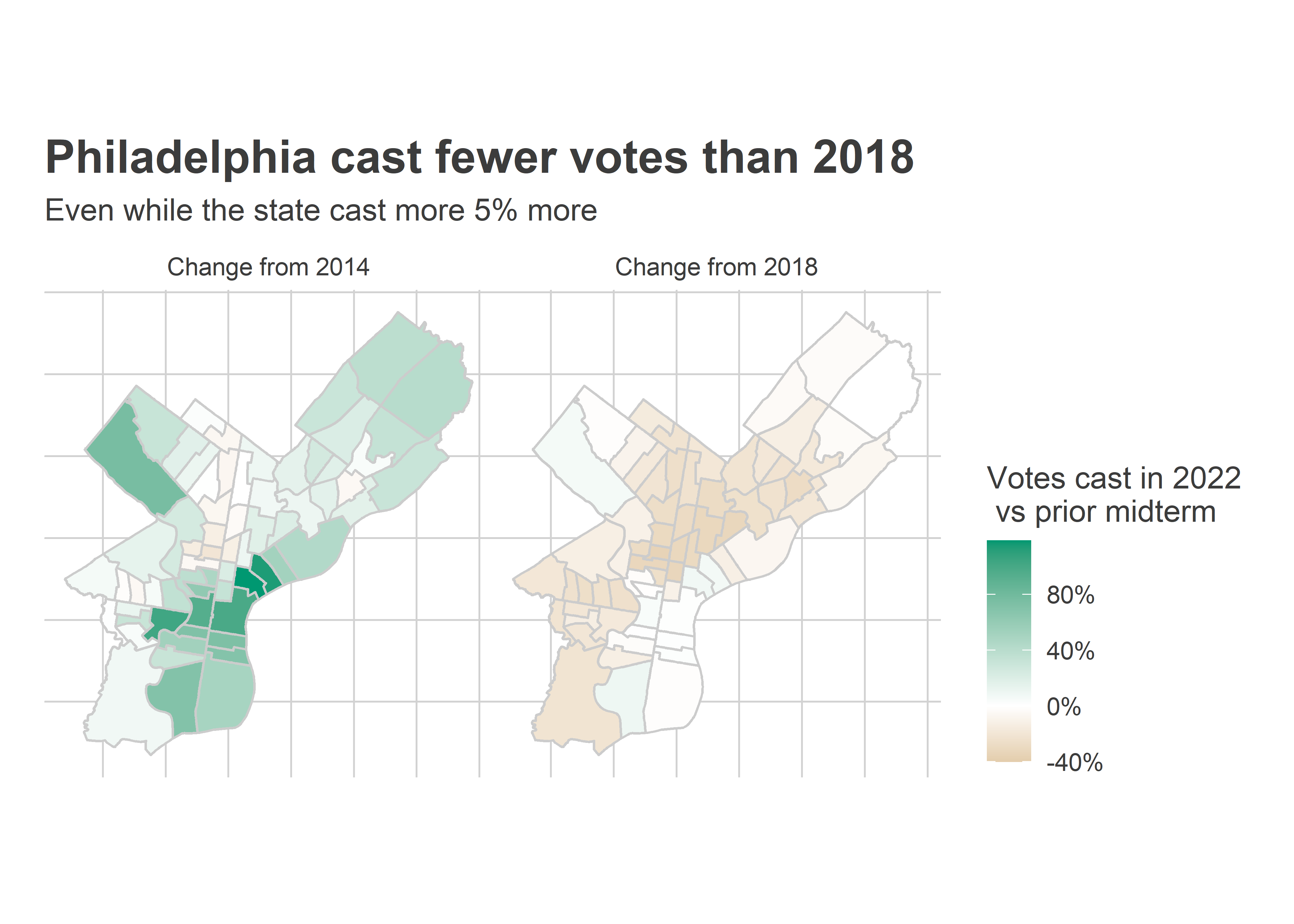
The Wealthy Progressive parts of Center City and the Northwest managed to keep pace with 2018, while North and West Philly fell off sharply, back to 2014 levels.
I’ll do some more soon, but right now, in an election that was surprisingly good for Democrats statewide, the results in Philadelphia are decidedly mixed.