What broke the Turnout Tracker?

Philadelphia’s turnout on November 3rd was disappointing, but it was far from the bloodbath that the Turnout Tracker was predicting.

At the end of Election Day, I was estimating 285,000 in-person votes, with a CI of (262K, 303K). The actual number was 360K. What went wrong?

View code
knitr::opts_chunk$set(echo = FALSE, warning = FALSE, message=FALSE)

# setwd("C:/Users/Jonathan Tannen/Dropbox/sixty_six/posts/turnout_tracker/tracker_v0/")
library(dplyr)
library(stargazer)
source("config.R", chdir=TRUE)
source("../../R/util.R", chdir=TRUE)
source("../../R/generate_plots.R", chdir=TRUE)
source("../../R/bootstrap.R", chdir=TRUE)

config <- extend_config(config)

params <- readRDS("outputs/params.Rds")
bs <- readRDS("outputs/bootstrap.Rds")

get_ward <- config$get_ward_from_precinct

raw_data <- readRDS("outputs/raw_data.Rds") %>% 
  mutate(
    ward=get_ward(precinct),
    time_of_day=config$base_time + minutes(minute)
  )

current_time <- max(bs@raw_result@time_df$time_of_day)

turnout_df <- get_ci_from_bs(bs, predict_topline, keys="time_of_day")
current_turnout <- filter_to_eod(turnout_df)

ward_turnout <- get_ci_from_bs(
  bs, 
  predict_ward_turnout, 
  get_ward=get_ward,
  keys="ward"
)
precinct_turnout <- get_ci_from_bs(
  bs, 
  predict_precinct_eod,
  keys="precinct"
)

ci_df <- get_ci_from_bs(bs, predict_topline, keys="time_of_day", eod=FALSE)
  
winsorize <- function(x, t = 0.95){
  mean_x <- mean(x, na.rm=TRUE)
  x_demean <- x - mean_x
  cutoff <- quantile(abs(x_demean), probs=t, na.rm=TRUE)
  return(
    mean_x + sign(x_demean) * pmin(abs(x_demean), cutoff)
  )
}
  
resid_data <- raw_data %>%
  mutate(
    pred = predict_turnout(
      bs@raw_result, 
      precinct=precinct, 
      time_of_day=time_of_day
    )$turnout,
    resid = winsorize(log_obs - log(pred))
  ) %>% 
  left_join(ci_df)
  
ggplot(
  ci_df,
  aes(x=time_of_day, y=turnout)
) +
  geom_point(data=resid_data, aes(y=turnout * exp(resid))) +
  geom_ribbon(
    aes(ymin = p025, ymax = pmin(p975, 1.5e6)),
    alpha = 0.2,
    color = NA,
    fill = strong_purple
  ) +
  geom_line(size = 2, color = strong_purple) +
  scale_x_datetime("", date_labels = "%I", date_breaks = '1 hour') +
  scale_y_continuous("", labels = scales::comma) +
  geom_hline(yintercept = 360e3) + 
  geom_text(
    data = data.frame( 
      turnout = 360e3,
      time_of_day = rep(config$base_time + minutes(30), 1),
      label = "Actual Turnout = 360K"
    ),
    aes(label=label, y=turnout),
    vjust = 1.2,
    hjust = 0
  ) +
  expand_limits(x = config$election_day + hours(config$end_hour), y=0) + 
  ggtitle("Estimated In-Person Election Turnout") +
  theme_sixtysix() 

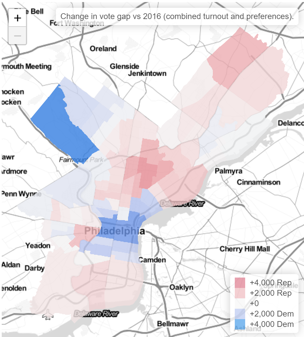
The miss was not the same across the city.

This is bad. I underpredicted the whole of the Northeast, plus North, West, and South Philly. I also ended up over-predicting Center City and Chestnut Hill (and way over-predicting Penn’s 27th).

The patterns here map clearly to the city’s Voting Blocs, but it’s important to make clear that the model already accounts for historic correlations among Voting Blocs. In fact, here’s the same map from the 2019 primary.

There’s much less of a pattern, and the model handled all of the correlations pretty well. It underpredicted Hispanic North Philly, where there was a competitive 7th District council race, but overall the true turnout was well within the CI, and we missed getting it on the nose by only 14K votes.

So yes, something went wrong this year, and yes, it’s correlated with the Voting Blocs. But it’s not as simple as failing to account for correlations. Instead, Covid broke the historic patterns.

What the Tracker does and doesn’t do.

First, some background.

The Turnout Tracker takes submissions from voters across the city. Participants give me (a) their division, (b) the time of day, and (c) their “voter number” in their division: how many people have voted before them, plus them. The result is I can estimate the cumulative distribution of votes for each division, and the total number of votes cast so far across the city.

Doing that well requires some hefty statistical work. I use historic correlations among divisions to predict the votes in divisions without any submissions, and estimate a non-parametric time distribution (the curvy line above) on the fly. And I bootstrap the whole thing to get confidence intervals. (Math person? See the Appendix, and then the github repo, for the math.)

A common concern I get about the Tracker is “what if you don’t get many submissions from a ward?” People are concerned that if I don’t get any submissions from the 66th, for example, I’ll treat that as if zero people there voted. Or maybe just assume the 66th is the same as the places where I do have submissions. But I don’t. I use the historic correlations to effectively take a weighted average among the submissions of the wards that historically have been similar. Having submissions from the ward itself will make me more confident in the estimate, but ward estimates should not be biased just because we don’t have submissions. As a toy example, suppose the city had two wards, which historically showed no correlations. If all of the submissions were from Ward A, then that would have no effect on the estimate for Ward B (they’re uncorrelated): the tracker would simulate Ward B as having the entire range of historic turnouts it’s ever had. The error bars would be huge. As we got submissions from Ward B, the estimate would narrow down on a portion of that range, becoming more confident. In the real Tracker, each Ward is correlated with other Wards at some value between -1 and 1.

For example, in predicting the Northeast’s 66th Ward relative to the city as a whole, here is the weighting I give to submissions from each other ward:

Notice that the 66th Ward depends mostly on other Northeast and South Philly wards, followed by the River Wards and Manayunk, then Center City West. In fact, conditional on the overall city turnout, it usually swings in the opposite direction of North and West Philly. (Though it’s worth pointing out that the “overall city turnout” uses all wards, so high numbers in North Philly may increase the 66th’s estimate by increasing the total estimate.)

The key is that the Tracker will not be broken by disproportionate submissions, or by large swings of turnout among Philadelphia’s Voting Blocs that are consistent with historic swings. Instead, what breaks the Tracker is when an entirely new pattern emerges, or a really big one, that we haven’t seen in the data back to 2002. And on Tuesday, November 3rd, that’s what happened.

How I handled mail-in ballots

This was the first year with no-excuse mail-in voting, and Covid meant that we would have enormous usage of it. Ahead of the election, I needed to figure out how to account for that.

The patterns of requests seemed to break down along familiar lines: the progressive wards of Center City and the ring around it requested ballots at high rates, while Black wards of West and North Philly did so somewhat less, and the Trumpy wards of South Philly and the Northeast less still. The pattern was familiar, and mapped to the Voting Blocs almost perfectly.

So I figured that once we subtract out the mail-in votes, the remaining in-person votes would look a lot like a typical election. Maybe what would happen is the Wealthy Progressive wards would swing towards low turnout, and everywhere else high, but those correlations would be correctly captured by the model. I decided to treat Election Day in-person turnout as any other election, ignoring the mail-in votes. Post-hoc, I added back the mail-in votes to get an accurate picture of the true topline.

What I decided not to do is parametrize model with mail-in votes to explicitly adjust the predictions (e.g. expecting places with low mail-in requests to vote in-person at much higher rates), or allow for different-than-normal covariances. But when you just pretend in-person votes were all that there was, this election was unlike any we’ve ever seen.

A jarring example is comparing the 66th Ward in the Northeast, from which I had no submissions, to the 8th Ward in Center City, from which I had a ton.

Typically, the 66th Ward casts about the same number of votes as the 8th Ward. Its high-water mark was in 2003, when it had 57% more votes than the 8th. In every year since 2016, it’s cast fewer.

So the Tracker expected the 66th Ward’s turnout to be somewhere in this range. I figured the 66th would make up for some of its mail-in lag, and we’d see in-person turnout at maybe 1.5 times the 8th. In other words, we’d see an extreme but historically-plausible proportion.

Here’s what happened:

View code
ggplot(
  turnout_df %>% filter(ward %in% c("08", target_ward)) %>%
    mutate(ward=ifelse(ward==target_ward, "target", ward)) %>%
    pivot_wider(names_from=ward, values_from=turnout, names_prefix = "t_") %>%
    bind_rows(
      turnout_20 %>%
        filter(ward %in% c(target_ward, "08")) %>%
        mutate(ward=ifelse(ward==target_ward, "target", ward)) %>%
        select(ward, inperson) %>%
        pivot_wider(names_from="ward", values_from="inperson", names_prefix = "t_") %>%
        mutate(year = "2020", election_type="general")
    ),
  aes(x=year, group=election_type, y=t_target / t_08)
) + 
  geom_line(aes(linetype=election_type), color=strong_blue) +
  geom_point(size=4, aes(color=(year == 2020 & election_type=="general"))) +
  scale_color_manual(values=c(`FALSE`=strong_blue, `TRUE`=strong_red), guide=FALSE) +
  # geom_histogram(binwidth = 0.1, boundary=0) +
  # geom_vline(
  #   xintercept=ward_turnout %>% 
  #       filter(ward %in% c("45", "08")) %>% 
  #       select(ward, turnout_20) %>% 
  #       pivot_wider(names_from="ward", values_from="turnout_20") %>%
  #       with(`45`/`08`),
  #   linetype="dashed"
  # ) +
  theme_sixtysix() +
  labs(
    title=sprintf("Distribution of %sth Ward turnout vs 8th", target_ward),
    subtitle="Elections from 2002 to the 2020 general (in red).",
    y=sprintf("Ward %s Turnout / Ward 8 Turnout", target_ward),
    x=NULL,
    linetype="Election"
  )

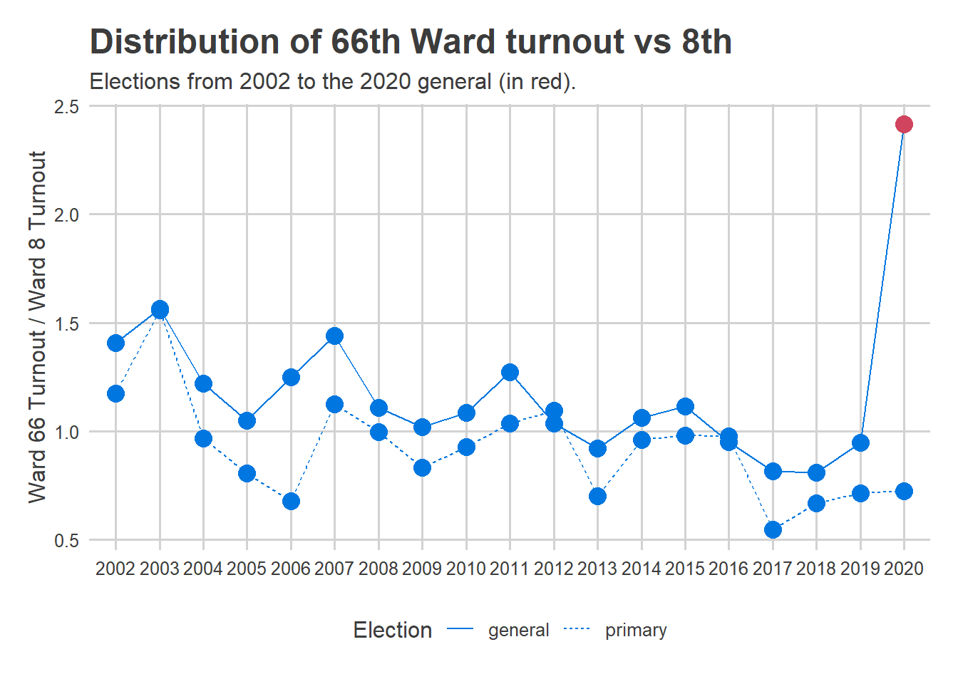
I completely underestimated the amount of catch-up that would happen on Election Day. The 66th Ward actually had 2.4 times the in-person votes of the 8th, a value that would seem impossible based on historic data. My assumption that in-person votes would look like maybe 2003 was wrong.

Obviously this didn’t just happen in the 66th and 8th. A similar plot exists for all of the errors in the maps above.

The result is that the Tracker vastly underpredicted the Northeast, expecting it to be more like Center City than it was (and overpredicted Center City and the universities).

Where to go frome here

Mail-in voting is here to stay, though hopefully Covid isn’t. What should be fixed for next elections? There are two possible strategies:

  1. Parametrize the model for mail-in requests. Allow the Tracker to adjust the covariances for the mail-ins requested, and expect a positive amount of catch-up in the low-requesting wards.

  2. Don’t overcorrect. This was probably an outlier election, thanks to Covid. Plus, when I retrain the model in May, I’ll have this election in the training set, so its priors should sufficiently allow for this trend. Finally, in future elections without Trump on the ballot, mail-ins will probably be less partisan. All of this suggests future elections should be relatively safe from this pandemic outlier.

I need to think about this, but I’ll probably choose a mix of these two strategies, and test the heck out of the new version for cases where mail-ins go berserk.

Plus, maybe I’ll finally get my act together and sufficiently recruit submissions from all wards in the city.

Appendix: The math

Suppose we have \(N_{obs}\) submissions for division voter counts. The turnout tracker models turnout response \(x_i\) on the log-scale, as \[ \log(x_{i}) = \alpha + \gamma_{d_i} + f(t_i) + \epsilon_i \] where \(\alpha\) is a fixed effect that scales the annual turnout, \(\gamma_d\) is an \(N_{div}\)-length vector of division-level random effects, with means and covariance that I’ve estimated on historic data, \(f(t)\) is a time-trend that goes from \(e^{f(0)} = 0\) at the start of the day to \(e^{f(t_{max})} = 1\) at the end (clearly \(f(0)\) is undefined, but we can get around this by only starting with the first datapoint), and \(\epsilon\) is noise.

The \(\gamma\) vector of division random effects are modeled as \[ \gamma \sim N(\mu, \Sigma) \] where \(\mu\) and \(\Sigma\) are estimated based on historic data of all Philadelphia elections since 2002.

The model simultaneously estimates \(\alpha\), \(f\), and the expectation of \(\gamma\) conditional on \(x\).

Suppose we know \(f(t)\). Define the residual as \(r_i = log(x_i) – f(t_i)\). Then the \(r_i\) are drawn from a normal \[ r_i \sim N(\alpha + \gamma_{d_i}, \sigma_\epsilon) \] Marginalizing out \(\gamma\), the covariance of \(r_i\), \(r_j\), \(i\neq j\), is \(\Sigma_{d_i, d_j}\), so the vector of \(r\) is drawn from a big multivariate normal, \[ r \sim N(\alpha + D\mu, D \Sigma D’ + Diag(\sigma_\epsilon)) \] where \(D\) is a \(N_{obs} \times N_{div}\) matrix with \(D_{ij} = 1\) if observation \(i\) belongs to division \(j\), 0 otherwise.

The log likelihood of \(r\) is \[ L(r; \alpha) = -\frac{1}{2} (r – \alpha – D \mu)’ (D \Sigma D’ + Diag(\sigma_\epsilon))^{-1} (r – \alpha – D \mu) + C \] and is maximized for an alpha satisfying \[ 0 = (r – \alpha_{MLE} – D\mu)'(D \Sigma D’ + Diag(\sigma_\epsilon))^{-1}1_{N_{obs}} \\ \alpha_{MLE} = \frac{(r – D\mu)'(D \Sigma D’ + Diag(\sigma_\epsilon))^{-1}1_{N_{obs}}}{1_{N_{obs}}’ (D \Sigma D’ + Diag(\sigma_\epsilon))^{-1}1_{N_{obs}}} \] To keep ourselves sane, we can write this as \[ \alpha_{MLE} = (r – D\mu)’ w \] where \(w\) is the \(N_obs\)-length weight-vector defined above. The key to the above formula is that observations from covarying divisions are discounted, so for example if we see two observations from divisions we know vote the same, they each get only half the weight.

Now consider \(\gamma\). Returning to the non-marginalized distribution, and plugging in \(\alpha_{MLE}\), the log-likelihood of \(r\) is \[ L(r; \gamma) = -\frac{1}{2 \sigma_\epsilon^2} (r – \alpha_{MLE} – D\gamma)'(r – \alpha_{MLE} – D\gamma) – \frac{1}{2}(\gamma – \mu)’\Sigma^{-1}(\gamma – \mu) + C \] Optimizing for \(\gamma_{MLE}\) gives \[ 0 = \frac{1}{\sigma_\epsilon^2} D'(r – \alpha_{MLE} – D\gamma_{MLE}) – \Sigma^{-1}(\gamma_{MLE} – \mu) \\ 0 = \frac{1}{\sigma_\epsilon^2} D'(r – \alpha_{MLE} – D(\gamma_{MLE}- \mu + \mu)) – \Sigma^{-1}(\gamma_{MLE} – \mu) \\ \left(\frac{D’D}{\sigma_\epsilon^2} + \Sigma^{-1}\right)(\gamma_{MLE} – \mu) = \frac{D'(r – \alpha_{MLE} – D\mu)}{\sigma_\epsilon^2} \\ \gamma_{MLE} – \mu = \left(\frac{D’D}{\sigma_\epsilon^2} + \Sigma^{-1}\right)^{-1} \frac{D'(r – \alpha_{MLE} – D\mu)}{\sigma_\epsilon^2} \] Note that \(D’D\) is just a diagonal matrix where the diagonal is the number of observations belonging to that division.

This is just a shrunk, weighted average of the deviations \(r\) from the means \(\alpha + D\mu\). Remember that \(D\) just maps observations to divisions, and \(D’D\) is just a diagonal with the number of observations to each division. So suppose we saw one observation from each division. The relative contributions to the random effects would be given by \((I + \sigma_\epsilon^2 \Sigma^{-1})^{-1}\) times each observation’s deviance from its mean. (This is what I map above.)

Philadelphia’s Underwhelming Turnout

Now that all of our votes have been counted, we can discuss what’s been in the air for weeks: Philadelphia’s underwhelming turnout. How can a record 749,317 votes cast be underwhelming, you ask? Because everyone else in the state did so much more.

Note: This post largely just codifies analyses that have lived on the Results Hub, with a little narration. All of this is based on unofficial results as of 11/21/2020.

Philadelphia accounted for its lowest fraction of state turnout

First things first: Philadelphia cast a record 742K votes for President. (Note, this is different from the 749K turnout because 7K voters left President blank. For data availability reasons, I focus on votes cast for topline office.)

View code
library(tidyverse)

cofile_pattern <-"^PA_(Uno|O)fficial_([0-9]{4})_general_results(_[0-9]+)?.CSV"
cofiles <- list.files(
  "../../data/pa_election_data/electionreturns.pa.gov/", 
  pattern=cofile_pattern,
  full.names = TRUE
)

res <- vector(mode="list")

for(f in cofiles){
  df_co <- readr::read_csv(f) %>%
    rename(
      county = `County Name`,
      office = `Office Name`,
      election = `Election Name`,
      candidate = `Candidate Name`,
      party = `Party Name`,
      votes=Votes
    ) %>%
    mutate(county = tolower(county)) %>%
    select(county, office, election, candidate, party, votes) %>%
    filter(substr(office, 1, 8) %in% c("Presiden", "Governor")) %>%
    mutate(year = substr(election, 1, 4))
  
  res[[f]] <- df_co
}
df <- bind_rows(res)
# table(df$year)

asnum <- function(x) as.numeric(as.character(x))

county_results <- df %>%
  group_by(county, year) %>%
  mutate(
    turnout=sum(votes),
    pvote = votes / turnout,
    cycle=ifelse(asnum(year) %% 4 == 0, "President", "Governor"),
    county_group = case_when(
      county == "philadelphia" ~ "Philadelphia",
      county %in% c("bucks", "delaware", "montgomery", "chester") ~ "Phila Suburbs",
      TRUE ~ "Rest of State"
    )
  ) %>%
  filter(party %in% c("Democratic", "Republican")) %>%
  select(-votes, -candidate) %>%
  pivot_wider(names_from = party, values_from=pvote, names_prefix = "pvote_")

ggplot(
  county_results %>% filter(county == "philadelphia"),
  aes(x=asnum(year), y=turnout)
) +
  geom_line(
    aes(group=cycle, linetype=cycle),
    size=1,
    color=strong_blue
  ) +
  geom_point(size=4, color=strong_blue) +
  scale_linetype_manual(values=c(President="solid", Governor="dashed"), guide=FALSE) +
  geom_text(
    data=tribble(
      ~year, ~turnout, ~label,
      "2015", 380e3, "Governor",
      "2015", 650e3, "President"
    ),
    aes(label=label),
    fontface="bold",
    color=strong_blue,
    size=4,
    hjust=-0.1
  ) +
  theme_sixtysix() +
  scale_y_continuous(labels=scales::comma, breaks = seq(0, 700e3, 100e3)) +
  expand_limits(y=0) +
  labs(
    title="Philadelphia cast its most votes in decades",
    y="Votes Cast",
    x=NULL
  )

But the rest of the state grew much, much more.

View code
ggplot(
  county_results %>%
    filter(year %in% c(2016, 2020)) %>%
    mutate(gap = pvote_Democratic - pvote_Republican) %>%
    select(county, county_group, year, cycle, turnout, gap) %>%
    pivot_longer(c(turnout, gap)) %>%
    unite(var, name, year, sep="_") %>%
    pivot_wider(names_from=var, values_from=value),
  aes(
    x=100*(gap_2016 + gap_2020)/2,
    y=100*(turnout_2020 - turnout_2016)/turnout_2016,
    color=county_group
  ) 
) +
  geom_point(aes(size=(turnout_2016 + turnout_2020)/2)) +
  geom_text(
    data=tribble(
      ~x, ~y, ~county_group,
      20, 20, "Phila Suburbs",
      42, 7, "Philadelphia"
    ),
    aes(x=x, y=y, label=county_group),
    size=4,
    fontface="bold",
    hjust=0
  ) +
  scale_color_manual(
    values=c("Philadelphia"=strong_blue, "Rest of State" = light_grey, "Phila Suburbs" = strong_green),
    guide=FALSE
  ) +
  scale_x_continuous(
    "Average of 2016 and 2020 Results",
    labels=function(x) sprintf("+%s%% %s", abs(x), ifelse(x >= 0, "Dem", "Rep"))
  ) +
  scale_y_continuous(
    "Change in votes cast (as % of 2016)",
    labels=scales::comma
  ) +
  scale_size_area(
    "Avg(2016 votes cast, 2020 votes cast)",
    labels=scales::comma
  ) +
  theme_sixtysix() +
  geom_hline(yintercept=0)+
  labs(
    title="Philadelphia's turnout grew less than the state.",
    subtitle="Second lowest growth, higher only than State College's Centre County."
  )

The net result is that Philadelphia represented its smallest share of the Presidential vote since at least 2000.

View code
grouped_turnout <- county_results %>%
    group_by(year, cycle, county_group) %>%
    summarise(turnout=sum(turnout)) %>%
    group_by(year) %>%
    mutate(frac = turnout / sum(turnout))

# grouped_turnout %>% filter(county_group == "Philadelphia") %>% arrange(frac)
# grouped_turnout %>% filter(county_group == "Phila Suburbs") %>% arrange(frac)
ggplot(
  grouped_turnout %>% filter(county_group != "Rest of State"),
  aes(x=year, y=100*frac, color=county_group)
) +
  geom_line(aes(group=interaction(cycle, county_group), linetype=cycle), size=1) +
  geom_point(size=4) +
  scale_linetype_manual(values=c(President="solid", Governor="dashed")) +
  scale_color_manual(
    values=c("Philadelphia"=strong_blue, "Rest of State" = strong_red, "Phila Suburbs" = strong_green),
    guide=FALSE
  ) +
  geom_text(
    data=tribble(
      ~year, ~frac, ~county_group, 
      "2016", 0.13, "Philadelphia",
      "2016", 0.20, "Phila Suburbs"
    ),
    aes(label=county_group),
    hjust=0,
    fontface="bold"
  ) +
  theme_sixtysix() +
  # theme(title=element_text(size=8)) +
  expand_limits(y=0) +
  labs(
    title="Philadelphia and Suburbs' vote share",
    subtitle="The city accounted for its lowest share of presidential votes since at least 2000.",
    x=NULL,
    y="Percent of PA's Votes Cast",
    linetype="Cycle"
  )

Perhaps more surprising than turnout, though, was that Philadelphia’s percent for Trump grew from four years ago. That was only true of a few other counties, all really Republican.

View code
ggplot(
  county_results %>%
    filter(year %in% c(2016, 2020)) %>%
    mutate(gap = pvote_Democratic - pvote_Republican) %>%
    select(county, county_group, year, cycle, turnout, gap) %>%
    pivot_longer(c(turnout, gap)) %>%
    unite(var, name, year, sep="_") %>%
    pivot_wider(names_from=var, values_from=value),
  aes(
    size=(turnout_2016 + turnout_2020)/2, 
    x=100*gap_2016,
    y=100*(gap_2020 - gap_2016),
    color=county_group
  ) 
) +
  geom_point() +
    scale_color_manual(
    values=c("Philadelphia"=strong_blue, "Rest of State" = light_grey, "Phila Suburbs" = strong_green),
    guide=FALSE
  ) +
  geom_text(
    data=tribble(
      ~x, ~y, ~county_group,
      20, 6, "Phila Suburbs",
      42, -3, "Philadelphia"
    ),
    aes(x=x, y=y, label=county_group),
    size=4,
    fontface="bold",
    hjust=0
  ) +
  scale_x_continuous(
    "2016 Result",
    labels=function(x) sprintf("+%s%% %s", abs(x), ifelse(x >= 0, "Clinton", "Trump"))
  ) +
  scale_y_continuous(
    "2020 Biden vs 2016 Clinton",
    labels=function(x) sprintf("+%s%% %s", abs(x), ifelse(x > 0, "Biden", "Clinton"))
  ) +
  scale_size_area(
    "Avg(2016 turnout, 2020 turnout)",
    labels=scales::comma
  ) +
  theme_sixtysix() +
  geom_hline(yintercept=0)+
  labs(
    title="Biden won less of Philadelphia than Clinton",
    subtitle="Change in county preferences, 2016 to  2020."
  )

There’s tension between the plots above and the fact that Biden would not have won PA without Philadelphia. If you delete Philadelphia from the state, Trump wins handily. People who worked hard to make the city’s record turnout happen can feel unappreciated by pieces like this. And it’s not obvious what the counterfactual is: without their hard work, would Philadelphia’s turnout have actually been down? But the following is clear: if you want to know why Trump won PA four years ago and lost it this year, the answer is not “Philadelphia changed”. In fact, changes in Philadelphia swung towards Trump. Nate Cohn has a great thread on this tension.

More importantly, talking about Black voters’ “flat” turnout or Hispanic voters’ shift towards Trump ignores the fact that they voted more overwhelmingly for Biden than White voters did, and have carried the party for decades. It feels pejorative of groups that have long been the party’s most steadfast base of support. And it feels especially callous after a year of Covid and police violence hit Black communities the hardest. I point out below that turnout was flat, but it’s important to make clear that I haven’t done any of the necessary reporting to understand *why*.

To be clear, Philadelphia’s Black wards voted for Biden at 95%. And if we extend that to Black voters in other wards, Black voters probably account for more than half of Biden’s Philadelphia votes.

Patterns within the city

Within the city, there are five clear groups of Divisions: Wealthy Progressive divisions that turned out in droves, Trumpy Divisions that did too, Black Divisions where turnout was flat, Hispanic Divisions where turnout fell and preferences moved towards Trump, and student Divisions where turnout cratered.

View code
library(leaflet)
make_leaflet <- function(
  data,
  get_color, 
  title,
  is_percent=FALSE,
  is_race=FALSE, #if is_race, color should be % Dem - % Rep
  diverge_at_zero=FALSE,
  zoom=6
){
  color <- get_color(data)  
  vals <- cut_vals(color, is_race, diverge_at_zero)  

  legend_list <- create_legend(
    vals$min, 
    vals$max, 
    vals$step_size,
    vals$pal,
    is_percent,
    is_race,
    diverge_at_zero
  )  

  init_map(data, zoom) %>%
    addPolygons(
      data=data$geometry,
      weight=0, 
      color="white", 
      opacity=1, 
      fillOpacity = 0.8, 
      smoothFactor = 0,
      fillColor = vals$pal(color),
      popup=data$popup
    ) %>%
    addControl(title, position="topright", layerId="map_title") %>% 
    addLegend(
      layerId="geom_legend",
      position="bottomright",
      colors=legend_list$colors,
      labels=legend_list$labels
    )
}

init_map <- function(data, zoom){
  bbox <- st_bbox(data)
  
  leaflet(
    options=leafletOptions(
      minZoom=zoom,
      # maxZoom=zoom,
      zoomControl=TRUE,
      dragging=TRUE
      )
  )%>% 
    setView(
      zoom=zoom,
      lng=mean(bbox[c(1,3)]),
      lat=mean(bbox[c(2,4)])
    ) %>%
    addProviderTiles(providers$Stamen.TonerLite) %>%
    setMaxBounds(
      lng1=bbox["xmin"],
      lng2=bbox["xmax"],
      lat1=bbox["ymin"],
      lat2=bbox["ymax"]
    )
}

create_legend <- function(
  min_value, 
  max_value, 
  step_size,
  pal,
  is_percent,
  is_race,
  diverge_at_zero
){ 
  legend_values <- seq(min_value, max_value, step_size)
  legend_colors <- pal(legend_values)
  
  if(is_race & is_percent){
    legend_labels <- sprintf(
      "+%s%% %s",
      abs(legend_values),
      case_when(
        legend_values==0 ~ "", 
        legend_values > 0 ~ "Dem",
        legend_values < 0 ~ "Rep"
      )
    )
  }else if(is_percent){
    legend_labels <- sprintf("%s%%", legend_values)
  } else if(is_race){
    legend_labels <- sprintf(
      "+%s %s",
      comma(abs(legend_values)),
      case_when(
        legend_values==0 ~ "", 
        legend_values > 0 ~ "Dem",
        legend_values < 0 ~ "Rep"
      )
    )
  } else {
    legend_labels <- scales::comma(legend_values)
  }
 
  list(
    colors=legend_colors,
    values=legend_values,
    labels=legend_labels
  )
}

cut_vals <- function(x, is_race, diverge_at_zero){
  min_value <- min(x, na.rm=TRUE)
  max_value <- max(x, na.rm=TRUE)
  
  if(diverge_at_zero) {
    max_value <- max(abs(min_value), abs(max_value))
    min_value <- -max_value
  }
  
  sigfig <- round(log10(max_value-min_value)) - 1
  step_size <- 2 * 10^(sigfig)
  
  min_value <- step_size * floor(min_value / step_size)
  max_value <- step_size * ceiling(max_value / step_size)
  
  if(!is_race & !diverge_at_zero){
    pal <- colorNumeric(
      "viridis", 
      domain=c(min_value, max_value)
    )
  } else if(is_race){
    pal <- colorNumeric(
      c(strong_red, "grey95", strong_blue),
      domain=c(min_value, max_value)
    )
  } else {
    pal <- colorNumeric(
      c(strong_orange, "grey95", strong_purple),
      domain=c(min_value, max_value)
    )
  }
  
  list(
    min=min_value,
    max=max_value,
    step_size=step_size,
    pal=pal
  )
}
  
make_leaflet_circles <- function(
  data,
  get_color,
  get_radius,
  title,
  is_percent=FALSE,
  is_race=FALSE, #if is_race, should be % Dem - % Rep
  diverge_at_zero=FALSE,
  zoom=6
){
  
  radius <- get_radius(data)
  max_radius <- 20
  radius <- max_radius * radius / max(radius)
  data <- data[order(radius, decreasing=TRUE),]
  radius <- radius[order(radius, decreasing=TRUE)]
  
  color <- get_color(data)  
  vals <- cut_vals(color, is_race, diverge_at_zero)
  
  legend_list <- create_legend(
    vals$min, 
    vals$max, 
    vals$step_size,
    vals$pal,
    is_percent,
    is_race
  )  
  
  init_map(data, zoom) %>%  
    addCircleMarkers(
      lat=asnum(data$INTPTLAT),
      lng=asnum(data$INTPTLON),
      radius=radius,
      # weight=0, 
      stroke=FALSE,
      color=vals$pal(color), 
      opacity=1, 
      fillOpacity = 1,
      # smoothFactor = 0,
      fillColor = vals$pal(color),
      popup=data$popup
    ) %>%
    addControl(title, position="topright", layerId="map_title") %>% 
    addLegend(
      layerId="geom_legend",
      position="bottomright",
      colors=legend_list$colors,
      labels=legend_list$labels
    )
}

pretty_time <- function(time){
  gsub("^0", "", format(time, "%I:%M %p"))
}

Philadelphia was still overwhelmingly Democratic, casting 81% of its votes for Biden to 18% for Trump.

View code
wards <- st_read("../../data/gis/warddivs/201911/Political_Wards.shp", quiet=TRUE) %>%
  mutate(ward=sprintf("%02d", asnum(WARD_NUM)))

phila_res <- readRDS("../election_night_2020/tmp/tmp_phila_res.RDS")

phila_res %<>% 
  group_by(ward) %>% 
  mutate(turnout=sum(votes)) %>%
  ungroup() %>% 
  pivot_wider(names_from=party, values_from=votes, names_prefix = "votes_")

phila_res_16 <- readr::read_csv("../../data/raw_election_data/2016_general.csv") %>%
  filter(OFFICE == "PRESIDENT AND VICE PRESIDENT OF THE UNITED STATES") %>%
  mutate(ward=sprintf("%02d", WARD)) %>%
  mutate(party=case_when(
    PARTY == "DEMOCRATIC" ~ "D",
    PARTY == "REPUBLICAN" ~ "R",
    TRUE ~ "O"
  )) %>%
  group_by(ward, party) %>%
  summarise(votes=sum(VOTES)) %>%
  group_by(ward) %>%
  mutate(turnout_16 = sum(votes)) %>%
  pivot_wider(names_from=party, values_from=votes, names_prefix = "votes_16_")

phila_df <- read.csv("../election_night_2020/tmp/mailin_phila.csv") %>%
  mutate(ward=substr(warddiv, 1, 2)) %>%
  select(-warddiv, -turnout_16) %>%
  group_by(ward) %>%
  summarise_all(sum)

wards %<>% 
  left_join(phila_res, by="ward") %>% 
  left_join(phila_df, by="ward") %>%
  left_join(phila_res_16)

if(nrow(wards) != 66) stop()

library(scales)
wards %<>%
  mutate(
    popup=sprintf(
      paste(
        c(
          "<b>Ward %s</b>",
          "Total Votes Counted: %s",
          "2016 Votes Cast: %s",
          "Change: %s",
          "Active Registered Voters: %s",
          "Turnout as %% of RVs: %0.0f%%",
          "",
          "Biden: %s (%0.0f%%)",
          "Trump: %s (%0.0f%%)",
          "",
          "Clinton 2016: %s (%0.0f%%)",
          "Trump 2016: %s (%0.0f%%)"
        ),
        collapse = "<br>"
      ),
      WARD_NUM,
      comma(turnout),
      comma(turnout_16),
      sprintf(
        "%s%0.0f%%", 
        ifelse(turnout > turnout_16, "+", "-"), 
        abs(100 * (turnout - turnout_16) / turnout_16)
      ),
      comma(n_reg),
      100 * turnout / n_reg,
      comma(votes_D), 100*votes_D / turnout,
      comma(votes_R), 100*votes_R / turnout,
      comma(votes_16_D), 100*votes_16_D / turnout_16,
      comma(votes_16_R), 100*votes_16_R / turnout_16
    )
  )

render_iframe <- function(widget, file=NULL){
  DIR <- "leaflet_files"
  if(!dir.exists(DIR)) dir.create(DIR)
  
  if(is.null(file)){
    obj.name <- deparse(substitute(widget))
    file <- sprintf("%s.html", obj.name)
  }
  
  setwd(DIR)  # saveWidget can't save to a folder
  
  htmlwidgets::saveWidget(
    widget, 
    file=file, 
    selfcontained=TRUE
  )
  
  setwd("..")
  
  sprintf(
    '<iframe src="%s/%s" width="100%%" height="600" scrolling="no" frameborder="0"></iframe>',
    DIR, file
  )
}

lf_res <- make_leaflet(
  data=wards,
  get_color=function(df) 100*(df$votes_D - df$votes_R)/df$turnout,
  is_percent = TRUE,
  title=sprintf("Presidential results"),
  is_race=TRUE,
  diverge_at_zero = TRUE,
  zoom=11
)

Turnout rose sharply in Center City and Fishtown, rose broadly across the Northeast, was flat in West Philly, fell in North Philly, and cratered in the wards around Penn, Drexel, and Temple.

View code
lf_turnout <- make_leaflet(
  data=wards,
  get_color=function(df) 100*(df$turnout - df$turnout_16)/df$turnout_16,
  is_percent = TRUE,
  title=sprintf("Change in votes cast from 2016"),
  is_race=FALSE,
  diverge_at_zero = TRUE,
  zoom=11
)

The correlation with demographics is striking. Merging in and crosswalking 2018 ACS estimates, we see that turnout was down sharply in Hispanic wards and flat in Black wards (in an election where the state and rest of the city was sharply up).

View code
pops <- read.csv(
  "../../data/census/acs_2018_5yr_age_phila/ACSST5Y2018.S1501_data_with_overlays_2020-11-08T110945.csv", 
  skip = 1
)

pops <- pops %>% 
  rename(
    pop_1824 = Estimate..Total..Population.18.to.24.years,
    pop_25over = Estimate..Total..Population.25.years.and.over,
    somecol_1824=Estimate..Total..Population.18.to.24.years..Some.college.or.associate.s.degree,
    colplus_1824 = Estimate..Total..Population.18.to.24.years..Bachelor.s.degree.or.higher
) %>% 
  dplyr::select(id, Geographic.Area.Name,pop_25over, pop_1824, somecol_1824, colplus_1824)

crosswalk <- readRDS("../../data/gis_crosswalks/bgs10_to_divs_201911.Rds")
crosswalk %<>% mutate(tract=substr(bg_fips, 1, 11)) %>%
  group_by(tract, WARD, DIV) %>%
  summarise(pop=sum(pop10), weight=sum(weight))

div_pops <- pops %>% 
  mutate(tract=gsub("^1400000US", "", id)) %>%
  left_join(crosswalk, by = "tract") %>% 
  group_by(WARD, DIV) %>%
  summarise(
    pop_25over=sum(pop_25over*weight),
    pop_1824=sum(pop_1824*weight),
    somecol_1824 =sum(somecol_1824 *weight),
    colplus_1824=sum(colplus_1824*weight)
  )

ward_pops <- div_pops %>% group_by(WARD) %>%
  summarise_at(vars(pop_25over:colplus_1824), sum) %>%
  mutate(
    p_1824_col=(somecol_1824 + colplus_1824)/(pop_25over + pop_1824)
  )

wards <- wards %>%
  left_join(ward_pops %>% rename(ward=WARD))

pops_race <- read.csv(
  "../../data/census/acs_2018_5yr_agerace_phila/ACSDP5Y2018.DP05_data_with_overlays_2020-11-08T121412.csv", 
  skip=1
)
pops_race <- pops_race %>%
  rename(
    pop_total=Estimate..HISPANIC.OR.LATINO.AND.RACE..Total.population,
    pop_hisp=Estimate..HISPANIC.OR.LATINO.AND.RACE..Total.population..Hispanic.or.Latino..of.any.race.,
    pop_nhwhite=Estimate..HISPANIC.OR.LATINO.AND.RACE..Total.population..Not.Hispanic.or.Latino..White.alone,
    pop_nhblack=Estimate..HISPANIC.OR.LATINO.AND.RACE..Total.population..Not.Hispanic.or.Latino..Black.or.African.American.alone
) %>%
  select(id, Geographic.Area.Name, pop_total, pop_hisp, pop_nhwhite, pop_nhblack)

div_race <- pops_race %>% 
  mutate(tract=gsub("^1400000US", "", id)) %>%
  left_join(crosswalk, by = "tract") %>% 
  group_by(WARD, DIV) %>%
  summarise(
    pop_total=sum(pop_total*weight),
    pop_hisp=sum(pop_hisp*weight),
    pop_nhwhite =sum(pop_nhwhite *weight),
    pop_nhblack=sum(pop_nhblack*weight)
  )

ward_race <- div_race %>% group_by(WARD) %>%
  summarise_at(vars(pop_total:pop_nhblack), sum) 

wards <- wards %>% left_join(ward_race %>% rename(ward=WARD))

df_race <- wards %>%
  as.data.frame() %>%
  pivot_longer(
    cols = c(pop_hisp, pop_nhwhite, pop_nhblack),
    names_to="race",
    values_to="pop"
  ) %>%
  mutate(prace = pop / pop_total)%>% 
  mutate(race_raw=gsub("pop_", "", race)) %>%
  mutate(
    race_formatted=case_when(
      race_raw=="nhwhite" ~ "Non-Hispanic White",
      race_raw=="nhblack" ~ "Non-Hispanic Black",
      race_raw=="hisp" ~ "Hispanic",
      TRUE ~ "NA"
    )
  )

ggplot(
  df_race ,
  aes(x=prace, y=turnout / turnout_16)
) + 
  geom_hline(yintercept=1) +
  geom_point(aes(size=turnout_16, color=race_raw), alpha=0.8, pch=16) +
  facet_grid(race_formatted ~ .) +
  theme_sixtysix() +
  scale_color_manual(
    values=c(
      nhblack=strong_blue,
      nhwhite=strong_red,
      hisp=strong_orange
    ),
    guide=FALSE
  ) +
  labs(
    x="Proportion of Population",
    y="Votes cast 2020 / Votes cast in 2016",
    title="Votes are down in Hispanic wards, flat in Black wards",
    subtitle=sprintf("Dots are wards, each ward shows up in each facet. Recorded votes as of %s.", format(Sys.time(), "%m/%d %H:%M")),
    size="2016 votes cast"
  )

Turnout was also way down in the student- and recent-grad-heavy wards. Presumably, these young voters just voted from their parents’ house, thanks to Covid. It may be a wash at the state level, though we certainly lost some out-of-state strategic swing voters, and it overall makes Philadelphia look disproportionately low.

How much better would the city’s turnout look with the students added back in? If we think they’re worth 30K votes, that would put Philadelphia still at the bottom of the pack, but not an outlier. I’ll dig into these results more when the individual-level voter file is updated.

View code
ggplot(
  wards,
  aes(x=p_1824_col, y=turnout/turnout_16)
) + 
  geom_hline(yintercept=1) +
  geom_point(
    aes(size=turnout_16),
    alpha=0.8,
    color=strong_grey,
    pch=16
  ) +
  scale_size_area() +
  theme_sixtysix() +
  labs(
    x="Proportion of over-18 pop that is 18-24 and has at least some college",
    y="Votes cast 2020 / Votes cast in 2016",
    title="Votes are down in young, educated wards",
    size="2016 votes cast"
  )

North Philly’s Hispanic wards not only turned out less, but shifted their preferences towards Trump. In 2016, Clinton won the 7th by 89 percentage points, Biden only won by 67. Meanwhile, Manayunk is the only neighborhood with a sizeable swing towards Biden.

View code
lf_pref <- make_leaflet(
  data=wards,
  get_color=function(df) 100*((df$votes_D - df$votes_R)/df$turnout - (df$votes_16_D - df$votes_16_R)/df$turnout_16),
  is_percent = TRUE,
  title=sprintf("Change in %% gap vs 2016."),
  is_race=TRUE,
  diverge_at_zero = TRUE,
  zoom=11
)

The result is a net change in the overall vote gap of +471K for Biden, down from +475 for Clinton in 2016. Again, not a huge change, but not in the direction that would explain Biden’s win. Turnout changes in Center City and Manayunk drove the largest increase in the gap for Biden, offset by shrinking gaps nearly everywhere else.

View code
lf_gap <- make_leaflet(
  data=wards,
  get_color=function(df) ((df$votes_D - df$votes_R) - (df$votes_16_D - df$votes_16_R)),
  is_percent = FALSE,
  title=sprintf("Change in vote gap vs 2016 (combined turnout and preferences)."),
  is_race=TRUE,
  diverge_at_zero = TRUE,
  zoom=11
)

Coming next: the Turnout Tracker

Now, if you watched the Turnout Tracker on Election Day, you wouldn’t have just been underwhelmed by the turnout. Instead, it looked like a bloodbath. Coming next, a deep dive into what went wrong.