On election night and the next day, I made some quick maps of the results. There were obvious patterns: the Democratic endorsees won largely on the back of traditional Party strongholds, Helen Gym did well everywhere, Justin looked like Gym from four years ago.
Today, I’m going to take those broad patterns and distill them down. Where did each candidate do well? What cohorts were decisive? (I’m not going to reproduce the maps, click through to the post for them.)
View code
library(tidyverse)
library(sf)
select <- dplyr::select

setwd("C:/Users/Jonathan Tannen/Dropbox/sixty_six/posts/quick_election_night_maps/")
source("../../admin_scripts/util.R")

filename <- max(list.files("../election_night_needle/raw_data/"))

df <- read_delim(
  paste0("../election_night_needle/raw_data/", filename),
  delim = "@"
) %>%
  rename(
    OFFICE = `Office_Prop Name`,
    candidate = Tape_Text,
    warddiv = Precinct_Name
  )

df <- df[-(nrow(df) - 0:1),]

df <- df %>% group_by(warddiv) %>%
  filter(sum(Vote_Count) > 0) %>%
  group_by()

turnout_19 <- df %>%
  filter(OFFICE == "MAYOR-DEM") %>%
  group_by(warddiv) %>%
  summarise(turnout = sum(Vote_Count))

df <- df %>%
  filter(!grepl("Write", candidate, ignore.case=TRUE))

cand_rank <- df %>%
  group_by(candidate, OFFICE) %>%
  summarise(votes=sum(Vote_Count)) %>%
  arrange(desc(votes)) %>%
  group_by(OFFICE) %>%
  mutate(office_rank = rank(desc(votes)))
cand_order <- cand_rank$candidate

df <- df %>%
  group_by(warddiv, OFFICE) %>%
  mutate(pvote = Vote_Count / sum(Vote_Count)) %>%
  group_by() %>%
  left_join(cand_rank)

divs <- st_read("../../data/gis/2019/Political_Divisions.shp")

divs <- st_transform(divs, 2272) %>%
  mutate(
    warddiv = paste0(
      substr(DIVISION_N, 1, 2),
      "-",
      substr(DIVISION_N,3,4)
    )
  )

saved_covars <- safe_load("../election_night_needle/saved_covars_logTRUE_2012after.Rda")
divs_to_council <- safe_load("../election_night_needle/divs_to_council.Rda")

turnout_cov <- saved_covars$turnout_cov_dem
pvote_cov <- saved_covars$pvote_cov
svd <- saved_covars$svd
First, let’s divide the city up into regions. I’ll use the Singular Value Decomposition. The SVD is a method that assigns a single score to each precinct, and chooses the best score that minimizes the variance left over (I’ll actually use the three best dimensions). When one division turns out especially strongly, the others with similar scores will too. If that division loves a candidate, the others will too. It’s the method at the core of the Turnout Tracker and The Needle.
The method identifies the most important “dimensions” of the vote in order of importance. Here are the results for Philadelphia.
View code
divs <- arrange(divs, DIVISION_N)
divs_svd <- cbind(divs, svd$u[,-1])

ggplot(
  divs_svd %>% gather("dimension", "score", X1:X4) %>%
    mutate(dimension = paste0("Dimension ", substr(dimension,2,2)))
  ) +
  geom_sf(aes(fill=score), color=NA) +
  scale_fill_gradient2(
    "Dimension\n Score",
    low=strong_blue, high=strong_red, mid="white"
  ) +
  facet_wrap(~dimension) +
  theme_map_sixtysix() %+replace%
  theme(legend.position = "right") +
  ggtitle("Dimensions of Philadelphia's Votes")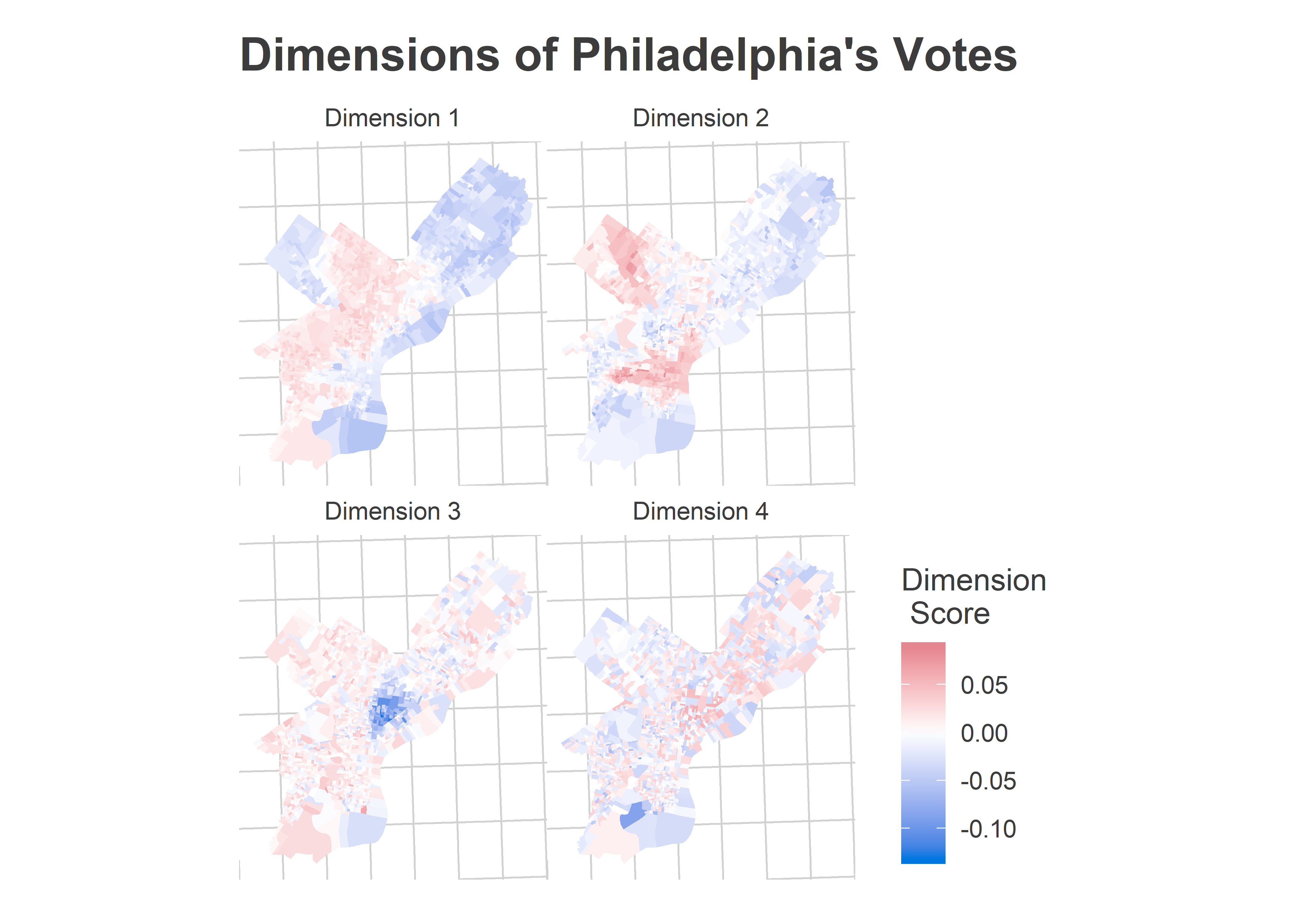
The dimension scores don’t know anything about the city’s demographics–SVD just identifies divisions that vote similarly–but to a Philadelphian’s eyes the story is clear. The vote is best explained by race and class. The first dimension that the SVD discovered divides Philadelphia’s Black neighborhoods from its White ones, the second divides wealthy neighborhoods from non-wealthy ones, and the third divides the Hispanic section of North Philly from everywhere else. The fourth looks like noise to my eyes, so we’ll just use the three. I’ll use these scores to divide up the city into four sections, named after the obvious demographics they represent.
(A note about naming: since writing this post, I’ve changed the way I name the dimensions. I’ve left the old names in this post, but see the discussion.)
Here are the city’s sections. Remember, I’m not actually using Census data to identify them. I’m finding divisions that vote similarly, and then attaching the names post-hoc.
I’m using only data from 2012 and later for this, to capture recent changes. This does make the regions noisy, but bear with me.
View code
library(ggmap)

divs_svd$cat <- NA

divs_svd$cat[divs_svd$X3 < -0.03] <- "Hispanic North Philly"
divs_svd$cat[divs_svd$X2 > 0.025] <- "Wealthy"
divs_svd$cat[divs_svd$X1 < 0.00 & is.na(divs_svd$cat)] <- "White non-wealthy"
divs_svd$cat[is.na(divs_svd$cat)] <- "Black non-wealthy"

divs_svd$cat <- factor(
  divs_svd$cat,
  levels = c(
    "Black non-wealthy",
    "Wealthy",
    "White non-wealthy",
    "Hispanic North Philly"
  )
)

cat_colors <- c(light_blue, light_red, light_orange, light_green)
names(cat_colors) <- levels(divs_svd$cat)

phila_bbox <- st_bbox(st_transform(divs, 4326))
names(phila_bbox) <- c("left", "bottom", "right", "top")
phila_map <- ggmap::get_map(
  location = phila_bbox,
  maptype="toner-lite"
)

ggmap(phila_map) +
  geom_sf(
    data=divs_svd %>% st_transform(4326),
    aes(fill=cat), color=NA,
    alpha=0.7,
    inherit.aes = F
  ) +
  theme_map_sixtysix() +
  scale_fill_manual("", values=cat_colors) +
  ggtitle(
    "Philadelphia's Geographic Voting Blocs"
  )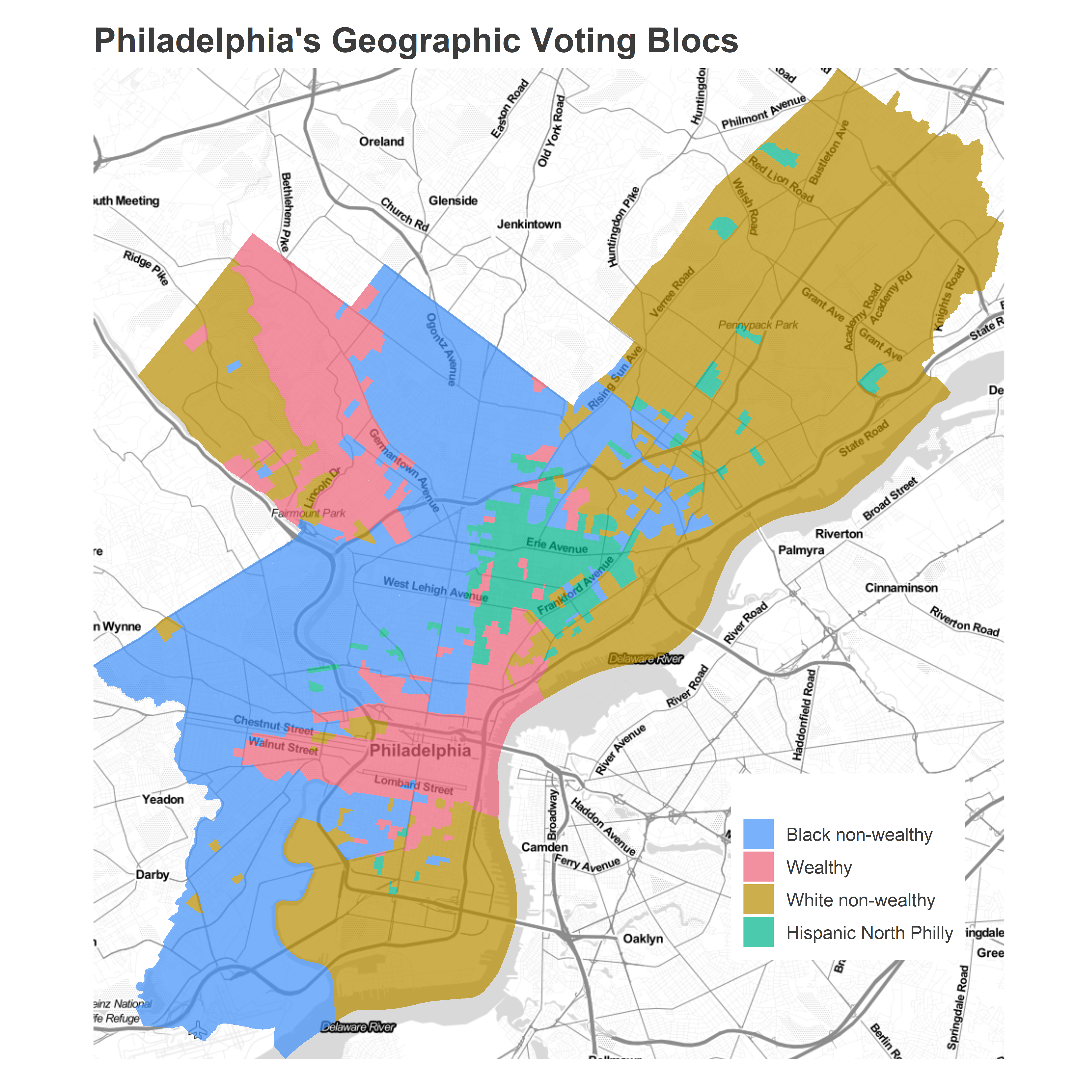
The Black non-wealthy divisions made up 49.7% of the Democratic Primary votes on Tuesday.
View code
div_cats <- divs_svd %>%
  as.data.frame() %>%
  select(DIVISION_N, cat) %>%
  rename(warddiv = DIVISION_N) %>%
  mutate(warddiv = paste0(substr(warddiv,1,2),"-",substr(warddiv,3,4)))

turnout_by_cat_19 <- turnout_19 %>% left_join(div_cats) %>%
  group_by(cat) %>%
  summarise(turnout = sum(turnout))

ggplot(
  turnout_by_cat_19,
  aes(x=cat, y=turnout)
) +
  geom_bar(aes(fill = cat), color=NA, stat="identity") +
  theme_sixtysix() +
  scale_fill_manual("", values=cat_colors, guide=FALSE) +
  scale_y_continuous("Votes cast for Mayor (D)", labels=scales::comma) +
  xlab("") +
  ggtitle("Turnout in the 2019 Democratic Primary")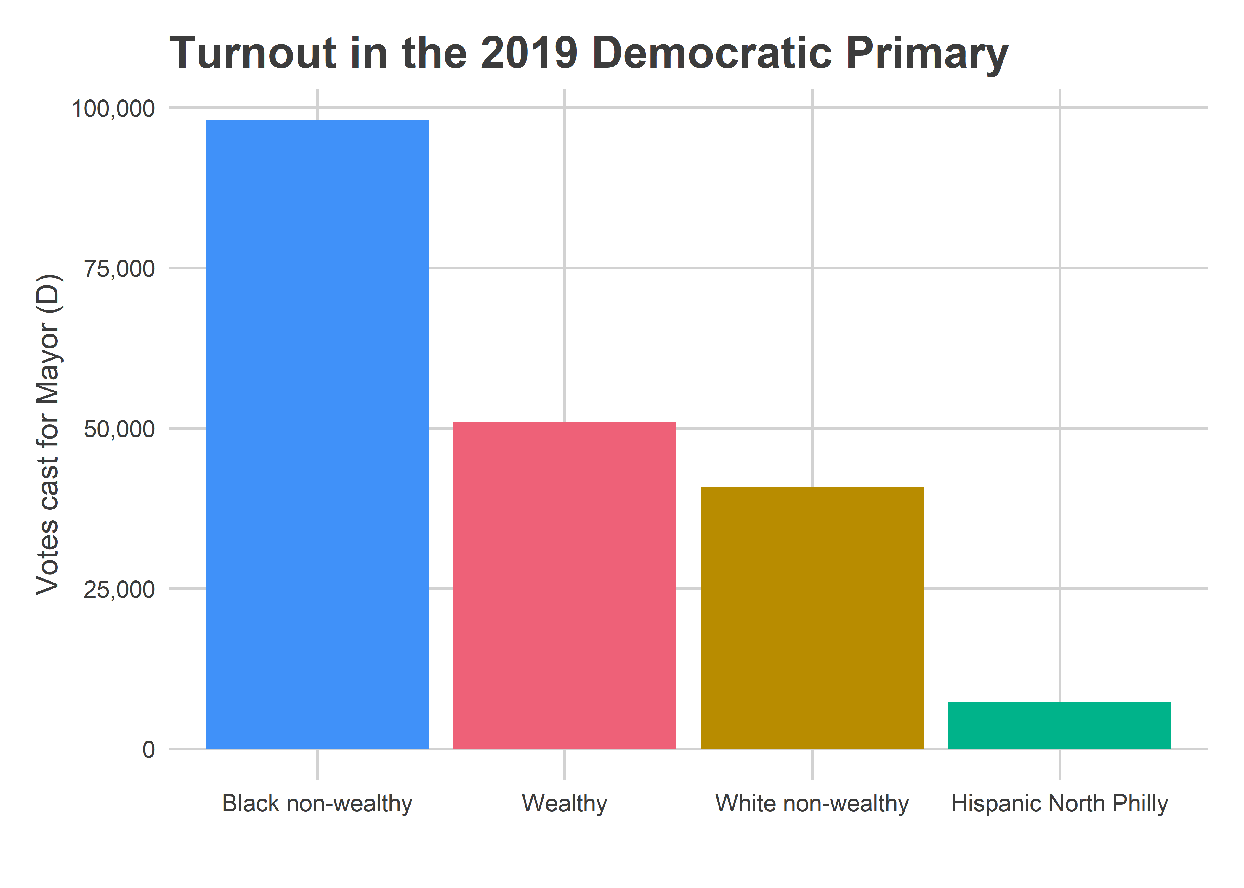
That represents a reversion of turnout share to 2014-2015-2016 levels, and not a repeat of the 2017-2018 levels. Black neighborhoods made up 50% of the vote, versus only 46% in 2017/2018; wealthy neighborhoods made up 26%, down from their 2017/2018 highs of 29/30%, but not quite down to the pre-2017 21%.
View code
format_name <- function(x){
  x <- gsub("(^\\s+)|(\\s+$)", "", x)
  x <- gsub("\\s+", " ", x)
  x <- gsub("\\b([A-Za-z])([A-Za-z]+)\\b", "\\U\\1\\L\\2", x, perl = TRUE)
  x <- gsub("(.*),.*", "\\1", x)
  x[x == "Almiron"] <- "Almirón"
  x[x == "Diberardinis"] <- "DiBerardinis"
  return(x)
}

df_with_cat <- df %>%
  filter(OFFICE == "COUNCIL AT LARGE-DEM") %>%
  left_join(
    divs_svd %>% as.data.frame() %>% select(warddiv, cat)
  ) %>%
  mutate(candidate = format_name(candidate))

df_past <- safe_load("../../data/processed_data/df_major_2019_05_14.Rda")
df_past<- df_past %>%
  filter(is_primary_office & election == "primary" & grepl("DEM", PARTY)) %>%
  mutate(warddiv = paste0(WARD19, "-", DIV19)) %>%
  group_by(warddiv, year) %>%
  summarise(turnout = sum(VOTES))

df_past <- bind_rows(df_past, turnout_19 %>% mutate(year = "2019"))

df_past <- df_past %>%
  left_join(df_with_cat %>% as.data.frame() %>% select(warddiv, cat))


turnout_by_cat <- df_past %>%
    group_by(year, cat) %>%
    summarise(turnout=sum(turnout)) %>%
    group_by(year) %>%
    mutate(prop = turnout/sum(turnout))

ggplot(
  turnout_by_cat,
  aes(x=year, y=prop*100, color = cat)
) +
  geom_line(aes(group=cat), size=2) +
  geom_point(data = turnout_by_cat %>% filter(year == 2019), size = 4) +
  annotate(
    geom="text",
    x = "2007",
    y = c(53, 16, 32, 8),
    label = names(cat_colors),
    color=cat_colors,
    fontface="bold"
  ) +
  scale_color_manual("", values=cat_colors, guide=FALSE) +
  scale_y_continuous("Percentage of total turnout") +
  scale_x_discrete("") +
  # facet_wrap(~year) +
  theme_sixtysix() %+replace%
  theme(axis.text.x = element_text(angle = 90)) +
  ggtitle("Turnout in Democratic Primaries by Neighborhood Group")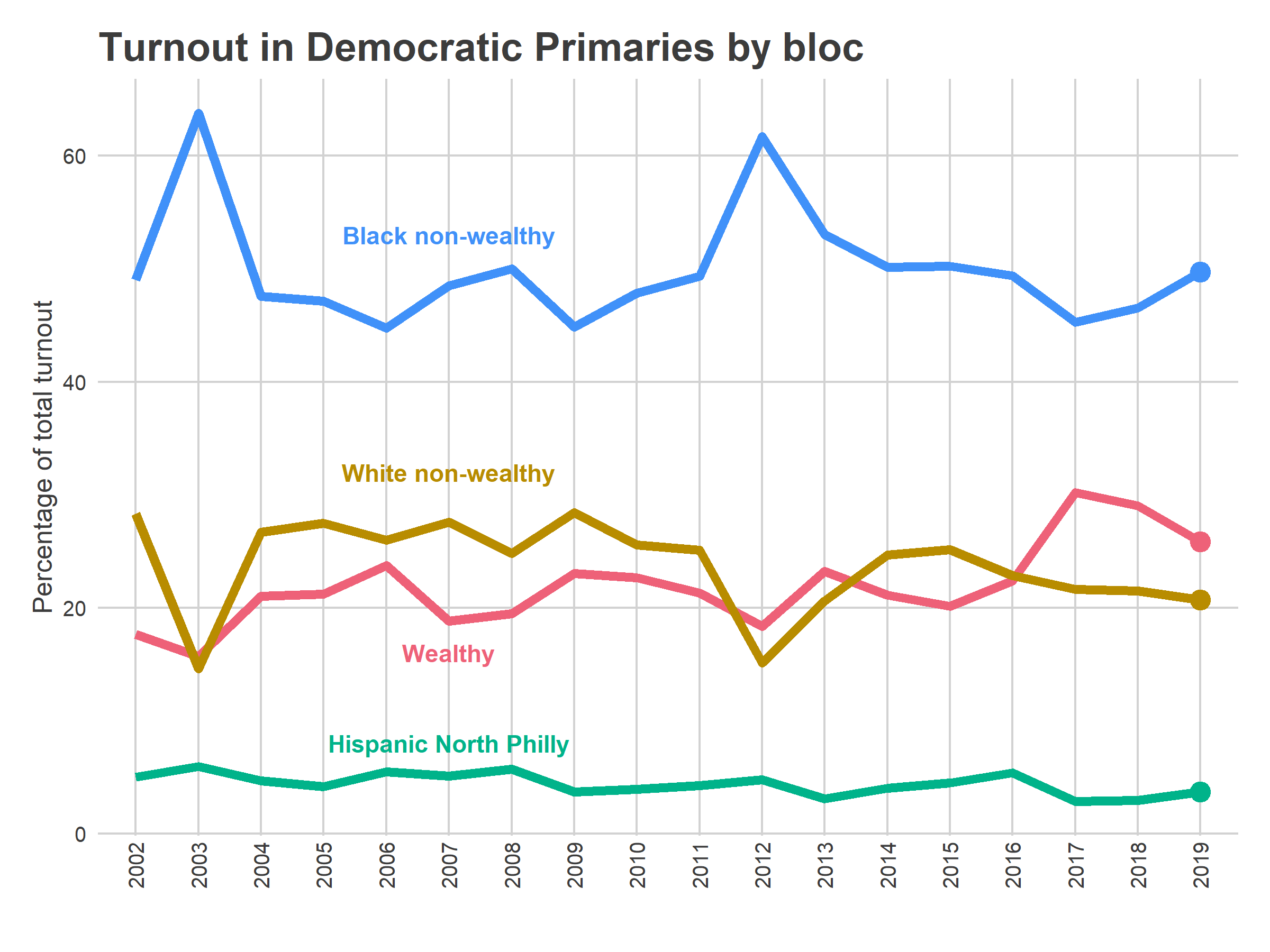
One important thing to remember is that Tuesday’s reversion in vote share happened amidst stunningly high turnout for an election with an incumbent Mayor; the story isn’t that turnout in the wealthy neighborhoods lagged, but that excitement in Black wards caught up.
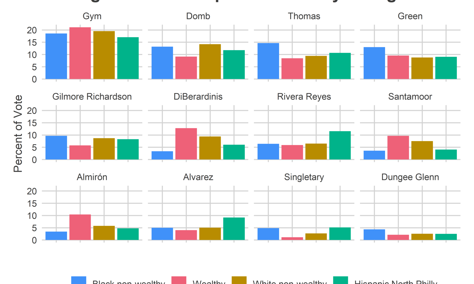
Now for the telling part: how did the candidates fare in each of these blocks?
View code
df_with_cat$candidate <- factor(
  df_with_cat$candidate,
  levels=unique(df_with_cat$candidate[order(df_with_cat$office_rank)])
)

ggplot(
  df_with_cat %>%
    filter(office_rank <= 12) %>%
    group_by(candidate, cat) %>%
    summarise(votes = sum(Vote_Count)) %>%
    group_by(cat) %>%
    mutate(pvote = 100 * votes / sum(votes)),
  aes(x=cat, y=pvote)
) +
  geom_bar(stat="identity", aes(fill=cat)) +
  scale_fill_manual("", values=c(light_blue, light_red, light_orange, light_green)) +
  facet_wrap(~candidate) +
  ylab("Percent of Vote") +
  xlab("") +
  theme_sixtysix() %+replace%
  theme(axis.text.x = element_blank()) +
  ggtitle("At Large Candidates' performance by voting bloc")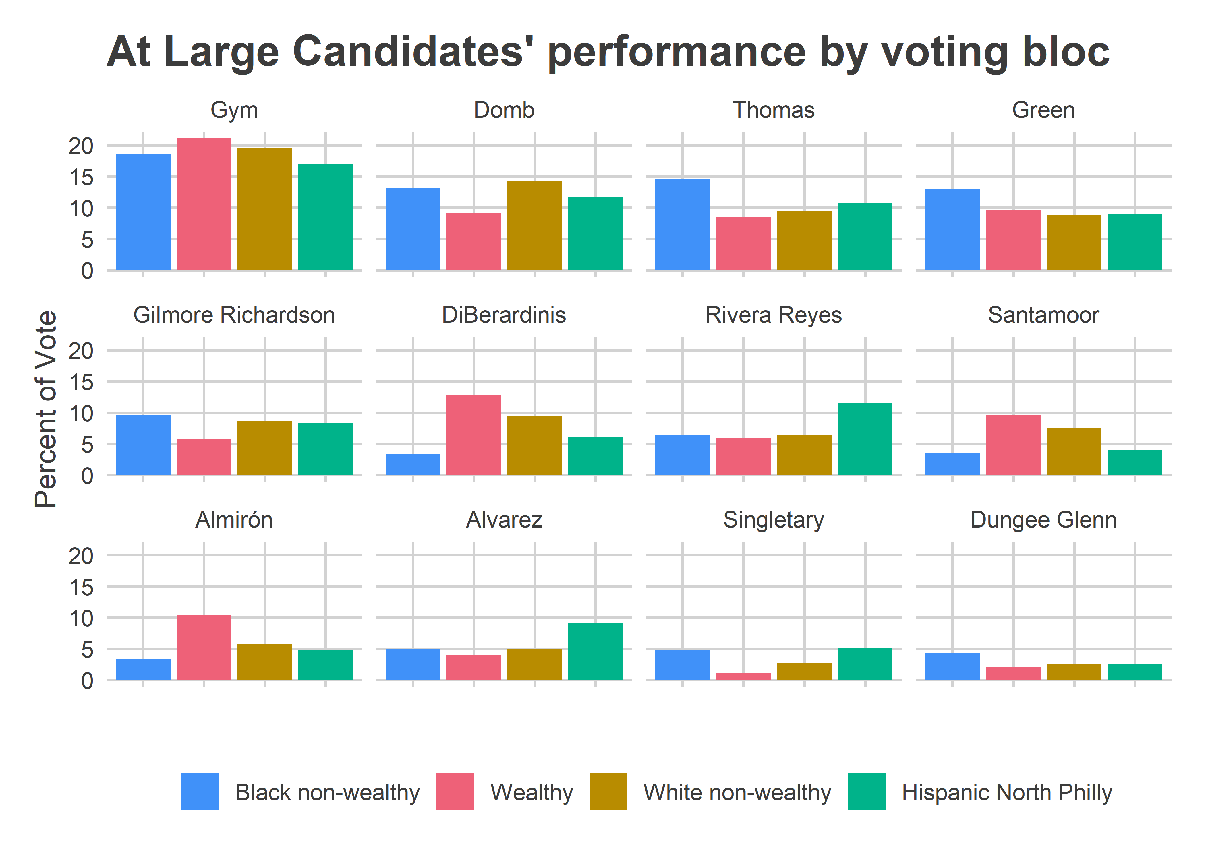
The two non-incumbents to win–Isaiah Thomas and Katherine Gilmore Richardson–did so with strong support from the Black neighborhoods. Their weakest results came from the wealthy ones. Meanwhile, three of the first four runners up have the exact same profile: DiBerardinis, Santamoor, and Almirón all did best in the wealthy wards and worst in the Black, non-wealthy ones. (Gym has a similar profile, but on steroids). Rivera Reyes and Alvarez dominated the Hispanic wards, but didn’t get enough traction elsewhere.
The Commissioners’ results divided the city even more clearly.
View code
commish_with_cat <- df %>%
  filter(OFFICE == "CITY COMMISSIONERS-DEM") %>%
  left_join(
    divs_svd %>% as.data.frame() %>% select(warddiv, cat)
  ) %>%
  mutate(candidate = format_name(candidate))

commish_with_cat$candidate <- factor(
  commish_with_cat$candidate,
  levels=unique(commish_with_cat$candidate[order(commish_with_cat$office_rank)])
)

ggplot(
  commish_with_cat %>%
    filter(office_rank <= 6) %>%
    group_by(candidate, cat) %>%
    summarise(votes = sum(Vote_Count)) %>%
    group_by(cat) %>%
    mutate(pvote = 100 * votes / sum(votes)),
  aes(x=cat, y=pvote)
) +
  geom_bar(stat="identity", aes(fill=cat)) +
  scale_fill_manual("", values=c(light_blue, light_red, light_orange, light_green)) +
  facet_wrap(~candidate) +
  ylab("Percent of Vote") +
  xlab("") +
  theme_sixtysix() %+replace%
  theme(axis.text.x = element_blank()) +
  ggtitle("Commissioners' performance by voting bloc")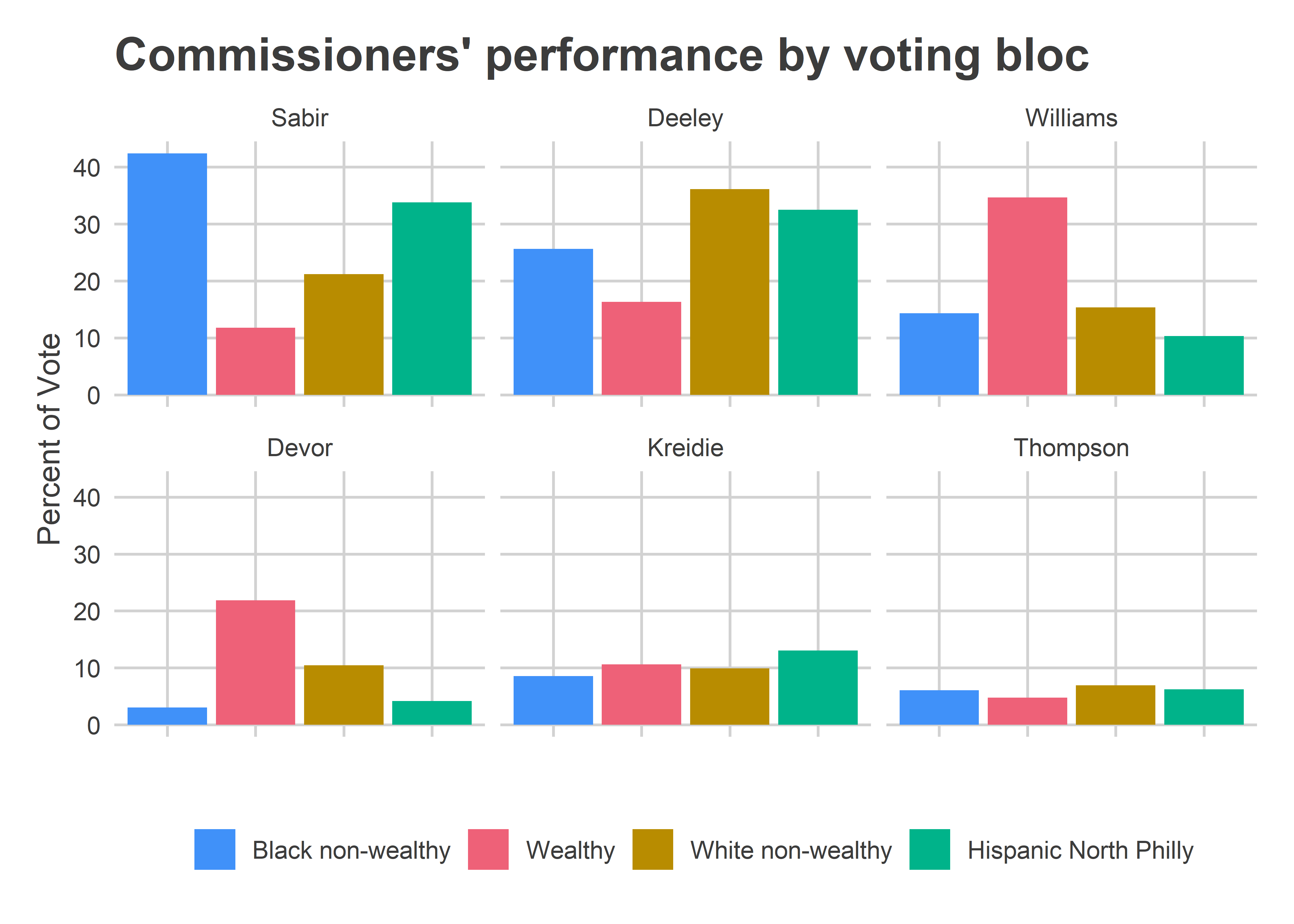
Sabir dominated Black and Hispanic neighborhoods, Deeley the White ones, and Williams and Devor the wealthy ones. Remember that Black non-wealthy divisions had 50% of the vote, White non-wealthy ones had 26%, wealthy 20%, and Hispanic 4%. With those shares, Sabir (25%) and Deeley (21%) won handily over Williams (17%) and Devor (8%).
The District 3 Surprise
The Wealthy voting bloc wasn’t entirely shut out on Tuesday. Gauthier won a surprise victory in West Philly’s 3rd District, with strong support from the wealthier divisions. (See the last post for the full maps).
In my pre-election analysis, I pointed out that recent increases in turnout made the University City vote much stronger (40% of the total district’s votes), and said Jamie would need to win 80% of the vote there, while winning 40% in the rest of the district. How did that fare?
Here are the categories for the district. Notice that these categories don’t perfectly match the West Philly/UCity divide from my pre-election post, because I created them in two different ways.
View code
d3 <- df %>%
  filter(OFFICE == "DISTRICT COUNCIL-3RD DISTRICT-DEM") %>%
  left_join(div_cats) %>%
  mutate(candidate = format_name(candidate))

d3_cat <- d3 %>%
  group_by(cat, candidate) %>%
  summarise(votes = sum(Vote_Count)) %>%
  group_by(cat) %>%
  mutate(
    turnout = sum(votes),
    pvote = votes / turnout
  )

d3_box <- divs %>%
  st_transform(4326) %>%
    inner_join(
      df %>%
        filter(OFFICE == "DISTRICT COUNCIL-3RD DISTRICT-DEM") %>%
        select(warddiv) %>% unique
  ) %>% st_bbox()
names(d3_box) <- c("left", "bottom", "right", "top")

wphilly_map <- ggmap::get_map(
  location = d3_box,
  maptype="toner-lite"
)

ggmap::ggmap(
  wphilly_map,
) +
  geom_sf(
    data = divs %>% st_transform(4326) %>%
      inner_join(
        df %>%
          filter(OFFICE == "DISTRICT COUNCIL-3RD DISTRICT-DEM") %>%
          select(warddiv) %>% unique
    ) %>%
      left_join(div_cats),
    inherit.aes=F,
    aes(fill=cat), color=NA,
    alpha = 0.7
  ) +
  theme_map_sixtysix() +
  scale_fill_manual("", values=cat_colors) +
  ggtitle(
    "District 3's Geographic Voting Blocs"
) 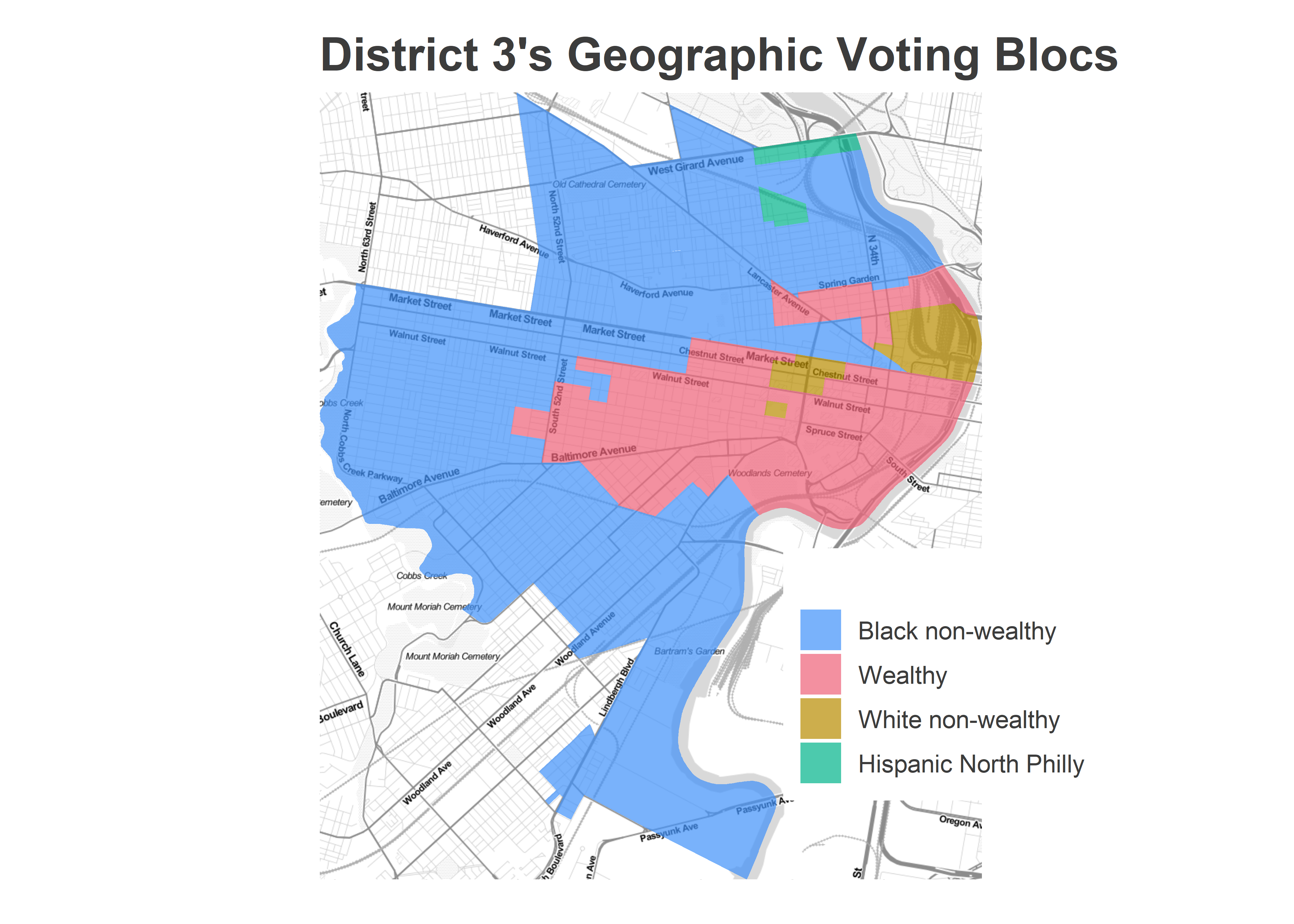
Turnout in the District strongly reverted back to 2015 levels. Black wards turned out strongly in the district, and the wealthy divisions only represented 27% of the vote. (White non-wealthy and Hispanic divisions didn’t make up enough votes to merit plotting.)
View code
ggplot(
  d3_cat %>% select(cat, turnout) %>% unique %>% filter(turnout > 200),
  aes(x=cat, y=turnout)
) +
  geom_bar(aes(fill = cat), color=NA, stat="identity") +
  theme_sixtysix() +
  scale_fill_manual("", values=cat_colors, guide=FALSE) +
  scale_y_continuous("Votes cast for Council District 3", labels=scales::comma) +
  xlab("") +
  ggtitle("Turnout in District 3")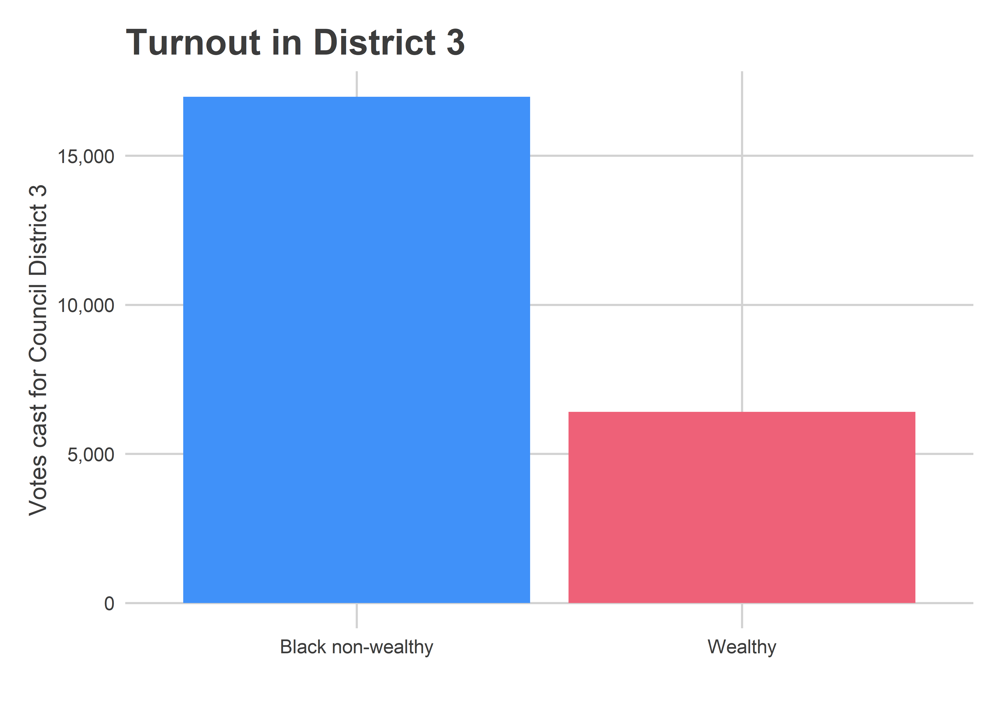
With that turnout like that, Jamie needed to do better than 40% in the Black districts, and she did.
View code
ggplot(
  d3_cat %>%
    filter(as.numeric(cat) %in% 1:2),
  aes(x=cat, y=100 * pvote)
) +
  geom_bar(stat="identity", aes(fill=cat)) +
  scale_fill_manual("", values=c(light_blue, light_red, light_orange, light_green)) +
  facet_wrap(~candidate) +
  ylab("Percent of Vote") +
  xlab("") +
  theme_sixtysix() %+replace%
  theme(axis.text.x = element_blank()) +
  ggtitle("At Large Candidates' performance by voting bloc")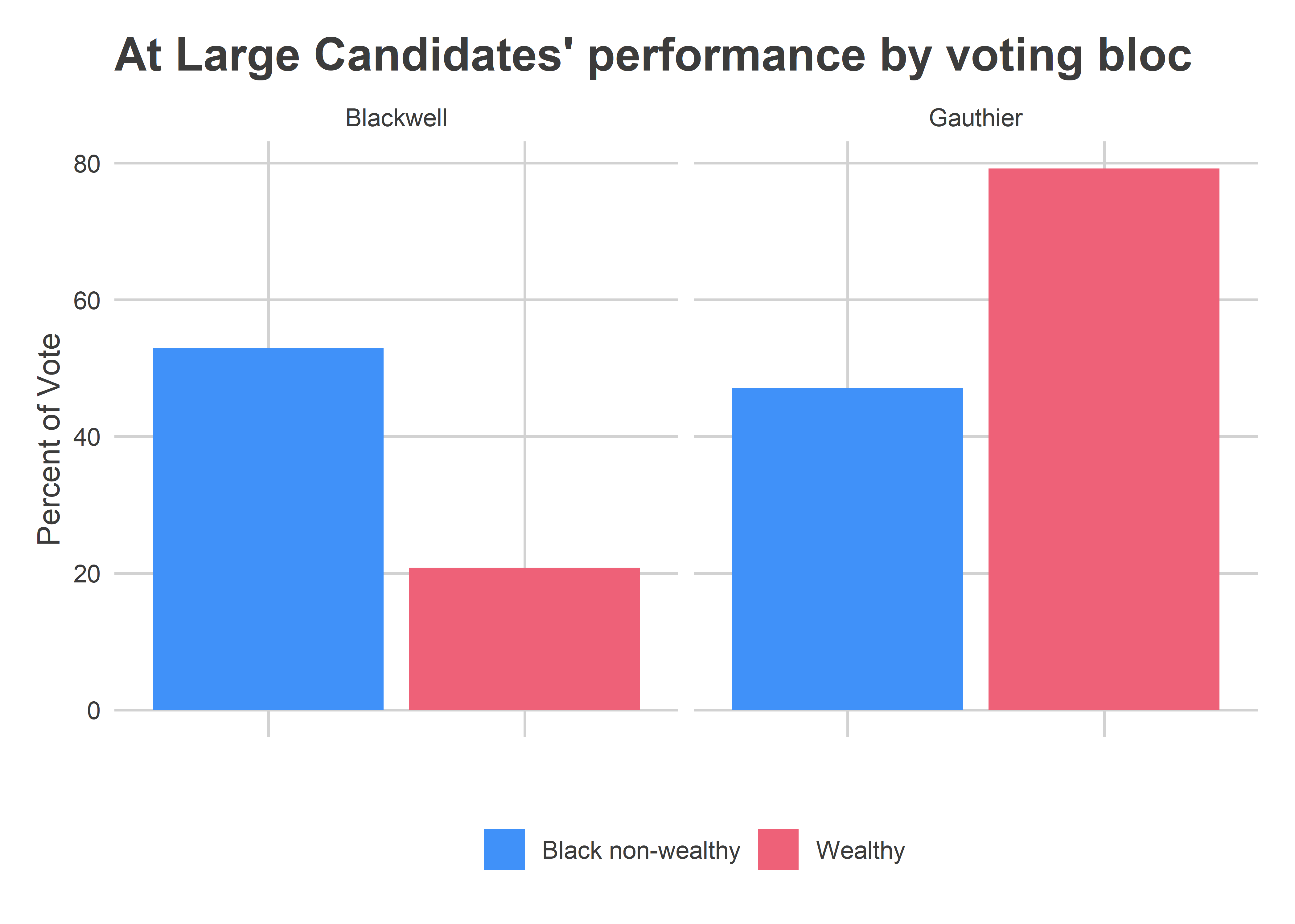
Gauthier got 79% of the vote in the wealthier divisions of University City, but managed a whopping 47% of the vote in the District’s Black divisions. That was enough for a decisive 56-44 win.
What are we to make of this?
City-wide, Black neighborhoods turned out stronger than they had the last two primaries, reasserting their electoral power and pushing their preferred candidates over the finish line. DiBerardinis came closest to recreating Gym’s 2015 path to victory, but finished just short. Even in West Philly’s surprise upset, Jamie Gauthier’s win was largely enabled by surprising strength in the high-turnout West, Southwest, and Mantua divisions.
Coming Up
I’ll be looking at more aspects of the race in the weeks to come, including a post tentatively titled: “The Election Needle: Was it lucky? Or psychic?”. Stay tuned!
One Reply to “How did they win? A look at 2019’s Voting Blocs.”
Comments are closed.