Turnout, Race, and Income

Last week, I looked at Philadelphia’s turnout boom. What I didn’t talk about was the unmistakable race and class story in which neighborhoods saw surging turnout, and which didn’t. The neighborhoods surrounding Center City–University City, Fishtown, Passyunk–saw the greatest increases in turnout over the prior District Attorney election in 2013, with many divisions *tripling* their votes. Those neighborhoods are also where the most gentrification has recently occurred. However, turnout changed across the city, and the story is not as simple as “gentrification leads to more voting”.

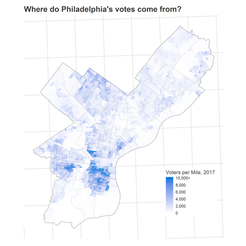
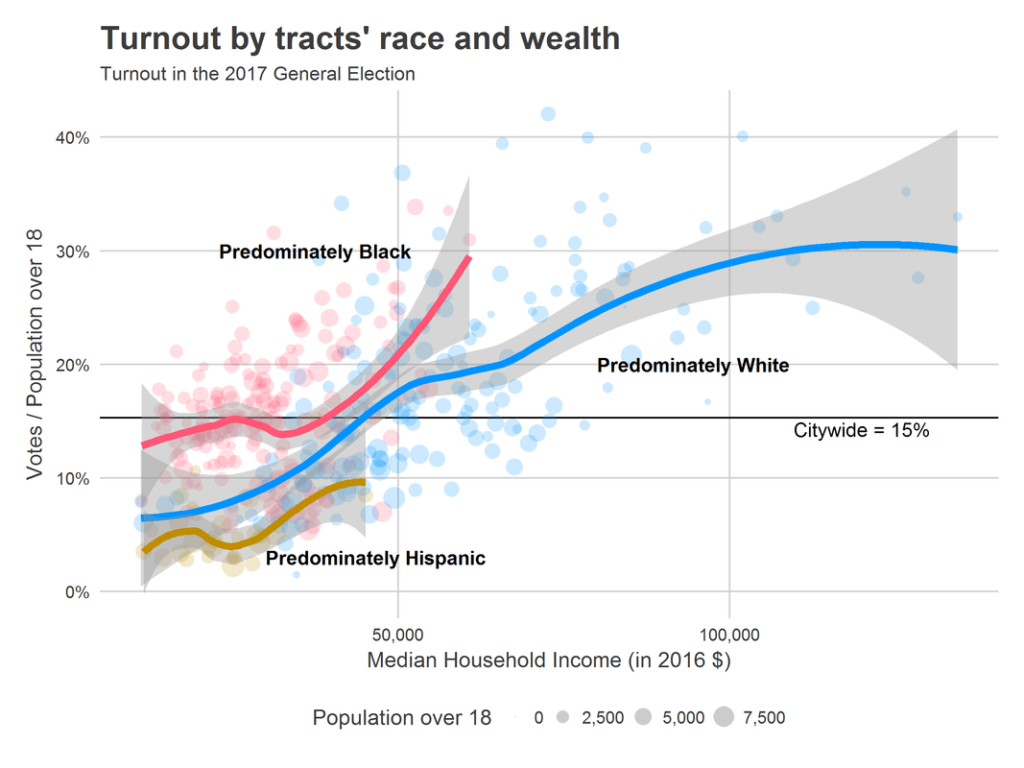
Philadelphian voters, by race and income
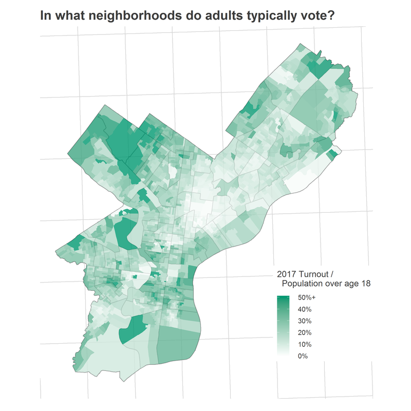
First, let’s look at the racial and class dynamics of voting in the 2017 election. We don’t have data on individual voters, so I map divisions to census tracts, and assign votes to racial/class groups based on their tract-level representation among the over-18 population. For example, a tract that was 60% Black would be apportioned 60% of the votes in that tract.[1] This will almost certainly understate the differences between groups: it assumes that groups within a tract vote at the same rates even if they vote at different rates across the city. All of the populations I use are five-year estimates from the American Community Survey (annually conducted by the Census Bureau), so the most recent data is from 2011 – 2015. First, let’s look at the number of voters of each race.

White non-Hispanic people make up more of the voting population than the overall over-18 population. The least represented are Hispanic voters. Some of this is likely eligibility to vote–I’m using the total population over 18 rather than registered voters, which I explained last week–but much of it isn’t: the gap was almost representative in the presidential election of 2016.
Class plays a role in these patterns. Below, I plot tracts’ turnout versus their median income. Wealthier tracts clearly vote at higher rates. The citywide rate was 15% (this is lower than the official turnout, which uses registered voters as the denominator). The turnout among tracts with median incomes over $50,000 was 22%. Among tracts with median incomes below $50,000, turnout was 13%.
However, the breakdown by race within this income plot is nuanced. Below is the same plot, with tracts colored by their predominant race (for example, a 60% Hispanic tract would be colored orange). Within racial groups, tracts with higher incomes vote at higher rates, but there are also differences across racial groups.
White tracts have the highest turnout overall, but among tracts with similar incomes, Black tracts have higher turnout. Hispanic tracts lag both.

Changes in turnout and race
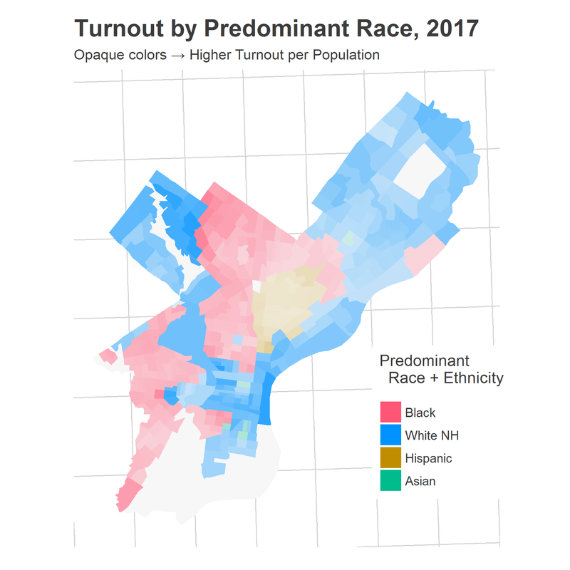
These turnouts are not uniformly spread across the city. Among White tracts, there are large differences in turnout. Ditto among Black tracts Below maps the turnout of tracts in the city for 2017 and for 2009, where tracts have been colored by their predominant race.

Among Black tracts in 2017, Germantown, Stenton, and Point Breeze have the highest turnout rates.  University City, Mount Airy, and Center City have high rates among White tracts. The highest rate among Hispanic tracts is in Kensington, at the southern tip of Hispanic North Philly.

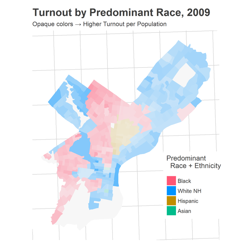
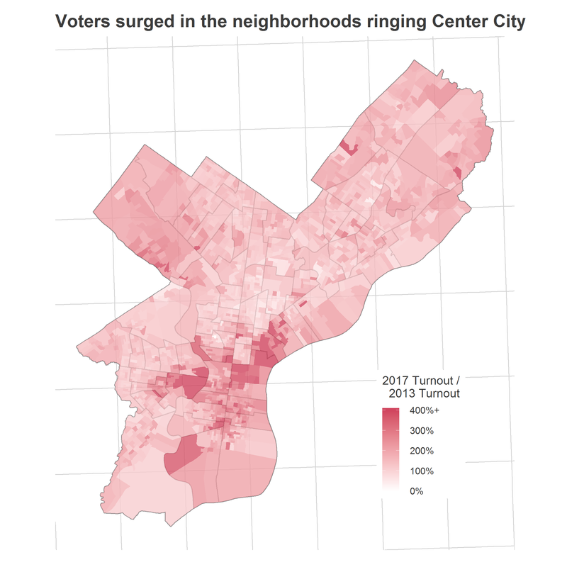
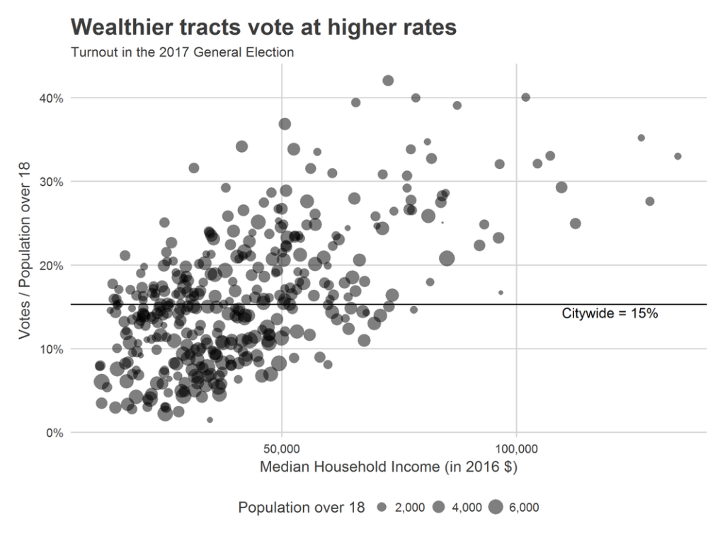
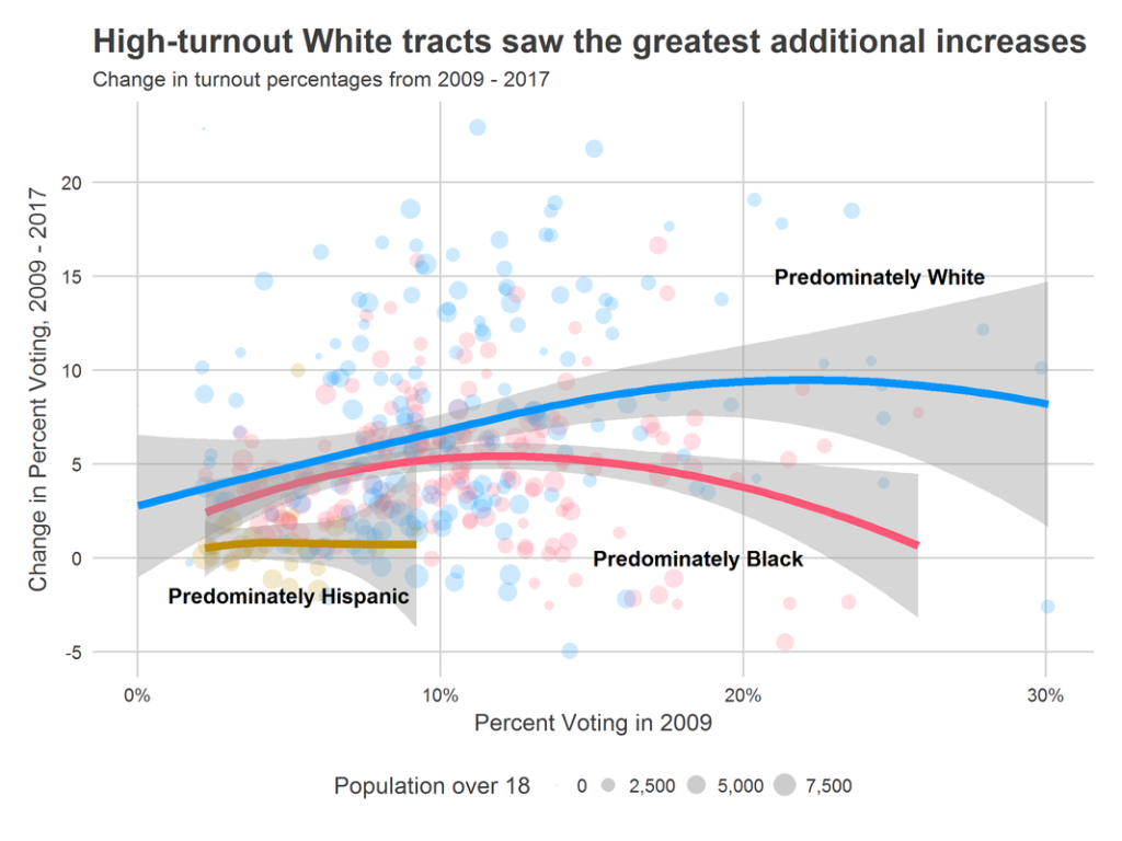
Between 2009 and 2017, citywide turnout increased from 9.6% of the over-18 population voting to 15.3%. Comparing the maps above makes clear that this increase did not happen uniformly, but instead by the rich getting richer: already-high-turnout tracts also had the largest increases in turnout. Below is a scatter plot of the same data. The x-axis is tracts’ turnout in 2009, while the y-axis is the change in turnout from 2009 to 2017. Points are colored by their predominant race in 2015.

The tracts that saw the greatest increase in turnout were predominately White tracts that were already voting at the highest rates in 2009. The slope among predominately-Black tracts is much shallower–all tracts saw turnout increase by about 5 percentage points–while the slope is non-existent among predominately Hispanic tracts. A note of caution: the background points show that these trends capture little of the variation among tracts.

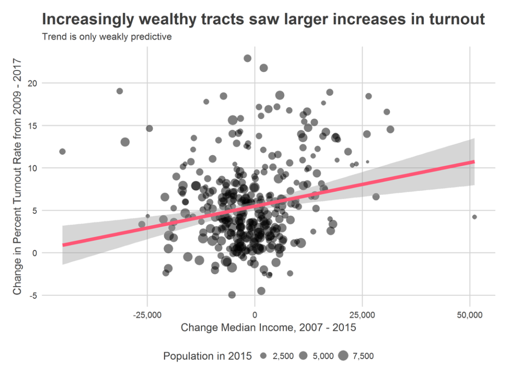
Look back at the map. Notice that many of the highest turnout regions occur along racial boundaries. In past research, I’ve argued that these boundaries are where gentrification typically happens. Part of the high turnout along boundaries may be evidence that crudely shading tracts by the predominant race hides changing populations within them, and that the gentrifiers in University City, Brewerytown, and Kensington may be disproportionately voting. That certainly matches anecdotal evidence of who was energized by the Krasner/Rhynhart new blood in 2017. ​

There is certainly evidence that tracts with higher increases in income saw higher increases in turnout. The pattern is only weakly predictive, however. It wasn’t every newly-wealthy neighborhood that increased turnout. Cedar Park, Fishtown, Passyunk, and Brewerytown certainly did, but there are other tracts where incomes increased but voting didn’t; the tracts ringing Center City are different in type.

A certain group of Philadelphians is particularly engaged
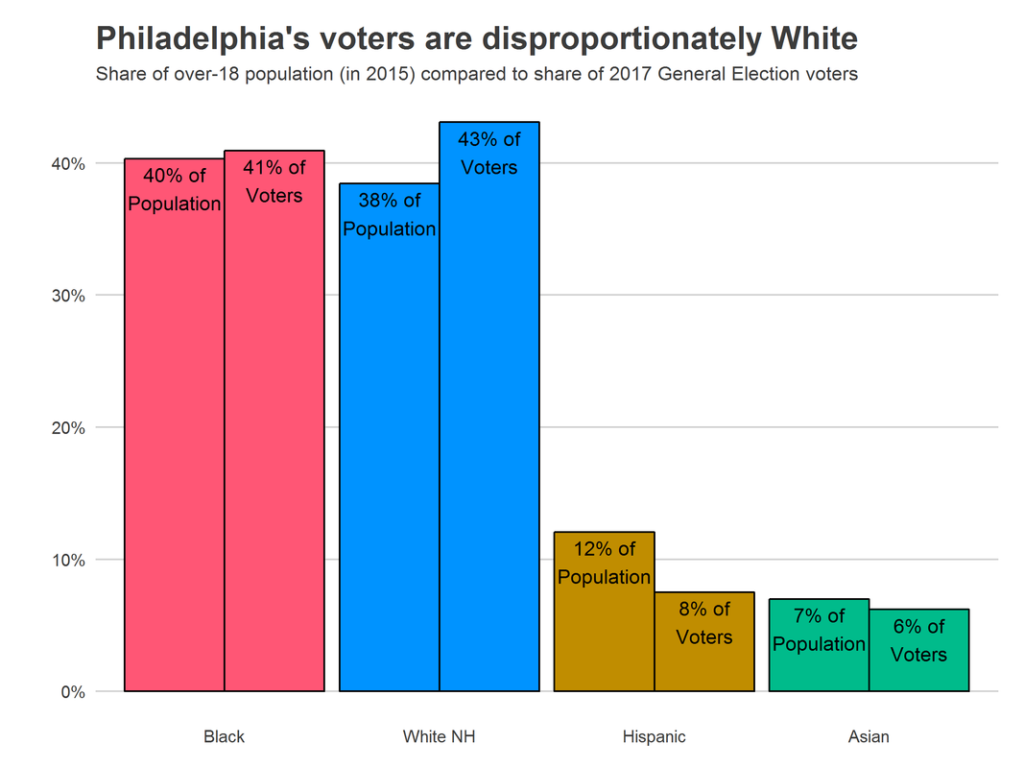
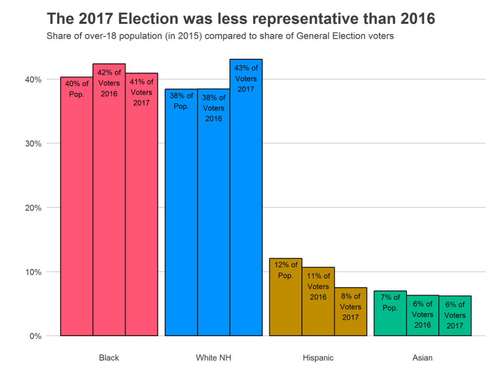
The recent turnout surge occurred predominately among wealthier White tracts that already were voting at high rates. Black tracts in Philadelphia saw their votes increase at about similar rates to the city as a whole, while Hispanic votes fell disproportionately from 2016 highs.

The energy of 2017 is most extreme in the neighborhoods ringing Center City and in the Northwest. Philadelphia’s role in the 2018 Governor’s race may depend on energizing the *rest* of the city. More on that next week.

Questions? Comments? Ideas for future posts?
Leave a comment below!
Footnotes
[1] Assuming that e.g. higher voting in predominately Black wards implies that Black residents are more likely to vote suffers from the ecological fallacy. It may be instead true that the non-Black residents in those divisions are themselves more likely to vote. In fact, there may be good reason to suspect this in the predominately-Black, gentrifying neighborhoods. But this is the best data we have.

Philadelphia’s Turnout Boom

For the very first post to Sixty-Six Wards, I thought I’d recap turnout in Philadelphia’s most recent election. In a city where general elections aren’t competitive, turnout is the single most important variable for the future: will enough Philadelphia voters cast ballots to carry the state in 2018?

First, let’s look at what happened on November 7th.

Philadelphia turnout *surged*. Some 198,905 ballots were cast in the race for District Attorney, compared to 110,351 in 2013. That’s an 80% increase in voters, after a 156% increase in May’s Primary. Pessimists will point out that 199 thousand voters is still only 20% of Philadelphia’s registered voters, but movement like this is impressive. (As of now, 2017 turnout only includes machine records, so this number could increase by another two to five thousand).

This year’s election was the District Attorney race out of the four-year cycle, which historically has the lowest  turnout. Presidential elections have the highest turnout, predictably, followed by Governor, Mayor, and then D.A.

One interesting aspect of this plot is how reactive voters are to competitiveness of a race. Presidential and Gubernatorial races are always competitive in the general election, and the turnout for those races is highest and flat, with small excitement fluctuations. D.A. turnout is flat and low, garnering little attention (or was, until this year). The Mayoral races shows the most variance. The fewest voters showed up in 2011, for Michael Nutter’s easy reelection. The most voted in 2003. That dramatic spike is easily explained: Sam Katz.
​
Compare the Generals to the Primaries:
Primary turnout is volatile. Every time a race has a competitive democratic primary, turnout surges. President, Mayor, and Governor all show clear incumbent valleys. It appears voters actually behave quite rationally: when races aren’t competitive they spend their days doing other things. (Of course, this could also be a function of a lack of awareness and no get-out-the-vote in non-competitive years).

This year saw a competitive D.A.’s primary and a general election that was closer than usual. Still, 2017’s turnout, in both plots, represents larger swings than any D.A. swings we’ve recently seen. Something is fundamentally different.

The ring around Center City is driving the turnout boom
​​Voting across the city was up 80% from 2013. But many of the divisions surrounding Center City saw turnout *triple*. University City, Northern Liberties, Fishtown, and Point Breeze/Girard Estates are marked hot spots on the map. [An interactive version of all maps is available at the bottom of this post.]

These neighborhoods are also the neighborhoods that have gentrified the most dramatically since 2013. I’ll explore the interaction of race, class, and Philadelphia’s electoral map in an upcoming post.

​What about the other wealthy neighborhoods? They’ve been voting all along, and just didn’t have much room to grow. Center City and Chestnut Hill already had the highest turnout rates in the city. Below is a map of the percentage of all residents over age 18 that voted (I prefer this to registered voters, because it bakes in inequities in registration and eligibility, and skirts the challenges of keeping rolls up to date).

Chestnut Hill and Center City shine, along with parts of South Philly and the Northeast. But look at the neighborhoods that don’t vote, too: Penn and Drexel’s campuses in University City aren’t surprising, but the swath of North Philly with rates all under 8% exactly matches the predominately Hispanic neighborhoods East of Broad. Again, more on race, ethnicity, and income to come.

A final way to map electoral turnout is by voters per mile. This represents where the voters actually are, down-scaling neighborhoods that have high turnout rates​ but not many residents.

If a candidate wants to hit the most voters, she should hit University City, Fitler Square, South Philly, and Fairmount. The darker region of Northwest Philly are Wards 50 and 10, which are notoriously well-organized politically.

Where we go from here
Turnout surged this year, and in a way that appears to be fundamentally different from anything we’ve recently seen. In upcoming posts, I’ll continue to explore this fascinating time:
– How does Philadelphia’s turnout intersect with race and class, and what does this mean for our governance?
– Could this surge be permanent?
– In what other ways is the ring around Center City, with booming votes, politically different?
– What turnout does Philadelphia need to carry the state in 2018?

Questions? Comments? Ideas? Comment below!

Appendix: Maps!