The State House Model did really well. But it was broken.

Before November’s election, I published a prediction of the Pennsylvania General Assembly Lower House: Democrats would win on average 101.5 seats (half of the 203), and were slight favorites (53%) to win the majority. Then I found a bug, and published an updated prediction: Democrats would win 96 seats on average (95% confidence interval from 88 to 104), and had only a 13% chance of taking the house. This prediction, while still giving Republicans the majority, represented an average 14 seat pickup for Democrats from 2016.

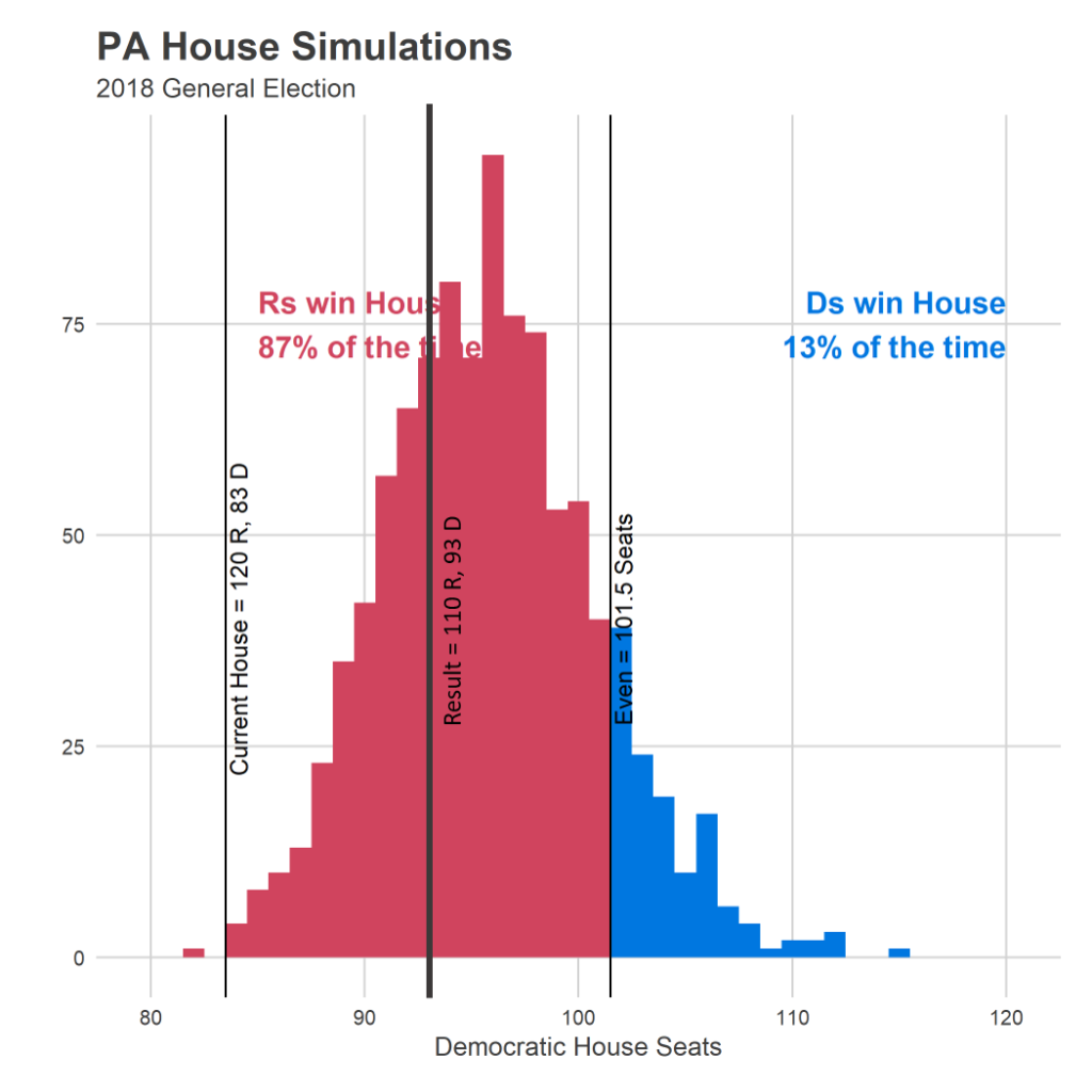
That prediction ended up being correct: Democrats currently have the lead in 93 seats, right in the meat of the distribution.

But as I dug into the predictions, seat-by-seat, it looked like there were a number of seats that I got wildly wrong. And I’ve finally decided that the model had another bug; probably one that I introduced in the fix to the first one. In this post I’ll outline what it was, and what I think the high-level modelling lessons are for next time. 

Where the model did well, and where it didn’t

The mistake ended up being in the exact opposite of the fix I implemented: candidates in races with no incumbents.

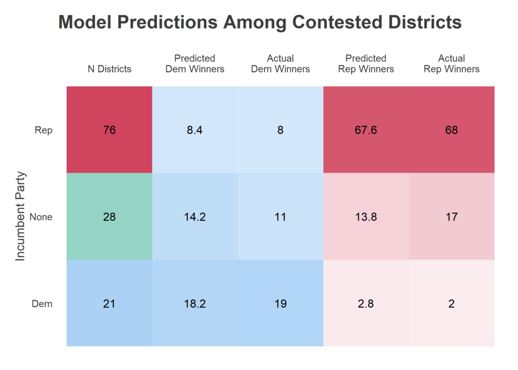
The State House has 203 seats. This year, there were 23 uncontested Republicans and 55 uncontested Democrats. I got all of them right 😎. The party imbalance in uncontested seats was actually unprecedented in at least the last two decades, they’re usually about even. Among the 125 contested races, 21 had a Democratic incumbent, 76 a Republican incumbent, and 28 no incumbent. I was a little bit worried this new imbalance meant that the process of choosing which seats to contest had changed, and that past results in contested races would be different from this year. Perhaps Democrats were contesting harder seats, and would win a lower percentage of them than in the past. That didn’t prove true.

The aggregate relationship between my predictions and the results look good. I got the number of incumbents that would lose, both Democrat and Republican right. In races without incumbents, I predicted an even split of 14 Democrats and 14 Republicans, and the final result of 17 R – 11 D might seem… ok? Within the range of error, as we saw in the histogram above. But the scatterplot tells a different story.

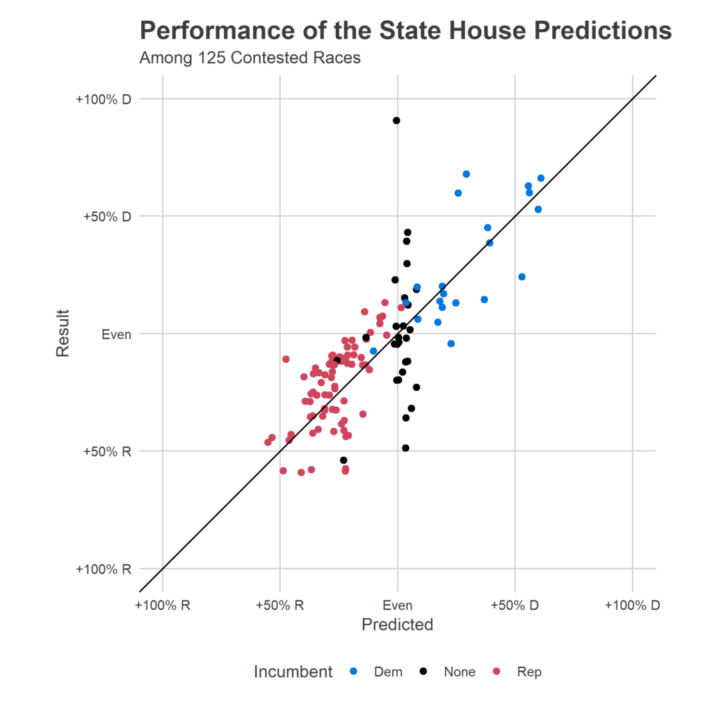
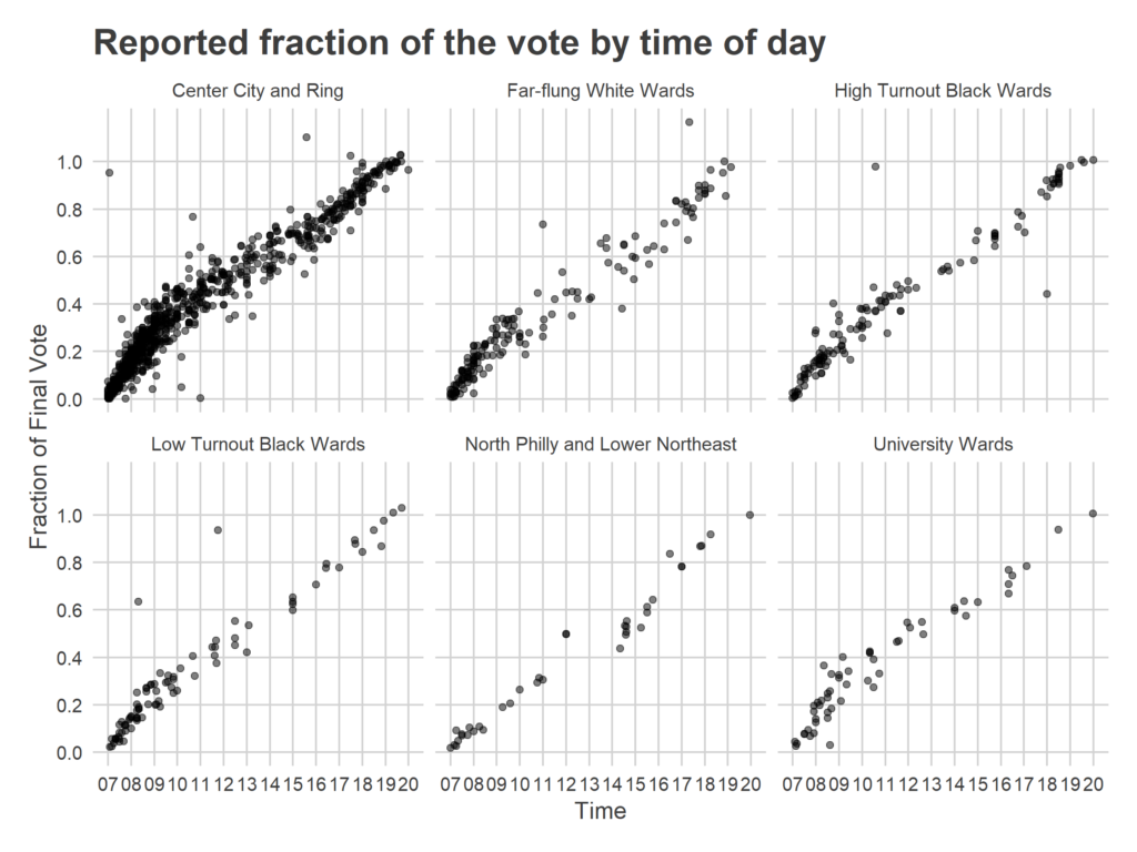
Above is a scatterplot of my predicted outcome (the X axis) versus the actual outcome (the Y axis). Perfect predictions would be along the 45 degree line. Points are colored by the party of the incumbent (if there was one). The blue dots and the red dots look fine; my model actually expected any given point to be centered around this line, plus/minus 20 points, so that distribution was exactly expected.  But black dots look horribly wrong. Among those 28 races without incumbents,  I predicted all but three to be close contests, and missed many of them wildly. (That top black dot, for example, was Philadelphia’s 181, where I predicted Malcolm Kenyatta (D) slightly losing to Milton Street (R). That was wrong, to put it mildly. Kenyatta won 95% of the vote.)

What happened? My new model specification, done in haste to fix the first bug, imposed a faulty logic. It forced the past Presidential races to carry the same information about races without incumbents as races with, even though races with incumbents had other information. I should have allowed the model to fall back on district partisanship when it didn’t have incumbent results, but the equivalent of a modelling typo didn’t allow that. Instead, all of these predictions ended up at a bland, basically even race, because the model couldn’t use the right information to differentiate them. My overall house prediction ended up being good only because a few 28 of the total 203 districts were affected, and getting three too many wrong didn’t make the topline look too bad. But it was a bug.

Modelling Takeaways
I’m new to this world of publishing predictive models based on limited datasets and with severe time constraints (I can’t spend the months on a model that I would in grad school or at work). What are the lessons of how to build useful models under these constraints?

Lesson 1: Go through every single prediction. I never looked at District 181. If I had seen that prediction, I would have realized something was terribly wrong. Instead, I looked at the aggregate predictions (similar to the table, and things looked okay enough). Next time, I’ll force myself to go through every single prediction (or a large enough sample of predictions if there are too many). When I tried to hand-pick sanity checks based on my gut, I happened to not choose “a race with no incumbents, but which had an incumbent for decades, and which voted for Clinton at over 85%”.

Lesson 2: Prefer clarity of the model’s calculations over flexibility. I fell into the trap of trying to specify the full model in a single linear form. Through generous use of interactions, I thought I would allow the model flexibility for it to identify different relationships between historic presidential races and length of incumbency. This would have been correct, if I had implemented it bug-free. But I happened to leave out an important three-way interaction. If I had fit separate models for different classes of races–perhaps allowing the estimates to be correlated across models–I would have immediately noticed the differences.

Lesson 2b: I actually learned this extension to Rule 2 in the process of fitting, but the post-hoc assessment bangs it home: when you have good information, the model can be quite simple. In this case, the final predictions did well even with the bug because the aggregate result was really pretty easy to predict given three valuable pieces of information: (a) incumbency, (b) past state house results, and (c) FiveThirtyEight’s Congressional predictions. The last was vital: it’s a high-quality signal about the overall sentiment of this year’s election, which is the biggest factor after each district’s partisanship. A model that used only these three data points and then correctly estimated districts’ correlated errors around those trends would have gotten this election spot on.

Predictions will be back
For better or worse, I’ve convinced myself that this project is actually possible to do well, and I’m going to take another stab at it in upcoming elections. First up is May’s Court of Common Pleas election. These judges are easy to predict: nobody knows anything about the candidates, so you can nail it with just structural factors. More on that later!

When do Philadelphians Vote? Midterm General Election Edition

On November 6, 2018, we (i.e. all of you readers out there) collectively generated 1,341 turnout data points to the Sixty-Six Wards Live Turnout Tracker. That made my modelling effort pretty easy: we missed the true turnout of 548,000 by only 7,000 votes! (This is almost too good… More thoughts on that in a later post.)

One novel feature of this dataset is that we can look at when through the day Philadelphians voted. I did this back in the Primary, and my surprising finding was that turnout was relatively flat. While there were before- and after-work surges, they weren’t nearly as pronounced as I had expected.

That was a midterm primary. How about this time, in the record-setting general? Two weeks ago we saw an unprecedented, energized electorate, and it looks like their time-of-day voting pattern was different too.

Analysis
Estimating the overall pattern requires some statistics. Each data submission contains three pieces of information: precinct, time of day, and the cumulative votes at that precinct. Here, I fit something different than my live election-day model, since I have the true final results. I assume that between hours h-1 and h, a fraction f(h) of the city’s population votes, and each precinct as a fraction that randomly deviates from that distribution.

For division d, the fraction of the final votes that have been achieved by hour h is given by
v_d(0) = 0
v_d(h) = v_d(h-1) + f(h) + f_d(h)
where f(h) is the city-wide precinct average fraction (I use an improper, flat prior), and the deviations are drawn from a normal distribution with an unknown standard deviation sigma_dev.

Because observations don’t occur only on the hour, I use linear interpolation in between, so a data submission x_i, which occurs in division d at time h + t with t between 0 and 1, is modeled as
x_i ~ student_t(1, mean = (1-t) v_d(h) + t v_d(h+1), sd = sd_error),
with sd_error unknown.

The result is that I estimate the fraction of the votes cast in a given hour, f(h), around which divisions randomly deviate. Notice that this isn’t exactly the citywide fraction of votes if those deviations from the mean are correlated with overall turnout (if, for example, high-turnout wards also are more likely to vote before 9am), but the coverage of submissions is heavily skewed towards high-turnout wards, so you should read these results as mainly pertaining to high-turnout wards anyway (see below for more). I also don’t account for the fact that needing to add up to 100% of the vote induces correlations in the estimates but… um… this will be fine.

​When Philadelphia Votes
The results: In this election, we saw strong before- and after-work volume, with 26.9% of votes coming before 9am [95% CI: (25.8, 28.1)] and 27.4% of votes coming between 4 and 7pm (24.7 , 30.1).

The overall excitement of the election appears to have largely manifested in the morning, when reports of lines (in a midterm!) came from across the city. There is another surge from 4-7, as people leave work, but once again voting from 7-8 was quiet (without the thunderstorm, this time).

Do neighborhoods vote differently?
It seems likely that residents of different neighborhoods would vote at different times of the day. Unfortunately, the (albeit humbling) participation in the Turnout Tracker came disproportionately from Whiter, wealthier wards, and I don’t have great data to identify differences between groups. But here’s a tentative stab at it.

I’ve manually divided wards into six groups based on their overall turnout rates, their correlated voting patterns across the last 16 elections, and racial demographics. (Any categorization is sure to upset people, so I’m preemptively sorry. But these wards appear to vote similarly, and I’ve chosen clear names over euphemistic ones.)

Below is a plot of the raw data submissions, divided by the eventual final votes, by ward group. The difference between groups is not especially pronounced, but it appears that Center City and Ring did vote disproportionately before 9am  (along with Manayunk, which behaves like them). [Notice that in the raw submissions, some of the fractions are over 1, meaning that a submitted voter number was higher than the final vote count.]
To estimate the fraction of the vote at exactly 9am, I filter all of the data to between 8 and 10am, drop the obvious outliers, and fit a simple linear model of fraction on  time for each group. The estimated fractions at 9am are below.
Ward Group
​Percent Voted Before 9am (95% MOE)
Center City and Ring
27.8 +/- 0.7
Far-Flung White Wards
24.0 +/- 1.3
High-Turnout Black Wards
23.7 +/- ​1.7
Low-Turnout Black Wards
23.7 +/- ​1.5
North Philly and Lower Northeast
16.6 +/- ​1.1
University Wards
28.2 +/- ​4.7
Nearly 28% of the Center City and Ring Wards’ votes came before 9am, which was statistically significantly higher than all other groups except for the Universities (which had large uncertainty). The other wards hovered around 24% by 9am, except for the very low-turnout North Philly and Lower Northeast wards which only had 17% of their final turnout by that hour.

Energy means early voting?
It certainly appears that in this highly energetic election, a disproportionate amount of votes came in the morning. This could mean that the population that gets energized is more likely to vote in the morning (perhaps workers, as opposed to retirees), or that in excited elections, voters want to ensure their vote in the morning.

In May 2019, the Live Election Tracker will be back. And at that point, we’ll have three whole datasets to be able to evaluate time of day data! Then we’ll really be able to say something. Before then, I’ve got a number of posts in the pipeline. Next up: evaluating my various models, some better than others. Stay tuned!