I developed and tuned the model without having any data that would look like what we actually got on election day: I had final vote counts by division, but not the time-series—how many people voted by 8am? How many by 3pm?—that I would need to use on election day. Now that I have that, let’s evaluate how the model worked.
Here was my last prediction from Tuesday night, for Democratic turnout.
It’s 8pm. Polls are closed.
I’ll leave the form open so late voters can still submit (please do! https://t.co/mUF9uEf3sL)
Current estimate is that a whopping *193,855* voters voted. (margin of error: 177,550 – 210,199)
617 of you have submitted information, from *52* wards.
— Sixty-Six Wards (@sixtysixwards) May 16, 2018
So what happened? I’ve dug into the model and broken the results into three categories: the good, the bad, and the really really stupid.
First, let me remind you what the model was. Residents across the city submitted three data points: their Ward+Division, the time of day, and the voter number at their precinct.
I modeled the cumulative votes V for submission i, in Division d, at time t, using the log scale:
log(V_idt) = alpha_t + beta_d + e_i
This appears easy to fit, but the sparsity of the data makes it quite complicated. We don’t observe every division at every time, obviously, so need to borrow information across data points. I used an E-M style algorithm with following parametrizations:
alpha_t ~ loess(t)
beta_d ~ MultiVariateNormal(mu, Sigma)
e_i ~ normal(0, sigma_e)
This model implicitly assumes that all divisions have the same distribution of votes through the day. For example, while divisions can have different vote totals overall, if one division has 30% of its votes by 9am, then all do (plus or minus noise). I did not enforce that the time series should be non-decreasing, though obviously it must be. Instead, I figured the data would largely corroborate that fact. This does mean that the estimated trend can in general go down, due to noise when the true trend is flat. Eh, it largely works.
As for the divisions, mu is forced to have mean 0, so the overall level of voting is absorbed into alpha. I use mu and Sigma estimated on the historic final turnout counts of each division, and the covariance matrix of that turnout. I discuss what that covariance looks like here.
The final turnout is estimated as exp(alpha) * sum(exp(beta_d)), ignoring the small correction for asymmetry in exp(e_i).
Good: your participation.
“hey jonathan, how many people do you think you need to submit their voter number to make good estimates?”
“i dunno… fifty? i’d be floored if i got a hundred.”
134 Philadelphians have shared their turnout. As of 10:35.https://t.co/Cat1vDtwnZ
— Jonathan Tannen□ (@jtannen215) May 15, 2018
[Note: I’m including some straggler submissions that came in through the rest of the night, which is why this result and what’s below don’t match the night-of results exactly. None of this changes the substantive results]
Really Really Stupid: What does Voter Count represent?
I announced that I was estimating Democratic turnout, because I remembered someone from the last primary saying that voter numbers are broken down by party. Turns out that’s wrong. And I never bothered to confirm. So the whole time I said I was estimating Democratic turnout, the model was actually estimating the total number of voters. So I should have been pointing to that overall 172 thousand popular count, and that’s a lot closer to my estimate. From here on out, let’s pretend I didn’t mess that up, and use the 172K as the test comparison.
Bad (but defensible): Smoothing and the thunderstorm.
I never imagined I would have over 600 data points. To give you a sense of how many points I was expecting, I built and tested the model on datasets of 40. At that size, it was really important to strongly borrow information across time and divisions, and not overfit single points. So I hard-coded very strong smoothing into the time series. Notice how the time plot above keeps going up in a straight line from 5pm to 8pm.
It turns out (because y’all are amazing) that I had enough data points to use much less smoothing, and let the model identify more nuanced bends in the data. That would have helped a lot. Here’s what the plot looks like if I use much less smoothing:
When I fit the model with the more adaptive smoothing parameter, the prediction would have been 173,656 (CI: 157,150 – 192,058). That’s… really close.
Good: Ward relative turnout
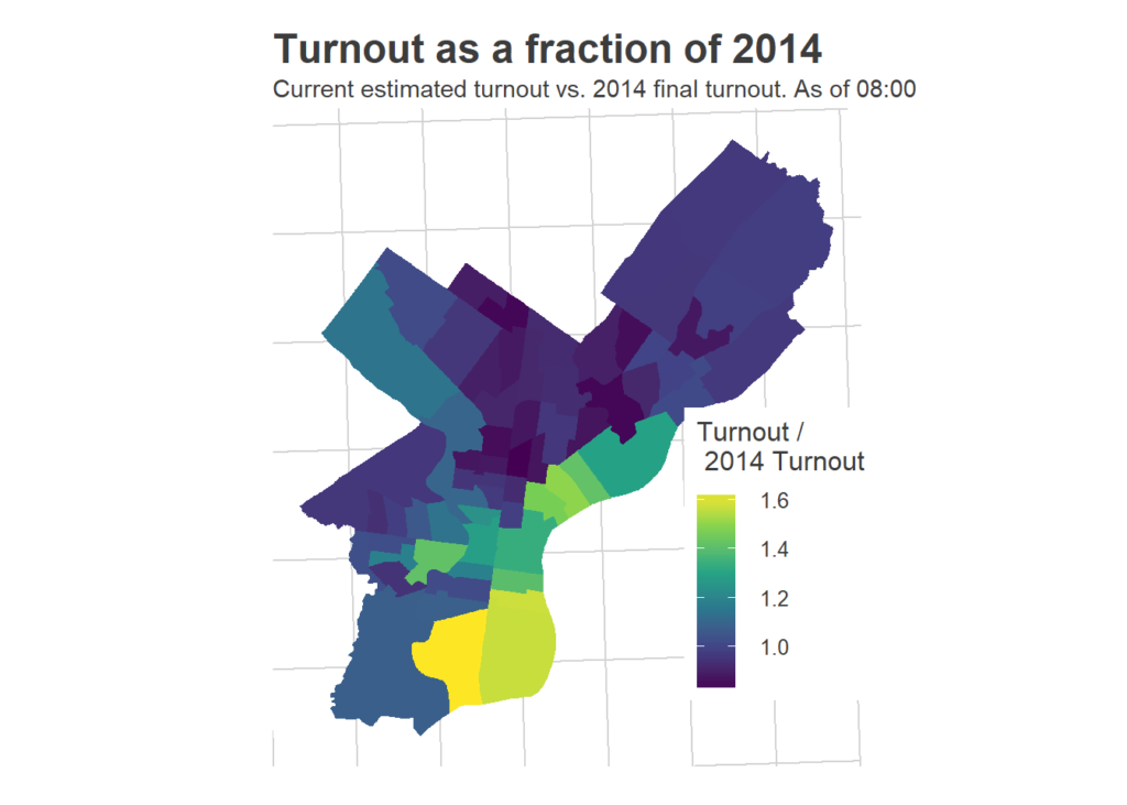
On the beta side of the model, things turned out pretty well. Here is the plot I created with the change in votes from 2014.
NEW: These wards had the highest increase in voter turnout compared to the 2014 Primary Election. #PAPrimary pic.twitter.com/5zymQInLn2
— Commissioner Al Schmidt (@Commish_Schmidt) May 19, 2018
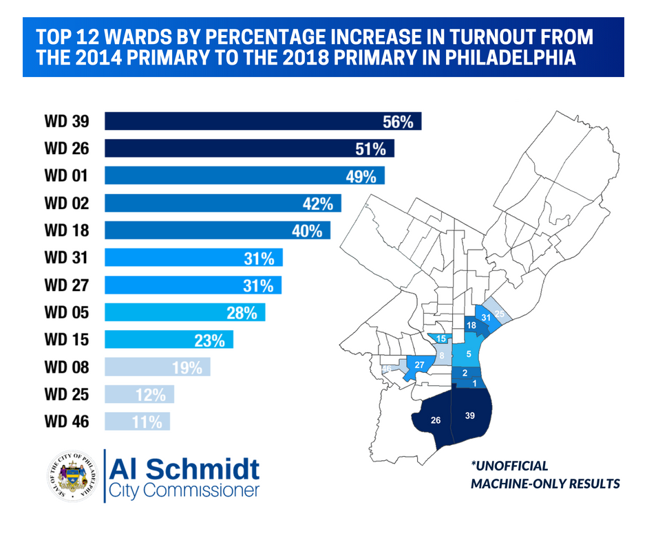
It’s worth emphasizing how cool this is: with 641 submissions, many from before noon, we were able to almost perfectly rank wards based on their increased turnout.
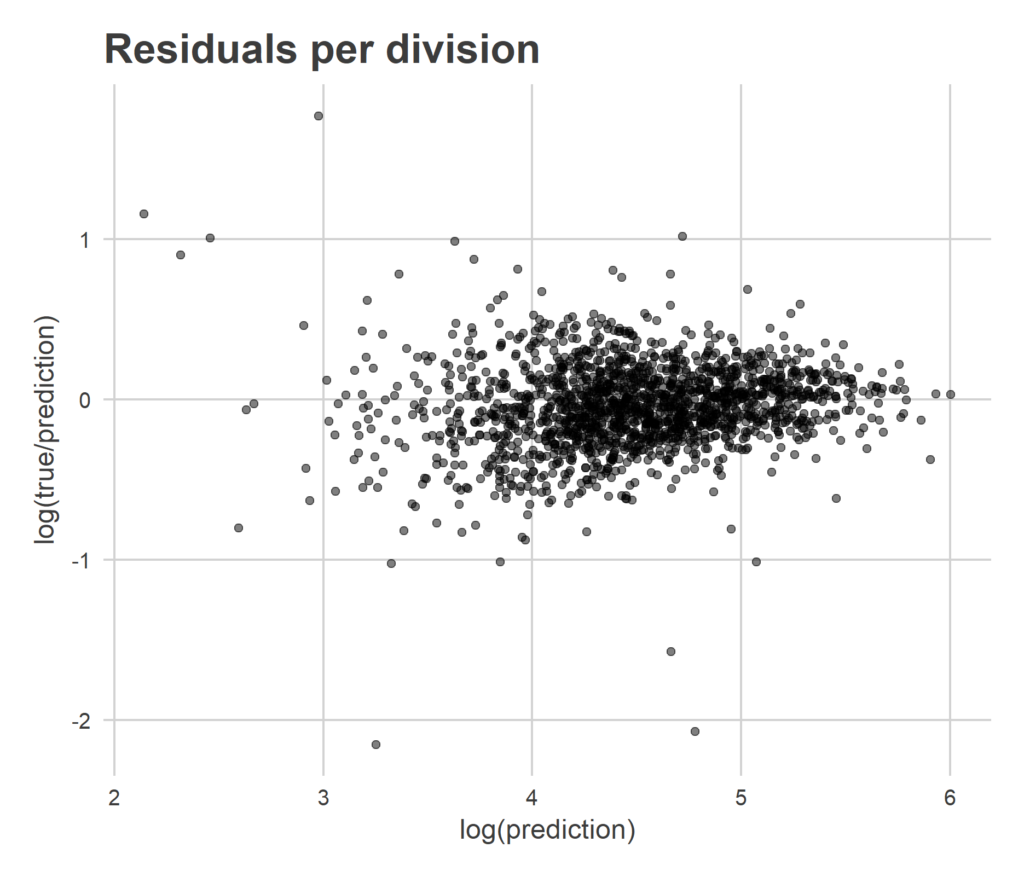
Another way to evaluate the spatial part of the model is to compare my Division-level predictions with the true turnout. Below is a plot of my final estimate for each division on the x-axis, with the difference between the true turnout and my prediction (the residual) on the y-axis.
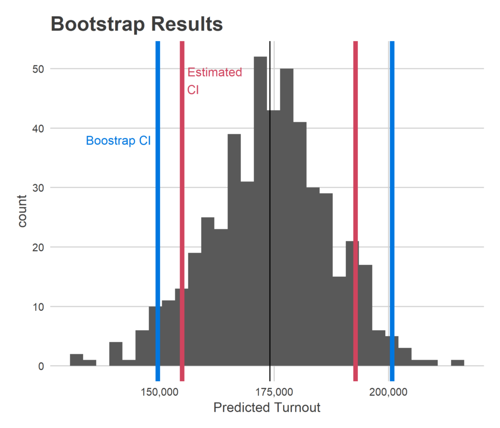
In statistics, it’s usually a lot easier to estimate a value than it is to put error bars around it. And a point estimate is of no use without a measure of its uncertainty. I’ve got a somewhat complicated model; how did my purported uncertainty do?
One way to test this out is the bootstrap. You sample from your observed data over and over with replacement, to create simulated, plausible data sets. You can then calculate your point estimate as if that were your data, and look at the distribution of those estimates. Voila, you have an estimate of the uncertainty in your method. The benefit of this is that you can mechanically explore the uncertainty in your full process, rather than needing to rely on math that uses perhaps-invalid assumptions.
This model is not a perfect use case of the bootstrap because it relies so heavily on having data from a variety of divisions. The bootstrap will necessarily provide fewer divisions than the data we have, because data points get repeated. Thus, we would expect the bootstrap uncertainty to be larger than the true uncertainty in the model with real data.
This project had some errors this time around, but it seems like with some easy fixes we could build something that does really, really well. Here are some additional features I hope to build in.
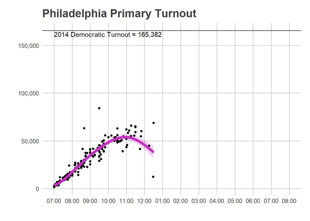
Outliers
While you guys are awesome, some of you still made mistakes. Here is a plot from 12:30:
Here’s another plot:
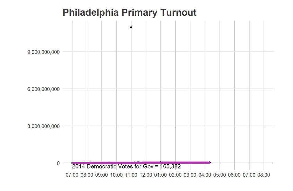
Through the day I implemented some ad-hoc outlier detection methods, but for the most part my strategy was to manually delete the points that were obviously wrong. But there are some points that are still unclear, and which I ended up leaving in. I hope to build in more sophisticated tests for removing outliers by November.
Predicting final outcomes
Because nobody had collected time-of-day data on Philadelphia voting before, I couldn’t predict the end of day turnout. This means, for example, at 3pm I could estimate how many people had voted as of 3pm, but was not predicting what final turnout would look like. I simply didn’t know how voting as of 3pm correlated with voting after 3pm. But *now*, we have one election’s worth of time-of-day data! I am going to work up an analysis on the time-of-day patterns of voting (stay tuned to this blog!) and see if it’s reasonable to add a live, end-of-day prediction to the tool.
See you in November!
I’m going to put aside the live modelling business for a while, and spend the next few months looking at static analyses of these results, and what they might mean for November. But don’t worry, the Live Election Tracker will be back in November!