The race for PA Senate 1

Party control of the Pennsylvania Senate will be contested this November, especially important in 2020 as the winners will draw the post-Census boundaries.

But that’s in November. Before that, in April’s Primary, we are going to have a rare contested senate race right here in our city. Incumbent Senator Larry Farnese is being challenged by fellow (former) Ward leader Nikil Saval (Saval stepped down from the second to be able to run for this seat). Saval, a co-founder of Reclaim Philadelphia, is presumably trying to win by running to Farnese’s left, a heat check of the recent successes of Larry Krasner and Kendra Brooks.

What are the dynamics at play? Let’s break down Philadelphia’s State Senate PA-1.

View code
library(tidyverse)
library(sf)
library(ggmap)
library(magrittr)
source("../../admin_scripts/util.R")

df_major <- readRDS("../../data/processed_data/df_major_2019-12-03.Rds")
df_major %<>% mutate(warddiv = pretty_div(warddiv))

divs <- st_read("../../data/gis/warddivs/201911/Political_Divisions.shp") %>%
  mutate(
    warddiv = pretty_div(DIVISION_N),
    area = as.numeric(st_area(geometry)) / (1609^2)  # mi^2
  )wards <- st_read("../../data/gis/warddivs/201911/Political_Wards.shp") %>%
  mutate(ward = sprintf("%02d", asnum(WARD_NUM)))sts <- st_read("../../data/gis/state_senate/tigris_upper_house_2015.shp") %>%
  st_transform(4326)sts_1 <- sts %>% filter(SLDUST == "001")
expand <- function(x, factor){
  mean_x <- mean(x)
  return(mean_x + factor * (x - mean_x))
}

expand_bb <- function(bb, factor){
  bb[c(1,3)] <- expand(bb[c(1,3)], factor)
  bb[c(2,4)] <- expand(bb[c(2,4)], factor)
  bb
}

st_bbox <- function(obj, expand, ...){
  bb <- sf::st_bbox(obj, ...)
  bb %<>% expand_bb(expand)
  names(bb) <- c("left", "bottom", "right", "top")
  bb
}

bb <- st_bbox(sts_1, expand=1.2)

basemap <- ggmap::get_stamenmap(
  bbox=bb, 
  zoom = 12, 
  maptype="toner-lite"
)

get_labpt_df <- function(sf){
  df <- st_centroid(sf) %>%
    mutate(
      x=sapply(geometry, "[", 1),
      y=sapply(geometry, "[", 2)
    ) %>%
    as.data.frame() %>%
    select(-geometry)
  return(df)
}

district_map <- ggmap(
  basemap, 
  extent="device",
  base_layer = ggplot(sts),
  maprange = FALSE
) +
  theme_map_sixtysix() %+replace%
  theme(legend.position = c(0.8, 0.2))

The geography of PA-1

[Reminder: You can make all of these maps and more on the Ward Portal!]

PA-1 covers most of South Philly (minus Point Breeze), Center City, and reaches North into Brewerytown, Kensington, and Port Richmond. Both of the candidates were until recently Ward Leaders in the district: Farnese still is in West Center City’s 8th Ward, and Saval was in Queen Village’s 2nd until resigning to run for this seat.

View code
phila_whole <- st_union(wards)
bb_phila <- st_bbox(phila_whole, 1.2)

ggplot(phila_whole) +
  geom_sf(fill=strong_green, color=NA, alpha=0.4) +
  geom_sf(
    data=st_crop(sts, bb_phila),
    fill=strong_green, color = "white", size = 1, alpha=0.3
  ) +
  geom_sf(
    data=sts %>% filter(SLDUST == "001"),
    fill=strong_green, color = "white", size = 1
  ) +
  geom_sf_text(
    data = st_crop(sts, bb_phila),
    aes(label=asnum(SLDUST))
  ) +
  ggtitle("State Senate Districts") +
  theme_map_sixtysix() %+replace%
  theme(panel.grid.major = element_blank())
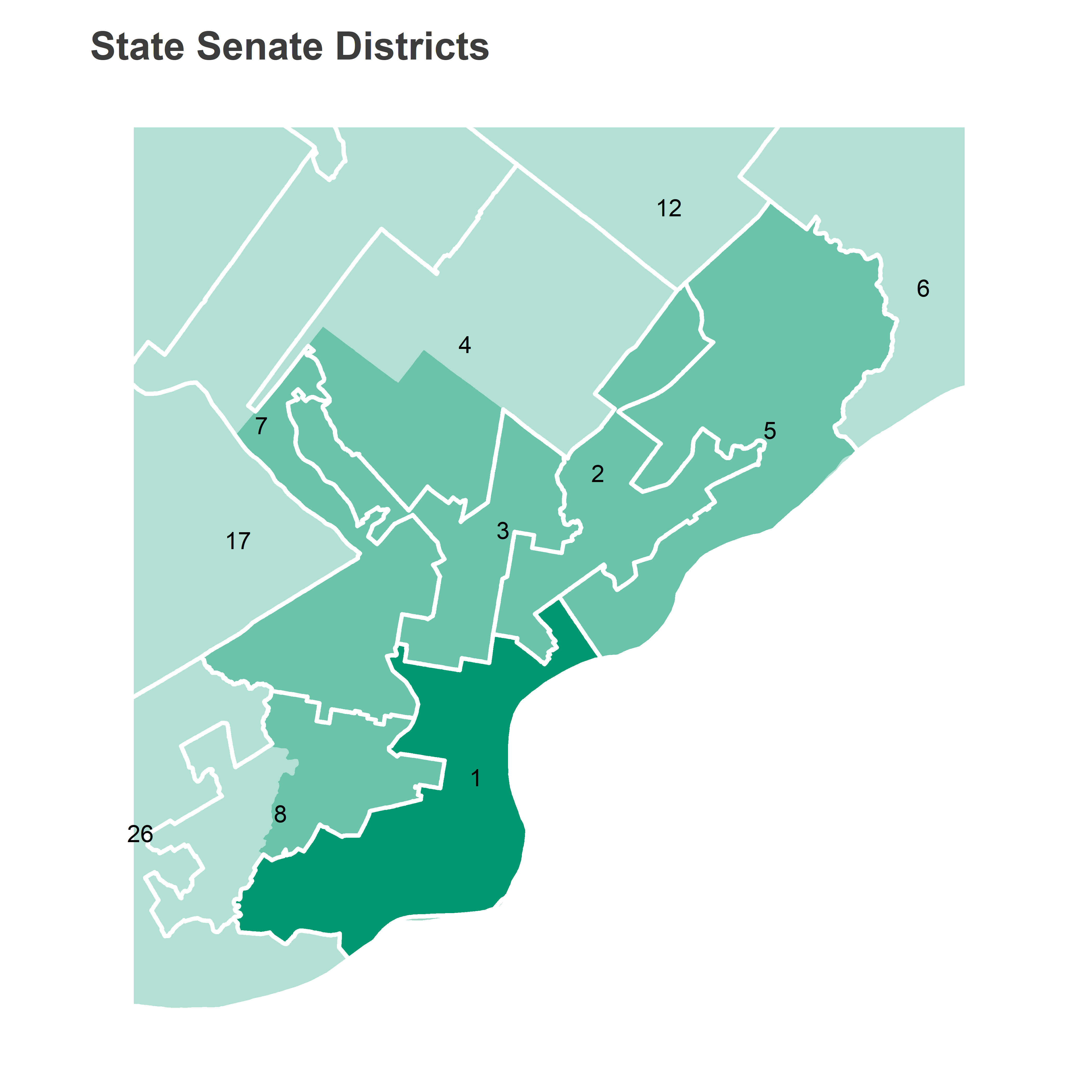
View code
divs$sts <- divs %>%
  st_centroid() %>%
  st_covered_by(sts) %>%
  (function(x){sts$SLDUST[unlist(x)]})

district <- "001"
district_map +
  geom_sf(
    data = wards %>% filter(ward %in% c("02", "08")),
    fill="black",
    alpha = 0.5,
    color=NA
  ) +
  geom_sf(
    aes(alpha = (SLDUST == district)),
    fill="black",
    color = "grey50",
    size=2
  ) +
  geom_sf_text(
    data=wards %>% filter(ward %in% c("02", "08")),
    aes(label = sprintf("Ward %i", asnum(ward))),
    color="white"
  ) +
  scale_alpha_manual(values = c(`TRUE` = 0.2, `FALSE` = 0), guide = FALSE) +
  ggtitle(sprintf("State Senate District %s", asnum(district)))

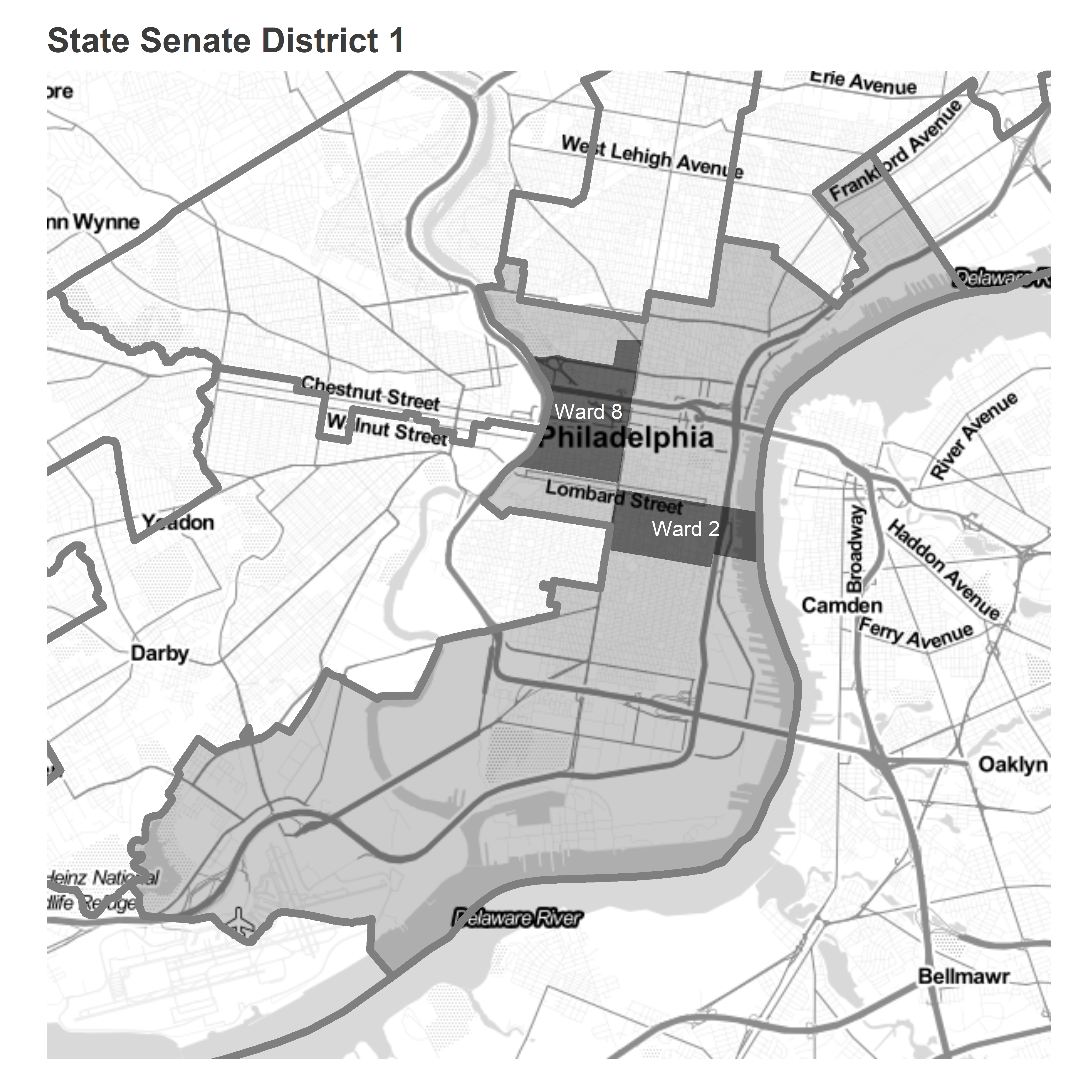
The vast majority of the district’s votes come from Center City, South Philly, and Fairmount, which represented the highest-turnout neighborhoods in the entire city in November’s General.

View code
turnout <- df_major %>%
  filter(is_topline_office) %>%
  group_by(warddiv, year, election) %>%
  summarise(turnout = sum(votes))

maxval <- 20e3
labelmax <- function(x, max) {
  ifelse(
    x == max, 
    paste0(scales::comma(x), "+"), 
    scales::comma(x)
  )
}

district_map +
  geom_sf(
    data=divs %>% 
      left_join(
        turnout %>% filter(year == 2019, election == "general")
      ),
    aes(fill = pmin(turnout/area, maxval)),
    color=NA,
    alpha=0.8
  ) +
  geom_sf(
    data=st_crop(sts, bb_phila), 
    fill=NA, 
    color="white",
    size=2
  ) +
  scale_fill_viridis_c(
    "Votes/\n mile^2", 
    labels=function(x) labelmax(x, maxval)
  ) +
  ggtitle("Votes in the 2019 General")

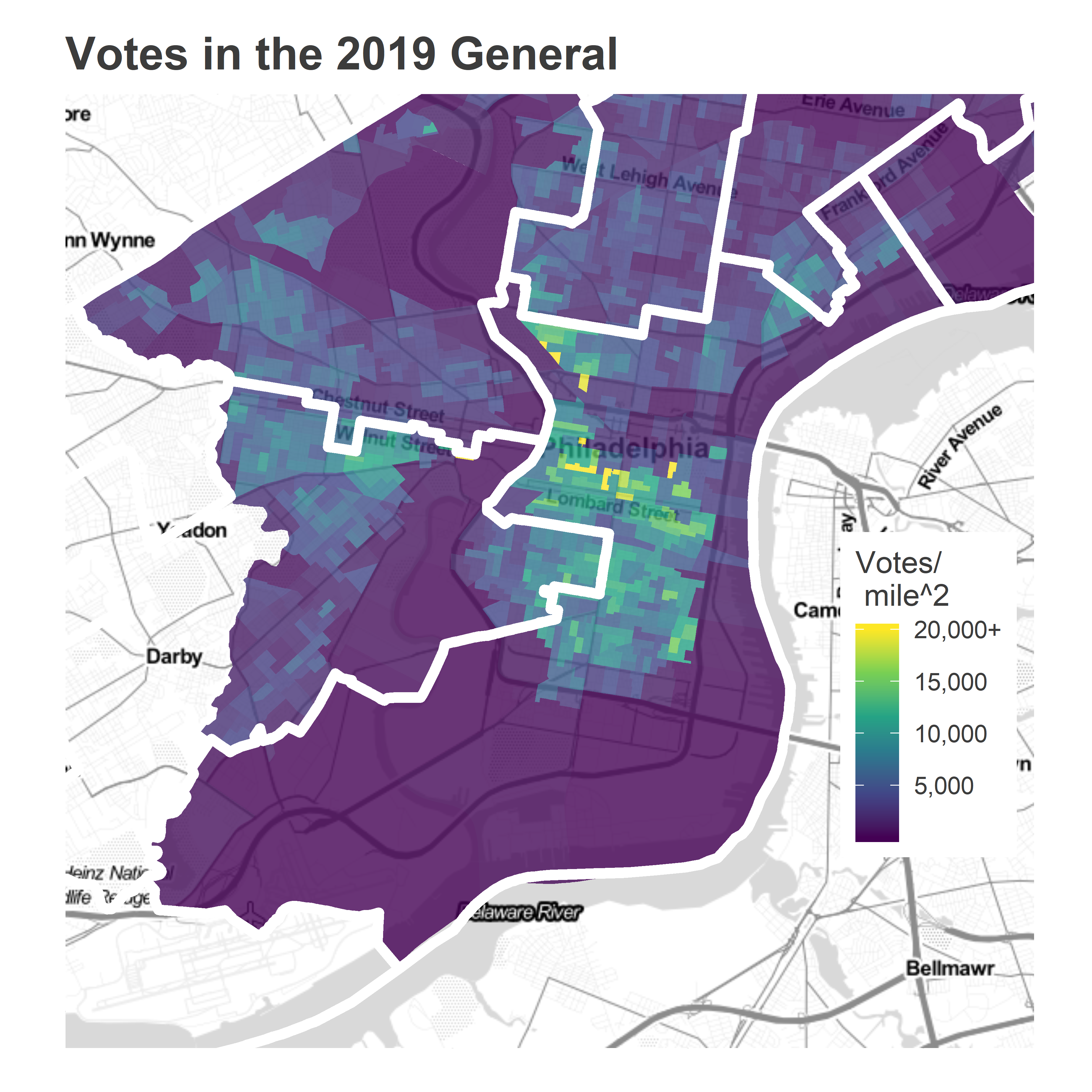
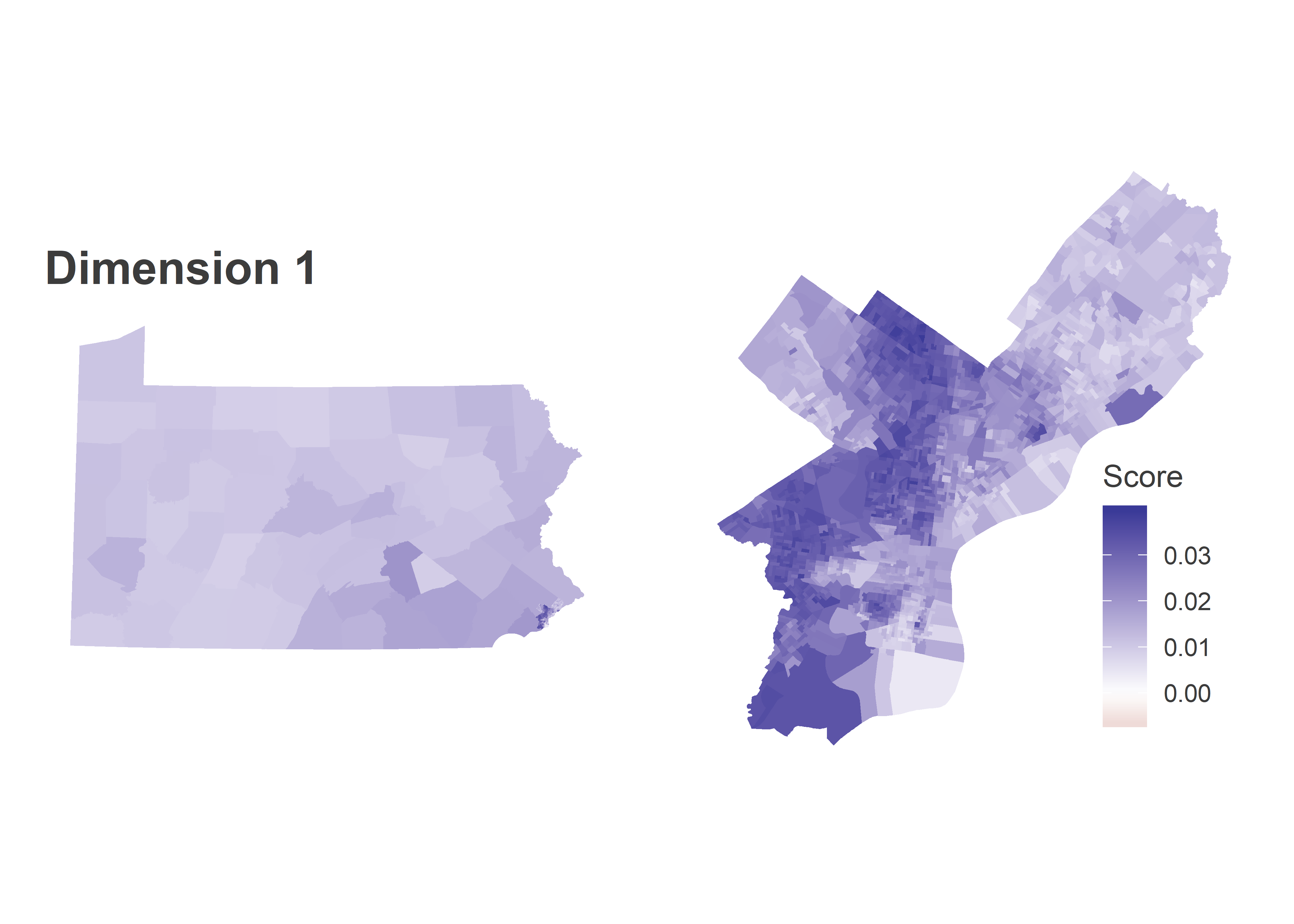
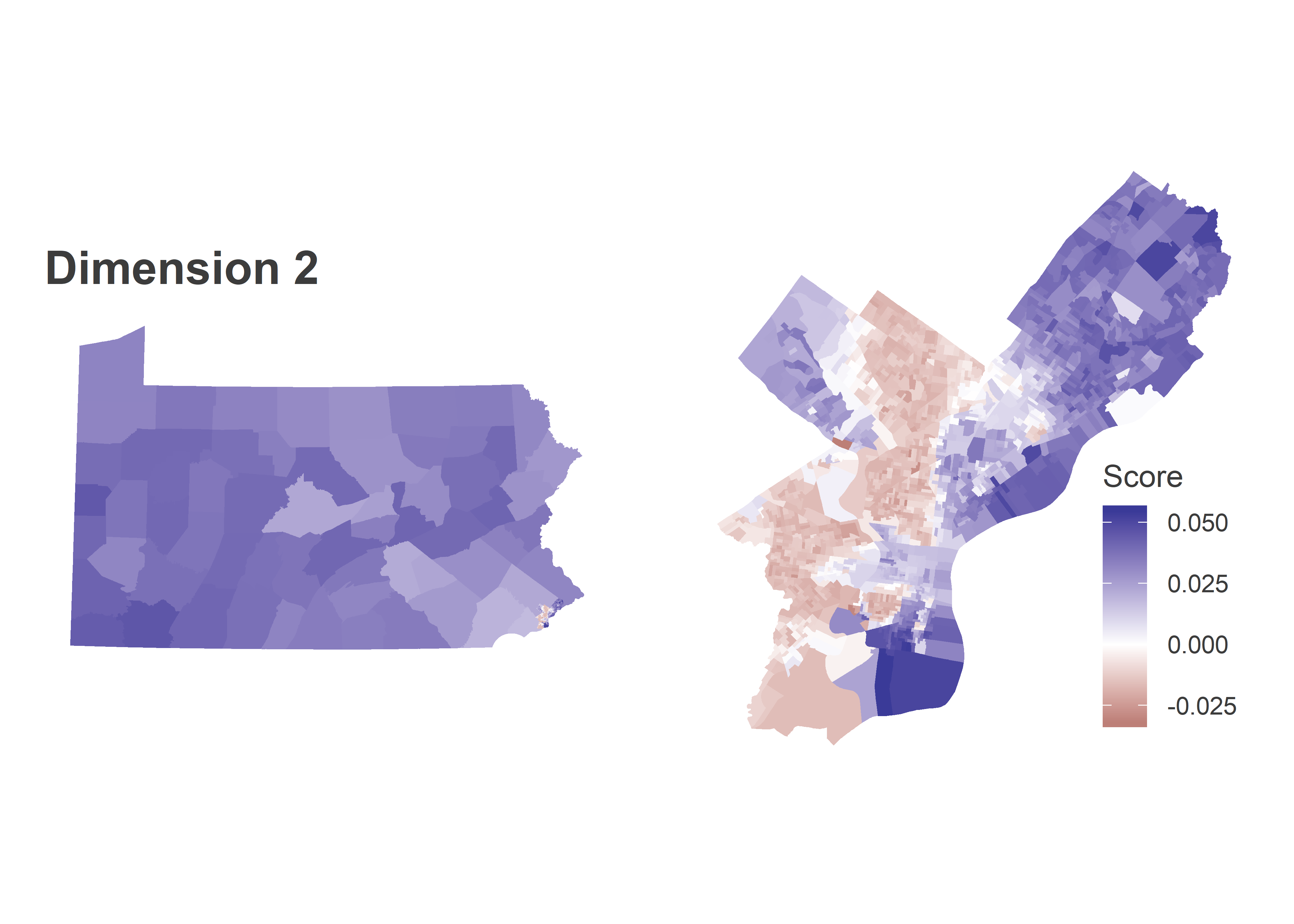
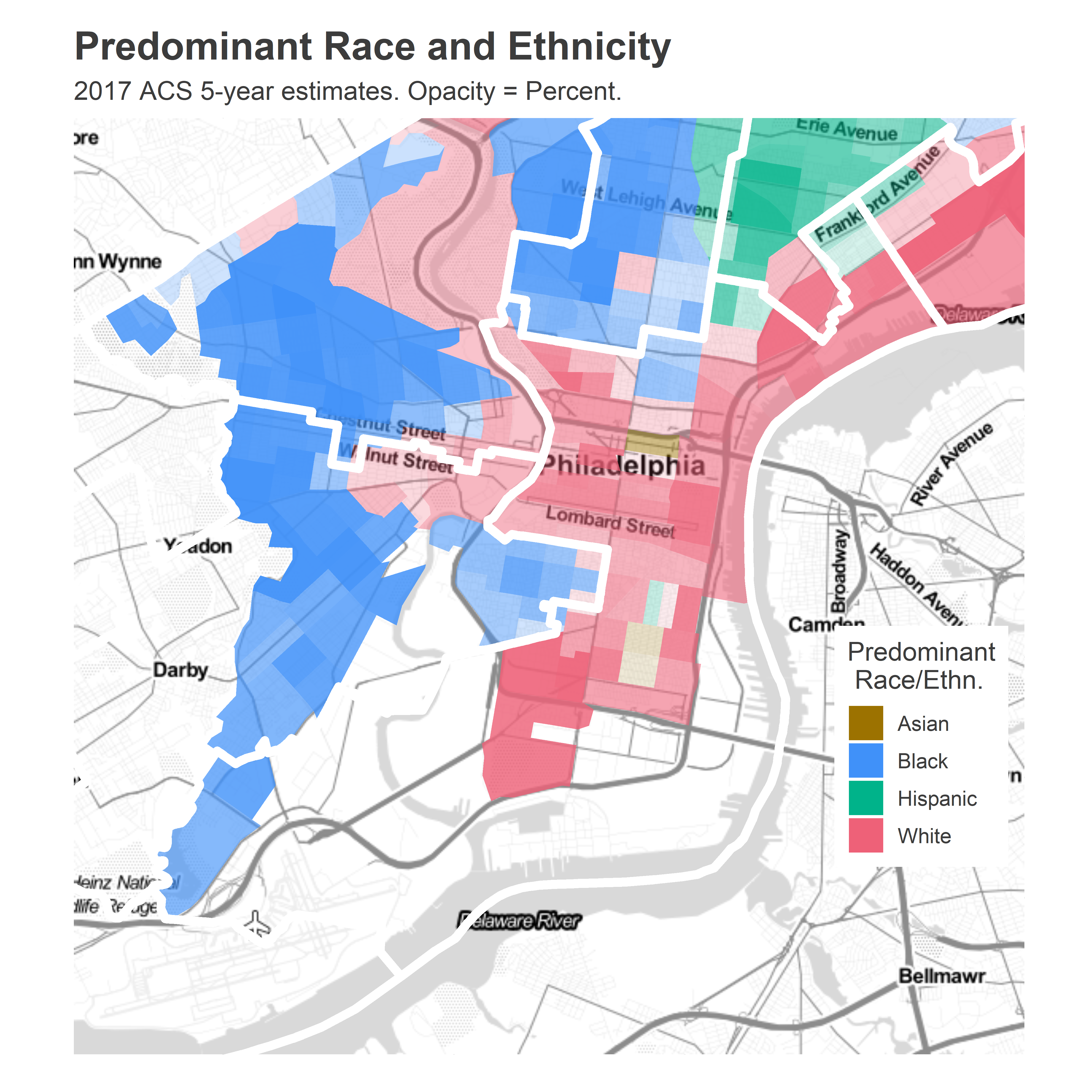
The district’s residents are mostly White: the ACS 2017 estimates have the district 61% White, 13% Black, 12% Asian, and 11% Hispanic. The boundaries manage to almost perfectly gerrymander out the predominantly-Black neighborhoods of Point Breeze, carving out below Washington, above Passyunk, and West of Broad; and North Philly, running along the racial boundary of Girard.

View code
census <- read_csv("../../data/census/acs_2013_2017_phila_bg_race_income.csv")

maxpop_name <- function(wht, blk, hisp, asn){
  maxes <- apply(cbind(wht, blk, hisp, asn), 1, which.max)
  maxes <- sapply(maxes, function(x) if(length(x) == 1) x else NA)
  c("white", "black", "hispanic", "asian")[maxes]
}

maxpop_val <- function(wht, blk, hisp, asn){
  apply(cbind(wht, blk, hisp, asn), 1, max)
}

census <- census %>%
  mutate(tract = substr(as.character(Geo_FIPS), 1, 11)) %>%
  group_by(tract) %>%
  summarise_at(
    vars(starts_with("pop_")), 
    funs(sum)
  ) %>%
  mutate(pop_total = pop_hisp + pop_nh) %>%
  mutate(
    pwht = pop_nh_white / pop_total,
    pblk = pop_nh_black / pop_total,
    phisp = pop_hisp / pop_total,
    pasn = pop_nh_asian / pop_total
  ) %>%
  mutate(
    maxpop = maxpop_name(pwht, pblk, phisp, pasn),
    maxpop_val = maxpop_val(pwht, pblk, phisp, pasn)
  )

tracts <- st_read("../../data/gis/census/cb_2015_42_tract_500k.shp") %>%
  filter(COUNTYFP == "101") %>%
  st_transform(4326) %>%
  left_join(census, by=c("GEOID" = "tract"))district_map +
  geom_sf(
    data=tracts %>% 
      filter(!is.na(maxpop_val)) %>%
      mutate(maxpop = format_name(maxpop)),
    aes(
      fill=maxpop,
      alpha = 100 * maxpop_val
    ),
    color=NA
  ) +
  geom_sf(
    data=st_crop(sts, bb_phila), 
    fill=NA, 
    color="white",
    size=2
  ) +
  scale_alpha_continuous(
    range=c(0, 1),
    guide=FALSE
  ) +
  scale_fill_manual(
    "Predominant\n Race/Ethn.",
    values = c(
      Black = light_blue,
      White = light_red,
      Hispanic = light_green,
      Asian = strong_orange
    )
  ) +
  ggtitle(
    "Predominant Race and Ethnicity", 
    "2017 ACS 5-year estimates. Opacity = Percent."
  )

PA-1’s recent elections

Farnese hasn’t been plausibly challenged since 2008, when he won the seat vacated by indicted Senator Vince Fumo.

Ironically, Farnese won that race on the votes of Center City’s wealthy progressives, edging out Johnny Doc 43% to 38% (candidate Anne Dicker won the last 19%).

View code
sts_2008 <- df_major %>% 
  filter(
    election == "primary", party == "DEMOCRATIC", 
    year == 2008, office == "SENATOR IN THE GENERAL ASSEMBLY",
    district == 1
  ) %>%
  group_by(ward, candidate) %>%
  summarise(votes = sum(votes)) %>%
  group_by(ward) %>%
  mutate(
    total_votes = sum(votes), 
    pvote=100 * votes/total_votes,
    candidate=format_name(candidate),
    is_winner = rank(desc(pvote)) == 1,
    margin = pvote - pvote[rank(desc(pvote)) == 2]
  )

district_map +
  geom_sf(
    data = st_intersection(wards, sts_1) %>% 
      inner_join(sts_2008 %>% filter(is_winner)),
    aes(fill=candidate, alpha=margin),
    color=NA,
  ) +
  scale_fill_manual(
    "Winner",
    values=c(light_green, light_purple)
  ) +
  scale_alpha_continuous("Margin (%)") +
  theme(legend.box = "vertical") +
  ggtitle("The 2008 PA-1 Democratic Primary")

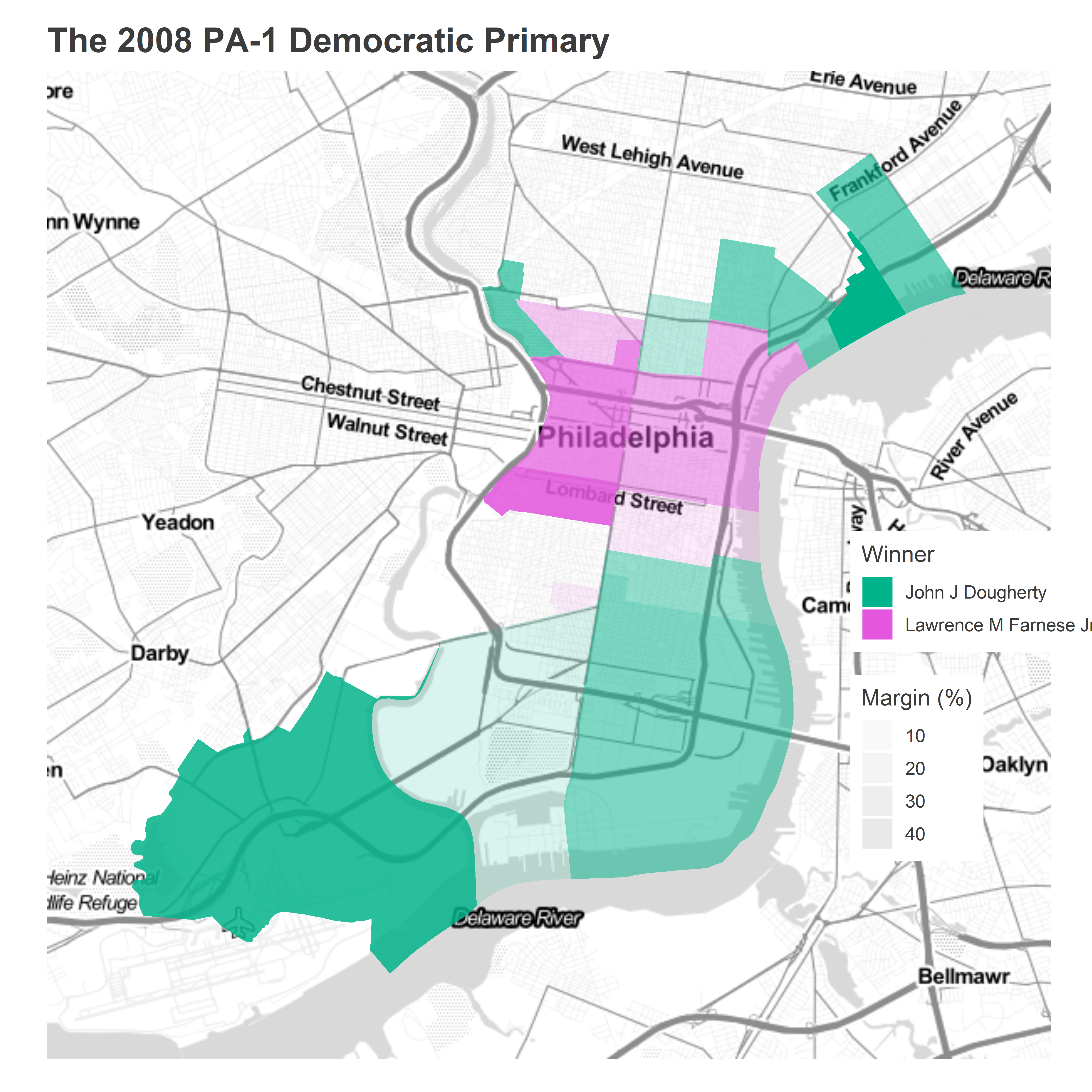
Those progressive districts have only become more influential. In more recent elections, the district has run significantly more progressive than the city as a whole. Bernie Sanders performed 7 percentage points better than in the city as a whole (though still lost the district to Clinton), Krasner 6 pp better, and Brooks 1.6 pp.

View code
races <- tribble(
  ~year, ~election, ~office, ~short_office, ~candidates,
  "2016", "primary", "PRESIDENT OF THE UNITED STATES", "President", list("HILLARY CLINTON", "BERNIE SANDERS"),
  "2017", "primary", "DISTRICT ATTORNEY", "District Attorney",list("LAWRENCE S KRASNER", "JOE KHAN"),
  "2019", "general", "COUNCIL AT LARGE", "City Council", list("KENDRA BROOKS", "DAVID OH")
)

div_cats <- readRDS("../../data/processed_data/div_cats_2019-12-03.RDS")
divs %<>% left_join(div_cats)

df_cand <- df_major %>% 
  inner_join(races) %>%
  filter(election == "general" | party == "DEMOCRATIC") %>%
  left_join(divs %>% as.data.frame() %>% select(warddiv, sts, cat)) %>%
  group_by(warddiv, year, office) %>%
  mutate(total_votes = sum(votes), pvote=100 * votes/total_votes) %>%
  filter(mapply(`%in%`, candidate, candidates))

df0 <- df_cand %>%
  group_by(candidate, year, election, short_office) %>%
  summarise(
    pvote_city = weighted.mean(pvote, total_votes),
    pvote_sts01 = weighted.mean(pvote, ifelse(sts == "001", total_votes, 0))
  ) %>%
  ungroup()

df0 %>%
  mutate(candidate = format_name(candidate)) %>% 
  arrange(year) %>%
  mutate(election = paste(year, format_name(election))) %>%
  select(election, candidate, pvote_city, pvote_sts01) %>%
  knitr::kable(digits=1, col.names=c("Election", "Candidate", "City %", "PA-1 %"))
Election Candidate City % PA-1 %
2016 Primary Bernie Sanders 37.0 44.2
2016 Primary Hillary Clinton 62.6 55.3
2017 Primary Joe Khan 20.3 24.7
2017 Primary Lawrence S Krasner 38.2 44.6
2019 General David Oh 4.0 4.5
2019 General Kendra Brooks 4.5 7.1

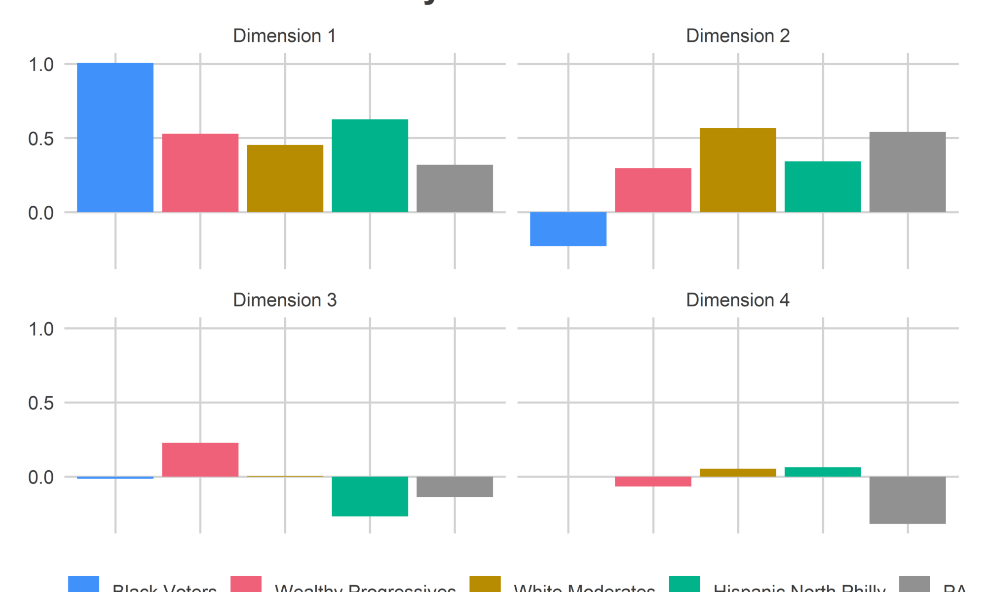
Revisit Philadelphia’s Voting Blocs. The district is mage up mostly of Wealthy Progressive and White Moderate divisions.

View code
bloc_colors <- c(
  "Black Voters" = light_blue,
  "Wealthy Progressives" = light_red,
  "White Moderates" = light_orange,
  "Hispanic North Philly" = light_green
)
district_map +
  geom_sf(
    data=divs,
    aes(fill = cat),
    color=NA,
    alpha=0.8
  ) +
  geom_sf(
    data=st_crop(sts, bb_phila), 
    fill=NA, 
    color="white"
  ) +
  scale_fill_manual(
    "Voting Bloc",
    values=bloc_colors
  ) +
  ggtitle("Voting Blocs of PA-1")

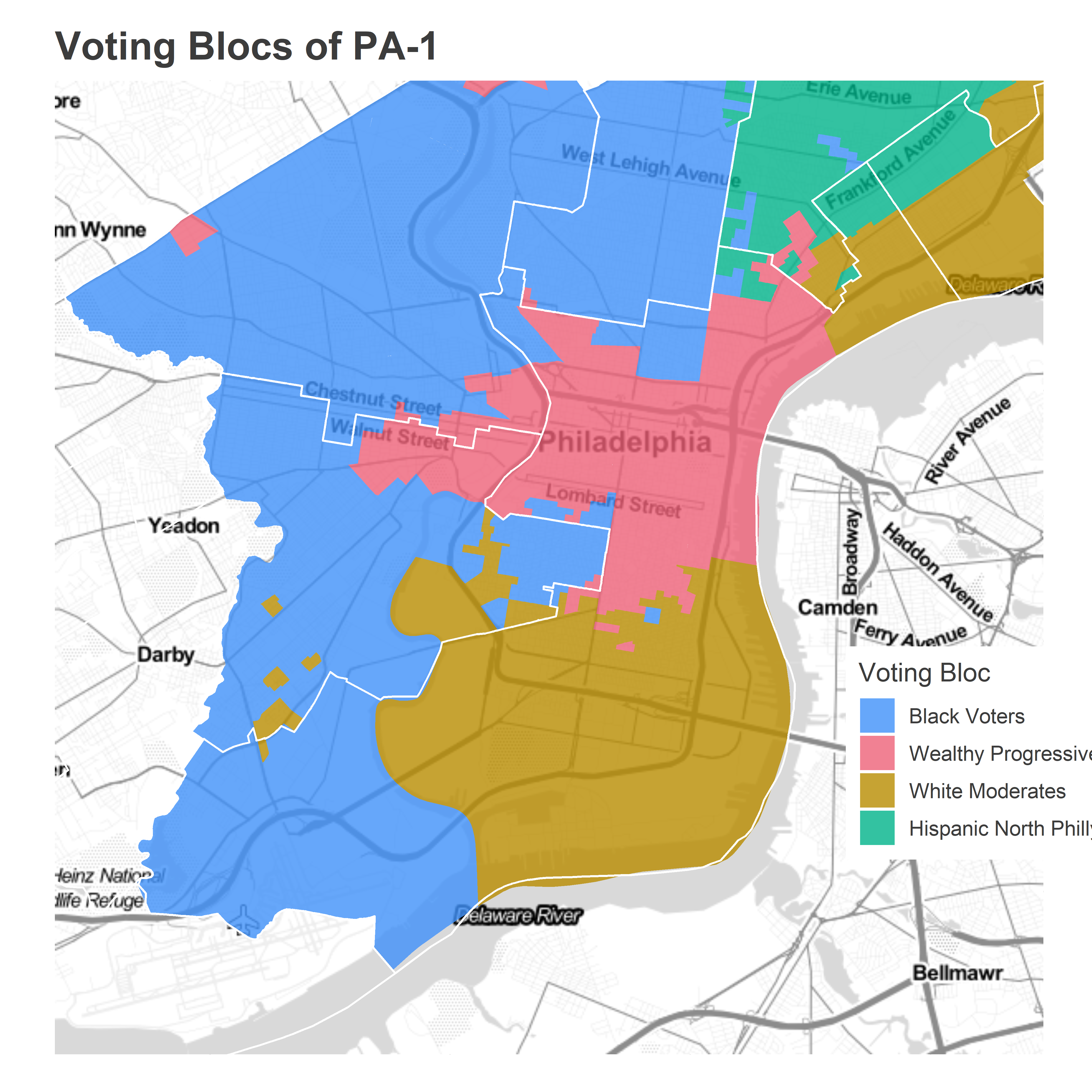
(Notice that my blocs based on voting patterns don’t perfectly match the Census populations; my Black Voter bloc extends above Washington Ave and the Census population doesn’t. That’s because the blocs are based on all elections back to 2002, while the Census data is more recent. That’s an emergent boundary that’s moving South as Point Breeze gentrifies.)

View code
turnout_nums <- turnout %>% 
  filter(year %in% c(2016, 2017, 2019)) %>% 
  ungroup() %>% 
  inner_join(
    divs %>%
      filter(sts == "001") 
  ) %>% 
  group_by(year,election,cat) %>%
  summarise(turnout = sum(turnout)) %>% 
  group_by(year, election) %>%
  mutate(pturnout = turnout / sum(turnout)) %>% 
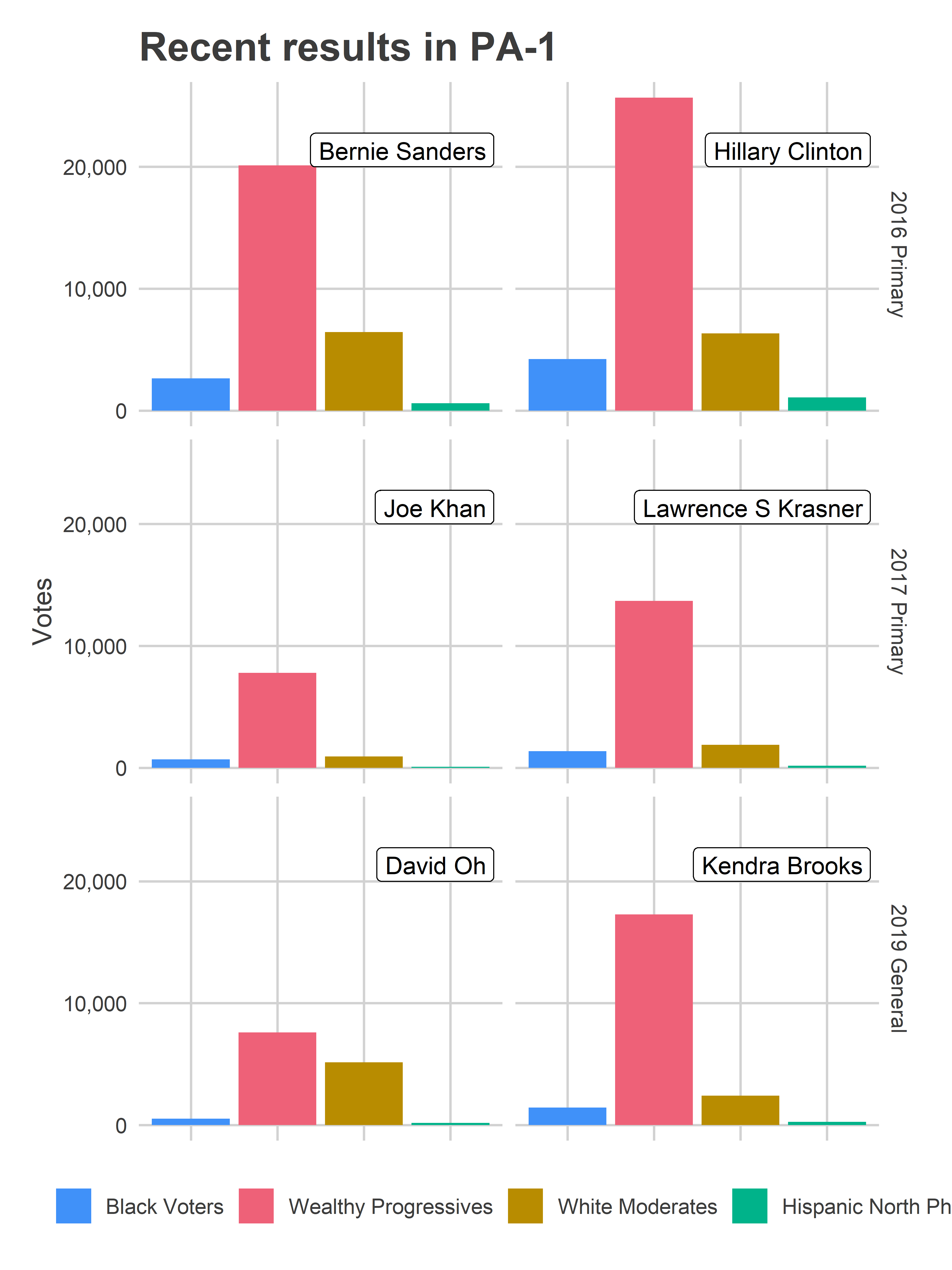
  as.data.frame()

The Wealthy Progressives cast 67% of the votes in the 2016 Primary, 73% in the 2017 Primary, and 68% in the 2019 General. Their votes drive the overall results of the district.

View code
cand_nums <- df_cand %>%
  group_by(year, election, short_office) %>%
  mutate(candnum = as.numeric(factor(candidate))) %>%
  select(year, election, short_office, candidate, candnum) %>%
  unique()

ggplot(
  df_cand %>% 
    ungroup() %>%
    filter(sts == "001") %>%
    group_by(candidate, year, election, short_office, cat) %>%
    summarise(votes = sum(votes)) %>%
    left_join(cand_nums)
) +
  geom_bar(
    aes(x = cat, y = votes, fill=cat),
    stat="identity"
  ) +
  scale_fill_manual(NULL, values=bloc_colors) +
  facet_grid(paste(year, format_name(election)) ~ candnum) +
  geom_label(
    data=cand_nums, 
    aes(label=format_name(candidate)), 
    x = 4.5, y=20e3,
    hjust=1,
    vjust=0
  ) +
  scale_y_continuous("Votes", labels = scales::comma) +
  theme_sixtysix() %+replace% 
  theme(
    strip.text.x = element_blank(),
    axis.text.x = element_blank()
  ) +
  labs(
    title="Recent results in PA-1",
    x=NULL
  )

The recent left-wing support comes slightly more from the gentrifying ring around Center City than from Center City itself, while deeper South Philly and Northern Kensington and Port Richmond remain more conservative.

View code
district_map +
  geom_sf(
    data=divs %>% 
      left_join(df_cand) %>%
      # left_join(office_max) %>%
      left_join(cand_nums) %>%
      group_by(year, election, short_office, warddiv) %>%
      mutate(pvote_head2head = 100 * pvote / sum(pvote)),
    aes(fill=pvote_head2head),
    color=NA,
    alpha=0.8
  ) +
  geom_sf(
    data=st_crop(sts, bb_phila), 
    fill=NA, 
    color="white"
  ) +
  geom_label(
    data = cand_nums,
    aes(label=format_name(candidate)),
    hjust=1.1,
    vjust=1,
    x = bb["right"],
    y = bb["top"]
  ) +
  facet_grid(year + election ~ candnum) +
  theme(
    strip.text.x = element_blank(),
    legend.position = "right"
  ) +
  scale_fill_viridis_c("Head-to-head\n % of Vote") +
  ggtitle("Recent Elections in PA-1", "Head-to-head Vote Percentages")

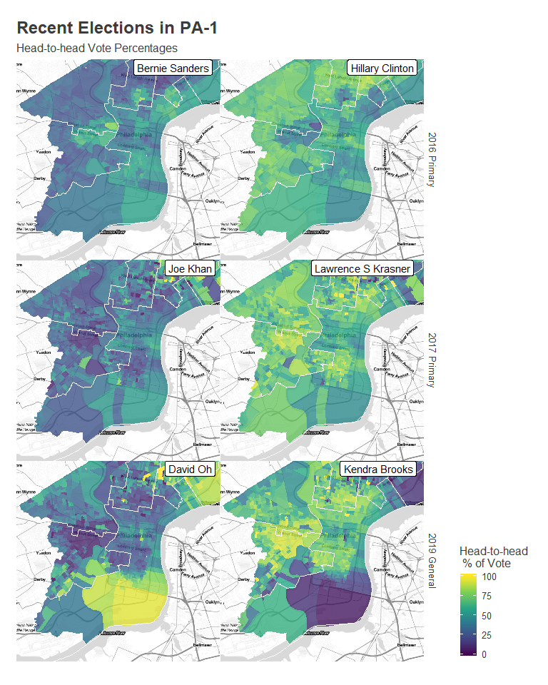
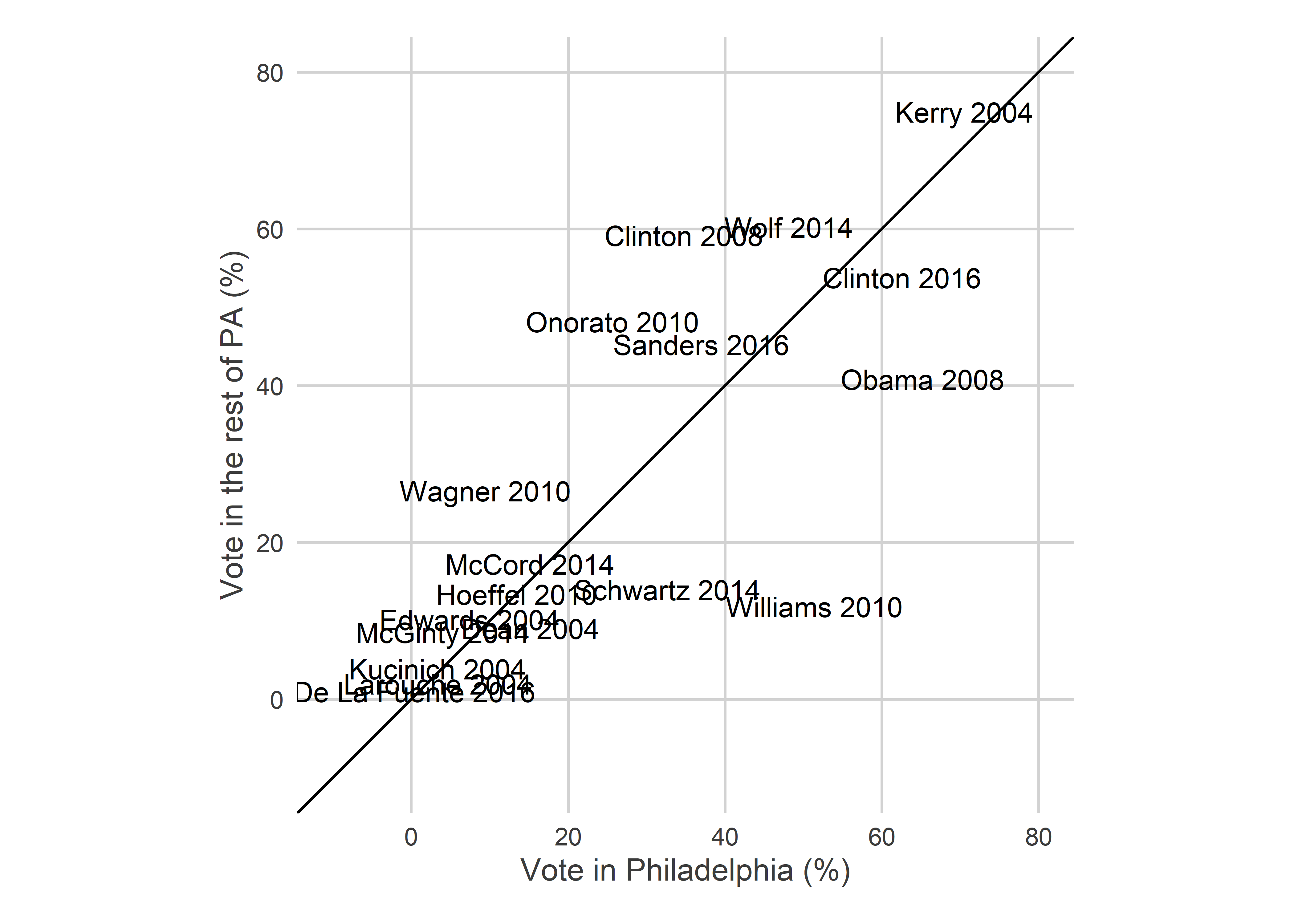
Farnese vs Saval in April

This race will test a dynamic that the city hasn’t really tested yet in the post-2016 world: a candidate who historically has performed well among Wealthy Progressive divisions being challenged from the left.

Because of that, it’s hard to use past elections to predict this one. There aren’t easily predictable fault-lines, the way there were in 2019’s Council races for District 2 and District 3.

But let’s assume Farnese does better than Saval in the White Moderate and Black Voter divisions, maybe by a gap of 70-30. And assume that the Wealthy Progressive divisions again make up 70% of the vote. Saval would need to win the Wealthy Progressives by 59 – 41 to win the district. That’s a steep challenge, but we’ve seen steep challenges overcome in recent months.

View code
prop_wealthy_progressive <- 0.7
line_slope <- -prop_wealthy_progressive / (1-prop_wealthy_progressive)
y_intercept <- 0.5 / (1-prop_wealthy_progressive)

cand_scatter <- df_cand %>% 
  ungroup() %>%
  filter(sts == "001") %>%
  mutate(
    is_wealthy = ifelse(
      cat == "Wealthy Progressives", "wealthyprogs", "other"
    )
  ) %>%
  group_by(candidate, year, election, short_office, is_wealthy) %>%
  summarise(votes = sum(votes)) %>%
  group_by(year, election, short_office, is_wealthy) %>%
  mutate(pvote_h2h = votes / sum(votes)) %>%
  ungroup() %>%
  select(year, election, short_office, candidate, is_wealthy, pvote_h2h) %>%
  spread(key=is_wealthy, value=pvote_h2h)
    

ggplot(
  cand_scatter,
  aes(x = 100*wealthyprogs, y=100*other)
) +
  geom_label(aes(label = format_name(candidate))) +
  geom_abline(
    slope = line_slope, 
    intercept = 100 * y_intercept,
    linetype="dashed"
  ) +
  coord_fixed() + 
  xlim(c(0,100)) +
  ylim(c(0, 100)) +
  annotate(
    "text",
    y=0,
    # x=-100*y_intercept/line_slope,
    x=0,
    label=sprintf("Assuming Wealthy Progressives have %s%% of turnout.\nCandidates are at their head-to-head percentages.", round(100*prop_wealthy_progressive)),
    hjust=0,
    vjust=-0.1,
    color="grey50"
  ) +
  labs(
    title="Win Line for PA-1",
    subtitle="Candidates to the top-right win.",
    x="Percent in Wealthy Progressive divisions",
    y="Percent in other divisions"
  ) +
  theme_sixtysix()

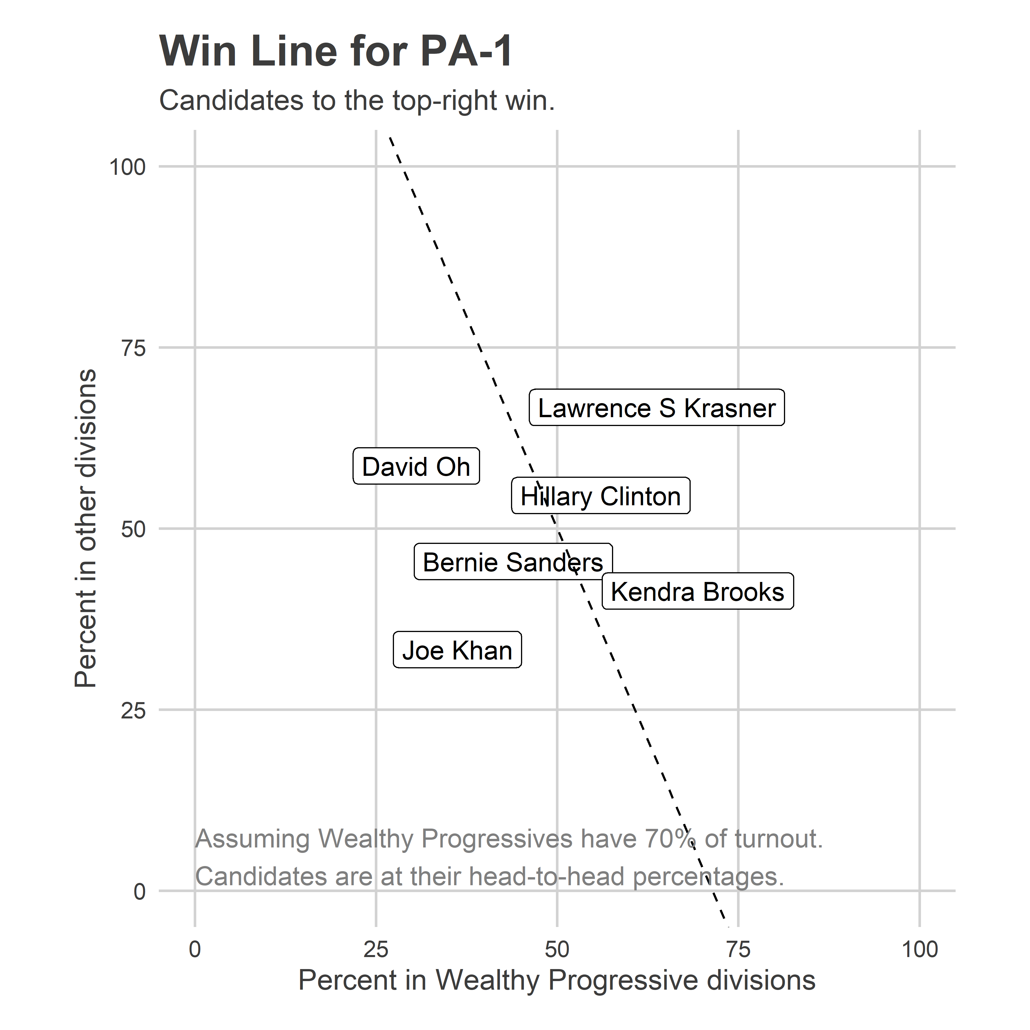
Need more? Create your own analyses on the Ward Portal!

How to predict the state from Philadelphia results

New Year, New Elections

2020 is here. Finally.

While most eyes are on the Presidential race, the comparative advantage for my blog is going to be the state races. Can Democrats take back the Pennsylvania house? The Senate?

We’ll get to all that when the time comes. But first, let’s do spend some time talking about the April 28th Primary.

By the time Pennsylvania votes, 34 states will have already voted. There’s a good chance the Democratic nominee will be clear by then. But we’ve had competitive primaries here before, and with so many candidates in the running there’s a good chance no single candidate will have locked up the endorsement.

On Election Night, if it’s close, eyes will be focused on the Election Needle, especially now that we know it honest-to-goodness works. But the Needle is only built on Philadelphia returns. And I’m not going to try to process live data from each of 67 counties.

When you’re watching the Needle, and it’s certain who will win the city, what can you say about the state? Is it possible to predict Pennsylvania’s results knowing only Philadelphia’s returns? Clearly Philadelphia is significantly more urban and more liberal than the state as a whole, but within that we have pockets of different voters. Could those blocs give us insights to the state as a whole? Let’s dig in.

Pennsylvania’s voting bloc

The high-level strategy is to measure how the rest of the state’s counties correlates with Philadelphia’s blocs. I use the same SVD methodology that’s behind the Needle. All of my state data comes from the Open Elections Project.

We’ll consider the elections from 2004-2018. To measure the statewide correlations, we need statewide races, so we’ll limit the data to only Presidential and Gubernatorial races. And party primaries have entirely different correlations than generals, so we’ll filter to only competitive Democratic Primaries (excluding 2006 and 2018). The result is that we have data on five elections. That’s not great for understanding correlated random effects at the year level. But within years we have a lot of geographies, and within-year patterns emerge.

View code
library(dplyr)
library(tidyverse)
library(ggplot2)
library(sf)
library(magrittr)
library(cowplot)

source("../../admin_scripts/util.R")

counties <- st_read("../../data/gis/census/tigris_counties_2015.shp")col_names <- readLines("../../data/pa_election_data/openelections-data-pa-master/col_names.txt")
col_names <- strsplit(col_names, "(\\s)*(\\t)+")
col_names <- sapply(col_names, function(x) x[1])
col_names <- gsub(" ", "_", tolower(col_names))
col_names[2] <- "election_type"

read_open_elec_csv <- function(file){
  read_csv(
      file, 
      col_names = col_names
    ) %>%
      select(
        election_year, election_type, `county_code_*`, precinct_code, 
        candidate_district, `candidate_office_code_*`, `candidate_party_code*`, 
        candidate_last_name, candidate_first_name,
        vote_total, fips_code
      ) %>%
      rename(
        candidate_party_code = `candidate_party_code*`,
        candidate_office_code = `candidate_office_code_*`
      )
}

get_open_elec_file <- function(year, election){
  state_results_dir <- "../../data/pa_election_data/openelections-data-pa-master/"
  year_dir <- sprintf("%s/%s", state_results_dir, year)
  primary_file <- grep(
    sprintf("[0-9]+__pa__%s__precinct\\.csv", election), 
    list.files(year_dir), 
    value=TRUE
  )
  file <- sprintf("%s/%s", year_dir, primary_file)
}


df_list <- list()
YEARS <- seq(2004, 2016, 2)

for(year in YEARS){
  for(election in c("primary", "general")){
    file <- get_open_elec_file(year, election)
    df_list[[paste(year, election)]] <- read_open_elec_csv(file)
  }
}

df_county <- bind_rows(df_list) %>%
  mutate(
    is_dem_primary = (election_type == "P" & candidate_party_code == "DEM"),
    is_general_dem_rep = (election_type == "G" & candidate_party_code %in% c("DEM", "REP"))
  ) %>%
  filter(
    is_dem_primary | is_general_dem_rep,
    candidate_office_code %in% c("USP", "GOV"),
    !toupper(candidate_last_name) %in% c("WRITE-IN", "SCATTERED")
  ) %>%
  group_by(
    election_year, election_type, fips_code, candidate_party_code,
    candidate_office_code, candidate_last_name, candidate_first_name
  ) %>%
  summarise(votes = sum(vote_total))

df_pa <- df_county %>%
  mutate(is_phila = (fips_code == "101")) %>%
  group_by(
    election_year, election_type, is_phila, candidate_party_code,
    candidate_office_code, candidate_last_name, candidate_first_name
  ) %>%
  summarise(votes = sum(votes)) %>%
  group_by(
    election_year, election_type, is_phila, candidate_office_code
  ) %>%
  mutate(
    is_competitive = n() > 1,
    pvote = votes / sum(votes)
  ) %>%
  ungroup()

Philadelphia’s results are broadly able to separate the candidates who are competitive in the rest of the state from those who aren’t. Among competitive candidates, the correlations are weaker; Obama won Philadelphia in 2008 but lost PA, Williams won Philadelphia in 2010 but Onorato won the state.

View code
ggplot(
  df_pa %>% 
    filter(is_competitive, election_type == "P") %>%
    gather(key="key", value="value", votes, pvote) %>%
    mutate(key = sprintf("%s_%s", key, ifelse(is_phila, "phila", "pa"))) %>%
    select(-is_phila) %>%
    spread(key=key, value=value),
  aes(x=100*pvote_phila, y=100*pvote_pa)
) + 
  geom_text(aes(label = sprintf("%s %s", format_name(candidate_last_name), election_year))) +
  theme_sixtysix() +
  coord_fixed() +
  geom_abline(slope=1, intercept=0) +
  expand_limits(x = c(-10,80), y=c(-10,80)) +
  labs(
    x="Vote in Philadelphia (%)",
    y="Vote in the rest of PA (%)"
  )

View code
df_major <- readRDS("../../data/processed_data/df_major_2019-12-03.Rds") %>%
  mutate(warddiv = pretty_div(warddiv)) 

div_cats <- readRDS("../../data/processed_data/div_cats_2019-12-03.RDS")

df_divs <- df_major %>%
  filter(
    candidate != "Write In",
    year %in% YEARS,
    # (election == "general" & party %in% c("DEMOCRATIC", "REPUBLICAN")) | party == "DEMOCRATIC",
    election == "primary", party == "DEMOCRATIC",
    is_topline_office
  ) %>%
  left_join(div_cats %>% select(warddiv, cat))

df_divs %<>% 
  mutate(
    last_name = gsub(".*\\s(\\S+)$", "\\1", candidate),
    last_name = ifelse(candidate == "LYNDON H LAROUCHE JR", "LAROUCHE", last_name),
    last_name = ifelse(candidate == "ROQUE ROCKY DE LA FUENTE", "DE LA FUENTE", last_name)
  )

assertthat::are_equal(
  df_divs %>% select(last_name, year, election) %>%
    unique() %>%
    filter(!last_name %in% unique(df_pa$candidate_last_name)) %>%
    nrow(),
  0
)

df_phila <- df_divs %>%
  group_by(year, election, last_name, cat) %>%
  summarise(votes = sum(votes)) %>%
  group_by(year, election, cat) %>%
  mutate(
    turnout = sum(votes),
    pvote = votes/turnout,
    election_type = toupper(substr(election, 1, 1))
  ) %>%
  group_by(year, election) %>%
  mutate(pct_turnout = turnout / sum(votes)) %>%
  ungroup() %>%
  select(-turnout) %>%
  gather("key", "value", votes, pvote, pct_turnout) %>%
  unite(key, key, cat, sep = "::") %>%
  spread(key, value)
View code
devtools::load_all("../svdcov")

divs <- st_read("../../data/gis/warddivs/201911/Political_Divisions.shp") %>%
  mutate(warddiv = pretty_div(DIVISION_N)) %>%
  st_transform(2272)counties <- st_transform(counties, 2272)

shp <- rbind(
  counties %>%
    select(GEOID, NAME, geometry) %>% mutate(level="county") %>%
    filter(GEOID != "42101"),
  divs %>% mutate(GEOID = warddiv) %>% rename(NAME = warddiv) %>% mutate(level="division") %>%
    select(GEOID, NAME, geometry, level)
)

# ggplot(shp) + geom_sf()

df_all <- bind_rows(
  df_county %>% 
    ungroup() %>%
    filter(fips_code != "101") %>% 
    mutate(
      GEOID = paste0("42", fips_code),
      level="county"
    ) %>%
    select(-candidate_first_name, -fips_code),
  df_divs %>% 
    mutate(
      candidate_office_code = c(GOVERNOR = "GOV", `PRESIDENT OF THE UNITED STATES` = "USP")[office],
      candidate_party_code = substr(party, 1, 3),
      election_type = toupper(substr(election, 1, 1)),
      GEOID=warddiv,
      candidate_last_name = last_name,
      election_year = asnum(year),
      level="division"
    ) %>%
    select(
      election_year, election_type, GEOID, 
      candidate_party_code, candidate_office_code, candidate_last_name, 
      votes, level
    )
)

USE_LOG <- FALSE
if(USE_LOG){
  transform_pvote <- function(x) log(x + 0.001)
  transform_pvote_inv <- function(y) exp(y) - 0.001
} else {
  transform_pvote <- identity
  transform_pvote_inv <- identity
}

df_all <- df_all %>%
  group_by(election_year, election_type, candidate_office_code) %>%
  mutate(ncand = length(unique(candidate_last_name))) %>%
  group_by(election_year, election_type, candidate_office_code, GEOID) %>%
  mutate(pvote = votes / sum(votes)) %>%
  group_by(election_year, election_type, candidate_office_code, candidate_last_name) %>%
  mutate(state_votes = sum(votes)) %>%
  group_by(election_year, election_type, candidate_office_code) %>%
  mutate(state_pvote = state_votes / sum(votes)) %>%
  ungroup() %>%
  mutate(
    target_demean = transform_pvote(pvote) - transform_pvote(1/ncand)
  )

pvote_wide <- df_all %>%
  ## ONLY CONSIDER CANDIDATES WITH AT LEAST 5% OF STATEWIDE VOTE
  filter(election_type == "P", state_pvote >= 0.05) %>%
  unite("key", candidate_last_name, candidate_office_code, election_year, election_type) %>%
  select(GEOID, key, target_demean) %>%
  spread(key, target_demean, fill=transform_pvote(0) - transform_pvote(1/2))

pvote_mat <- as.matrix(pvote_wide %>% select(-GEOID))

rownames(pvote_mat) <- pvote_wide$GEOID

svd <- get_svd(
  pvote_mat,
  n_svd=4,
  known_column_means=0,
  verbose=FALSE,
  method="svd"
)

cat_colors <- c(
  `Black Voters` = light_blue,
  `Wealthy Progressives` = light_red,
  `White Moderates` = light_orange,
  `Hispanic North Philly` = light_green,
  `PA` = light_grey
)

score_means <- svd@row_scores %>%
  left_join(
    div_cats %>% select(warddiv, cat), 
    by=c("row" = "warddiv")
  ) %>%
  mutate(
    cat = ifelse(is.na(cat), "PA", as.character(cat)),
    cat = factor(cat, levels=names(cat_colors))
  ) %>%
  group_by(cat) %>%
  summarise_at(vars(starts_with("score.")), list(mean)) %>%
  gather("key", "value", starts_with("score")) %>%
  mutate(
    score_num = as.numeric(gsub("^score\\.([0-9])$", "\\1", key)),
    value = value *  svd@svd_d[score_num]
  )

map_precinct_score <- function(svd, col, precinct_sf, adj_area=TRUE, geoid_col="warddiv"){
  if(!is(svd, "SVDParams")) stop("params must be of class SVDParams")
  
  precinct_sf$area <- as.numeric(st_area(precinct_sf))
  
  if(adj_area){
    if(svd@log){
      adj_fe <- function(fe, area) fe - log(area)
    } else {
      adj_fe <- function(fe, area) fe / area
    }
  } else {
    adj_fe <- function(x, ...) x
  }
  
  ggplot(
    precinct_sf %>%
      mutate(geoid = get(geoid_col)) %>%
      left_join(svd@row_scores, by=c("geoid"="row"))
  ) +
    geom_sf(
      aes(fill = adj_fe(!!sym(col), area)),
      color= NA
    ) +
    scale_fill_viridis_c("Score")+
    theme_map_sixtysix()
}

map_precinct_dim <- function(svd, k, precinct_sf, geoid_col="warddiv"){
  map_precinct_score(
    svd, paste0("score.",k), precinct_sf, adj_area=FALSE, geoid_col=geoid_col
  ) +
    scale_fill_gradient2(
      "Score",
      midpoint = 0
    )
}


for(k in 1:4){
  min_score <- min(svd@row_scores[[sprintf("score.%s",k)]])
  max_score <- max(svd@row_scores[[sprintf("score.%s",k)]])
  
  state_map <- map_precinct_dim(svd, k, shp, geoid_col="GEOID") +
    ggtitle(sprintf("Dimension %s", k)) +
    theme(
      legend.position="bottom", legend.direction="horizontal"
    ) +
    guides(fill = FALSE) +
    expand_limits(fill=c(min_score, max_score))
  
  phila_map <- map_precinct_dim(
    svd, k, shp %>% filter(level == "division"), geoid_col="GEOID"
  ) +
    # ggtitle(sprintf("Philadelphia, Dimension %s", k)) +
    expand_limits(fill=c(min_score, max_score)) +
    theme(line=element_blank(), legend.position = c(0.7, 0.05))
  
  print(
    plot_grid(state_map, phila_map)
  )
}

Dimension 1 is entirely blue, meaning when a candidate does better in one place, they do better everywhere. But within Philadelphia, the Black divisions of West and North Philly swing more for the popular candidates, and South-Eastern PA is swingier than the rest of the state. The table at the bottom of the post contains candidates’ scores in each dimension. Kerry (2004), Williams (2010), and Clinton (2016) had the most positive scores in this dimension (thought Williams had a large Dimension 2 score, so “broadly popular” may not be the right term).

Dimension 2 identified Philadelphia’s racial divide. Candidates who did disproportionately well in the red regions were Obama (2008) and Williams (2010), candidates who did better in the blue regions were Clinton (2008) and Kerry (2004). The red Divisions are Philadelphia’s Black divisions, and the dark blue are Philadelphia’s White Moderates. The rest of the state looks a lot like the White Moderates along this dimension. The Philadelphia suburbs, including Delaware and Chester Counties, and State College’s Centre County are only light blues, meaning closer to the middle. Remember that this is only among Democratic Primaries, so this is a split within the party, and not Democratic-Republican. Also, many of the other counties would have red precincts within them if I used within-county measures instead of the county averages. But not everyone has historical data as clean as Philadelphia’s.

Dimension 3 finally introduces diversity in the rest of the state. Within Philadelphia, it divides the Wealthy Progressives (blue) from Hispanic North Philly (red). In the rest of the state, the Philadelphia suburbs and Centre County vote for similar candidates to the Wealthy Progressives, and the rest of Pennsylvania votes for similar candidates to Hispanic North Philly (these are typically broadly popular candidates.) Candidates who did disproportionately well in the blue regions were Obama (2008) and Hoeffel (2010), candidates who did well in the red were Wolf (2014) and Clinton (2008 and 2016).

Dimension 4 looks like noise within the city, but the rest of the state is deep red. It basically identifies candidates that split the state into Philadelphia versus everyone else. Wolf (2014) and Sanders (2016) have especially negative scores, and did disproportionately well in the rest of the state.

The below bar plot and candidate table illustrates the relationship between Philadelphia’s blocs and the rest of the state. To get a candidate’s predicted percent, you would take the candidate’s scores in each dimension, multiply by the region’s score, and sum across dimensions. So candidates with negative scores in a dimension do better in regions with negative scores in that dimension, and vice versa.

View code
ggplot(
  score_means %>% 
    mutate(
      key = sprintf("Dimension %s", gsub("score\\.([0-9])", "\\1", key))
    ),
  aes(x = cat, y=value)
) + 
  geom_bar(aes(fill=cat), stat="identity") +
  facet_wrap(~key) +
  scale_fill_manual(values = cat_colors) +
  theme_sixtysix() %+replace% theme(axis.text.x = element_blank()) +
  labs(
    y=NULL,
    x=NULL,
    fill=NULL,
    title="Dimensions of Pennsylvania's Democratic Primaries"
  )

View code
DT::datatable(
  svd@col_scores %>%
  select(-mean) %>%
    separate(col, into = c("candidate", "office", "year","election")) %>%
    mutate(candidate = format_name(candidate)) %>%
    arrange(desc(score.1)) %>%
    mutate_at(vars(starts_with("score")), function(x) sprintf("%0.3f", x)),
  filter="none",
  rownames=FALSE,
  extensions = c("FixedColumns"),
  options=list(
    fixedColumns=TRUE,
    scrollX=TRUE,
    pageLength=nrow(svd@col_scores),
    dom='t'
  )
)

The equation to predict the rest of the state

So, the rest of PA looks a lot like Philadelphia’s White Moderate divisions in all dimensions but Dimension 4. How should we aggregate up Philadelphia’s votes on election night?

I’ll use a totally different methodology that reassuringly gives qualitatively similar intuition. Let’s regress a candidate’s vote in the rest of the state on the vote coming out of Philadelphia’s blocs.

View code
df_lm <- df_pa %>%
  filter(!is_phila) %>%
  left_join(
    df_phila %>% mutate(year = asnum(year)),
    by = c(
      "election_year" = "year",
      "election_type" = "election_type",
      "candidate_last_name" = "last_name"
    )
  ) %>%
  group_by(election_year, election_type) %>% mutate(ncand = n()) %>% ungroup


formula <- sprintf(
  "pvote ~  ncand + %s",
  paste0(
    sprintf(
      "`pvote::%s`",
      c("Wealthy Progressives","Black Voters","White Moderates", "Hispanic North Philly")[-4]
    ),
    collapse = " + ")
)

fit <- lm(
  as.formula(formula),
  data = df_lm
)

# summary(fit)

## Proportions of votes
df_all %>% 
  filter(election_type == "P", candidate_party_code == "DEM") %>% 
  group_by(election_year, candidate_office_code, level) %>% 
  summarise(votes = sum(votes)) %>%
  group_by(election_year) %>%
  mutate(pct = votes / sum(votes))
  
 df_divs %>% 
  group_by(year, election, cat) %>% 
  summarise(votes = sum(votes)) %>% 
  group_by(year, election) %>% 
  mutate(pct = votes / sum(votes)) %>%
  select(-votes) %>%
  spread(key=cat, value = pct)

We don’t have a ton of races. Worse, within each year candidates’ results are correlated with each other. This all means I don’t have much faith in the standard errors of the estimates. But at a high level, the results seem sane. Treat this like a rule of thumb, rather than rigorous analysis.

To predict the vote in the rest of the state, the formula is

Pct(Rest of PA) = 0.75 * Pct(White Moderates) + 0.33 * Pct(Wealthy Progressives) – 0.08 * Pct(Black Voters).

Candidates who do better in Philadelphia’s Black divisions actually do worse in the rest of the state, holding constant their results in the Whiter divisions.

Philadelphia accounts for about 20% of the state’s votes in the Democratic Primary, so if we add in those votes to get the combined results of Philadelphia plus the rest of the state (using the proportions that Philadelphia’s turnout is 53% Black Voters, 20% Wealthy Progressives, 23% White Moderates, 4% Hispanic North Philly),

Pct(State-Wide) = 0.65 * Pct(White Moderates) + 0.30 * Pct(Wealthy Progressives) + 0.04 * Pct(Black Voters) + 0.01 * Pct(Hispanic North Philly).