In the past, I’ve relied heavily on what I call Philadelphia’s Voting Blocs, groups of Divisions that vote for similar candidates. These provide a simplified but extremely powerful way to capture broad geographic trends in candidates’ performance. They’re built on top of the same methodology that powers the Turnout Tracker and the Needle.
One thing that’s always bothered me is that I’ve assumed the Blocs were the same in 2002 as they are today. I wasn’t allowing the boundaries to change. As someone who literally has a Ph.D. in measuring the movement of emergent neighborhood boundaries, this is off brand.
Today, I’ll relax that assumption to fit a model that allows the Blocs to change over time.
The old, time-invariant Voting Blocs
First, here’s how the Blocs were modeled until today. The source data is a giant matrix with rows for each divisions and columns for each candidate from elections since 2002. I model the votes \(x_{ij}\) in division \(i\) for candidate \(j\) as \[ \log(E[x_{ij}]) = \log(T_{iy_j}) + \mu_j + U_i’DV_j \] where \(T_{ir_j}\) is the turnout in Division \(i\) for candidate \(j\)’s race (\(r_j\)), \(\mu_j\) is a candidate mean, \(U_i\) is a \(K\)-length vector of latent scores for division \(i\) (I’ll use \(K=3\)), \(V_j\) is a \(K\)-length vector of latent scores for candidates, and \(D\) is a \(K\) by \(K\) diagonal matrix of scaling factors. My original Voting Blocs I didn’t directly fit this, but instead calculated \(\hat{\mu_j}\) as the sample mean of \(\log(x_{ij}/T_{r_j})\) and then used SVD to calculate matrices \(U\), \(D\), and \(V\) on the residual.
The result was a set of latent scores for divisions and candidates: candidates with positive scores in a dimension did disproportionately well in divisions with a positive score in that dimension, and disproportionately poorly in divisions with a negative score (vice versa for candidates with negative scores, the sign is arbitrary).
Here are those dimensions:
View code
library(tidyverse)
library(sf)
library(magrittr)

# setwd("C:/Users/Jonathan Tannen/Dropbox/sixty_six/posts/svd_time/")

source("../../data/prep_data/data_utils.R", chdir=TRUE) # most_recent_file
source("../../admin_scripts/util.R")

PRESENT_VINTAGE <- "201911"
OFFICES <- c(
  "UNITED STATES SENATOR", "PRESIDENT OF THE UNITED STATES",
  "MAYOR", "GOVERNOR", "DISTRICT ATTORNEY", #"DISTRICT COUNCIL",
  "COUNCIL AT LARGE", "CITY COMMISSIONERS"
)

df_raw <- most_recent_file("../../data/processed_data/df_major_") %>%
  readRDS() %>%
  mutate(warddiv = pretty_div(warddiv))

MIN_YEAR <- 2002

df <- df_raw %>%
  filter(
    candidate != "Write In",
    substr(warddiv, 1, 2) != "99",
    (election_type == "primary" & substr(party, 1, 3) == "DEM") | election_type=="general",
    office %in% OFFICES
  ) %>%
  filter(year >= MIN_YEAR) %>%
  group_by(year, election_type, warddiv, office) %>%
  mutate(total_votes = sum(votes)) %>%
  ungroup() %>%
  # filter(total_votes > 0) %>%
  mutate(
    pvote = votes / total_votes,
    candidate = factor(candidate),
    warddiv = factor(warddiv),
    year = asnum(year) - MIN_YEAR
  ) %>%
  group_by(year, election_type, office) %>%
  mutate(ncand = length(unique(candidate))) %>%
  filter(ncand > 1) %>%
  group_by(year, election_type, office, candidate) %>%
  # filter(n() > 1703) %>%
  ungroup()

df %<>%
  unite(candidate_key, office, candidate, party, year, election_type, remove=FALSE)

candidates <- df %>%
  group_by(candidate_key, year) %>%
  summarise(
    pvote_city = sum(votes) / sum(total_votes),
    mean_log_pvote = mean(log(votes+1) - log(total_votes+ncand)),
    .groups="drop"
  )

df_wide <- df %>%
  left_join(candidates) %>%
  mutate(resid = log(votes + 1) - log(total_votes + ncand) - mean_log_pvote) %>%
  dplyr::select(candidate_key, warddiv, resid) %>%
  spread(key=candidate_key, value=resid)

mat <- as.matrix(df_wide %>% dplyr::select(-warddiv))
row.names(mat) <- df_wide$warddiv

mat[is.na(mat)] <- 0

K <- 3
svd_0 <- svd(mat, nu=K, nv=K)

U_0 <- data.frame(
  warddiv = row.names(mat),
  alpha = svd_0$u,
  beta = matrix(0, nrow=nrow(mat), ncol=K)
)

V_0 <- data.frame(
  candidate_key = colnames(mat),
  score=svd_0$v
) %>%
  left_join(candidates %>% dplyr::select(candidate_key, mean_log_pvote))

D_0 <- svd_0$d[1:K]
View code
divs <- st_read(
  sprintf("../../data/gis/warddivs/%s/Political_Divisions.shp", PRESENT_VINTAGE)
) %>%
  mutate(warddiv = pretty_div(DIVISION_N))map_u <- function(U, D, years=c(2002, 2020), dimensions=1:K){
  U_gg <-  U %>%
    pivot_longer(cols=c(starts_with("alpha"), starts_with("beta"))) %>%
    separate(name,into=c("var", "num"), sep="\\.") %>%
    pivot_wider(names_from=var, values_from=value) %>%
    left_join(data.frame(num=as.character(dimensions), d=D)) %>%
    inner_join(
      as.data.frame(
        expand.grid(num = as.character(dimensions), year=years)
      )
    ) %>%
    mutate(val = (alpha + beta * (year-MIN_YEAR)) * d)

  ggplot(
    divs %>% left_join(U_gg)
  ) +
    geom_sf(aes(fill=val), color=NA) +
    scale_fill_gradient2("Dimension\nScore", low=strong_red, high=strong_blue) +
    facet_grid(num ~ year, labeller=labeller(.rows=function(x) sprintf("Dim %s", x))) +
    theme_map_sixtysix() %+replace%
    theme(legend.position = c(1.5, 0.5), legend.justification="center") +
    ggtitle(title)
}

map_u(U_0, D_0, 2002) + ggtitle("SVD Results")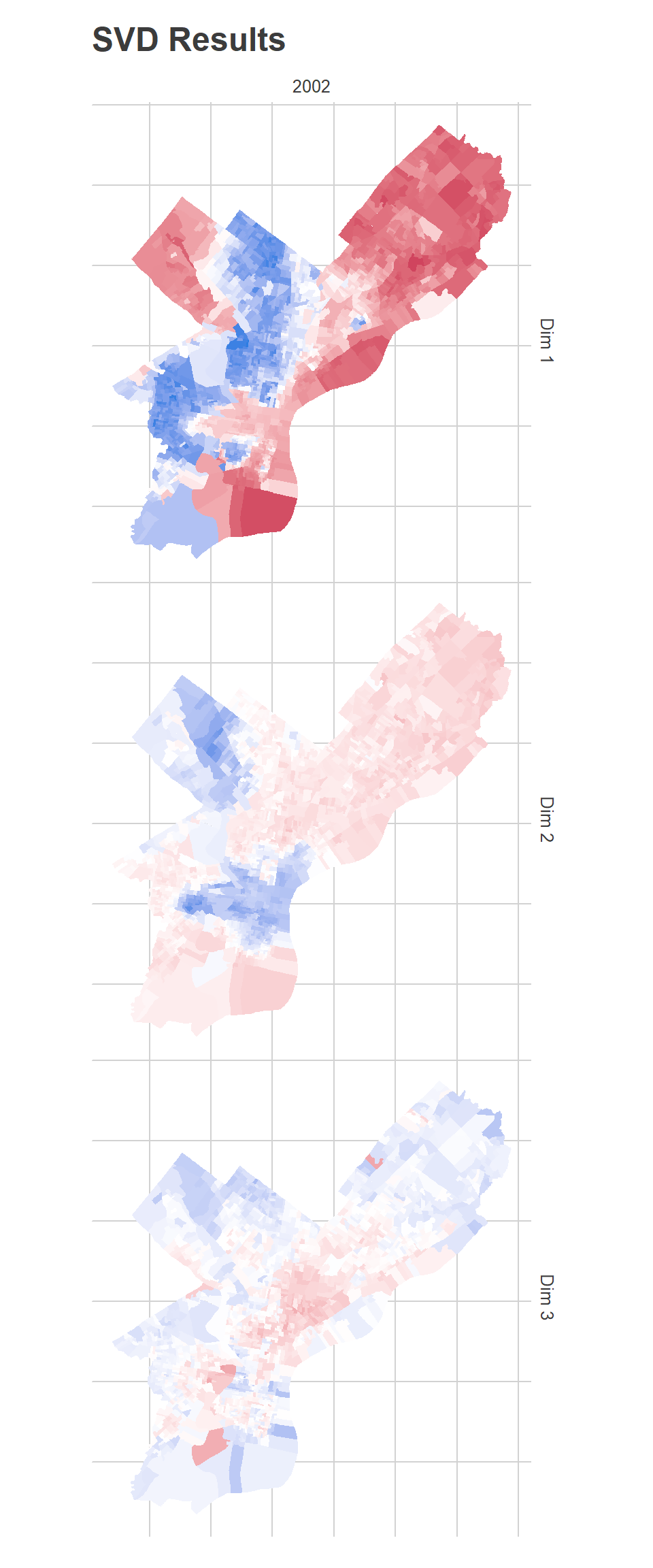
To those familiar with Philadelphia’s racial geography, Dimension 1 has clearly captured the White-Black political divide (or, similarly, the Democrtic-Republican one). It’s important to remember that the algorithm has no demographic or spatial information. Any spatial patterns or correlations with race are simply because those divisions vote for similar candidates.
The candidates who did disproportionately best in the red divisions are all Republicans: John McCain in 2008, Mitt Romney in 2012, Sam Katz in 2003. In Democratic primaries, the candidates who did disproportionately well were Hillary Clinton in 2008 and John O’Neill in 2017. Remember that this map adjusts for a candidate’s overall performance. So it’s not that John McCain won the red divisions, but that he did better than his citywide 16%.
Conversely, the candidates who did disproportionately best in the blue divisions were Chaka Fattah in the 2007 primary, Tariq Karim El-Shabazz in 2017, and Anthony Hardy Williams in 2015.
The second dimension is weaker than the first (as measured by \(D\) and exemplified as the weaker colors in the map). It captures candidates who did disproportionately well in Center City and the ring around it, and in Mount Airy and Chestnut Hill.
The candidates who did disproportionately best in the blue divisions were all third-party Council challengers: Andrew Stober in 2015, Nicolas O’Rourke in 2019, Kendra Brooks in 2019, and Kristin Combs in 2015. The candidates who did disproportionately best in the red divisions were John O’Neill and Michael Untermeyer in the 2017 DA primary and Ed Neilson in the 2015 Council primary.
The third dimension is the weakest, and has identified an interesting pattern: lumping together the Northwest, parts of the Northeast, and deep South Philly as blue, and Hispanic North Philly with Penn and other young sections of the city as red. This dimension has identified Democratic party power: the candidates who did disproportionately best in the blue divisions all had strong party backing, including Edgar Howard in the 2003 Commissioner primary, Allan Domb and Derek Green in the 2019 primary, and Jim Kenney in the 2011 primary. The candidates who did disproportionately best in the red divisions were non-party challengers (who didn’t align with Dimension 2’s progressive candidates): Nelson Diaz for 2015 mayor, Joe Vodvarka for 2010 senate, and third-party mayoral candidates Boris Kindij and Osborne Hart in 2015.
A fascinating note: remember that the model doesn’t know anything about space. There is nothing built into the model that tries to say neighboring divisions should have similar scores. All of the spatial correlations in the scores are purely because those divisions vote similarly.
Changes over time
All of the above I’ve discussed before. But the thing that’s bothered me is that these boundaries have all clearly changed since 2002. The base for progressive challengers has expanded into the ring around Center City: University City, Fishtown and Kensington, East Passyunk. And the demographics of the city have changed: we have a strongly growing Hispanic population, and Black householders continue to grow in Philadelphia’s Middle Neighborhoods. If you naively applied the boundaries from the maps above to a 2020 election, you would miss important shifts on the edges. We can do better.
Consider candidates who did well in each dimension, but from early and late in the data. Here are maps of some candidates that had large scores in the first:
View code
map_keys <- function(key_df){
  dim_1_map <- df %>%
    inner_join(key_df) %>%
    arrange(sign, time) %>%
    mutate(
      candidate_key = factor(candidate_key, levels=unique(candidate_key)),
      votes=votes+1,
      total_votes=total_votes+ncand,
      pvote=votes/total_votes
    )

  dim_1_map %<>%
    group_by(candidate_key) %>%
    mutate(
      pvote_city = sum(votes) / sum(total_votes)
    )

  winsorize <- function(x, pct=0.95){
    cutoff <- quantile(abs(x), pct, na.rm = T)
    replace <- abs(x) > cutoff
    x[replace] <- sign(x[replace]) * cutoff
    x
  }

  ggplot(divs %>% left_join(dim_1_map)) +
    geom_sf(aes(fill=winsorize(log10(pvote / pvote_city))), color=NA) +
    scale_fill_viridis_c("log(\n % of Vote /\n % of Vote in city\n)") +
    facet_wrap(
      ~candidate_key, 2, 2,
      labeller=labeller(
        candidate_key = function(key){
          candidate <- gsub(".*_(.*)_.*_(.*)_(.*)", "\\1", key) %>% format_name
          year <- as.integer(gsub(".*_(.*)_.*_(.*)_(.*)", "\\2", key)) + MIN_YEAR
          election <- gsub(".*_(.*)_.*_(.*)_(.*)", "\\3", key) %>% format_name
          sprintf("%s, %s %s", candidate, year, election)
        }
      )
    ) +
    theme_map_sixtysix() %+replace% theme(legend.position="right")
}

map_keys(
  tribble(
    ~candidate_key, ~sign, ~time,
    "MAYOR_SAM KATZ_REPUBLICAN_1_general", -1, 0,
    "PRESIDENT OF THE UNITED STATES_DONALD J TRUMP_REPUBLICAN_14_general", -1, 1,
    "MAYOR_JOHN F STREET_DEMOCRATIC_1_general", 1, 0,
    "MAYOR_ANTHONY HARDY WILLIAMS_DEMOCRATIC_13_primary", 1, 1
  )
) +
  ggtitle("Candidates with extreme scores in Dimension 1")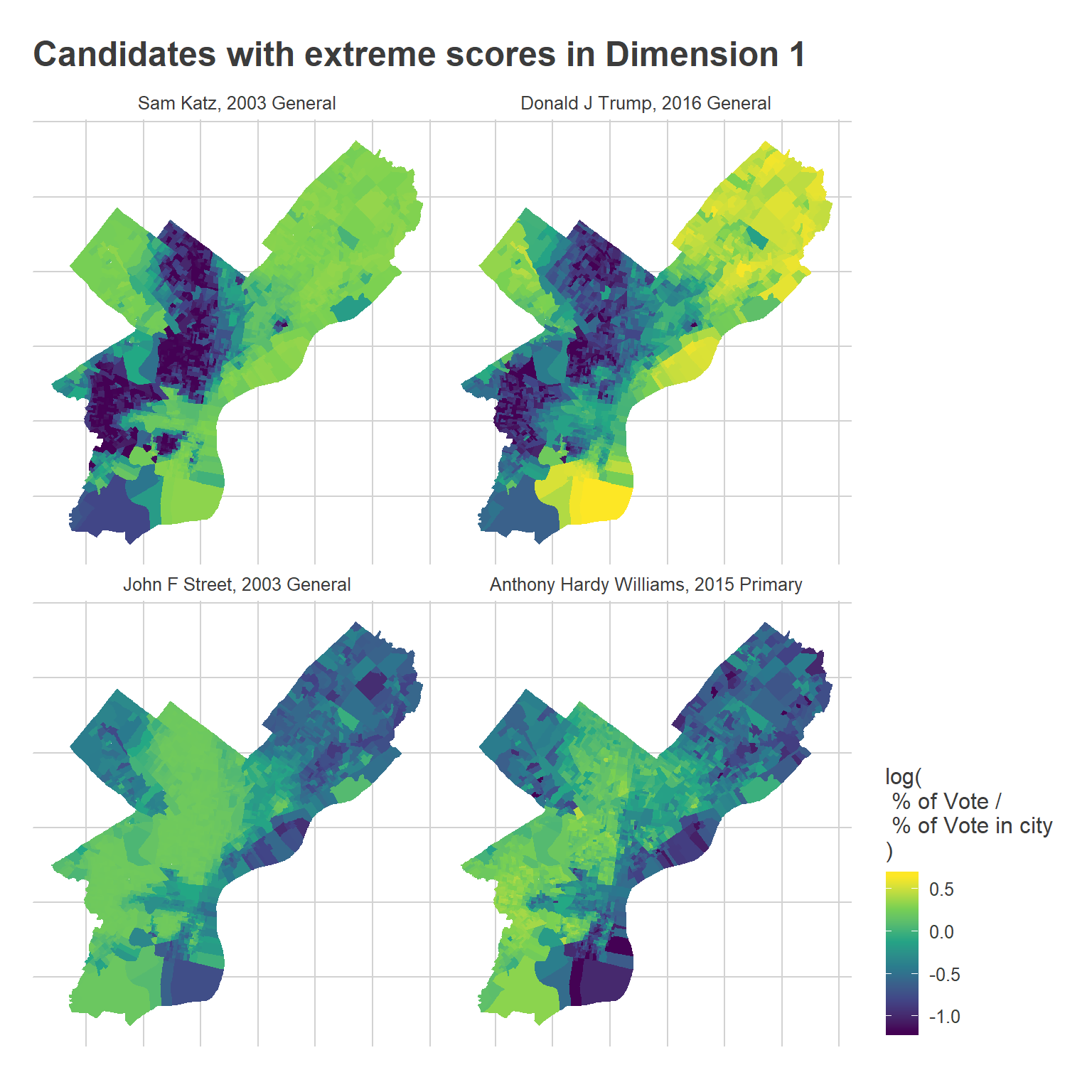
Notice that the boundaries in some places changed, such as Street’s performance in University City versus Hardy Williams’.
Here’s Dimension 2:
View code
map_keys(
  tribble(
    ~candidate_key, ~sign, ~time,
    "COUNCIL AT LARGE_KENDRA BROOKS_WORKING FAMILIES PARTY_17_general", -1, 1,
    "COUNCIL AT LARGE_ANDREW TOY_DEMOCRATIC_5_primary", -1, 0,
    "MAYOR_ROBERT A BRADY_DEMOCRATIC_5_primary", 1, 0,
    "DISTRICT ATTORNEY_JOHN O NEILL_DEMOCRATIC_15_primary", 1, 1
  )
) +
  ggtitle("Candidates with extreme scores in Dimension 2")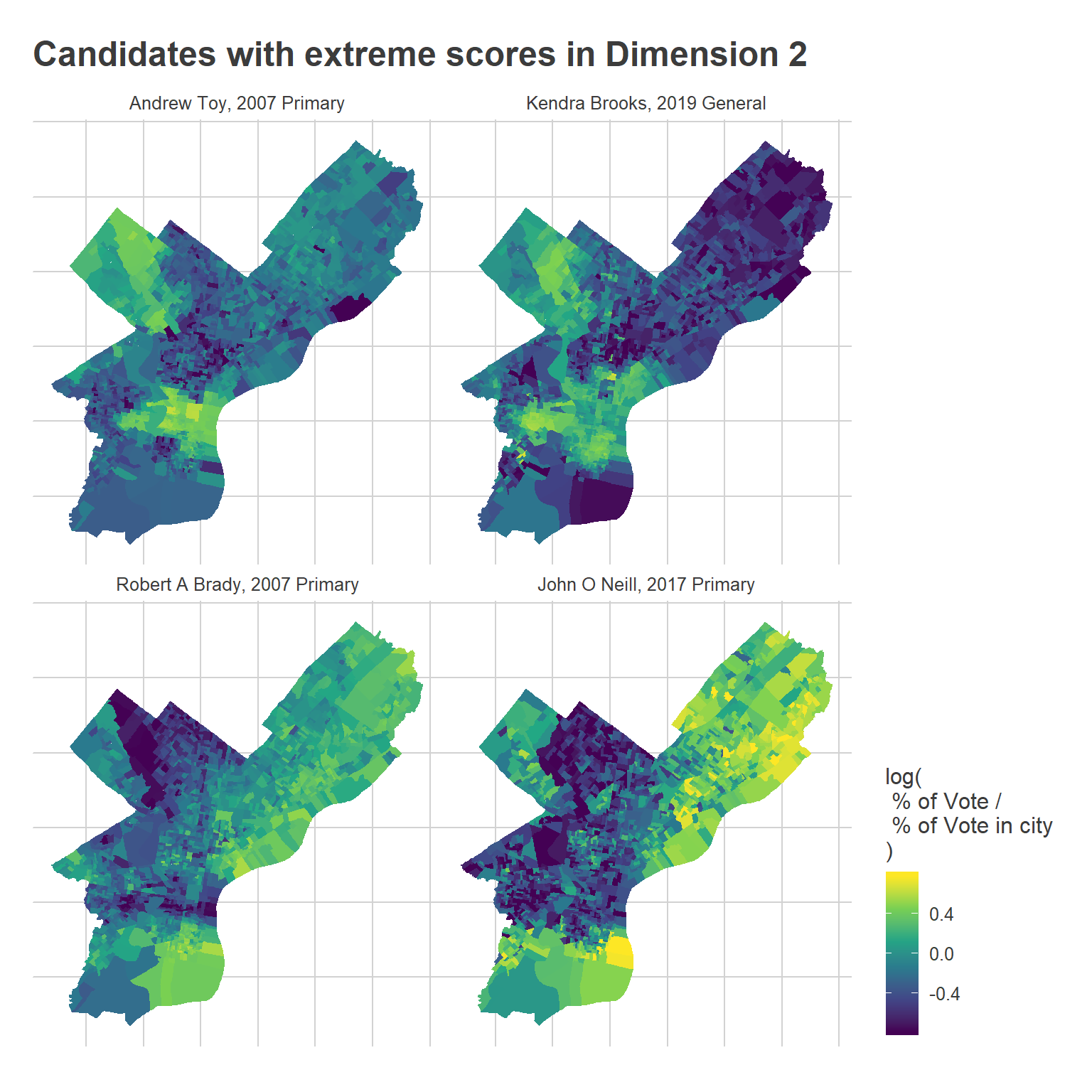
The main takeaway from the maps is that the Center City progressive bloc has expanded outward. Toy did better in a core Center City region, whereas Brooks outperformed to the West, South, and North of where he did. It’s a little hard to see, but Brady also won much more of Fishtown and Kensington than O’Neill did.
And finally, Dimension 3:
View code
map_keys(
  tribble(
    ~candidate_key, ~sign, ~time,
    "MAYOR_NELSON DIAZ_DEMOCRATIC_13_primary", -1, 1,
    "COUNCIL AT LARGE_JUAN F RAMOS_DEMOCRATIC_1_primary", -1, 0,
    "COUNCIL AT LARGE_KATHERINE GILMORE RICHARDSON_DEMOCRATIC_17_primary", 1, 1,
    "MAYOR_MICHAEL NUTTER_DEMOCRATIC_5_primary", 1, 0
  )
) +
  ggtitle("Candidates with extreme scores in Dimension 3")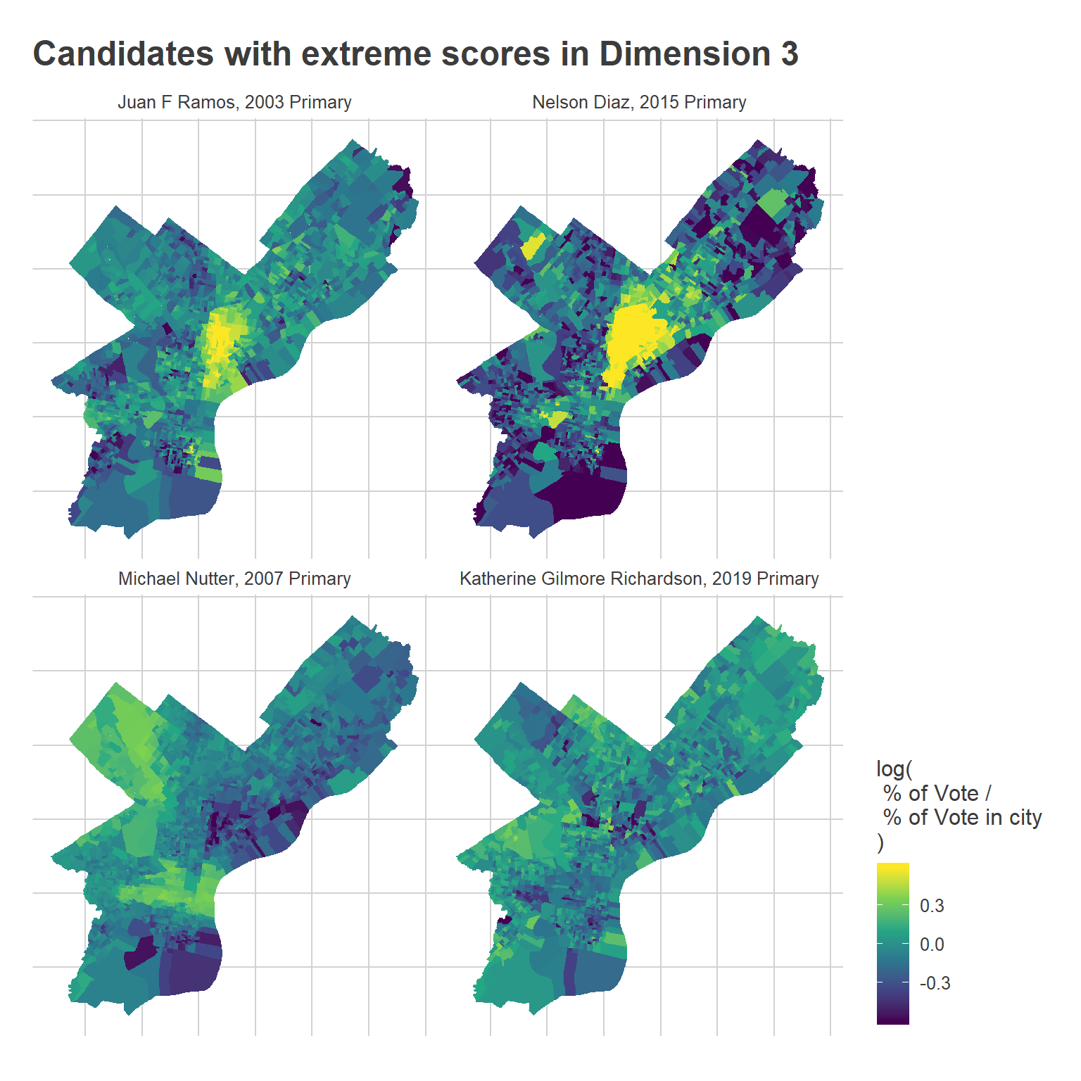
Notice that the Hispanic cluster has expanded into the Northeast.
Time-varying Blocs
Instead of the static model, consider a model where divisions’ scores are allowed to change over time. \[ \log(E[x_{ij}]) = \log(T_i) + \mu_j + (\alpha_i + \beta_i y_j)’DV_j \] where \(\alpha_i + \beta_i y_j\) is a linearly changing vector of division \(i\)’s scores by year \(y\). We’ve now allowed the embedding of the Divisions in University City, for example, to become more positive in the progressive Dimension 2 from 2002 to 2020.
Fitting this model isn’t as easy as SVD. I’ll use gradient descent to find a maximum likelihood solution, initialized with the time-invariant SVD solution. Since I’m now using likelihood, I’ll also assume a poisson distribution for \(x\). [One mathematical note: we lose the guarantee of SVD that the U- and V-vectors will be orthogonal. I’m not really worried about this, and am not convinced there are practical implications as long as we sufficiently normalize, but be forewarned.]
View code
VERBOSE <- TRUE
printv <- function(x, ...) if(VERBOSE) print(x, ...=...)

U_df <- U_0
V_df <- V_0
D <- D_0

update_U <- function(df, D, V_df){
  form <- sprintf(
    "votes ~ -1 + %s",
    paste(sprintf("dv.%1$i + year:dv.%1$i", 1:K), collapse=" + ")
  )

  for(k in 1:K){
    var.k <- function(stem) sprintf("%s.%i", stem, k)
    V_df[[var.k("dv")]] <- D[k] * V_df[[var.k("score")]]
  }

  U_new <- df %>%
    mutate(votes=round(votes)) %>%
    left_join(
      V_df %>% select(candidate_key, mean_log_pvote, starts_with("dv.")),
      by=c("candidate_key")
    ) %>%
    filter(total_votes > 0) %>%
    group_by(warddiv) %>%
    do(
      broom::tidy(
        glm(
          as.formula(form),
          data = .,
          family=poisson(link="log"),
          offset=log(total_votes) + mean_log_pvote
        )
      )
    ) %>%
    ungroup()

  U_new %<>%
    mutate(
      term_clean=case_when(
        grepl("year", term) ~ gsub(".*dv\\.([0-9]+)(:.*|$)", "beta.\\1", term),
        TRUE ~ gsub("dv\\.([0-9]+)$", "alpha.\\1", term)
      )
    ) %>%
    select(warddiv, term_clean, estimate) %>%
    spread(key=term_clean, value=estimate)

  return(U_new)
}


update_V <- function(df, U_df, D){

  dfu <- df %>%
    left_join(U_df,by="warddiv")

  for(k in 1:K){
    var.k <- function(stem) sprintf("%s.%i", stem, k)
    dfu[[var.k("du")]] <- D[k] * (dfu[[var.k("alpha")]] + dfu[[var.k("beta")]] * dfu$year)
  }

  form <- sprintf(
    "votes ~ 1 + %s",
    paste(sprintf("du.%1$i", 1:K), collapse=" + ")
  )

  V_new <-  dfu %>%
    mutate(votes=round(votes)) %>%
    filter(total_votes > 0) %>%
    group_by(candidate_key) %>%
    do(
      broom::tidy(
        glm(
          as.formula(form),
          data = .,
          family=poisson(link="log"),
          offset=log(total_votes)
        )
      )
    ) %>%
    mutate(
      term = case_when(
        grepl("^du", term) ~ gsub("^du", "score", term),
        term=="(Intercept)" ~ "mean_log_pvote"
      )
    ) %>%
    select(candidate_key, term, estimate) %>%
    spread(key=term, value=estimate)

  return(V_new)
}

scale_udv <- function(U_df, D, V_df){
  for(k in 1:K){
    var.k <- function(stem) paste0(stem, ".", k)

    sum_sq <- sum(V_df[[var.k("score")]]^2)
    D[k] <- D[k] * sqrt(sum_sq)
    V_df[[var.k("score")]] <- V_df[[var.k("score")]] / sqrt(sum_sq)

    u <- U_df[[var.k("alpha")]] + outer(U_df[[var.k("beta")]], 0:max(df$year))
    sum_sq <- sum(u^2)
    D[k] <- D[k] * sqrt(sum_sq)
    U_df[[var.k("alpha")]] <- U_df[[var.k("alpha")]] / sqrt(sum_sq)
    U_df[[var.k("beta")]] <- U_df[[var.k("beta")]] / sqrt(sum_sq)
  }

  return(list(U=U_df, D=D, V=V_df))
}


predict_score <- function(df, U_df, V_df, D){
  outer <- df %>%
    select(warddiv, candidate_key, year, votes, total_votes) %>%
    left_join(U_df, by="warddiv") %>%
    left_join(V_df, by=c("candidate_key"))

  vec <- 0
  for(k in 1:K){
    var.k <- function(var) paste0(var, ".", k)
    a <- outer[[var.k("alpha")]]
    b <- outer[[var.k("beta")]]
    u <- (a + b*outer$year)
    v <- outer[[var.k("score")]]
    vec <- vec +  u * v * D[k]
  }

  outer$udv <- vec
  outer$log_pred <- outer$mean_log_pvote + log(outer$total_votes) + outer$udv
  outer$pred <- exp(outer$log_pred)
  outer$resid <- outer$votes - outer$pred
  return(outer %>% select(candidate_key, warddiv, udv, votes, pred, log_pred, resid, year))
}

calc_ll <- function(pred){
  sum(
    dpois(round(pred$votes), pred$pred, log=TRUE)[df$total_votes > 0]
  )
}

pred_0 <- predict_score(df, U_0, V_0, D_0)
resids <- calc_ll(pred_0)

RUN <- FALSE
if(RUN){
  for(i in 1:100){
    U_df <- update_U(df, D, V_df)
    new_pred <- predict_score(df, U_df, V_df, D)
    # plot_compare_to_svd(new_pred)
    printv(
      sprintf("%i U: %0.6f", i, calc_ll(new_pred))
    )
    resids <- c(resids, calc_ll(new_pred))

    V_df <- update_V(df, U_df, D)
    new_pred <- predict_score(df, U_df, V_df, D)
    # plot_compare_to_svd(new_pred)
    printv(
      sprintf("%i V: %0.6f", i, calc_ll(new_pred))
    )
    resids <- c(resids, calc_ll(new_pred))

    ## Not necessary to model D, since V is always maximized. Instead, just rescale it.
    # D <- update_D(df, U_df, V_df)
    scaled <- scale_udv(U_df, D, V_df)
    U_df <- scaled$U
    D <- scaled$D
    V_df <- scaled$V

    new_pred <- predict_score(df, U_df, V_df, D)
    # plot_compare_to_svd(new_pred)
    printv(
      sprintf("%i D: %0.6f", i, calc_ll(new_pred))
    )
    if(abs(calc_ll(new_pred)-resids[length(resids)]) > 1e-8)
      stop("D changed resids, it shouldn't.")
    plot(log10(diff(resids)), type="b")
  }

  res <- list(U=U_df, D=D, V=V_df)
  saveRDS(res, file=dated_stem("svd_time_res", "", "RDS"))
} else {
  res <- readRDS(max(list.files(pattern="svd_time_res")))
  U_df <- res$U
  V_df <- res$V
  D <- res$D
}
View code
## Just for fun, I figured I'd try the model in the new R torch package too :)

if(RUN){
  library(torch)

  V_t <- torch_tensor(
    as.matrix(V_df %>% ungroup() %>% select(starts_with("score"))),
    requires_grad=TRUE
  )
  cand_means <- torch_tensor(V_df$mean_log_pvote, requires_grad=TRUE)

  alpha <- torch_tensor(
    as.matrix(U_df %>% select(starts_with("alpha"))),
    requires_grad=TRUE
  )
  beta <- torch_tensor(
    as.matrix(U_df %>% select(starts_with("beta"))),
    requires_grad=TRUE
  )

  year <- torch_tensor(t(t(df$year)), requires_grad=FALSE)

  # Don't let D change, since V will scale freely.
  D_t <- torch_tensor(D[1:K], requires_grad=FALSE)


  cands_i <- match(df$candidate_key, V_df$candidate_key)
  divs_i <- match(df$warddiv, U_df$warddiv)

  votes <- torch_tensor(df$votes, requires_grad=FALSE)
  log_total_votes <- torch_tensor(df$total_votes, requires_grad=FALSE)$log()

  valid_rows <- df$total_votes > 0

  create_dfs <- function(alpha, beta, D, V, cand_means){
      U_df <- data.frame(
        warddiv=U_df$warddiv,
        alpha=as_array(alpha),
        beta=as_array(beta)
      )

      V_df <- data.frame(
        candidate_key=V_df$candidate_key,
        score=as_array(V),
        mean_log_pvote=as_array(cand_means)
      )

      return(scale_udv(U_df, as_array(D), V_df))
  }

  cand_rows <- lapply(candidates$candidate_key, function(x) which(df$candidate_key == x))

  learning_rate <- 1e-4
  lls <- c()
  for (t in seq_len(5e3)) {
    alpha_i <- alpha[divs_i]
    beta_i <- beta[divs_i]
    cand_means_i <- cand_means[cands_i]
    V_i <- V_t[cands_i,]

    udv <- (alpha_i + beta_i$mul(year))$mul(D_t)$mul(V_i)$sum(2)
    log_pred <- cand_means_i$add(log_total_votes)$add(udv)

    loss <- nn_poisson_nll_loss()
    ll <- loss(
      log_pred[valid_rows],
      votes[valid_rows]
    )

    ll$backward()

    if (t %% 100 == 0 || t == 1){
      with_no_grad({
        lls <- c(lls, as.numeric(ll))
        cat("Step:", t, ":\n", as.numeric(ll), "\n")

        dfs <- create_dfs(alpha, beta, D_t, V_t, cand_means)
        new_pred <- predict_score(df, dfs$U, dfs$V, dfs$D)
        resids <- c(resids, calc_ll(new_pred))
        plot(log10(diff(resids)), type="b")
        cat(tail(resids, 1), "\n")
      })
    }

    if(is.na(as.numeric(ll))) stop("Bad ll")

    with_no_grad({
      V_t$sub_(learning_rate * V_t$grad)
      cand_means$sub_(learning_rate * cand_means$grad)
      alpha$sub_(learning_rate * alpha$grad)
      beta$sub_(learning_rate * beta$grad)

      # D$sub_(learning_rate * D$grad)

      V_t$grad$zero_()
      cand_means$grad$zero_()
      alpha$grad$zero_()
      beta$grad$zero_()
      # D$grad$zero_()

    })
  }

  res <- create_dfs(alpha, beta, D_t, V_t, cand_means)
  U_df <- res$U
  D <- res$D
  V_df <- res$V
  saveRDS(res, file=dated_stem("svd_time_res", "", "RDS"))
}
The results show how the dimensions have changed over time.
View code
# V_df %>%
#   # filter(grepl("_primary", candidate_key)) %>%
#   arrange(-score.3)

map_u(U_df, D, c(2002, 2020)) + ggtitle("Time-Varying Results")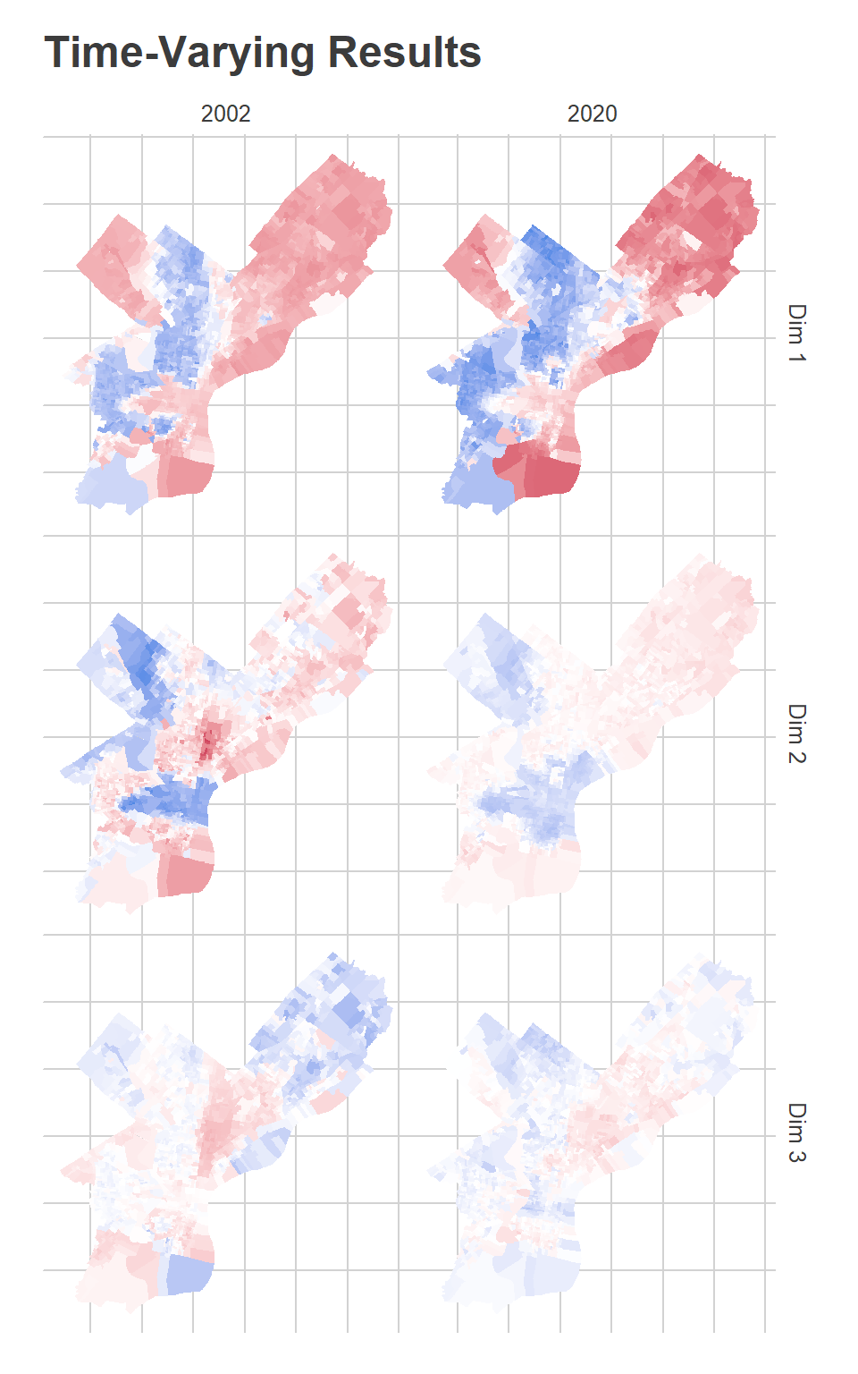
The first dimension, which I said captures Black-White divides (or, similarly, Democratic-Republican), shows that the blue dimension has expanded in the Northwest and in Overbrook/Wynnefield, while the red dimension have expanded outward from its dense Center City core, and lost ground in the lower Northeast. John Street did disproportionately well in the blue divisions in 2003, while Tariq El-Shabazz did disproportionately well in 2017. Meanwhile, the candidates who did disproportionately best in the red dimension are Republicans: John McCain, Mitt Romney, Sam Katz.
The second dimension, for which I said blue captures progressive candidates, has expanded outward even more from Center City, now covering much of Fishtown and Kensington, upper South Philly, and into Brewerytown. Meanwhile, the wealthy progressive base in Wynnefield and Overbrook is gone, having been replaced by the strong-Democrat dimension 1.
The third dimension is hard to figure out. In 2002, It was strongly red in Hispanic North Philly, deep South Philly, and Overbrook. By 2020, it’s broadly red in Hispanic North Philly up into the lower Northeast. Meanwhile, the blue divisions include the Northeast and the Northwest. The General election candidates who do disproportionately well in the red divisions are third parties–Osborne Hart and John Staggs in 2015, Neal Gale in 2018–and the candidates who do well in the Democratic Primary typically have Hispanic surnames–Nelson Diaz in 2015, Humberto Perez in 2011, Deja Lynn Alvarez in 2019. Remember, this is all after controlling for the stronger dimensions 1 and 2, and is not a terribly influential dimension.
Changing Voting Blocs
The Voting Blocs themselves were a discretized version of these continuous scores into four categories.
In previous iterations, I hand-curated the Voting Blocs by choosing cutoffs for the categories. Now, since we have different scores across different years, I’ll try to automate it. I’ll use simple K-means clustering on the scores.
View code
years <- c(2002, 2020)

mutate_add_score <- function(U_df, D, year, min_year=MIN_YEAR){
  year_dm <- year - min_year
  for(k in 1:K){
    var.k <- function(x) sprintf("%s.%i", x, k)
    U_df[[var.k("score")]] <- D[k] * (
      U_df[[var.k("alpha")]] + U_df[[var.k("beta")]] * year_dm
    )
  }
  return(U_df)
}

div_cats <- purrr::map(
  c(2002, 2020),
  function(y) mutate_add_score(U_df, D, as.integer(y))
) %>%
  bind_rows(.id = "id") %>%
  mutate(year = c(2002, 2020)[as.integer(id)])

# plot(div_cats %>% select(starts_with("score")))

km <- kmeans(
  div_cats[, c("score.1","score.2","score.3")],
  centers=matrix(
    10 * c(
      1, -1, 0,
      -1, 1, 0,
      0, -1, -1,
      -1, -1, 1
    ),
    4, 3,
    byrow=T
  )
)

cats <- c(
  "Black Voters",
  "Wealthy Progressives",
  "Hispanic Voters",
  "White Moderates"
)
div_cats$cluster <- factor(cats[km$cluster], levels=cats)
cat_colors <- c(light_blue, light_red, light_orange, light_green)
names(cat_colors) <- cats

plot(div_cats %>% select(starts_with("score")), col=cat_colors[km$cluster])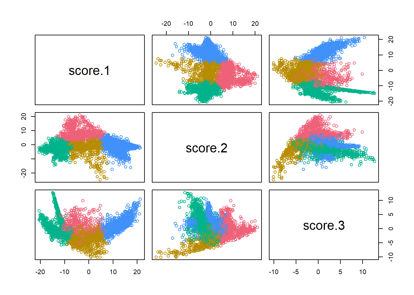
The three score dimensions are chopped into four groups. Bloc 1 (Blue), has positive scores in Dimension 1. These are the Black Voter divisions. Bloc 2 (Red) has middling scores in Dimension 1 but positive scores in Dimension 2. These are the Wealthy Progressive divisions. Bloc 3 has middling scores in Dimension 1, negative scores in Dimension 2, and negative scores in Dimension 3. These are the Hispanic Voter divisions. (I previously called these Hispanic North Philly, but once we allow for time, it turns out that some South Philly divisions in 2002 were also in the group). Bloc 4 has negative scores in Dimension 1 and negative scores in Dimension 2. These are the White Moderate divisions.
View code
ggplot(divs %>% left_join(div_cats)) +
  geom_sf(aes(fill=cluster), color=NA) +
  scale_fill_manual(NULL, values=cat_colors) +
  facet_wrap(~year) +
  theme_map_sixtysix() %+replace%
  theme(legend.position="bottom", legend.direction="horizontal") +
  ggtitle("Voting Blocs over time")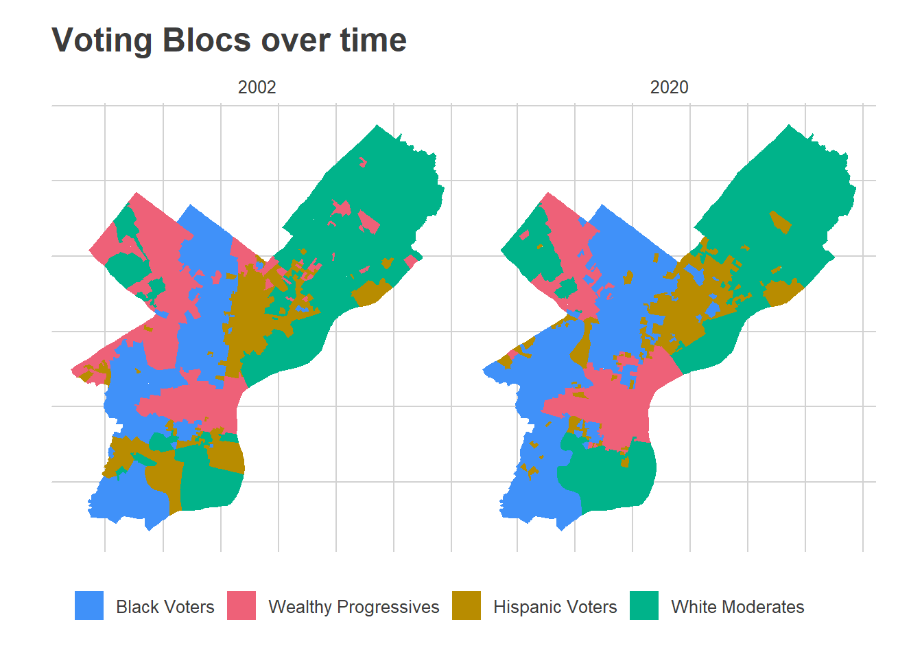
In the maps above, you can clearly see the expansion of the Wealthy Progressive divisions outward from Center City, and growth of the Black Voter divisions in North and West Philly, along with a shift in the Hispanic Voter divisions eastward and up into the lower Northeast.
With the moving boundaries, the changes in Blocs’ share of the vote is even starker than before.
View code
mutate_add_cat <- function(U_df, D, year, km, min_year=MIN_YEAR){
  U_score <- mutate_add_score(U_df, D, year, min_year)

  cluster <- apply(
    as.matrix(km$centers),
    1,
    function(center) {
      apply(
        as.matrix(U_score %>% select(starts_with("score"))),
        1,
        function(row) sum((row - center)^2)
      )
    }
  )

  cat <- cats[apply(cluster, 1, which.min)]

  return(U_score %>% mutate(cat=cat))
}

div_cats <- purrr::map(
  2002:2020,
  function(y) mutate_add_cat(U_df, D, as.integer(y), km)
) %>% bind_rows(.id = "id") %>% mutate(year=as.integer(id)-1)

turnout_df <- df %>%
  filter(is_topline_office) %>%
  group_by(year, election_type, warddiv) %>%
  summarise(turnout=sum(votes), .groups="drop") %>%
  left_join(div_cats) %>%
  group_by(year, election_type) %>%
  do(
    mutate_add_cat(U_df=., D=D, year=.$year + MIN_YEAR, km=km)
  )

turnout_cat <- turnout_df %>%
  group_by(year, election_type, cat) %>%
  summarise(turnout=sum(turnout)) %>%
  group_by(year, election_type) %>%
  mutate(prop=turnout/sum(turnout))

ggplot(
  turnout_cat,
  aes(x=year+MIN_YEAR, y=100*prop, color=cat)
) +
  geom_line(aes(linetype=election_type), size=2)+
  geom_text(
    data=tribble(
      ~prop, ~cat,
      0.48, "Black Voters",
      0.35, "Wealthy Progressives",
      0.21, "White Moderates",
      0.06, "Hispanic Voters"
    ),
    aes(label=cat),
    fontface="bold",
    x=2015.5,
    hjust=0
  ) +
  scale_color_manual(values=cat_colors, guide=FALSE) +
  theme_sixtysix() +
  expand_limits(y=0, x=2021) +
  labs(
    title="Voting Blocs' proportions of turnout",
    subtitle="Grouped by changing blocs",
    y="Percent of Turnout",
    x=NULL,
    linetype=NULL
  )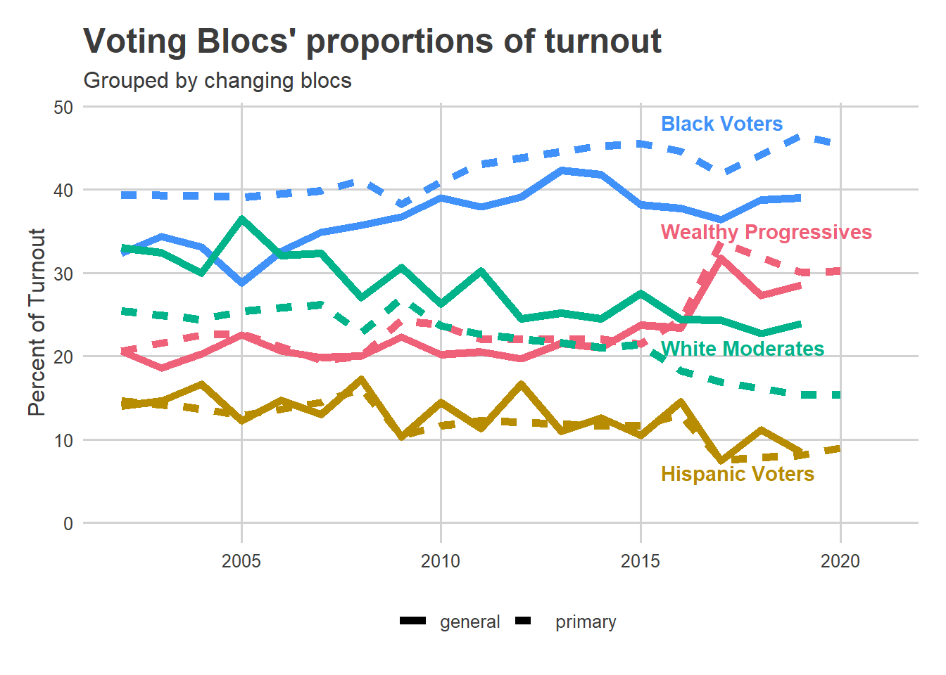
Black Voters have seen an increasing share of the turnout since 2002, though that’s somewhat mitigated by changes since 2016. Wealthy Progressive share took a clear leap in 2017 and after. White Moderate and Hispanic Voter shares have seen a steady decline since 2002. Notice that this is not directly applicable to people; this is all traits of divisions. For example, if the Hispanic population is becoming more dispersed across the city, or voting more similarly to the other Voting Blocs, they may represent a steadier share of the electorate even while Divisions clearly identifiable as Hispanic Voters are sparser. This is an instance of what is known as Ecological Inference.
Next Steps
I’ll be adapting all of my tooling: the Turnout Tracker, Election Needle, and the Voting Blocs, to use these time-varying dimensions instead. To come!