Could Kenyatta Lose?
Kenyatta Johnson, the two term councilmember from Southwest and South Philly’s District 2, is being challenged by Lauren Vidas, the former assistant finance director under Mayor Nutter. Johnson dominated a challenge from developer Ori Feibush four years ago, but has since been mired in land deal scandals. In Wednesday’s post, I claimed District 3’s challenger faced a plausible but steep path. How about for District 2? What would it take for Vidas to win?
Johnson’s District 2 is quite different from West Philly’s District 3. The gentrification has covered less ground, and Graduate Hospital didn’t take to Bernie Sanders and Larry Krasner in the same way that University City did. On the other hand, Johnson’s recent scandals will likely kneecap his 2015 popularity, and Vidas occupies a quite different lane than developer Feibush.
What are the neighborhood cohorts that will decide District 2? If Johnson holds, what neighborhoods will he have done well in? If Vidas’s challenge is successful, which neighborhoods’ vote will she have monopolized?
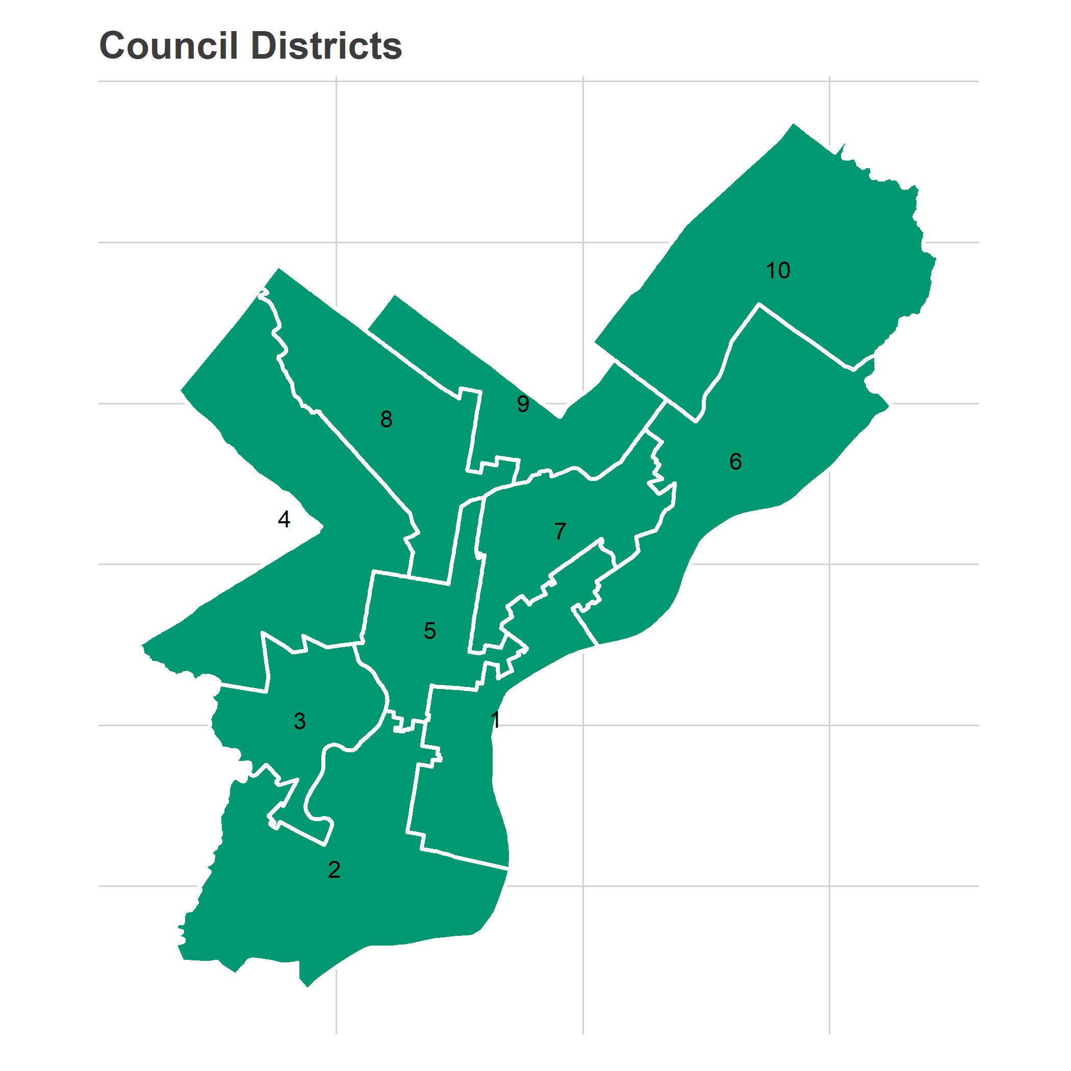
District 2’s voting blocks
The voting blocks for District 2 are less distinct than for District 3: there’s the pro-Kenyatta base of Point Breeze, the challenger base of Grad Hospital and a nub of East Passyunk, and then there’s Southwest Philly, which is somewhere in between.
View code
library(tidyverse)
library(rgdal)
library(rgeos)
library(sp)
library(ggmap)

sp_council <- readOGR("../../../data/gis/city_council/Council_Districts_2016.shp", verbose = FALSE)
sp_council <- spChFIDs(sp_council, as.character(sp_council$DISTRICT))

sp_divs <- readOGR("../../../data/gis/2016/2016_Ward_Divisions.shp", verbose = FALSE)
sp_divs <- spChFIDs(sp_divs, as.character(sp_divs$WARD_DIVSN))
sp_divs <- spTransform(sp_divs, CRS(proj4string(sp_council)))

load("../../../data/processed_data/df_major_2017_12_01.Rda")

ggcouncil <- fortify(sp_council) %>% mutate(council_district = id)
ggdivs <- fortify(sp_divs) %>% mutate(WARD_DIVSN = id)
View code
## Need to add District 2 election from 2015
raw_d2 <-  read.csv("../../../data/raw_election_data/2015_primary.csv")
raw_d2 <- raw_d2 %>%
  filter(OFFICE == "DISTRICT COUNCIL-2ND DISTRICT-DEM") %>%
  mutate(
    WARD = sprintf("%02d", asnum(WARD)),
    DIV = sprintf("%02d", asnum(DIVISION))
  )

load('../../../data/gis_crosswalks/div_crosswalk_2013_to_2016.Rda')
crosswalk_to_16 <- crosswalk_to_16 %>% group_by() %>%
  mutate(
    WARD = sprintf("%02s", as.character(WARD)),
    DIV = sprintf("%02s", as.character(DIV))
  )

d2 <- raw_d2 %>%
  left_join(crosswalk_to_16) %>%
  group_by(WARD16, DIV16, OFFICE, CANDIDATE) %>%
  summarise(VOTES = sum(VOTES * weight_to_16)) %>%
  mutate(PARTY="DEMOCRATIC", year="2015", election="primary")
df_major <- bind_rows(df_major, d2)
View code
races <- tribble(
  ~year, ~OFFICE, ~office_name,
  "2015", "MAYOR", "Mayor",
  "2015", "DISTRICT COUNCIL-2ND DISTRICT-DEM", "Council 2nd District",
  "2015", "COUNCIL AT LARGE", "City Council At Large",
  "2016", "PRESIDENT OF THE UNITED STATES", "President",
  "2017", "DISTRICT ATTORNEY", "District Attorney"
) %>% mutate(election_name = paste(year, office_name))

candidate_votes <- df_major %>%
  filter(election == "primary" & PARTY == "DEMOCRATIC") %>%
  inner_join(races %>% select(year, OFFICE)) %>%
  mutate(WARD_DIVSN = paste0(WARD16, DIV16)) %>%
  group_by(WARD_DIVSN, OFFICE, year, election) %>%
  mutate(
    total_votes = sum(VOTES),
    pvote = VOTES / sum(VOTES)
  ) %>%
  group_by()

turnout_df <- candidate_votes %>%
  filter(!grepl("COUNCIL", OFFICE)) %>%
  group_by(WARD_DIVSN, OFFICE, year, election) %>%
  summarise(total_votes = sum(VOTES)) %>%
  left_join(
    sp_divs@data %>% select(WARD_DIVSN, AREA_SFT)
  )

turnout_df$AREA_SFT <- asnum(turnout_df$AREA_SFT)
The second council district covers Southwest Philly, and parts of South Philly including Point Breeze and Graduate Hospital.
View code
get_labpt_df <- function(sp){
  mat <- sapply(sp@polygons, slot, "labpt")
  df <- data.frame(x = mat[1,], y=mat[2,])
  return(
    cbind(sp@data, df)
  )
}

ggplot(ggcouncil, aes(x=long, y=lat)) +
  geom_polygon(
    aes(group=group),
    fill = strong_green, color = "white", size = 1
  ) +
  geom_text(
    data = get_labpt_df(sp_council),
    aes(x=x,y=y,label=DISTRICT)
  ) +
  theme_map_sixtysix() +
  coord_map() +
  ggtitle("Council Districts")
View code
DISTRICT <- "2"
sp_district <- sp_council[row.names(sp_council) == DISTRICT,]

bbox <- sp_district@bbox
## expand the bbox 20%for mapping
bbox <- rowMeans(bbox) + 1.2 * sweep(bbox, 1, rowMeans(bbox))

basemap <- get_map(bbox, maptype="toner-lite")

district_map <- ggmap(
  basemap,
  extent="normal",
  base_layer=ggplot(ggcouncil, aes(x=long, y=lat, group=group)),
  maprange = FALSE
)
## without basemap:
# district_map <- ggplot(ggcouncil, aes(x=long, y=lat, group=group))

district_map <- district_map +
  theme_map_sixtysix() +
  coord_map(xlim=bbox[1,], ylim=bbox[2,])


sp_divs$council_district <- over(
  gCentroid(sp_divs, byid = TRUE),
  sp_council
)$DISTRICT

sp_divs$in_bbox <- sapply(
  sp_divs@polygons,
  function(p) {
    coords <- p@Polygons[[1]]@coords
    any(
      coords[,1] > bbox[1,1] &
      coords[,1] < bbox[1,2] &
      coords[,2] > bbox[2,1] &
      coords[,2] < bbox[2,2]
    )
  }
)

ggdivs <- ggdivs %>%
  left_join(
    sp_divs@data %>% select(WARD_DIVSN, in_bbox)
  )

district_map +
  geom_polygon(
    aes(alpha = (id == DISTRICT)),
    fill="black",
    color = "grey50",
    size=2
  ) +
  scale_alpha_manual(values = c(`TRUE` = 0.2, `FALSE` = 0), guide = FALSE) +
  ggtitle(sprintf("Council District %s", DISTRICT))
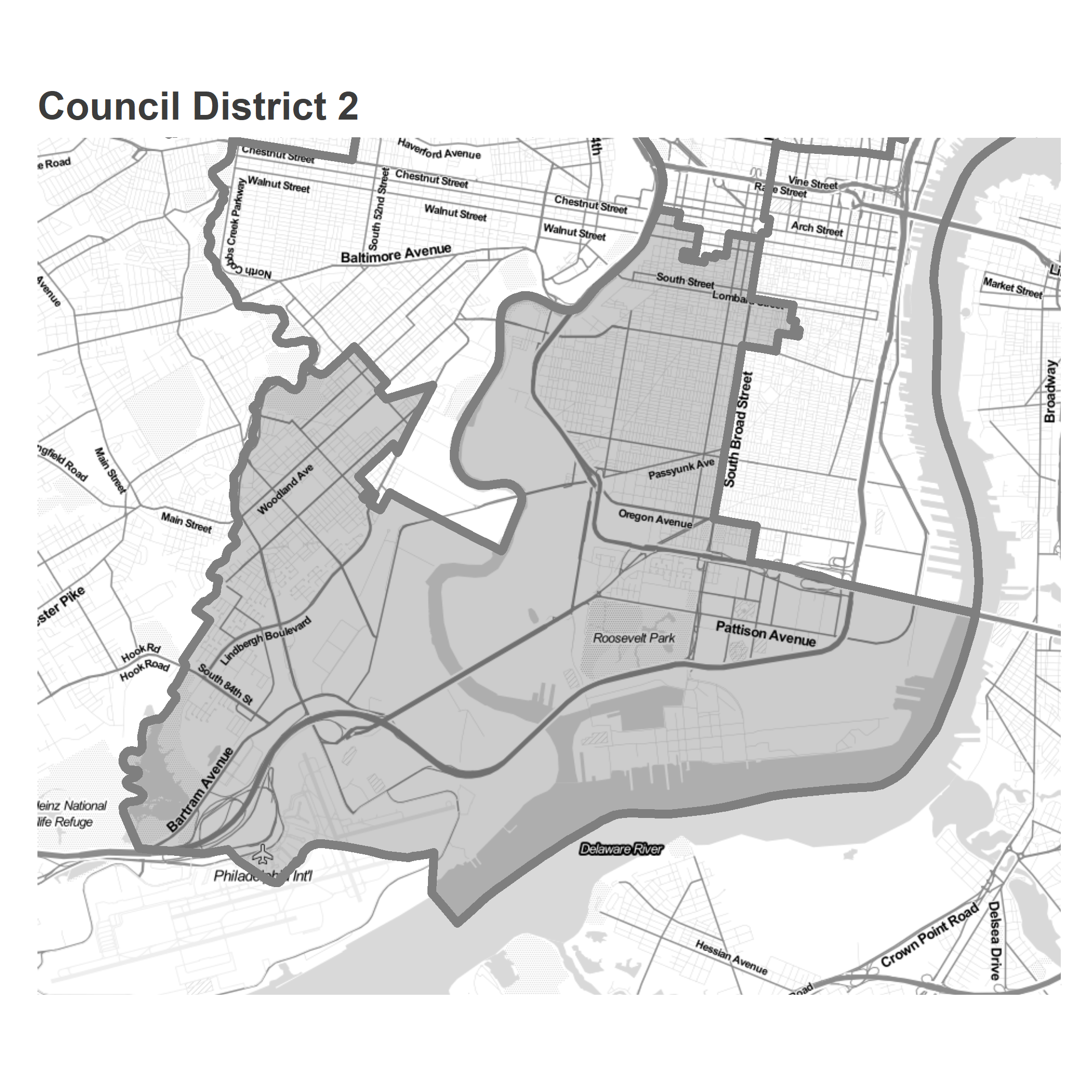
Despite the large expanse of land, the vast majority of the district’s votes come from Center City and northern South Philly.
View code
# hist(turnout_df$total_votes / turnout_df$AREA_SFT, breaks = 1000)

turnout_df <- turnout_df %>%
  left_join(races)

district_map +
  geom_polygon(
    data = ggdivs %>%
      filter(in_bbox) %>%
      left_join(turnout_df, by =c("id" = "WARD_DIVSN")),
    aes(fill = pmin(total_votes / AREA_SFT, 0.0005))
  ) +
  scale_fill_viridis_c(guide = FALSE) +
  geom_polygon(
    fill=NA,
    color = "white",
    size=1
  ) +
  facet_wrap(~ election_name) +
  ggtitle(
    "Votes per mile in the Democratic Primary",
    sprintf("Council District %s", DISTRICT)
  )
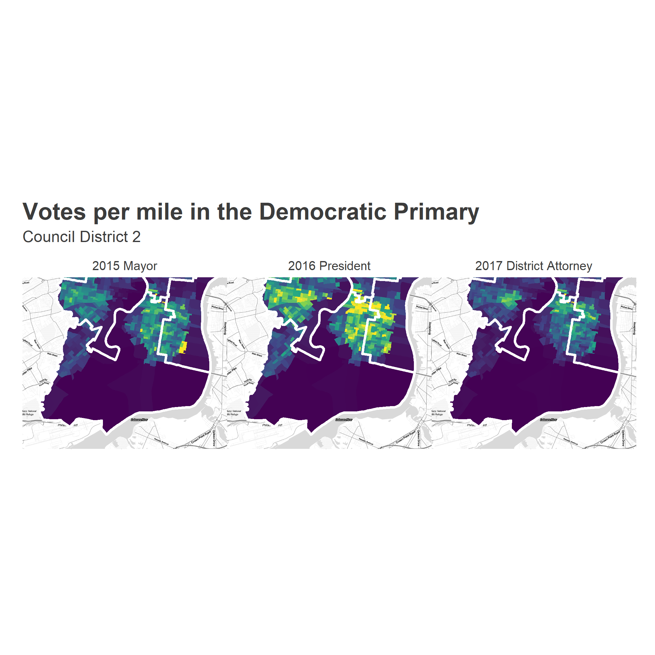
In fact, so few votes come from the industrial Southernmost tip of the city that let’s drop it from the maps. Sorry Navy Yard, but you’re ruining my scale.
View code
d2_subset <- sp_divs[sp_divs$council_district == DISTRICT,]
d2_subset <- d2_subset[
  d2_subset$WARD_DIVSN %in%
    turnout_df$WARD_DIVSN[turnout_df$total_votes / turnout_df$AREA_SFT > 0.0001],
]

bbox <- gUnionCascaded(d2_subset)@bbox
## expand the bbox 20%for mapping
bbox <- rowMeans(bbox) + 1.2 * sweep(bbox, 1, rowMeans(bbox))

basemap <- get_map(bbox, maptype="toner-lite")

district_map <- ggmap(
  basemap,
  extent="normal",
  base_layer=ggplot(ggcouncil, aes(x=long, y=lat, group=group)),
  maprange = FALSE
)
## without basemap:
# district_map <- ggplot(ggcouncil, aes(x=long, y=lat, group=group))

district_map <- district_map +
  theme_map_sixtysix() +
  coord_map(xlim=bbox[1,], ylim=bbox[2,])


sp_divs$council_district <- over(
  gCentroid(sp_divs, byid = TRUE),
  sp_council
)$DISTRICT
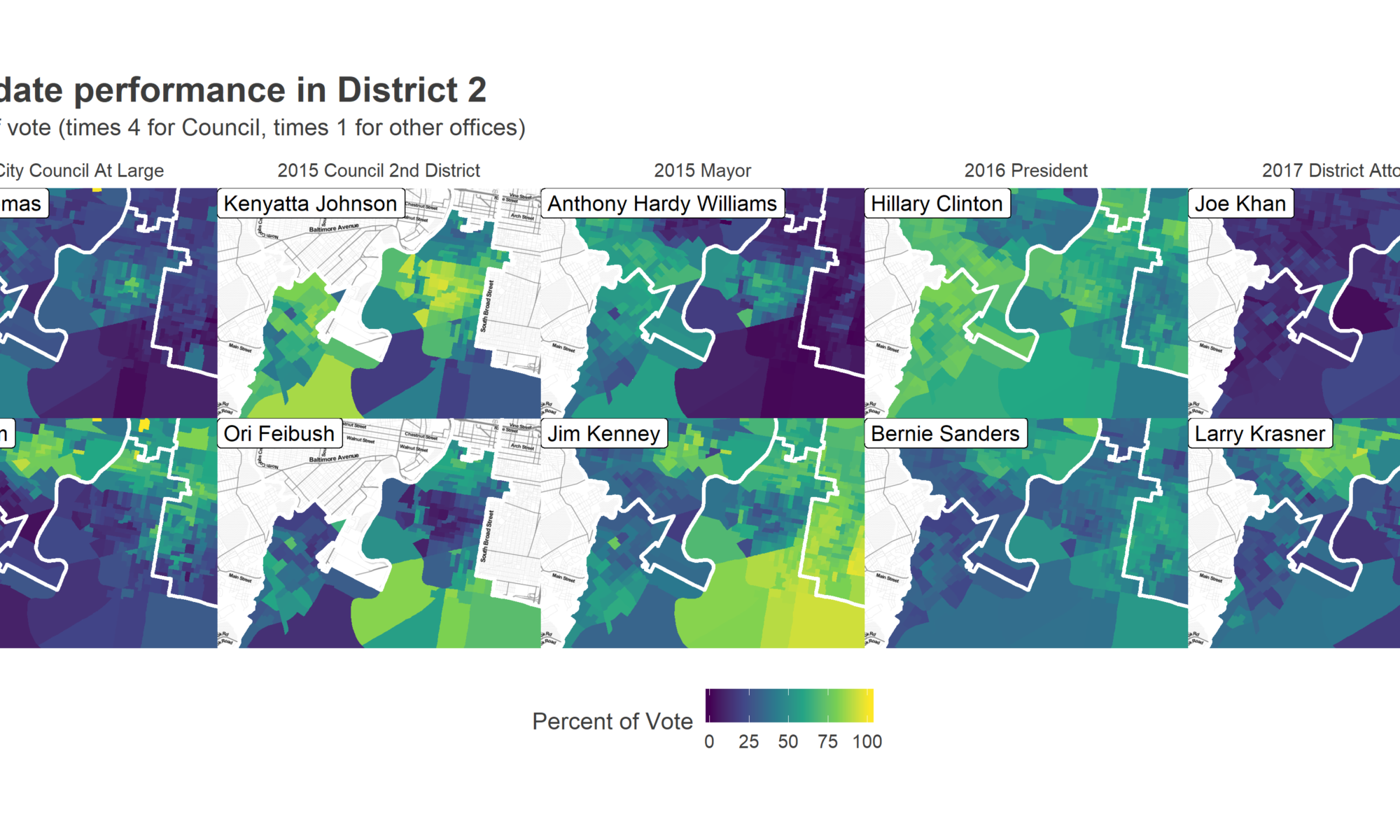
First, let’s look at the results from five recent, compelling Democratic Primary races: 2015 City Council At Large, City Council District 2, and Mayor; 2016 President; and 2017 District Attorney. The maps below show the vote for the top two candidates in District 2 (except for City Council in 2015, where I use Helen Gym and Isaiah Thomas, who were 4th and 5th in the district, and 5th and 6th citywide.)
View code
candidate_votes <- candidate_votes %>%
  left_join(sp_divs@data %>% select(WARD_DIVSN, council_district))

## Choose the top two candidates in district 3
## Except for city council, where we choose Gym and Thomas
# candidate_votes %>%
#   group_by(OFFICE, year, CANDIDATE) %>%
#   summarise(
#     city_votes = sum(VOTES),
#     district_votes = sum(VOTES * (council_district == DISTRICT))
#   ) %>%
#   arrange(desc(city_votes)) %>%
#   filter(OFFICE == "DISTRICT ATTORNEY")

candidates_to_compare <- tribble(
  ~year, ~OFFICE, ~CANDIDATE, ~candidate_name, ~row,
  "2015", "COUNCIL AT LARGE", "HELEN GYM", "Helen Gym", 2,
  "2015", "COUNCIL AT LARGE", "ISAIAH THOMAS", "Isaiah Thomas", 1,
  "2015", "DISTRICT COUNCIL-2ND DISTRICT-DEM", "KENYATTA JOHNSON", "Kenyatta Johnson", 1,
  "2015", "DISTRICT COUNCIL-2ND DISTRICT-DEM", "ORI C FEIBUSH", "Ori Feibush", 2,
  "2015", "MAYOR", "JIM KENNEY", "Jim Kenney",  2,
  "2015", "MAYOR", "ANTHONY HARDY WILLIAMS", "Anthony Hardy Williams", 1,
  "2016", "PRESIDENT OF THE UNITED STATES", "BERNIE SANDERS", "Bernie Sanders", 2,
  "2016", "PRESIDENT OF THE UNITED STATES", "HILLARY CLINTON", "Hillary Clinton", 1,
  "2017", "DISTRICT ATTORNEY", "LAWRENCE S KRASNER", "Larry Krasner", 2,
  "2017", "DISTRICT ATTORNEY", "JOE KHAN","Joe Khan", 1
)

candidate_votes <- candidate_votes %>%
  left_join(races) %>%
  left_join(candidates_to_compare)

vote_adjustment <- function(pct_vote, office){
  ifelse(office == "COUNCIL AT LARGE", pct_vote * 4, pct_vote)
}

district_map +
  geom_polygon(
    data = ggdivs %>%
      filter(in_bbox) %>%
      left_join(
        candidate_votes %>% filter(!is.na(row))
      ),
    aes(fill = 100 * vote_adjustment(pvote, OFFICE))
  ) +
  scale_fill_viridis_c("Percent of Vote") +
  theme(
    legend.position =  "bottom",
    legend.direction = "horizontal",
    legend.justification = "center"
  ) +
  geom_polygon(
    fill=NA,
    color = "white",
    size=1
  ) +
  geom_label(
    data=candidates_to_compare %>% left_join(races),
    aes(label = candidate_name),
    group=NA,
    hjust=0, vjust=1,
    x=bbox[1,1],
    y=bbox[2,2]
  ) +
  facet_grid(row ~ election_name) +
  theme(strip.text.y = element_blank()) +
  ggtitle(
    sprintf("Candidate performance in District %s", DISTRICT),
    "Percent of vote (times 4 for Council, times 1 for other offices)"
  )
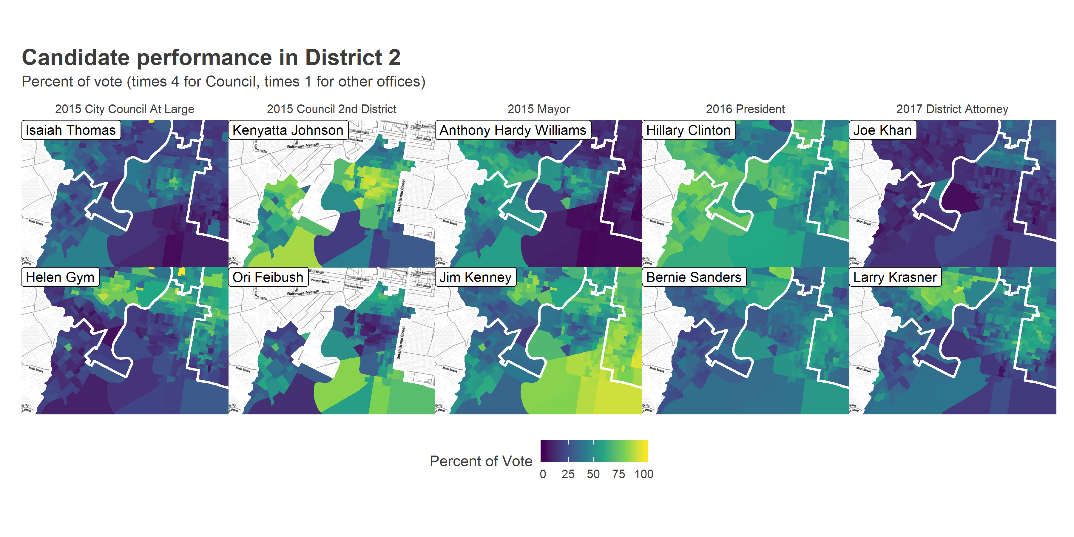
Notice two things. First, the section of Point Breeze that dominated for Kenyatta Johnson in 2015, but also voted disproportionately for Isaiah Thomas, Anthony Hardy Williams, and Hillary Clinton. These are predominantly Black neighborhoods that didn’t bite on Helen Gym, Jim Kenney, or Bernie Sanders. Unlike in West Philly, Krasner did even better in Black Point Breeze than he did in the White, gentrified Graduate Hospital, where Joe Khan did unusually well. East Passyunk exhibited similar Krasner excitement to University City.
Second, note that Washington Avenue provides the stark boundary between pro-Kenyatta Point Breeze and pro-Gym, Feibush, and Kenney Graduate Hospital (Interested in this emergent boundary? Boy, have I got a dissertation for you!) Above Washington (along with the nub of East Passyunk that extends into the East of the district) both support the farther left challengers and turn out in force, although they didn’t support Sanders and Krasner as sharply as other gentrified parts of the city.
The district had one more coalition, hidden by these maps: Trump supporters.
View codeusp_2016 <- df_major %>%
filter(
election=="general"&
year == 2016 &
OFFICE == "PRESIDENT OF THE UNITED STATES" &
CANDIDATE %in% c("DONALD J TRUMP", "HILLARY CLINTON")
) %>%
mutate(WARD_DIVSN = paste0(WARD16, DIV16)) %>%
group_by(WARD_DIVSN, CANDIDATE) %>%
summarise(VOTES = sum(VOTES)) %>%
group_by(WARD_DIVSN) %>%
summarise(
turnout = sum(VOTES),
pdem = sum(VOTES * (CANDIDATE == "HILLARY CLINTON")) / sum(VOTES)
)
district_map +
geom_polygon(
data = ggdivs %>%
filter(in_bbox) %>%
left_join(
usp_2016
),
aes(fill = 100 * (1-pdem))
) +
scale_fill_gradient2(
"Percent for Donald Trump",
low = strong_blue, mid = "white", high = strong_red, midpoint = 50
)+
theme(
legend.position = "bottom",
legend.direction = "horizontal",
legend.justification = "center"
) +
geom_polygon(
fill=NA,
color = "white",
size=1
) +
expand_limits(fill = 80) +
ggtitle("South of Passyunk went for Trump", "Percent of two-party vote in the 2016 Presidential election")
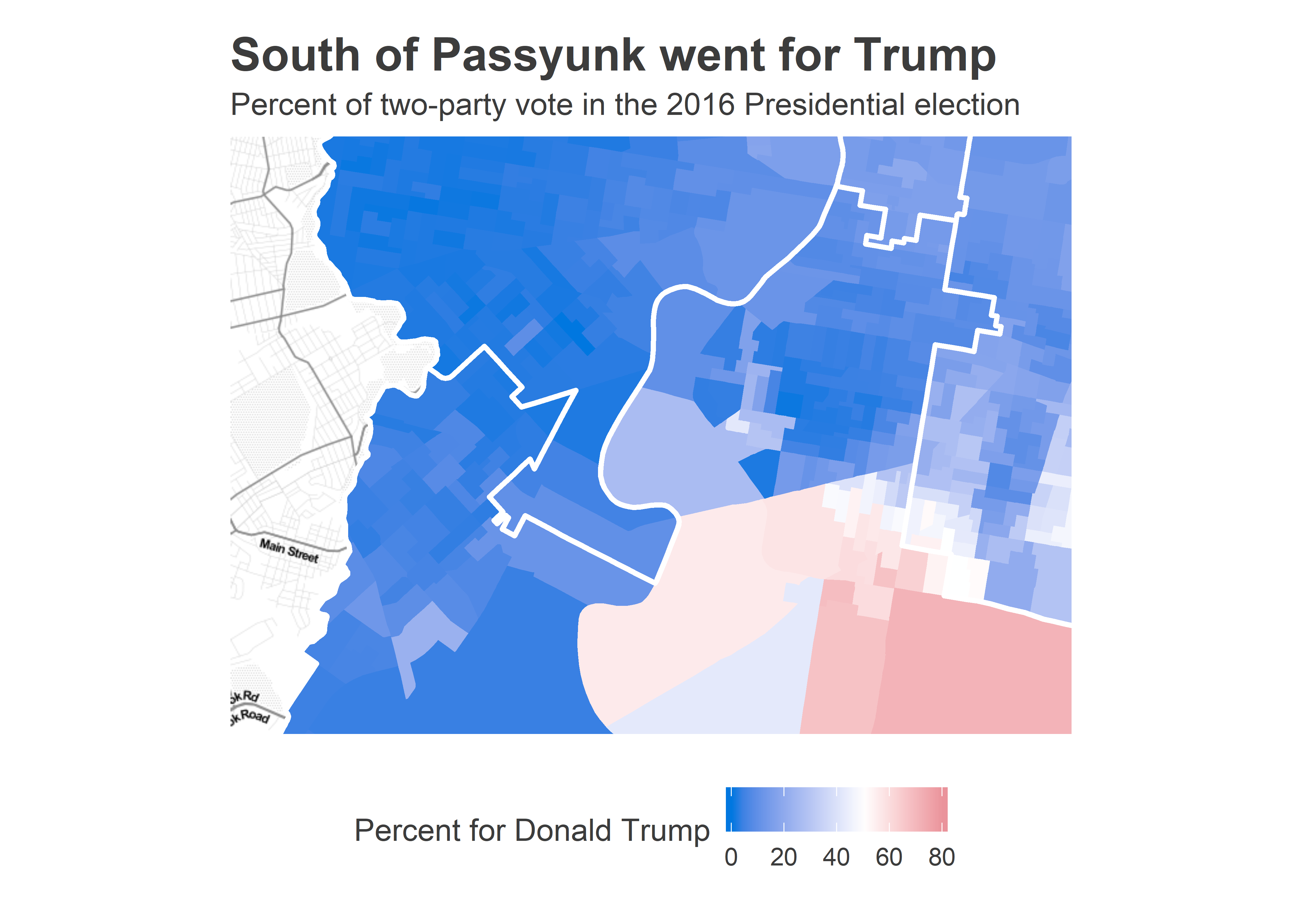
South of Passyunk voted Trump, with up to 60% of the vote! Coupled with parts of the Northeast, this represents Philadelphia’s Trump Democrats. We’ll treat them separately.
To simplify the analysis, let’s divide the District into coalitions. We’ll use four: “Johnson’s Base” of Point Breeze, “Gentrified Challengers” of Graduate Hospital and East Passyunk, “Southwest Philly”, which supported Johnson but not homogenously, and “Trumpist South Philly”, below Passyunk.
View code
xcand <- "Kenyatta Johnson"
ycand <- "Larry Krasner"

## Everything west of the Schuylkill call Southwest.
div_centroids <- gCentroid(sp_divs[sp_divs$council_district == DISTRICT,], byid=TRUE)
sw_divs <- attr(div_centroids@coords, "dimnames")[[1]][div_centroids@coords[,1] < -75.20486]

## Pull out the places trump won
trump_winners <- usp_2016 %>%
  inner_join(sp_divs@data %>% filter(council_district == DISTRICT)) %>%
  filter(pdem < 0.5)

district_categories <- candidate_votes %>%
  filter(!is.na(candidate_name)) %>%
  group_by(WARD_DIVSN) %>%
  mutate(votes_2016 = total_votes[candidate_name == 'Bernie Sanders']) %>%
  group_by() %>%
    filter(
      council_district == DISTRICT &
        candidate_name %in% c(xcand, ycand)
    ) %>%
    group_by(WARD_DIVSN, votes_2016) %>%
    summarise(
      x_pvote = pvote[candidate_name == xcand],
      y_pvote = pvote[candidate_name == ycand]
    ) %>%
  mutate(
    is_sw = WARD_DIVSN %in% sw_divs,
    trump_winner = WARD_DIVSN %in% trump_winners$WARD_DIVSN,
    cat = ifelse(is_sw, "Southwest", ifelse(trump_winner, "Trumpists", "East"))
  )

# district_categories <- district_categories %>% left_join(turnout_wide, by = "WARD_DIVSN")

ggplot(
  district_categories,
  aes(x = 100 * x_pvote, y = 100 * y_pvote)
  # aes(x = 100 * x_pvote, y = (votes_2017 - votes_2015) * 5280^2)
) +
  geom_point(aes(size = votes_2016), alpha = 0.3) +
  scale_size_area("Total Votes in 2016")+
  theme_sixtysix() +
  xlab(sprintf("Percent of Vote for %s", xcand)) +
  ylab("Change in Votes/Mile, 2015 - 2017") +
  ylab(sprintf("Percent of Vote for %s", ycand)) +
  coord_fixed() +
  geom_abline(slope = 3, intercept =  -130) +
  # geom_hline(yintercept=0) +
  # geom_vline(xintercept=60, linetype="dashed") +
  # geom_abline(slope = 100, intercept =  -7000) +
  geom_text(
    data = data.frame(cat = rep("East", 2)),
    x = c(28, 80),
    y = c(70, 10),
    hjust = 0.5,
    label = c("Challenger\nBase", "Johnson\nBase"),
    color = c(strong_green, strong_purple),
    fontface="bold"
  ) +
  facet_wrap(~cat)+
  ggtitle("Divisions' vote", sprintf("District %s Democratic Primary", DISTRICT))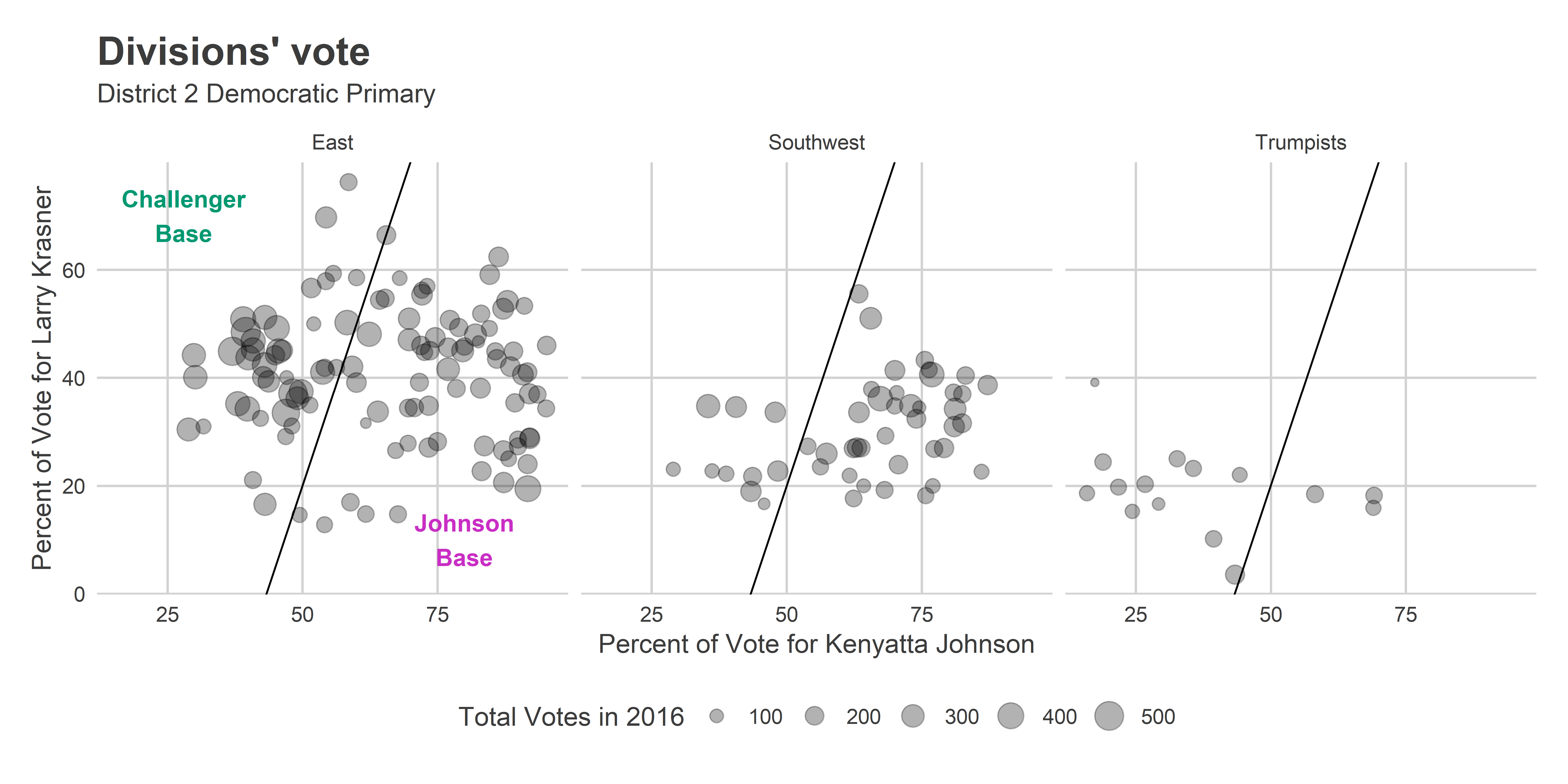
The Vote for Krasner is only weakly negatively correlated with the vote for Johnson, surprisingly. I’ve drawn an arbitrary line that appears to divide the clusters. We’ll call the divisions in the East above the line the Gentrified Challengers, and those below the line Johnson’s Base.
Here’s the map of the cohorts that this categorization gives us.
View code
district_categories$category <- with(
  district_categories,
  ifelse(
    cat != "East", cat,
    ifelse(y_pvote > 3 * x_pvote - 1.30, "Gentrified Challengers", "Johnson Base")
  )
)

cohort_colors <- c(
      "Johnson Base" = strong_purple,
      "Gentrified Challengers" = strong_green,
      "Southwest" = strong_orange,
      "Trumpists" = strong_red
    )

district_map +
  geom_polygon(
    data = ggdivs %>%
      left_join(district_categories) %>%
      filter(!is.na(category)),
    aes(fill = category)
  ) +
  scale_fill_manual(
    "Cohort",
    values=cohort_colors
  ) +
  ggtitle(sprintf("District %s neighborhood divisions", DISTRICT))+
  theme(legend.position = c(0,1), legend.justification = c(0,1))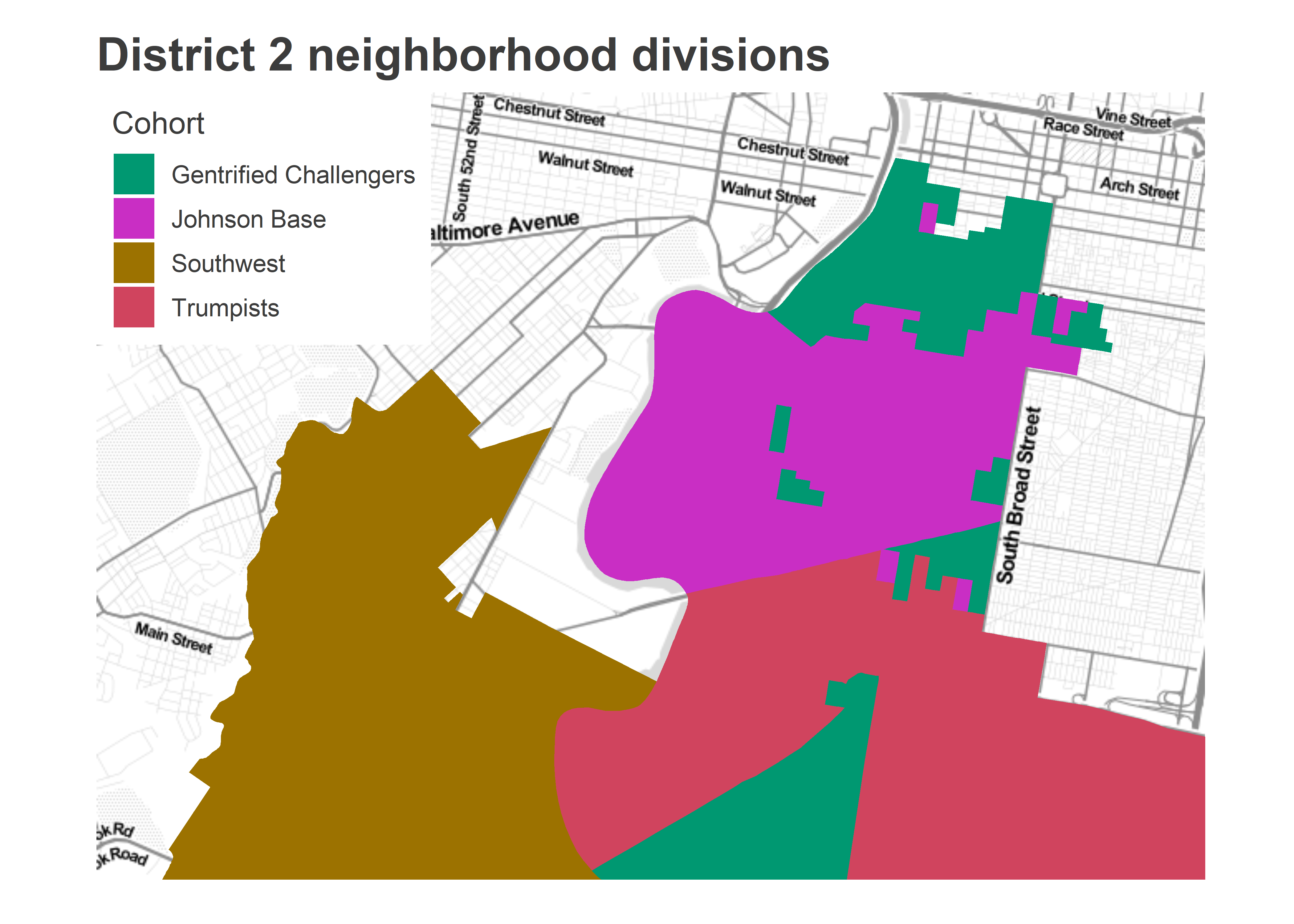
Looks reasonable.
How did the candidates do in each of the sections? The boundaries separate drastic performance splits.
View code
neighborhood_summary <- candidate_votes %>%
  inner_join(candidates_to_compare) %>%
  group_by(candidate_name, election_name) %>%
  mutate(
    citywide_votes = sum(VOTES),
    citywide_pvote = 100 * sum(VOTES) / sum(total_votes)
  ) %>%
  filter(council_district == DISTRICT) %>%
  left_join(district_categories) %>%
  group_by(candidate_name, citywide_votes, citywide_pvote, election_name, category) %>%
  summarise(
    votes = sum(VOTES),
    pvote = 100 * sum(VOTES) / sum(total_votes),
    total_votes = sum(total_votes)
  ) %>%
  group_by(candidate_name, election_name) %>%
  mutate(
    district_votes = sum(votes),
    district_pvote = 100 * sum(votes) / sum(total_votes)
  ) %>% select(
    election_name, candidate_name, citywide_pvote, district_pvote, category, pvote, total_votes
  ) %>%
  gather(key="key", value="value", pvote, total_votes) %>%
  unite("key", category, key) %>%
  spread(key, value)


neighborhood_summary %>%
  knitr::kable(
    digits=0,
    format.args=list(big.mark=','),
    col.names=c("Election", "Candidate", "Citywide %", sprintf("District %s %%", DISTRICT), "Gentrified Challengers %", "Gentrified Challengers Turnout", "Johnson Base %", "Johnson Base Turnout", "Southwest %", "Southwest Turnout", "Trumpist %", "Trumpist Turnout")
  )
| Election | Candidate | Citywide % | District 2 % | Gentrified Challengers % | Gentrified Challengers Turnout | Johnson Base % | Johnson Base Turnout | Southwest % | Southwest Turnout | Trumpist % | Trumpist Turnout |
|---|---|---|---|---|---|---|---|---|---|---|---|
| 2015 City Council At Large | Helen Gym | 8 | 9 | 14 | 24,471 | 7 | 25,139 | 4 | 15,569 | 5 | 5,338 |
| 2015 City Council At Large | Isaiah Thomas | 7 | 7 | 5 | 24,471 | 10 | 25,139 | 8 | 15,569 | 2 | 5,338 |
| 2015 Council 2nd District | Kenyatta Johnson | 62 | 62 | 44 | 6,669 | 79 | 9,508 | 64 | 5,894 | 36 | 2,057 |
| 2015 Council 2nd District | Ori Feibush | 38 | 38 | 55 | 6,669 | 21 | 9,508 | 36 | 5,894 | 64 | 2,057 |
| 2015 Mayor | Anthony Hardy Williams | 26 | 30 | 11 | 7,606 | 41 | 10,127 | 45 | 6,740 | 2 | 2,580 |
| 2015 Mayor | Jim Kenney | 56 | 56 | 70 | 7,606 | 46 | 10,127 | 44 | 6,740 | 89 | 2,580 |
| 2016 President | Bernie Sanders | 37 | 37 | 39 | 11,702 | 38 | 14,293 | 29 | 9,224 | 47 | 2,051 |
| 2016 President | Hillary Clinton | 63 | 63 | 60 | 11,702 | 62 | 14,293 | 71 | 9,224 | 52 | 2,051 |
| 2017 District Attorney | Joe Khan | 20 | 23 | 33 | 6,985 | 18 | 6,569 | 13 | 3,354 | 14 | 982 |
| 2017 District Attorney | Larry Krasner | 38 | 39 | 43 | 6,985 | 41 | 6,569 | 32 | 3,354 | 18 | 982 |
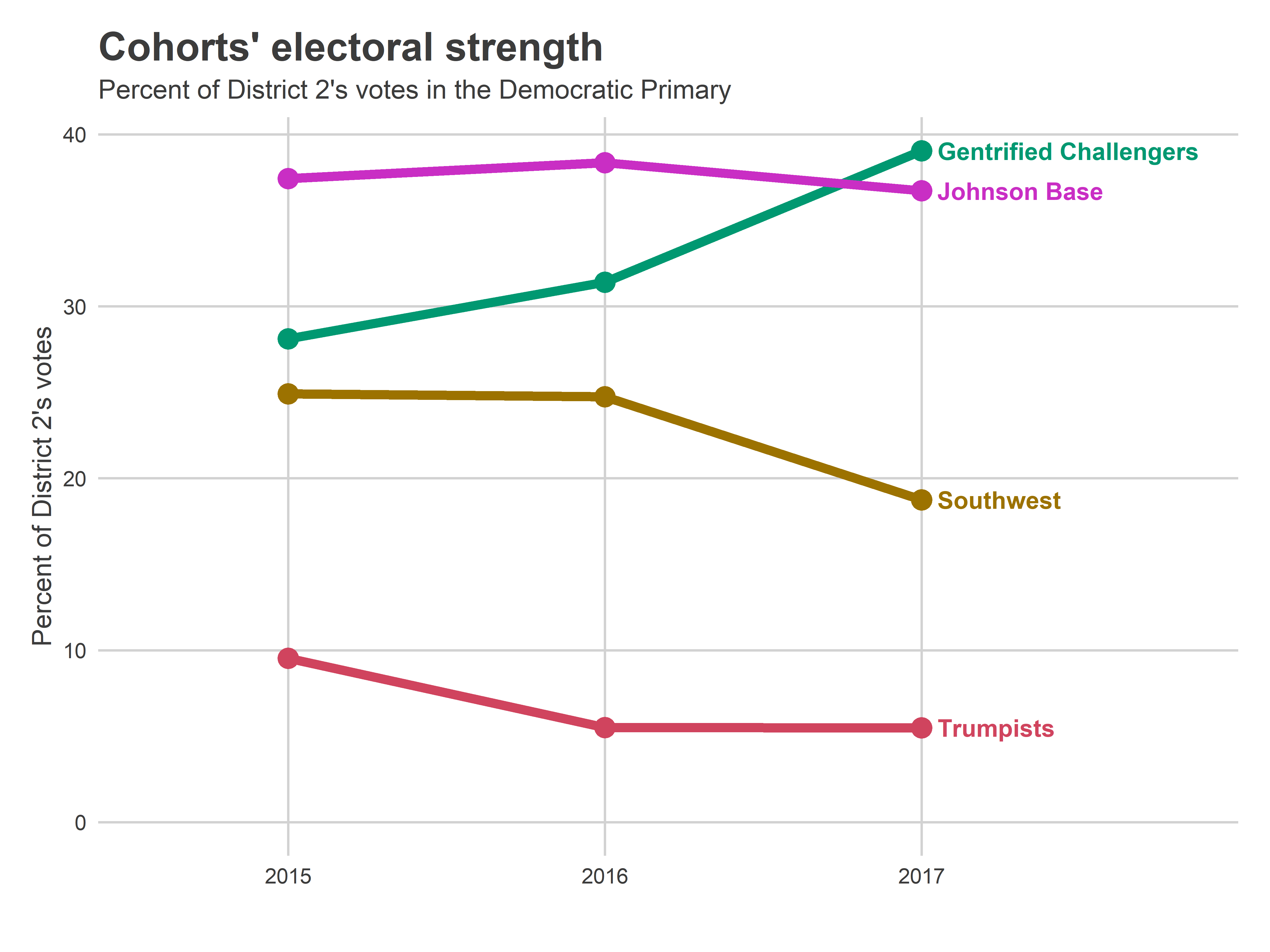
The turnout splits are fascinating. The Johnson Base represented a consistent 37ish percent of the votes, dominating the election in 2015 and 2016, but surpassed by the Gentrified Challengers’ 39% in 2017. Still, the Southwest typically represents 25% of the votes (this fell to 19% in 2017), so Johnson’s Base combined with the Southwest made up a strong 63% of the 2016 vote, and 58% of the 2017 vote.
View code
cohort_turnout <- neighborhood_summary %>%
  group_by() %>%
  filter(election_name %in% c("2015 Mayor", "2016 President", "2017 District Attorney")) %>%
  select(election_name, ends_with("_total_votes")) %>%
  gather("cohort", "turnout", -election_name) %>%
  unique() %>%
  mutate(
    year = substr(election_name, 1, 4),
    cohort = gsub("^(.*)_total_votes", "\\1", cohort)
  ) %>%
  group_by(year) %>%
  mutate(pct_turnout = turnout / sum(turnout))

ggplot(cohort_turnout, aes(x=year, y=100*pct_turnout)) +
  geom_line(aes(group=cohort, color=cohort), size=2) +
  geom_point(aes(color=cohort), size=4) +
  scale_color_manual(values=cohort_colors, guide=FALSE) +
  theme_sixtysix() +
  expand_limits(y=0) +
  expand_limits(x=4)+
  geom_text(
    data = cohort_turnout %>% filter(year == 2017),
    aes(label = cohort, color = cohort),
    x = 3.05,
    fontface="bold",
    hjust = 0
  ) +
  ylab("Percent of District 2's votes") +
  xlab("") +
  ggtitle(
    "Cohorts' electoral strength", "Percent of District 2's votes in the Democratic Primary"
  )
How does the combination of (a) Johnson’s Base sheer size but (b) the Gentrifiers’ surge in voting impact the election? It comes down to percent of the vote in each region. In 2015, Kenyatta won 44% in the Challenger Base even as he dominated his own Base and the Southwest, 79 and 64%. Feibush won 64% from the South Philly Trumpists. Vidas, who is a very different candidate from Feibush (to put it mildly), would have to do much, much better in the Gentrified regions, and hope Johnson’s dominance of Point Breeze has fallen.
The relative power of West and Southwest and University City
How much does the power shift between the two cohorts? Let’s do some math.
How much does a candidate need from each of the sections to win? Let t_i be the relative turnout in section i, defined as the proportion of total votes. So in the 2017 District Attorney Race, t_i was 0.39 for the Gentrified Challengers, and 0.37 for the Johnson Base. Let p_ic be the proportion of the vote received by candidate c in section i, so in 2017, p is 0.41 for Krasner in the Johnson Base.
Then a candidate wins a two-way race whenever the turnout-weighted proportion of their vote is greater than 0.5: sum_over_i(t_i p_ic) > 0.5.
Since we’ve divided District 2 into four sections, it’s hard to plot on a two-way axis. For simplicity, I’ll combine the Johnson Base with Southwest Philly, and the Gentrified Challengers with the Trumpists (these are in my opinion the likely race-correlated dynamics that will play out). On the x-axis, let’s map a candidate’s percent of the vote in the Gentrifiers + Trumpists, and on the y, a candidate’s percent of the vote in Southwest + the Johnson Base (assuming a two-person race). The candidate wins whenever the average of their proportions, weighted by t, is greater than 50%. The dashed lines show the win boundaries; candidates to the top-right of the lines win. Turnout matters less than in District 2 than in District 3 because it swings less; they didn’t experience the Krasner bump in 2017.
I’ll plot only the two-candidate vote for the top two candidates in the district for each race, to emulate a two-person race. (For City Council in 2015, I use Helen Gym and Isaiah Thomas, who were 4th and 5th in the district, and 5th and 6th citywide.)
View code
get_line <- function(x_total_votes, y_total_votes){
  ## solve p_x t_x+ p_y t_y > 50
  tot <- x_total_votes + y_total_votes
  tx <- x_total_votes / tot
  ty <- y_total_votes / tot

  slope <- -tx / ty
  intercept <- 50 / ty  # use 50 since proportions are x100
  c(intercept, slope)
}

line_2017 <- with(
  neighborhood_summary,
  get_line(
    (`Gentrified Challengers_total_votes` + Trumpists_total_votes)[candidate_name == "Larry Krasner"],
    (`Johnson Base_total_votes` + `Southwest_total_votes`)[candidate_name == "Larry Krasner"]
  )
)

line_2015 <- with(
  neighborhood_summary,
  get_line(
    (`Gentrified Challengers_total_votes` + Trumpists_total_votes)[candidate_name == "Jim Kenney"],
    (`Johnson Base_total_votes` + `Southwest_total_votes`)[candidate_name == "Jim Kenney"]
  )
)

## get the two-candidate vote
neighborhood_summary <- neighborhood_summary %>%
  group_by(election_name)  %>%
  mutate(
    challenger_pvote_2cand = (
      `Gentrified Challengers_pvote` + Trumpists_pvote
      ) / sum(`Gentrified Challengers_pvote` + Trumpists_pvote),
    kenyatta_pvote_2cand = (`Southwest_pvote` + `Johnson Base_pvote`)/sum(`Southwest_pvote` + `Johnson Base_pvote`)
  )


library(ggrepel)

ggplot(
  neighborhood_summary,
  aes(
    x=100*challenger_pvote_2cand,
    y=100*kenyatta_pvote_2cand
  )
) +
  geom_point() +
  geom_text_repel(aes(label=candidate_name)) +
  geom_abline(
    intercept = c(line_2015[1], line_2017[1]),
    slope = c(line_2015[2], line_2017[2]),
    linetype="dashed"
  ) +
  coord_fixed() +
  scale_x_continuous(
    "Gentrified Challenger + Trumpist percent of vote",
    breaks = seq(0,100,10)
  ) +
  scale_y_continuous(
    "Johnson Base + Southwest percent of vote",
    breaks = seq(0, 100, 10)
  ) +
  annotate(
    geom="text",
    label=paste(c(2015, 2017), "turnout"),
    x=c(10, 8),
    y=c(
      line_2015[1] + 10 * line_2015[2],
      line_2017[1] + 8 * line_2017[2]
    ),
    hjust=0,
    vjust=-0.2,
    angle = atan(c(line_2015[2], line_2017[2])) / pi * 180,
    color="grey40"
  )+
  annotate(
    geom="text",
    x = 80,
    y=75,
    label="Candidate wins",
    fontface="bold",
    color = strong_green
  ) +
  geom_hline(yintercept = 50, color="grey50") +
  geom_vline(xintercept = 50, color="grey50")+
  expand_limits(x=100, y=80)+
  theme_sixtysix() +
  ggtitle(
    "The relative strengths of District 2 neighborhoods",
    "Candidates to the top-right of the lines win. Points are two-candidate vote."
  )
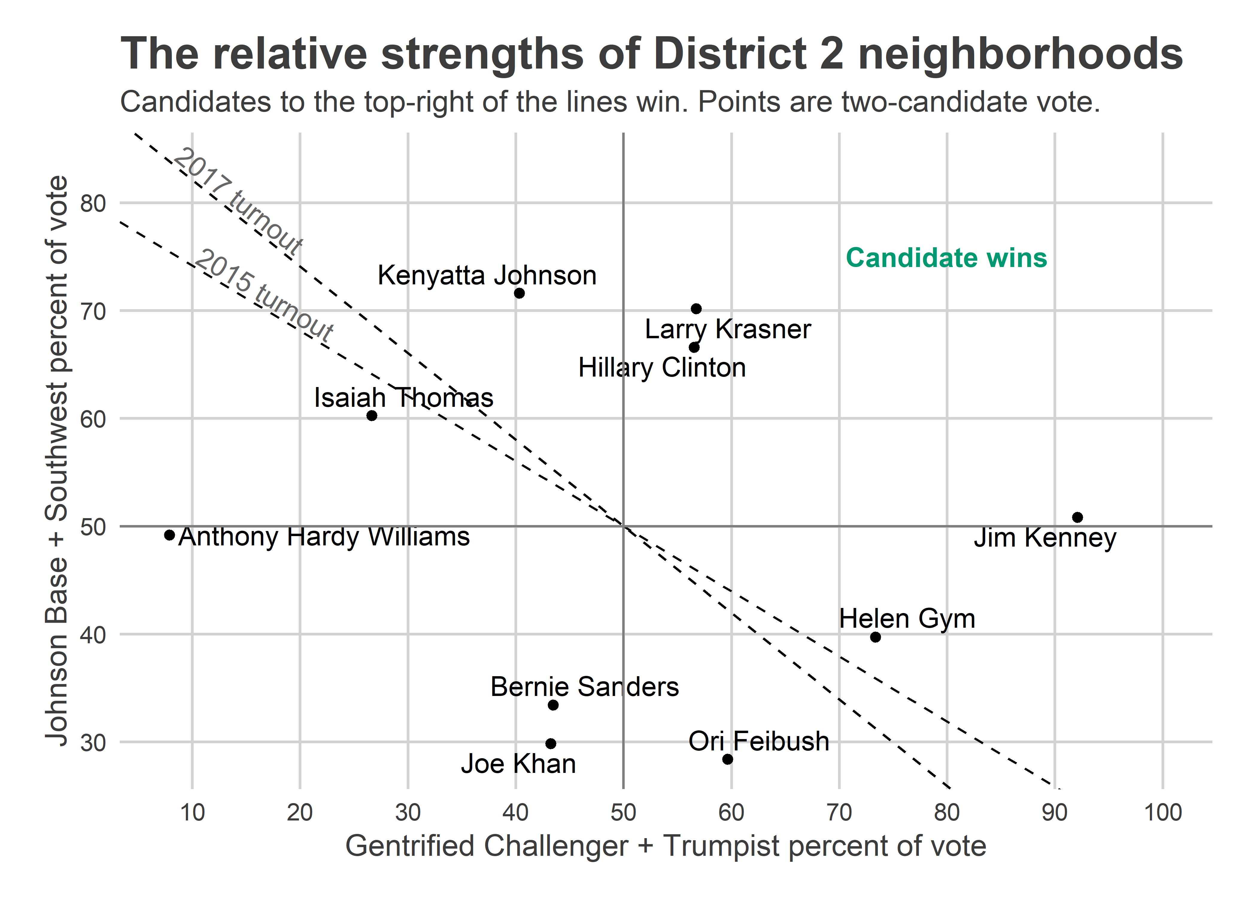
Hillary Clinton, Larry Krasner, and Jim Kenney won the two-way votes in all sections. Kenyatta lost the Gentrified + Trumpist vote 59-41, but dominated Point Breeze and Southwest Philly. (Notice the points don’t match the table above because these are two-candidate votes.)
What would be Vidas’s path to victory? Helen Gym looks like a prototype (remember that there were actually 16 candidates for five spots, so this head-to-head analysis is hypothetical). Developer Ori Feibush didn’t do nearly well enough in Grad Hospital and East Passyunk to win. If Vidas burnishes more progressive credentials, and pushes that percentage up to 80%, then she could win even if Johnson doesn’t lose any support in his base.
Looking to May
We’re left in a grey area. There are reasons to believe that the recent scandals could drastically change Johnson’s support from 2015, but without polling, we have no way to tell exactly how much. It would take a huge change from 2015 for him to lose, but the combination of scandal and not running against Feibush could be that change.
Up next, I’ll stick with scandal-plagued incumbents and look at Henon’s District 6. Stay tuned!
You left out a big chunk of the district. Girard Estate, West of Broad, Packer Park, the Reserves and Siena Place??
These areas will go to Johnson. He has done alot. Almost a million went into Girard Park past few years.
Also, just dont see these areas going for Vidas
Yeah, I’ve updated the analysis to break out South of Passyunk, which it turns out went heavily for Trump. Thanks!