The Needle was right, again. Here’s what I’m changing.

Once again, on election night, the Needle was 100% confident who would win by 9:37 pm.

Once again, I doubted.

Once again, it was exactly right.

Let’s dig into what the Needle knew and when it knew it, and what I’m going to change so that I finally trust it.

View code
ELECTION <- 20191105
USE_LOG <- TRUE
source(sprintf("configs/config_%s.R", ELECTION))

source("needle.R")timestamp <- "213752"
df <- load_data(sprintf("raw_data/results_20191105_%s.csv", timestamp))
df_eod <- load_data("raw_data/results_20191119_194343.csv")

needle_params <- readRDS(
  sprintf("outputs/needleparams_%s_log%s_svd.Rds", ELECTION, USE_LOG)
)

office_suffix <- identity
turnout_svd <- needle_params@turnout_svds$general
n_council_winners <- 7
turnout_office <- "MAYOR"

What the Needle knew and when it knew it

First, an overview of the Needle. (One day, I’ll publish the code on github… I just have dreams of adding all the best practices we all procrastinate on.)

The structure of the needle is simple:

  1. Before election day, I calculate the historic covariances among divisions in turnout and votes for specific candidates.
  2. When partial results come in, I calculate the distribution of results from the divisions that haven’t reported yet conditional on the ones that have
  3. I simulate each division’s (a) turnout and (b) votes for candidates from that posterior distribution. The fraction of times a candidate wins in those simulations is their probability of winning.

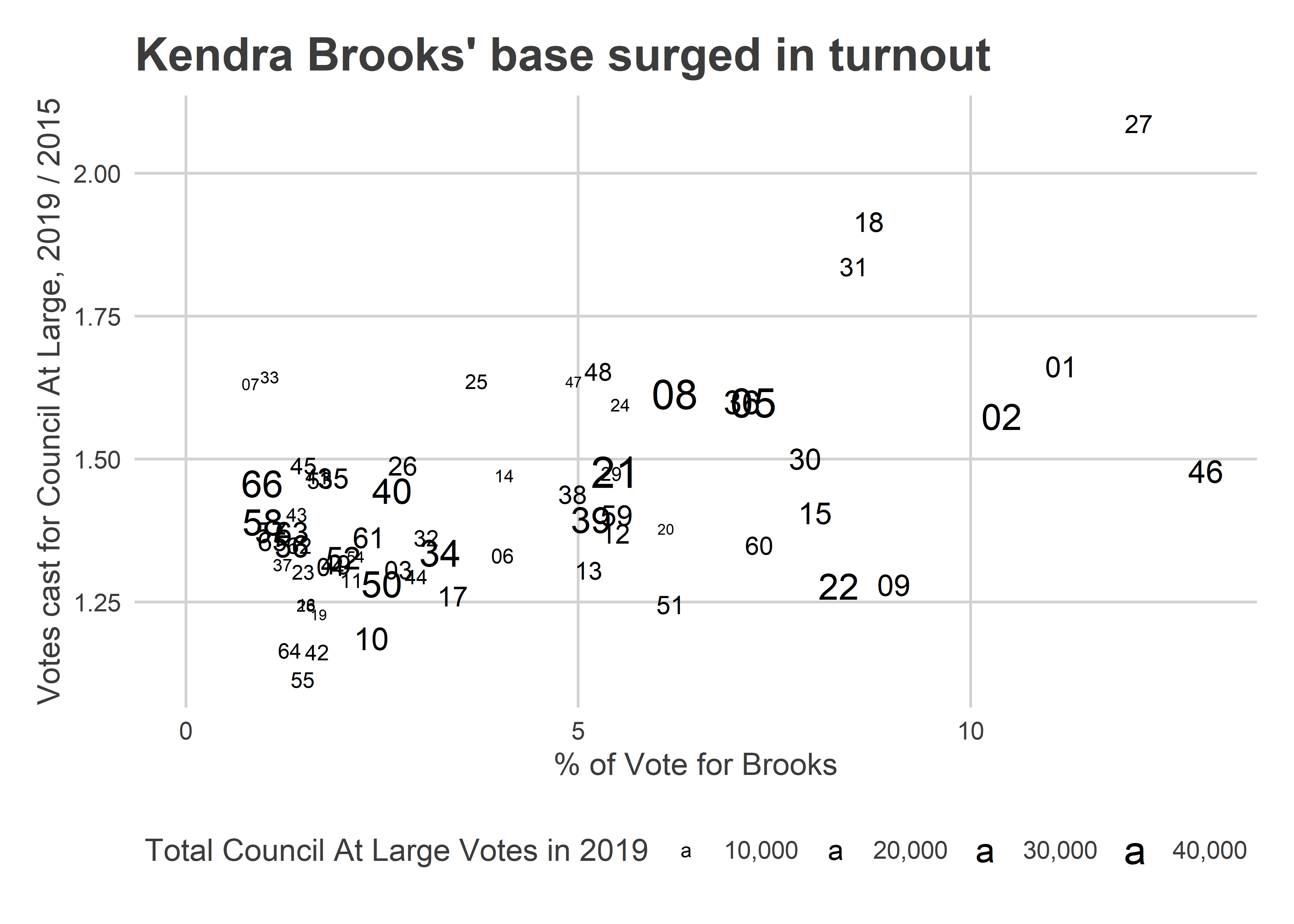
At 9:37, the Commissioners posted the spreadsheet from the new voting machines. With 371 out of 1,703 divisions reporting, Kendra Brooks had received 10,007 votes (4.8%), David Oh 8,403 (4.0%), Nicolas O’Rourke 7,887 (3.8%), and Al Taubenberger 7,071 (3.3%).

The Needle spun into gear, and here’s what it spat out.

View code
pretty_simulated <- function(simulated) {
  ifelse(simulated, "Simulated Divisions", "Reporting Divisions")
}

turnout_sim <- simulate_turnout(
  df=df, 
  turnout_office=office_suffix(turnout_office), 
  turnout_svd=turnout_svd, 
  verbose=TRUE
) %>%
  mutate(simulated = pretty_simulated(simulated))
  
pvote_svd <- needle_params@pvote_svd
simulate_office <- function(
  office, 
  office_name, 
  n_winners=1,
  consider_divs=NULL
){
  simulate_pvote(
    df,
    use_office=office_suffix(office),
    office_name=office_name,
    turnout_sim=turnout_sim,
    pvote_svd=pvote_svd,
    n_winners=n_winners,
    verbose=FALSE,
    consider_divs=consider_divs
  )
}

council_sim <- simulate_office(
  "COUNCIL AT LARGE",
  "Council At Large",
  n_winners=7
)
print(council_sim$needle)

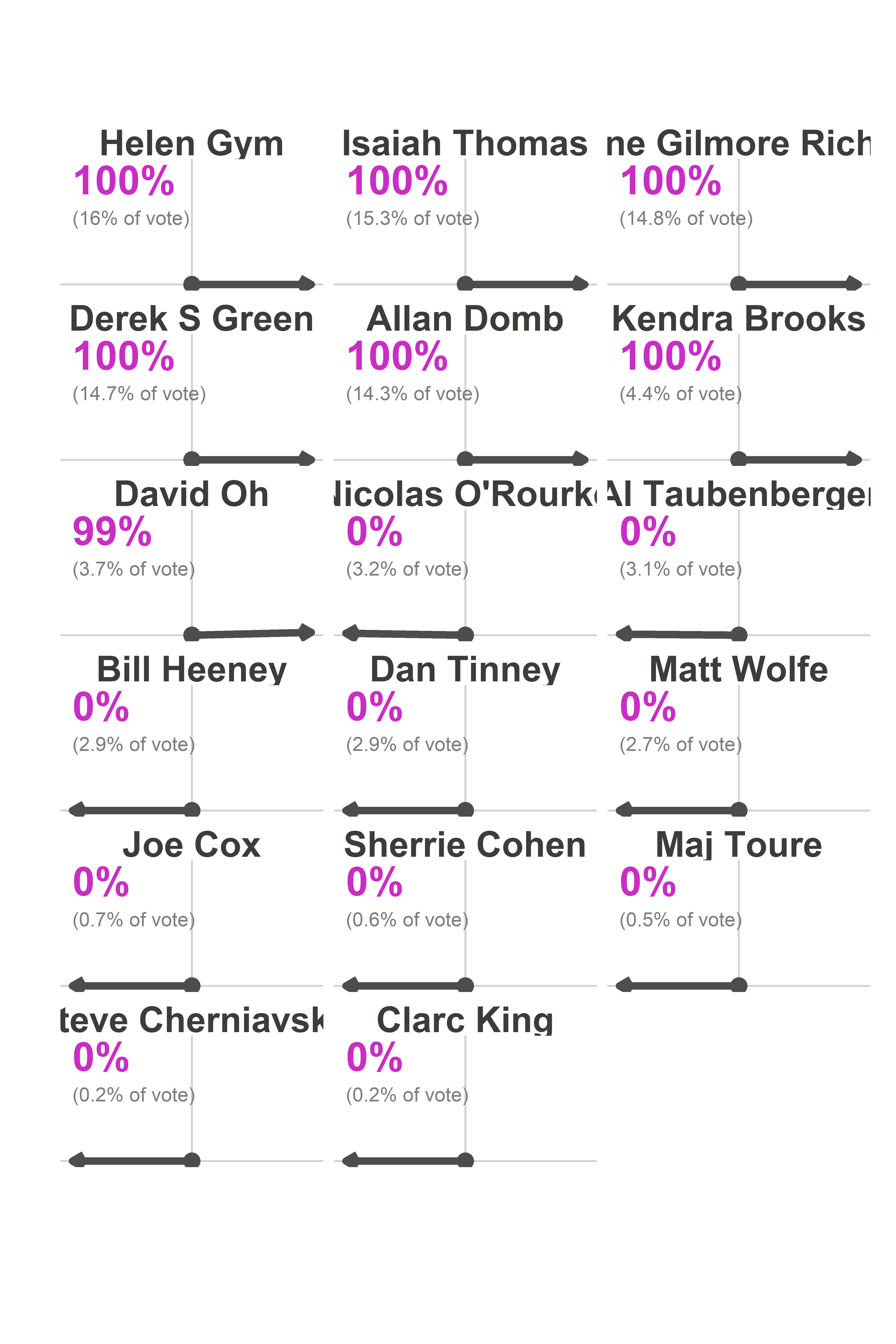
I saw that and freaked out. There was no doubt that Brooks would win? That O’Rourke would lose to Oh? He was only down 516 votes!

What the needle knew (and I didn’t) was where the remaining votes were going to come from, and how easy it is to predict those divisions once you’ve got 371 data points.

Here’s what the Needle was predicting under the hood.

View code
candidates <- c("Kendra Brooks", "David Oh", "Nicolas O'Rourke", "Al Taubenberger")
filter_to_candidates <- function(df){
  df %>%
    filter(candidate %in% candidates) %>%
    mutate(candidate=factor(candidate, levels=candidates))
}

cand_sim <- council_sim$office_sim %>%
  mutate(simulated = pretty_simulated(simulated)) %>%
  filter_to_candidates() %>%
  ## Doesn't account for different cands/voter
  left_join(turnout_sim %>% select(sim, warddiv, turnout)) %>%
  group_by(candidate, sim, simulated) %>%
  summarise(pvote = weighted.mean(pvote, w=turnout)) %>%
  group_by(candidate, simulated) %>%
  summarise(
    mean = mean(pvote),
    pct_975 = quantile(pvote, 0.975),
    pct_025 = quantile(pvote, 0.025)
  )

cand_true <- df_eod %>%
  filter(office == "COUNCIL AT LARGE") %>%
  group_by(warddiv) %>%
  mutate(total_votes = sum(votes), pvote = votes/total_votes) %>%
  filter_to_candidates() %>%
  left_join(turnout_sim %>% filter(sim==1) %>% select(warddiv, simulated)) %>%
  group_by(candidate, simulated) %>%
  summarise(votes=sum(votes), pvote = weighted.mean(pvote, w=total_votes)) %>%
  ungroup()

pretty_time <- sprintf(
  "%s:%s", 
  floor(as.numeric(timestamp)/1e4) - 12,
  floor(as.numeric(timestamp)/1e2) %% 100
)

sim_subtitle <- "Dots are actual eventual results. Intervals are 95% of simulations."

ggplot(
  cand_sim, 
  aes(x=candidate, y=100*mean)
) + 
  geom_bar(stat="identity") +
  geom_errorbar(aes(ymin =100* pct_025, ymax=100*pct_975), width = 0.5) +
  geom_text(y = 0.4, aes(label = sprintf("%0.1f", 100*mean)), color="white") +
  facet_grid(. ~ simulated) +
  geom_point(
    data = cand_true %>% rename(mean=pvote)
  ) +
  theme_sixtysix() %+replace% 
  theme(
    axis.text.x = element_text(angle=45, vjust = 0.8, hjust=0.8)
  ) +
  scale_y_continuous(labels=scales::comma) +
  # scale_fill_manual(values=cat_colors) +
  labs(
    x=NULL,
    y="Percent of the vote",
    title=sprintf("Needle Results as of %s pm", pretty_time),
    subtitle=sim_subtitle,
    fill=NULL
  )

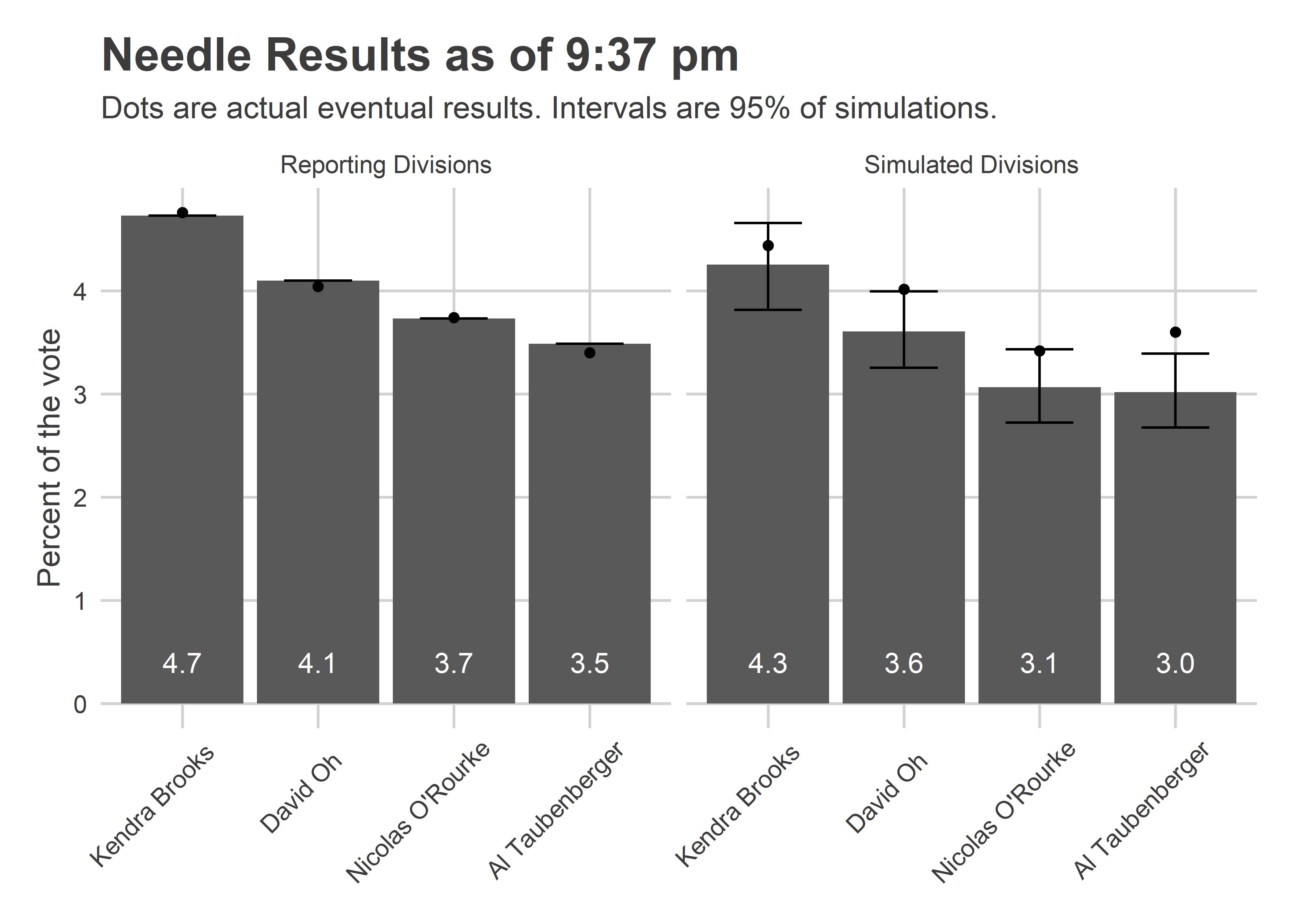
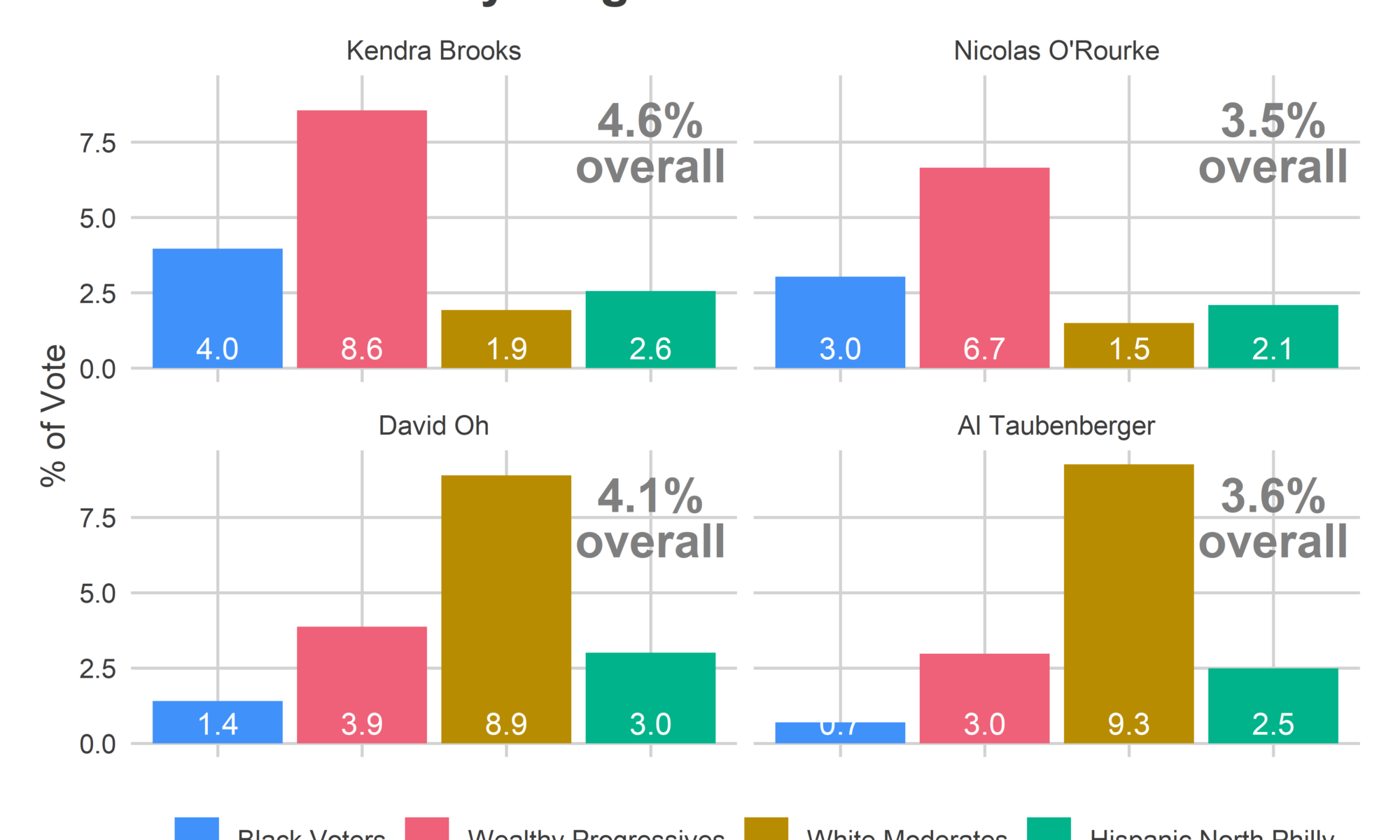
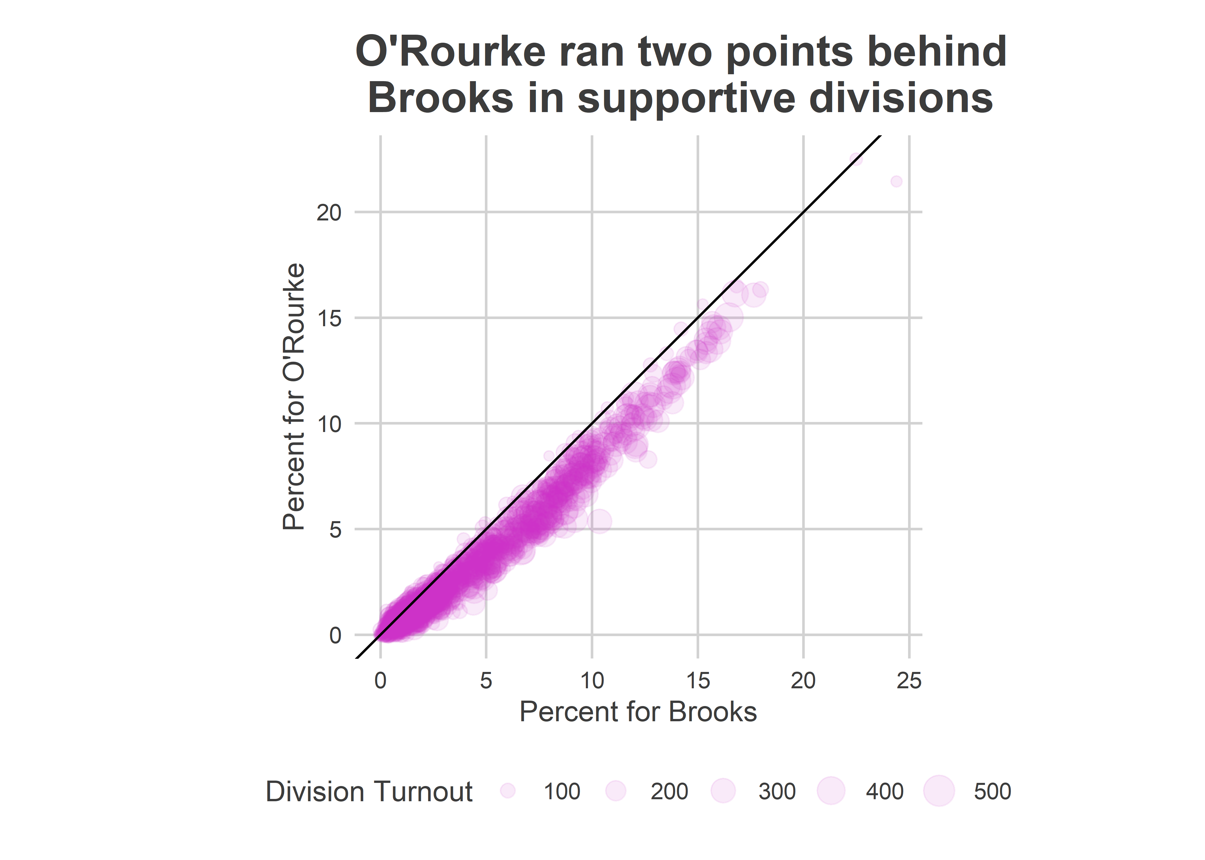
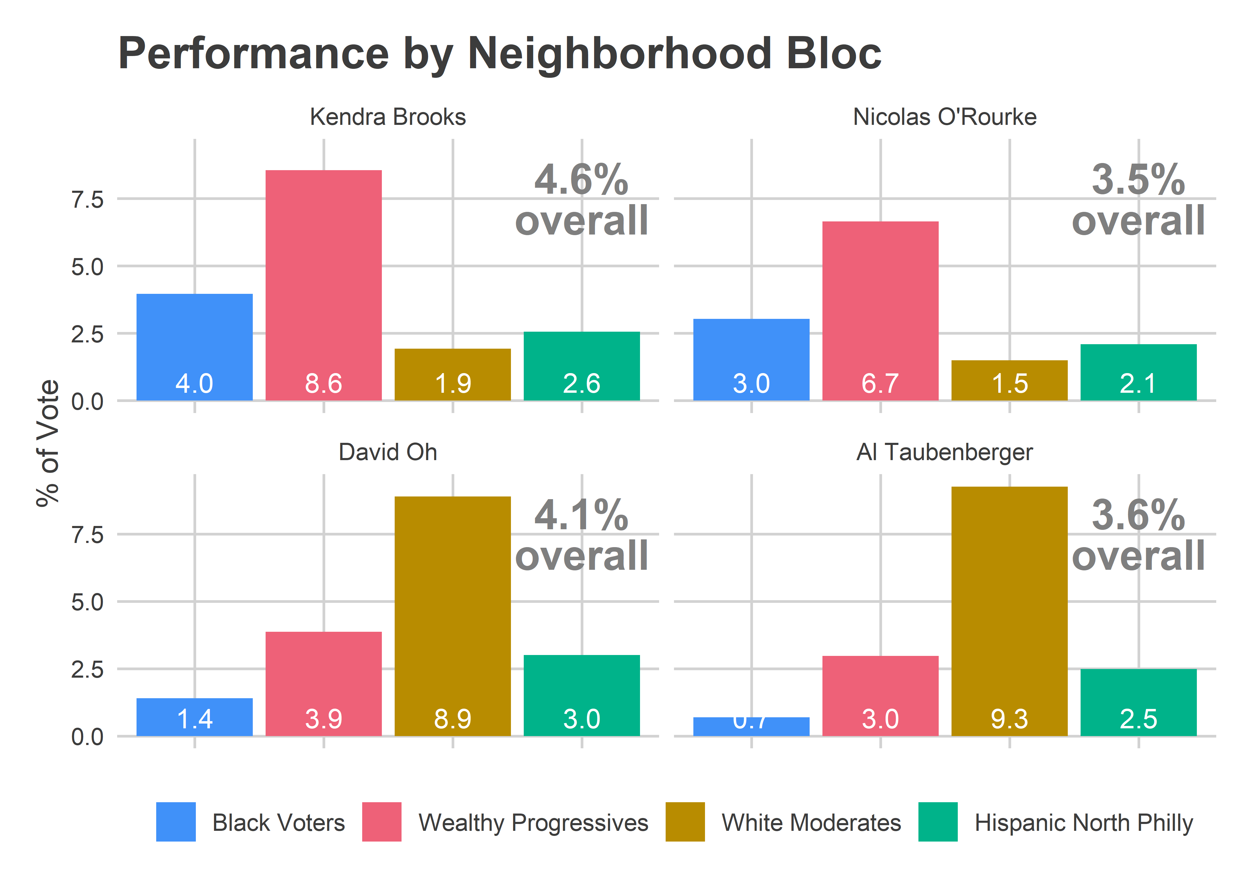
The Needle provided narrow error bars for the candidates’ performance in the remaining divisions. It predicted, for example, that Brooks would win between 3.8 and 4.7% of the votes in the remaining divisions; she got 4.4. It predicted Oh would get between 3.2 and 4.0%, and that O’Rourke between 2.7 and 3.4%. Oh really got 4.0%, and O’Rourke 3.4%. Adding in the divisions that were already locked in, O’Rourke didn’t beat Oh in a single simulation.

One thing worries me in the plot above. Notice that Oh, O’Rourke, and especially Taubenberger all had actual results at the high end of my simulations. That could occur due to random chance, but is pretty unlikely. And it turns out something went wrong.

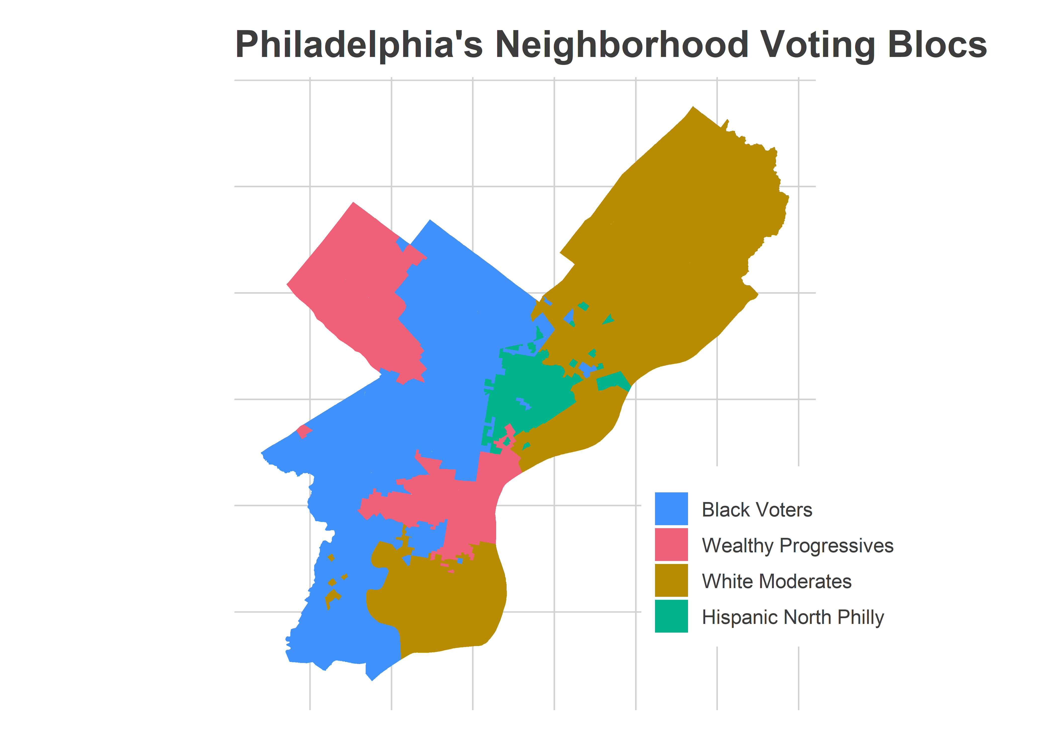
Simulations by Neighborhood Bloc

In retrospect, what really would have convinced me that the Needle was working as advertised would be plotting the results by voting bloc. At 9:37 on November 5th, here’s what that would have shown.

View code
div_cats <- readRDS("../../data/processed_data/div_cats_2019-11-08.RDS")

cand_sim_cat <- council_sim$office_sim %>%
  mutate(simulated = pretty_simulated(simulated)) %>%
  filter_to_candidates() %>%
  ## Doesn't account for different cands/voter
  left_join(turnout_sim %>% select(sim, warddiv, turnout)) %>%
  left_join(div_cats %>% select(warddiv, cat)) %>%
  group_by(candidate, sim, cat, simulated) %>%
  summarise(pvote = weighted.mean(pvote, w=turnout)) %>%
  group_by(candidate, cat, simulated) %>%
  summarise(
    mean = mean(pvote),
    pct_975 = quantile(pvote, 0.975),
    pct_025 = quantile(pvote, 0.025)
  )

cand_true_cat <- df_eod %>%
  filter(office == "COUNCIL AT LARGE") %>%
  group_by(warddiv) %>%
  mutate(total_votes = sum(votes), pvote = votes/total_votes) %>%
  filter_to_candidates() %>%
  left_join(div_cats %>% select(warddiv, cat)) %>%
  left_join(turnout_sim %>% filter(sim==1) %>% select(warddiv, simulated)) %>%
  group_by(candidate, cat, simulated) %>%
  summarise(votes=sum(votes), pvote = weighted.mean(pvote, w=total_votes)) %>%
  ungroup()


cat_colors <- c(
   "Black Voters" = light_blue, 
   "Wealthy Progressives" = light_red, 
   "White Moderates" = light_orange, 
   "Hispanic North Philly" = light_green
)
  
ggplot(
  cand_sim_cat, 
  aes(x=cat, y=100*mean)
) + 
  geom_bar(stat="identity", aes(fill=cat)) +
  geom_errorbar(aes(ymin =100* pct_025, ymax=100*pct_975), width = 0.5) +
  facet_grid(candidate ~ simulated) +
  geom_point(
    data = cand_true_cat %>% rename(mean=pvote)
  ) +
  theme_sixtysix() %+replace% theme(axis.text.x = element_blank()) +
  scale_y_continuous(labels=scales::comma) +
  scale_fill_manual(values=cat_colors) +
  labs(
    x=NULL,
    y="Percent of the vote",
    title=sprintf("Needle Results as of %s pm", pretty_time),
    subtitle=sim_subtitle,
    fill=NULL
  )

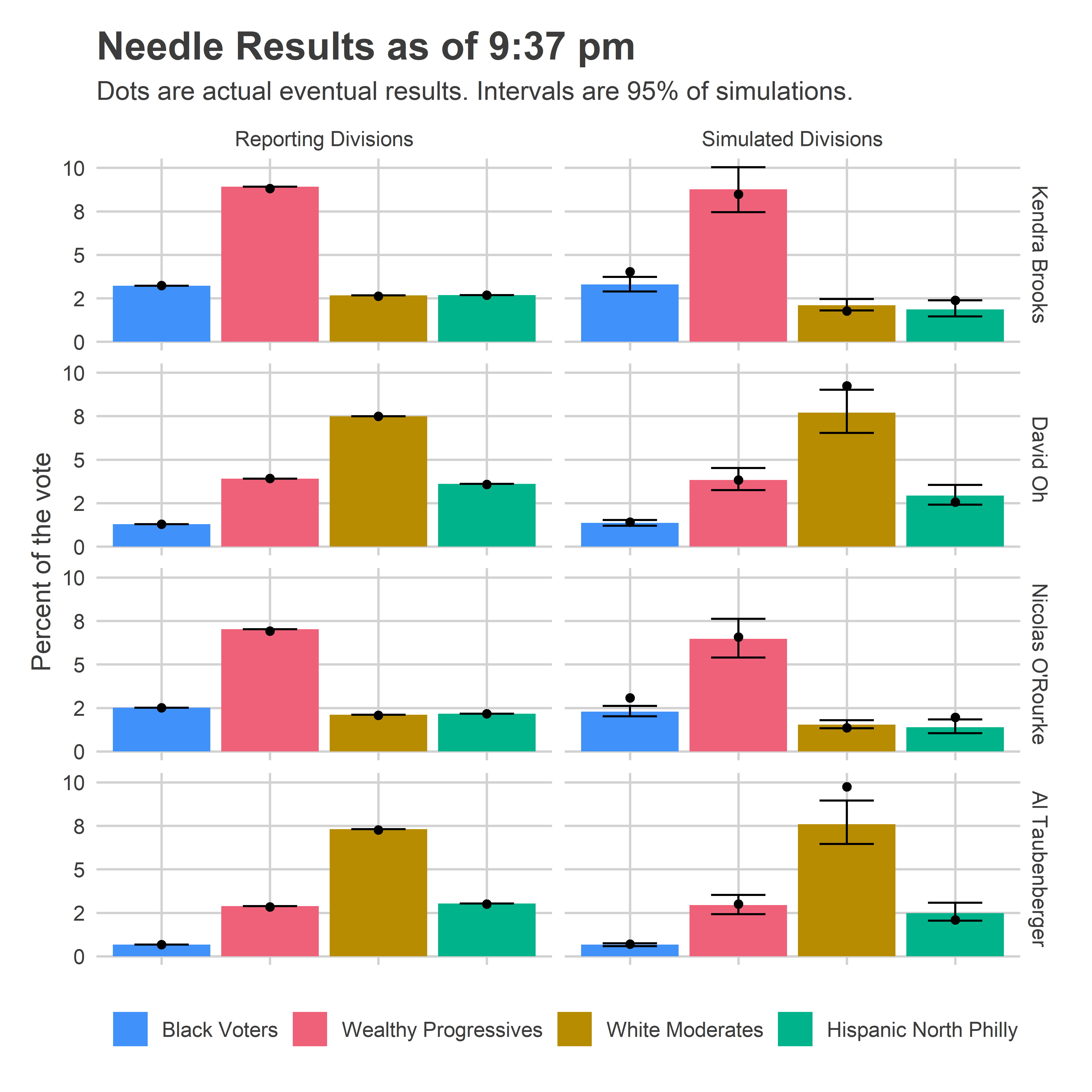
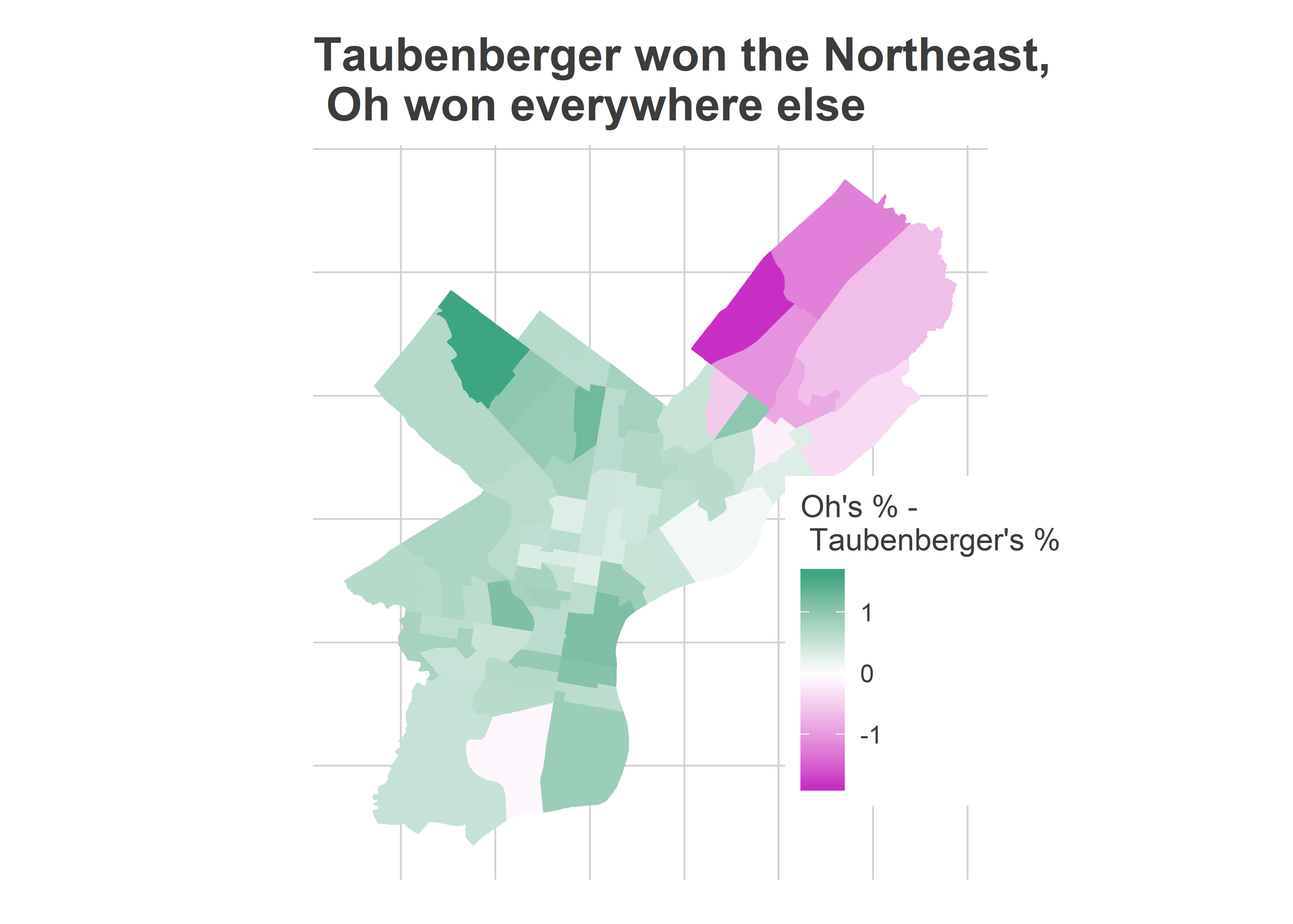
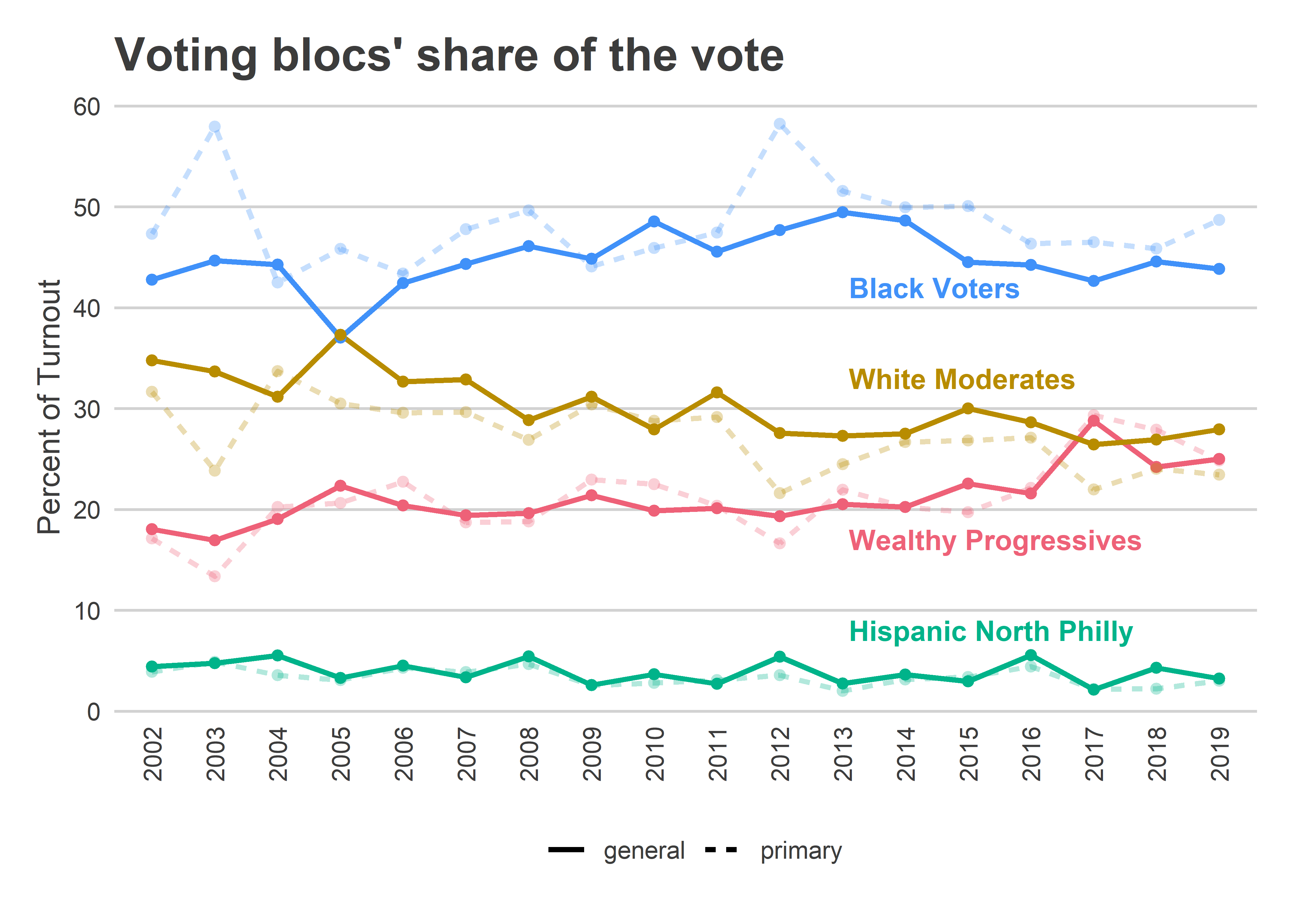
The Needle was largely predicting that candidates would perform similarly in the remaining divisions as they had already done in divisions from the same blocs. And it had a reasonable uncertainty for them, +/- 1 percentage point in their bases. Those predictions were fairly accurate, but with not quite enough uncertainty; I think because they did better in the Northeast than their performance in South Philly and the River Wards would suggest.

Percent of the vote is just half of the calculation, though. We also need to know the turnout in each of those blocs.

View code
cat_sim <- turnout_sim %>%
    left_join(div_cats %>% select(warddiv, cat)) %>%
    group_by(simulated, cat, sim) %>%
    summarise(
      n_divs = length(unique(warddiv)),
      turnout = sum(turnout)
    ) %>%
    gather(key="var", value="value", n_divs, turnout) %>%
    group_by(simulated, cat, var) %>%
    summarise(
      mean = mean(value),
      pct_975 = quantile(value, 0.975),
      pct_025 = quantile(value, 0.025)
    )

true_turnout <- df_eod %>%
  filter(office == office_suffix(turnout_office)) %>%
  group_by(warddiv) %>%
  summarise(turnout = sum(votes)) %>%
  left_join(turnout_sim %>% filter(sim==1) %>% select(warddiv, simulated)) %>%
  left_join(div_cats %>% select(warddiv, cat)) %>%
  group_by(simulated, cat) %>%
  summarise(turnout = sum(turnout))


ggplot(
  cat_sim %>% mutate(key = ifelse(var=="turnout", "Turnout", "N(Divisions)")), 
  aes(x=cat, y=mean)
) + 
  geom_bar(stat="identity", aes(fill=cat)) +
  geom_errorbar(aes(ymin = pct_025, ymax=pct_975), width = 0.5) +
  facet_grid(key ~ simulated, scales="free_y") +
  geom_point(
    data = true_turnout %>% mutate(key="Turnout") %>% rename(mean=turnout)
  ) +
  theme_sixtysix() %+replace% theme(axis.text.x = element_blank()) +
  scale_y_continuous(labels=scales::comma) +
  scale_fill_manual(values=cat_colors) +
  labs(
    x=NULL,
    y=NULL,
    title=sprintf("Needle Results as of %s pm", pretty_time),
    subtitle=sim_subtitle,
    fill=NULL
  )

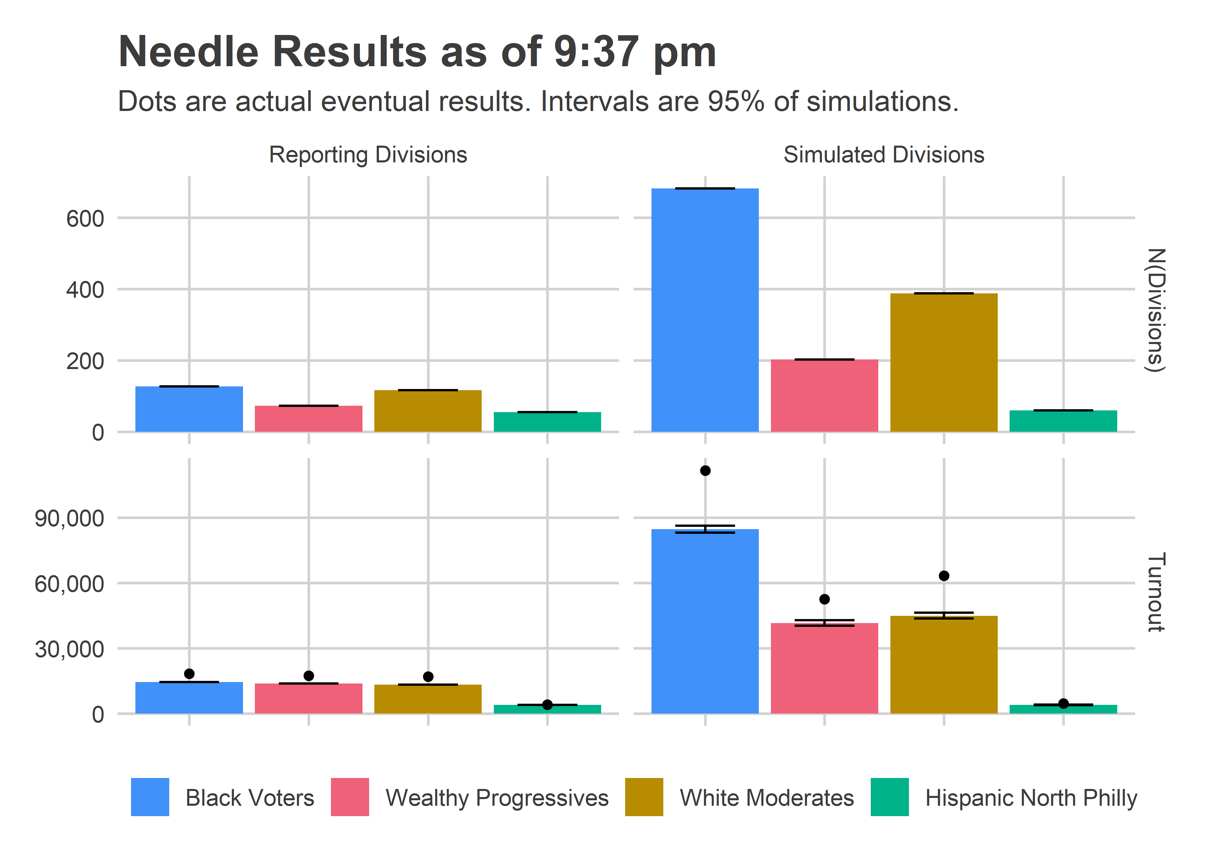
This is where things went very wrong. Notice that the Needle was super confident about how many votes would come from the left-over divisions, and under-predicted by a lot, 112K instead of 85K in Black Voter divisions (+32%), and 63K instead of 45K in White Moderate divisions (+40%).

The evidence for what went wrong is actually in the Reporting Division plots; the eventual, true turnout was higher than what was reported at the time! I did all of the calculations assuming those numbers were final. Instead, what must have happened is some of those results only represented a fraction of the machines for the division. This was explicitly called out in the data from the old machines; I’ll need to figure out how to get that data from the new machines.

Luckily, that didn’t hurt the needle too badly. What would have been bad is if the turnout imbalance occured disproportionately by bloc. But it occurred about as much in the Black Voter divisions as the White Moderate divisions (minus 8%), so didn’t ruin the predictions.

[Something went wrong in the spreadsheet at 10:20 and O’Rourke shot to 36%. I haven’t been able to reproduce that, and think it may have to do with the fact that the results in already-reporting divisions changed, which I assumed couldn’t happen. I’m going to overhaul that logic to robustify it.]

What I’ll do differently

So it looks like the needle was basically right. But I still didn’t trust it. What will it take to finally learn my lesson?

The answer, as always, is model transparency. The problem with the results was that I saw a bunch of 100’s and no intuition for why the Needle had converged so fast. Suppose, instead, I had produced all of the plots above in real time. I would have been convinced!

So that’s what I’ll do. The next iteration of the Needle will provide live updates of all the plots above: the results by voting bloc separately for the reporting and simulated divisions. Maybe then I’ll finally embrace the Needle’s extreme confidence.

See you in April!

View code
# votes_per_voter <- df_eod %>%
#   filter(office %in% c("COUNCIL AT LARGE", "MAYOR")) %>%
#   group_by(warddiv, office) %>%
#   summarise(total_votes = sum(votes)) %>%
#   left_join(div_cats %>% select(warddiv, cat)) %>%
#   # left_join(turnout_sim %>% filter(sim==1) %>% select(warddiv, simulated)) %>%
#   # group_by(cat, simulated, office) %>%
#   group_by(cat, office) %>%
#   summarise(total_votes = sum(total_votes)) %>%
#   spread(key=office, value=total_votes) %>%
#   mutate(at_large_per_mayor = `COUNCIL AT LARGE` / MAYOR)
# 
# ggplot(
#   votes_per_voter,
#   aes(x = cat, y = at_large_per_mayor)
# ) +
#   geom_bar(stat="identity", aes(fill=cat)) +
#   geom_text(
#     y = 0.4, 
#     aes(label=sprintf("%0.2f", at_large_per_mayor)),
#     size=7,
#     color="white"
#   ) +
#   theme_sixtysix() %+replace% 
#   theme(axis.text.x = element_text(angle=45, vjust = 0.8, hjust=0.8)) +
#   scale_y_continuous(labels=scales::comma) +
#   scale_fill_manual(values=cat_colors, guide=FALSE) +
#   labs(
#     x=NULL,
#     y=NULL,
#     title="Voters typically vote for 4.5 candidates",
#     subtitle="At Large Votes divided by Votes for Mayor (voters could have selected 5)",
#     fill=NULL
#   )
# 

A Surprising 2019 Council At Large Recap

We’re all still recovering from Tuesday night. Surprise wins for both Kendra Brooks and David Oh turned the Philadelphia political world on its head. I won’t waste your time narrating what others will write better. Let’s look at some numbers, with 99% of Divisions reporting.

Helen Gym paced the way with 15.3% of the vote. None of the Democrats lost. But most importantly, we’ll consider the two surprises: Kendra Brooks and David Oh.

View code
library(sf)
library(tidyverse)

load_data <- function(file){
  df <- read_download(file)
  df %<>% 
    filter_divs_and_offices() %>%
    format_columns()
  
  return(df)
}

read_download <- function(file){
  colnames <- read_csv(file, n_max = 1, col_names=F) %>% unlist()
  candidates <- read_csv(file, n_max = 1, skip=1, col_names=F) %>% unlist()
  
  df <- read_csv(file, skip=2, col_names=F) %>%
    rename(warddiv=X3) %>%
    select(-X1, -X2) %>%
    pivot_longer(values_to="votes", names_to="key", -warddiv) %>%
    filter(!is.na(votes)) %>% ##only removes X119
    mutate(key = asnum(gsub("^X", "", key))) %>%
    mutate(office = colnames[key], candidate=candidates[key]) %>%
    mutate(
      party = gsub("(.*) \\((.*)\\)$", "\\2", candidate),
      candidate = gsub("(.*) \\(.*\\)$", "\\1", candidate),
      office = ifelse(office == "COUNCIL AT-LARGE", "COUNCIL AT LARGE", office),
      office = ifelse(candidate %in% c('JUDY MOORE', "BRIAN O'NEILL"), "DISTRICT COUNCIL-10TH DISTRICT", office)
    ) %>% 
    select(warddiv, office, candidate, party, votes) %>%
    filter(warddiv != "COUNTY TOTALS")

  return(df)
}

filter_divs_and_offices <- function(df){
   returns <- df %>% 
     group_by(warddiv) %>%
     summarise(sum_votes = sum(votes)) %>%
     group_by() %>%
     filter(sum_votes > 0)
   
   df <- df %>% inner_join(returns %>% dplyr::select(warddiv))
   
   if(nrow(df) == 0) stop("No data yet!")
   
   df <- df %>% 
     filter(office %in% CONFIG$offices) %>%
     filter(!candidate %in% c("Write-In", "Write In"))
   
  return(df)     
} 

format_columns <- function(df) {
  df <- df %>% 
    mutate(candidate = format_candidate_name(candidate)) %>%
    group_by(warddiv, office) %>% 
    mutate(pvote = votes / sum(votes)) %>%
    group_by()
  return(df)
}

format_candidate_name <- function(x){
  x <- gsub("^[0-9]+\\-", "", x)
  x <- gsub("(.*)\\,.*", "\\1", x)
  x <- format_name(x)
  return(x)
}

CONFIG <- list(offices = c("MAYOR", "COUNCIL AT LARGE"))
ELECTION <- "20191105"
USE_LOG <- TRUE

df <- load_data(
  "../election_night_needle/raw_data/results_20191107_194343.csv"
)

divs <- st_read("../../data/gis/201911/Political_Divisions.shp") %>%
  mutate(warddiv=pretty_div(DIVISION_N))wards <- st_read("../../data/gis/2019/Political_Wards.shp") %>%
  mutate(ward=sprintf("%02d", asnum(WARD_NUM)))div_cats <- readRDS(
  most_recent_file("../../data/processed_data/div_cats_")
)

at_large_table <- df %>%
  filter(office == "COUNCIL AT LARGE") %>%
  group_by(candidate) %>%
  summarise(votes=sum(votes)) %>%
  mutate(
    pvote=100*votes/sum(votes)
  ) %>%
  arrange(desc(pvote))

knitr::kable(
  at_large_table, 
  digits=1, 
  col.names=c("Candidate", "Votes", "% Vote"), 
  format.args=list(big.mark=',')
)
Candidate Votes % Vote
Helen Gym 187,161 15.3
Isaiah Thomas 178,571 14.6
Katherine Gilmore Richardson 172,435 14.1
Derek S Green 172,264 14.1
Allan Domb 169,395 13.9
Kendra Brooks 55,599 4.6
David Oh 49,700 4.1
Al Taubenberger 44,084 3.6
Nicolas O’Rourke 43,012 3.5
Dan Tinney 42,962 3.5
Bill Heeney 40,187 3.3
Matt Wolfe 38,341 3.1
Sherrie Cohen 8,354 0.7
Joe Cox 8,229 0.7
Maj Toure 5,676 0.5
Steve Cherniavsky 3,225 0.3
Clarc King 2,731 0.2

First, the turnout. With 99% of divisions reporting, we’re at an unprecedented count of 295,955. (You all helped me predict that. We’ll talk about that in a future post. ::sunglassesemoji::)

The post-2016 surge in turnout continued, with South Philly, Fairmount, and University City pacing the city.

View code
TURNOUT_OFFICE <- "COUNCIL AT LARGE"

turnout_19 <- df %>% 
  filter(office==TURNOUT_OFFICE) %>%
  group_by(warddiv) %>%
  summarise(turnout=sum(votes))

ward_turnout_19 <- turnout_19 %>%
  mutate(ward=substr(warddiv,1,2)) %>%
  group_by(ward) %>%
  summarise(turnout=sum(turnout))

ggplot(
  divs %>% 
    left_join(turnout_19) %>%
    mutate(turnout_per_sf=turnout/as.numeric(st_area(geometry)))
) + 
  geom_sf(aes(fill=1609^2 * pmin(turnout_per_sf, 0.025)), color=NA) +
  scale_fill_viridis_c("Votes per mile", labels=scales::comma) +
  theme_map_sixtysix() +
  ggtitle("Votes Cast per Mile", "Council At Large")

Every single ward voted more than in 2015. And this race had an incumbent mayor.

View code
valid_divs <- unique(df$warddiv)

df_past <- readRDS("../../data/processed_data/df_major_2019-11-07.Rds") %>%
  mutate(warddiv=pretty_div(warddiv)) %>%
  filter(warddiv %in% valid_divs)

comp_year <- 2015

turnout_comp <- df_past %>% 
  filter(
    year==comp_year,
    election=="general",
    office==TURNOUT_OFFICE
  ) %>%
  group_by(warddiv) %>%
  summarise(turnout=sum(votes))

ward_turnout_comp <- turnout_comp %>%
  mutate(ward=substr(warddiv,1,2)) %>%
  group_by(ward) %>%
  summarise(turnout=sum(turnout))

ggplot(
  wards %>% 
    left_join(ward_turnout_comp) %>%
    left_join(ward_turnout_19, by="ward", suffix=c(".comp", ".19")) %>%
    mutate(turnout_ratio = turnout.19 / turnout.comp)
) + 
  geom_sf(aes(fill=turnout_ratio), color=NA) +
  scale_fill_viridis_c("Votes cast,\n 2019 / 2015") +
  theme_map_sixtysix() +
  ggtitle("Change in votes cast, 2015 - 2019", "Council At Large")

But the increase wasn’t evenly spread, and that helped Brooks. The biggest changes came from the ring around Center City, including Fishtown’s wards 18 and 31 (+91% and 84% more votes, respectively), and South Philly’s 1 and 48 (+66% and 65%). They’re not terrible bright on the map, though, because University City’s 27 (+109%) breaks the color scale.

Two candidates who won, and two who didn’t

Brooks and Oh won by different paths. Brooks dominated the Wealthy Progressive divisions and did well enough in Black divisions to cruise to victory. Oh did predictable well in the Northeast, and inched ahead of his competition by eking out votes in Democratic strongholds.

To illustrate just how narrow each of their paths to victory were, let’s consider the electoral doppleganger of each: Nicolas O’Rourke and Al Taubenberger.

View code
use_candidates <- c(
  "Kendra Brooks", "Nicolas O'Rourke", "David Oh", "Al Taubenberger"
)

at_large_df <- df %>% 
  filter(
    office=="COUNCIL AT LARGE",
    candidate %in% use_candidates
  ) %>% mutate(candidate=factor(candidate, levels=use_candidates))

total_votes <- df %>%
  filter(office == "COUNCIL AT LARGE") %>%
  group_by(warddiv) %>%
  summarise(total_votes=sum(votes))

ggplot(
  divs %>% 
    # add NA divs
    left_join(
      expand.grid(warddiv=divs$warddiv, candidate=use_candidates)
    ) %>%
    left_join(at_large_df)
) + 
  geom_sf(aes(fill=100*pmin(pvote, 0.2)), color=NA) +
  scale_fill_viridis_c("% of Vote") +
  theme_map_sixtysix() %+replace%
  theme(legend.position = "right") +
  facet_wrap(~candidate, ncol=2) +
  ggtitle("Two won and two didn't", "Council At Large")

It’s hard to tell the difference between the winners and losers from these maps. Kendra and Nicolas both dominated the Wealthy Progressive divisions of University City, South Philly, and Chestnut Hill; David and Al the Republican leaning Northeast, upper River Wards, and deep South Philly. You wouldn’t necessarily guess that Kendra would win but Nicolas wouldn’t, or that David would win without Al doing so, too.

But first, why was the race such a romp for Brooks? Notice the overlap between her map and the turnout map above. She enormously excited her base: the divisions where she won were also the ones that turned out at unprecedented rates.

View code
ggplot(
  df %>% 
    filter(
      office=="COUNCIL AT LARGE",
      candidate=="Kendra Brooks"
    ) %>%
    mutate(ward=substr(warddiv,1,2)) %>%
    group_by(ward) %>% 
    summarise(
      pvote=sum(votes, na.rm=TRUE) / sum(votes/pvote, na.rm=TRUE),
      total_votes=sum(votes/pvote, na.rm=TRUE)
    ) %>%
    left_join(ward_turnout_19) %>%
    left_join(ward_turnout_comp, by="ward", suffix=c(".19", ".comp")) %>%
    mutate(turnout_ratio = turnout.19/turnout.comp),
  aes(y=turnout_ratio, x=100*pvote)
) + 
  geom_text(aes(label=ward, size=total_votes)) +
  scale_size_area("Total Council At Large Votes in 2019", label=scales::comma) +
  expand_limits(x=0) +
  theme_sixtysix() +
  labs(
    title="Kendra Brooks' base surged in turnout",
    x="% of Vote for Brooks",
    y=sprintf("Votes cast for Council At Large, 2019 / %s", comp_year)
  )

But that would seem to help O’Rourke too. Why did Brooks win and O’Rourke lose? He ran a steady 2 points behind her across their supportive divisions.

View code
turnout_df <- df_past %>%
  filter(is_primary_office) %>%
  group_by(year, warddiv, election) %>%
  summarise(turnout=sum(votes)) %>%
  bind_rows(
    df %>% 
      filter(office=='MAYOR') %>% 
      group_by(warddiv) %>% 
      summarise(turnout=sum(votes)) %>% 
      mutate(year = '2019', election="general")
  )

ggplot(
  at_large_df %>%
    filter(candidate %in% c("Kendra Brooks", "Nicolas O'Rourke")) %>%
    select(warddiv, candidate, pvote) %>%
    spread(key=candidate, value=pvote) %>%
    left_join(turnout_df %>% filter(year == 2019, election == "general")),
  aes(x=100*`Kendra Brooks`, y=100*`Nicolas O'Rourke`)
) +
  geom_point(
    aes(size = turnout),
    color=strong_purple,
    alpha=0.1
    # pch=16
  ) +
  scale_size_area("Division Turnout") +
  geom_abline(slope=1) +
  coord_fixed() +
  theme_sixtysix() +
  labs(
    title="O'Rourke ran two points behind\n Brooks in supportive divisions",
    x="Percent for Brooks",
    y="Percent for O'Rourke"
  )

How about on the Republican side? Why did Oh win and Taubenberger lose? Taubenberger nudged out Oh in the Republican bases, but Oh outpaced him in the rest of the city. And the rest of the city has more votes.

View code
winsorize <- function(x, t=0.99){
  cutoff <- quantile(abs(x), probs=t, na.rm=TRUE)
  return(sign(x) * pmin(abs(x), cutoff))
}

ggplot(
  wards %>% left_join(
    at_large_df %>%
      filter(candidate %in% c("David Oh", "Al Taubenberger")) %>%
      mutate(ward = substr(warddiv,1,2)) %>%
      group_by(ward, candidate) %>%
      summarise(votes=sum(votes)) %>%
      left_join(ward_turnout_19) %>%
      mutate(pvote=votes/turnout) %>%
      select(ward, candidate, pvote) %>%
      spread(key=candidate, value=pvote)
  )
) +
  geom_sf(
    aes(fill=100*winsorize(`David Oh`-`Al Taubenberger`)),
    color=NA
  ) +
  scale_fill_gradient2(
    "Oh's % -\n Taubenberger's %",
    low=strong_purple,
    high=strong_green
  ) +
  theme_map_sixtysix() +
  labs(
    title="Taubenberger won the Northeast,\n Oh won everywhere else"
  )

Philadelphia’s Voting Blocs

My new favorite way to cleanly describe a race is with Philadelphia’s Voting Blocs. I use historic correlations to identify sets of divisions that vote for the same candidates. The patterns are striking, and tell a clear story: Philadelphia’s voting is a story of race and class.

I’ve updated my data and tweaked the methodology since the first post, so here’s a new map of the voting blocs.

View code
cat_colors <- c(light_blue, light_red, light_orange, light_green)
names(cat_colors) <- levels(div_cats$cat)             

ggplot(
  divs %>% 
    left_join(div_cats) 
) + 
  geom_sf(aes(fill=cat), color=NA) +
  scale_fill_manual(NULL, values=cat_colors) +
  theme_map_sixtysix() +
  ggtitle("Philadelphia's Neighborhood Voting Blocs")

The Trump era has changed the city’s dynamics. After hovering below 23% of General Elections’ turnout up to November 2016, Wealthy Progressives had 29% of the turnout for Krasner’s 2017 General, 24% in 2018 and 25% on Tuesday.

View code
turnout_divcat <- turnout_df %>%
  left_join(div_cats) %>%
  group_by(cat, year, election) %>%
  summarise(turnout=sum(turnout)) %>%
  group_by(year, election) %>%
  mutate(pct_of_turnout=turnout/sum(turnout))

ggplot(
  turnout_divcat, 
  aes(x=year, y=100*pct_of_turnout, color=cat, alpha=election)
) +
  geom_line(
    aes(
      group=interaction(election, cat), 
      linetype=election
    ), 
    size=1
  ) +
  geom_point(pch=16, size=2) +
  scale_color_manual(NULL, values=cat_colors, guide=FALSE) +
  scale_alpha_manual(NULL, values=c(general=1, primary=0.3), guide=FALSE) +
  annotate(
    geom="text",
    x=12.1,
    y=c(42, 17, 33, 8),
    hjust=0,
    label=names(cat_colors),
    color=cat_colors,
    fontface="bold"
  ) +
  scale_y_continuous(breaks=seq(0,100,10))+
  labs(
    x=NULL,
    y="Percent of Turnout",
    title="Voting blocs' share of the vote",
    linetype=NULL
  ) +
  theme_sixtysix() %+replace%
  theme(axis.text.x = element_text(angle=90), panel.grid.major.x = element_blank())

Brooks would have won even if the turnout shares had looked like pre-2016, though. She received 8.6% of the vote in the Wealthy Progressive Divisions, and 3.2% in the rest of the city. The difference between Wealthy Progressives comprising 25% of the vote versus 20% gave her an extra 0.3 percentage points. That difference was the difference between a nail-biter and the romp that we saw, but didn’t itself cause the win.

Instead, for both Oh and Brooks, it was the performance outside of their bases that carried them to victory. Performance by bloc makes it clear why Brooks and Oh won, and their party-mates came up just short.

View code
bar_df <- at_large_df %>%
  left_join(total_votes) %>%
  left_join(div_cats) %>%
  group_by(candidate, cat) %>%
  summarise(
    total_votes = sum(total_votes),
    votes = sum(votes)
  ) %>%
  mutate(pvote = votes/total_votes)

overall <- bar_df %>% group_by(candidate) %>%
  summarise(pvote = weighted.mean(pvote, w=total_votes))

ggplot(
  bar_df,
  aes(x=cat, y=100*pvote)
) + 
  geom_bar(aes(fill=cat), stat = "identity") +
  geom_text(aes(label=sprintf("%0.1f", 100*pvote)), color="white", y=0, vjust=-0.4) +
  geom_text(
    data = overall,
    aes(label=sprintf("%0.1f%%\noverall", 100*pvote)),
    hjust=0.5,
    lineheight=0.8,
    x=4, y=7.5,
    size=6, fontface="bold", color="grey50"
  ) +
  scale_fill_manual(NULL, values=cat_colors) +
  facet_wrap(~candidate) +
  theme_sixtysix() %+replace%
  theme(axis.text.x = element_blank()) +
  labs(
    x=NULL,
    y="% of Vote",
    title="Performance by Neighborhood Bloc"
  )

Brooks won because she ran ahead of O’Rourke everywhere, including by a whopping two points in the supportive Wealthy Progressive divisions, and by one point in the voting-dominant Black wards.

Oh won because of his support outside of his base: he tortoised his way slowly but surely through the rest of the city, collecting votes in the Wealthy Progressive divisions (0.9 percentage points more than Taubenberger), Black Voter divisions (0.7 more), and Hispanic North Philly (0.5 more). My hunch is that’s a function of his greater name recognition and activity.

Why was I wrong?

When I looked at this race in August, I thought third parties were a long shot.

(In my defense, Helen Gym endorsed Brooks literally the day after I hit publish. I would have written the piece very differently had she pulled that unprecedented move 24 hours earlier.)

I wrote that Brooks would need 10.6% of the vote from Wealthy Progressives, and even then it would be toss up. Instead, she got 8.6% and cruised to victory.

What happened? The Black Voter divisions voted for her, and did so hard. Those neighborhoods hadn’t voted for non-Democrats before, and I proposed maybe she could get 1.7% in my high projection. Those wards are strongly organized by the Democratic Party, and hadn’t strayed from their Party loyalty before. But they voted for Brooks at 4%, more than double what I thought plausible. That’s the story of this election, and the reason the impossible happened.

How did the Working Families Party pull that off? I’ll let the real reporters work that out, but probably through some combination of running candidates that Black voters found compelling and a massive outreach program teaching voters about the intricacies of Philadelphia’s Charter and encouraging strategic voters.

So I’m gonna claim I wasn’t that wrong. 🙂