A note on names

I’ve received some good feedback about the names I used in my analysis of Philadelphia’s voting blocs. In that piece, I divided Philadelphia’s divisions into four groups that all voted similarly. Today, I’m taking a moment to walk through the method, the naming process, and then lay out some changes I’ll make moving forward.

Where the dimensions come from

To figure out Philadelphia’s dimensions, I used historic election results. I used Singular Vector Decomposition to ask, “In what divisions do candidates do similarly well?” Importantly for this discussion, the method uses only voting data; I didn’t input any demographic or neighborhood information. I just asked of the data: if a candidate did well in Division X, what other divisions did they do well in?

Here are the four clusters that produced:

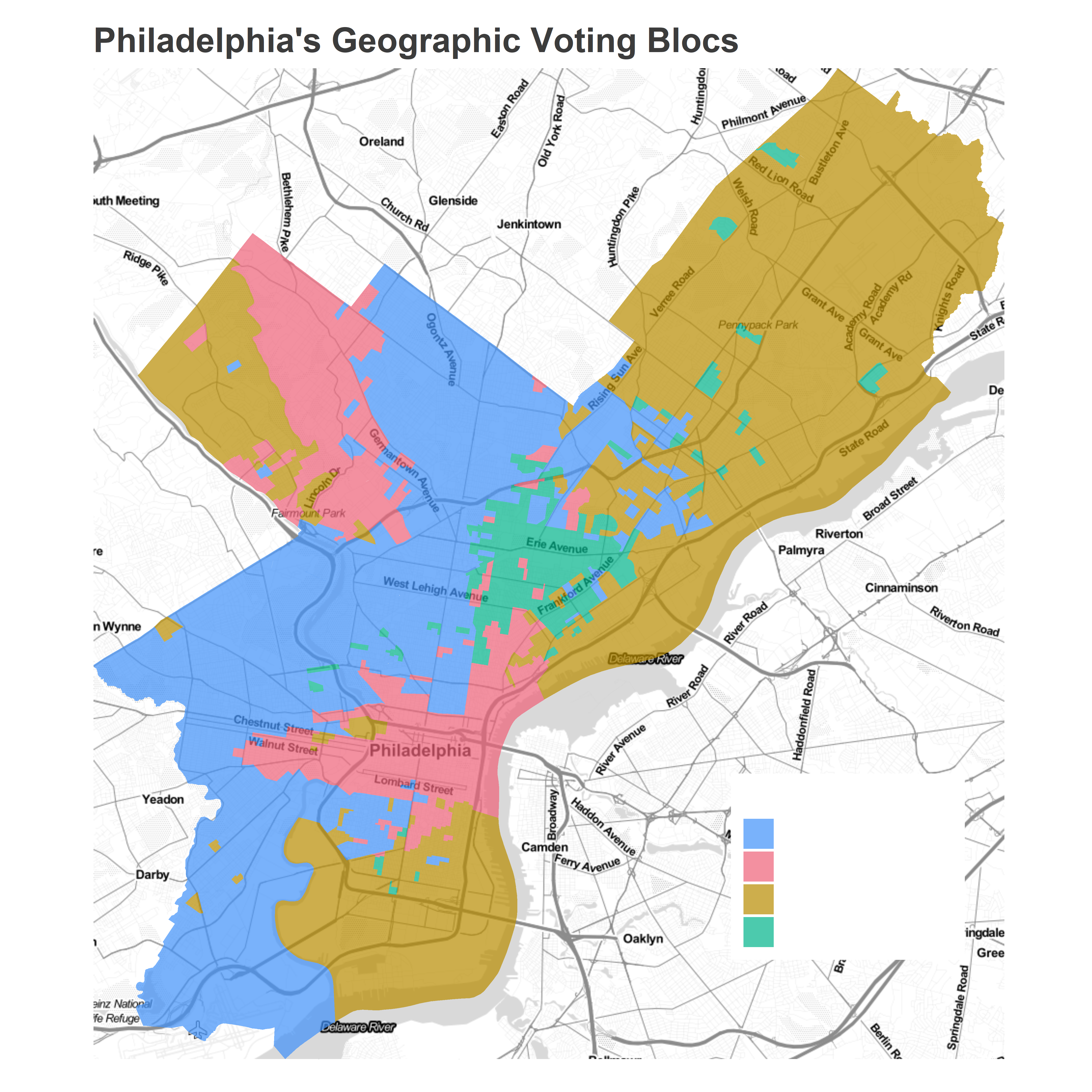
When the method produces the dimensions, it doesn’t provide any names, or any other clues as to why the divisions might be similar. It just says “over the last 17 years, candidates who did well in one red divisions tended to do well in the other ones”. Adding names (in an attempt to make my analysis readable) was entirely done by me, after the fact.

Choosing names

So, here’s where I sat. I saw these groups, and needed to figure out the unifying element. The first cluster that I named was the red one that unites Center City and the ring around it with Chestnut Hill and much of Mount Airy. I called these the “Wealthy” divisions. These are the parts of the city with the highest median incomes and highest home prices.

The name was a little blunt, but honestly, I liked that about it: Philadelphia is the eleventh-most segregated metropolitan region in the US (self-cite), and using a euphamism to bury the fact that wealth was the thing these divisions all had in common would only serve to make people who live in these segregated communities (including me) feel better about themselves. I like to use clear, non-euphamistic names that illustrate the way by which the groups were defined, and “Wealthy” is the obvious best word for these divisions.

The next clusters I named were blue and orange. These clusters overlap in incomes, but blue covers Point Breeze, Southwest, West, North, and parts of Northwest Philadelphia, while orange unites the Northeast and River Wards with deep South Philly and Manayunk. Again, the decisive factor isn’t subtle: the blue divisions are almost entirely predominantly Black, and the orange divisions predominantly White.

I couldn’t just call these by the racial demographics, though, because I already had a cluster whose name didn’t depend on race, “Wealthy”. I was worried that having one cluster named “Wealthy” and another “Black” would semantically imply that wealth was mutually distinct from Blackness. So I decided to call them “Black non-wealthy” and “White non-wealthy”, which would safely acknowledge that divisions in the Wealthy cluster could be both White or Black. I was in the clear.

Of course, that’s not really how folks read it. Instead, it felt like I was making a statement about the wealth of the residents. I think there were two features of the names that made people uncomfortable, one that I’m ok with, and one that I want to change.

First, what I want to change: It was a problem that I used a negation in the names–“non-Wealthy” instead of “Moderate Income” or “Working Class”. The first focuses on a comparison with someone else, while the second considers the given divisions without any comparison. That values what they are, without focusing on what they’re not. It’s similar to how people blanche when you call yourself an atheist, but are generally cool with you calling yourself a humanist; one focuses on what you’re not, and feels like a challenge, the other focuses on what you are.

I haven’t found the exact term for these clusters that I love yet. Both “Moderate Income” and “Working Class” feel either ill-defined or euphamistic, but I’ll keep thinking (suggestions welcome!). But I definitely won’t be using “non-wealthy” any more.

The second reason I think the names bothered people is the broad way they lumped together divisions. The blue cluster combines a diverse set of neighborhoods, from West Philly, to North Philly, up to West Oak Lane. While it’s true that all of the divisions are predominantly Black, the neighborhoods are different in other ways, and residents are rightfully wary of all being lumped together and treated as a monolithic group.

This is the concern that I think I’m ok with. While these divisions are different in myriad ways, it turns out that they all typically vote for the same candidates. If we were studying something else, we would want categories that handled those differences. But in studying voting patterns, grouping together these divisions is useful.

One important thing: I don’t know the causality of why these places all vote similarly. Obviously the racial similarity is important, but I don’t know if the specific causal mechanism is that the wards endorse similar candidates, or if residents have similar preferences, or if candidates target their outreach to the same neighborhoods. That’s obviously a crucial question, but it’s not one I’ve figured out how to disentangle yet.

Moving forward

So that’s where I’m at. I won’t go back and change the posts that I’ve already written. That would gloss over this useful discussion. But I’ve added a note there, and I’ll come up with better names before I use the clusters again.

The inspiration for this post was some great conversations with readers. I love hearing from you! I’m still surprised that people are reading, and more surprised when folks wanna engage. jonathan dot tannen at gmail dot com.

Update 2019-06-30: The names I’ve chosen

I’ve settled on names. After a lot indecision, I had a stroke of insight that is obvious in retrospect: if I use only voting patterns to identify the clusters, I should name them based on those voting patterns. This is the necessary response to my claim above that I should choose dimension names close to the definitional aspect of the clusters. So here are my chosen names:

  1. Black Voters
  2. Wealthy Progressives
  3. White Moderates
  4. Hispanic North Philly

These feel right to me. The main difference between the Center City divisions and Northeast/South Philly is between support for progressive vs centrist candidates (think Krasner vs Khan/O’Neill). The Black divisions don’t obviously line up along that dimension, supporting Krasner in 2017, but not the Wealthy Progressive favorites of DiBerardinis and Almirón. When these divisions differ, it is often to support Black candidates. The Hispanic divisions form a largely contiguous block of North Philly, allowing me to attach the neighborhood name to it.

These names manage to be clear, and enunciate the differences between the clusters without euphamism. But they also don’t editorialize, and stay faithful to how the divisions vote differently. So these are what I’ll use. Until I change my mind again.

How did the Common Pleas judges win?

Ahead of May 21st, I made some predictions about the Court of Common Pleas. I predicted a 66% chance that all six winners would be Recommended by the Bar; they all were. I predicted that 2.5 candidates would win from the first column and 1.0 from the second; those columns produced 2 and 1 winners, respectively.

But I’m here today to talk about something I got very, very wrong. Here’s something I wrote:

We get no Highly Recommended winners in 46% of simulations, and only one in another 47%. […] Getting two [Highly Recommended] winners (let alone three or four) would be a huge achievement, and presumably good for the citizens of Philadelphia, too.

Well, three Highly Recommended candidates won. I was pretty sure that wouldn’t happen, I gave it a 7% chance. To be fair, things with 7% chances happen all the time, but I actually think something changed this election. The Bar’s High Recommendations flexed their muscle.

Who won, and where

Looking at the layout of the ballot, you can tell yourself an easy story about how most candidates won.

View code
library(tidyverse)
df <- read_delim(
  paste0("../election_night_needle/raw_data/PRECINCT_2019525_H08_M09_S54.txt"),
  delim = "@"
) %>%
  rename(
    OFFICE = `Office_Prop Name`,
    candidate = Tape_Text,
    warddiv = Precinct_Name
  )

df <- df[-(nrow(df) - 0:1),]

df <- df %>% group_by(warddiv) %>%
  filter(sum(Vote_Count) > 0) %>%
  group_by()

df_cp <- df %>% filter(OFFICE == "JUDGE OF THE COURT OF COMMON PLEAS-DEM")
View code
format_name <- function(x){
  x <- tolower(x)
  x <- gsub("\\b([a-z])([a-z]*)", "\\U\\1\\L\\2", x, perl=TRUE)
  x <- gsub("\\bMc([a-z])", "Mc\\U\\1", x, perl=TRUE)
  return(x)
}

ballot <- read_csv("../../data/common_pleas/judicial_ballot_position.csv") %>%
  mutate(lastname = gsub(".* ([A-Za-z]+)$", "\\1", name) %>% format_name())

df_cp <-  df_cp %>%
  filter(candidate != "Write In") %>%
  mutate(
    candidate = format_name(candidate),
    Last_Name=format_name(Last_Name), 
    First_Name=format_name(First_Name)
  )

ballot <- ballot %>%
  filter(year == 2019) %>%
  left_join(
    df_cp %>% select(candidate, Last_Name) %>% unique, 
    by = c("lastname" = "Last_Name")
  )

cp_overall <- df_cp %>%
  group_by(Last_Name, First_Name) %>%
  summarise(VOTES = sum(Vote_Count)) %>%
  group_by() %>%
  mutate(
    winner=rank(desc(VOTES)) <= 6,
    pvote = VOTES / sum(VOTES),
    lastname=Last_Name
  ) 
  
cp_overall <- cp_overall %>% left_join(ballot %>% filter(year == 2019))

ggplot(
  cp_overall %>% arrange(VOTES),
  aes(y=rownumber, x=colnumber)
) +
  geom_tile(
    aes(fill=pvote*100, color=winner),
    size=2
  ) +
  geom_text(
    aes(
      label = ifelse(philacommrec==1, "R", ifelse(philacommrec==2,"HR","")),
      x=colnumber+0.45,
      y=rownumber+0.45
    ),
    color="grey70",
    hjust=1, vjust=0
  ) +
  geom_text(
    aes(
      label = ifelse(dcc==1, "D", ""),
      x=colnumber-0.45,
      y=rownumber+0.45
    ),
    color="grey70",
    hjust=0, vjust=0
  ) +
  geom_text(
    aes(label = sprintf("%s\n%0.1f%%", lastname, 100*pvote)),
    color="black"
    # fontface="bold"
  ) +
  scale_y_reverse(NULL) +
  scale_x_continuous(NULL)+
  scale_fill_viridis_c(guide=FALSE) +
  scale_color_manual(values=c(`FALSE`=NA, `TRUE`="yellow"), guide=FALSE) +
  annotate(
    "text",
    label="R = Recommended\nHR = Highly Recommended\nD = DCC Endorsed",
    x = 5.6,
    y = 4,
    hjust=0,
    color="grey70"
  ) +
  theme_sixtysix() %+replace% 
  theme(
    panel.grid.major=element_blank(),
    axis.text=element_blank()
  ) +
  ggtitle(
    "2019 Common Pleas Results",
    "Winners are outlined."
  )

Jennifer Schultz won with number one ballot position and a Bar Recommendation. Joshua Roberts combined the first column with a Bar Rec and a Democratic City Committee endorsement. Crumlish had the top of the second column plus a High Recommendation. Kyriakakis and Jacquinto combined Bar Recommendations with DCC endorsements.

The person who my model thought absolutely, positively would not win was Tiffany Palmer. And she romped by 2.6 points.

When I published my predictions, I didn’t share the candidate-level results. That’s because my model only used structural factors, and knew nothing about candidates themselves. It would perform well at overall counts, while looking pretty silly for individual candidates. It knew, for example, that some candidates would be breakaway stars from the third column or later, but spread that probability among all of them.

Well, let’s go back and look under the hood at the candidate predictions themselves.

View code
cp_sim <- read.csv("../simulating_cp/simdf.csv")
cp_overall <- cp_overall %>% left_join(cp_sim %>% mutate(name=format_name(name)))

cp_overall <- cp_overall %>% arrange(desc(mean_pvote)) %>%
  mutate(name=factor(name, levels=name))

ggplot(
  cp_overall,
  aes(x=name, y=100*mean_pvote)
) +
  geom_point() +
  geom_errorbar(
    aes(ymin=100*pvote_05, ymax=100*pvote_95),
    width=0
  ) +
  geom_point(aes(y=100*pvote), color=strong_purple, size=2) +
  theme_sixtysix() %+replace%
  theme(axis.text.x = element_text(angle=-90, hjust=0)) +
  scale_x_discrete(NULL) +
  scale_y_continuous("Percent of Vote") +
  expand_limits(y=0) +
  ggtitle("Simulated and actual Common Pleas results") +
  annotate("point", x = 15, y = 12, size=2, color=strong_purple) +
  annotate("text", x = 15.4, y = 12, size=4, color=strong_purple, hjust=0, label="Actual Results", fontface="bold") +
  annotate("point", x = 15, y = 14) +
  annotate("errorbar", x = 15, ymin = 13.5, ymax=14.5, width=0) +
  annotate("text", x = 15.4, y = 14, size=4, hjust=0, label="Simulated 90% Credible Interval", fontface="bold")

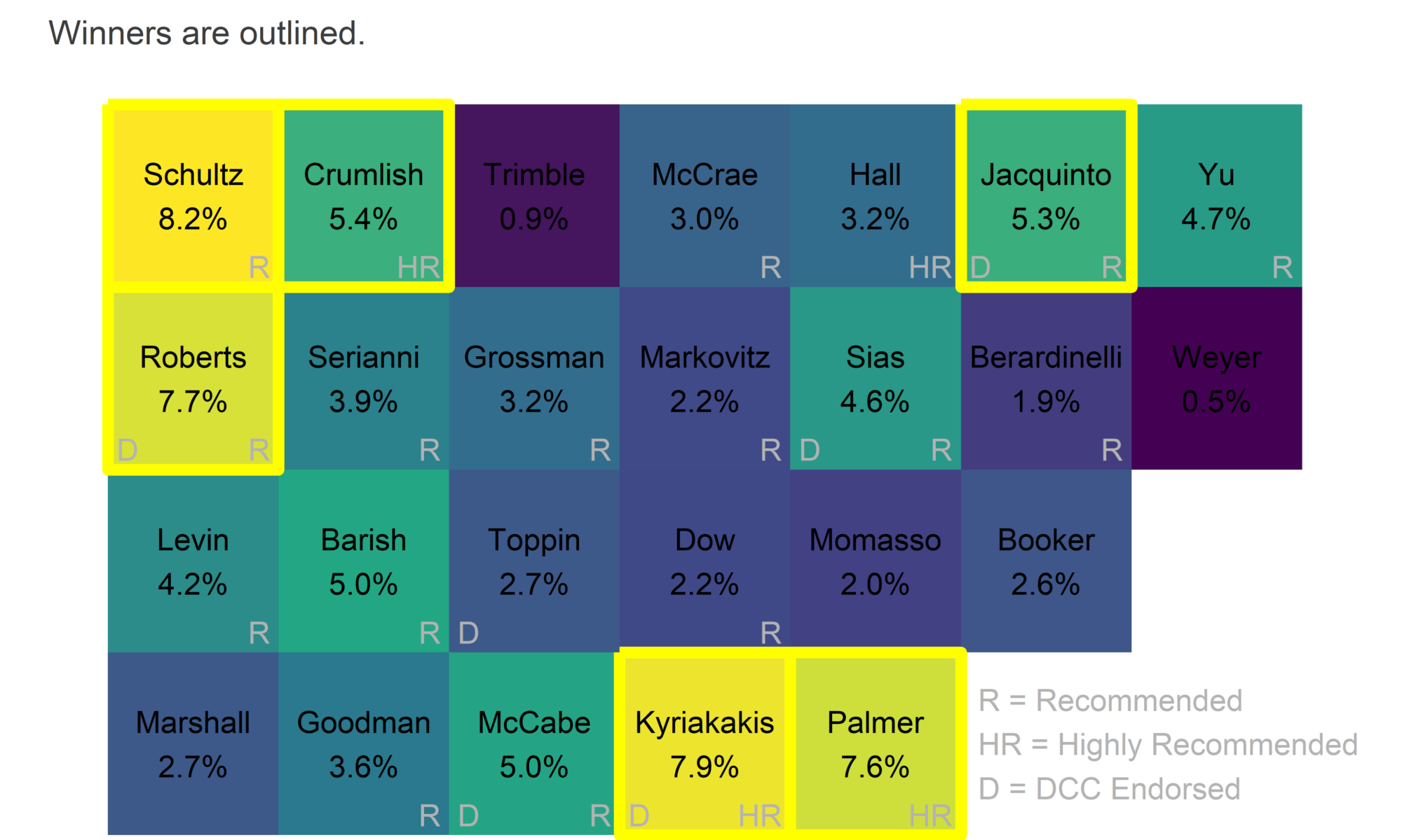
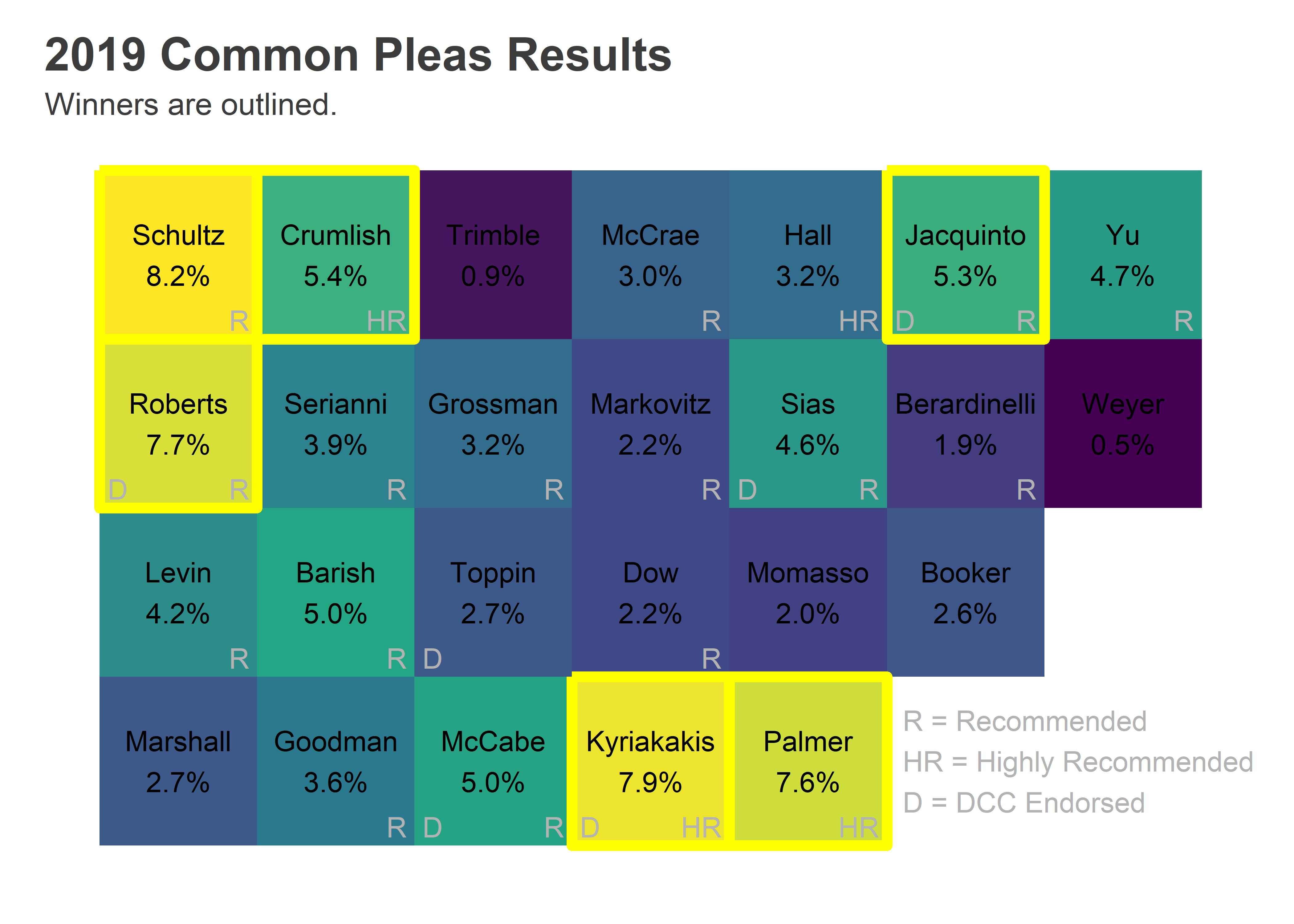
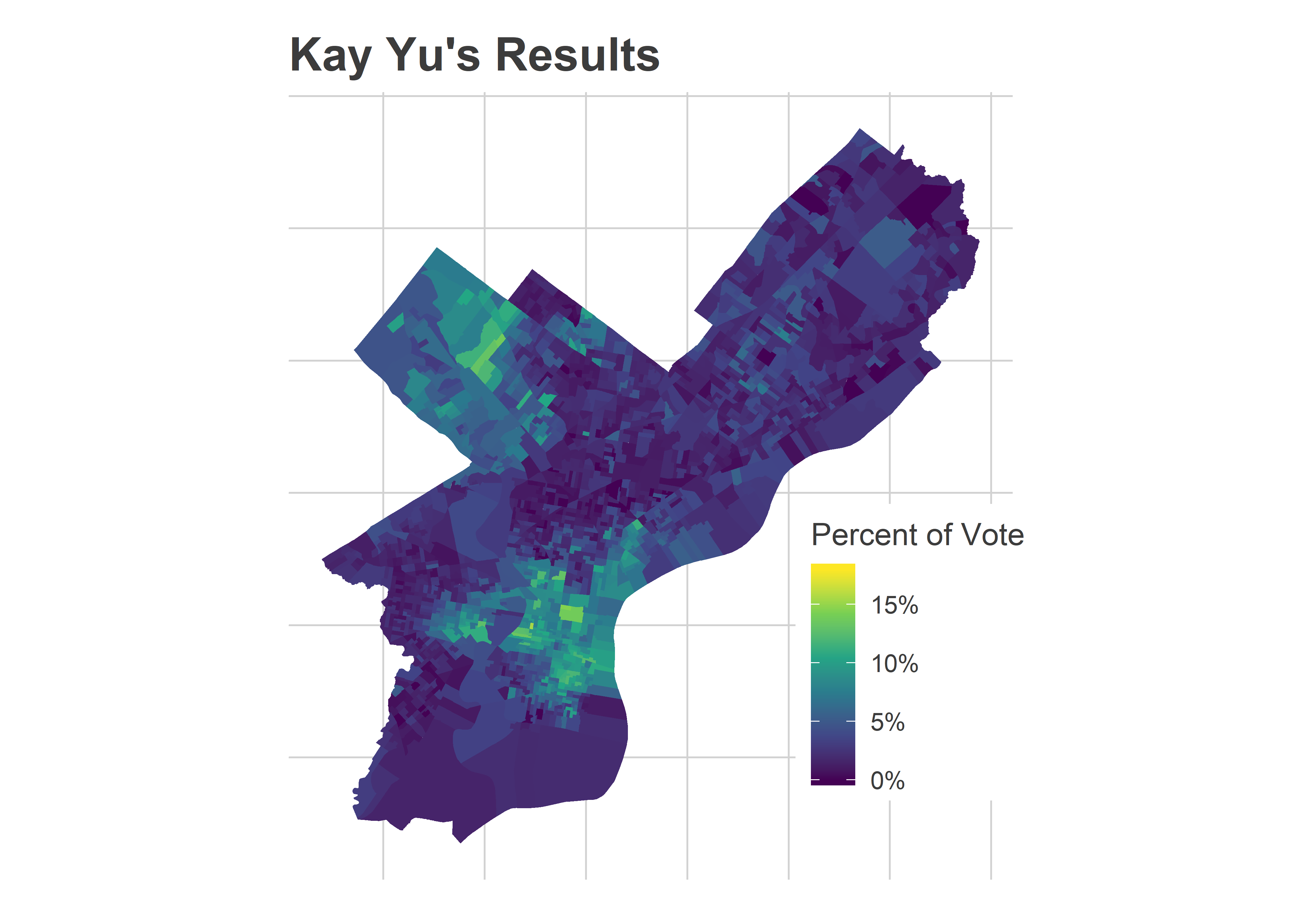
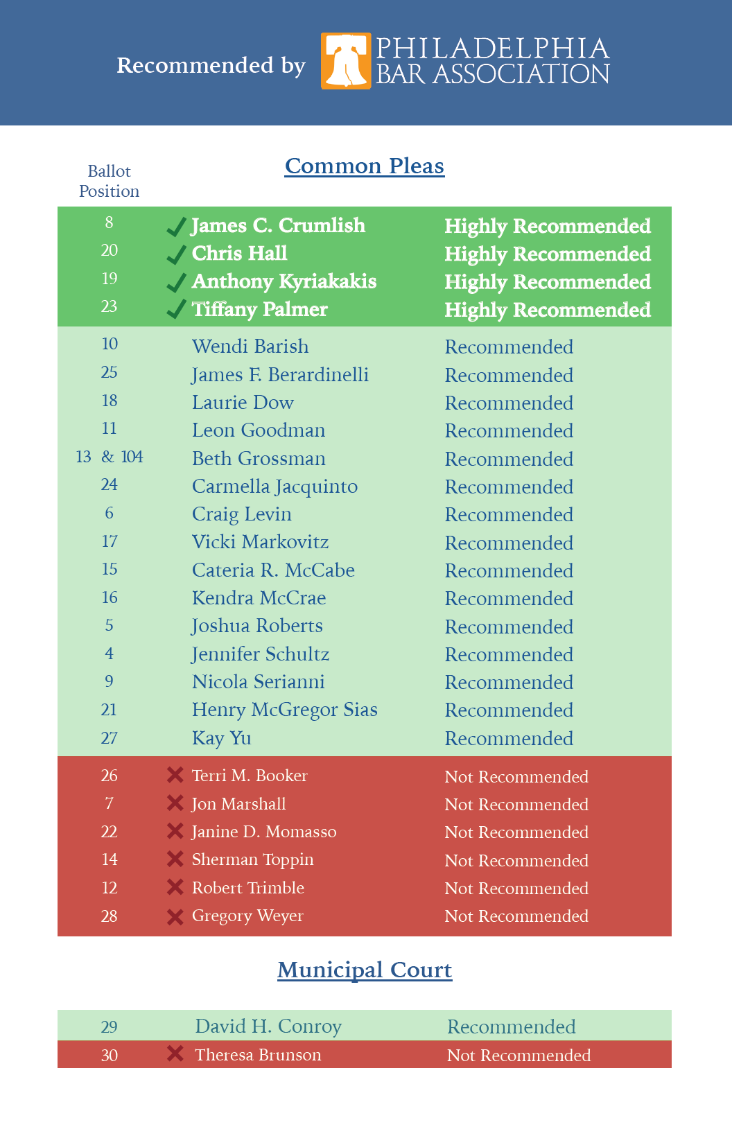
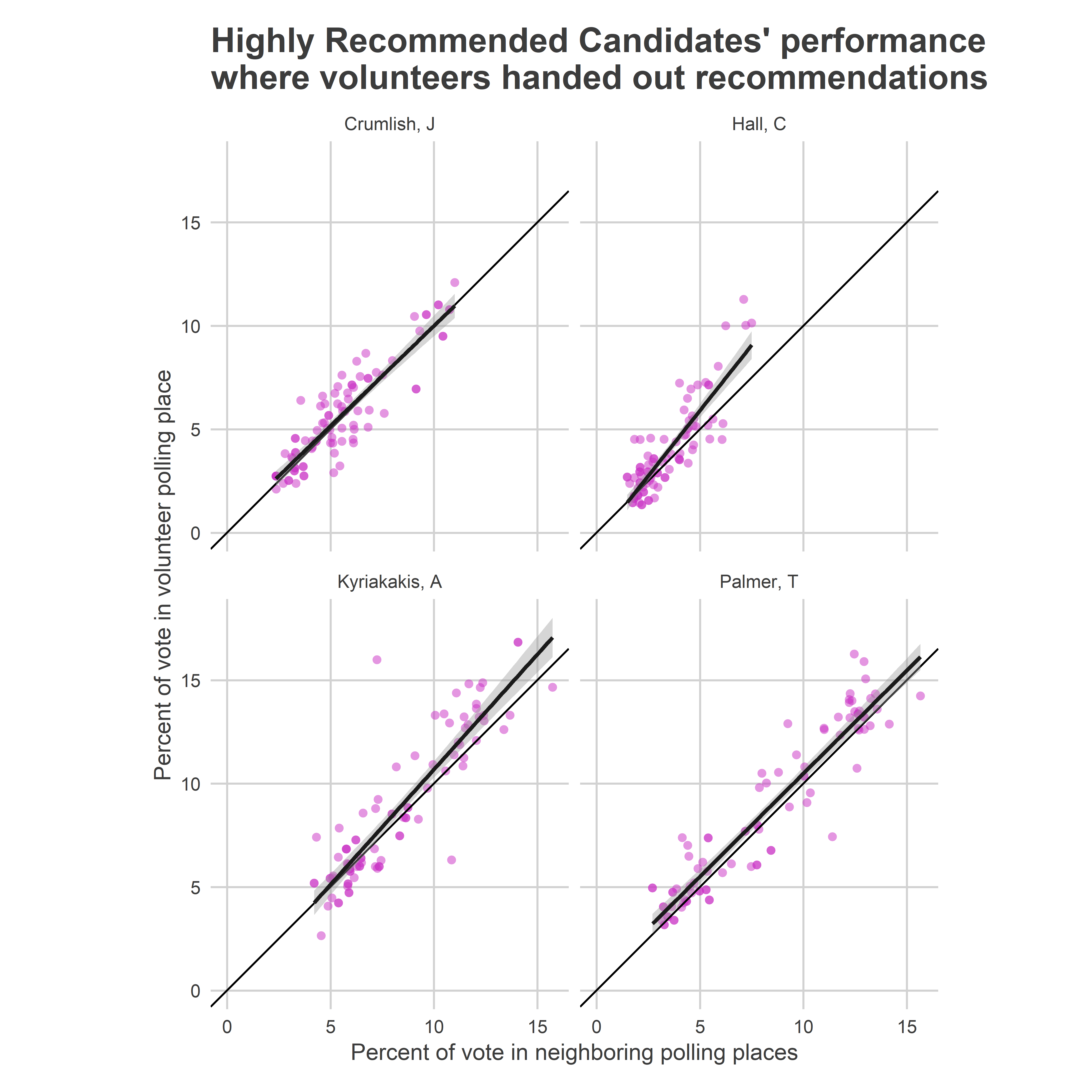
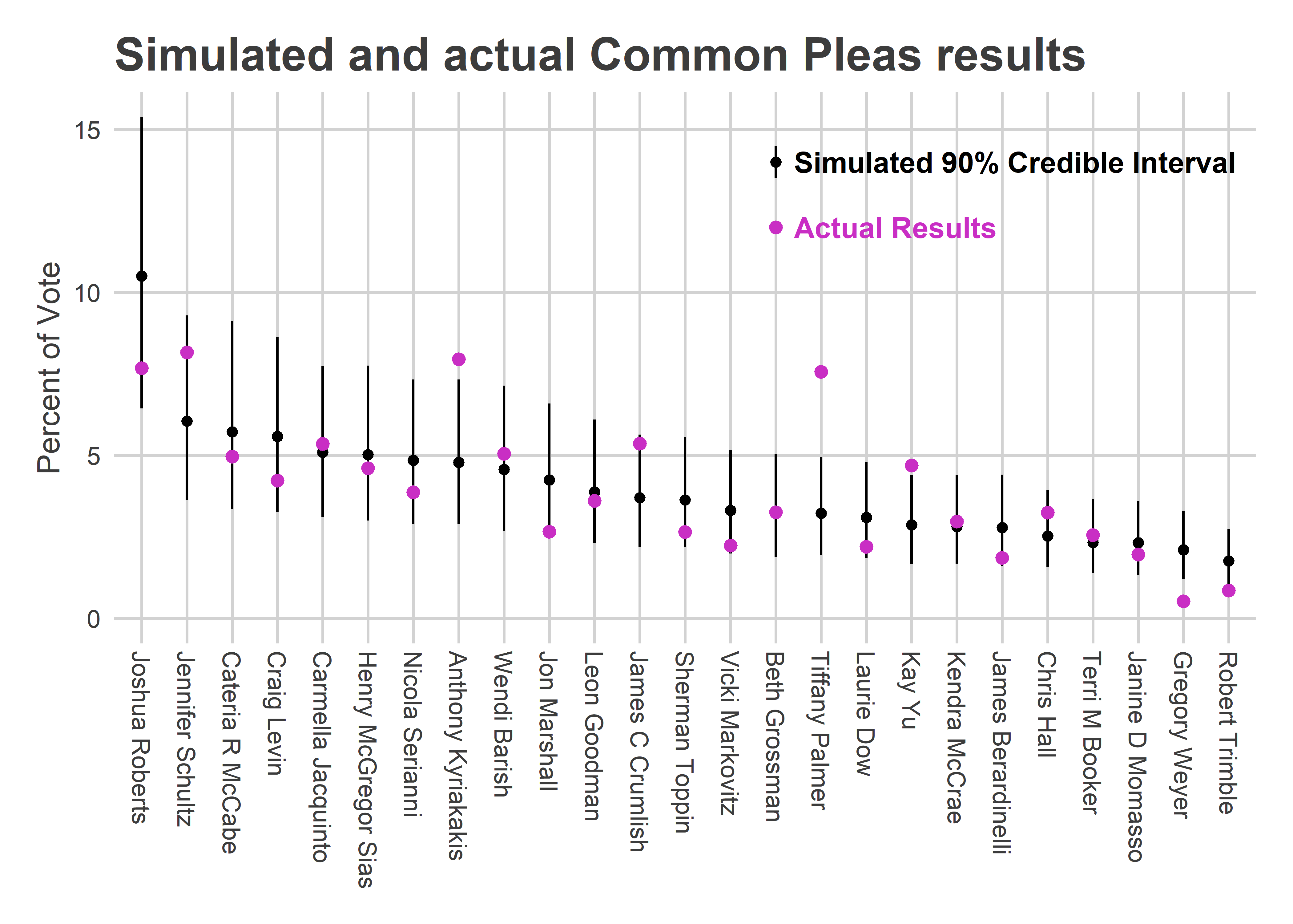
Kyriakakis and Palmer greatly exceeded the 90% credible range, and James Crumlish was at the top of it. Those three Highly Recommended candidates were all in the top four candidates who most overperformed my prediction (Kay Yu was the other).
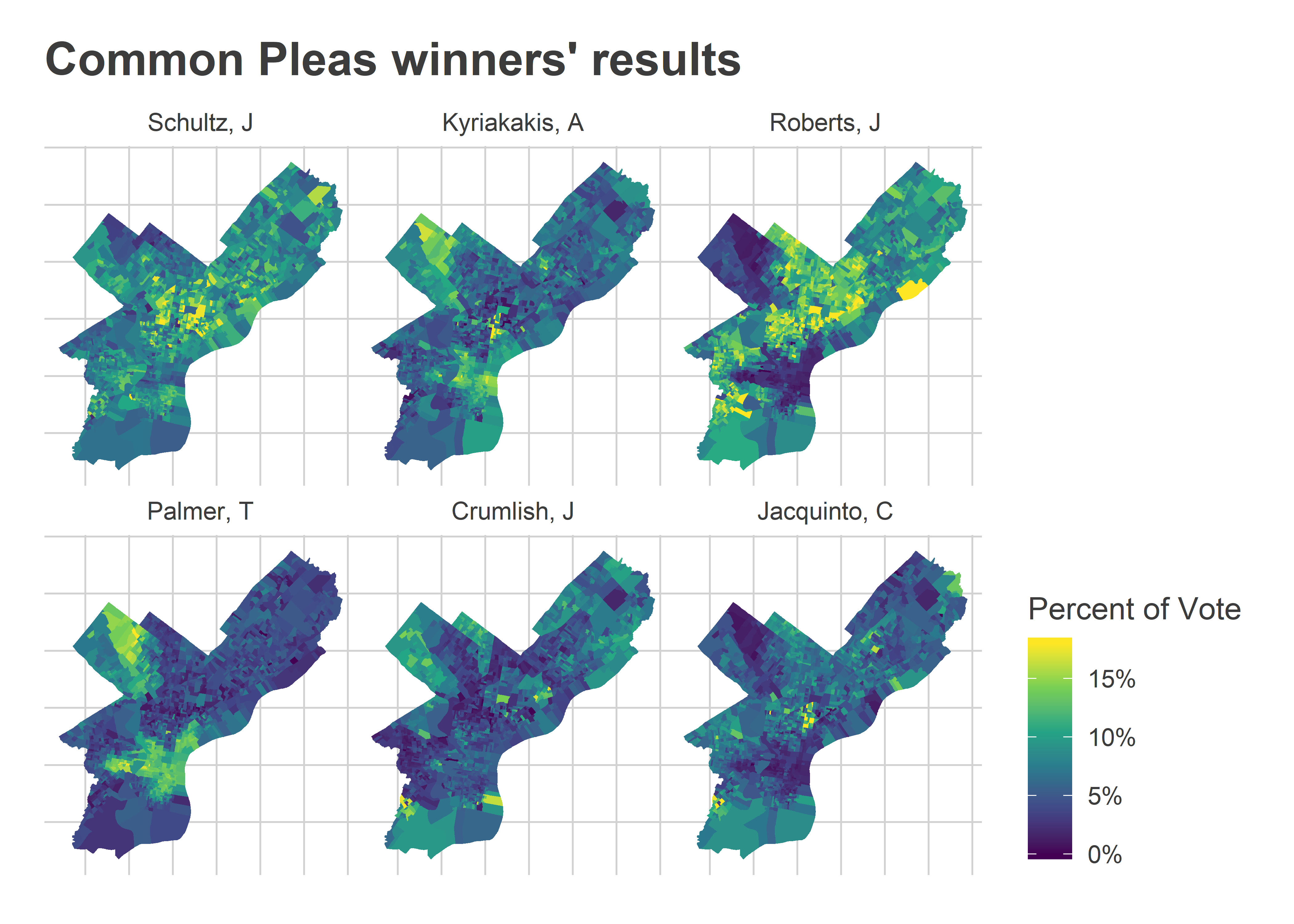
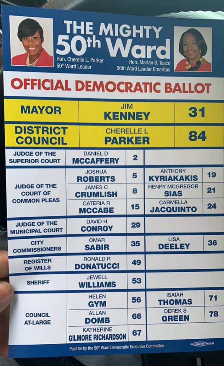
I significantly underestimated the Highly Recommended candidates this time. But it wasn’t my fault! Two years ago, the Bar didn’t Highly Recommend anybody. Four years ago, they Highly Recommended three; they all won, but didn’t appear to receive any more votes given their ballot position than the regular Recommendeds. So it was reasonable coming into this election to think that High Recommendations were just like regular ones.

The map of the winners’ votes makes it even clearer how each won.

View code
library(sf)
divs <- st_read("../../data/gis/2019/Political_Divisions.shp", quiet=TRUE) %>%
  mutate(warddiv=paste0(substr(DIVISION_N, 1, 2), "-", substr(DIVISION_N, 3, 4)))

df_cp <- df_cp %>% 
  group_by(warddiv) %>% 
  mutate(pvote = Vote_Count/sum(Vote_Count)) %>%
  left_join(cp_overall, by=c("candidate"), suffix=c("",".y")) %>%
  group_by()
div_cp <- divs %>% 
  left_join(df_cp)

winners <-cp_overall %>% arrange(desc(pvote)) %>% with(candidate[1:6])

ggplot(
  div_cp %>% 
    filter(candidate %in% winners) %>% 
    mutate(candidate = factor(candidate, levels=winners))
) +
  geom_sf(aes(fill=pmin(100*pvote, 18)), color=NA) +
  facet_wrap(~candidate)+
  theme_map_sixtysix() %+replace% theme(legend.position = "right") +
  scale_fill_viridis_c(
    "Percent of Vote", 
    labels=function(x) paste0(x, "%", ifelse(x>=18,"+",""))
  ) +
  ggtitle("Common Pleas winners' results")

Schultz won across the board: a telltale sign of the top ballot position. Roberts and Jacquinto won on the back of the DCC endorsements (with Roberts’s votes being super-charged by the second ballot position).

Crumlish did oddly well in the 50th and 10th wards in the Northwest (that nub of green at the top center). Those wards have powerful endorsements, and he wasn’t DCC endorsed. But it turns out he was in fact endorsed there. Here’s an image submitted to Max Marin’s #phillyballots collection:

View code
knitr::include_graphics("ward_50_endorsements.jpg_large")

Kyriakakis and Palmer won with the wealthier wards (Center City and its ring, and Mount Airy/Chestnut Hill). This is where we’d expect the Bar Association’s Recommendations to matter most.

Have we done away with unqualified judges? Probably not.

All six of our winners were Recommended by the bar. This is a big improvement from the last two elections, which had three Not Recommended winners each.

But largely, that was luck. There was only one Not Recommended candidate in the first two columns of the of the ballot. Looking at the scatterplot above, the election went basically as predicted, except for the Highly Recommended dominance of Kyriakakis and Palmer. But nothing else has changed; especially the fact that a Not Recommended candidate at the top of the first ballot would probably have won.

Lessons Learned

This year, we elected zero Not Recommended judges. That’s a big achievement, and important not to overlook.

Most of that was luck. If a Not Recommended candidate were to end up at the top of the first column, they would probably still win. Our system is still stupid.

But, the Highly Recommended candidates did better than we’ve seen before. That was probably mostly thanks to those candidates capitalizing on the recommendations: Palmer clearly maximized its impact in a way that Hall and even winner Crumlish didn’t.

Handing out listings had a larger effect this time than we saw two years ago, and may be part of a pathway to electing Highly Recommended judges, but more important is the myriad other ways that the Highly Recommended candidates have to capitalize on the Recommendations.