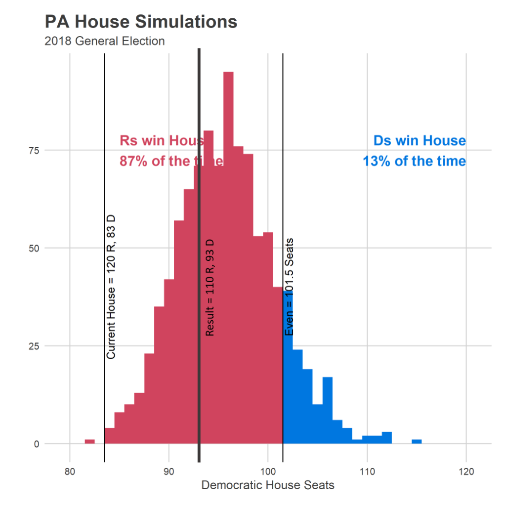
That prediction ended up being correct: Democrats currently have the lead in 93 seats, right in the meat of the distribution.

But as I dug into the predictions, seat-by-seat, it looked like there were a number of seats that I got wildly wrong. And I’ve finally decided that the model had another bug; probably one that I introduced in the fix to the first one. In this post I’ll outline what it was, and what I think the high-level modelling lessons are for next time.
Where the model did well, and where it didn’t
The mistake ended up being in the exact opposite of the fix I implemented: candidates in races with no incumbents.
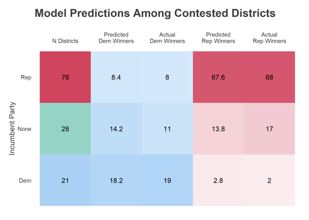
The State House has 203 seats. This year, there were 23 uncontested Republicans and 55 uncontested Democrats. I got all of them right 😎. The party imbalance in uncontested seats was actually unprecedented in at least the last two decades, they’re usually about even. Among the 125 contested races, 21 had a Democratic incumbent, 76 a Republican incumbent, and 28 no incumbent. I was a little bit worried this new imbalance meant that the process of choosing which seats to contest had changed, and that past results in contested races would be different from this year. Perhaps Democrats were contesting harder seats, and would win a lower percentage of them than in the past. That didn’t prove true.


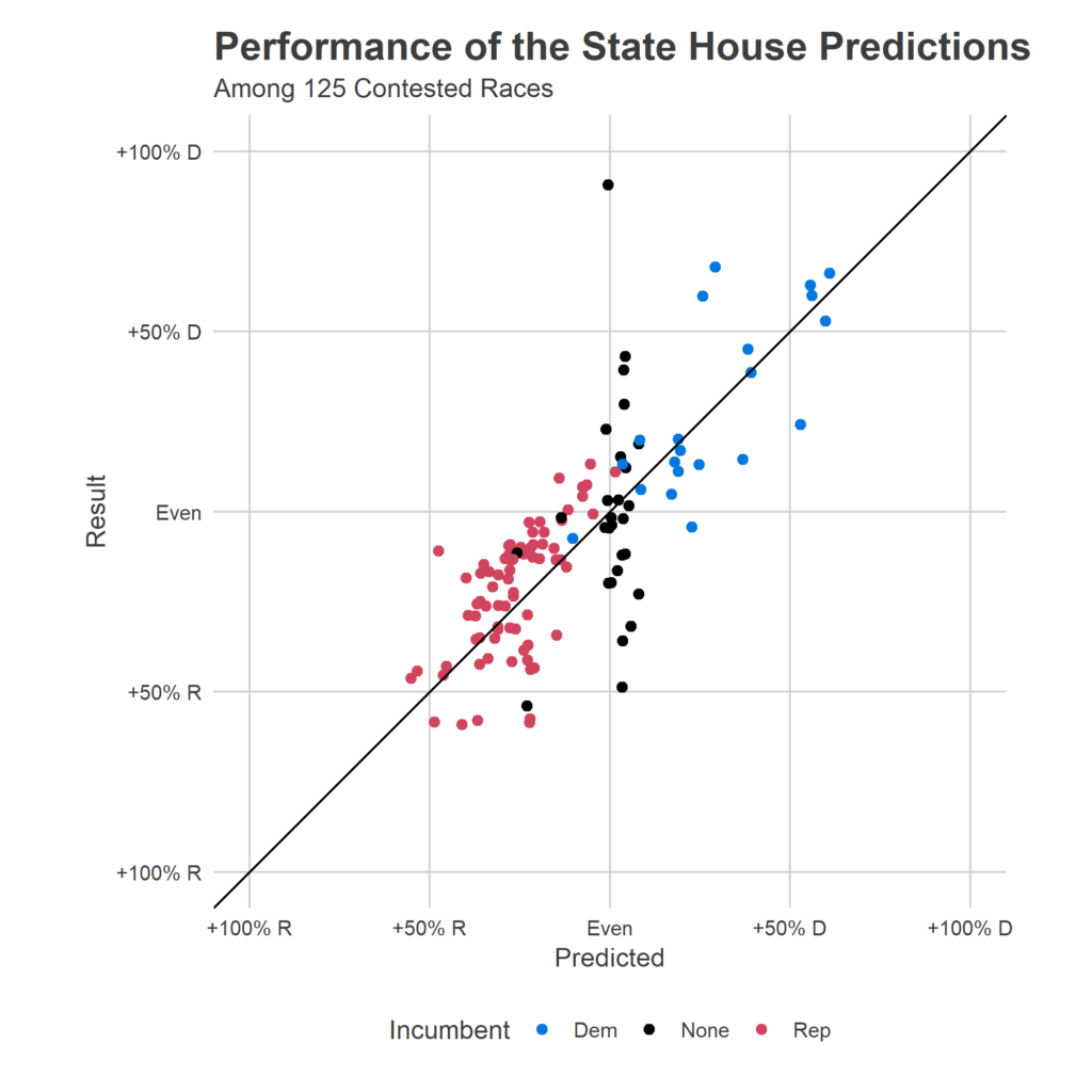
Above is a scatterplot of my predicted outcome (the X axis) versus the actual outcome (the Y axis). Perfect predictions would be along the 45 degree line. Points are colored by the party of the incumbent (if there was one). The blue dots and the red dots look fine; my model actually expected any given point to be centered around this line, plus/minus 20 points, so that distribution was exactly expected. But black dots look horribly wrong. Among those 28 races without incumbents, I predicted all but three to be close contests, and missed many of them wildly. (That top black dot, for example, was Philadelphia’s 181, where I predicted Malcolm Kenyatta (D) slightly losing to Milton Street (R). That was wrong, to put it mildly. Kenyatta won 95% of the vote.)
What happened? My new model specification, done in haste to fix the first bug, imposed a faulty logic. It forced the past Presidential races to carry the same information about races without incumbents as races with, even though races with incumbents had other information. I should have allowed the model to fall back on district partisanship when it didn’t have incumbent results, but the equivalent of a modelling typo didn’t allow that. Instead, all of these predictions ended up at a bland, basically even race, because the model couldn’t use the right information to differentiate them. My overall house prediction ended up being good only because a few 28 of the total 203 districts were affected, and getting three too many wrong didn’t make the topline look too bad. But it was a bug.
I’m new to this world of publishing predictive models based on limited datasets and with severe time constraints (I can’t spend the months on a model that I would in grad school or at work). What are the lessons of how to build useful models under these constraints?
Lesson 1: Go through every single prediction. I never looked at District 181. If I had seen that prediction, I would have realized something was terribly wrong. Instead, I looked at the aggregate predictions (similar to the table, and things looked okay enough). Next time, I’ll force myself to go through every single prediction (or a large enough sample of predictions if there are too many). When I tried to hand-pick sanity checks based on my gut, I happened to not choose “a race with no incumbents, but which had an incumbent for decades, and which voted for Clinton at over 85%”.
Lesson 2: Prefer clarity of the model’s calculations over flexibility. I fell into the trap of trying to specify the full model in a single linear form. Through generous use of interactions, I thought I would allow the model flexibility for it to identify different relationships between historic presidential races and length of incumbency. This would have been correct, if I had implemented it bug-free. But I happened to leave out an important three-way interaction. If I had fit separate models for different classes of races–perhaps allowing the estimates to be correlated across models–I would have immediately noticed the differences.
Lesson 2b: I actually learned this extension to Rule 2 in the process of fitting, but the post-hoc assessment bangs it home: when you have good information, the model can be quite simple. In this case, the final predictions did well even with the bug because the aggregate result was really pretty easy to predict given three valuable pieces of information: (a) incumbency, (b) past state house results, and (c) FiveThirtyEight’s Congressional predictions. The last was vital: it’s a high-quality signal about the overall sentiment of this year’s election, which is the biggest factor after each district’s partisanship. A model that used only these three data points and then correctly estimated districts’ correlated errors around those trends would have gotten this election spot on.
Predictions will be back
For better or worse, I’ve convinced myself that this project is actually possible to do well, and I’m going to take another stab at it in upcoming elections. First up is May’s Court of Common Pleas election. These judges are easy to predict: nobody knows anything about the candidates, so you can nail it with just structural factors. More on that later!