Decomposing the Funnel
I’m conceptualizing the entire process that filters down the whole population as a funnel, with four stages at which a fraction of the population drops out.
Let’s break down the funnel using the following accounting equation:
Voters per mile =
(Population over 18 per mile) x
(Proportion of over-18 population that are citizens) x
(Proportion of citizens that are registered to vote) x
(Proportion of registered voters that voted in 2016) x
(Proportion of those who voted in 2016 that voted in 2018).
The implications are very different if a neighborhood lags in a given one of these steps. If a ward has a low proportion of citizens that are registered, registration drives make sense. If a neighborhood has very low turnout in midterms vs presidential elections, then awareness and motivation is what matters.
We are also going to see that using metrics based on Registered Voters in Philadelphia is flawed. The lack of removal of voters from the rolls—which is actually a good practice, since the alternative is to aggressively remove potential voters—means that the proportion of registered voters that vote is not a useful metric.
Funnel Maps
Let’s walk through the equation above, map by map.
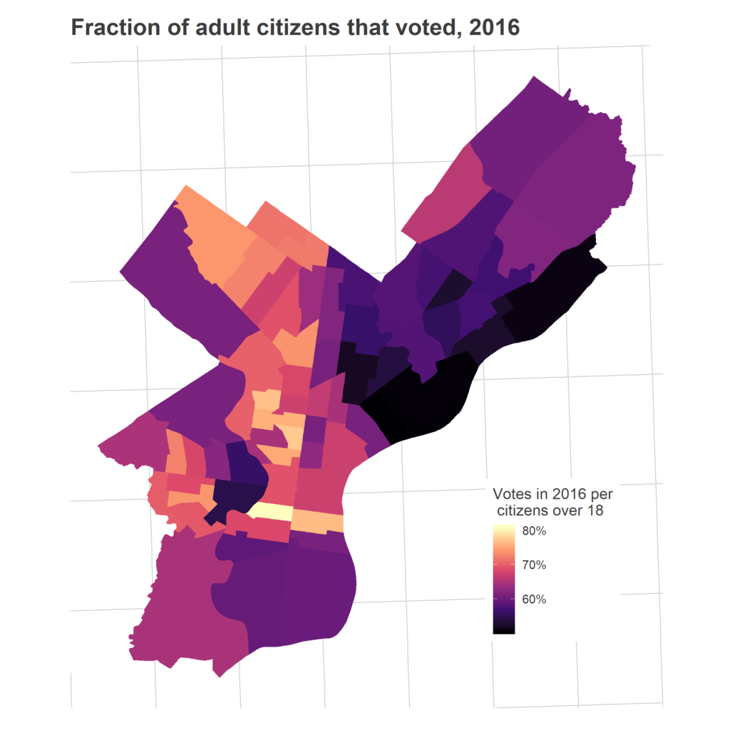
Overall, 44% of Philadelphia’s adults voted in 2018. That represented high turnout (measured as a proportion of adults) from the usual suspects: the ring around Center City, Chestnut Hill, Mount Airy, and the Oak Lanes.
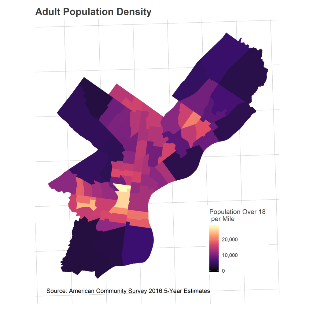
First, consider something not in that map: population density. This is obviously, almost definitionally, important. Wards with more population will have more voters.
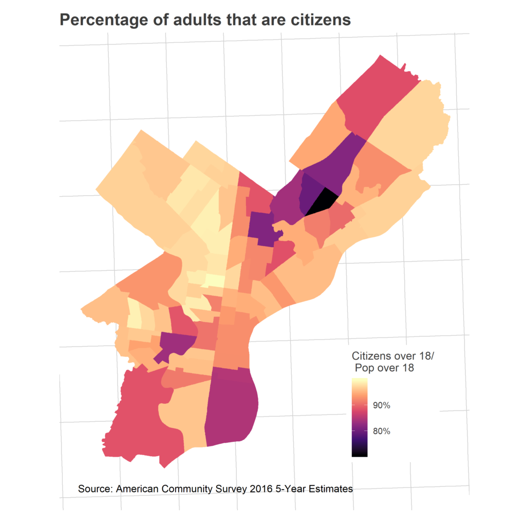
We don’t allow all of those adults to vote. I don’t have data on explicit voter eligibility, but we can at least look at citizenship.
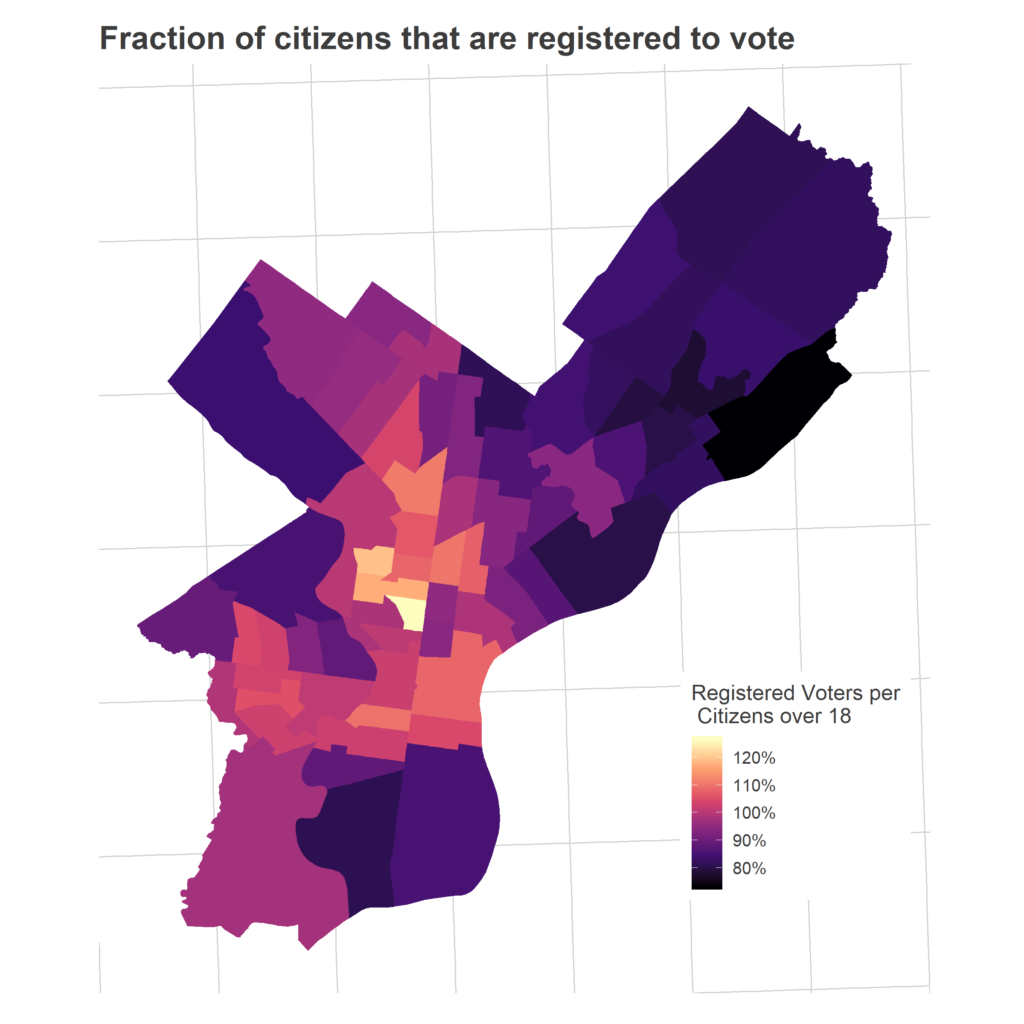
The next step in the funnel: what fraction of those citizens are registered to vote? Here’s where things get hairy.
While people tend to use facts like this to suggest conspiracy theories, Philadelphia’s ratio is actually quite typical for the state, across wealthy and poor, Republican and Democratic counties. [See below!]
And it’s very (very) important to point out that this is good for democracy: being too aggressive in removing voters means disenfranchising people who haven’t moved. And we have no evidence that anybody who has moved is actually *voting*, just that their name remains in the database.
It does, however, mean that measuring turnout as a fraction of registered voters is misleading.
I explore the registered voter question below, but for the time being let’s remove the registration process from the equation above to sidestep the issue:
Voters per mile =
(Population over 18 per mile) x
(Proportion of Over 18 pop that are citizens) x
(Proportion of citizens that voted in 2016) x
(Proportion of those who voted in 2016 that voted in 2018).
Why break out 2016 voters first, then 2018? Because there are deep differences in the processes that lead people to voting in Presidential elections versus midterms, and low participation in 2016 and 2018 have different solutions. Presidential elections are obviously high-attention, high-energy affairs. If you didn’t vote in 2016, didn’t turn out in the highest-profile, biggest-budget election of the cycle, you either have steep barriers to voting (time constraints, bureaucratic blockers, awareness), or are seriously disengaged. If someone didn’t vote in 2016, it’s hard to imagine you’d get them to vote in 2018.
Compare that to people who voted in 2016 but not in 2018. These voters (a) are all registered, (b) are able to get to the polling place, and (c) know where their polling place is. This group is potentially easier to get to vote in a midterm: they’re either unaware of or uninterested in the lower-profile races of the midterm, or have made the calculated decision to skip it. Whichever the reason, it seems a lot easier to get presidential voters to vote in a midterm than to get the citizens who didn’t even vote in the Presidential race.
So which citizens voted in 2016?
How many of these 2016 voters came out again two years later?
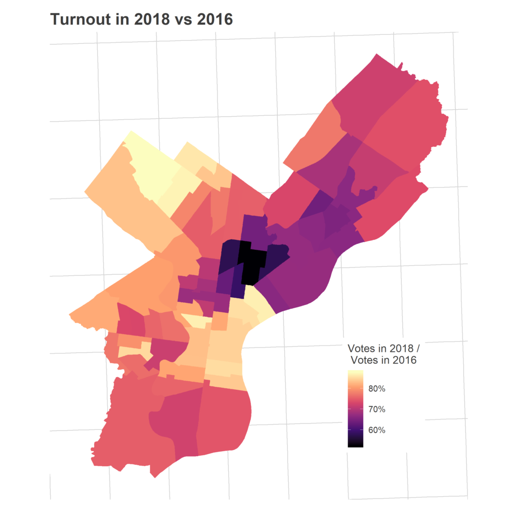
The dark spot is the predominantly Hispanic section of North Philly. It’s not entirely surprising that this region would have low turnout in a midterm, but remember that this map has as its denominator *people who voted in 2016*! So there’s even disproportionate fall-off among people who voted just two years ago.
So that’s the funnel. We have some small variations in citizenship, confusing variations in proportions registered, steep differences in who voted in 2016, and then severely class- and race-based differences in who comes out in the midterm. Chestnut Hill and Center City have high scores on basically all of these dimensions, leading to their electoral dominance (except for Chestnut Hill’s low population density and Center City’s relatively high proportion of non-citizens). Upper North Philly and the Lower Northeast are handcuffed at each stage, with telling correlations between non-citizen residents and later voting patterns, even those which could have been unrelated, such as the turnout among citizens.
What’s going on with the Registered Voters?
It’s odd to see more registered voters than the Census claims there are adult citizens. I’ve claimed this is probably due to failing to remove from the the rolls people who move, so let’s look at some evidence.
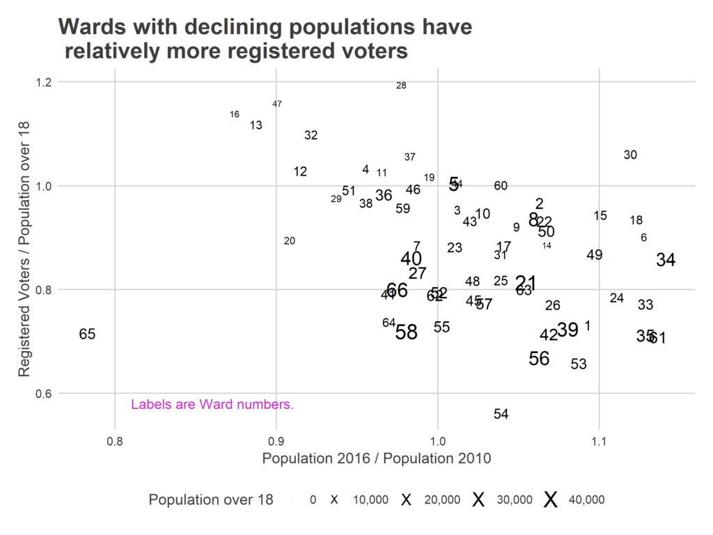
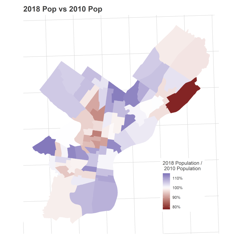
First, let’s consider the problem of uncertainty in the population estimates. The American Community Survey is a random sample, meaning the population counts have uncertainty. I’ve used the 5-year estimates to minimize that uncertainty, but some still exists. The median margin of error in the population estimates among the wards is +/- 7%. This uncertainty is larger for less populous wards: the margin of error for Ward 28’s population is +/-12%. So the high registration-to-population ratios may be partially driven by an unlucky sample giving a small population estimate. But the size of the uncertainty isn’t enough to explain the values that are well above one, and even if it were large enough to bring the ratios just below one, the idea that nearly 100% of the population would be registered would still be implausibly high.
So instead, let’s look at evidence that these high ratios might be systematic, and due to lags in removal. First, consider renters.
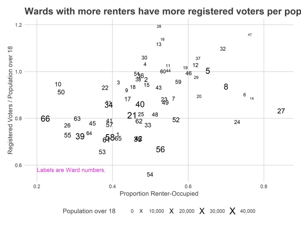
r home and to the city, and less invested in local politics. On the other hand, they have higher turnover, so any lag in removing voters will mean more people are registered at a given address. The visible positive correlation suggests that the second is so strong as to even overcome the first.
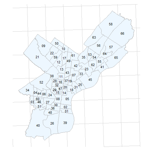
(For reference, here’s a map of Ward numbers)
First, there isn’t a strong correlation between Registered Voters per adult citizen and Democratic counties.
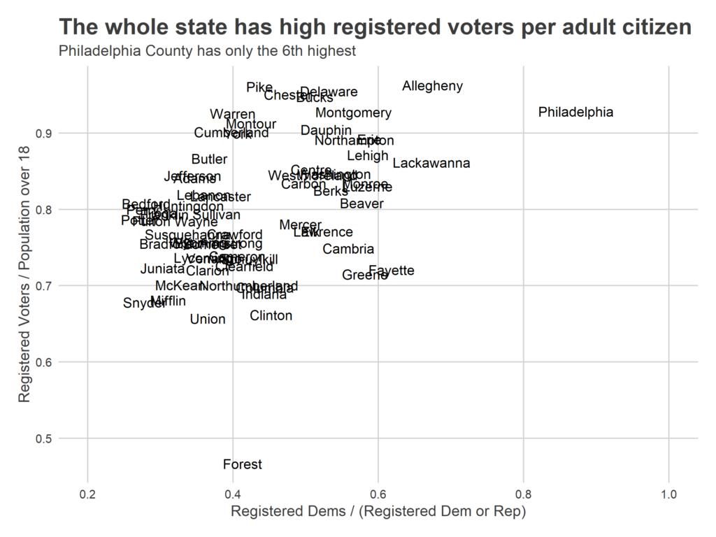
More telling is a county’s fraction of the residents that have moved in since 2000: it looks like counties with higher turnover has higher ratios, which we would expect if the culprit were lagging removal.

Apologies for the long explanation. I didn’t want to just ignore this finding, but I’m terrified it’ll be discovered and used by some conspiracy theorist.
Philadelphia’s diverse wards have a diverse array of turnout challenges. Unfortunately, the voter registration rolls are pretty unhelpful as a signal, at least in the simplistic aggregate way I considered them here. (Again: good for democracy, bad for blogging).
Which stage of the funnel matters depends on two things: their respective sizes, and how easy it is to move each. Is it more plausible to get out the citizens who didn’t vote in 2016? Or is it more plausible to get the 2016 voters out again in 2018? Where will registration drives help, and where is that not the issue?
Next year’s mayoral primary, a local election with an incumbent mayor, will likely be an exaggerated version of the midterm, with even more significant fall-off than we saw in November. More on that later.
Appendix: Merging Census data with Wards
I use population data from the Census Bureau’s American Community Survey, an annual sample of the U.S. population with an extensive questionnaire on demographics and housing. Because it’s a sample, I use the five-year aggregate collected from 2012-2016. This will minimize the sampling uncertainty in the estimates, but mean there could be some bias in regions where the population has been changing since that period.
The Census collects data in its own regions: block groups and tracts. These don’t line up with Wards, so I’ve built a crosswalk from census geographies to political ones:
– I map the smallest geography–Census Blocks–to the political wards.
– Using that mapping, I calculate the fraction of each block group’s 2010 population in each Ward. I use 2010 because blocks are only released with the Decennial Census. Largely, any changes over time in block populations are swamped by across-block variations in populations that are consistent through time.
– I then apportion each block group’s ACS counts–of adults, of citizens–according to those proportions.
This method is imperfect; it will be off wherever block groups are split by a ward and the block group is internally segregated, but I think the best available approach.