2018 is finally here, and with it midterm elections. While national eyes will be focused on control of Congress, Pennsylvania’s voters will decide in November whether to reelect Democratic incumbents Governor Tom Wolf and Senator Bob Casey, or support as-yet undecided Republican challengers.
Within swing-state Pennsylvania, Philadelphia plays the role of Democratic bastion. Elections often boil down to two questions (1) how do Pittsburgh and Philadelphia’s suburbs swing between parties, and (2) can Philadelphia’s turnout overcome those swings.
I’ve downloaded data from the *amazing* Open Elections Project. Let’s look ahead to November.
Philadelphia and Pennsylvania’s turnout
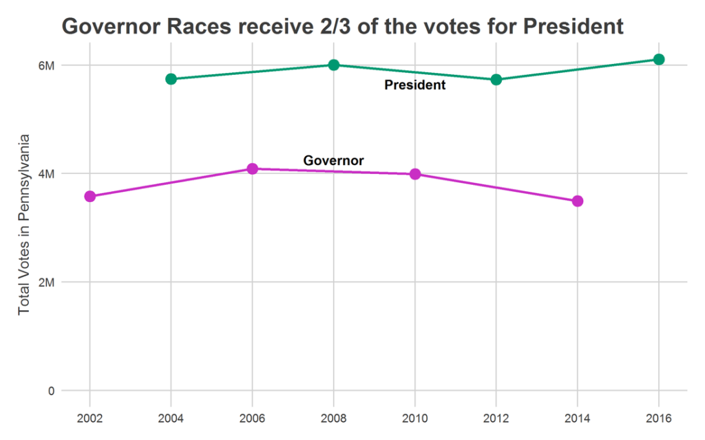
Turnout in PA Governor races is typically 2/3 of the turnout in Presidential elections. Just under 6 Million votes are typically cast for President, while under 4 Million are cast for Governor. This means that there is significant room for growth in 2018 turnout with an energized electorate.
The closest proxy for 2018 is probably 2006: in that year, an unpopular Republican President and an incumbent Democratic Governor led to a sweeping victory across the state, with Ed Rendell winning reelection by 19.8 percentage points. Coincidentally, Bob Casey was running then as now, and this wave carried him to a 17.4 point win over incumbent Rick Santorum.
That election also saw the highest statewide turnout for a Governor’s race, with 4.1 million Pennsylvanians voting. Democratic voters in 2018 appear to be even more motivated than twelve years ago; if turnout closes even a fraction of the 2 Million vote gap between Presidential and Gubernatorial races, we could expect record vote counts.
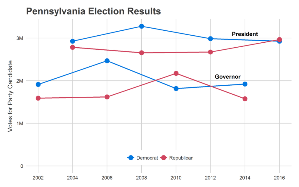
Despite its reputation as a swing state, Pennsylvania entered 2016 with the Democrat having won six of the prior seven President & Governor races. Of course, swinginess reasserted itself in 2016, as Trump carried the state overall by 44 thousand votes. Interestingly, Rendell’s big Democratic win in 2006 came even while the Republican count of votes held steady: he received 55,000 more votes than in 2002, and that leap was responsible for the surging victory.
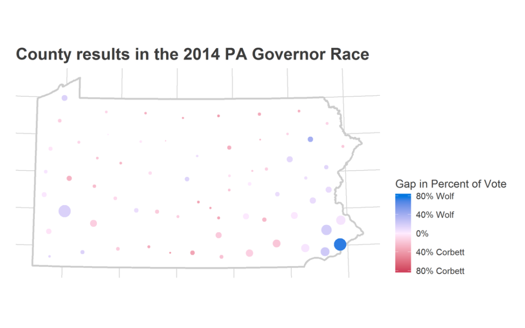
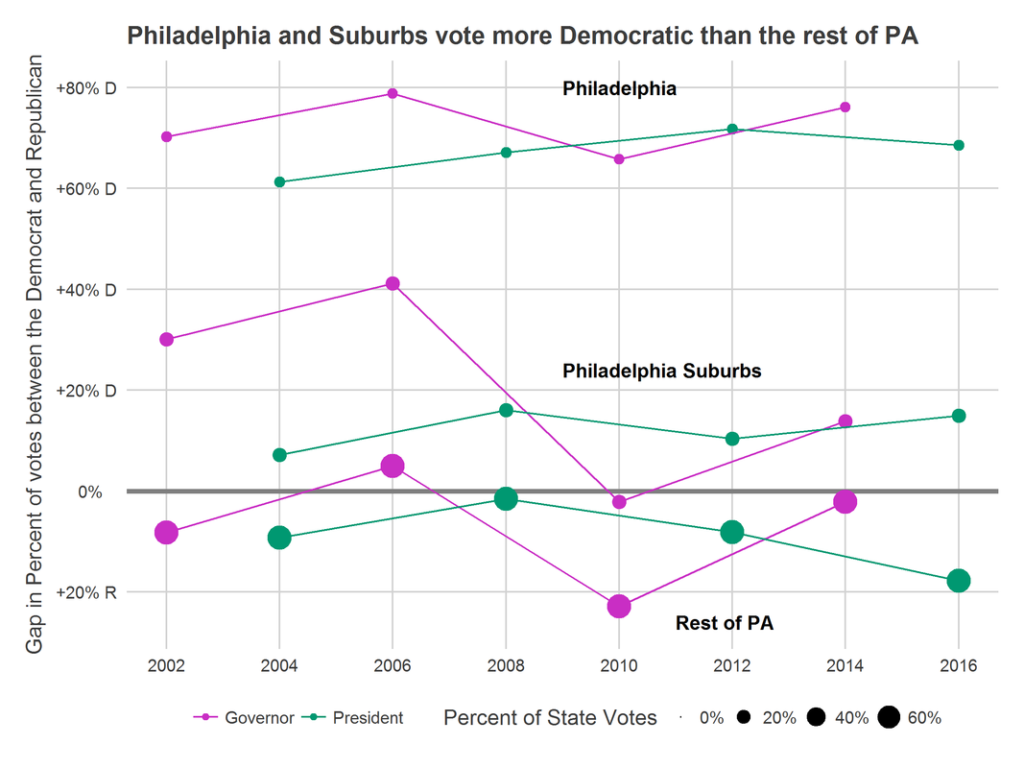
Within the state, Philadelphia serves both the roles of casting the most votes and being the most Democratic county. In 2014, Philadelphia supported Wolf with 88% of the vote. He carried the state with 55%.
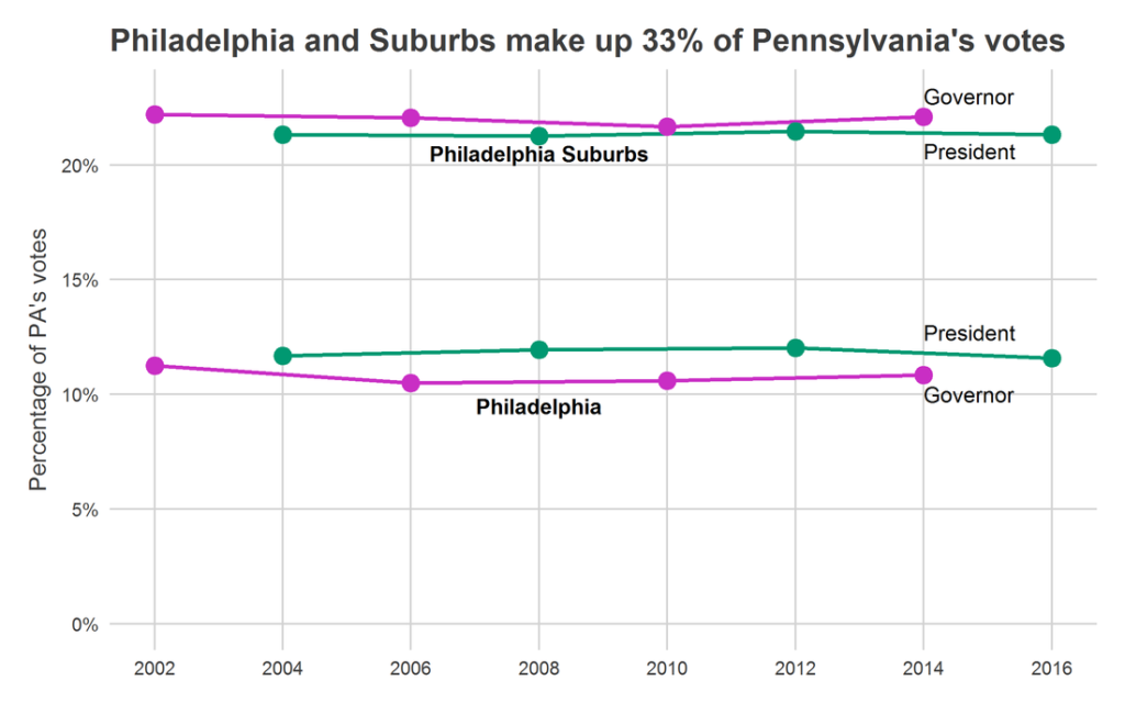
Together, Philadelphia and its four-county suburbs–Bucks, Chester, Delaware and Montgomery–constitute 31% of the state’s population and 33% of its votes. Philadelphians vote disproportionately more in Presidential elections, making up 11.8% of the electorate on average, as opposed to 10.8% of the electorate in Governor’s races. That difference may seem small, but combined with the fact that Philadelphia often votes 36 percentage points more Democratic than the rest of the state, this single swing can change statewide results by 0.36 percentage points. For a sense of size, Donald Trump won the state by 1.2 percentage points.
Philadelphia and its suburbs regularly vote more Democratic than the rest of the state. Across the years, however, there are some subtle trends. Philadelphia’s suburbs appear to be the most susceptible to waves: the swing from Democrat to Republican between 2006 and 2010 was much more dramatic than in Philadelphia or the rest of the state. In 2016, those same suburbs exemplified the anti-Trump movement, and actually voted *more* for Clinton than they had for Obama in 2012. Both Philadelphia and the rest of PA did the opposite.
Turnout vs. Persuasion in Pennsylvania
In a previous post,
I decomposed swings in votes into changes in turnout and changes in party selection. Let’s apply that same calculation to state, county by county.
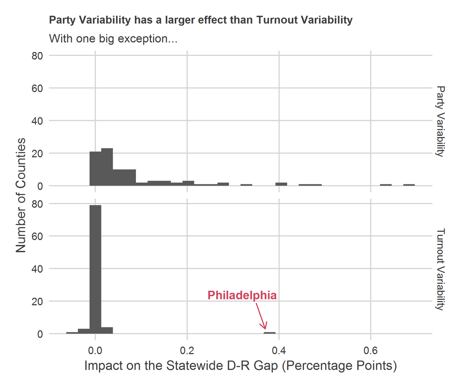
A recap: the calculation decomposes each county’s effect on the statewide election results into the effect of its turnout swings and of swings in its party preference. If a county has a score of 0.2 in Party Variability, that means that its typical swing in party preference changes the statewide election outcomes by 0.2 percentage points. If a county has strong average turnout but varies in which party it votes for, it will have a high Party Variability score. If a county always votes for one party, and its turnout varies from election to election, it will have a high Turnout Variability score. Counties that always have low turnout or don’t vote strongly for a given party will have low scores, as will counties that never vary.
In almost every county, party variability dominates turnout variability. The single, huge exception is Philadelphia. Philadelphia’s score of 0.37 means that its changes in turnout between Governor and Presidential races can change the statewide election by 0.74 percentage points, as it goes from one deviation below its mean to one deviation above. All other counties almost entirely affect the state by swings in party preference.
(Note: This calculation focuses on county-level results, and I don’t have data on individual voter turnout. Some of the Party Variability is almost certainly within-county turnout differentials: if within a county the Republicans are more likely to vote than the Democrats in a given election, that will appear in this calculation as a change in that county’s party preference. As such, this calculation almost certainly overstates Party Variability and understates Turnout Variability. Nonetheless, Philadelphia’s larger score is telling.)
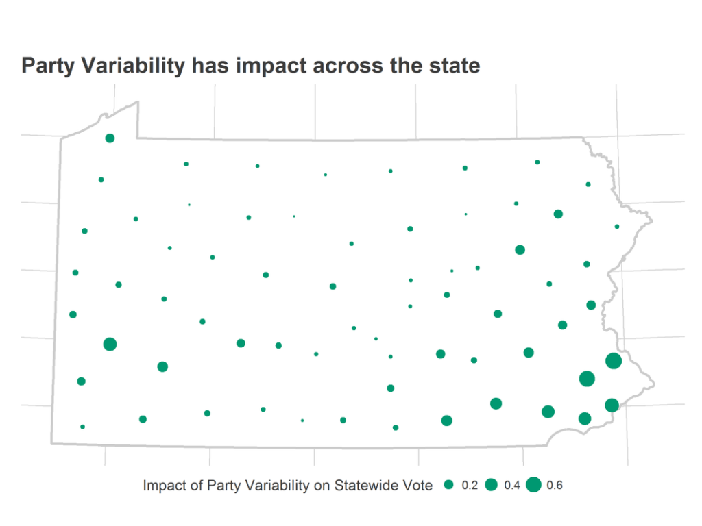
Party Variability impacts the entire state, and the map of the Variability impact largely looks like the map of voters.
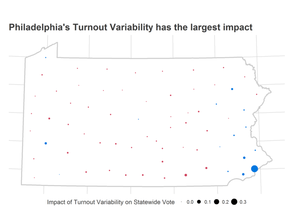
By comparison, only Philadelphia has a consistent-enough party preference and enough turnout variability for its turnout to have a large effect.
Questions? Comments?
Now that 2018 is finally here, there is a lot of analysis to do. In the coming year, I will be profiling local congressional districts, analyzing state and local polls, and trying to understand our city and state a little bit better with each week.
Do you have thoughts for a post? An open question? A calculation or map you’d like to see? Let me know!