Could Jannie Lose?
Jannie Blackwell, the six term councilmember from West Philly’s District 3, is being challenged by Jamie Gauthier. The race appears to be shaping up as a reform-minded challenger against a powerful longtime incumbent, and it’s generated some serious buzz due to recent protests and homophobic remarks. Could it really be close?
More generally, I’m curious about the way Philadelphia’s gentrification and the 2016 election have changed electoral power structures. Even in 2015, Helen Gym won largely on the votes of Center City and the ring around it. But then 2016 happened, and turnout in those neighborhoods reached unprecedented heights. Exactly how powerful is that cohort? And while they’re strong citywide, have they taken over specific districts, to be able to dictate outcomes there?
Blackwell hasn’t faced a primary challenger since 1999, so we don’t have any evidence on her individual strength. Let’s instead look at recent competitive elections that could illustrate the neighborhood’s relative views.
What are the neighborhood cohorts that will decide District 3? Is the Krasner/Gym base strong enough on its own to dictate the election, or is the traditionally decisive West and Southwest Philly base still decisive?
District 3’s voting blocks
In the last three Democratic primaries, District 3 has displayed two clear voting blocks: University City and farther West/Southwest Philly.
View code
library(tidyverse)
library(rgdal)
library(rgeos)
library(sp)
library(ggmap)

sp_council <- readOGR("../../../data/gis/city_council/Council_Districts_2016.shp", verbose = FALSE)
sp_council <- spChFIDs(sp_council, as.character(sp_council$DISTRICT))

sp_divs <- readOGR("../../../data/gis/2016/2016_Ward_Divisions.shp", verbose = FALSE)
sp_divs <- spChFIDs(sp_divs, as.character(sp_divs$WARD_DIVSN))
sp_divs <- spTransform(sp_divs, CRS(proj4string(sp_council)))

load("../../../data/processed_data/df_major_2017_12_01.Rda")

ggcouncil <- fortify(sp_council) %>% mutate(council_district = id)
ggdivs <- fortify(sp_divs) %>% mutate(WARD_DIVSN = id)
View code
races <- tribble(
  ~year, ~OFFICE, ~office_name,
  "2015", "MAYOR", "Mayor",
  "2015", "COUNCIL AT LARGE", "City Council",
  "2016", "PRESIDENT OF THE UNITED STATES", "President",
  "2017", "DISTRICT ATTORNEY", "District Attorney"
) %>% mutate(election_name = paste(year, office_name))

candidate_votes <- df_major %>%
  filter(election == "primary" & PARTY == "DEMOCRATIC") %>%
  inner_join(races %>% select(year, OFFICE)) %>%
  mutate(WARD_DIVSN = paste0(WARD16, DIV16)) %>%
  group_by(WARD_DIVSN, OFFICE, year, election) %>%
  mutate(
    total_votes = sum(VOTES),
    pvote = VOTES / sum(VOTES)
  ) %>%
  group_by()

turnout_df <- candidate_votes %>%
  filter(OFFICE != "COUNCIL AT LARGE") %>%
  group_by(WARD_DIVSN, OFFICE, year, election) %>%
  summarise(total_votes = sum(VOTES)) %>%
  left_join(
    sp_divs@data %>% select(WARD_DIVSN, AREA_SFT)
  )

turnout_df$AREA_SFT <- asnum(turnout_df$AREA_SFT)
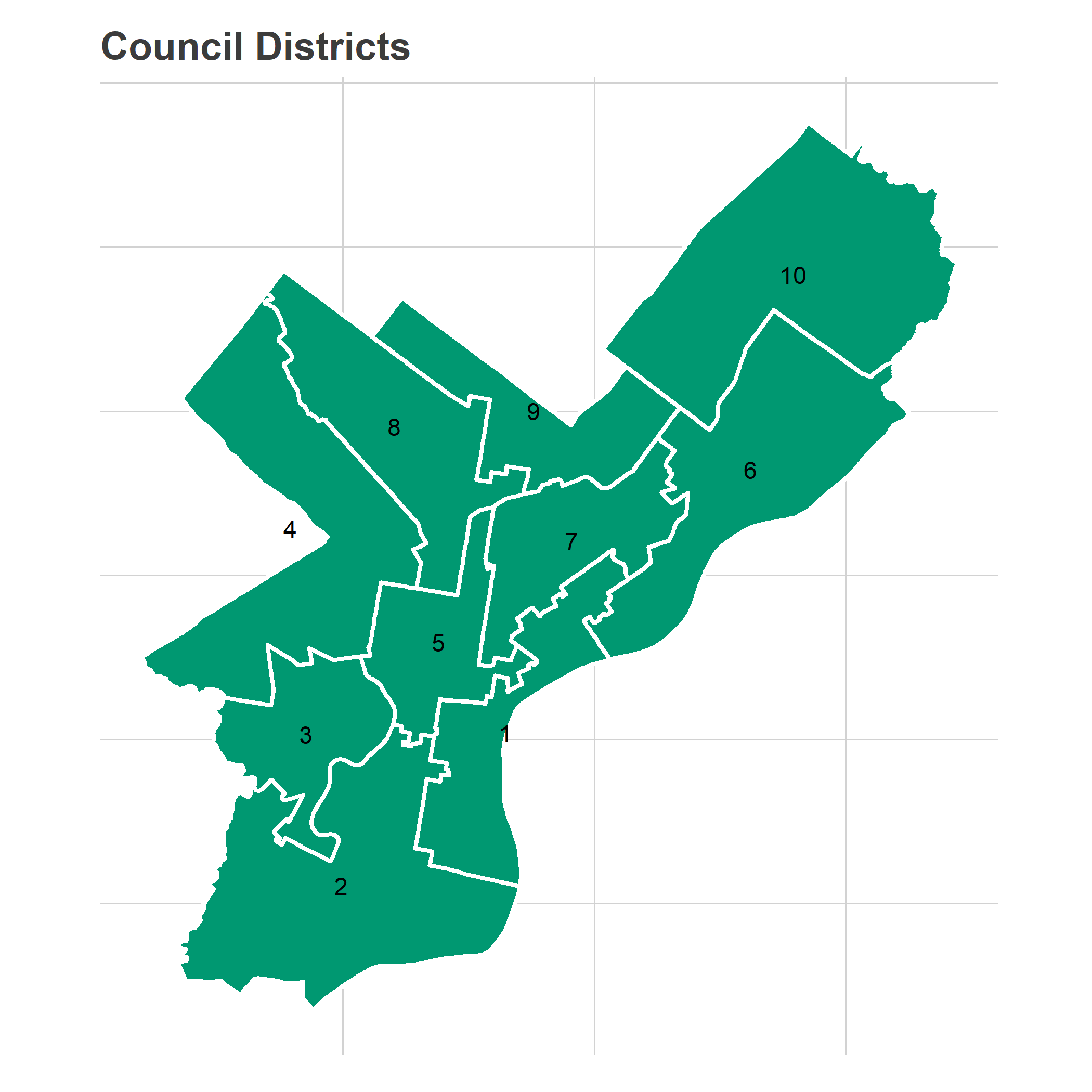
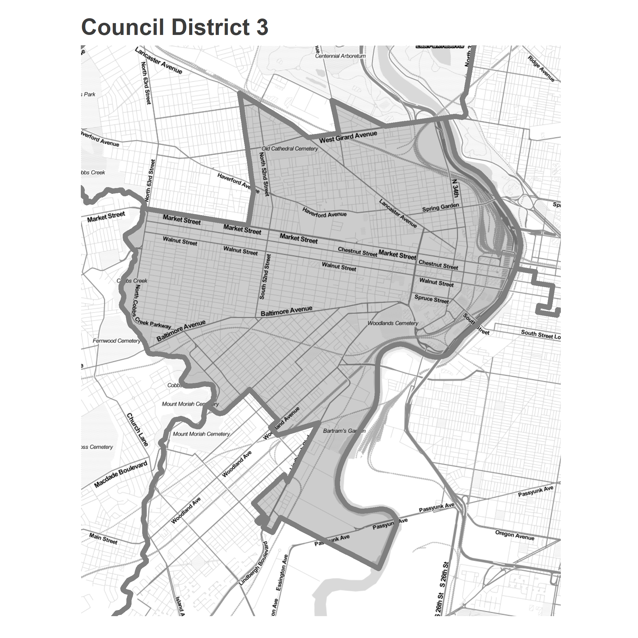
The third council district covers West Philly, from the Schuylkill River to the city line.
View code
get_labpt_df <- function(sp){
  mat <- sapply(sp@polygons, slot, "labpt")
  df <- data.frame(x = mat[1,], y=mat[2,])
  return(
    cbind(sp@data, df)
  )
}

ggplot(ggcouncil, aes(x=long, y=lat)) +
  geom_polygon(
    aes(group=group),
    fill = strong_green, color = "white", size = 1
  ) +
  geom_text(
    data = get_labpt_df(sp_council),
    aes(x=x,y=y,label=DISTRICT)
  ) +
  theme_map_sixtysix() +
  coord_map() +
  ggtitle("Council Districts")
View code
DISTRICT <- "3"
sp_district <- sp_council[row.names(sp_council) == DISTRICT,]

bbox <- sp_district@bbox
## expand the bbox 20%for mapping
bbox <- rowMeans(bbox) + 1.2 * sweep(bbox, 1, rowMeans(bbox))

basemap <- get_map(bbox, maptype="toner-lite")

district_map <- ggmap(
  basemap,
  extent="normal",
  base_layer=ggplot(ggcouncil, aes(x=long, y=lat, group=group)),
  maprange = FALSE
) +
  theme_map_sixtysix() +
  coord_map(xlim=bbox[1,], ylim=bbox[2,])

sp_divs$council_district <- over(
  gCentroid(sp_divs, byid = TRUE),
  sp_council
)$DISTRICT

sp_divs$in_bbox <- sapply(
  sp_divs@polygons,
  function(p) {
    coords <- p@Polygons[[1]]@coords
    any(
      coords[,1] > bbox[1,1] &
      coords[,1] < bbox[1,2] &
      coords[,2] > bbox[2,1] &
      coords[,2] < bbox[2,2]
    )
  }
)

ggdivs <- ggdivs %>%
  left_join(
    sp_divs@data %>% select(WARD_DIVSN, in_bbox)
  )

district_map +
  geom_polygon(
    aes(alpha = (id == DISTRICT)),
    fill="black",
    color = "grey50",
    size=2
  ) +
  scale_alpha_manual(values = c(`TRUE` = 0.2, `FALSE` = 0), guide = FALSE) +
  ggtitle(sprintf("Council District %s", DISTRICT))
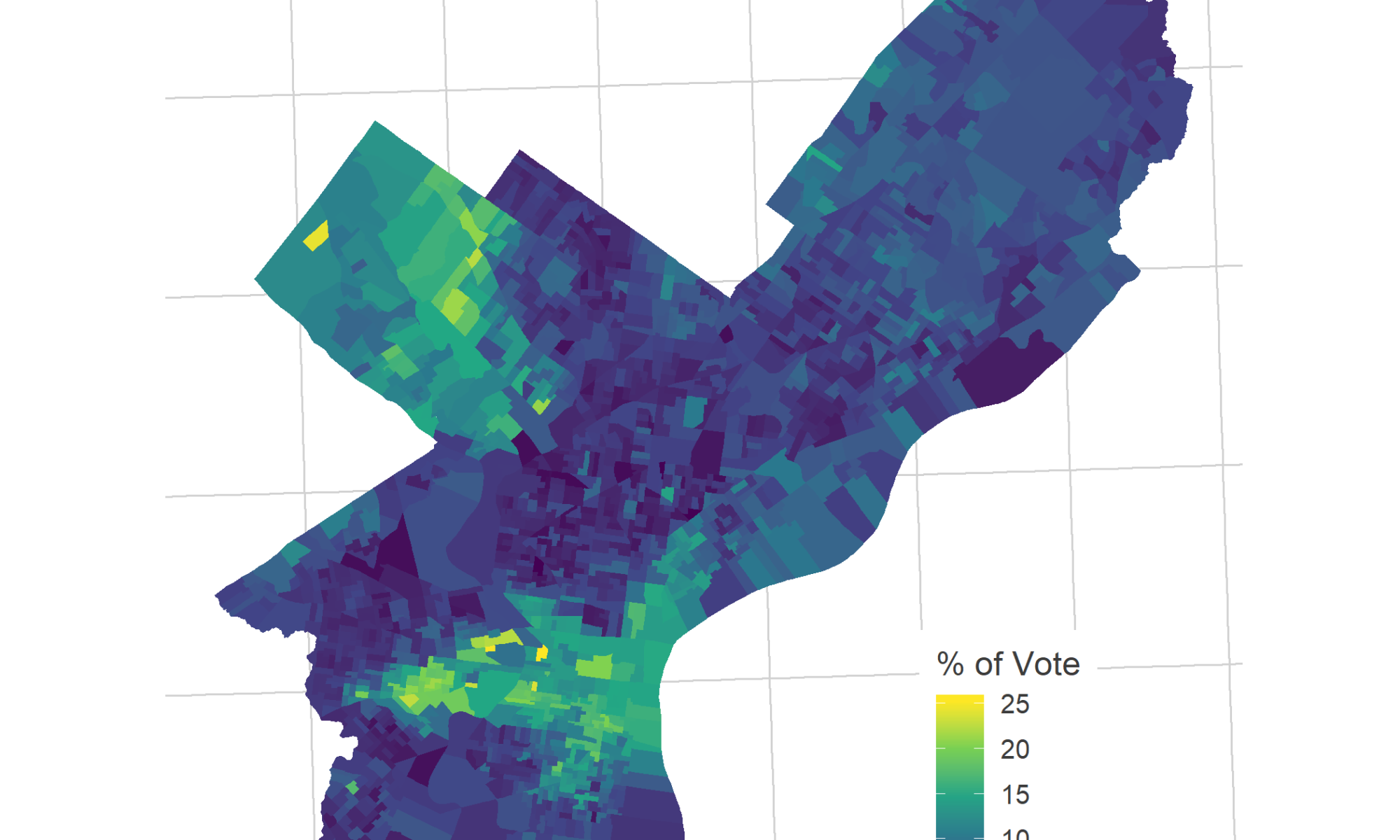
First, let’s look at the results from four recent, compelling Democratic Primary races: 2015 City Council At Large and Mayor, 2016 President, and 2017 District Attorney. The maps below show the vote for the top two candidates in District 3 (except for City Council in 2015, where I use Helen Gym and Isaiah Thomas, who were 4th and 5th in the district, and 5th and 6th citywide.)
View code
candidate_votes <- candidate_votes %>%
  left_join(sp_divs@data %>% select(WARD_DIVSN, council_district))

## Choose the top two candidates in district 3
# Except for city council, where we choose Gym and Thomas
# candidate_votes %>%
#   group_by(OFFICE, year, CANDIDATE) %>%
#   summarise(
#     city_votes = sum(VOTES),
#     district_votes = sum(VOTES * (council_district == DISTRICT))
#   ) %>%
#   arrange(desc(district_votes)) %>%
#   filter(OFFICE == "COUNCIL AT LARGE")

candidates_to_compare <- tribble(
  ~year, ~OFFICE, ~CANDIDATE, ~candidate_name, ~row,
  "2015", "COUNCIL AT LARGE", "HELEN GYM", "Helen Gym", 1,
  "2015", "COUNCIL AT LARGE", "ISAIAH THOMAS", "Isaiah Thomas", 2,
  "2015", "MAYOR", "JIM KENNEY", "Jim Kenney",  1,
  "2015", "MAYOR", "ANTHONY HARDY WILLIAMS", "Anthony Hardy Williams", 2,
  "2016", "PRESIDENT OF THE UNITED STATES", "BERNIE SANDERS", "Bernie Sanders", 1,
  "2016", "PRESIDENT OF THE UNITED STATES", "HILLARY CLINTON", "Hillary Clinton", 2,
  "2017", "DISTRICT ATTORNEY", "LAWRENCE S KRASNER", "Larry Krasner", 1,
  "2017", "DISTRICT ATTORNEY", "TARIQ KARIM EL SHABAZZ","Tariq Karim El Shabazz", 2
)

candidate_votes <- candidate_votes %>%
  left_join(races) %>%
  left_join(candidates_to_compare)

vote_adjustment <- function(pct_vote, office){
  ifelse(office == "COUNCIL AT LARGE", pct_vote * 4, pct_vote)
}

district_map +
  geom_polygon(
    data = ggdivs %>%
      filter(in_bbox) %>%
      left_join(
        candidate_votes %>% filter(!is.na(row))
      ),
    aes(fill = 100 * vote_adjustment(pvote, OFFICE))
  ) +
  scale_fill_viridis_c("Percent of Vote") +
  theme(
    legend.position =  "bottom",
    legend.direction = "horizontal",
    legend.justification = "center"
  ) +
  geom_polygon(
    fill=NA,
    color = "white",
    size=1
  ) +
  geom_label(
    data=candidates_to_compare %>% left_join(races),
    aes(label = candidate_name),
    group=NA,
    hjust=0, vjust=1,
    x=-75.258,
    y=39.985
  ) +
  facet_grid(row ~ election_name) +
  theme(strip.text.y = element_blank()) +
  ggtitle(
    sprintf("Candidate performance in District %s", DISTRICT),
    "Percent of vote (times 4 for Council, times 1 for other offices)"
  )
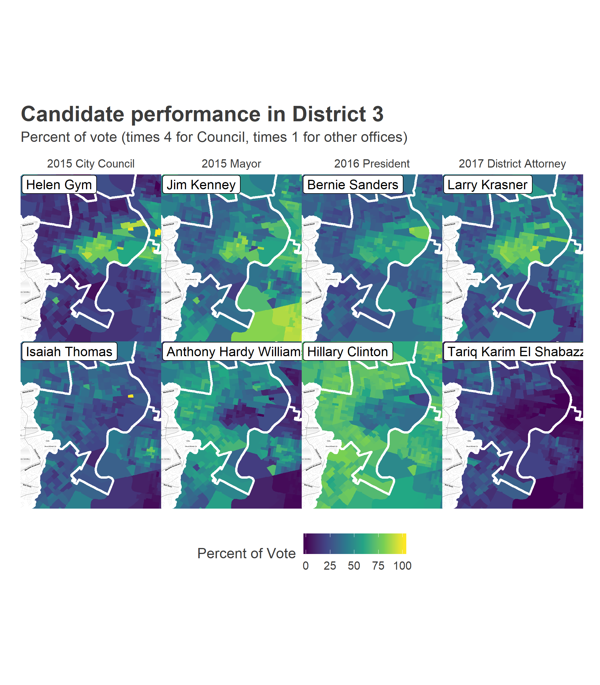
Notice two things. First, these competitive elections all split along the same boundaries: University City versus farther West and Southwest Philly. The candidates’ overall results were different (Sanders lost the district, Krasner won), but their relative strengths were exactly the same place. Demographically, the split is obvious: University City is predominantly White and wealthier, farther West is predominantly Black and has lower incomes. Even though Krasner did well across the city, and Shabazz poorly, Krasner did disproportionately well in University City, and Shabazz dispropotionately well farther West and Southwest.
Turnout is a more complicated story.
View code
# hist(turnout_df$total_votes / turnout_df$AREA_SFT)

turnout_df <- turnout_df %>%
  left_join(races)

district_map +
  geom_polygon(
    data = ggdivs %>%
      filter(in_bbox) %>%
      left_join(turnout_df, by =c("id" = "WARD_DIVSN")),
    aes(fill = pmin(total_votes / AREA_SFT, 0.0005))
  ) +
  scale_fill_viridis_c(guide = FALSE) +
  geom_polygon(
    fill=NA,
    color = "white",
    size=1
  ) +
  facet_wrap(~ election_name) +
  ggtitle(
    "Votes per mile in the Democratic Primary",
    sprintf("Council District %s", DISTRICT)
  )
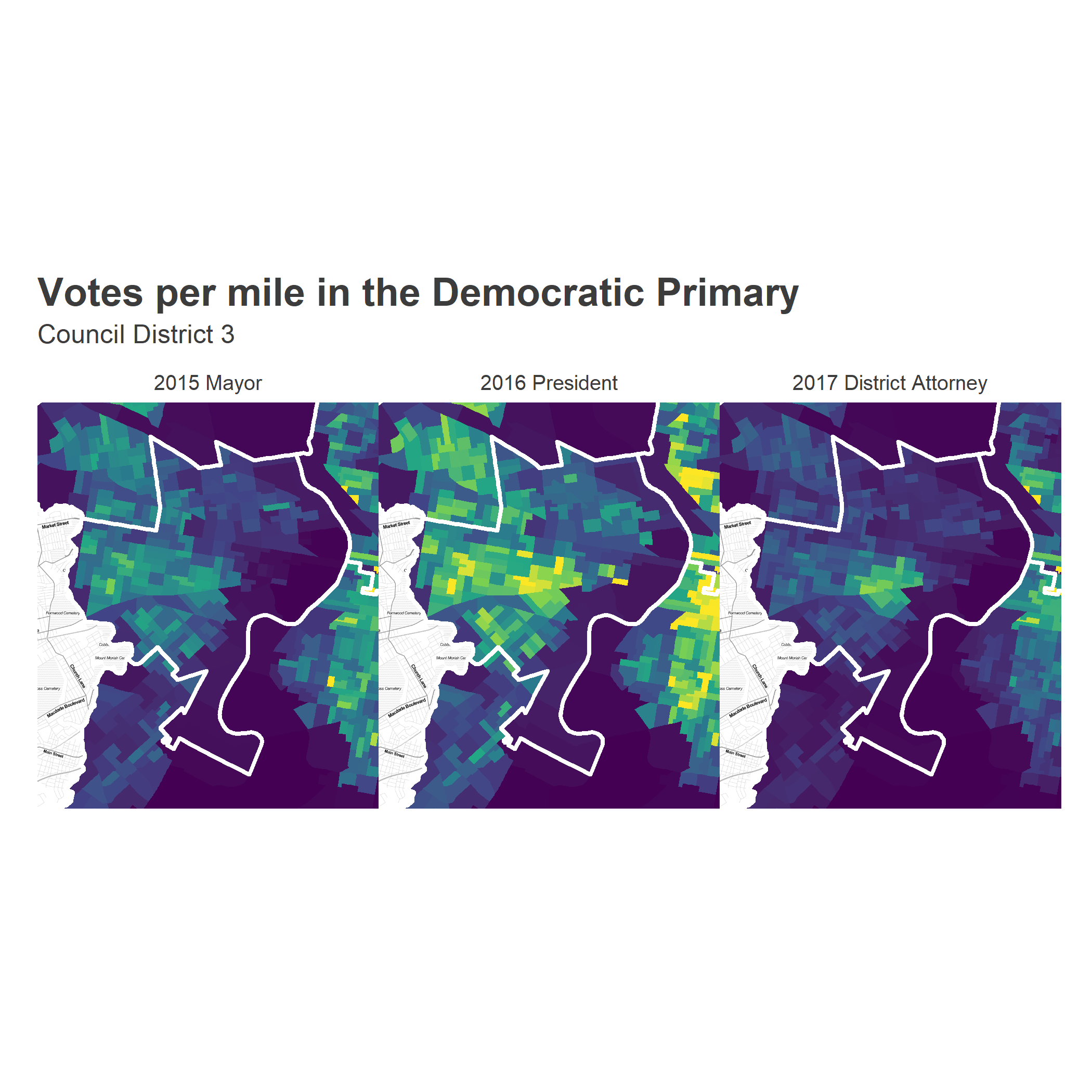
The 2017 election was completely different from 2015. In 2015, we saw the West and Southwest Philly neighborhoods dominate the vote, and decide the election. In 2017, University City (really, Cedar Park and Spruce Hill) boomed for Krasner. While Gym, Kenney, and Sanders all monopolized the University City percent of the vote, only Krasner multiplied that effect by monopolizing the turnout.
The change in votes per mile from 2015 to 2017 illustrates that starkly.
View code
turnout_wide <- turnout_df %>%
  group_by() %>%
  mutate(
    votes_per_sf = total_votes / AREA_SFT,
    key = paste0("votes_", year)
  ) %>%
  select(WARD_DIVSN, key, votes_per_sf) %>%
  spread(key = key, value = votes_per_sf)

district_map +
  geom_polygon(
    data = ggdivs %>%
      filter(in_bbox) %>%
      left_join(turnout_wide),
    aes(
      fill = (votes_2017 - votes_2015)*5280^2
    )
  ) +
  scale_fill_gradient2(
    "Change in votes per mile\n  2015 - 2017",
    low=strong_orange,
    mid="white",
    high=strong_purple,
    midpoint=0
  ) +
  geom_polygon(
    fill=NA,
    color = "black",
    size=1
  )  +
  theme(legend.position = "bottom", legend.direction = "horizontal") +
  ggtitle(
    sprintf("Change in votes per mile, District %s", DISTRICT),
    "Orange: More votes in 2015, Purple: More in 2017"
  )
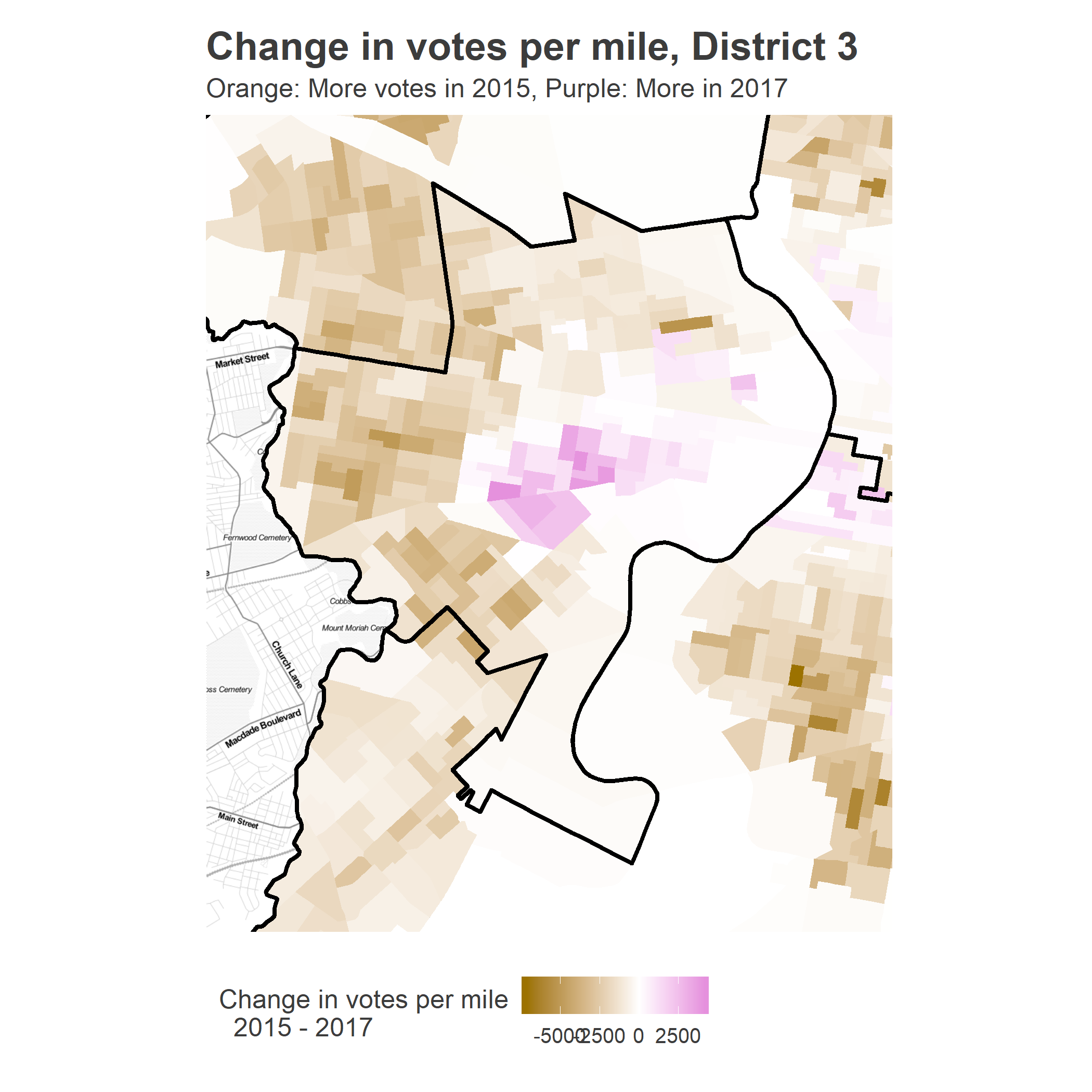
To simplify the analysis, let’s divide the District into the two distinct coalitions: the Clinton/Hardy Williams “West & Southwest”, and the Krasner/Sanders “University City”. While they’re obvious on the map, we need a rule to split them up; ideally, there would be natural clusters to divide them. Using the simplistic division based on whether the average Krasner/Sanders vote was greater than 50% is surprisingly useful:
View code
district_categories <- candidate_votes %>%
    filter(
      council_district == DISTRICT &
        candidate_name %in% c("Larry Krasner", "Bernie Sanders")
    ) %>%
    group_by(WARD_DIVSN) %>%
    mutate(votes_2016 = total_votes[year == 2016]) %>%
    select(WARD_DIVSN, votes_2016, candidate_name, pvote) %>%
    spread(key=candidate_name, value=pvote)

ggplot(
  district_categories,
  aes(x = 100 * `Bernie Sanders`, y = 100 * `Larry Krasner`)
) +
  geom_point(aes(size = votes_2016), alpha = 0.7) +
  scale_size_area("Total Votes in 2016")+
  theme_sixtysix() +
  xlab("Percent of Vote for Bernie Sanders") +
  ylab("Percent of Vote for Larry Krasner") +
  coord_fixed() +
  geom_abline(slope = -1, intercept =  100) +
  annotate(
    geom = "text",
    x = c(35, 20),
    y = c(15, 87),
    hjust = 0,
    label = c("West & Southwest", "University City"),
    color = c(strong_green, strong_purple),
    fontface="bold"
  ) +
  ggtitle("Divisions' vote", sprintf("District %s Democratic Primary", DISTRICT))
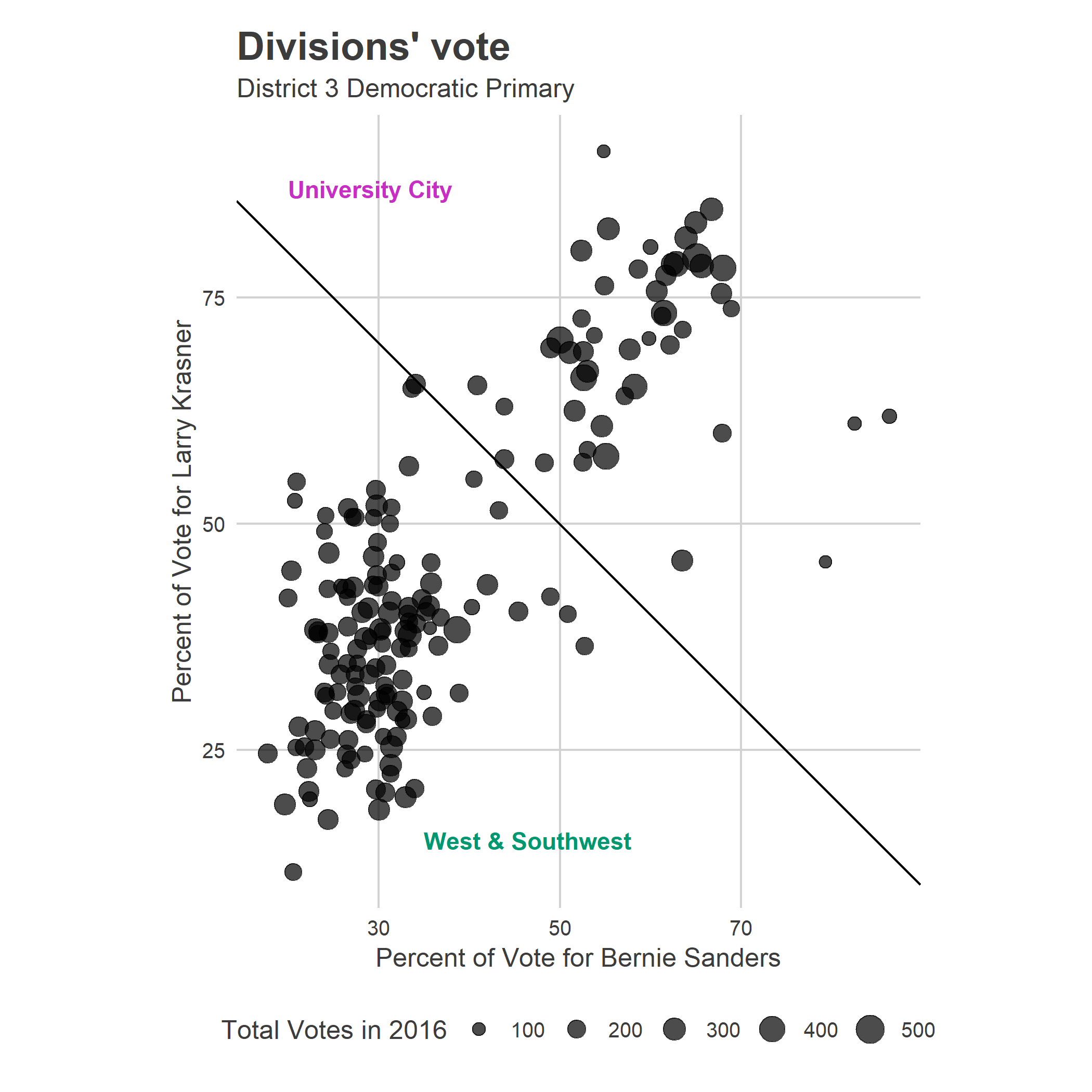
We’ll call the divisions above the line University City, and those below the line West & Southwest.
Here’s the map of the cohorts that this categorization gives us.
View code
district_categories$category <- with(
  district_categories,
  (`Bernie Sanders` + `Larry Krasner`) > 1.0
)
district_categories$cat_name <- ifelse(
  district_categories$category,
  "University City",
  "West & Southwest"
)

district_map +
  geom_polygon(
    data = ggdivs %>%
      left_join(district_categories) %>%
      filter(!is.na(cat_name)),
    aes(fill = cat_name)
  ) +
  scale_fill_manual(
    "",
    values = c("University City" = strong_purple, "West & Southwest" = strong_green)
  ) +
  ggtitle(sprintf("District %s neighborhood divisions", DISTRICT))
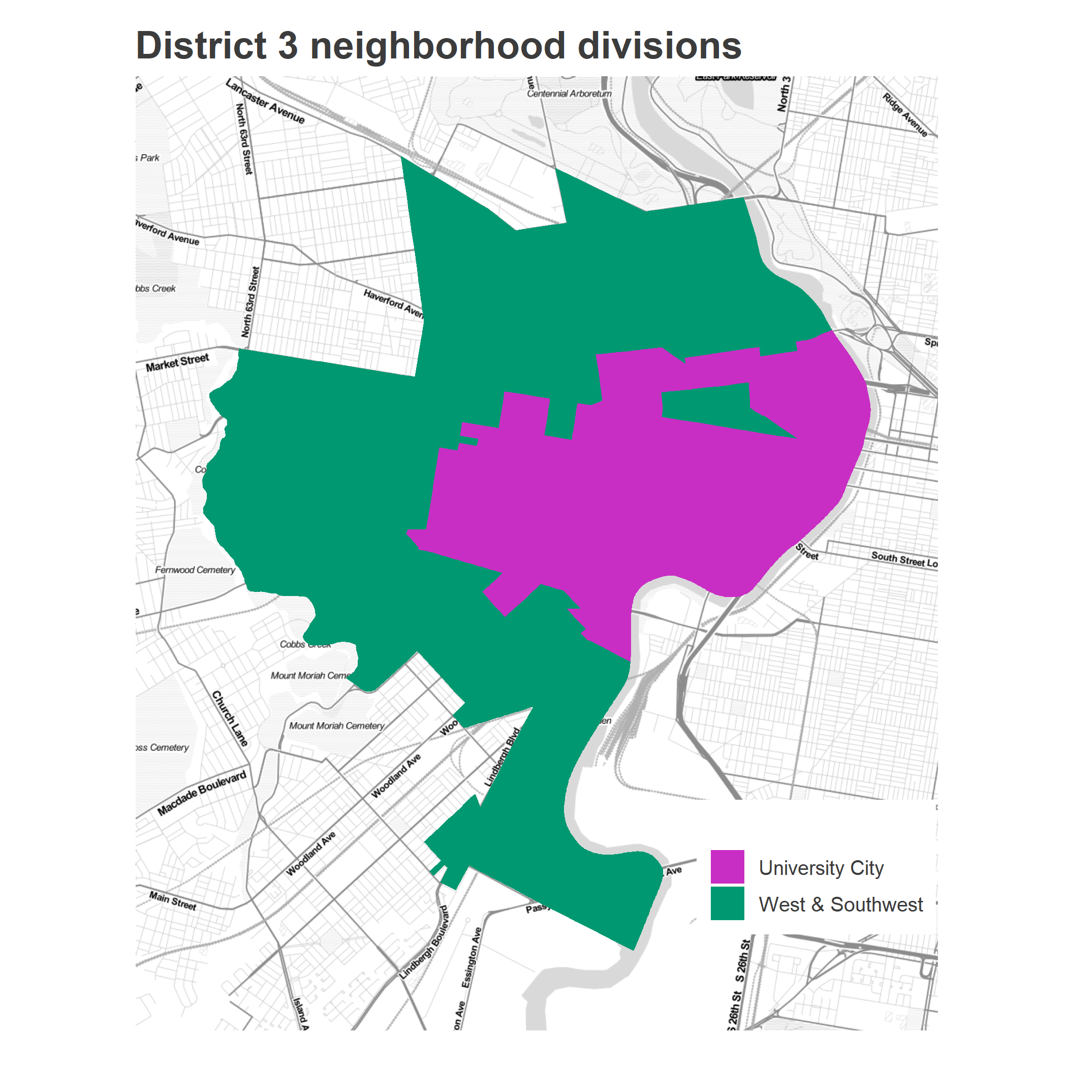
Looks reasonable.
How did the candidates do in each of the two sections? The boundary separates drastic performance splits.
View code
neighborhood_summary <- candidate_votes %>%
  inner_join(candidates_to_compare) %>%
  group_by(candidate_name, election_name) %>%
  mutate(
    citywide_votes = sum(VOTES),
    citywide_pvote = 100 * sum(VOTES) / sum(total_votes)
  ) %>%
  filter(council_district == DISTRICT) %>%
  left_join(district_categories) %>%
  group_by(candidate_name, citywide_votes, citywide_pvote, election_name, cat_name) %>%
  summarise(
    votes = sum(VOTES),
    pvote = 100 * sum(VOTES) / sum(total_votes),
    total_votes = sum(total_votes)
  ) %>%
  group_by(candidate_name, election_name) %>%
  mutate(
    district_votes = sum(votes),
    district_pvote = 100 * sum(votes) / sum(total_votes)
  ) %>% select(
    election_name, candidate_name, citywide_pvote, district_pvote, cat_name, pvote, total_votes
  ) %>%
  gather(key="key", value="value", pvote, total_votes) %>%
  unite("key", cat_name, key) %>%
  spread(key, value)


neighborhood_summary %>%
  knitr::kable(
    digits=0,
    format.args=list(big.mark=','),
    col.names=c("Election", "Candidate", "Citywide %", sprintf("District %s %%", DISTRICT), "University City %", "University City Turnout", "West & Southwest %", "West & Southwest Turnout")
  )
| Election | Candidate | Citywide % | District 3 % | University City % | University City Turnout | West & Southwest % | West & Southwest Turnout |
|---|---|---|---|---|---|---|---|
| 2015 City Council | Helen Gym | 8 | 8 | 16 | 18,521 | 5 | 47,400 |
| 2015 City Council | Isaiah Thomas | 7 | 8 | 7 | 18,521 | 8 | 47,400 |
| 2015 Mayor | Anthony Hardy Williams | 26 | 48 | 24 | 5,738 | 55 | 19,335 |
| 2015 Mayor | Jim Kenney | 56 | 39 | 62 | 5,738 | 33 | 19,335 |
| 2016 President | Bernie Sanders | 37 | 39 | 59 | 12,376 | 30 | 27,991 |
| 2016 President | Hillary Clinton | 63 | 61 | 41 | 12,376 | 70 | 27,991 |
| 2017 District Attorney | Larry Krasner | 38 | 51 | 73 | 7,125 | 36 | 11,113 |
| 2017 District Attorney | Tariq Karim El Shabazz | 12 | 15 | 5 | 7,125 | 22 | 11,113 |
Gym won 16% in University City, but only 5% in West & Southwest; Thomas ran an even 7 and 8%, respectively. Kenney won 62% in University City and only 33% in West and Southwest, Hardy Williams flipped that for 24 and 55%. Krasner won an astounding 73% of the vote in University City (in a crowded race!), and only 36% in West and Southwest, though that was still good enough to win the neighborhood. El Shabazz won 5 and 22%.
Also, notice the dramatic change in relative turnout. In the 2015 Mayoral race, West & Southwest had 3.4 times the vote of University City. The dramatic turnout swing of 2017 shrunk that to 1.6. West and Southwest still hold most of the voters (among substantially more households), but the relative proportions needed shift.
The relative power of West and Southwest and University City
How much does the power shift between the two cohorts? Let’s do some math.
How much does a candidate need from each of the sections to win? Let t_i be the relative turnout in section i, defined as the proportion of total votes. So in the 2017 District Attorney Race, t_i was 0.39 for University City, and 0.61 for West & Southwest. Let p_ic be the proportion of the vote received by candidate c in section i, so in 2017, p is 0.73 for Krasner in University City.
Then a candidate wins a two-way race whenever the turnout-weighted proportion of their vote is greater than 0.5: sum_over_i(t_i p_ic) > 0.5.
Since we’ve divided District 3 into only 2 sections, we can plot this on a two-way plot. On the x-axis, let’s map a candidate’s percent of the vote in University City, and on the y, a candidate’s percent of the vote in West & Southwest (assuming a two-person race). The candidate wins whenever the average of their proportions, weighted by \(\tilde{t}\) is greater than 50%. If the turnout looks like 2015, West & Southwest easily carry the District; if it looks like 2017, the sections carry nearly equal weight. The dashed lines show the win boundaries; candidates to the top-right of the lines win.
I’ll plot only the two-candidate vote for the top two candidates in the district for each race, to emulate a two-person race. (For City Council in 2015, I use Helen Gym and Isaiah Thomas, who were 4th and 5th in the district, and 5th and 6th citywide.)
View code
get_line <- function(x_total_votes, y_total_votes){
  ## solve p_x t_x+ p_y t_y > 50
  tot <- x_total_votes + y_total_votes
  tx <- x_total_votes / tot
  ty <- y_total_votes / tot

  slope <- -tx / ty
  intercept <- 50 / ty  # use 50 since proportions are x100
  c(intercept, slope)
}

line_2017 <- with(
  neighborhood_summary,
  get_line(
    `University City_total_votes`[candidate_name == "Larry Krasner"],
    `West & Southwest_total_votes`[candidate_name == "Larry Krasner"]
  )
)

## get the two-candidate vote
neighborhood_summary <- neighborhood_summary %>%
  group_by(election_name)  %>%
  mutate(
    ucity_pvote_2cand = `University City_pvote` / sum(`University City_pvote`),
    wsw_pvote_2cand = `West & Southwest_pvote`/sum(`West & Southwest_pvote`)
  )

line_2015 <- with(
  neighborhood_summary,
  get_line(
    `University City_total_votes`[candidate_name == "Jim Kenney"],
    `West & Southwest_total_votes`[candidate_name == "Jim Kenney"]
  )
)

library(ggrepel)

ggplot(
  neighborhood_summary,
  aes(
    x=100*ucity_pvote_2cand,
    y=100*wsw_pvote_2cand
  )
) +
  geom_point() +
  geom_text_repel(aes(label=candidate_name)) +
  geom_abline(
    intercept = c(line_2015[1], line_2017[1]),
    slope = c(line_2015[2], line_2017[2]),
    linetype="dashed"
  ) +
  coord_fixed() +
  scale_x_continuous(
    "University City percent of vote",
    breaks = seq(0,100,10)
  ) +
  scale_y_continuous(
    "West & Southwest percent of vote",
    breaks = seq(0, 100, 10)
  ) +
  annotate(
    geom="text",
    label=paste(c(2015, 2017), "turnout"),
    x=c(10, 8),
    y=c(
      line_2015[1] + 10 * line_2015[2],
      line_2017[1] + 8 * line_2017[2]
    ),
    hjust=0,
    vjust=-0.2,
    angle = atan(c(line_2015[2], line_2017[2])) / pi * 180,
    color="grey40"
  )+
  annotate(
    geom="text",
    x = 70,
    y=75,
    label="Candidate wins",
    fontface="bold",
    color = strong_green
  ) +
  geom_hline(yintercept = 50, color="grey50") +
  geom_vline(xintercept = 50, color="grey50")+
  expand_limits(x=100, y=80)+
  theme_sixtysix() +
  ggtitle(
    "The relative strength of W & SW Philly and U City",
    "Candidates to the top-right of the lines win."
  )
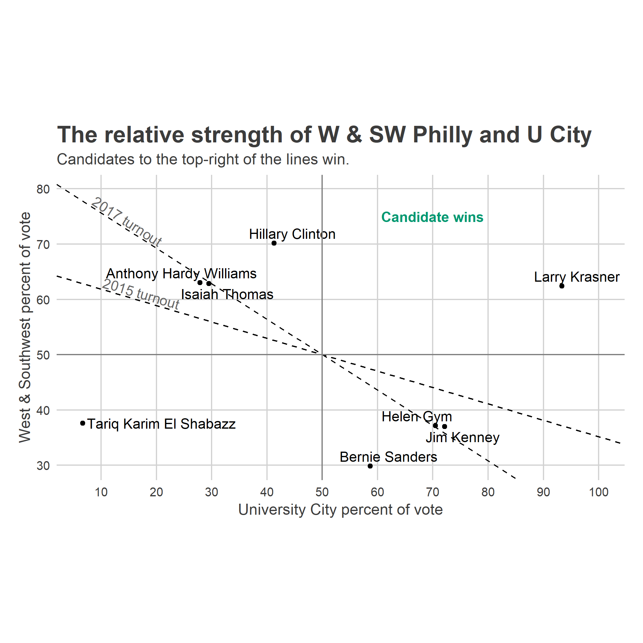
Hillary Clinton and Larry Krasner won the district in a landslide, with Clinton winning despite losing University City to Sanders. Helen Gym and Jim Kenney were in the turnout-dependent zone: they would win the district if turnout looked like 2017, and lose it if turnout looked like 2015 (and vice versa for Hardy Williams and Thomas).
So could a candidate who monopolized University City win? Maybe, but it’s hard. If turnout looks like 2017, then a candidate who wins 70% of the University City vote still needs to win 37% of the West and Southwest vote. If the turnout looks like 2015, the required W/SW vote jumps to 44. Clinton and Krasner pulled off dominant victories that would win in any turnout climate; Hardy Williams, Kenney, El Shabazz, and Gym saw the neighborhoods’ turnouts be decisive.
Looking to May
I don’t know how Jamie Gauthier will fare in University City or in West & Southwest Philly, but my hunch is that she’s seeking the reformist, University City lane. But that’s a hard lane to win in. Even if she achieves Gym and Kenney percentages, she would need to additionally inspire turnout the way that Krasner did. Alternatively, she needs to pull enough support from West and Southwest; significantly more than Gym and Kenney did. It’s possible, but a steep climb.