May’s primary will include elections for Philadelphia City Council. The council is constituted of 17 councilors, ten of whom are voted in by specific districts and seven of whom are At Large, voted in by the city as a whole. Of those seven at large, only five can come from the same party. In practice means that five Democrats will win this primary, and then win landslide elections in November.
In advance of May, I’m going to be looking at what it takes to win a Democratic City Council At Large seat. Today, let’s look at how polarizing candidates are.
[Note: I’m starting today making my blog posts in RMarkdown. Click the View Code to see the R code!]
View code
## You can access the data at:
## https://github.com/jtannen/jtannen.github.io/tree/master/data
# load("df_major_2017_12_01.Rda")

df_major$CANDIDATE <- gsub("\\s+", " ", df_major$CANDIDATE)
df_major$PARTY[df_major$PARTY == "DEMOCRATIC"] <- 'DEMOCRAT'

df_major <- df_major %>%
  filter(
    election == "primary" &
      OFFICE == "COUNCIL AT LARGE" &
      PARTY %in% c("DEMOCRAT")
  )

df_total <- df_major %>%
  group_by(CANDIDATE, year, PARTY) %>%
  summarise(votes = sum(VOTES)) %>%
  group_by(year, PARTY) %>%
  arrange(desc(votes)) %>%
  mutate(rank = rank(desc(votes)))

div_votes <- df_major %>%
  group_by(WARD16, DIV16, OFFICE, year) %>%
  summarise(div_votes = sum(VOTES))
Measuring Vote Polarization
One way to measure polarization is using the Gini coefficient, common in studying inequality. Suppose for each candidate we line up the precincts in order of their percent of the vote. We then move down the precincts, adding up the total voters and the votes for that candidate. We plot the curve, with the cumulative voters along the x axis, and the cumulative votes for that candidate along the y.
The curvature of that line is a measure of the inequality of the distribution of votes. In this case, I call that polarization. Suppose a candidate got 50% of the vote in every single precinct. Then the curve would just be a straight line with a slope of 0.5; there would be no polarization. Alternatively, if a candidate got zero of the votes from 90% of the precincts, but all of the vote in the remaining 10%, then the curve would be flat at 0 for the first 90% of the x-axis, but then bend and shoot up; a sharp curve and a lot of polarization.
View code
vote_cdf <- df_major %>%
  left_join(div_votes) %>%
  group_by(CANDIDATE, year) %>%
  mutate(
    p_vote_div = VOTES / div_votes,
    cand_vote_total = sum(VOTES)
  ) %>%
  arrange(p_vote_div) %>%
  mutate(
    cum_votes = cumsum(VOTES),
    vote_cdf = cum_votes / cand_vote_total,
    cum_denom = cumsum(div_votes) / sum(div_votes)
  )

ggplot(
  vote_cdf %>%
    left_join(df_total) %>%
    filter(year == 2015 & rank <= 7),
  aes(x=cum_denom, y=cum_votes)
) + geom_line(
    aes(group=CANDIDATE, color=CANDIDATE),
    size=1
) +
  geom_text(
    data = vote_cdf %>%
    left_join(df_total) %>%
    filter(year == 2015 & rank <= 7) %>%
      group_by(CANDIDATE) %>%
      filter(cum_votes == max(cum_votes)),
    aes(label = tolower(CANDIDATE)),
    x = 1.01,
    hjust = 0
  ) +
  xlab("Cumulative voters") +
  scale_y_continuous(
    "Cumulative votes for candidate",
    labels=scales::comma
  ) +
  scale_color_discrete(guide=FALSE)+
  expand_limits(x=1.3)+
  theme_sixtysix() +
  ggtitle(
    "Vote distributions for 2015 Council At Large",
    "Top seven finishers"
  )

Above is that plot for the top seven At Large finishers in 2015 (remember that five Democrats can win). Helen Gym was the fifth. Interestingly, she also was the most polarizing: 49.4% of her votes came from her best 25% of divisions. For comparison, 38.3% of Derek Green’s votes came from his best 25% of divisions.
If we scale each candidate’s y-axis by their final total votes, the difference in curvature is even more stark.
View code
ggplot(
  vote_cdf %>%
    left_join(df_total) %>%
    filter(year == 2015 & rank <= 7),
  aes(x=cum_denom, y=vote_cdf)
) + geom_line(
  aes(group=CANDIDATE, color=CANDIDATE),
  size=1
) +
  coord_fixed() +
  geom_abline(slope = 1, yintercept=0) +
  xlab("Cumulative voters") +
  ylab("Cumulative proportion of candidate's votes") +
  scale_color_discrete(guide = FALSE) +
  annotate(
    geom="text",
    y = c(0.45, 0.3),
    x = c(0.52, 0.6),
    hjust = c(1, 0),
    label = c("william k greenlee", "helen gym")
  ) +
  theme_sixtysix() +
    ggtitle(
    "Vote distributions for 2015 Council At Large",
    "Top seven finishers, scaled for total votes"
  )

So Helen Gym snuck in four years ago, with a highly polarized vote. Is that common for new challengers? Not really. Usually, it’s hard to win without more even support.
To summarise the curvature into a single number, the Gini coefficient is defined as the area above the curve but below the 45 degree line, divided by the total area of the triangle. Notice that the more curved the line, the more area between the 45-degree line and the curve, and the higher the coefficient. If there is no inequality, the Gini coefficient is 0, if there’s complete inequality, it’s 1. Helen Gym’s Gini coefficient is 0.35, Bill Greenlee’s is 0.19.
Below I plot each candidate’s proportion of the vote on the x-axis (blue names are winners), and their Gini coefficient on the y-axis (higher values are more polarized).
View code
gini <- vote_cdf %>%
  arrange(CANDIDATE, year, cum_denom) %>%
  group_by(CANDIDATE, year) %>%
  mutate(
    is_first = cum_denom == min(cum_denom),
    bin_width = cum_denom - ifelse(is_first, 0, lag(cum_denom)),
    avg_height = (vote_cdf + ifelse(is_first, 0, lag(vote_cdf)))/2,
    area = bin_width * avg_height
  ) %>%
  summarise(
    gini = 1 - 2 * sum(area),
    total_votes = weighted.mean(p_vote_div, div_votes)
  )

ggplot(
  gini %>% left_join(df_total) %>% filter(rank <= 10),
  aes(x=total_votes, y=gini)
) +
  geom_text(
    aes(label=tolower(CANDIDATE), color=(rank<=5)),
    size = 3
  ) +
  scale_color_manual(
    "winner",
    values=c(`TRUE` = strong_blue, `FALSE` = strong_red),
    guide = FALSE
  )+
  scale_x_continuous(
    "proportion of vote",
    expand=expand_scale(mult=0.2)
  ) +
  ylab("gini coefficient (higher means more polarization)")+
  facet_wrap(~year) +
  theme_sixtysix() +
  ggtitle("Total votes versus vote polarization",
          "Top ten finishers for City Council At Large. Winners in blue.")

Helen Gym had the highest Gini coefficient of any winner in the last four elections, and no one else was close.
There are a few things going on here. First, the winners are usually incumbents, and incumbents probably benefit from name recognition across the city. All of the winners in 2011 were incumbents, for example.
But even the non-incumbents who won had more even support. Allan Domb had the second lowest gini coefficient in 2015, and Derek Green the third. Greenlee and Bill Green had the lowest Gini coefficients when they won as challengers in 2007 (Greenlee was technically an incumbent from a 2006 Special Election).
There are a few ways to view Helen Gym’s polarization. Remember that this is unrelated to total proportion of the vote; she won the fifth most votes, more than candidates who had even and low support across the city. She did so by particularly consolidating her neighborhoods, mobilizing the wealthier, whiter progressive wards that formed her coalition (presumably with the incumbency, she will receive broader support this time around).
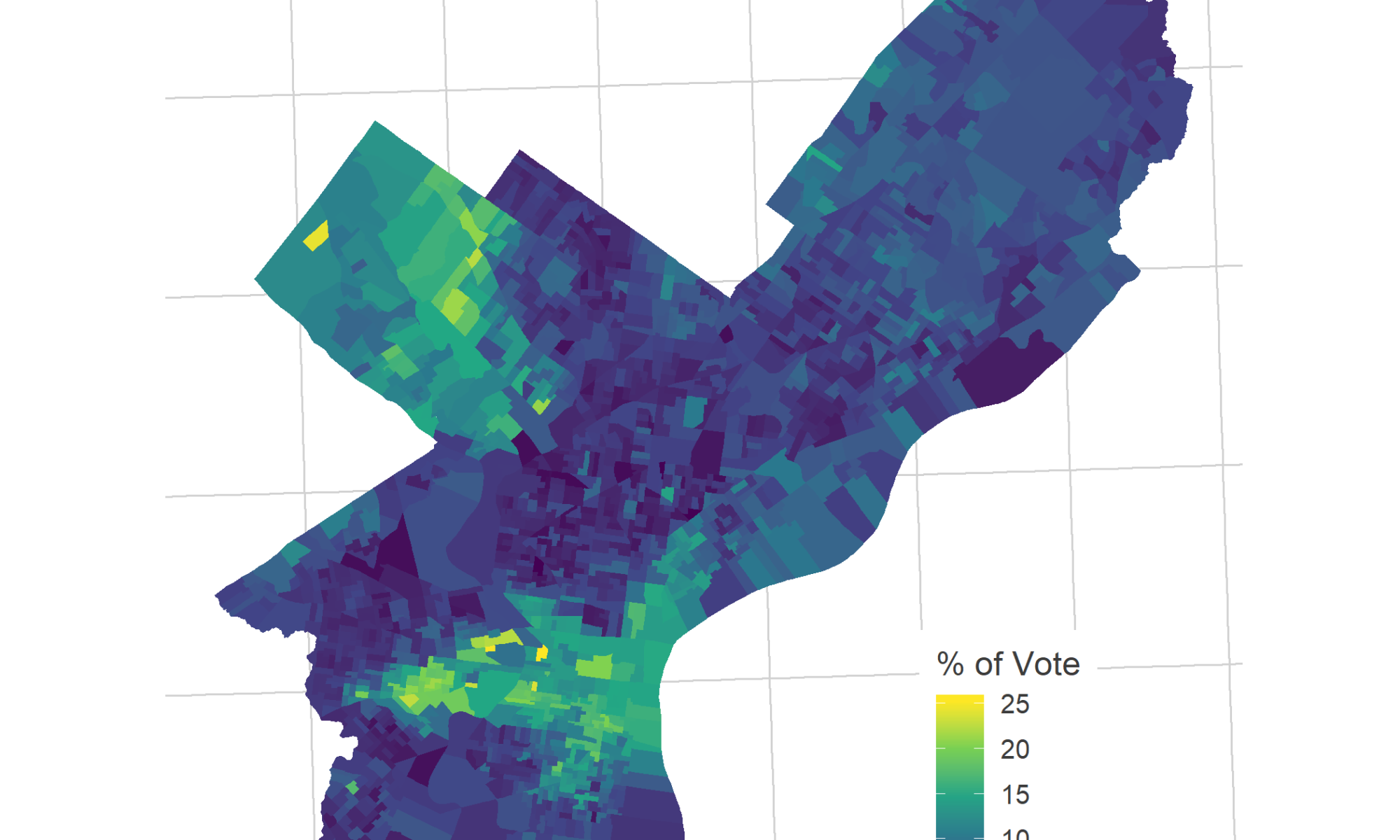
View code
# library(sf)
# divs <- st_read("2016_Ward_Divisions.shp", quiet = TRUE)

gym_vote <- divs %>%
  left_join(
    df_major %>%
      filter(year == 2015) %>%
      mutate(WARD_DIVSN = paste0(WARD16, DIV16)) %>%
      group_by(WARD_DIVSN) %>%
      mutate(p_vote = VOTES / sum(VOTES)) %>%
      filter(CANDIDATE == "HELEN GYM")
    )

ggplot(gym_vote)+
  geom_sf(
    aes(fill = p_vote * 100),
    color = NA
  ) +
  theme_map_sixtysix() +
  scale_fill_viridis_c("% of Vote") +
  ggtitle(
    "Helen Gym's percent of the vote, 2015",
    "Voters could vote for up to five At Large candidates"
  )

One perspective is that she won entirely on the support of whiter, wealthier liberals. Another is that she managed to squeeze the last drips of votes out of those neighborhoods, eking out her edge over candidates with similar city-wide votes. Notably, the common concern around a candidate with this base would be that she would ignore the lower income, Black and Hispanic neighborhoods that didn’t vote for her, but I don’t think that’s a common complaint lodged against the fierce public education advocate.
What coalitions win the City Council At Large seats?
One question I find fascinating is what coalitions candidates use to win. Gym clearly won with the wealthier white progressive wards, but candidates may also just as often win with support of the Black wards, or the more conservative Northeast and deep South Philly. In the upcoming months, I’m going to dig more into this question.
One Reply to “What At Large City Councilors most polarized the vote?”
Comments are closed.