Philadelphian voters, by race and income
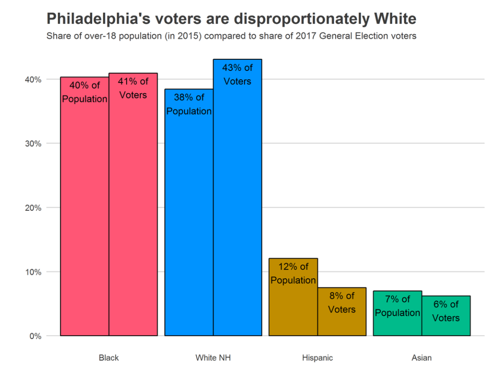
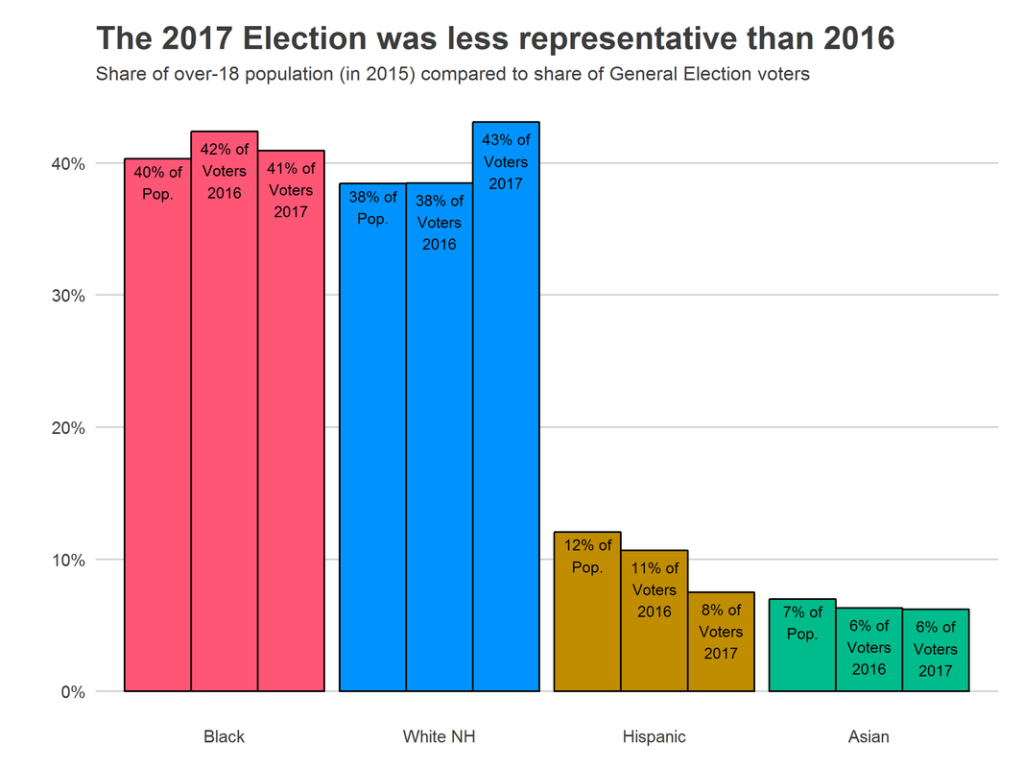
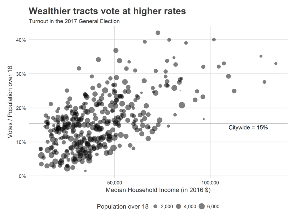
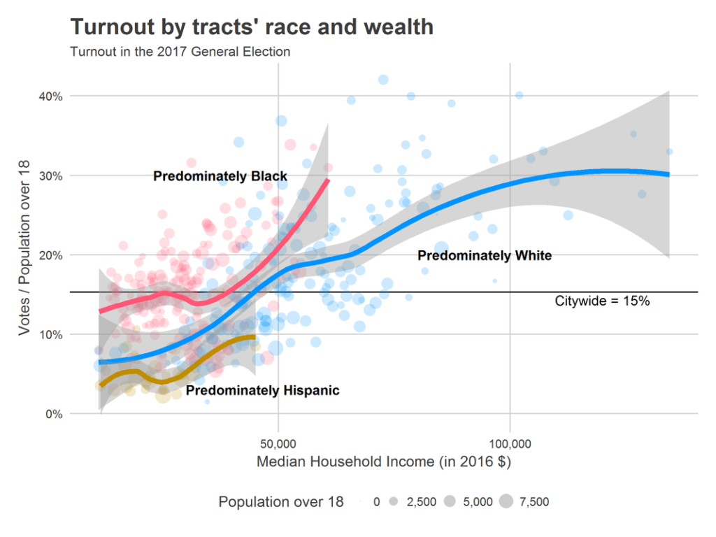
First, let’s look at the racial and class dynamics of voting in the 2017 election. We don’t have data on individual voters, so I map divisions to census tracts, and assign votes to racial/class groups based on their tract-level representation among the over-18 population. For example, a tract that was 60% Black would be apportioned 60% of the votes in that tract.[1] This will almost certainly understate the differences between groups: it assumes that groups within a tract vote at the same rates even if they vote at different rates across the city. All of the populations I use are five-year estimates from the American Community Survey (annually conducted by the Census Bureau), so the most recent data is from 2011 – 2015. First, let’s look at the number of voters of each race.
Changes in turnout and race
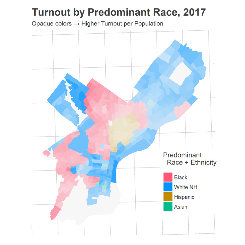
These turnouts are not uniformly spread across the city. Among White tracts, there are large differences in turnout. Ditto among Black tracts Below maps the turnout of tracts in the city for 2017 and for 2009, where tracts have been colored by their predominant race.
 |
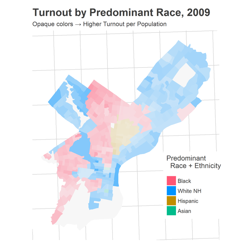 |
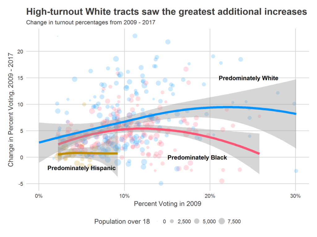
Between 2009 and 2017, citywide turnout increased from 9.6% of the over-18 population voting to 15.3%. Comparing the maps above makes clear that this increase did not happen uniformly, but instead by the rich getting richer: already-high-turnout tracts also had the largest increases in turnout. Below is a scatter plot of the same data. The x-axis is tracts’ turnout in 2009, while the y-axis is the change in turnout from 2009 to 2017. Points are colored by their predominant race in 2015.
Look back at the map. Notice that many of the highest turnout regions occur along racial boundaries. In past research, I’ve argued that these boundaries are where gentrification typically happens. Part of the high turnout along boundaries may be evidence that crudely shading tracts by the predominant race hides changing populations within them, and that the gentrifiers in University City, Brewerytown, and Kensington may be disproportionately voting. That certainly matches anecdotal evidence of who was energized by the Krasner/Rhynhart new blood in 2017.
A certain group of Philadelphians is particularly engaged
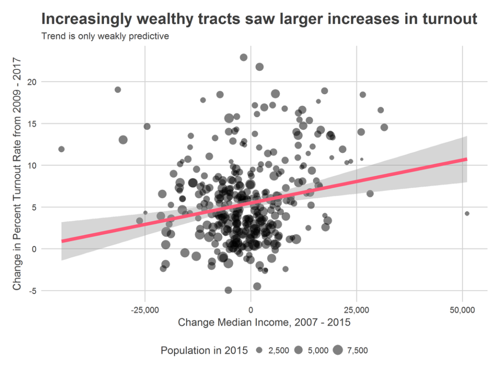
The recent turnout surge occurred predominately among wealthier White tracts that already were voting at high rates. Black tracts in Philadelphia saw their votes increase at about similar rates to the city as a whole, while Hispanic votes fell disproportionately from 2016 highs.
The energy of 2017 is most extreme in the neighborhoods ringing Center City and in the Northwest. Philadelphia’s role in the 2018 Governor’s race may depend on energizing the *rest* of the city. More on that next week.
Leave a comment below!
[1] Assuming that e.g. higher voting in predominately Black wards implies that Black residents are more likely to vote suffers from the ecological fallacy. It may be instead true that the non-Black residents in those divisions are themselves more likely to vote. In fact, there may be good reason to suspect this in the predominately-Black, gentrifying neighborhoods. But this is the best data we have.