Once again, on election night, the Needle was 100% confident who would win by 9:37 pm.
Once again, I doubted.
Once again, it was exactly right.

Let’s dig into what the Needle knew and when it knew it, and what I’m going to change so that I finally trust it.
View code
ELECTION <- 20191105
USE_LOG <- TRUE
source(sprintf("configs/config_%s.R", ELECTION))

source("needle.R")timestamp <- "213752"
df <- load_data(sprintf("raw_data/results_20191105_%s.csv", timestamp))
df_eod <- load_data("raw_data/results_20191119_194343.csv")

needle_params <- readRDS(
  sprintf("outputs/needleparams_%s_log%s_svd.Rds", ELECTION, USE_LOG)
)

office_suffix <- identity
turnout_svd <- needle_params@turnout_svds$general
n_council_winners <- 7
turnout_office <- "MAYOR"
What the Needle knew and when it knew it
First, an overview of the Needle. (One day, I’ll publish the code on github… I just have dreams of adding all the best practices we all procrastinate on.)
The structure of the needle is simple:
- Before election day, I calculate the historic covariances among divisions in turnout and votes for specific candidates.
- When partial results come in, I calculate the distribution of results from the divisions that haven’t reported yet conditional on the ones that have
- I simulate each division’s (a) turnout and (b) votes for candidates from that posterior distribution. The fraction of times a candidate wins in those simulations is their probability of winning.
At 9:37, the Commissioners posted the spreadsheet from the new voting machines. With 371 out of 1,703 divisions reporting, Kendra Brooks had received 10,007 votes (4.8%), David Oh 8,403 (4.0%), Nicolas O’Rourke 7,887 (3.8%), and Al Taubenberger 7,071 (3.3%).
The Needle spun into gear, and here’s what it spat out.
View code
pretty_simulated <- function(simulated) {
  ifelse(simulated, "Simulated Divisions", "Reporting Divisions")
}

turnout_sim <- simulate_turnout(
  df=df,
  turnout_office=office_suffix(turnout_office),
  turnout_svd=turnout_svd,
  verbose=TRUE
) %>%
  mutate(simulated = pretty_simulated(simulated))

pvote_svd <- needle_params@pvote_svd
simulate_office <- function(
  office,
  office_name,
  n_winners=1,
  consider_divs=NULL
){
  simulate_pvote(
    df,
    use_office=office_suffix(office),
    office_name=office_name,
    turnout_sim=turnout_sim,
    pvote_svd=pvote_svd,
    n_winners=n_winners,
    verbose=FALSE,
    consider_divs=consider_divs
  )
}

council_sim <- simulate_office(
  "COUNCIL AT LARGE",
  "Council At Large",
  n_winners=7
)
print(council_sim$needle)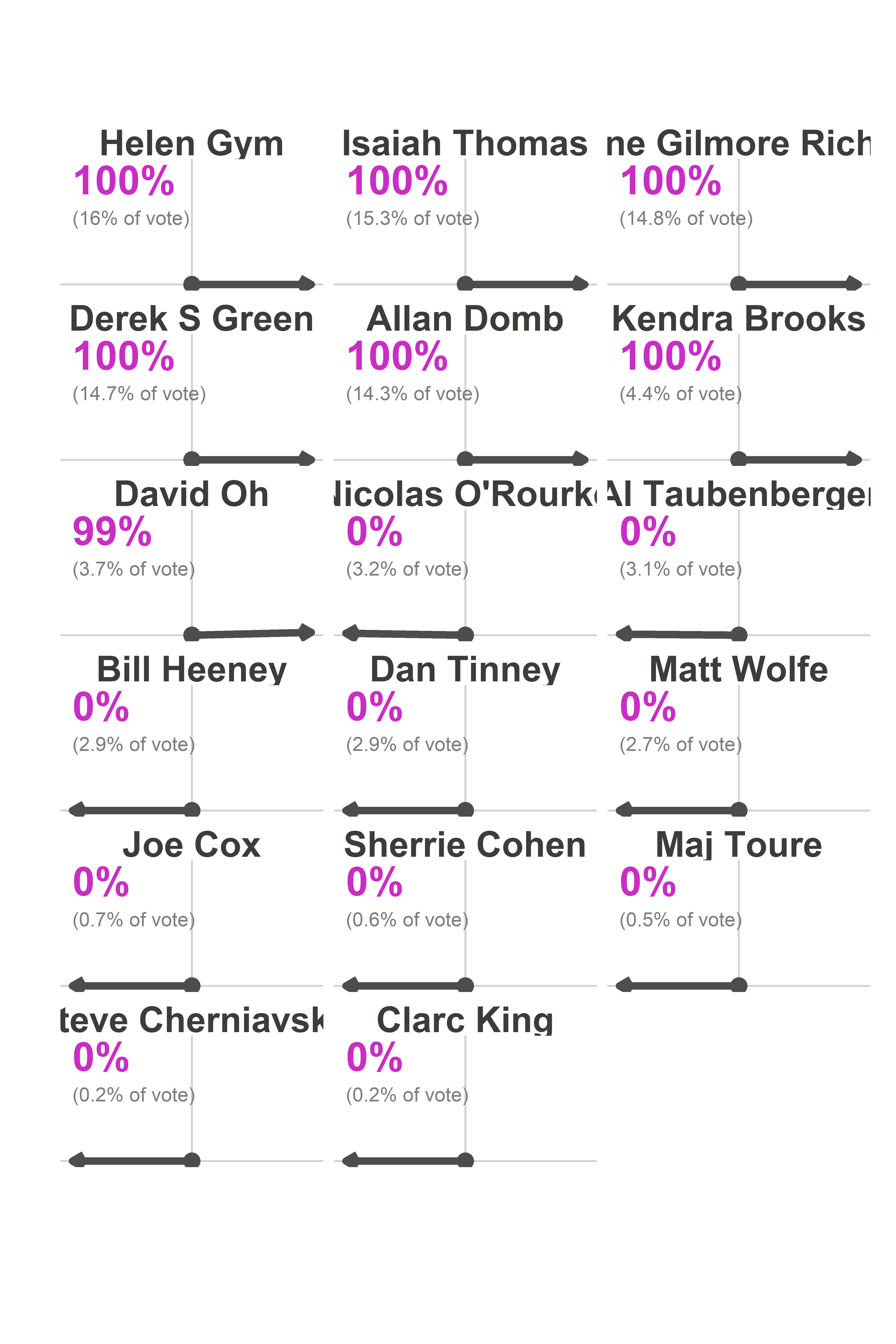
I saw that and freaked out. There was no doubt that Brooks would win? That O’Rourke would lose to Oh? He was only down 516 votes!
What the needle knew (and I didn’t) was where the remaining votes were going to come from, and how easy it is to predict those divisions once you’ve got 371 data points.
Here’s what the Needle was predicting under the hood.
View code
candidates <- c("Kendra Brooks", "David Oh", "Nicolas O'Rourke", "Al Taubenberger")
filter_to_candidates <- function(df){
  df %>%
    filter(candidate %in% candidates) %>%
    mutate(candidate=factor(candidate, levels=candidates))
}

cand_sim <- council_sim$office_sim %>%
  mutate(simulated = pretty_simulated(simulated)) %>%
  filter_to_candidates() %>%
  ## Doesn't account for different cands/voter
  left_join(turnout_sim %>% select(sim, warddiv, turnout)) %>%
  group_by(candidate, sim, simulated) %>%
  summarise(pvote = weighted.mean(pvote, w=turnout)) %>%
  group_by(candidate, simulated) %>%
  summarise(
    mean = mean(pvote),
    pct_975 = quantile(pvote, 0.975),
    pct_025 = quantile(pvote, 0.025)
  )

cand_true <- df_eod %>%
  filter(office == "COUNCIL AT LARGE") %>%
  group_by(warddiv) %>%
  mutate(total_votes = sum(votes), pvote = votes/total_votes) %>%
  filter_to_candidates() %>%
  left_join(turnout_sim %>% filter(sim==1) %>% select(warddiv, simulated)) %>%
  group_by(candidate, simulated) %>%
  summarise(votes=sum(votes), pvote = weighted.mean(pvote, w=total_votes)) %>%
  ungroup()

pretty_time <- sprintf(
  "%s:%s",
  floor(as.numeric(timestamp)/1e4) - 12,
  floor(as.numeric(timestamp)/1e2) %% 100
)

sim_subtitle <- "Dots are actual eventual results. Intervals are 95% of simulations."

ggplot(
  cand_sim,
  aes(x=candidate, y=100*mean)
) +
  geom_bar(stat="identity") +
  geom_errorbar(aes(ymin =100* pct_025, ymax=100*pct_975), width = 0.5) +
  geom_text(y = 0.4, aes(label = sprintf("%0.1f", 100*mean)), color="white") +
  facet_grid(. ~ simulated) +
  geom_point(
    data = cand_true %>% rename(mean=pvote)
  ) +
  theme_sixtysix() %+replace%
  theme(
    axis.text.x = element_text(angle=45, vjust = 0.8, hjust=0.8)
  ) +
  scale_y_continuous(labels=scales::comma) +
  # scale_fill_manual(values=cat_colors) +
  labs(
    x=NULL,
    y="Percent of the vote",
    title=sprintf("Needle Results as of %s pm", pretty_time),
    subtitle=sim_subtitle,
    fill=NULL
  )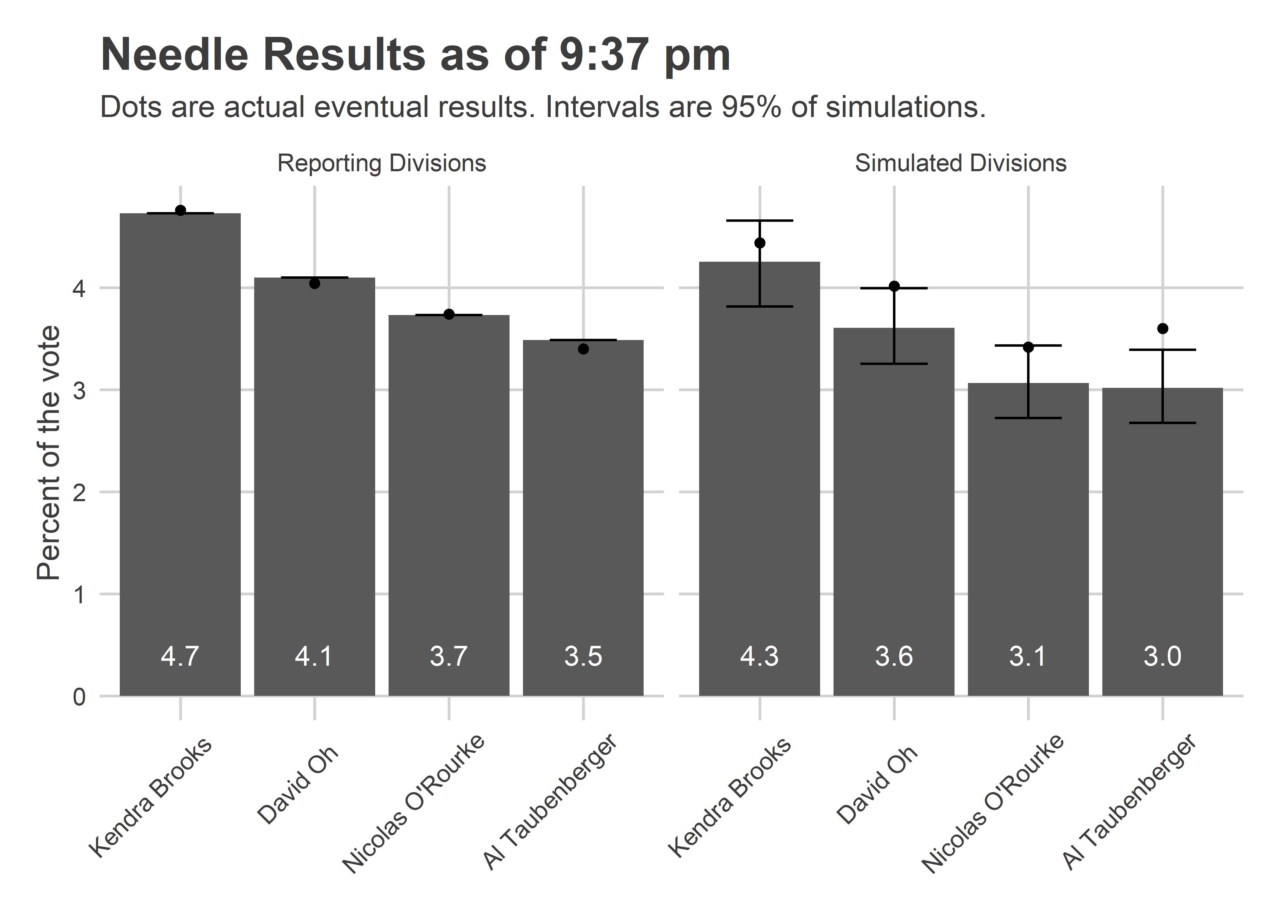
The Needle provided narrow error bars for the candidates’ performance in the remaining divisions. It predicted, for example, that Brooks would win between 3.8 and 4.7% of the votes in the remaining divisions; she got 4.4. It predicted Oh would get between 3.2 and 4.0%, and that O’Rourke between 2.7 and 3.4%. Oh really got 4.0%, and O’Rourke 3.4%. Adding in the divisions that were already locked in, O’Rourke didn’t beat Oh in a single simulation.
One thing worries me in the plot above. Notice that Oh, O’Rourke, and especially Taubenberger all had actual results at the high end of my simulations. That could occur due to random chance, but is pretty unlikely. And it turns out something went wrong.
Simulations by Neighborhood Bloc
In retrospect, what really would have convinced me that the Needle was working as advertised would be plotting the results by voting bloc. At 9:37 on November 5th, here’s what that would have shown.
View code
div_cats <- readRDS("../../data/processed_data/div_cats_2019-11-08.RDS")

cand_sim_cat <- council_sim$office_sim %>%
  mutate(simulated = pretty_simulated(simulated)) %>%
  filter_to_candidates() %>%
  ## Doesn't account for different cands/voter
  left_join(turnout_sim %>% select(sim, warddiv, turnout)) %>%
  left_join(div_cats %>% select(warddiv, cat)) %>%
  group_by(candidate, sim, cat, simulated) %>%
  summarise(pvote = weighted.mean(pvote, w=turnout)) %>%
  group_by(candidate, cat, simulated) %>%
  summarise(
    mean = mean(pvote),
    pct_975 = quantile(pvote, 0.975),
    pct_025 = quantile(pvote, 0.025)
  )

cand_true_cat <- df_eod %>%
  filter(office == "COUNCIL AT LARGE") %>%
  group_by(warddiv) %>%
  mutate(total_votes = sum(votes), pvote = votes/total_votes) %>%
  filter_to_candidates() %>%
  left_join(div_cats %>% select(warddiv, cat)) %>%
  left_join(turnout_sim %>% filter(sim==1) %>% select(warddiv, simulated)) %>%
  group_by(candidate, cat, simulated) %>%
  summarise(votes=sum(votes), pvote = weighted.mean(pvote, w=total_votes)) %>%
  ungroup()


cat_colors <- c(
   "Black Voters" = light_blue,
   "Wealthy Progressives" = light_red,
   "White Moderates" = light_orange,
   "Hispanic North Philly" = light_green
)

ggplot(
  cand_sim_cat,
  aes(x=cat, y=100*mean)
) +
  geom_bar(stat="identity", aes(fill=cat)) +
  geom_errorbar(aes(ymin =100* pct_025, ymax=100*pct_975), width = 0.5) +
  facet_grid(candidate ~ simulated) +
  geom_point(
    data = cand_true_cat %>% rename(mean=pvote)
  ) +
  theme_sixtysix() %+replace% theme(axis.text.x = element_blank()) +
  scale_y_continuous(labels=scales::comma) +
  scale_fill_manual(values=cat_colors) +
  labs(
    x=NULL,
    y="Percent of the vote",
    title=sprintf("Needle Results as of %s pm", pretty_time),
    subtitle=sim_subtitle,
    fill=NULL
  )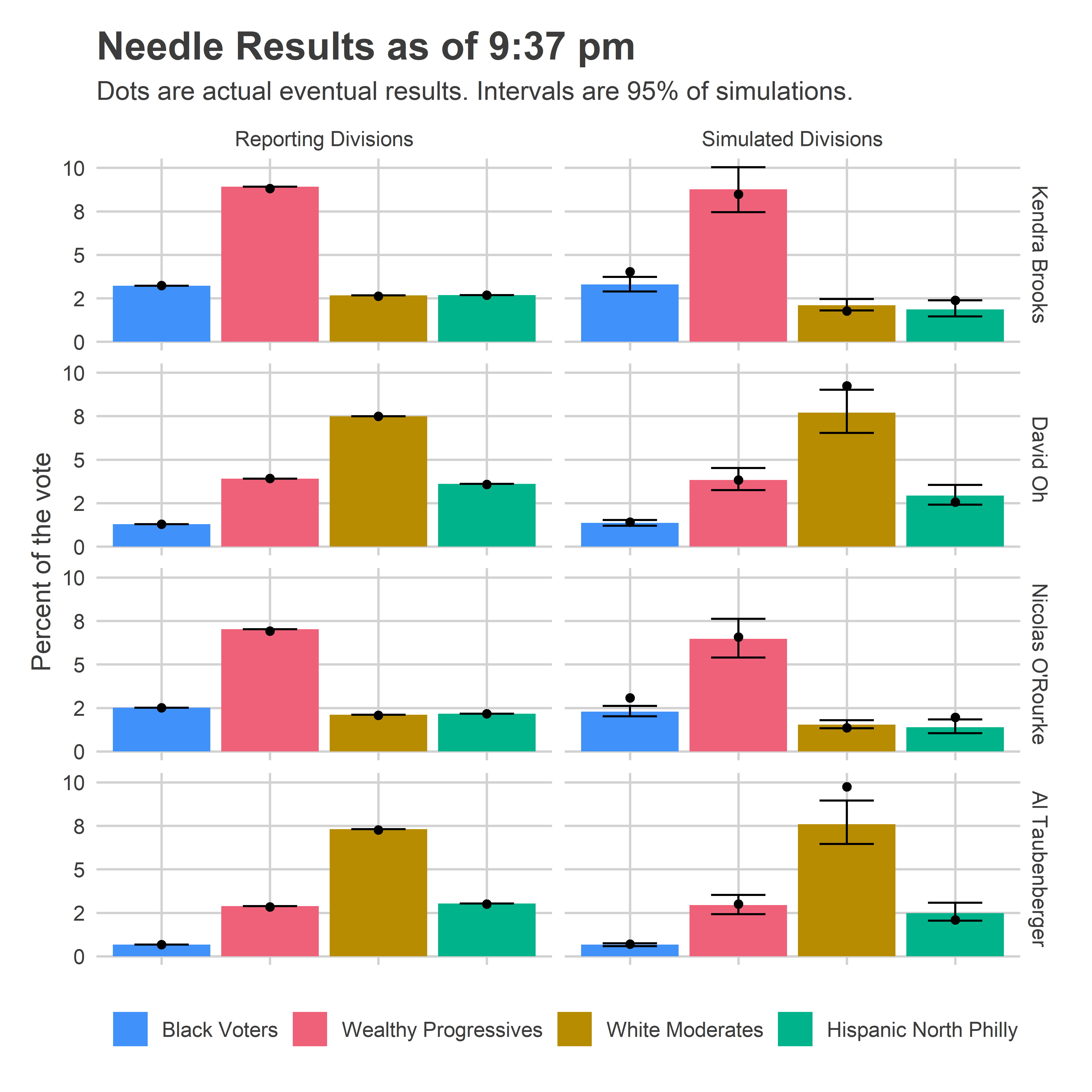
The Needle was largely predicting that candidates would perform similarly in the remaining divisions as they had already done in divisions from the same blocs. And it had a reasonable uncertainty for them, +/- 1 percentage point in their bases. Those predictions were fairly accurate, but with not quite enough uncertainty; I think because they did better in the Northeast than their performance in South Philly and the River Wards would suggest.
Percent of the vote is just half of the calculation, though. We also need to know the turnout in each of those blocs.
View code
cat_sim <- turnout_sim %>%
    left_join(div_cats %>% select(warddiv, cat)) %>%
    group_by(simulated, cat, sim) %>%
    summarise(
      n_divs = length(unique(warddiv)),
      turnout = sum(turnout)
    ) %>%
    gather(key="var", value="value", n_divs, turnout) %>%
    group_by(simulated, cat, var) %>%
    summarise(
      mean = mean(value),
      pct_975 = quantile(value, 0.975),
      pct_025 = quantile(value, 0.025)
    )

true_turnout <- df_eod %>%
  filter(office == office_suffix(turnout_office)) %>%
  group_by(warddiv) %>%
  summarise(turnout = sum(votes)) %>%
  left_join(turnout_sim %>% filter(sim==1) %>% select(warddiv, simulated)) %>%
  left_join(div_cats %>% select(warddiv, cat)) %>%
  group_by(simulated, cat) %>%
  summarise(turnout = sum(turnout))


ggplot(
  cat_sim %>% mutate(key = ifelse(var=="turnout", "Turnout", "N(Divisions)")),
  aes(x=cat, y=mean)
) +
  geom_bar(stat="identity", aes(fill=cat)) +
  geom_errorbar(aes(ymin = pct_025, ymax=pct_975), width = 0.5) +
  facet_grid(key ~ simulated, scales="free_y") +
  geom_point(
    data = true_turnout %>% mutate(key="Turnout") %>% rename(mean=turnout)
  ) +
  theme_sixtysix() %+replace% theme(axis.text.x = element_blank()) +
  scale_y_continuous(labels=scales::comma) +
  scale_fill_manual(values=cat_colors) +
  labs(
    x=NULL,
    y=NULL,
    title=sprintf("Needle Results as of %s pm", pretty_time),
    subtitle=sim_subtitle,
    fill=NULL
  )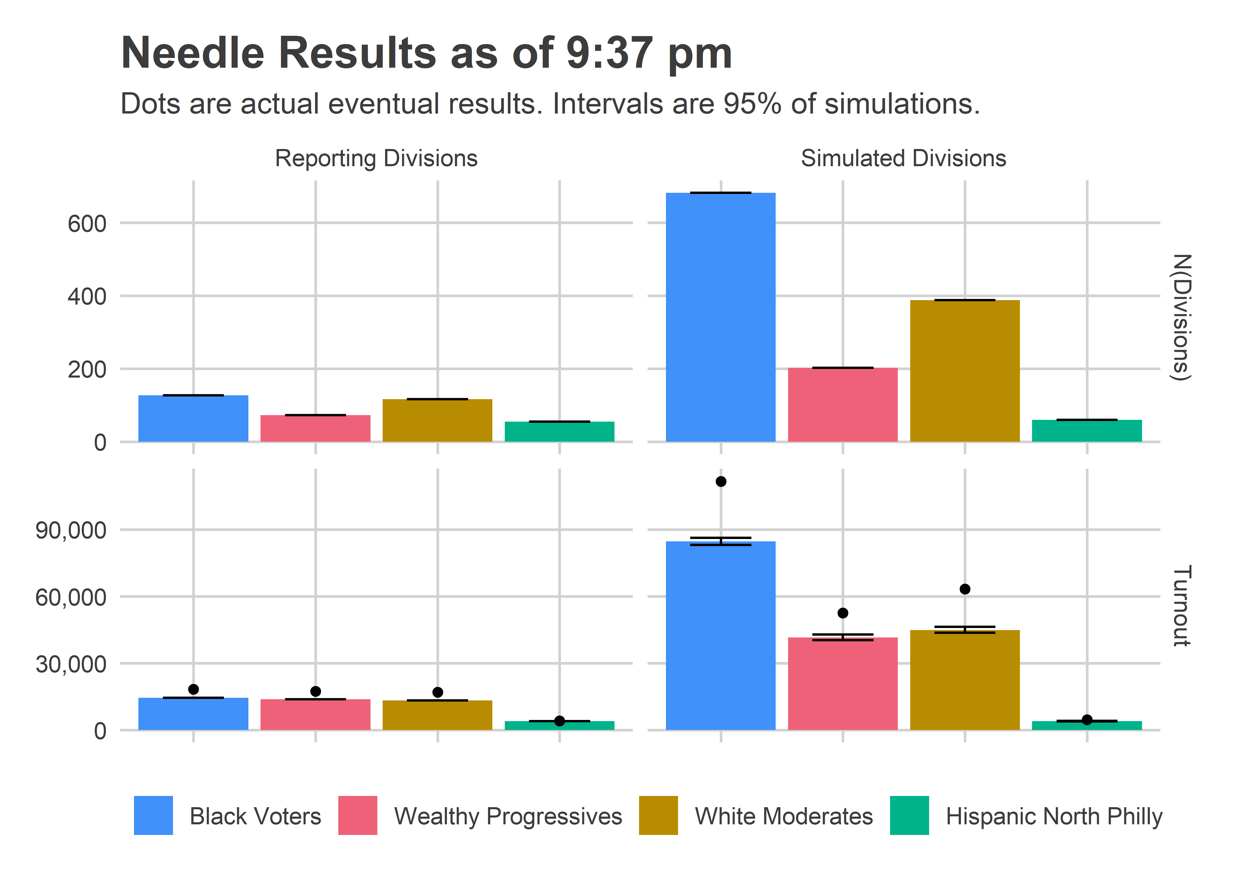
This is where things went very wrong. Notice that the Needle was super confident about how many votes would come from the left-over divisions, and under-predicted by a lot, 112K instead of 85K in Black Voter divisions (+32%), and 63K instead of 45K in White Moderate divisions (+40%).
The evidence for what went wrong is actually in the Reporting Division plots; the eventual, true turnout was higher than what was reported at the time! I did all of the calculations assuming those numbers were final. Instead, what must have happened is some of those results only represented a fraction of the machines for the division. This was explicitly called out in the data from the old machines; I’ll need to figure out how to get that data from the new machines.
Luckily, that didn’t hurt the needle too badly. What would have been bad is if the turnout imbalance occured disproportionately by bloc. But it occurred about as much in the Black Voter divisions as the White Moderate divisions (minus 8%), so didn’t ruin the predictions.
[Something went wrong in the spreadsheet at 10:20 and O’Rourke shot to 36%. I haven’t been able to reproduce that, and think it may have to do with the fact that the results in already-reporting divisions changed, which I assumed couldn’t happen. I’m going to overhaul that logic to robustify it.]
What I’ll do differently
So it looks like the needle was basically right. But I still didn’t trust it. What will it take to finally learn my lesson?
The answer, as always, is model transparency. The problem with the results was that I saw a bunch of 100’s and no intuition for why the Needle had converged so fast. Suppose, instead, I had produced all of the plots above in real time. I would have been convinced!
So that’s what I’ll do. The next iteration of the Needle will provide live updates of all the plots above: the results by voting bloc separately for the reporting and simulated divisions. Maybe then I’ll finally embrace the Needle’s extreme confidence.
See you in April!
View code
# votes_per_voter <- df_eod %>%
#   filter(office %in% c("COUNCIL AT LARGE", "MAYOR")) %>%
#   group_by(warddiv, office) %>%
#   summarise(total_votes = sum(votes)) %>%
#   left_join(div_cats %>% select(warddiv, cat)) %>%
#   # left_join(turnout_sim %>% filter(sim==1) %>% select(warddiv, simulated)) %>%
#   # group_by(cat, simulated, office) %>%
#   group_by(cat, office) %>%
#   summarise(total_votes = sum(total_votes)) %>%
#   spread(key=office, value=total_votes) %>%
#   mutate(at_large_per_mayor = `COUNCIL AT LARGE` / MAYOR)
#
# ggplot(
#   votes_per_voter,
#   aes(x = cat, y = at_large_per_mayor)
# ) +
#   geom_bar(stat="identity", aes(fill=cat)) +
#   geom_text(
#     y = 0.4,
#     aes(label=sprintf("%0.2f", at_large_per_mayor)),
#     size=7,
#     color="white"
#   ) +
#   theme_sixtysix() %+replace%
#   theme(axis.text.x = element_text(angle=45, vjust = 0.8, hjust=0.8)) +
#   scale_y_continuous(labels=scales::comma) +
#   scale_fill_manual(values=cat_colors, guide=FALSE) +
#   labs(
#     x=NULL,
#     y=NULL,
#     title="Voters typically vote for 4.5 candidates",
#     subtitle="At Large Votes divided by Votes for Mayor (voters could have selected 5)",
#     fill=NULL
#   )
# 
Have you analyzed the winning at-large seats by Ward, Division, and perhaps polling places to determine results by party affiliation to look where there was a particularized variance between registered party voters and the candidates they voted for.
Having worked on the elections in the 9th Ward, my pure “gut” feeling is that those who voted for Kendra Brooks for a change also decided that David Oh deserved another term. Therefore, there would be a positive correlation between votes for Oh and Brooks.
Additionally, the effect of under-voting in Wards, Divisions, and polling places could be informative.
I worked in East Mount Airy. Polling sites 1, 2, and 3 had very few
Republicans (as low as 12 per polling place). Brooks did very well. Oh’s votes were well in excess of what party registration would suggest.
I enjoyed your Taubenberger/Oh variance map (Taubenberger took the Northeast, Oh took everywhere else. Thank you.