Belatedly, I’ve had time to sit down with the 2021 Primary results. Here are some observations.
In November, Philadelphia will elect eight new judges on the Court of Common Pleas. After the May Primary, we know almost certainly who those judges will be; the Democratic nominees will all win.
All eight Democratic nominees are Recommended by the Bar, three Highly. Surprisingly, they don’t include the person in the number one ballot position. And they won with a wide diversity of maps.
View code
library(dplyr)
library(tidyr)
library(ggplot2)
devtools::load_all("../../admin_scripts/sixtysix/")

ballot <- read.csv("../../data/common_pleas/judicial_ballot_position.csv")
res <- readxl::read_xlsx("C:/Users/Jonathan Tannen/Downloads/2021_primary (1).xlsx")
res <- res %>%
  pivot_longer(
    cols=`JUSTICE OF THE\r\nSUPREME COURT DEM\r\nMARIA MCLAUGHLIN`:`QUESTION #5\r\nNO`,
    names_to="candidate",
    values_to="votes"
  )
names(res) <- gsub("(\\r|\\n)+", " ", names(res))
names(res) <- gsub("\\s", "_", tolower(names(res)))

res$vote_type <- case_when(
  res$vote_type == "E" ~ "Election Day",
  res$vote_type == "M" ~ "Mail",
  res$vote_type == "P" ~ "Provisional"
)

res_cp <- res %>%
  filter(
    grepl("^JUDGE OF THE\r\nCOURT OF COMMON PLEAS DEM\r\n", candidate)
  ) %>%
  mutate(
    candidate = gsub("^JUDGE OF THE\r\nCOURT OF COMMON PLEAS DEM\r\n","", candidate)
  )

res_cp <- res_cp %>%
  left_join(ballot %>% filter(year == 2021) %>% mutate(candidate = toupper(name))) %>%
  mutate(name=format_name(name))

assertthat::assert_that(
  res_cp %>% filter(is.na(name)) %>% with(all(candidate == "Write-in"))
)

res_type <- res_cp %>%
  filter(!is.na(name)) %>%
  group_by(name, vote_type, rownumber, colnumber, philacommrec, dcc, inq) %>%
  summarise(votes=sum(votes)) %>%
  group_by(vote_type) %>%
  mutate(pvote = votes/sum(votes))
View code
res_total <- res_type %>%
  group_by(name, rownumber, colnumber, philacommrec, dcc, inq) %>%
  summarise(votes=sum(votes), .groups="drop") %>%
  mutate(pvote = votes/sum(votes))

ggplot(
  res_total %>% arrange(votes) %>% mutate(winner = rank(-votes) <= 8),
  aes(y=rownumber, x=colnumber)
) +
  geom_tile(
    aes(fill=pvote*100, color=winner),
    size=2
  ) +
  geom_text(
    aes(
      label = ifelse(philacommrec==1, "R", ifelse(philacommrec==2,"HR","")),
      x=colnumber+0.45,
      y=rownumber+0.45
    ),
    color="grey70",
    hjust=1, vjust=0
  ) +
  geom_text(
    aes(
      label = ifelse(dcc==1, "D", ""),
      x=colnumber-0.45,
      y=rownumber+0.45
    ),
    color="grey70",
    hjust=0, vjust=0
  ) +
  geom_text(
    aes(label = sprintf("%s\n%0.1f%%", name, 100*pvote)),
    color="black"
    # fontface="bold"
  ) +
  scale_y_reverse(NULL) +
  scale_x_continuous(NULL)+
  scale_fill_viridis_c(guide=FALSE) +
  scale_color_manual(values=c(`FALSE`=NA, `TRUE`="yellow"), guide=FALSE) +
  annotate(
    "text",
    label="R = Recommended\nHR = Highly Recommended\nD = DCC Endorsed",
    x = 1.6,
    y = 6,
    hjust=0,
    vjust=0.5,
    color="grey70"
  ) +
  theme_sixtysix() %+replace%
  theme(
    panel.grid.major=element_blank(),
    axis.text=element_blank()
  ) +
  ggtitle(
    "Common Pleas Results",
    "2021 Democratic Primary, arranged as on the ballot. Winners are outlined."
  )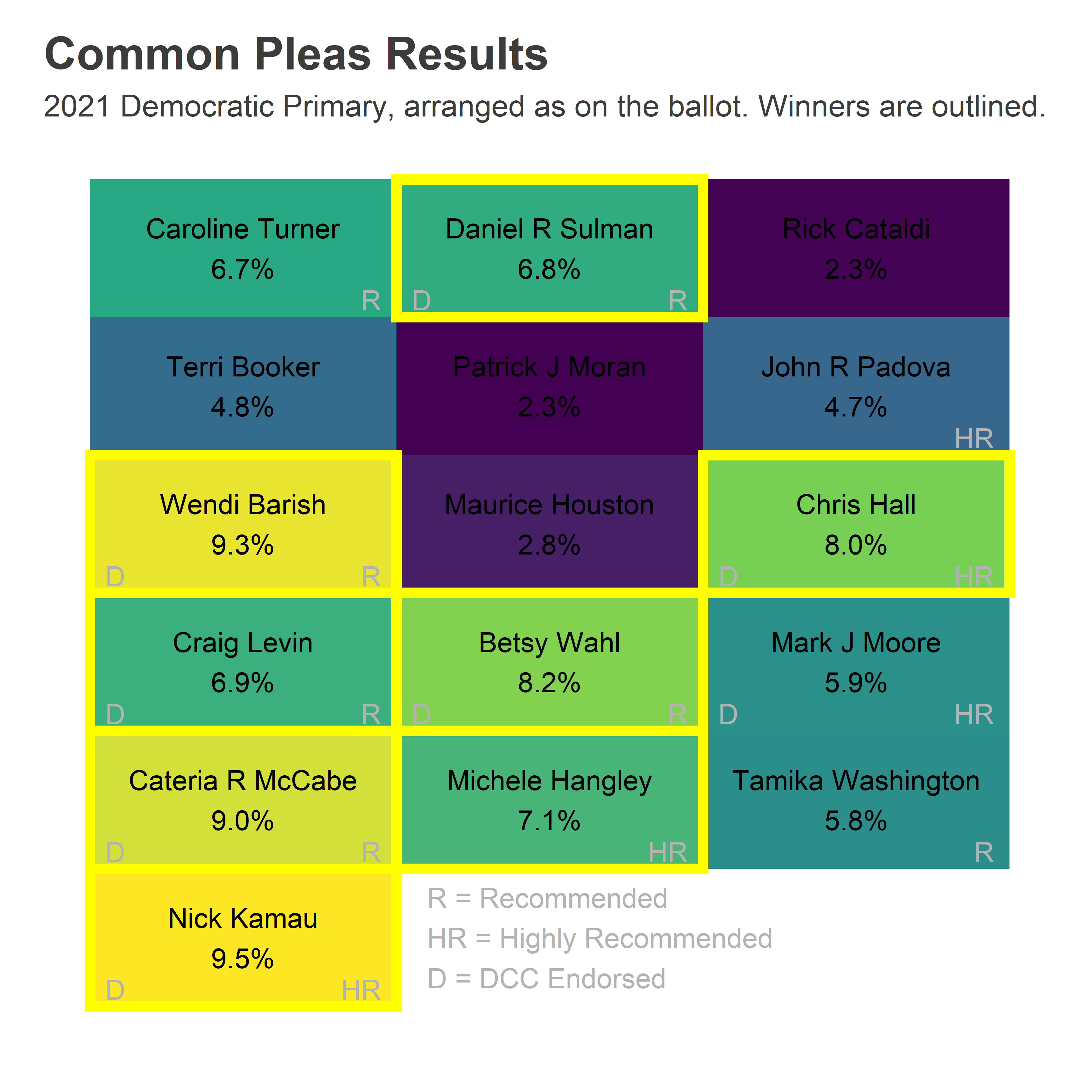
Four candidates won in the first column, three in the second, and one in the third. Three winners were Highly Recommended by the Bar, including Michele Hangley in the second column and Chris Hall in the third, but by itself that rating wasn’t sufficient: John Padova and Mark Moore failed to capitalize on it. There’s some additional work needed to use it to your advantage.
The candidates’ maps are diverse. Nick Kamau and Cateria McCabe won everywhere, though slightly stronger in the Black wards of West and North Philly (and decidedly not the Northeast). Wendi Barish also won everywhere, slightly stronger in Center City and its ring. Betsy Wahl, Chris Hall, and Michele Hangley all won thanks to their strength in the Wealthy Progressive ring around Center City and in Chestnut Hill and Mount Airy. Craig Levin did the opposite, winning the Northeast and West and North Philly, presumably on the strength of his DCC endorsement. And Dan Sulman was the eighth and final winner, with the bright yellow 53rd ward just enough to push him through, where his sister is the Ward Leader.
View code
library(sf)

divs <- st_read("../../data/gis/warddivs/202011/Political_Divisions.shp") %>%
  mutate(warddiv = pretty_div(DIVISION_N))wards <- st_read("../../data/gis/warddivs/201911/Political_Wards.shp") %>%
  mutate(ward=sprintf("%02d", asnum(WARD_NUM)))res_ward_type <- res_cp %>%
  mutate(ward = substr(division, 1, 2)) %>%
  group_by(ward, name, vote_type) %>%
  summarise(votes=sum(votes)) %>%
  group_by(vote_type) %>%
  mutate(pvote=votes/sum(votes))

res_ward <- res_ward_type %>%
  group_by(ward, name) %>%
  summarise(votes=sum(votes)) %>%
  group_by(ward) %>%
  mutate(pvote=votes/sum(votes))

res_ward <- left_join(wards, res_ward)

candidate_order <- res_total %>% arrange(desc(votes)) %>% with(name)

ggplot(
  res_ward %>%
    filter(!is.na(name)) %>%
    mutate(name=factor(name, levels=candidate_order))
) +
  geom_sf(aes(fill=100*pvote), color=NA) +
  scale_fill_viridis_c("Vote %") +
  facet_wrap(~ name) +
  theme_map_sixtysix() %+replace% theme(legend.position="right") +
  ggtitle("Common Pleas Results", "2021 Democratic Primary")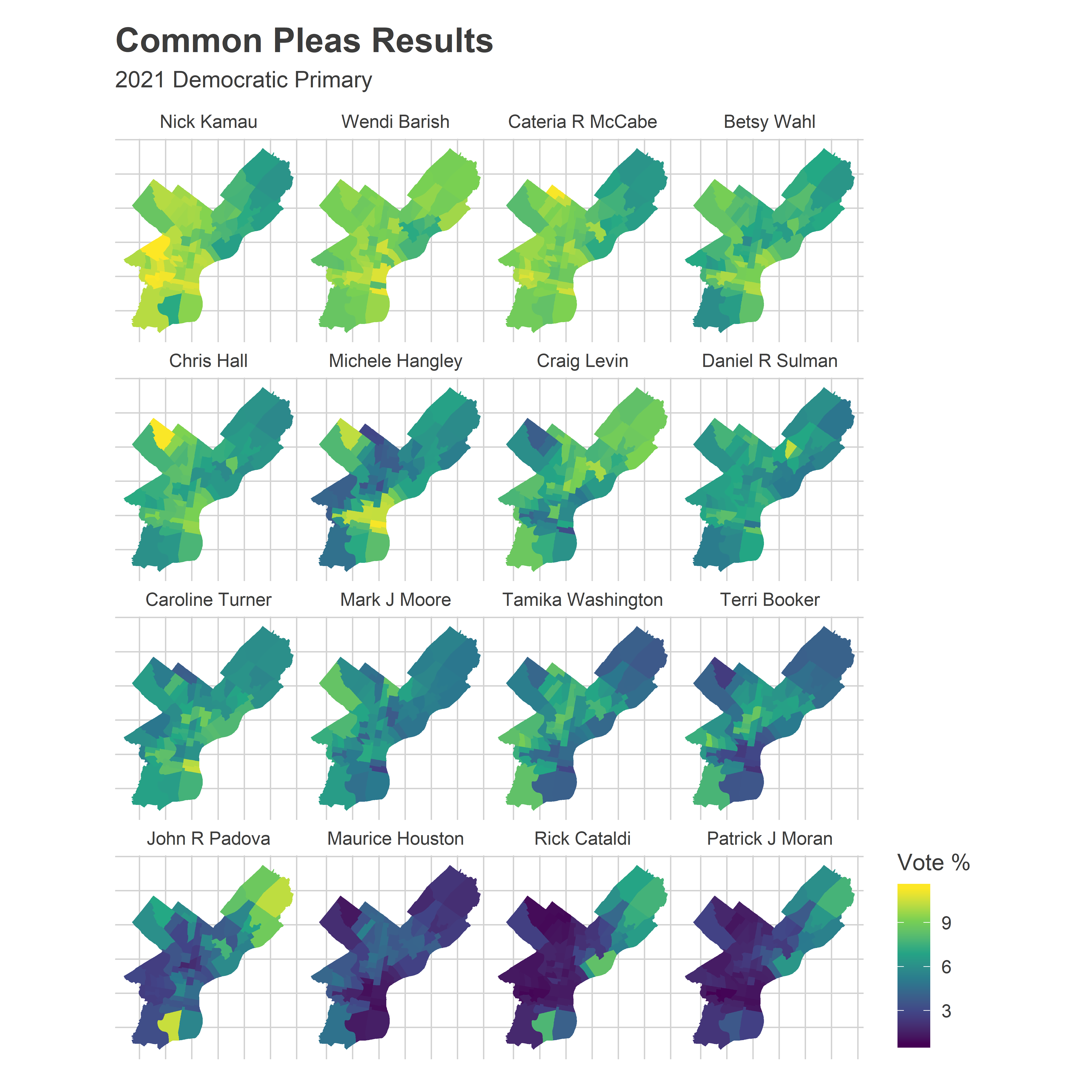
Caroline Turner was the first runner up, and the first candidate to fail to win from the top ballot position since at least 2007 (which is all the ballot layouts I can find). But she did really well in the 1st and 2nd Wards, which now deserve a name.
The Reclaim Wards
When clicking through the results online, I saw a cut that made me laugh out loud.
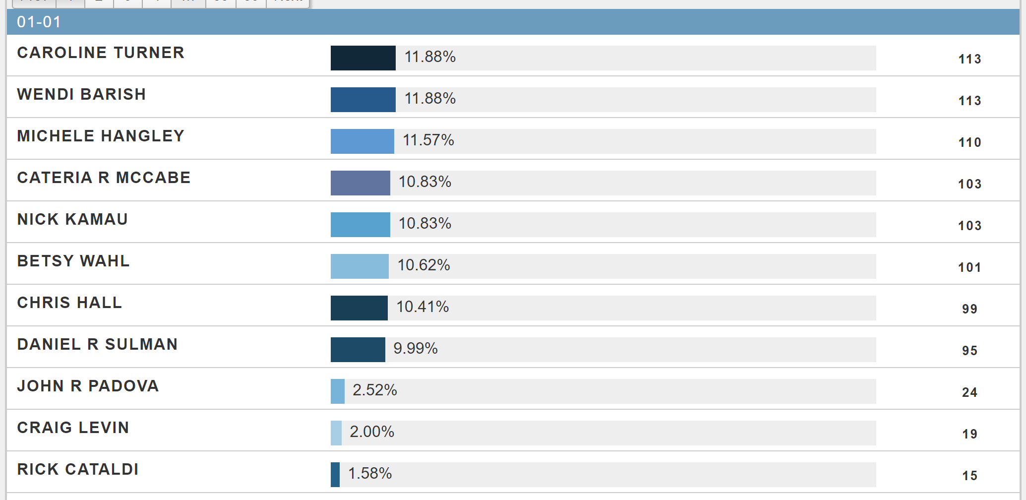
Results from Division 01-01
The top eight winners in 01-01 each received more than 9.99% of the vote. Ninth place? Only 2.5%. This is the kind of electoral coordination party bosses dream of.
In fact, that consolidation is true of the entire first ward (covering East Passyunk in South Philly).
View code
ward_bar <- function(ward, endorsements){
  df <- res_ward %>%
  as.data.frame() %>%
  filter(ward==!!ward, !is.na(name)) %>%
  arrange(desc(votes)) %>%
  # filter(1:n() <= 10) %>%
  mutate(name=factor(name, levels=name)) %>%
  mutate(
    last_name = gsub(".* ([A-Za-z]+)$", "\\1", name),
    endorsed= last_name %in% endorsements,
    reclaim = last_name %in% c("Hall", "Hangley", "Kamau", "Barish","Sulman", "McCabe", "Turner", "Wahl")
  )

  ggplot(df, aes(x=name, y=votes)) +
  geom_bar(stat="identity", aes(color=endorsed, fill=reclaim), size=1.2) +
      geom_vline(xintercept=8.5, linetype="dashed") +
  scale_color_manual(
    NULL,
    values=c(`TRUE` = "goldenrod", `FALSE`=NA),
    labels=sprintf(c("Not %s Endorsed", "%s Endorsed"), ward)
  ) +
  scale_fill_manual(
    NULL,
    values=c(`TRUE`="grey30", `FALSE`="grey60"),
    labels=c("Not Reclaim", "Reclaim")
  ) +
  theme_sixtysix() %+replace%
  theme(axis.text.x = element_text(angle=45, hjust=1, vjust=1))+
  labs(
    title=sprintf("Common Pleas Results in Ward %s", ward),
    subtitle="2021 Democratic Primary",
    x=NULL,
    y="Votes"
  )

}

ward_bar(
  "01",
  c("Hall", "Hangley", "Kamau", "Barish","Sulman", "McCabe", "Turner", "Wahl")
) 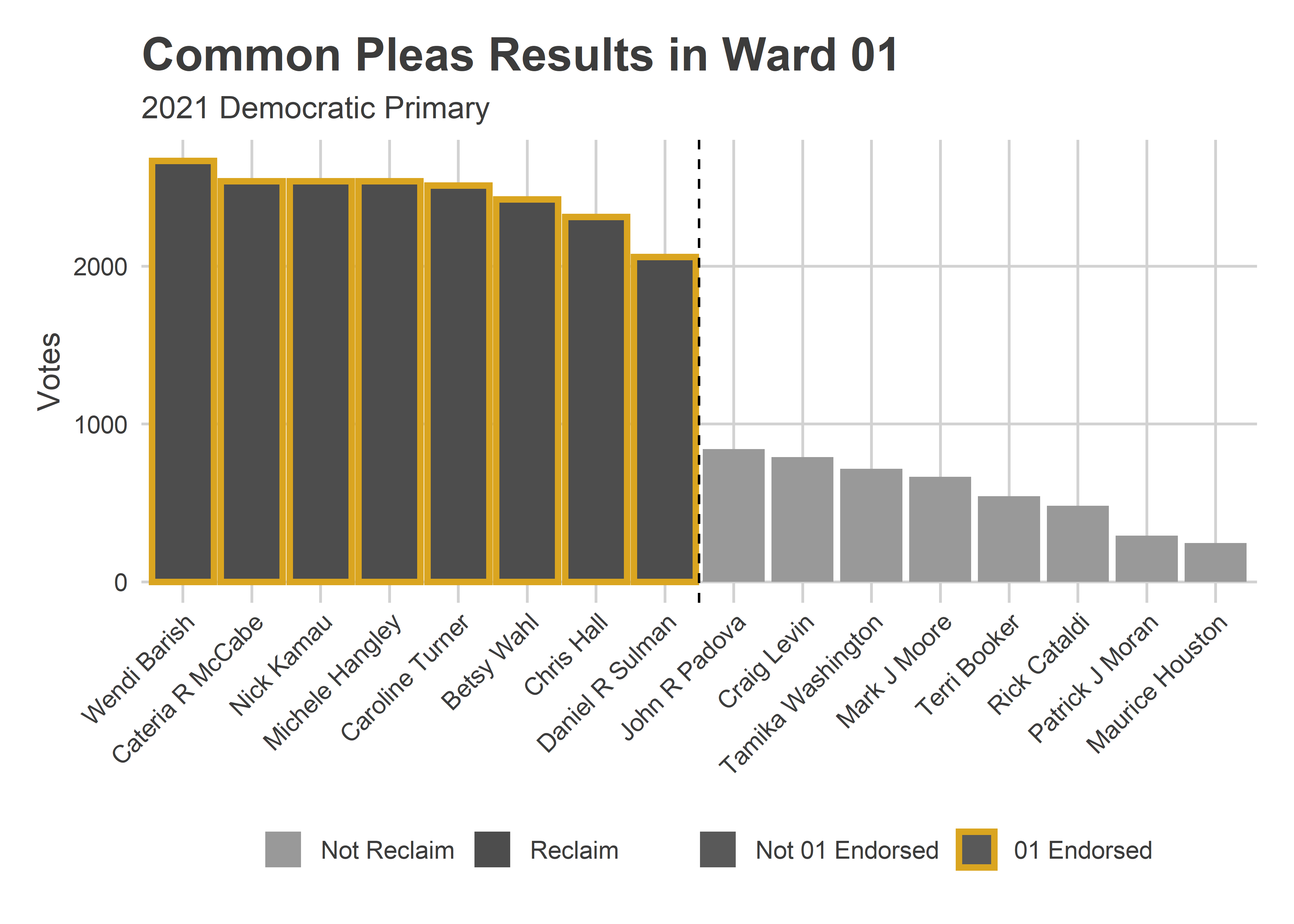
It’s usually impossible to separate the many overlapping endorsements. Was it the Bar that brought the win, the DCC, or the Ward? But these eight winners are exactly the ward’s endorsed candidates. They were also the full Reclaim slate, so it’s impossible to separate the Ward’s power from Reclaim. But the deciding factors were almost certainly these two.
The four wards with the biggest gap between eighth and ninth place–suggesting the strongest slate power–were South Philly’s 1st and 2nd and West Philly’s 27th and 46th.
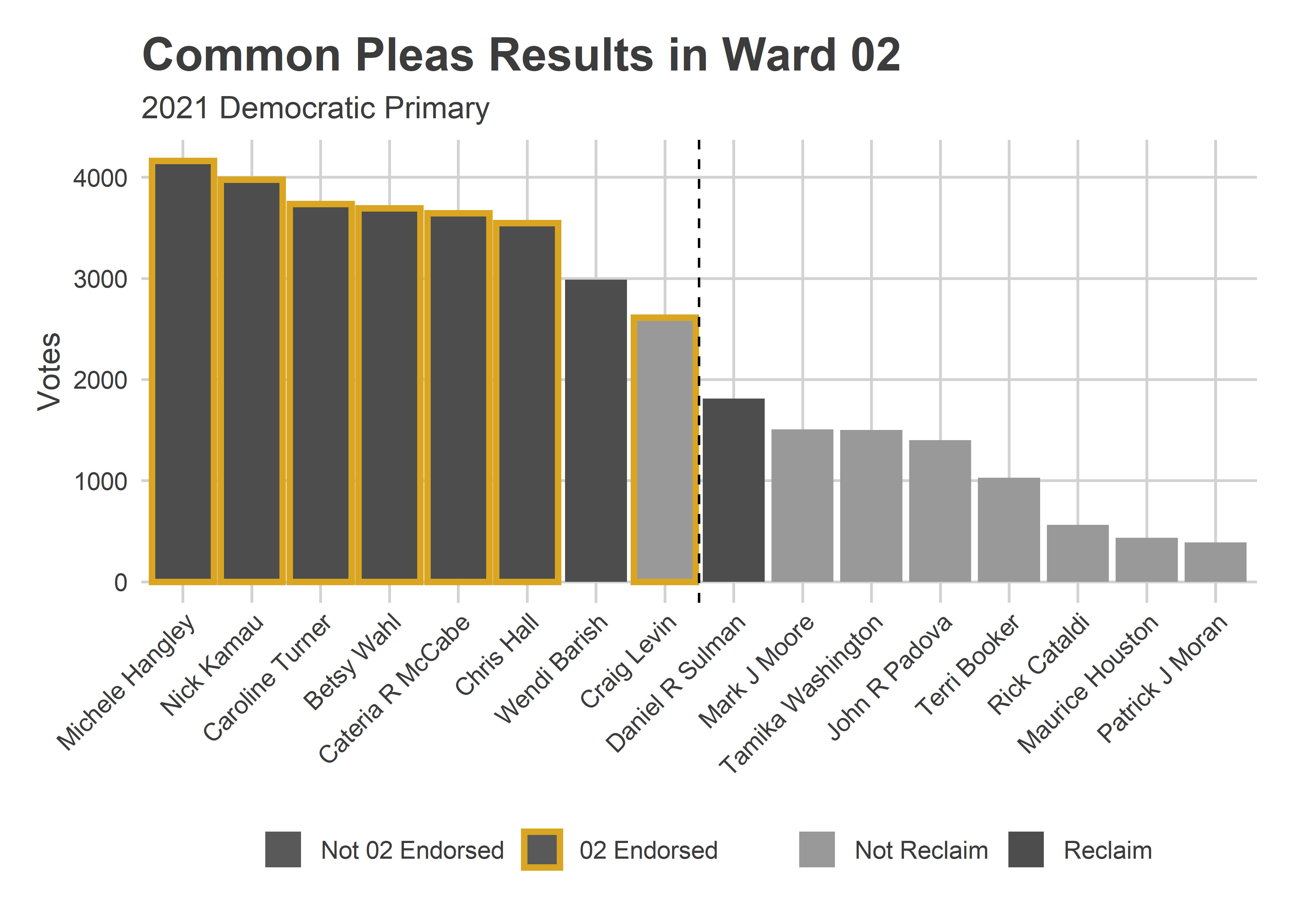
The 2nd Ward, just to the 1st’s North, had slightly different endorsements than Reclaim. The six candidates who had both a Reclaim and 2nd Ward endorsement did best. Barish came in seventh with only a Reclaim endorsement, Levin in eighth with only the 2nd, and Sulman in ninth with only Reclaim.
View code
ward_bar(
  "02",
  c("Hall", "Hangley", "Kamau", "Levin", "McCabe", "Turner", "Wahl")
) 
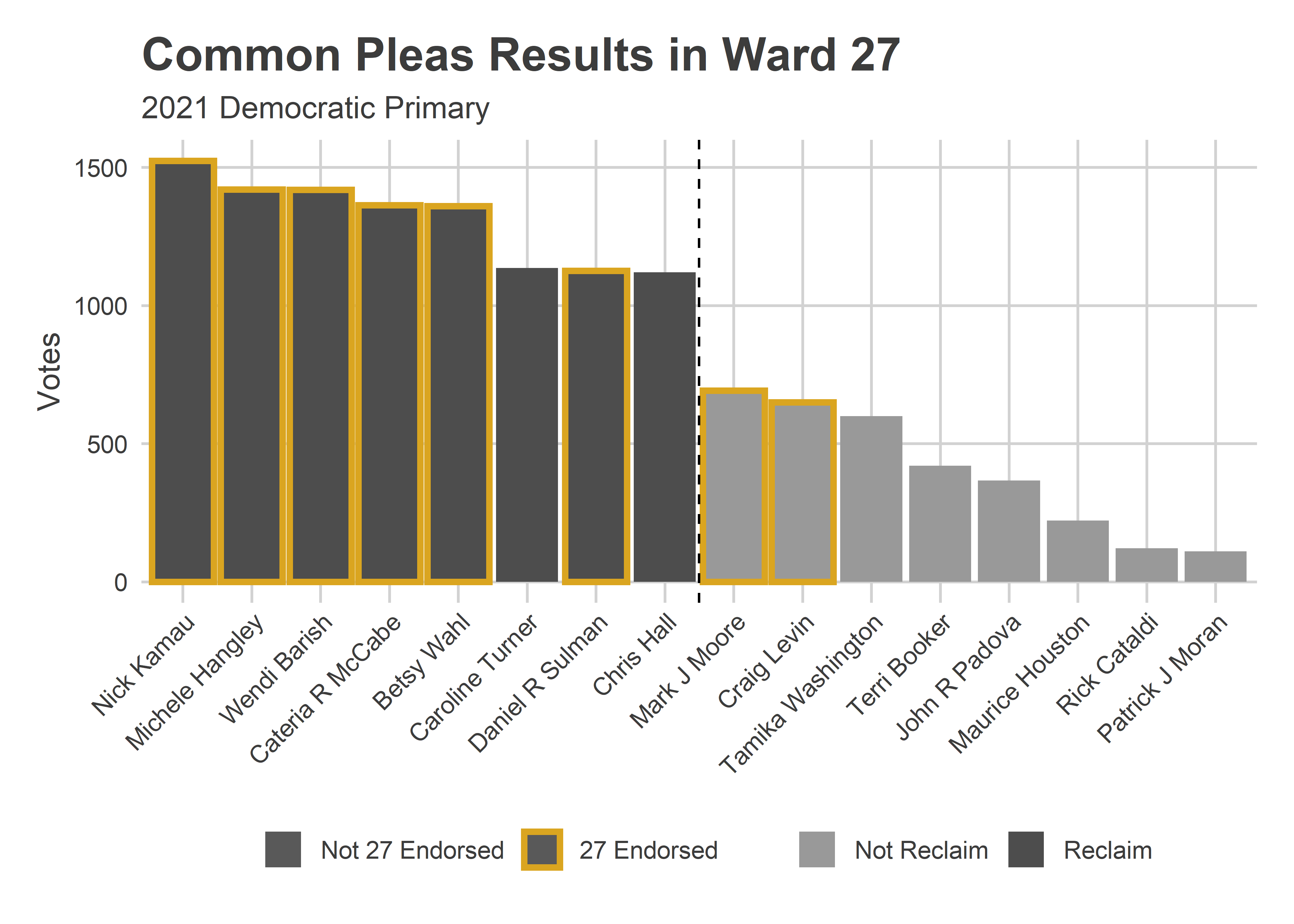
In the 27th (where, full disclosure, I’m a committeeperson), the Reclaim endorsements appear to have carried the day: Turner and Hall won, while 27-endorsed Moore and Levin didn’t.
View code
ward_bar(
  "27",
      c("Barish", "Moore", "Hangley", "Kamau", "Levin", "McCabe", "Sulman", "Wahl")
)
I haven’t found the 46th ward endorsements, but the Reclaim slate cleaned up.
View code
ward_bar(
  "46",
      c()
) + labs(subtitle="2021 Primary. Endorsements not available.")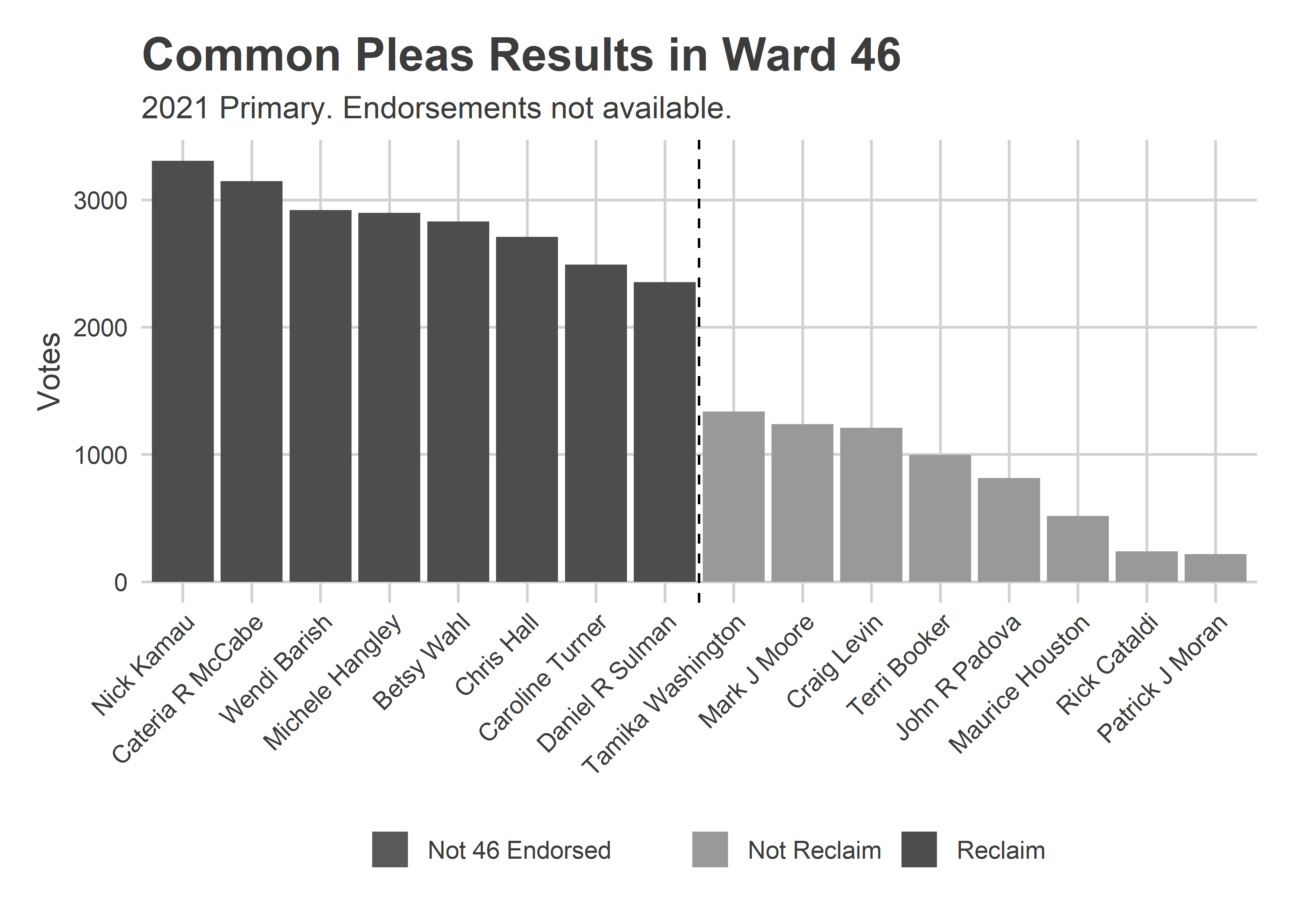
Not only was the Reclaim slate particularly strong in these wards, but the gap between eighth and ninth position make it clear it was the Reclaim endorsement itself, and not one of the other pregressive slates that drove voters.
But the Reclaim endorsement wasn’t itself enough to win across the city. Caroline Turner came in ninth despite it and first ballot position, mostly due to poor results in the Black wards.
Wealthy Progressive divisions did consolidate their votes in a way other divisions didn’t. Grouping divisions by my Voting Blocs shows that the Wealthy Progressive divisions’ preferred candidates did better there than the preferred candidates of other blocs’.
View code
devtools::load_all("C:/Users/Jonathan Tannen/Dropbox/sixty_six/posts/svdcov/")
svd_time <- readRDS("../../data/processed_data/svd_time_20210813.RDS")
div_cats <- get_row_cats(svd_time, 2020)
# ggplot(divs %>% left_join(div_cats, by=c("warddiv"="row_id"))) +
# geom_sf(aes(fill=cat), color=NA)
res_cat <- res_cp %>% left_join(div_cats, by=c("division"="row_id")) %>%
filter(!is.na(name)) %>%
group_by(name, cat) %>%
summarise(votes=sum(votes)) %>%
group_by(cat) %>%
mutate(
rank = rank(desc(votes)),
pvote=votes/sum(votes)
)
ggplot(res_cat, aes(x=rank, y=100*pvote)) +
geom_bar(stat="identity", fill="grey50") +
facet_grid(cat ~ .) +
geom_text(
aes(label=gsub(".* ([A-Za-z]+)$", "\\1", name)),
y=0.3,
angle=90,
hjust=0
)+
theme_sixtysix() +
geom_vline(xintercept=8.5, linetype="dashed") +
labs(x="Rank", y="% of Vote", title="Results by Division Bloc")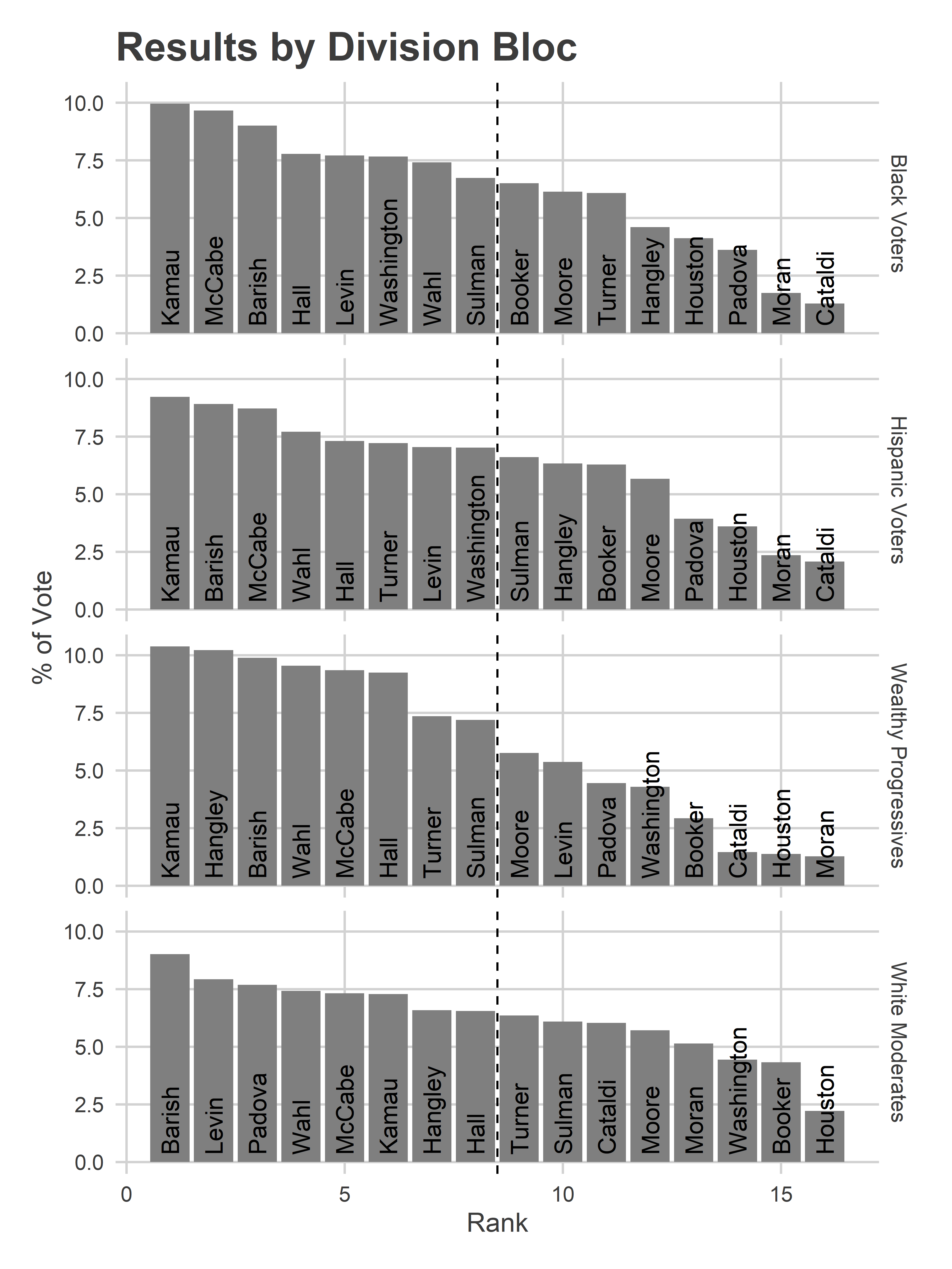 The top eight candidates in the Wealthy Progressive divisions received on average 9.1% of the vote, compared to 8.2% in the Black Voter divisions, 7.9% in the Hispanic Voter, and 7.5% in the White Moderate. To measure another way, Common Pleas candidates had a gini coefficient of votes of 0.29 in Wealthy Progressive divisions, compared to 0.22, 0.19, and 0.14 in the other three blocs, indicating greater inequality in the votes candidates received, and thus more separation.
This is probably due to voters there being more likely to look up recommendations either on or before election day, and having consolidated preferences.
View code
gini <- function(x){
  outer_sum <- outer(x, x, FUN="-")
  gini <- sum(abs(outer_sum)) / (2 * length(x)^2 * mean(x))
  return(gini)
}

# res_cat %>%
#   group_by(cat) %>%
#   summarise(
#     gini = gini(pvote),
#     mean=mean(pvote[rank <= 8])
#   )
Mail-In Votes
Entering this election, I was especially interested if mail-in ballots would have different dynamics than in-person voting. When people vote at the kitchen table, likely over days, will ballot position matter less? Will endorsements matter more?
In total, 33% of the votes for CP came by Mail, vs 66% on Election Day (and 1% Provisionals). The Wealthy Progressive divisions were more likely to use mail: 38% of their votes were by mail, compared to 34% in the White Moderate divisions, and 29 and 28% in the Black and Hispanic Voter divisions.
View code
# res_cp %>% group_by(vote_type) %>%
#   summarise(votes=sum(votes)) %>%
#   mutate(pct=votes/sum(votes))
#
# res_cp %>%
#   left_join(div_cats, by=c("division"="row_id")) %>%
#   group_by(cat, vote_type) %>%
#   summarise(votes=sum(votes)) %>%
#   group_by(cat) %>%
#   mutate(pct=votes/sum(votes))
The candidates who did better by mail were all in the bottom right of the ballot. The top three were also Highly Recommended, suggesting that endorsements were more likely to be looked up by people voting by mail.
View code
res_votetype <- res_cp %>%
  filter(!is.na(name)) %>%
  group_by(vote_type, name, rownumber, colnumber, philacommrec, dcc) %>%
  summarise(votes=sum(votes)) %>%
  group_by(vote_type) %>%
  mutate(pvote=votes/sum(votes)) %>%
  group_by(name) %>%
  mutate(votes_total=sum(votes)) %>%
  ungroup() %>%
  pivot_wider(names_from=vote_type, values_from=c(votes, pvote)) %>%
  mutate(pvote_total=votes_total / sum(votes_total)) %>%
  arrange(desc(pvote_Mail - `pvote_Election Day`))

ggplot(
  res_votetype %>% arrange(votes_total) %>% mutate(winner = rank(-votes_total) <= 8) %>%
    mutate(diff=pvote_Mail - `pvote_Election Day`),
  aes(y=rownumber, x=colnumber)
) +
  geom_tile(
    aes(fill=100*diff),
    size=2
  ) +
  geom_text(
    aes(
      label = ifelse(philacommrec==1, "R", ifelse(philacommrec==2,"HR","")),
      x=colnumber+0.45,
      y=rownumber+0.45
    ),
    color="grey70",
    hjust=1, vjust=0
  ) +
  geom_text(
    aes(
      label = ifelse(dcc==1, "D", ""),
      x=colnumber-0.45,
      y=rownumber+0.45
    ),
    color="grey70",
    hjust=0, vjust=0
  ) +
  geom_text(
    aes(
      label = sprintf("%s\n%s%0.1f%%, (%0.1f%% - %0.1f%%)", name, ifelse(diff>0, "+", "-"),100*abs(diff), 100*pvote_Mail,100* `pvote_Election Day`)
    ),
    color="black"
    # fontface="bold"
  ) +
  scale_y_reverse(NULL) +
  scale_x_continuous(NULL)+
  scale_fill_viridis_c(guide=FALSE) +
  annotate(
    "text",
    label="R = Recommended\nHR = Highly Recommended\nD = DCC Endorsed",
    x = 1.6,
    y = 6,
    hjust=0,
    vjust=0.5,
    color="grey70"
  ) +
  theme_sixtysix() %+replace%
  theme(
    panel.grid.major=element_blank(),
    axis.text=element_blank()
  ) +
  ggtitle(
    "Common Pleas: Mail minus In Person.",
    "2021 Democratic Primary, arranged as on the ballot."
  )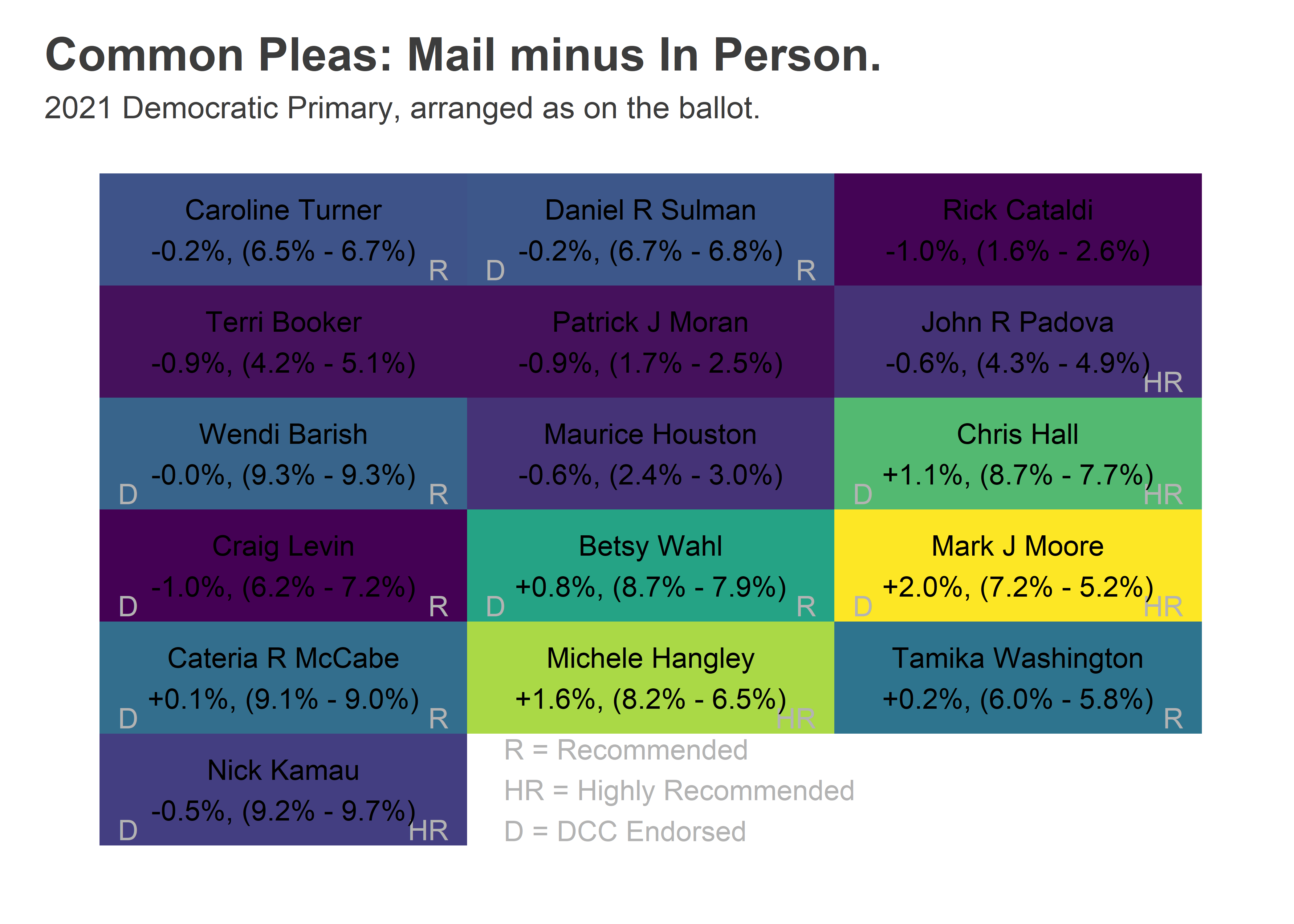
Some of these differences are due to differential rates of mail-in usage: Moore, Hangley, and Wahl all did better in Wealthy Progressive wards, and they mailed in more often. We can adjust that by taking the within-Division difference for each candidate, and then taking a weighted average across divisions weighted by total votes. This decomposition leads to basically the same finding but slightly smaller effects: Moore did 1.9 percentage points better by mail within a given division, Hangley 1.2, and Hall 0.9.
Some of this may still be because the mail voters were systematically different from in-person voters, but this within-division comparison is the closest we can get with the available data.
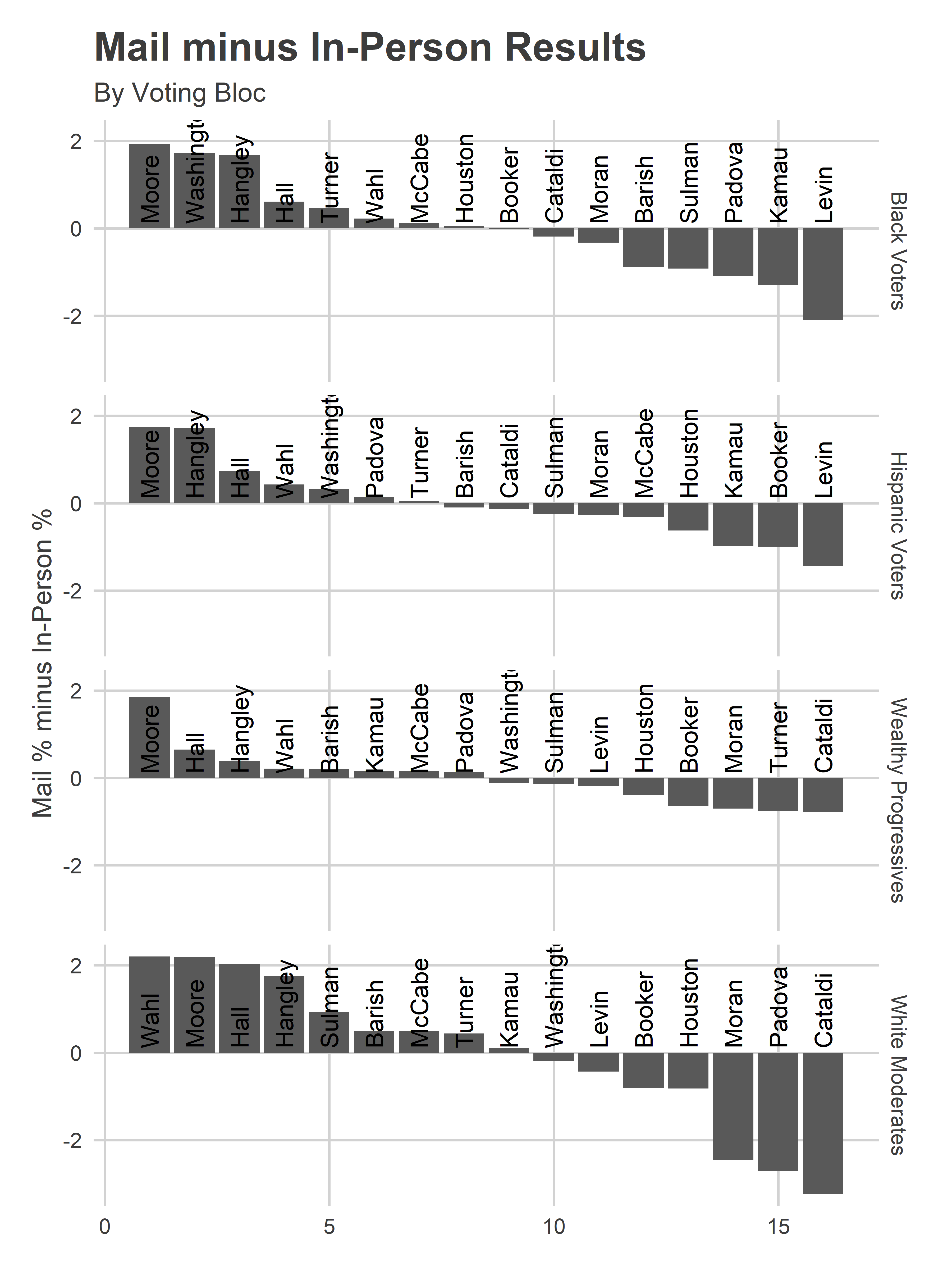
Doing the decomposition by Voting Bloc is interesting. Moore does better everywhere by mail than in person, probably reflecting the important DCC and Bar effects but a lack of endorsements with Election Day presence. In every bloc, the highest differences are the poor-ballot-position, Bar-recommended candidates. Interestingly, the largest differences are in the White Moderate divisions (South Philly and the Northeast), probably reflecting the politicized nature of mail-in voting, and that in those divisions there were political differences between those who voted by mail and in person.
View code
res_votetype_weighted <- res_cp %>%
  select(division, name, vote_type, votes) %>%
  filter(!is.na(name)) %>%
  group_by(division, vote_type) %>%
  mutate(pvote=votes/sum(votes)) %>%
  group_by(division) %>%
  mutate(total_votes=sum(votes)) %>%
  select(-votes) %>%
  pivot_wider(names_from=vote_type, values_from=pvote) %>%
  mutate(diff = `Mail` - `Election Day`) %>%
  group_by(name) %>%
  summarise(
    diff=weighted.mean(diff, w=total_votes, na.rm = T)
  )

res_votetype_weighted_cat <- res_cp %>%
  select(division, name, vote_type, votes) %>%
  filter(!is.na(name)) %>%
  group_by(division, vote_type) %>%
  mutate(pvote=votes/sum(votes)) %>%
  group_by(division) %>%
  mutate(total_votes=sum(votes)) %>%
  select(-votes) %>%
  left_join(div_cats, by=c("division"="row_id")) %>%
  pivot_wider(names_from=vote_type, values_from=pvote) %>%
  mutate(diff = `Mail` - `Election Day`) %>%
  group_by(name, cat) %>%
  summarise(
    diff=weighted.mean(diff, w=total_votes, na.rm = T)
  )

ggplot(
  res_votetype_weighted_cat %>% group_by(cat) %>%
    mutate(rank=rank(desc(diff))),
  aes(x=rank, y=100*diff)
) +
  geom_bar(stat="identity") +
  facet_grid(cat~.) +
  theme_sixtysix() +
  geom_text(aes(label= gsub(".* ([A-Za-z]+)$", "\\1", name)), angle=90, hjust=0, y=0.1)+
  labs(
    title="Mail minus In-Person Results", subtitle="By Voting Bloc",
    y="Mail % minus In-Person %",
    x=NULL
  )
Next: The Effect of the Bar Recommendations!
Coming soon.
Who’s requesting mail-in ballots?
Covid-19 and PA’s first-ever mail-in ballot election.
With Coronavirus upon us, Philadelphians are re-evaluating how we might vote in the June 2nd Primary. Coincidentally, this is also the first year that Pennsylvanians can request mail-in ballots even if they won’t be absentee. This combination has led to a huge amount of requests, and big questions about what this might mean for turnout and the results.
The friendly folks at the Commissioners’ Office have sent me all of Philadelphia’s requests through Thursday May 7th. Let’s dig in.
An astounding 91,587 voters have requested ballots. Philadelphia has 913,000 active registered voters. In the 2019 Primary, 217,000 people voted. For a brand new program, that number is a huge percent.
Who is requesting ballots?
As with everything political in this city, that pattern wasn’t equal across the city.
View code
library(tidyr)
library(dplyr)
library(readr)
library(ggplot2)
library(sf)
library(magrittr)
library(lubridate)
setwd("C:/Users/Jonathan Tannen/Dropbox/sixty_six/posts/mail_in/")
source("../../admin_scripts/util.R")
fve <- readRDS("../../data/processed_data/voter_db/fve.Rds")
v2e <- readRDS("../../data/processed_data/voter_db/voters_to_elections.Rds")
elections <- readRDS("../../data/processed_data/voter_db/elections.Rds")
mail_in <- read_csv("../../data/voter_registration/mail_in/Absentee_Mail-in Ballot Listing (5-7-20).csv")
mail_in %<>% filter(!duplicated(`ID Number`))
mail_in %<>% left_join(fve, by=c("ID Number" = "voter_id"))
# table(mail_in$voter_status, useNA = "always")
divs <- st_read("../../data/gis/warddivs/201911/Political_Divisions.shp")divs %<>% mutate(warddiv = pretty_div(DIVISION_N))
mail_in_div <- mail_in %>%
group_by(warddiv) %>%
summarise(n_mail = n())
fve_div <- fve %>%
filter(voter_status == "A") %>%
group_by(warddiv) %>%
summarise(n_reg = n())
df_major <- readRDS("../../data/processed_data/df_major_20191203.Rds")
df_major %<>% mutate(warddiv = pretty_div(warddiv))
turnout <- df_major %>%
filter(is_topline_office) %>%
group_by(warddiv, year, election) %>%
summarise(turnout = sum(votes))
turnout_wide <- turnout %>%
unite("key", year, election) %>%
spread(key, turnout)
divs %<>% left_join(mail_in_div) %>% mutate(n_mail = ifelse(is.na(n_mail), 0, n_mail))
divs %<>% left_join(fve_div)
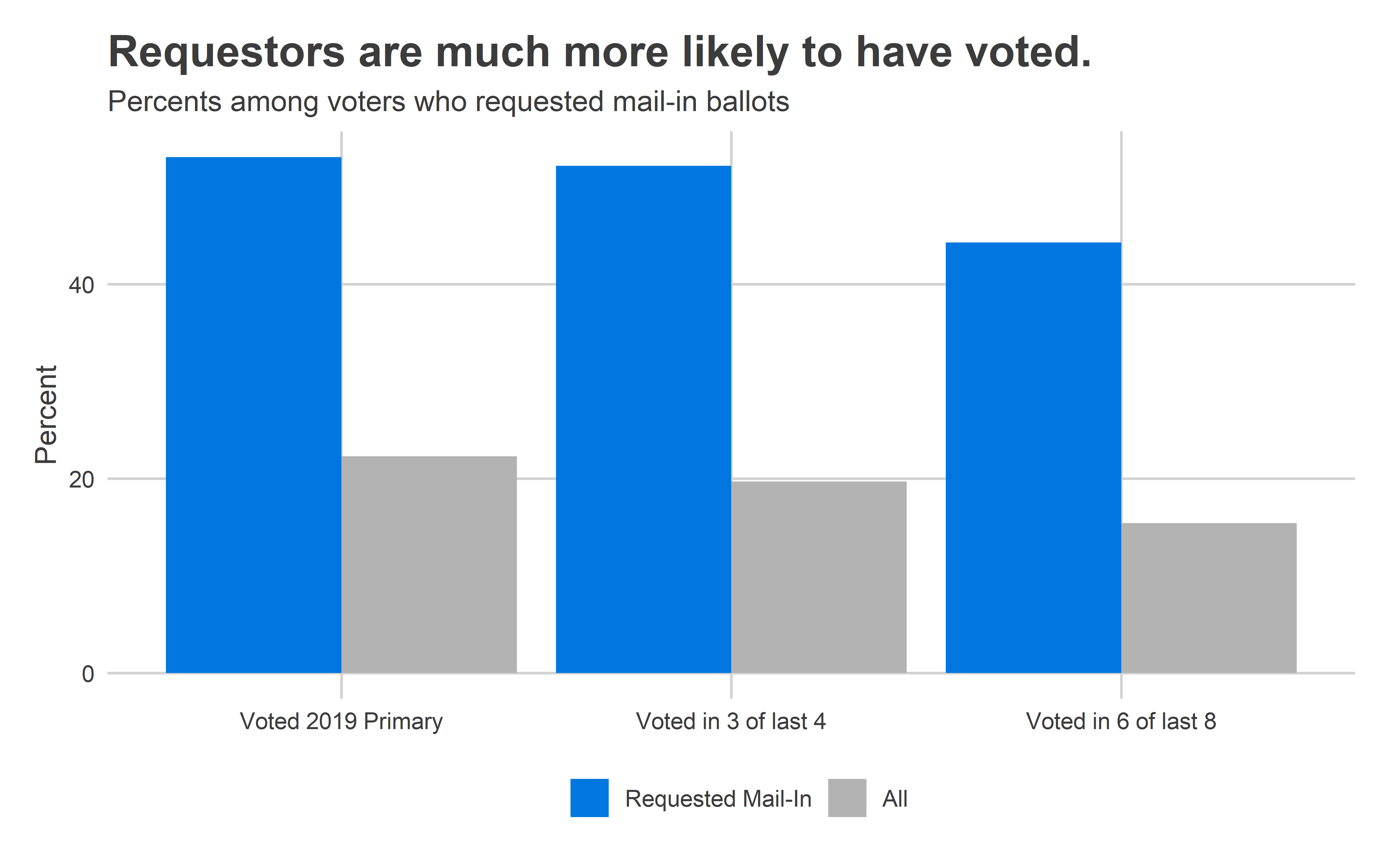
divs %<>% left_join(turnout_wide)These requestors are much more likely to have voted than a typical Philadelphian. A whopping 53% of them voted in the 2019 Primary (overall turnout among active voters was 24%). Some 52% of them voted in at least three of the last four elections, and 44% in six of the last eight (the number is presumably lower because of people who didn’t live in the state eight years ago).
View code
mail_in_v2e <- v2e %>%
  mutate(mail_in_reqd = voter_id %in% mail_in$`ID Number`) %>%
  inner_join(
    elections %>% filter(is_general | is_primary, year >= 2016) %>%
      select(election_date, year, fve_election_id)
  ) %>%
  group_by(voter_id, mail_in_reqd) %>%
  summarise(
    voted_2019 = !is.na(vote_method[election_date == "2019-05-21"]),
    voted_l4 = sum(!is.na(vote_method[year >= 2018])),
    voted_l8 = sum(!is.na(vote_method)),
    cnt = n()
  ) %>%
  group_by(mail_in_reqd) %>%
  summarise(
    voted_2019 = sum(voted_2019),
    voted_l4 = sum(voted_l4 >= 3),
    voted_l8 = sum(voted_l8 >= 6),
    cnt = n()
  )

mail_in_v2e <- bind_rows(
  mail_in_v2e %>% mutate(mail_in_reqd = ifelse(mail_in_reqd, "Requested Mail-In", "No Request")),
  mail_in_v2e %>% mutate(mail_in_reqd = "All") %>% group_by(mail_in_reqd) %>% summarise_all(sum)
)

ggplot(
  mail_in_v2e %>% filter(mail_in_reqd %in% c("Requested Mail-In", "All")) %>%
    mutate(mail_in_reqd = forcats::fct_inorder(mail_in_reqd)) %>%
    gather("key", "value", voted_2019, voted_l4, voted_l8) %>%
    mutate(
      key = case_when(
        key == "voted_2019" ~ "Voted 2019 Primary",
        key == "voted_l4" ~ "Voted in 3 of last 4",
        key == "voted_l8" ~ "Voted in 6 of last 8"
      )
    ),
  aes(x=key, y=100*value / cnt, fill=mail_in_reqd)
) +
  geom_bar(stat="identity", position="dodge") +
  theme_sixtysix() +
  scale_fill_manual(values = c(strong_blue, grey(0.70))) +
  labs(
    x = NULL,
    y = "Percent",
    fill = NULL,
    title = "Requestors are much more likely to have voted.",
    subtitle = "Percents among voters who requested mail-in ballots"
  )
By Age
The mail-in requests are coming disproportionately from younger voters. The cohort aged 30-40 made up only 15% of votes in the 2019 Primary, but over 23% of the requests so far.
View code
age_cuts <- c(18, seq(10, 120, 10))
fve_age <- fve %>%
  filter(voter_status == "A") %>%
  mutate(
    age = (lubridate::ymd("2020-06-02") - lubridate::ymd(dob)) / dyears(1),
    age_cat = cut(age, age_cuts)
  ) %>%
  group_by(age_cat) %>%
  summarise(n = n()) %>%
  ungroup() %>%
  mutate(prop = n / sum(n))

fve_age_2019 <- fve %>%
  inner_join(
    v2e %>%
      inner_join(elections %>% filter(election_date == "2019-05-21")) %>%
      filter(!is.na(vote_method))
  ) %>%
  mutate(
    age = (lubridate::ymd("2020-06-02") - lubridate::ymd(dob)) / dyears(1),
    age_cat = cut(age, age_cuts)
  ) %>%
  group_by(age_cat) %>%
  summarise(n = n()) %>%
  ungroup() %>%
  mutate(prop = n / sum(n))

mail_in_age <- mail_in %>%
  mutate(
    age = (lubridate::ymd("2020-06-02") - lubridate::ymd(dob)) / dyears(1),
    age_cat = cut(age, age_cuts)
  ) %>%
  group_by(age_cat) %>%
  summarise(n = n()) %>%
  ungroup() %>%
  mutate(prop = n / sum(n))

age_cats <- bind_rows(
  mail_in_age %>% mutate(source = "Mail-In Requests"),
  fve_age_2019 %>% mutate(source = "2019 Primary Voters"),
  fve_age %>% mutate(source = "Active Registered Voters")
) %>%
  mutate(source = forcats::fct_inorder(source))


ggplot(
  age_cats %>%
    filter(!is.na(age_cat), !age_cat %in% c("(0,10]","(100,110]","(110,120]")) %>%
    mutate(
      age_cat = droplevels(age_cat)
    ),
  aes(x = age_cat, y = 100 * prop, fill=source)
) + geom_bar(
  stat="identity",
  position="dodge"
) +
  theme_sixtysix() +
  labs(
    y="Percent of Total",
    x = "Age",
    fill = ""
  ) +
  scale_fill_manual(values = c(strong_blue, grey(0.70), grey(0.9))) +
  ggtitle("Voters under 40 are disproportionately requesting ballots")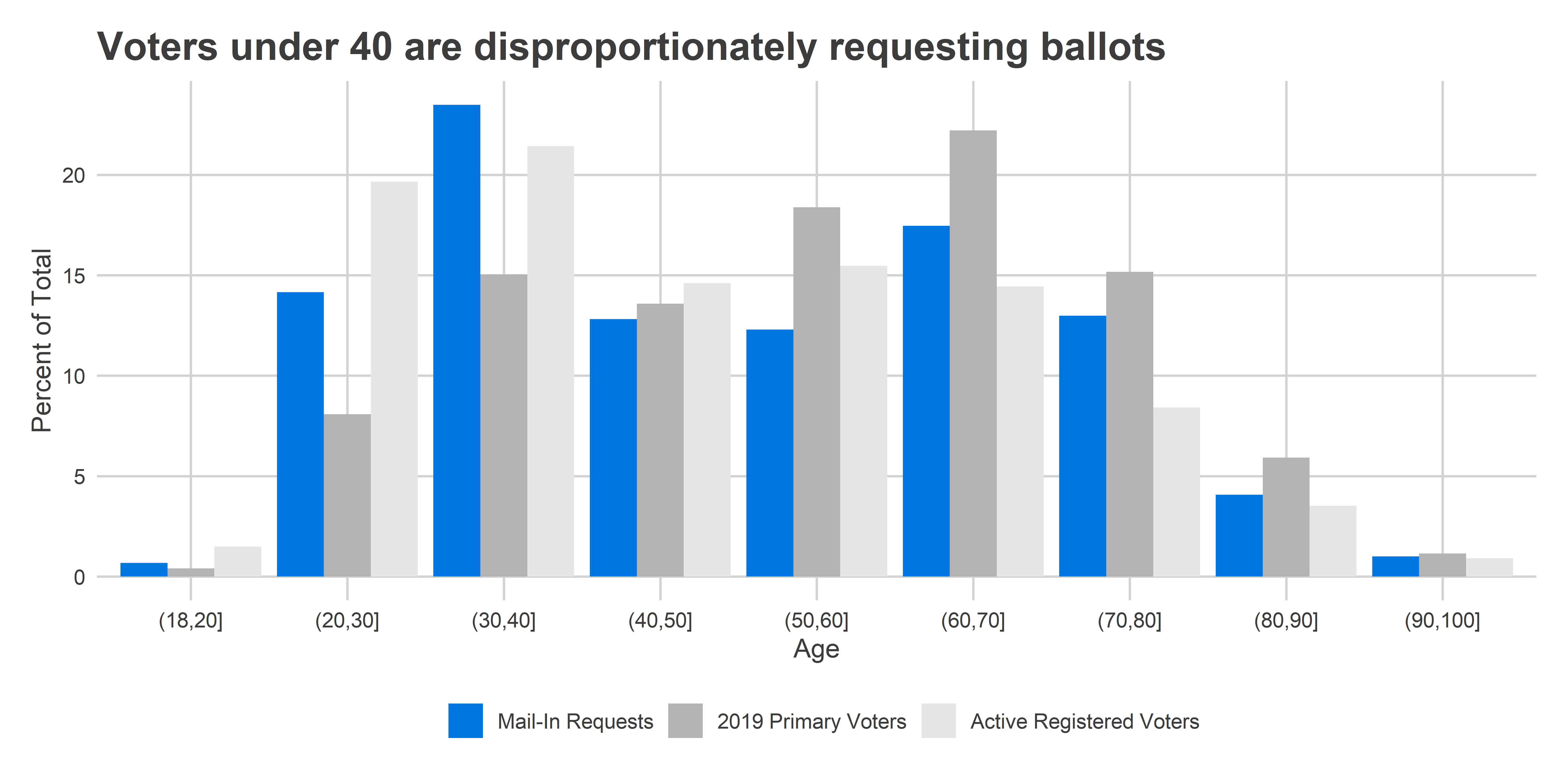
By Neighborhood
Geographically, the patterns are even starker. More than 13,000 of the requests came from the two Center City wards–5 and 8–alone.
[See the Appendix for Division-level maps.]
View code
library(leaflet)

make_leaflet <- function(
  sf,
  color_col,
  title,
  is_percent=FALSE,
  pal="viridis"
){
  zoom <- 11

  min_value <- min(sf[[color_col]], na.rm=TRUE)
  max_value <- max(sf[[color_col]], na.rm=TRUE)

  sigfig <- round(log10(max_value-min_value)) - 1
  step_size <- 2 * 10^(sigfig)

  min_value <- step_size * (min_value %/% step_size)
  max_value <- step_size * (max_value %/% step_size + 1)

  color_numeric <- colorNumeric(
    pal,
    domain=c(min_value, max_value)
  )

  legend_values <- seq(min_value, max_value, step_size)
  legend_colors <- color_numeric(legend_values)
  if(is_percent){
    legend_labels <- sprintf("%s%%", legend_values)
  } else{
    legend_labels <- scales::comma(legend_values)
  }

  bbox <- st_bbox(sf)

  leaflet(
    options=leafletOptions(
      minZoom=zoom,
      # maxZoom=zoom,
      zoomControl=TRUE
      # dragging=FALSE
    )
  )%>%
    addProviderTiles(providers$Stamen.TonerLite) %>%
    addPolygons(
      data=sf$geometry,
      weight=0,
      color="white",
      opacity=1,
      fillOpacity = 0.8,
      smoothFactor = 0,
      fillColor = color_numeric(sf[[color_col]]),
      popup=sf$popup
    ) %>%
    setMaxBounds(
      lng1=bbox["xmin"],
      lng2=bbox["xmax"],
      lat1=bbox["ymin"],
      lat2=bbox["ymax"]
    ) %>%
    addControl(title, position="topright", layerId="map_title") %>%
    addLegend(
      layerId="geom_legend",
      position="bottomright",
      colors=legend_colors,
      labels=legend_labels
    )
}

wards <- divs %>%
  mutate(ward = substr(warddiv, 1, 2)) %>%
  group_by(ward) %>%
  summarise_at(
    .funs=list(sum),
    .vars=vars(n_mail, n_reg, `2002_general`:`2019_primary`)
  )

wards %<>%
  mutate(
    popup = sprintf(
      paste(
        c(
          "<b>Ward %s</b>",
          "Active Registered Voters: %s",
          "Mail-In Requests: %s",
          "Votes in the 2019 Primary: %s",
          "Votes in the 2016 Primary: %s"
        ),
        collapse = "<br>"
      ),
      ward,
      scales::comma(n_reg),
      scales::comma(n_mail),
      scales::comma(round(`2019_primary`)),
      scales::comma(round(`2016_primary`))
    )
  )

wards$color_mail <- wards$n_mail
wards_mail <- make_leaflet(
  wards,
  "color_mail",
  "Number of Mail-In Requests"
)
library(widgetframe)
knitr::opts_chunk$set(widgetframe_self_contained = TRUE)
frameWidget(wards_mail)
As a percent of all voters, Center City, the wealthy ring around it, and Mount Airy/Chestnut Hill stand out. These Wards make up what I’ve dubbed the Wealthy Progressives.
View code
wards$color_mail_vs_reg <- 100 * wards$n_mail / wards$n_reg
mail_reg <- make_leaflet(
  wards,
  "color_mail_vs_reg",
  "Mail-In Requests as % of Active Registered Voters",
  is_percent=TRUE
)
knitr::opts_chunk$set(widgetframe_self_contained = TRUE)
frameWidget(mail_reg)
View code
wards$color_mail_vs_2019 <- 100 * wards$n_mail / wards$`2019_primary`
mail_2019 <- make_leaflet(
  wards,
  "color_mail_vs_2019",
  "Mail-in requests as % of 2019 Primary voters",
  is_percent=TRUE
)
knitr::opts_chunk$set(widgetframe_self_contained = TRUE)
frameWidget(mail_2019)
In fact, aggregating by those Division Cohorts paints a stark picture.
View code
div_cats <- readRDS("../../data/processed_data/div_cats_20200411.RDS")
divs %<>% left_join(div_cats %>% select(warddiv, cat))
cat_colors <- c(
  "Black Voters" = light_blue,
  "Wealthy Progressives" = light_red,
  "White Moderates" = light_orange,
  "Hispanic North Philly" = light_green
)

div_cats <- divs %>%
  as.data.frame() %>%
  select(-geometry) %>%
  group_by(cat) %>%
  summarise_at(
    .funs=list(sum),
    .vars=vars(n_mail, n_reg, `2002_general`:`2019_primary`)
  ) %>%
  ungroup()

ggplot(
  div_cats,
  aes(x = cat, y = n_reg, fill=cat)
) + geom_bar(
  stat="identity",
  position="dodge"
) +
  theme_sixtysix() + # %+replace% theme(axis.text.x = element_blank())+
  scale_y_continuous(labels=scales::comma) +
  labs(
    y=NULL,
    x = NULL,
    fill = "",
    title="Black Voter Divisions represent nearly half of Active Voters",
    subtitle="Active Registered Voters"
  ) +
  scale_fill_manual(values = cat_colors, guide=FALSE)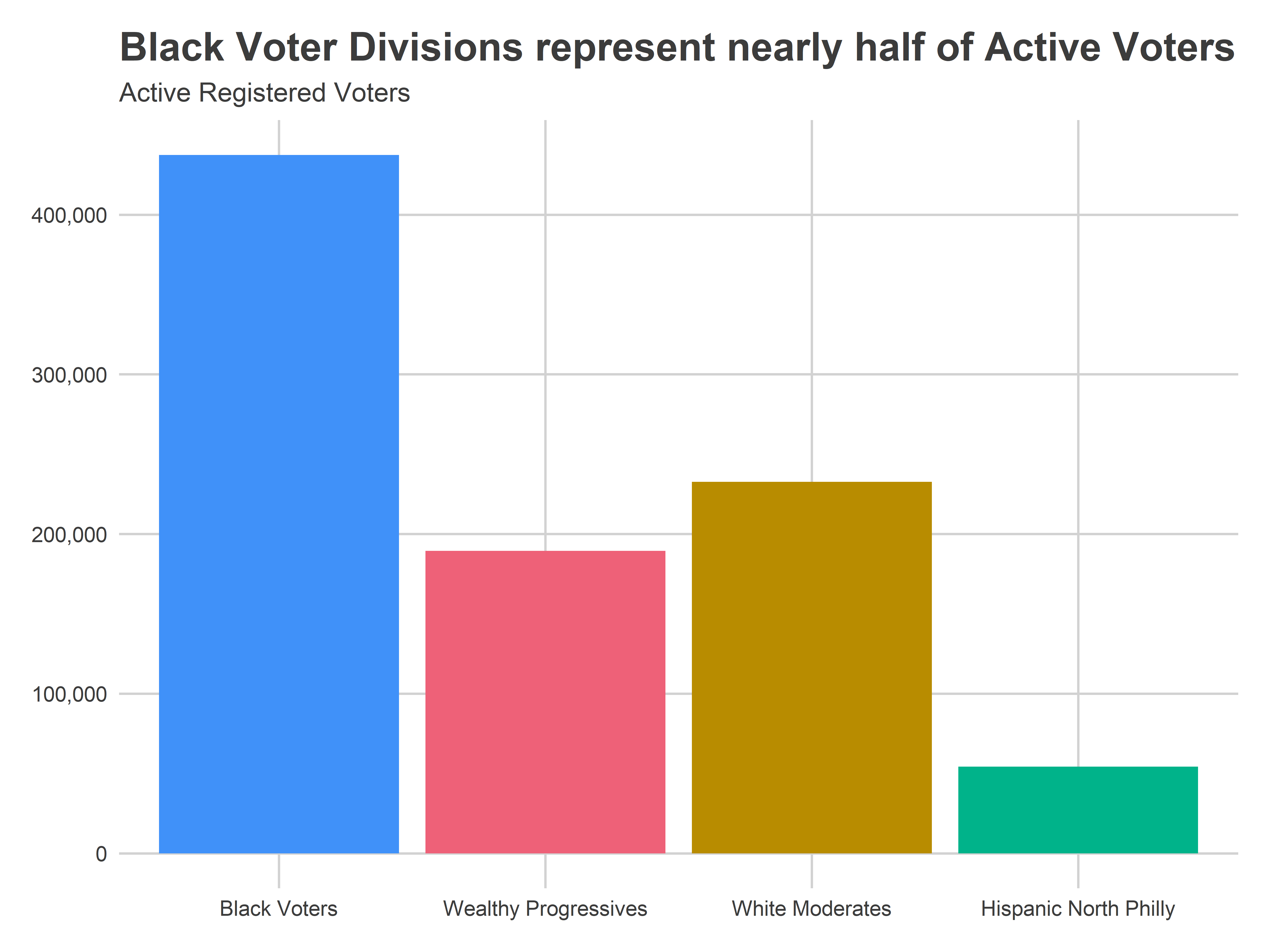
View code
ggplot(
  div_cats %>%
    mutate(prop_mail = n_mail / n_reg),
  aes(x = cat, y = 100 * prop_mail, fill=cat)
) + geom_bar(
  stat="identity",
  position="dodge"
) +
  theme_sixtysix() %+replace% theme(title = element_text(size = 10)) +
  labs(
    y=NULL,
    x = NULL,
    fill = "",
    title="But Wealthy Progressive Divisions have the most mail-in requests",
    subtitle="Mail-in requests as a percent of active registered voters"
  ) +
  scale_fill_manual(values = cat_colors, guide=FALSE)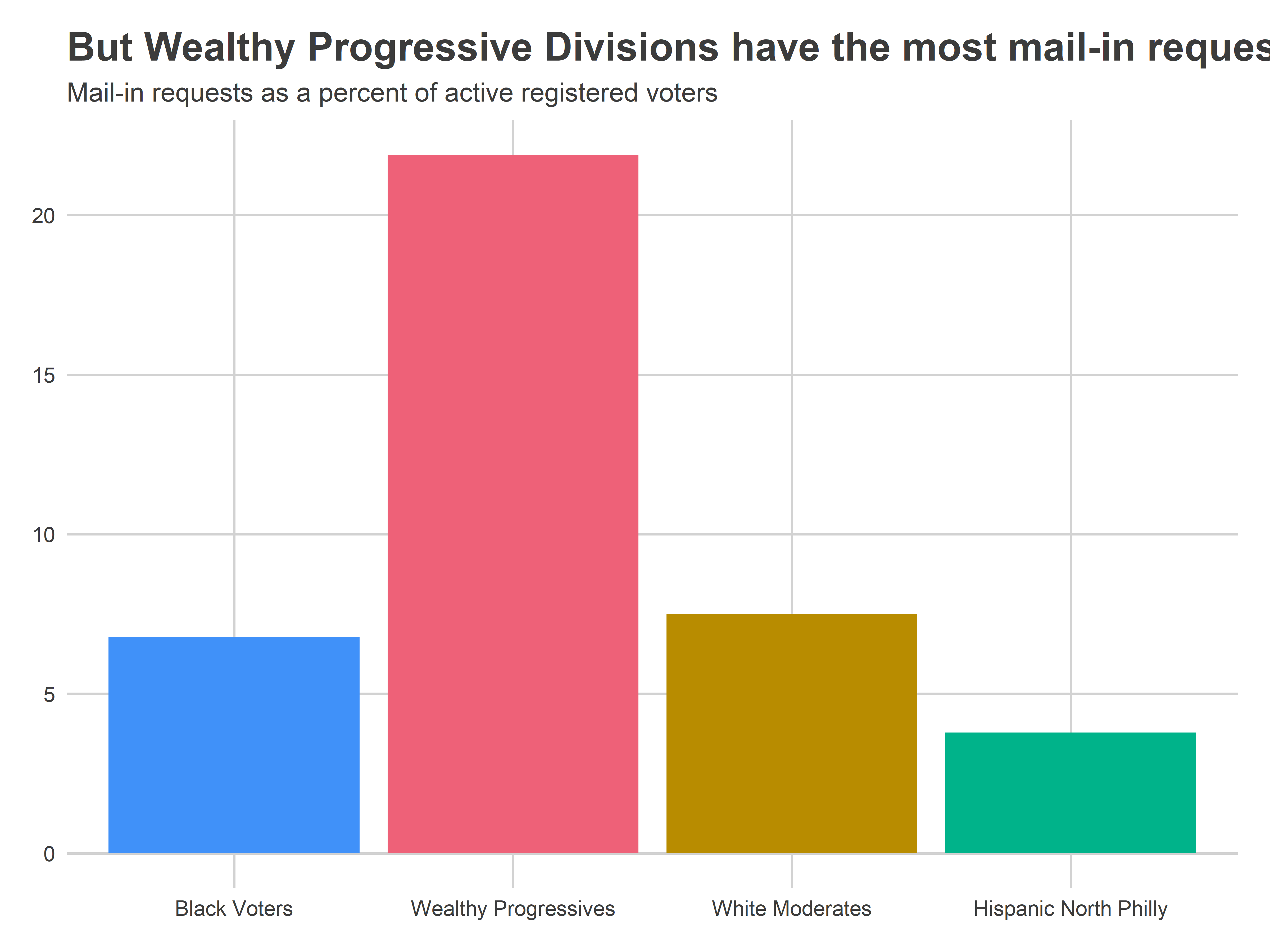
View code
ggplot(
  div_cats %>%
    mutate(prop_2019 = n_mail / `2019_primary`),
  aes(x = cat, y = 100 * prop_2019, fill=cat)
) + geom_bar(
  stat="identity",
  position="dodge"
) +
  theme_sixtysix() + # %+replace% theme(axis.text.x = element_blank())+
  labs(
    y=NULL,
    x = NULL,
    fill = "",
    title="Mail-in requests as percent of 2019 Primary turnout",
    subtitle="Requests from Wealthy Progressive Divisions are nearly 80% of their 2019 turnout."
  ) +
  scale_fill_manual(values = cat_colors, guide=FALSE)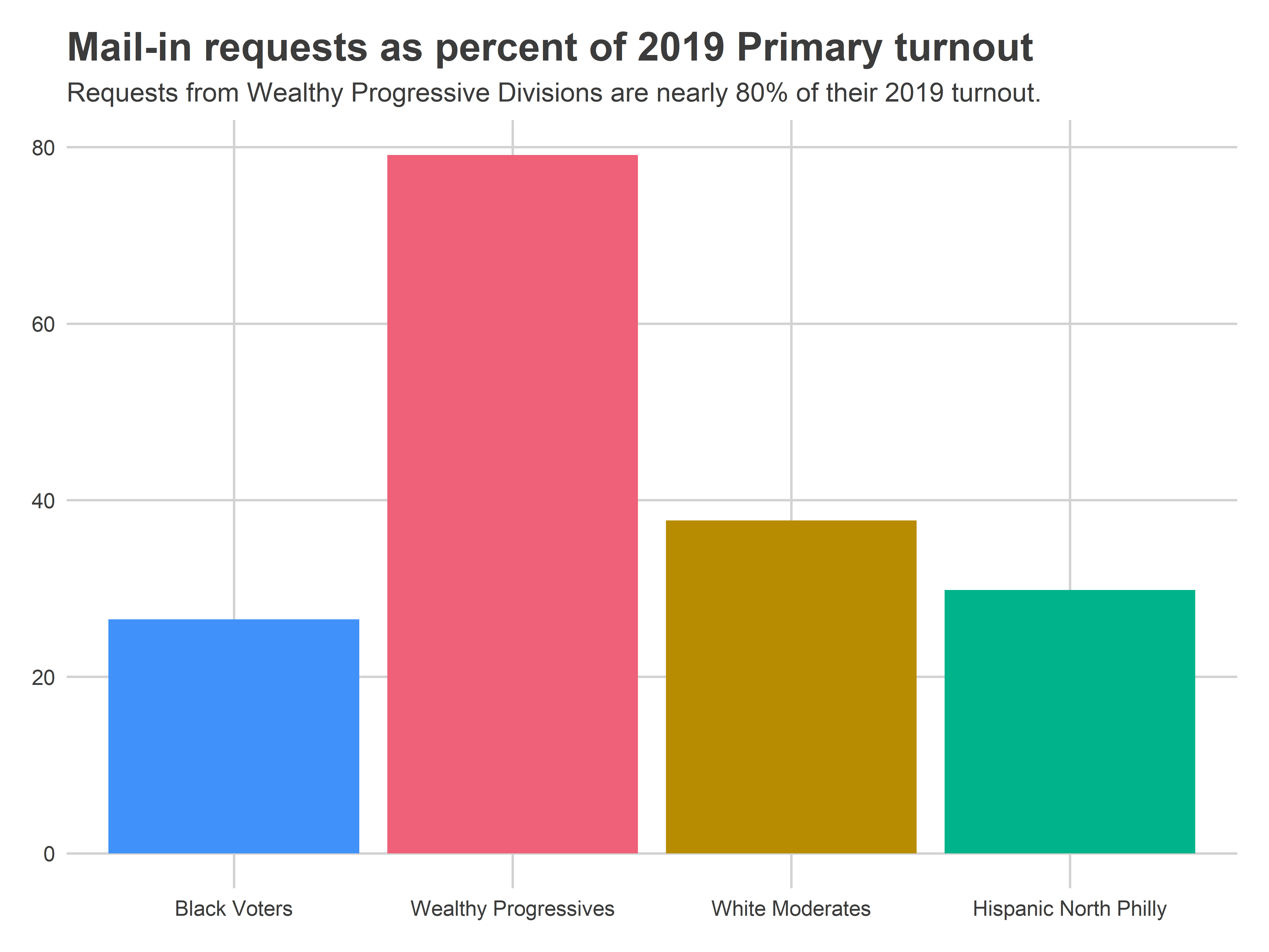
What this means for the election
Since we’ve never had mail-in voting before and it’s been over 100 years since the last pandemic, it’s impossible to know what this means for total turnout in June.
Two things are possible:
These mail-in percents represent the actual turnout. Voters decide not to vote in person, and Wealthy Progressives vastly over-represent the electorate.
Voters that aren’t requesting mail-in ballots are just planning to vote in person, and the gap totally closes on Election Day. The city-wide turnout looks normal.
Probably, the outcome will be somewhere in between. What does that mean for PA-1 and other local races? Coming soon!
Appendix: Division Maps
View code
divs %<>%
  mutate(
    popup = sprintf(
      paste(
        c(
          "<b>Division %s</b>",
          "Active registered voters: %s",
          "Mail-in requests: %s",
          "Votes in the 2019 Primary: %s",
          "Votes in the 2016 Primary: %s"
        ),
        collapse = "<br>"
      ),
      warddiv,
      scales::comma(n_reg),
      scales::comma(n_mail),
      scales::comma(round(`2019_primary`)),
      scales::comma(round(`2016_primary`))
    )
  )


divs$color_mail <- divs$n_mail
div_color_mail <- make_leaflet(
  divs,
  "color_mail",
  "Number of mail-in requests"
)
knitr::opts_chunk$set(widgetframe_self_contained = TRUE)
frameWidget(div_color_mail)
View code
divs$color_mail_vs_reg <- 100 * divs$n_mail / divs$n_reg
l0 <- make_leaflet(
  divs,
  "color_mail_vs_reg",
  "Mail-in requests as % of active registered voters",
  is_percent=TRUE
)
knitr::opts_chunk$set(widgetframe_self_contained = TRUE)
frameWidget(l0)
View code
divs$color_mail_vs_2019 <- 100 * divs$n_mail / divs$`2019_primary`
l1 <- make_leaflet(
  divs,
  "color_mail_vs_2019",
  "Mail-in requests as % of 2019 Primary voters",
  is_percent=TRUE
)
knitr::opts_chunk$set(widgetframe_self_contained = TRUE)
frameWidget(l1)
View code
divs$color_mail_vs_2016 <- 100 * divs$n_mail / divs$`2016_primary`
l2 <- make_leaflet(
  divs,
  "color_mail_vs_2016",
  "Mail-in requests as % of 2016 Primary voters",
  is_percent=TRUE
)
knitr::opts_chunk$set(widgetframe_self_contained = TRUE)
frameWidget(l2)