With the release of 2020’s Census data, redistricting will kick into gear. While boundaries for both the US Congress and State Senate and House will be redrawn, I thought I’d start close to home: City Council.
Philadelphia’s City Council consists of 17 seats, 10 of which are districted and the rest At Large. For the drawing of those 10 districts, the primary restriction imposed by the Charter is that they must have relatively equal populations. This has been implemented as each district being within 5% of one tenth of the city’s total population. Council has six months from the release of the data to produce maps, which would put the deadline at March 12, though that might depend on resolution of the allocation of incarcerated people.
I’ll use my jaywalkr library to crosswalk the data.
Methodological Note: I haven’t adapted the crosswalking for the Census’ Differential Privacy. It shouldn’t make a huge difference when aggregated to council districts. For the later analyses, I’ll use Block Groups which are less affected than Blocks.
View code
library(sf)
library(dplyr)
library(ggplot2)
library(readr)
library(tidyr)
devtools::load_all("../../admin_scripts/sixtysix/")

bgs <- st_read("../../data/gis/census/tl_2020_42_bg/tl_2020_42_bg.shp", quiet=TRUE) %>%
  filter(COUNTYFP == "101")

council <- st_read("../../data/gis/city_council/Council_Districts_2016.shp", quiet=TRUE)
council <- st_transform(council, st_crs(bgs))

blocks <- st_read(
  "../../data/gis/census/tl_2020_42101_tabblock/tl_2020_42101_tabblock20.shp",
  quiet=TRUE
)

block_pops <- read_csv(
  "../../data/census/decennial_2020_poprace_phila_blocks/DECENNIALPL2020.P4_data_with_overlays_2021-09-22T083940.csv",
  skip=1
)

block_pops <- block_pops %>% rename(total_pop = `!!Total:`) %>% select(id, total_pop)
block_pops <- block_pops %>% mutate(GEOID20 = substr(id, 10, 25))

blocks <- blocks %>% left_join(block_pops, by="GEOID20")
block_centroids <- st_centroid(blocks) %>% filter(total_pop > 0)

bg_pops <- read_csv(
  "../../data/census/decennial_2020_poprace_phila_bg/DECENNIALPL2020.P2_data_with_overlays_2021-09-21T090431.csv",
  skip=1
) %>%
  mutate(GEOID = substr(id, 10, 25))

bg_pops <- bg_pops %>%
  mutate(
    total_pop = `!!Total:`,
    hispanic = `!!Total:!!Hispanic or Latino`,
    black = `!!Total:!!Not Hispanic or Latino:!!Population of one race:!!Black or African American alone`,
    white = `!!Total:!!Not Hispanic or Latino:!!Population of one race:!!White alone`,
    asian = `!!Total:!!Not Hispanic or Latino:!!Population of one race:!!Asian alone`
  ) %>%
  select(GEOID, total_pop:asian)

# table(is.na(blocks$total_pop))

divs <- st_read("../../data/gis/warddivs/202011/Political_Divisions.shp", quiet=TRUE) %>%
  st_transform(st_crs(bgs)) %>%
  mutate(warddiv=pretty_div(DIVISION_N))

devtools::load_all("../../admin_scripts/libs/jaywalkr/")

div_bg_cw <- crosswalk_geoms(
  divs$geometry,
  bgs$geometry,
  block_centroids$geometry,
  block_centroids$total_pop,
  divs$warddiv,
  bgs$GEOID,
  allow_unmatched_weights = "distance",
  verbose=FALSE
)

df_major <- readRDS("../../data/processed_data/df_major_20210118.Rds")
df_major <- df_major %>% mutate(candidate=factor(candidate))
levels(df_major$candidate) <- format_name(levels(df_major$candidate))
df_major$candidate <- as.character(df_major$candidate)

bg_votes <- df_major %>%
  filter(year == 2019, election_type=="primary", office =="MAYOR") %>%
  group_by(warddiv) %>%
  summarise(votes=sum(votes)) %>%
  left_join(div_bg_cw, by=c("warddiv" = "geom.id.x")) %>%
  group_by(geom.id.y) %>%
  summarise(votes = sum(votes * from_x_to_y, na.rm=TRUE))

bgs <- bgs %>% left_join(bg_pops) %>% left_join(bg_votes, by=c("GEOID" = "geom.id.y"))

bg_council_cw <- crosswalk_geoms(
  bgs$geometry,
  council$geometry,
  weight_pts=block_centroids$geometry,
  weights=block_centroids$total_pop,
  x_id=bgs$GEOID,
  y_id=as.character(council$DISTRICT),
  allow_unmatched_weights = "distance",
  verbose=FALSE
)

div_council_cw <- crosswalk_geoms(
  divs$geometry,
  council$geometry,
  weight_pts=block_centroids$geometry,
  weights=block_centroids$total_pop,
  x_id=divs$warddiv,
  y_id=as.character(council$DISTRICT),
  allow_unmatched_weights = "distance",
  verbose=FALSE
)

council_pops <- as.data.frame(bgs) %>%
  filter(total_pop > 0) %>%
  left_join(bg_council_cw, by=c("GEOID"="geom.id.x")) %>%
  group_by(geom.id.y) %>%
  summarise(
    across(
      total_pop:asian,
      function(x) sum(x * from_x_to_y, na.rm=TRUE),
      .names="{.col}_sum"
    ),
    across(
      total_pop:asian,
      function(x) sum(x * from_x_to_y^2 * votes, na.rm=TRUE),
      .names="{.col}_vote_weighted"
    ),
    total_votes = sum(votes)
  ) %>%
  mutate(
    across(
      hispanic_vote_weighted:asian_vote_weighted,
      function(x) x/total_pop_vote_weighted,
      .names="p_{.col}"
    ),
    across(
      hispanic_sum:asian_sum,
      function(x) x/total_pop_sum,
      .names="p_{.col}"
    )
  )

council <- council %>%
  left_join(council_pops, by=c("DISTRICT"="geom.id.y"))

council <- council %>%
  mutate(
    across(
      hispanic_sum:asian_sum,
      function(x) x / total_pop_sum,
      .names="p_{.col}"
    )
  )
TARGET_POP = sum(bg_pops$total_pop)/10
library(scales)
pct <- function(x, digits=0){
paste0(round(100*x, digits=digits), "%")
}
color_text <- function(pop, target){
color <- ifelse(
pop > target,
colors_sixtysix()$strong_blue,
colors_sixtysix()$strong_red
)
sprintf(
'<span style="color:%s">%s (%s) %s target</span>',
color,
comma(abs(pop - target)),
pct(abs(pop - target)/target),
ifelse(pop > target, "over", "under")
)
}
council <- council %>%
mutate(
popup=glue::glue(
"<b>District {DISTRICT}</b><br>
2020 Pop: {comma(total_pop_sum)}<br>
{color_text(total_pop_sum, TARGET_POP)}<br>
% NH Black: {pct(p_black_sum)}<br>
% NH White: {pct(p_white_sum)}<br>
% Hispanic: {pct(p_hispanic_sum)} <br>
% Asian: {pct(p_asian_sum)} <br>"
)
)
lf_pops <- make_leaflet(
df=council,
fill_col="total_pop_sum",
popup_col = "popup",
zoom=11,
pal_type = "divergent",
midpoint=TARGET_POP
) %>%
addLabelOnlyMarkers(
data=council$geometry %>% st_centroid() %>% st_coordinates() %>% as.data.frame(),
lng=~X,
lat=~Y,
label=council$DISTRICT,
labelOptions=labelOptions(permanent=TRUE, textOnly=TRUE, textsize="16px", style=list(fontWeight="bold"))
) %>%
addPolygons(data=council, fill=FALSE, color="white", opacity = 1.0, weight = 2)
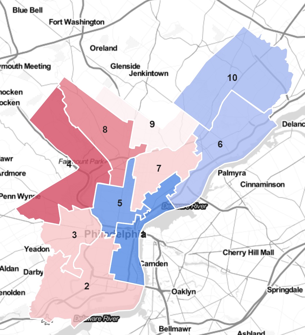
cat(render_iframe(lf_pops))Four districts are too populous, with Districts 1 and 5 above the 5% margin. The Northwest’s 4 and 8 are below the target by more than 5%.
The existing districts are relatively well representative of Philadelphia’s racial composition. Four districts are predominantly Black, two predominantly White, and one predominantly Hispanic. Of the three without a racial majority, North Philly’s District 5 is 41% Black and 38% White, South Philly’s 2 is 41% White and 39% Black, and the River Wards’ 6 is 46% White, 20% Hispanic, and 18% Black.
View code
council_long <- council %>%
as.data.frame() %>%
tidyr::pivot_longer(
p_hispanic_sum:p_asian_sum,
names_to="race",
names_pattern = "p_([a-z]+)_sum",
values_to = "prop"
) %>%
mutate(race=format_name(race))
overall_demo <- council_long %>%
group_by(race) %>%
summarise(prop = weighted.mean(prop, w=total_pop_sum))
binwidth <- 5
breaks <- seq(0, 100, binwidth)
council_long$bin <- as.numeric(cut(100*council_long$prop, breaks)) * binwidth - binwidth/2
save_and_render_image <- function(gg, file=NULL, hover="", ...){
DIR <- "images"
if(!dir.exists(DIR)) dir.create(DIR)
if(is.null(file)){
obj.name <- deparse(substitute(gg))
file <- sprintf("%s.png", obj.name)
}
path <- paste0(DIR,"/", file)
ggsave(filename=path, plot=gg, ...)
sprintf("", hover, path)
}
source("../../admin_scripts/sixtysix/R/theme_sixtysix.R")
bar_demo_overall <- ggplot(council_long, aes(x = bin, y=1)) +
geom_bar(stat = "identity", colour = "black", width = 5, fill="grey80") +
geom_text(aes(label=DISTRICT),
position=position_stack(vjust=0.5), colour="black") +
facet_wrap(~race) +
geom_vline(
data=overall_demo,
linetype="dashed",
aes(xintercept=100*prop)
) +
geom_vline(
xintercept=50, color=grey(0.4)
) +
theme_sixtysix() +
scale_x_continuous(breaks=seq(0,100,10)) +
labs(
title="Council District Demographics",
subtitle="Dashed lines are Philadelphia's overall demographics",
x="Percent of Demographic",
y="Number of Districts"
)
cat(save_and_render_image(bar_demo_overall))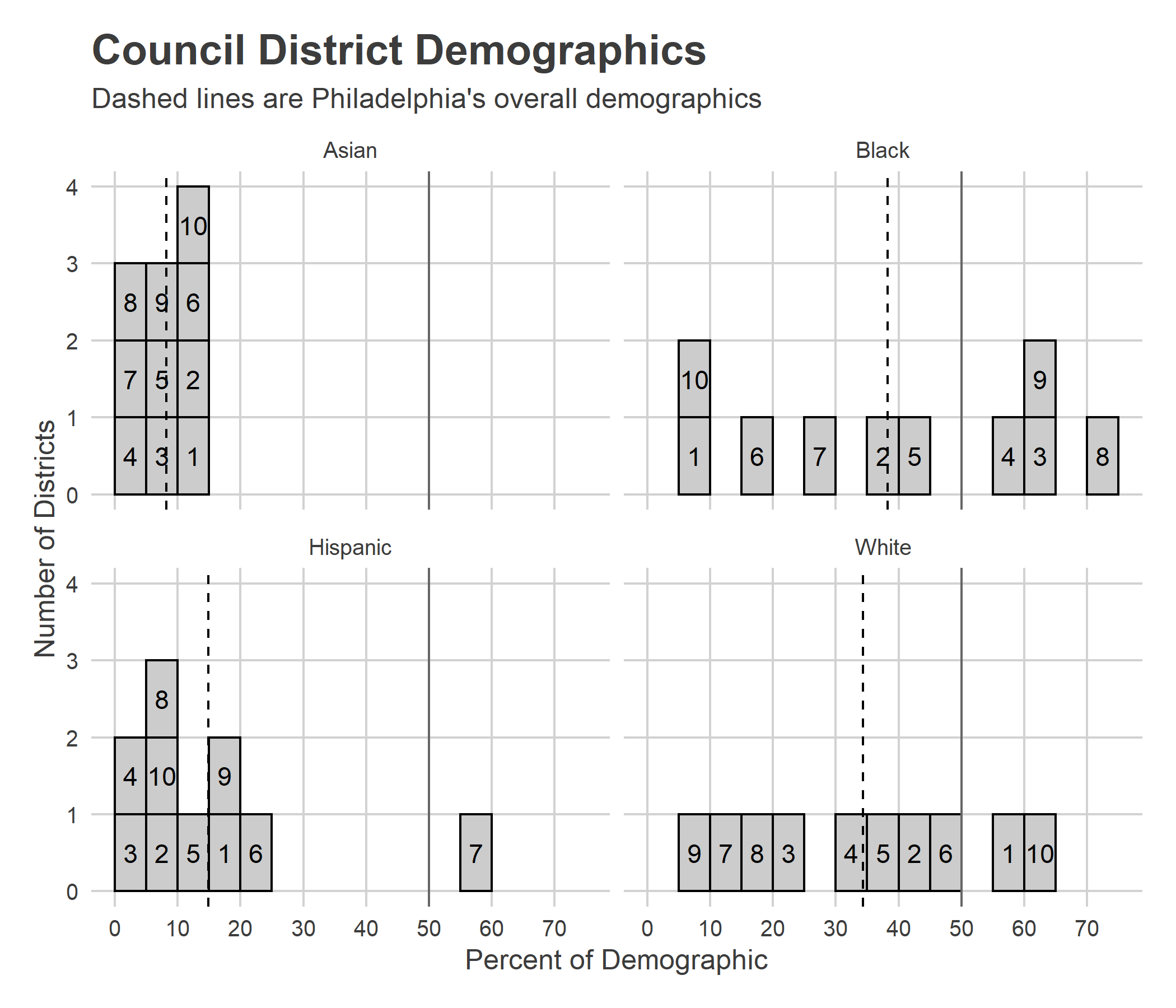
Weighting Block Groups’ demographics by votes (I’ll use the 2019 Mayoral Primary) doesn’t change the topline much, but does switch some orders: it makes District 2 46% White, 34% Black; District 5 43% White, 37% Black; and pushes District 6 to a majority 52% White.
View code
# council %>%
#   select(DISTRICT, p_white_sum, p_white_vote_weighted, p_black_sum, p_black_vote_weighted, p_hispanic_sum, p_hispanic_vote_weighted)
get_election_df <- function(filtered_df_major){
get_popup <- function(office, year, election_type, candidate, votes, pvote){
res <- glue::glue("{format_name(office[1])} {year[1]} {format_name(election_type[1])}")
order <- order(votes, decreasing=TRUE)
order <- order[order %in% which(votes>0)]
lines <- glue::glue("{candidate[order]}: {comma(votes[order])} ({pct(pvote[order])})")
res <- paste(c(res, lines), collapse="<br>")
}
winner_df <- filtered_df_major %>%
group_by(warddiv, year, election_type, office) %>%
mutate(
rank = rank(desc(votes)),
pvote=votes/sum(votes)
) %>%
summarise(
winner = candidate[rank==1],
pvote_winner=pvote[rank==1],
total_votes=sum(votes),
popup=get_popup(office, year, election_type, candidate, votes, pvote),
.groups="drop"
)
wide_df <- filtered_df_major %>%
select(warddiv, year, election_type, office, candidate, votes) %>%
group_by(warddiv) %>%
mutate(pvote = votes/sum(votes)) %>%
ungroup() %>%
pivot_wider(names_from = candidate, values_from=c(votes, pvote))
winner_df %>% left_join(wide_df)
}
pres_16 <- df_major %>%
filter(
year == 2016,
election_type=="primary",
party=="DEMOCRATIC",
office=="PRESIDENT OF THE UNITED STATES"
) %>%
get_election_df()
da_17 <- df_major %>%
filter(
year == 2017,
election_type=="primary",
party=="DEMOCRATIC",
office=="DISTRICT ATTORNEY"
) %>%
get_election_df()
get_winner_color <- function(election_df){
candidates <- election_df %>%
filter(!is.na(winner)) %>%
group_by(winner) %>%
count() %>%
arrange(desc(n)) %>%
with(winner)
colors <- with(
colors_sixtysix(),
c(
strong_blue, strong_orange, strong_purple,
strong_green, strong_red, light_yellow,
strong_grey, strong_grey
)[1:length(candidates)]
)
names(colors) <- candidates
colors
}To understand the local political dynamics in the districts, consider two recent Democratic Primaries that split the city: the 2016 Presidential and the 2017 District Attorney Primaries.
View code
council_pres <- pres_16 %>% left_join(div_council_cw, by=c("warddiv"="geom.id.x")) %>%
  pivot_longer(starts_with("votes_"), names_pattern = "^votes_(.*)$", values_to="votes") %>%
  group_by(geom.id.y, name) %>%
  summarise(votes=sum(votes)) %>%
  filter(name %in% c("Bernie Sanders", "Hillary Clinton")) %>%
  group_by(geom.id.y) %>%
  mutate(pvote=votes/sum(votes)) %>%
  filter(name %in% c("Bernie Sanders"))

binwidth <- 5
breaks <- seq(0, 100, binwidth)
council_pres$bin <- as.numeric(cut(100*council_pres$pvote, breaks)) * binwidth - binwidth/2

pres_bar <- ggplot(council_pres, aes(x = bin, y=1)) +
  geom_bar(stat = "identity", colour = "black", width = 5, fill="grey80") +
  geom_text(aes(label=geom.id.y),
   position=position_stack(vjust=0.5), colour="black") +
  theme_sixtysix() +
  expand_limits(x=c(0,100)) +
  labs(
    title="Council District 2016 Primary Results",
    x="Two-way Percent for Bernie Sanders",
    y="Count of Districts"
  )
cat(save_and_render_image(pres_bar))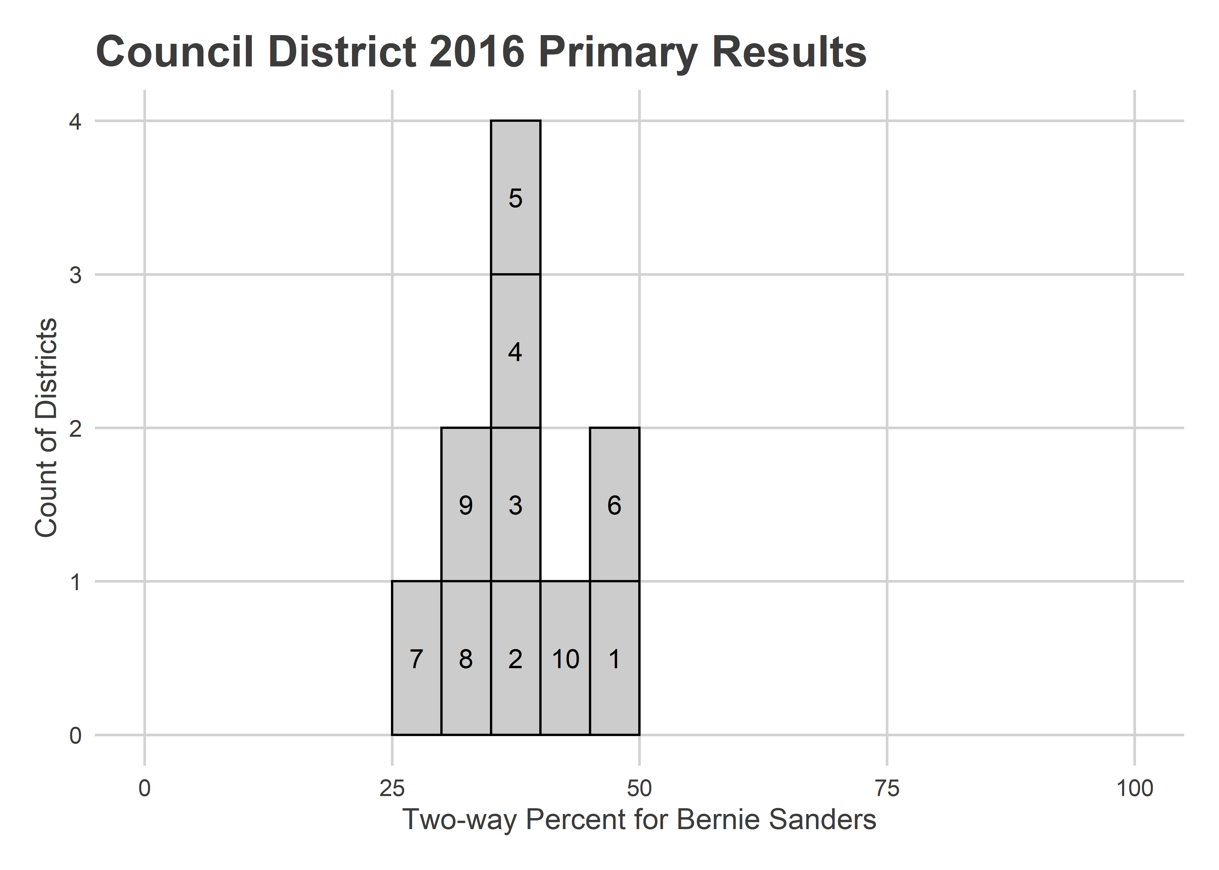
Sanders won no district overall in 2016, but came close in Districts 1, 6, and 10. Interestingly, District 3 combines his best neighborhoods in University City with some of Clinton’s best in farther West Philly.
View code
council_da <- da_17 %>% left_join(div_council_cw, by=c("warddiv"="geom.id.x")) %>%
pivot_longer(starts_with("votes_"), names_pattern = "^votes_(.*)$", values_to="votes") %>%
group_by(geom.id.y, name) %>%
summarise(votes=sum(votes)) %>%
group_by(geom.id.y) %>%
mutate(pvote=votes/sum(votes)) %>%
filter(name %in% c("Lawrence S Krasner"))
binwidth <- 5
breaks <- seq(0, 100, binwidth)
council_da$bin <- as.numeric(cut(100*council_da$pvote, breaks)) * binwidth - binwidth/2
bar_da <- ggplot(council_da, aes(x = bin, y=1)) +
geom_bar(stat = "identity", colour = "black", width = binwidth, fill="grey80") +
geom_text(aes(label=geom.id.y),
position=position_stack(vjust=0.5), colour="black") +
theme_sixtysix() +
expand_limits(x=c(0,100)) +
labs(
title="Council District 2017 Primary Results",
x="Overall Percent for Larry Krasner",
y="Count of Districts"
)
cat(save_and_render_image(bar_da))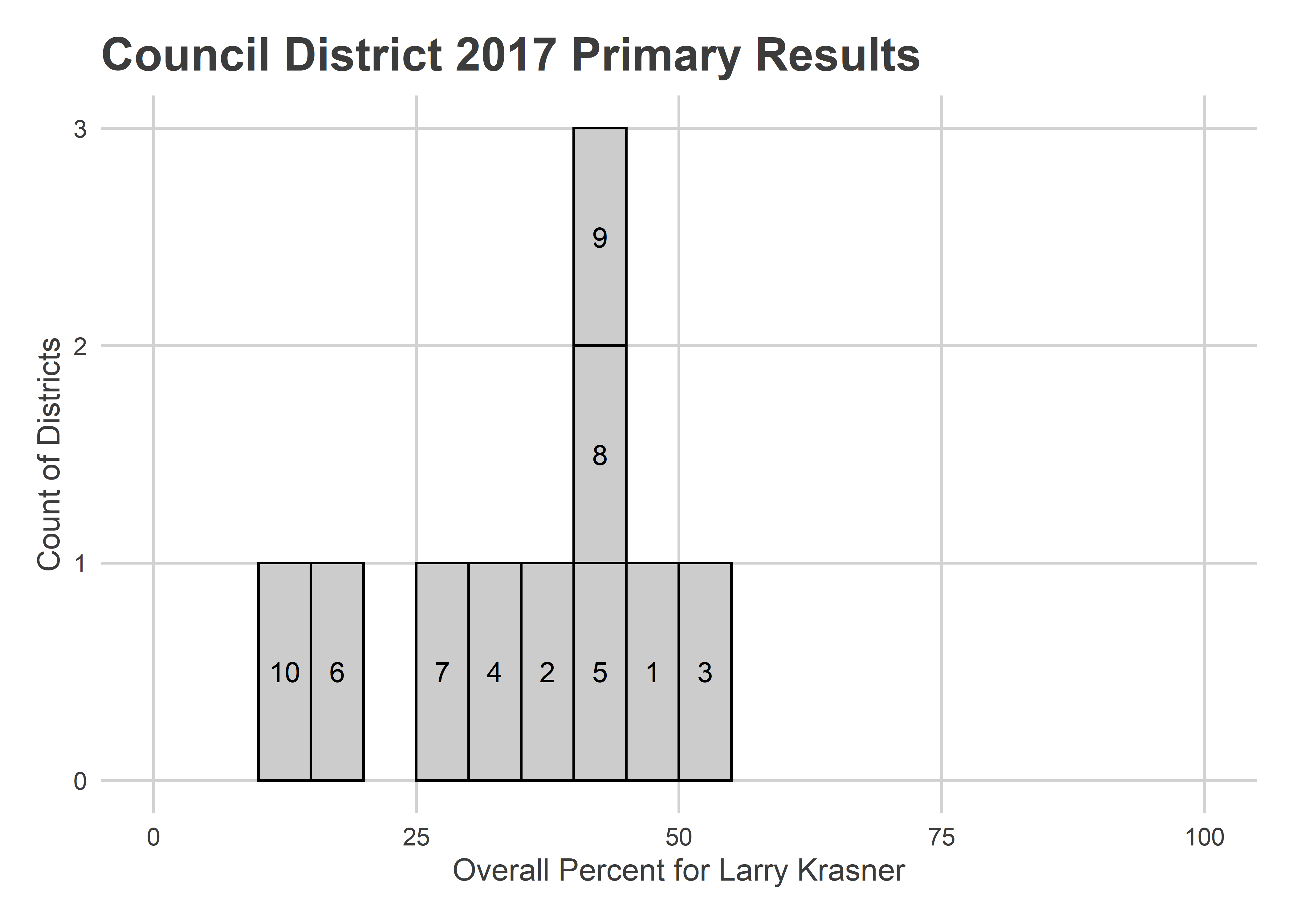 D.A. in 2017 was a many-candidate race, so breaking 50% in any district was a feat. Krasner did just that in District 3, and came close in 1, 5, 8, and 9.
View code
init_district_leaflet <- function(district){
  bbox <- st_bbox(
    council %>% filter(as.character(DISTRICT) == !!district) %>%
      with(st_as_sfc(st_as_binary(geometry)))
  )
  leaflet() %>%
    setView(
      zoom=12,
      lng=mean(bbox[c(1,3)]),
      lat=mean(bbox[c(2,4)])
    ) %>%
    addProviderTiles(providers$Stamen.TonerLite) %>%
    setMaxBounds(
      lng1=bbox["xmin"],
      lng2=bbox["xmax"],
      lat1=bbox["ymin"],
      lat2=bbox["ymax"]
    )
}


map_election <- function(election_df, district, title){

  div_df <- divs %>% left_join(election_df)

  div_df <- div_df %>%
    mutate(
      popup = glue::glue(
        "<b>Division {warddiv}</b><br>{popup}"
      )
    )

  colors <- get_winner_color(election_df)
  winner_fill <- colors[as.character(div_df$winner)]

  # alpha <- div_df$pvote_winner
  # alpha <- alpha / max(alpha, na.rm=TRUE)
  # alpha[is.na(alpha)] <- mean(alpha, na.rm=TRUE)

  alpha <- div_df$total_votes / st_area(div_df$geometry)
  cutoff <- quantile(alpha[!is.na(alpha)], 0.9)
  alpha <- pmin(alpha, cutoff)
  alpha <- alpha / max(alpha, na.rm=TRUE)
  alpha <- 0.1 + 0.9 * as.numeric(alpha)
  alpha[is.na(alpha)] <- mean(alpha, na.rm=TRUE)

  winner_fill[is.na(winner_fill)] <- grey(0.5)
  RGB = colorspace::hex2RGB(winner_fill)@coords
  fill <- rgb(RGB[,1], RGB[,2], RGB[,3], alpha)

  init_district_leaflet(district) %>%
    leaflet::addPolygons(
      data=div_df,
      weight=0,
      color="white",
      opacity=1,
      fillOpacity = 0.8,
      smoothFactor = 0,
      fillColor = fill,
      popup=div_df$popup
    ) %>%
    leaflet::addPolygons(
      data=council %>% filter(DISTRICT == !!district),
      weight = 4,
      fill=FALSE,
      opacity=1,
      color=grey(0.2),
      fillOpacity = 0
    ) %>%
    addControl(title, position="topright", layerId="map_title")  %>%
    addLegend(
      layerId="geom_legend",
      position="bottomright",
      colors=colors,
      labels=names(colors)
    )
}
election_bar <- function(election_df, district, title){
colors <- get_winner_color(election_df)
if(length(colors) > 4){
text_angle <- 45
text_hjust <- 1
text_vjust <- 1
} else {
text_angle <- 0
text_hjust <- 0.5
text_vjust <- 0.5
}
ggplot(
election_df %>%
left_join(div_council_cw, by=c("warddiv"="geom.id.x")) %>%
filter(geom.id.y == !!district) %>%
pivot_longer(starts_with("votes_"), values_to="votes") %>%
mutate(candidate=factor(gsub("^votes_","",name), levels=names(colors))) %>%
filter(!is.na(candidate)) %>%
group_by(candidate) %>%
summarise(votes=sum(votes)),
aes(x=candidate, y=votes)
) +
geom_bar(stat="identity", aes(fill=candidate)) +
labs(
title=title,
x=NULL,
y="Votes"
) +
scale_y_continuous(labels=scales::comma) +
scale_fill_manual(values=colors, guide=FALSE)+
theme_sixtysix() %+replace%
theme(axis.text.x = element_text(
angle=text_angle,
hjust=text_hjust,
vjust=text_vjust
))
}bg_df <- bgs %>%
left_join(bg_pops) %>%
# filter(total_pop > 0) %>%
mutate(
across(
hispanic:asian,
function(x) x / total_pop,
.names="p_{.col}"
)
) %>%
mutate(
popup=glue::glue(
"<b>Block Group {GEOID}</b><br>
2020 Pop: {comma(total_pop)}<br>
% NH Black: {pct(p_black)}<br>
% NH White: {pct(p_white)}<br>
% Hispanic: {pct(p_hispanic)} <br>
% Asian: {pct(p_asian)} <br>
"
),
majority_demo = apply(cbind(p_hispanic, p_black, p_white, p_asian), 1, which.max)
)
bg_df$majority_demo[sapply(bg_df$majority_demo, length) == 0] <- NA
bg_df$majority_demo <- unlist(bg_df$majority_demo)
bg_df$pct_of_majority_demo <- with(
bg_df,
cbind(p_hispanic, p_black, p_white, p_asian)[cbind(1:nrow(bg_df), bg_df$majority_demo)]
)
bg_df$majority_demo <- c("Hispanic", "Black", "White", "Asian")[unlist(bg_df$majority_demo)]
demo_colors <- c(
"Black"=colors_sixtysix()$strong_green,
"White"=colors_sixtysix()$strong_blue,
"Hispanic"=colors_sixtysix()$strong_orange,
"Asian"=colors_sixtysix()$strong_red
)
map_demographic <- function(district, title){
demo_fill <- demo_colors[bg_df$majority_demo]
alpha <- with(bg_df, total_pop/st_area(geometry))
cutoff <- quantile(alpha, 0.99)
alpha <- pmin(alpha, cutoff)
alpha <- alpha / max(alpha, na.rm=TRUE)
demo_fill[is.na(demo_fill)] <- grey(0.5)
alpha[is.na(alpha)] <- mean(alpha, na.rm=TRUE)
RGB = colorspace::hex2RGB(demo_fill)@coords
fill <- rgb(RGB[,1], RGB[,2], RGB[,3], alpha)
init_district_leaflet(district) %>%
leaflet::addPolygons(
data=bg_df,
weight=0,
color="white",
opacity=1,
fillOpacity = 1,
smoothFactor = 0,
fillColor = fill,
popup=bg_df$popup
) %>%
leaflet::addPolygons(
data=council %>% filter(DISTRICT == !!district),
weight = 4,
fill=FALSE,
opacity=0.8,
color=grey(0.2),
fillOpacity = 0
) %>%
addControl(title, position="topright", layerId="map_title") %>%
addLegend(
layerId="geom_legend",
position="bottomright",
colors=demo_colors,
labels=names(demo_colors)
)
}
save_widget <- function(widget, file, dir="leaflet_files"){
if(!dir.exists(dir)) dir.create(dir)
old <- setwd(dir) # saveWidget can't save to a folder
on.exit(setwd(old))
htmlwidgets::saveWidget(
widget,
file=file,
selfcontained=TRUE
)
}
bar_demographic <- function(district, title){
ggplot(
council_pops %>%
filter(geom.id.y==!!district) %>%
pivot_longer(hispanic_sum:asian_sum, values_to="pop") %>%
mutate(
race=factor(
format_name(gsub("_sum$","",name)),
levels=names(demo_colors)
),
pct_race=pop/total_pop_sum
) %>%
filter(!is.na(race)),
aes(x=race, y=100*pct_race)
) +
geom_bar(stat="identity", aes(fill=race)) +
labs(
title=title,
x=NULL,
y="% of District"
) +
scale_y_continuous(labels=scales::comma) +
scale_fill_manual(values=demo_colors, guide=FALSE)+
theme_sixtysix()
}View code
RECREATE_MAPS <- FALSE

cat_ln <- function(...) cat(paste0(..., '\n\n'))
iframe <- function(DIR, file) {
  sprintf(
    '<iframe src="%s/%s" width="100%%" height="600" scrolling="no" frameborder="0"></iframe>',
    DIR, file
  )
}

for(DISTRICT in as.character(1:10)){
  cat_ln(sprintf("### District %s", DISTRICT))

  get_file <- function(pattern) sprintf(pattern, DISTRICT)
  get_title <- function(title) sprintf("%s, District %s", title, DISTRICT)

  pop <- council_pops %>%
    filter(geom.id.y==!!DISTRICT) %>% with(total_pop_sum)

  cat_ln(
    glue::glue(
      "District {DISTRICT} has {scales::comma(pop)} people, ",
      "{pct(abs(pop - TARGET_POP)/TARGET_POP, 1)} ",
      "{if(pop > TARGET_POP) 'over' else 'under'} the target of ",
      "{scales::comma(round(TARGET_POP))} and would need to ",
      "{if(pop > TARGET_POP) 'shrink' else 'grow'}."
    )
  )

  cat_ln(
    case_when(
      DISTRICT == "1" ~
        "District 7 to its North and 2 to its Southwest both need to grow. Bringing down the Northern bounadry would cut out the less liberal Hispanic voters along Frankford. Bringing up the Southern boundary would cut out some of the less liberal White voters in South Philly. Either way, this district likely becomes more progressive.",
       DISTRICT == "2" ~
        "District 2 could expand into District 1's South Philly, 5's Center City, or 3's Southwest. The first two would add a predominantly-White, leftist population, while the last would add a predominantly-Black, Clinton-supporting group.",
      DISTRICT == "3" ~
        "Bounded by the Schuylkill and two also-too-small districts, District 3 doesn't have a ton of natural space to expand. It will need to expand into either District 2 and 4's predominantly-Clinton sections, or cross the river.",
      DISTRICT == "4"~
        "Of all the districts, 4 needs to grow the most. It could easily come into North Philly's District 5, increasing it's already noteable diversity.",
      DISTRICT == "5"~
        "District 5 is among the highest population districts, and needs to shrink. It could cut out the dense, liberal sections of Center City or Fishtown it currently includes, or yield some of the predominantly-Clinton regions in its North.",
      DISTRICT == "6"~
        "District 6 would need to probably yield some of its River Wards region to 7.",
      DISTRICT == "7" ~
        "District 7 could grow in any direction except the North, into the predominantly-Black sections of North Philly's 5, Bernie-supporting Fisthown of 1, or the more conservative White sections of 6. Regardless, it will almost certainly stay Philadelphia's single predominantly-Hispanic District.",
      DISTRICT == "8" ~
        "District 8's only boundary with a district that needs to shrink is into North Philly's 5.",
      DISTRICT == "9" ~
        "District 9 is basically at the city's average population.",
    DISTRICT == "10" ~
      "Needing a little shrinkage, District 10 could yield some land to 9.",
      TRUE ~ ""
    )
  )

  bar_demo <- bar_demographic(
    district=DISTRICT,
    title=get_title("2020 Census Population")
  )
  cat_ln(save_and_render_image(bar_demo, get_file("bar_demo_%s.png")))

  if(RECREATE_MAPS){
    lf_demo <- map_demographic(
      district=DISTRICT,
      title="2020 Census Population, Opacity = Pop. Density"
    )

    render_iframe(lf_demo, get_file("lf_demo_%s.html"))
  }
  cat_ln(iframe("leaflet_files", get_file("lf_demo_%s.html")))

  bar_pres <- pres_16 %>% election_bar(
    district=DISTRICT,
    title=get_title("2016 Presidential Primary")
  )
  cat_ln(save_and_render_image(bar_pres, get_file("bar_pres_%s.png")))

  if(RECREATE_MAPS){
    lf_pres <- pres_16 %>% map_election(
      district=DISTRICT,
      title="2016 Presidential Primary, Opacity = Vote Density"
    )
    render_iframe(lf_pres, get_file("lf_pres_%s.html"))
  }
  cat_ln(iframe("leaflet_files", get_file("lf_pres_%s.html")))


  bar_da <- da_17 %>% election_bar(
    district=DISTRICT,
    title=get_title("2017 District Attorney Primary")
  )
  cat_ln(save_and_render_image(bar_da, get_file("bar_da_%s.png")))

  if(RECREATE_MAPS){
    lf_da <- da_17 %>% map_election(
      district=DISTRICT,
      title="2017 District Attorney Primary, Opacity = Vote Density"
    )
    render_iframe(lf_da, get_file("lf_da_%s.html"))
  }
  cat_ln(iframe("leaflet_files", get_file("lf_da_%s.html")))
}