I’ve been trying to figure out what to write on the District Attorney race for a bit. It’s really, really hard for me to imagine Krasner losing, if only because incumbents in Philadelphia rarely lose, and the only recent examples of it used an entirely different lane than Vega is attempting.
The best way to write this post would be to use a survey. But I don’t have one, so instead I’ll look at some past elections to understand if Vega winning is just unlikely or near impossible. This type of analysis has led me wrong before (though, to this day, I maintain that I wasn’t that wrong if you read the conclusion).
The last time an incumbent DA lost was when Ed Rendell beat Emmett Fitzpatrick in the 1977 Democratic Primary. Since then, we’ve had five DAs–Rendell, Castille, Abraham, Williams, Krasner–and the only times an incumbent was replaced were when they declined to run, either seeking other political office or with legal trouble. The closest Lynne Abraham came to losing in her four reelections was a 56-44 win over Seth Williams in 2005.
View code
library(dplyr)
library(tidyr)
library(ggplot2)

devtools::load_all("../../admin_scripts/sixtysix/")
df_major <- readRDS("../../data/processed_data/df_major_type_20210118.Rds")

da_res <- df_major %>%
  filter(
    election_type=="primary", party=="DEMOCRATIC", office=="DISTRICT ATTORNEY"
  ) %>%
  group_by(candidate, office, year) %>%
  summarise(votes=sum(votes)) %>%
  arrange(year, desc(votes))
However, we have seen challengers beat incumbents in two recent races for other offices. Kendra Brooks won an At Large Council seat from Republican Al Taubenberger in 2019, and Rebecca Rhynhart won the 2017 race for City Controller from Alan Butkovitz. The problem for Vega is that they both did that by dominating the Wealthy Progressive divisions: Center City and the ring around it, coupled with Chestnut Hill and Mount Airy. Vega is attempting to do the opposite.
View code
library(sf)
divs <- st_read("../../data/gis/warddivs/202011/Political_Divisions.shp") %>%
  mutate( warddiv = pretty_div(as.character(DIVISION_N)))cands <- tribble(
  ~candidate, ~election_type, ~year,
  "KENDRA BROOKS", "general", 2019,
  "REBECCA RHYNHART", "primary", 2017
)

cand_df <- df_major %>% filter(
  (office == "COUNCIL AT LARGE" & year == 2019 & election_type == "general") |
    (office == "CITY CONTROLLER" & year == 2017 & election_type == "primary" & party == "DEMOCRATIC")
) %>%
  group_by(candidate, office, year, warddiv) %>%
  summarise(votes = sum(votes)) %>%
  group_by(office, year, warddiv) %>%
  mutate(total_votes = sum(votes)) %>%
  ungroup() %>%
  filter(candidate %in% c("KENDRA BROOKS", "REBECCA RHYNHART")) %>%
  mutate(pvote = 100 * votes / total_votes) %>%
  group_by(candidate) %>%
  mutate(
    overall_pvote = weighted.mean(pvote, total_votes),
    pvote_norm = pvote / overall_pvote
  )

map_cand <- function(cand, year){
  ggplot(
    divs %>% left_join(cand_df) %>% filter(candidate == cand)
  ) +
    geom_sf(
      aes(fill=pvote),
      color=NA
    ) +
    scale_fill_viridis_c() +
    theme_map_sixtysix() +
    labs(
      title = sprintf("Results for %s, %s", format_name(cand), year),
      fill = "% of Vote"
    )
}

map_cand("KENDRA BROOKS", 2019)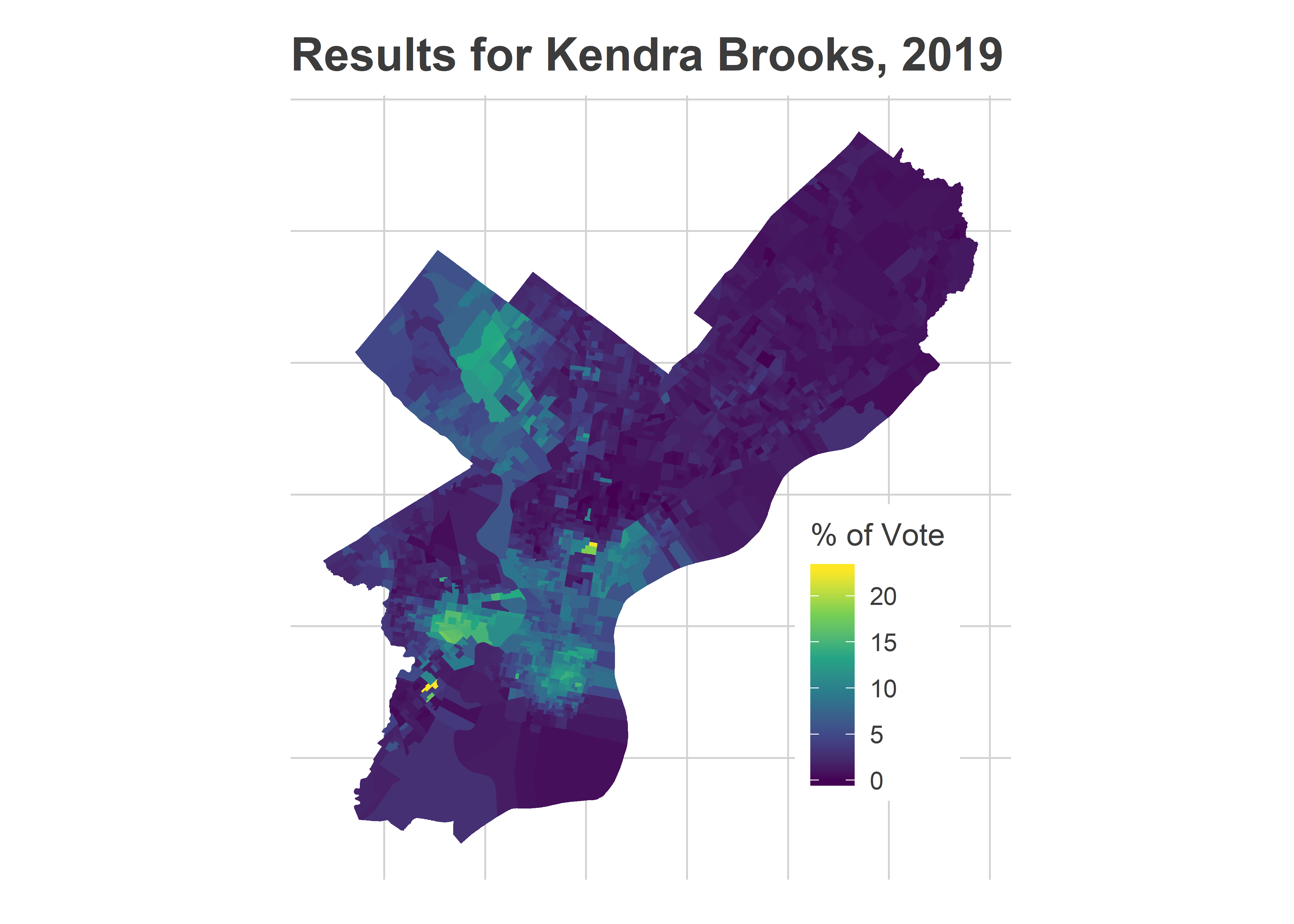
View code
map_cand("REBECCA RHYNHART", 2017)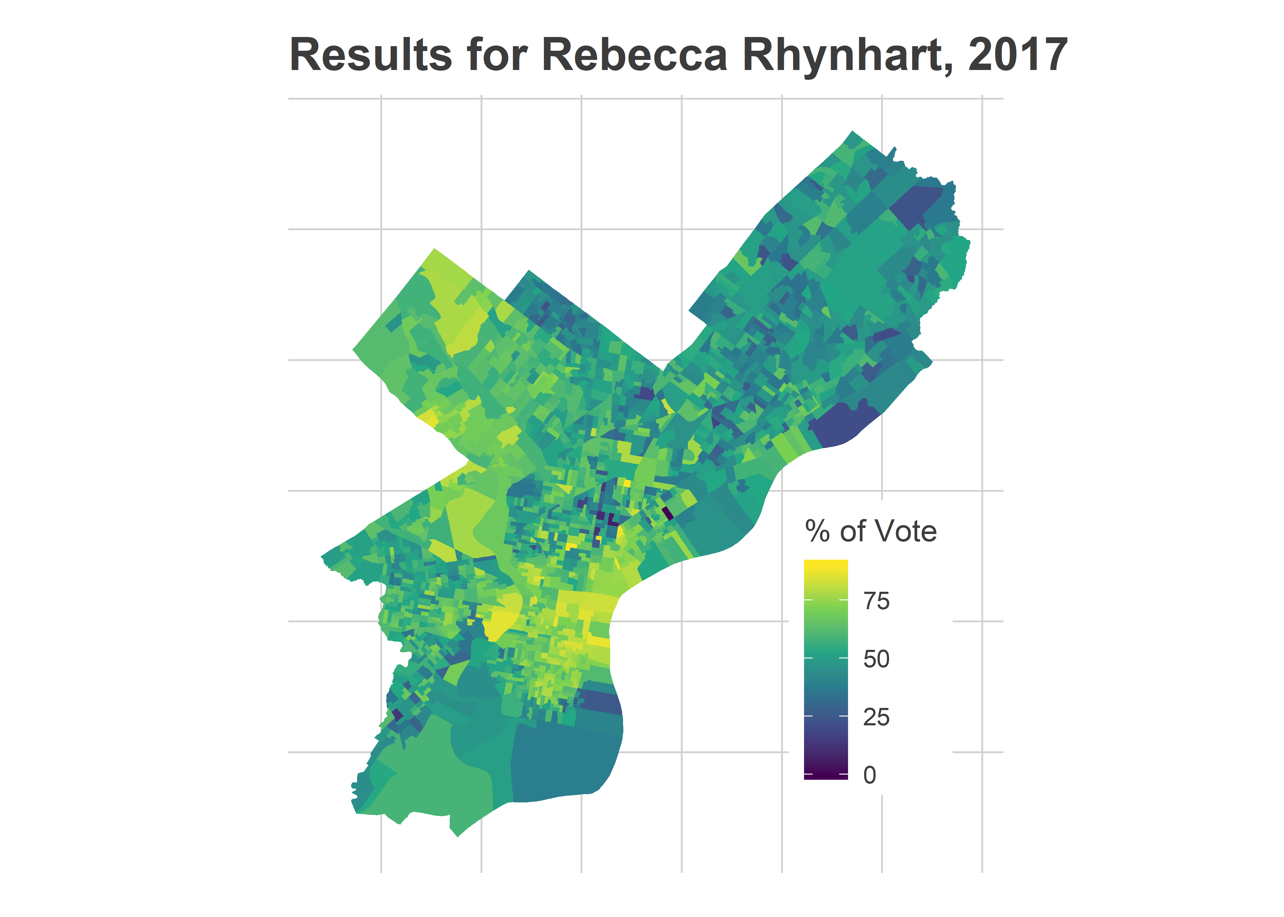
Vega’s path is particularly hard because of the shifting geography of votes in the city. With Philadelphia’s changing voting blocs, Black Voter divisions now cast about 45% of the votes in Democratic Primaries, and Wealthy Progressives over 30%. White Moderate divisions (South Philly and the Northeast) and Hispanic Voter divisions have declining vote shares: together they today constitute about 26% of the votes in primaries, down from over 40% in the early 2000s. These numbers could change in this Tuesday’s election if Vega has successfully mobilized those divisions, but probably not enough to by itself swing the election.
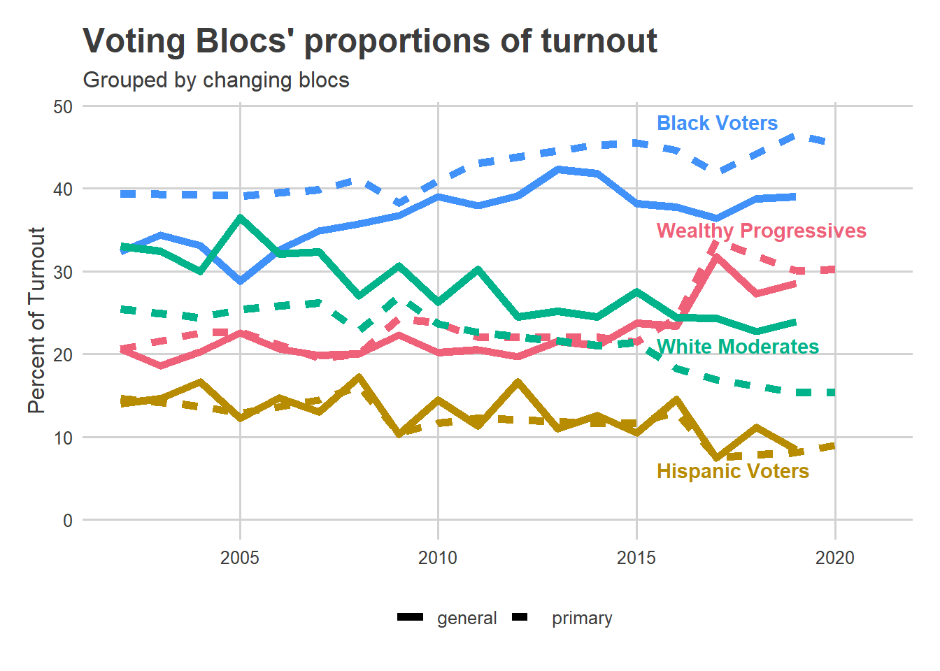
Instead, Vega will need to be competitive in the Black Voter and Wealthy Progressive divisions. Even if they only represent 2/3 of the vote, losing them 60-40 would mean Vega needs to win the White Moderates by 70-30.
And those divisions are where Krasner did best. He won over 50% of the vote among the Wealthy Progressives, in a seven-person race. And he won nearly 40% in the Black Voter divisions.
View code
svd_time <- readRDS("../svd_time/svd_time_res_20201205.RDS")

K <- 3
mutate_add_score <- function(U_df, D, year, min_year=2002){
  year_dm <- year - min_year
  for(k in 1:K){
    var.k <- function(x) sprintf("%s.%i", x, k)
    U_df[[var.k("score")]] <- D[k] * (
      U_df[[var.k("alpha")]] + U_df[[var.k("beta")]] * year_dm
    )
  }
  return(U_df)
}

div_cats <- purrr::map(
  c(2002, 2017, 2020),
  function(y) mutate_add_score(svd_time$U, svd_time$D, y, 2002)
) %>%
  bind_rows(.id = "id") %>%
  mutate(year = c(2002, 2017, 2020)[as.integer(id)])

km <- kmeans(
  div_cats[, c("score.1","score.2","score.3")],
  centers=matrix(
    10 * c(
      1, -1, 0,
      -1, 1, 0,
      0, -1, -1,
      -1, -1, 1
    ),
    4, 3,
    byrow=T
  )
)

cats <- c(
  "Black Voters",
  "Wealthy Progressives",
  "Hispanic Voters",
  "White Moderates"
)
div_cats$cluster <- factor(cats[km$cluster], levels=cats)
cat_colors <- with(colors_sixtysix(), c(light_blue, light_red, light_orange, light_green))
names(cat_colors) <- cats

df_da <- df_major %>%
  filter(
    year == 2017, election_type=="primary", party == "DEMOCRATIC", office == "DISTRICT ATTORNEY"
  ) %>%
  group_by(candidate, warddiv) %>%
  summarise(votes=sum(votes)) %>%
  group_by(warddiv) %>%
  mutate(
    total_votes=sum(votes),
    pvote = votes/sum(votes)
  )

ggplot(
  df_da %>% left_join(div_cats %>% filter(year == 2017)) %>%
    group_by(cluster, candidate) %>%
    summarise(
      pvote = weighted.mean(pvote, total_votes),
      total_votes=sum(total_votes)
    ) %>%
    filter(candidate != "Write In") %>%
    group_by(candidate) %>%
    mutate(pvote_overall = weighted.mean(pvote, total_votes)) %>%
    ungroup() %>%
    arrange(desc(pvote_overall)) %>%
    mutate(
      candidate=format_name(candidate),
      candidate = factor(candidate, levels=unique(candidate))
    )
) +
  geom_bar(aes(x=cluster, y=100*pvote, fill=cluster), stat="identity") +
  facet_wrap(~candidate) +
  scale_fill_manual(values=cat_colors) +
  theme_sixtysix() %+replace%
  theme(
    axis.text.x = element_blank(),
    plot.title = element_text(face="bold", size=14, hjust = 0)
  ) +
  labs(
    title="Krasner won big in Black Voter and Wealthy Progressive Divs",
    subtitle="2017 District Attorney Primary",
    x=NULL,
    y="Percent of Vote",
    fill=NULL
  )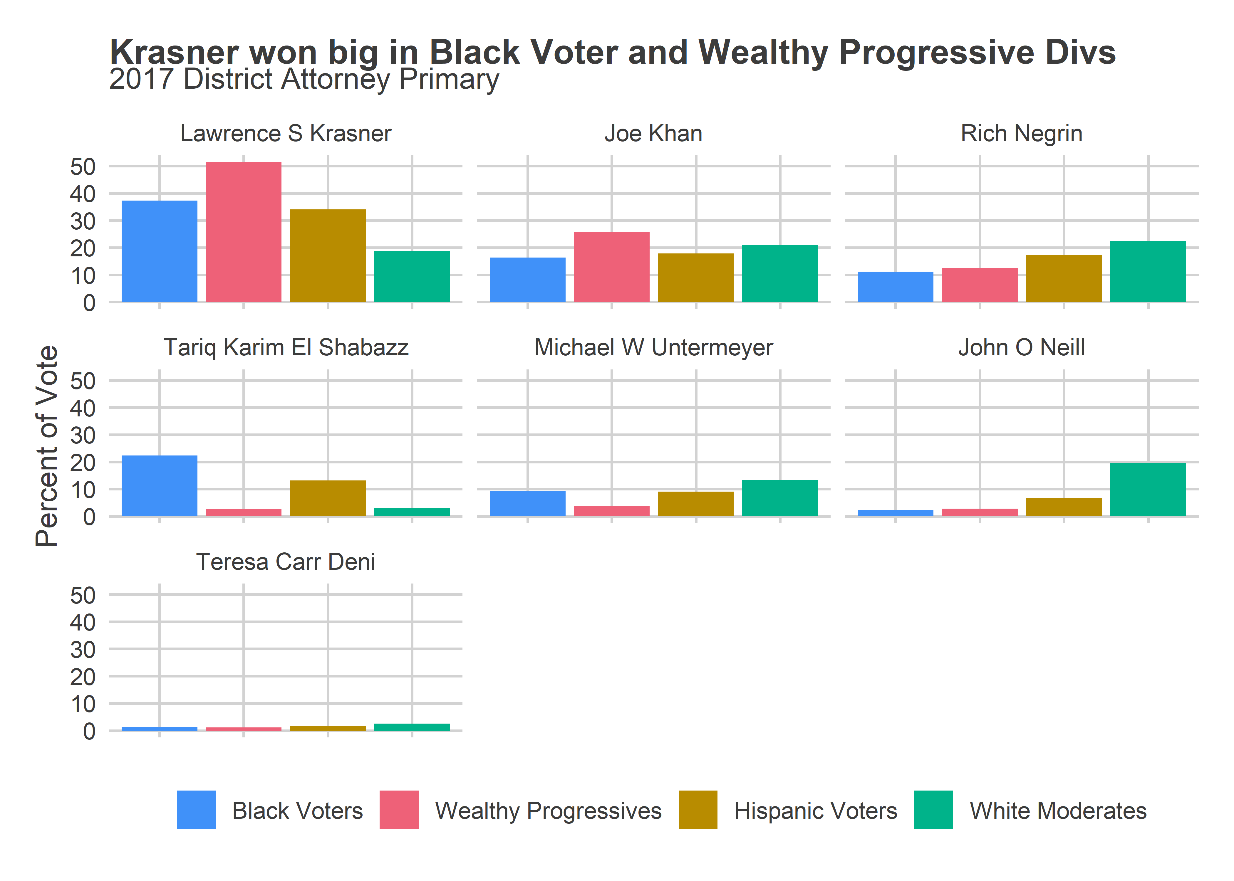
Naively, if the election looked like 2017, I’d expect Krasner to win both of these blocs by at least 70-30 in a two-way race. That would put the election away. Vega wouldn’t be able to win just by coalescing the South Philly and Northeast White Moderates and Hispanic North Philly. Has the opinion of Krasner shifted in those super supportive divisions by that much in that last four years? This is where surveys would really help, but strikes me as unlikely.
 .
.