MODEL UPDATE: Is the race really a tossup? It depends on the formerly uncontested incumbents.

Ok, I’ve gotten a ton of great engagement, and some ideas from you all for questions to ask of the model.

In doing so, I found that it was treating a certain candidate very weirdly: incumbent candidates who were uncontested in the last race. Usually it’s bad form to change a model after you see the results, but this feels more like a bug than post-hoc analysis. So I’ve updated my model, and the results have changed fairly significantly.

What was off?

I thought I’d write up a post about what my model thought about incumbency, and pretty quickly found an issue. I rely very heavily on prior elections’ results, and when a candidate hadn’t been contested before, I was using a combination of prior Presidential results and congressional results. It turns out this was a bad idea: I was predicting that about 30% of these candidates would lose. Instead, in the last 8 elections that number has been about 5%.

How did I miss this? The model was performing well on past years, and this imbalance didn’t have any impact there. But this year, we have a fundamental change in the number of contested races, and the balance between Democrats and Republicans. In 2016, there were 43 uncontested Democrats and 50 uncontested Republicans. In 2014, there were 56 and 57.  In 2012, 45 and 49. This year, there are 55 uncontested Democrats and *23* uncontested Republicans. That huge gap multiplied this error, and gave Democrats about 5.5 too many seats.[1]

​The New Model
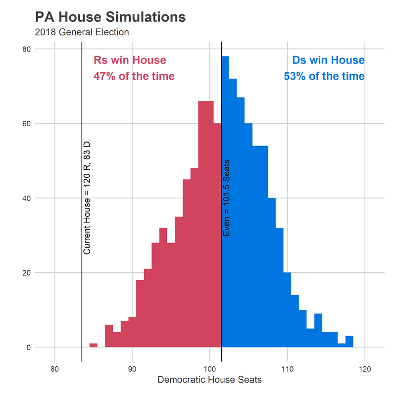
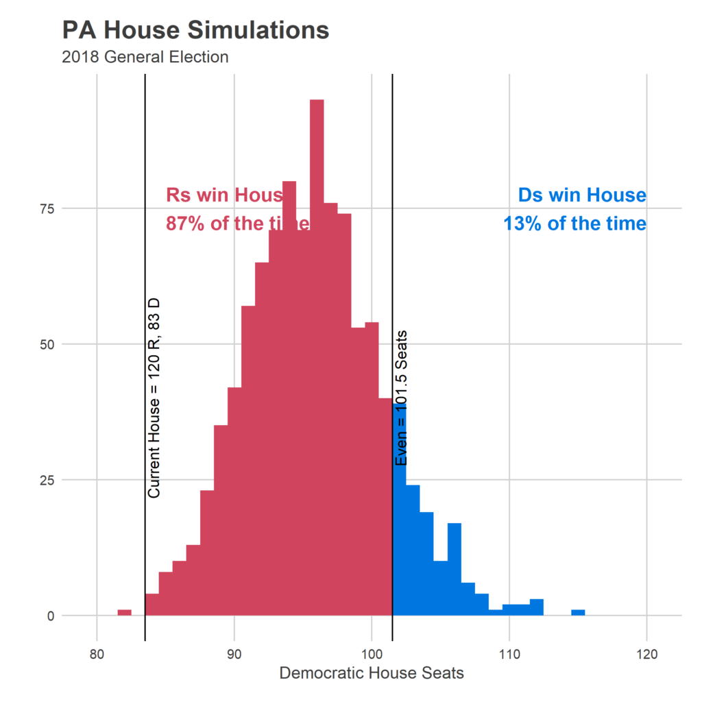
Since I think this is a bug, rather than a modelling decision, I decided to commit the cardinal sin of refitting the model after seeing the results. I basically changed it to treat incumbents who were uncontested the last year as a completely separate category, and the results are that (a) they do way better than I was predicting, and (b) the model is much more confident in the results. That combination of Democrats being expected to win 5.5 fewer seats, and the uncertainty shrinking, means that the probability of Dems getting over the 101.5 seat threshold is much (much) smaller.

New Predictions: 

Average Result: R 107, D 96
90% Range of Predictions:  R 115, D 88 — R 99, D 104
Probability of winning the House: R 87%, D 13%

How did seats change?
Two seats were big clues to what was going wrong with the model: 127 and 177.

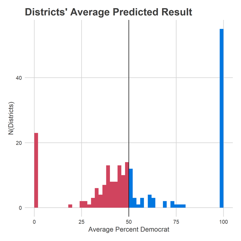
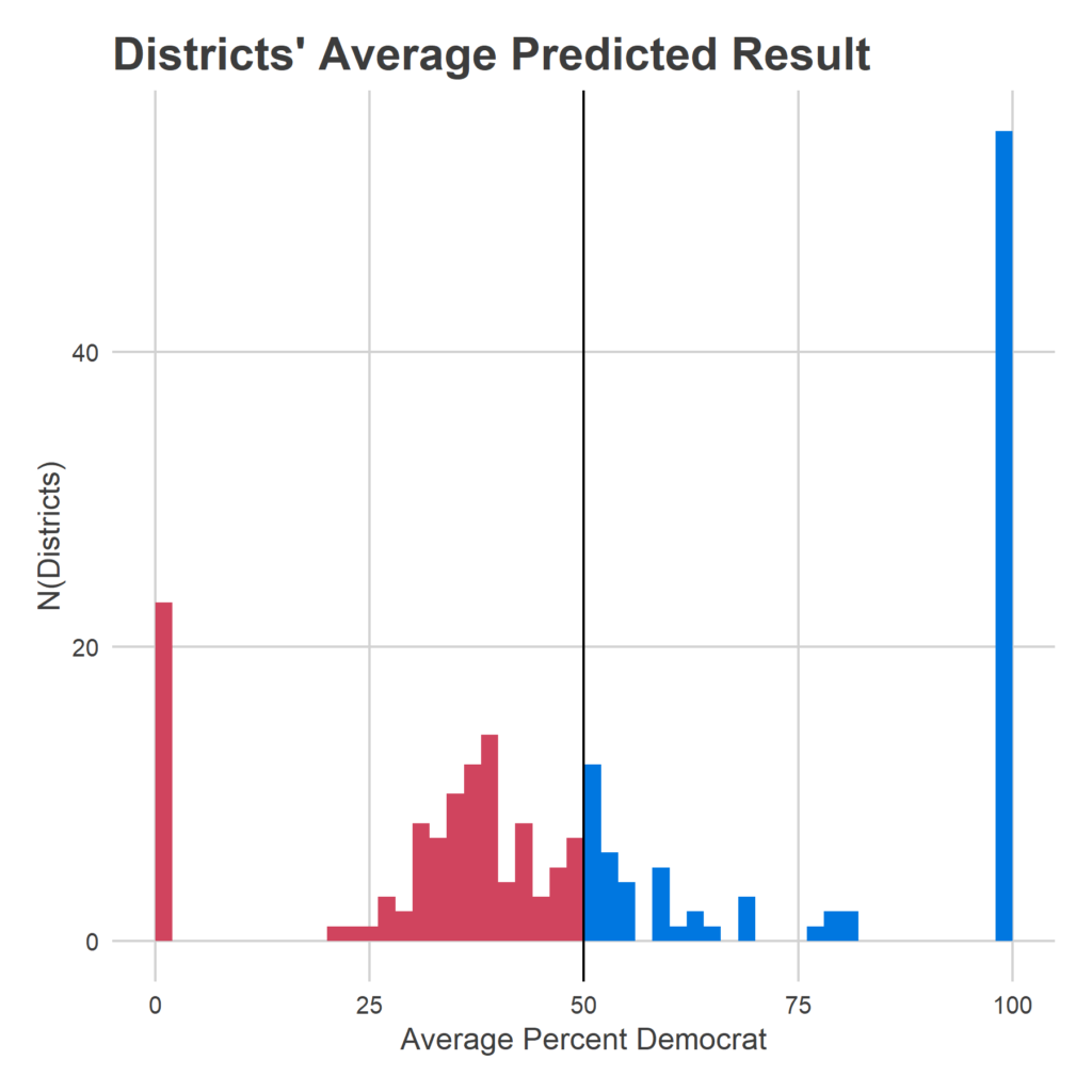
Reading’s seat 127 has been represented by Thomas Caltagirone for the last 41 years. He’s facing his first challenger since 2002. And yet my model gave him essentially even odds. Why? Because his district was basically even in the 2016 US Congressional race. I was relying too heavily on the last results from other races, pretending those were state house results. The new model? Gives him an 88% chance of keeping his seat.

Seat 177 is familiar to Philadelphians as Rep. John Taylor’s former seat, being contested by Patty Kozlowski (R) and Joe Hohenstein (D). It only gave Hohenstein a 34% chance of winning despite the fact that the longtime incumbent had stepped down, and Clinton won the district handily. This one was a weirder bank shot: I wasn’t giving John Taylor his due as a candidate, so I was instead scoring the district as more Republican than it really was, and when Hohenstein lost the district in 2016, scoring him weaker than I should. The new model realizes Taylor was a strong candidate in a quite Blue district, and gives Hohenstein now a 66% chance of winning.

Overall, it is able to better differentiate candidates, and separate them from the 50% threshold. This means that there’s a lot less noise in the model, which gives Democrats less chance to surge over 101.5.

[See the seat-by-seat results here]

Ok, that’s it. Sorry for the thrash. Time to go build the Turnout Tracker.

​Sources

Data comes from the amazing Open Elections Project.
I also leaned heavily on Ballotpedia to complement and extend the data.
GIS data is from the US Census.

Footnotes
[1] These numbers don’t include cases where candidates run as e.g. D/R, which always happens in a few uncontested races (5 in 2016, 2 in 2014, 6 in 2012). For the model, I do impute their party based on other elections.

Forecast: The PA House

The midterm elections are only two weeks away. Finally. Thankfully.

All eyes have been focused on the national elections. But in this space I’ve been looking at races for the PA General Assembly’s lower house. At first glance the house could appear out of reach for Democrats: the districts are famously gerrymandered, and the State Supreme Court’s February decision didn’t affect the state legislature boundaries. Democrats are down by 37 seats heading in to the race.

On the other hand, 19 districts that voted for Republican representatives in 2016 also voted for Clinton. And it looks like the state could have higher turnout than any midterm since at least 2002. Could the Blue Wave possibly sweep down to the state races, and change our state houses? Today I present my forecast.

​Modeling the PA House
Because it’s nerve-wracking to publish predictions into the world, and because I don’t have nearly the extent of data to do this responsibly (9 elections since 2002 doesn’t give me much to work with), I’m going to walk through some preamble before we get to the predictions. What information does the model use? When it inevitably is wrong, why will that be?

The challenge in forecasting these state races is that we don’t have polling. This is a huge problem, because public sentiments in districts are all correlated with each other, and if you don’t have some indication of what “type” of election it’s going to be, your prediction will have to cover the options from Blue Wave to Red Wave, giving gigantic error bars. Making it useless.

To get around this, I borrow information from polls for the Congressional races, and measure how historically congressional races have correlated with their local state races. It turns out that correlation is strong. So I pull in the current predictions from FiveThirtyEight’s House Model as a noisy estimate of each congressional outcome, which is highly suggestive of a strong Democratic year.

There are obviously a ton of other factors, including each district’s own history, incumbent candidates, and ways that certain districts tend to move together. I ended up choosing a fairly simple model, to account for the few years I have to work with. This means that it will capture the strongest trends, and leave the rest as uncertainty. The model relies mostly on (a) a district’s last election results for state house, congress, and the president/governor, and (b) the FiveThirtyEight predictions for the current governor and congressional races. It also has election and candidate random effects, to capture correlated outcomes in an election and certain historically over-performing candidates (e.g. 177’s John Taylor).

As such, I expect the model to do a good job of capturing the overall mood of the state, as well as the historic stickiness of incumbents in specific races. Also, when we have a new, unknown candidate, it greatly increases the uncertainty in the race, since it knows nothing about them. If you have a favorite candidate that has an awesome twitter account, the model doesn’t know that. Instead, it shows the full range of outcomes for the historic variance in quality of candidates.

How to read the model
It’s scary to release a forecast into the world, especially one that’s so bullish (see below…). Here’s how to read the results: It’s a simple accounting of a few features that clearly affect elections, weighted for how those features have mattered since 2004. How do you account for gerrymandered districts? For incumbency? For the fact that 2018 is a midterm, the increase in districts that Democrats are contesting, and the overall tenor of US Congress races? This model looks at the historical size of the effects, and weights them accordingly. What it doesn’t do is account for the fact that maybe this election is Different™, and won’t look like any we’ve seen in the last 12 years.

How my model could be wrong
Given the lack of historic data, it’s possible that I haven’t captured the full range of potential types of elections there are. Given the need for lagging variables, I’ve further limited the elections I use to model to only elections from 2006-2016. If this election looks wildly different from any of those, then my forecasts could be wrong.

Particularly, if the large attention to the midterm or the nationalization of state politics has changed the correlation between competitive races and turnout, the power of incumbency, or the quality of new candidates, the model could be very wrong, largely by cases where all races swing together. Plausibly, if Democrats are running fundamentally different types of candidates (perhaps more skilled, perhaps more leftist) than in the past, the model won’t capture whether the candidates fit the district better or worse than before.

Finally, one of the largest sources of uncertainty is new candidates. I give the model no information about that, so every time it sees a new candidate, it has to cover the full range of quality, from terrible to great. This increases the uncertainty in each race, and uncertainty will shrink the prediction towards 50-50 (if the Republicans are favored to win most seats by a narrow margin, for example, added uncertainty will more often switch Republican seats to Democratic than vice versa.)

The Prediction
Enough hand wringing.
​
I predict that in two weeks the Democrats will win between 92 and 110 seats. On average in my simulations, they win 101.5 seats, which is annoyingly, bizarrely, exactly half of 203. They win the majority 53% of the time.

This is surprisingly bullish for Democrats. The average represents a 18.5 seat pickup for them, and even the low end of the confidence interval–92 seats–would be a 9 seat pickup.

My predictions are particularly optimistic on the Philadelphia area’s Democratic challengers, largely because of the sweeping victories expected in the region’s Congressional races. Remember: the model doesn’t know anything about the state candidates themselves, and just uses broad indications of the district and the environment, so your knowledge of a given candidate could mean very different predictions. It gives Democrat Kristin Seale a 32% chance of unseating Quinn in Delco’s 168. It gives Hohenstein a 34% chance of winning the River Wards’ 177, now that John Taylor isn’t in the picture. And it gives Michael Doyle a 36% chance of beating Martina White in 170 in the Northeast.

Below is a widget where you can see the predictions for every single race:
[EDIT: The widget didn’t embed correctly. CLICK HERE for it!]

One thing you may notice above is that even in the close races, Republicans are favored to win. That’s a fascinating fact of the model, and the race in general. Republicans are actually favored to win in in 115 seats.

How is that possible? How can Republicans be favored in more seats than is my upper bound on how many they’ll win? The answer is gerrymandering. Because of “cracking and packing”, there are a ton of districts that are safely Republican in any typical year, but not so safe as to waste too many votes. A Blue Wave would push them just to the boundary. Any additional randomness–a good Democratic candidate, a local story–pushes them over to Democrat seats. This is also helped by the fact that Democrats are contesting more districts than ever before. And there just aren’t any similarly teetering seats on the Democratic side. So while the model isn’t sure which of the close seats will swing over the line, it’s sure that some will. And maybe enough to win Democrats the house.

See you in two weeks!
I was stunned to predict such a close race. Democrats will pick up at least 8 seats, and are an even bet to win the house. With that aggressive prediction on the internet forever, I’m turning my attention to the Turnout Tracker. Stay tuned!

Sources
Data comes from the amazing Open Elections Project.
I also leaned heavily on Ballotpedia to complement and extend the data.
GIS data is from the US Census.