The race for the Pennsylvania House

November 6th are the midterm elections, the first national election since Donald Trump became president. Nationally, Democrats are expected to make gains. The discussion has largely centered on whether the “Blue Wave” will be large enough to help Democrats take control of the U.S. House or even the Senate.

Pennsylvania has important state and local races as well. Voters here will be choosing a Governor and Senator, in two elections where Democratic incumbents are well-positioned. How about the down-ballot races? Could the Pennsylvania House of Representatives be in play?

The Composition of the PA House
The Pennsylvania House has been solidly Republican since 2010, and has had a Republican majority for 20 out of the last 24 years. In 2016, 121 Republicans won versus 82 Democrats. Of those races, 51 were uncontested Republicans, and 47 uncontested Democrats.
In order to take back the house, Democrats need to pick up 20 seats. In a typical year, that would be impossible. But this year? Nationally, in Special Elections for congress, Democrats have seen an average 16 point increase over their baseline. This would imply that a race that went 58-42 to Republicans would be in play. If every state house district swung towards Democrats by 16 points from 2016, Democrats would pick up *17 seats*. And that’s not counting the races that Democrats failed to contest in 2016.

Philadelphia is vitally important in this picture. Some 13 of those Republican districts within 16 points are in Philadelphia or its four-county suburbs.

A surge of that size is probably not going to happen, but it shows what’s in play. These hyper-local races probably benefit from very strong incumbency, and it’s unclear how national signals will translate.

Pennsylvania has 19 districts with a Republican representative that was won by Hillary Clinton. Stunningly, every single one of them is in Philadelphia or its suburbs. And in two of those Democrats didn’t even field a candidate. If Donald Trump has nationalized the election, and energizes Democratic voters, Democrats could capitalize on this anti-Trump sentiment.

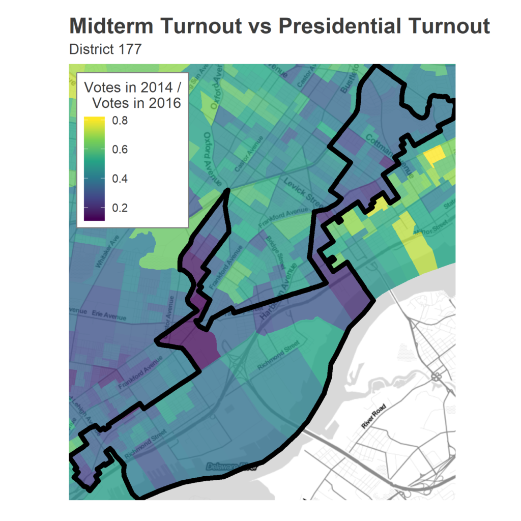
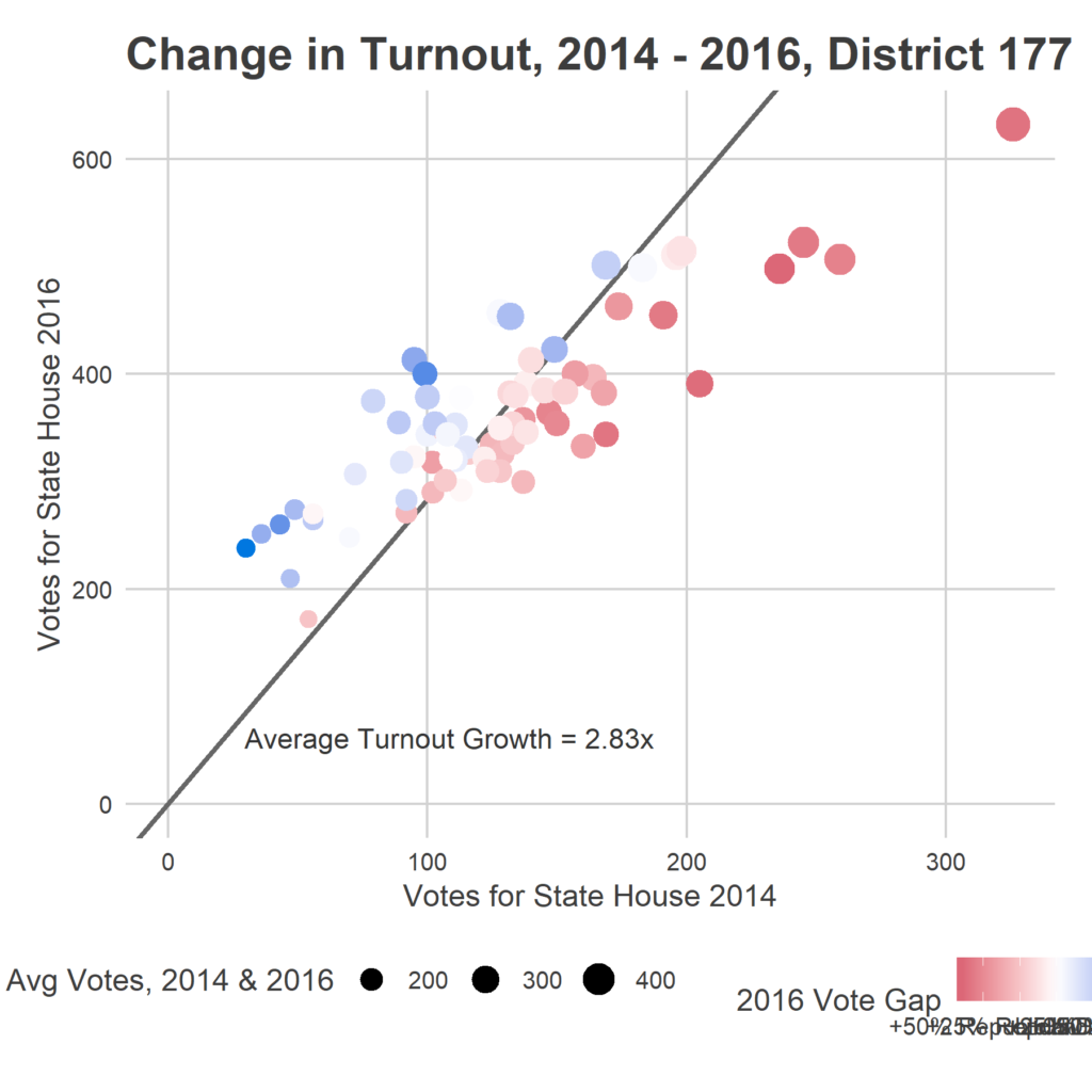
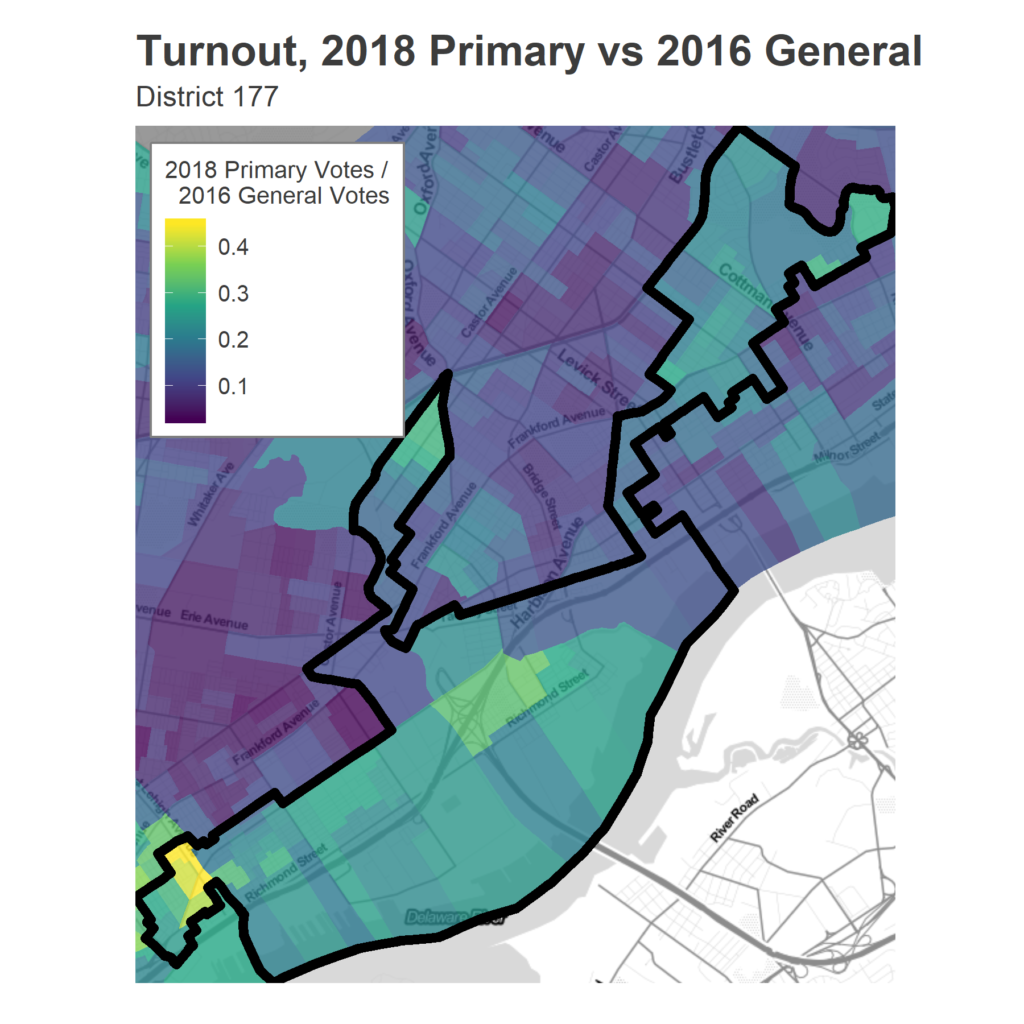
Plenty of people are trying to read the tea leaves in May’s Primary turnout. Could surges in Democratic Primary turnout presage victories in November? I look at turnout below. This discussion comes with a strong caveat: it’s unclear how well primary turnout translates to general election results, and that is even further complicated by the fact that turnout is driven by where races are competitive, and we had many (many) more competitive primaries than in 2014, the last midterm. That being said, below is a plot of primary turnout changes, from 2014 – 2018, broken down by 2016 election results.
District by District
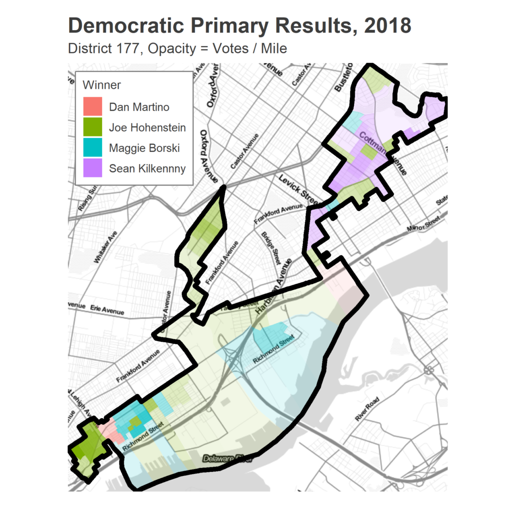
Finally, let’s look at the raw data for the districts. To make this manageable, I’ve broken them into chunks based on whether the primaries were contested, party of the Representative, and 2016 Presidential results. Below, I present each district’s 2016 results (as the two-party vote, meaning excluding third parties and non-votes), and turnout in the 2014 and 2018 primaries.

First, the 39 districts that the Democrats didn’t contest in 2016 but now have a candidate, including two that Hillary won.

Next, the other 17 districts that voted for Republican representatives but also for Hillary in 2016. They’re all in Philadelphia and its suburbs.
Next, the 53 districts where a Republican representative won a contested race and Trump did too. Four of these were within 16 points of a Democratic victory in 2016.
Where were the districts that were extra Trumpy? Here are the 17 that voted for a Democratic Representative, but also for Trump (including 8 that the Republicans didn’t field a candidate).
Next, the 65 districts where Democrats won both the State House and Presidential race.
Finally, the twelve districts that Democrats didn’t contest in 2016 and still aren’t contesting in 2018.
Coming up next
What do we make of all this? Unfortunately, it’s unclear how this election will break. Are the districts that voted for a Republican Representative but Clinton in 2016 more likely to swing towards the Democrats, given the first two years of Trump’s presidency, or will they continue to support the incumbent, especially with Trump not on the ballot? Will the districts with primary surges show up? How important is the fact that Democrats have fielded candidates in 39 districts that went uncontested in 2016, and can that shift turnout there in ways that change the Governor’s race?

As the summer comes to a close, I’ll be looking at a few of these Philadelphia-area races, and trying to understand the landscape for November.

When do Philadelphians Vote?

A ton of you shared your voter number as part of the live tracker on May 15th. This data helps me get at a question I’ve wondered for some time: When do Philadelphians vote? The answer may surprise you.


The data
When all was said and done, I had 619 valid submissions from election day. This included data from 50 wards, and from every hour of the day. Each submission consisted of the time of day, the ward + division, and the cumulative count of votes at that division up to that time.

One important thing to note is that my data is not representative of the city as a whole. The map below shows where data was submitted from. I have many more points from Philadelphia’s white, predominantly wealthy wards. My model will be overweighted towards these people. I break down the results by race and income, as much as is possible, at the end.


When did Philadelphia Vote?
For each point, I divide the current count by the final vote count in that division to calculate the proportional vote total at that time. This puts divisions on comparable footing. I then model the cumulative percentage of the vote across the city at each hour, treating each row of data as independent. 


Above is the distribution of votes across the day. About 19% of the votes came from 7-9 am. Another 16% of the votes came from 11am – 1pm, during the lunchtime surge. Some 42% of the votes came between 4 and 7pm.


I was amazed by the steady increasing nature of the plot; I expected the distribution to be much more heavily weighted to before and after work. Voting clearly slows down between 10 and 11am, and 1 and 3pm, but the lunchtime push is much stronger than I expected. Still, after work (starting around 4pm) is by far the strongest surge.

The results between 7 and 8pm require some discussion. I don’t impose any rule that the total be increasing, and the model actually predicts that negatively many people voted in the last hour. This is due to the thunderstorm that covered the city at exactly that hour. Don’t overinterpret the negative sign, the model isn’t that smart. Basically, nobody voted. Assuming that the trend from 6-7 would have continued, we could have seen another 30,000 votes without the storm. (This is also what broke my prediction…). 

One other weird thing is that my final total doesn’t finish at 100%. This means that people were reporting numbers at 8pm that didn’t match the city’s reported total. I’m not totally convinced how this happened, maybe they had actually voted earlier and got confused by the submission form?

Another way to view this data is to break voting down by hour. 


The highest proportion of votes came from 6-7pm, with nearly 15% of the vote. Next was 7am with 11%, followed by the 4-6pm surge, with just under 10% of the vote each hour. 


Votes by Ward Groups
This pattern could obviously vary by neighborhood type. I don’t have quite enough data from certain parts of the city to do a fine break down, but we can get a crude idea by using Race and Income data from the American Community Survey. I group wards based on the maximum represented race/ethnicity, and whether the median household income is below or over $60,000. This gives four groups: Black under $60K, Hispanic under $60K, White under $60K, and White over $60K. I only have two data points from the Hispanic wards, but let’s look at the remaining three groups.


It’s also important to note that I don’t actually use the race or income of the division. Even within Black or White low-income wards, I think that my data will overrepresent wealthier and whiter divisions. For example, among the Black wards, 51% of the submissions come from three wards: Ward 22 in East Mount Airy, 36 in Point Breeze, and 46 in University City, all wards that are notoriously gentrifying. This suggests that maybe the data will represent the gentrified divisions, and still not capture the Blacker neighborhoods. Maybe we’ll get more representative data in November.


With that being said, here is the same model fit only within each ward group.


In the Black wards, the overall trend looks similar to the city as a whole, though significantly more of the votes came between 8 and 9am, and fewer from 9 to 10. There was also a more exagerrated lunchtime rush, with 13.6% of the votes coming from 12-1pm. 
The White wards with incomes less than $60K are much steadier through the day. Some 12.2% of the votes came before 8am, though five other hours–12-1, 2-3, and 4-7–broke 10% of the vote.
 
Curiously, the White wards with incomes over $60K were the wards with the lowest share of the voting coming before 9am–only 17.9%–but where voting continued between 9 and 10am and where the after-work surge started as early as 3pm. These may be wards where people live close to work, and can arrive to work late or cut out early to vote.