What At Large City Councilors most polarized the vote?

May’s primary will include elections for Philadelphia City Council. The council is constituted of 17 councilors, ten of whom are voted in by specific districts and seven of whom are At Large, voted in by the city as a whole. Of those seven at large, only five can come from the same party. In practice means that five Democrats will win this primary, and then win landslide elections in November.

In advance of May, I’m going to be looking at what it takes to win a Democratic City Council At Large seat. Today, let’s look at how polarizing candidates are.

[Note: I’m starting today making my blog posts in RMarkdown. Click the View Code to see the R code!]

View code
## You can access the data at: 
## https://github.com/jtannen/jtannen.github.io/tree/master/data
# load("df_major_2017_12_01.Rda")

df_major$CANDIDATE <- gsub("\\s+", " ", df_major$CANDIDATE)
df_major$PARTY[df_major$PARTY == "DEMOCRATIC"] <- 'DEMOCRAT'

df_major <- df_major %>% 
  filter(
    election == "primary" &
      OFFICE == "COUNCIL AT LARGE" &
      PARTY %in% c("DEMOCRAT")
  )

df_total <- df_major %>% 
  group_by(CANDIDATE, year, PARTY) %>%
  summarise(votes = sum(VOTES)) %>%
  group_by(year, PARTY) %>%
  arrange(desc(votes)) %>%
  mutate(rank = rank(desc(votes)))

div_votes <- df_major %>%
  group_by(WARD16, DIV16, OFFICE, year) %>%
  summarise(div_votes = sum(VOTES))

Measuring Vote Polarization

One way to measure polarization is using the Gini coefficient, common in studying inequality. Suppose for each candidate we line up the precincts in order of their percent of the vote. We then move down the precincts, adding up the total voters and the votes for that candidate. We plot the curve, with the cumulative voters along the x axis, and the cumulative votes for that candidate along the y.

The curvature of that line is a measure of the inequality of the distribution of votes. In this case, I call that polarization. Suppose a candidate got 50% of the vote in every single precinct. Then the curve would just be a straight line with a slope of 0.5; there would be no polarization. Alternatively, if a candidate got zero of the votes from 90% of the precincts, but all of the vote in the remaining 10%, then the curve would be flat at 0 for the first 90% of the x-axis, but then bend and shoot up; a sharp curve and a lot of polarization.

View code
vote_cdf <- df_major %>%
  left_join(div_votes) %>%
  group_by(CANDIDATE, year) %>%
  mutate(
    p_vote_div = VOTES / div_votes,
    cand_vote_total = sum(VOTES)
  ) %>%
  arrange(p_vote_div) %>%
  mutate(
    cum_votes = cumsum(VOTES),
    vote_cdf = cum_votes / cand_vote_total,
    cum_denom = cumsum(div_votes) / sum(div_votes)
  ) 

ggplot(
  vote_cdf %>% 
    left_join(df_total) %>%
    filter(year == 2015 & rank <= 7),
  aes(x=cum_denom, y=cum_votes)
) + geom_line(
    aes(group=CANDIDATE, color=CANDIDATE),
    size=1
) +
  geom_text(
    data = vote_cdf %>% 
    left_join(df_total) %>%
    filter(year == 2015 & rank <= 7) %>%
      group_by(CANDIDATE) %>%
      filter(cum_votes == max(cum_votes)),
    aes(label = tolower(CANDIDATE)),
    x = 1.01,
    hjust = 0
  ) +
  xlab("Cumulative voters") +
  scale_y_continuous(
    "Cumulative votes for candidate",
    labels=scales::comma
  ) +
  scale_color_discrete(guide=FALSE)+
  expand_limits(x=1.3)+
  theme_sixtysix() +
  ggtitle(
    "Vote distributions for 2015 Council At Large",
    "Top seven finishers"
  )

plot of chunk gini

Above is that plot for the top seven At Large finishers in 2015 (remember that five Democrats can win). Helen Gym was the fifth. Interestingly, she also was the most polarizing: 49.4% of her votes came from her best 25% of divisions. For comparison, 38.3% of Derek Green’s votes came from his best 25% of divisions.

If we scale each candidate’s y-axis by their final total votes, the difference in curvature is even more stark.

View code
ggplot(
  vote_cdf %>% 
    left_join(df_total) %>%
    filter(year == 2015 & rank <= 7),
  aes(x=cum_denom, y=vote_cdf)
) + geom_line(
  aes(group=CANDIDATE, color=CANDIDATE),
  size=1
) +
  coord_fixed() +
  geom_abline(slope = 1, yintercept=0) +
  xlab("Cumulative voters") +
  ylab("Cumulative proportion of candidate's votes") +
  scale_color_discrete(guide = FALSE) +
  annotate(
    geom="text",
    y = c(0.45, 0.3),
    x = c(0.52, 0.6),
    hjust = c(1, 0),
    label = c("william k greenlee", "helen gym")
  ) +
  theme_sixtysix() +
    ggtitle(
    "Vote distributions for 2015 Council At Large",
    "Top seven finishers, scaled for total votes"
  )

plot of chunk gini_scaled

So Helen Gym snuck in four years ago, with a highly polarized vote. Is that common for new challengers? Not really. Usually, it’s hard to win without more even support.

To summarise the curvature into a single number, the Gini coefficient is defined as the area above the curve but below the 45 degree line, divided by the total area of the triangle. Notice that the more curved the line, the more area between the 45-degree line and the curve, and the higher the coefficient. If there is no inequality, the Gini coefficient is 0, if there’s complete inequality, it’s 1. Helen Gym’s Gini coefficient is 0.35, Bill Greenlee’s is 0.19.

Below I plot each candidate’s proportion of the vote on the x-axis (blue names are winners), and their Gini coefficient on the y-axis (higher values are more polarized).

View code
gini <- vote_cdf %>% 
  arrange(CANDIDATE, year, cum_denom) %>%
  group_by(CANDIDATE, year) %>%
  mutate(
    is_first = cum_denom == min(cum_denom),
    bin_width = cum_denom - ifelse(is_first, 0, lag(cum_denom)),
    avg_height = (vote_cdf + ifelse(is_first, 0, lag(vote_cdf)))/2,
    area = bin_width * avg_height
  ) %>% 
  summarise(
    gini = 1 - 2 * sum(area),
    total_votes = weighted.mean(p_vote_div, div_votes)
  )

ggplot(
  gini %>% left_join(df_total) %>% filter(rank <= 10), 
  aes(x=total_votes, y=gini)
) + 
  geom_text(
    aes(label=tolower(CANDIDATE), color=(rank<=5)),
    size = 3
  ) +
  scale_color_manual(
    "winner", 
    values=c(`TRUE` = strong_blue, `FALSE` = strong_red),
    guide = FALSE
  )+
  scale_x_continuous(
    "proportion of vote",
    expand=expand_scale(mult=0.2)
  ) +
  ylab("gini coefficient (higher means more polarization)")+
  facet_wrap(~year) +
  theme_sixtysix() +
  ggtitle("Total votes versus vote polarization",
          "Top ten finishers for City Council At Large. Winners in blue.")

plot of chunk gini_scatter

Helen Gym had the highest Gini coefficient of any winner in the last four elections, and no one else was close.

There are a few things going on here. First, the winners are usually incumbents, and incumbents probably benefit from name recognition across the city. All of the winners in 2011 were incumbents, for example.

But even the non-incumbents who won had more even support. Allan Domb had the second lowest gini coefficient in 2015, and Derek Green the third. Greenlee and Bill Green had the lowest Gini coefficients when they won as challengers in 2007 (Greenlee was technically an incumbent from a 2006 Special Election).

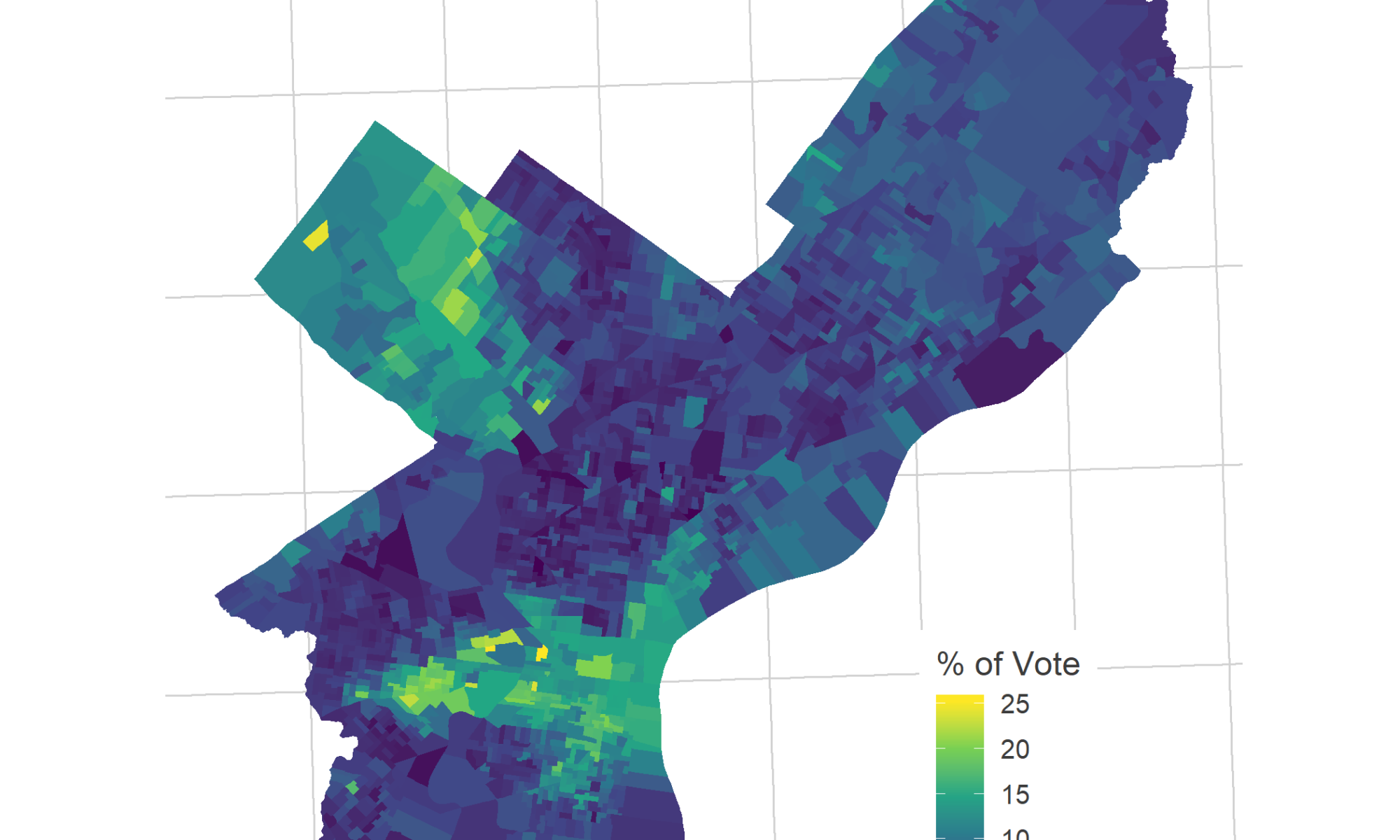
There are a few ways to view Helen Gym’s polarization. Remember that this is unrelated to total proportion of the vote; she won the fifth most votes, more than candidates who had even and low support across the city. She did so by particularly consolidating her neighborhoods, mobilizing the wealthier, whiter progressive wards that formed her coalition (presumably with the incumbency, she will receive broader support this time around).

View code
# library(sf)
# divs <- st_read("2016_Ward_Divisions.shp", quiet = TRUE)

gym_vote <- divs %>% 
  left_join(
    df_major %>% 
      filter(year == 2015) %>% 
      mutate(WARD_DIVSN = paste0(WARD16, DIV16)) %>% 
      group_by(WARD_DIVSN) %>% 
      mutate(p_vote = VOTES / sum(VOTES)) %>% 
      filter(CANDIDATE == "HELEN GYM")
    )

ggplot(gym_vote)+ 
  geom_sf(
    aes(fill = p_vote * 100),
    color = NA
  ) +
  theme_map_sixtysix() +
  scale_fill_viridis_c("% of Vote") +
  ggtitle(
    "Helen Gym's percent of the vote, 2015",
    "Voters could vote for up to five At Large candidates"
  )

plot of chunk gym_vote

One perspective is that she won entirely on the support of whiter, wealthier liberals. Another is that she managed to squeeze the last drips of votes out of those neighborhoods, eking out her edge over candidates with similar city-wide votes. Notably, the common concern around a candidate with this base would be that she would ignore the lower income, Black and Hispanic neighborhoods that didn’t vote for her, but I don’t think that’s a common complaint lodged against the fierce public education advocate.

What coalitions win the City Council At Large seats?

One question I find fascinating is what coalitions candidates use to win. Gym clearly won with the wealthier white progressive wards, but candidates may also just as often win with support of the Black wards, or the more conservative Northeast and deep South Philly. In the upcoming months, I’m going to dig more into this question.
Philadelphia’s Court of Common Pleas elections are decided by a lottery.

New year, new election.

This time around, May’s election will have the Mayoral race at the top of the ballot, and City Council races. Odd-year primaries also bring Philadelphia’s lesser-followed judicial elections. These elections are problematic: we vote for multiple candidates each election, upwards of 7, and even the most educated voter really doesn’t know anything about any of them. In these low-information elections, the most important factor in getting elected is whether a candidate ends up in the first column of the ballot. Ballot position is decided by a lottery. Philadelphia elects its judges at random.

I’ve looked into this before, measuring the impact of ballot position on the Court of Common Pleas, and then that impact by neighborhood. We even ran an experiment to see if we could improve the impact of the Philadelphia Bar’s Recommendations. But first, let’s revisit the story, update it with 2017 results, and establish the gruesome baseline.

The Court of Common Pleas
The most egregious race is for the city’s Court of Common Pleas. That court is responsible for major civil and criminal trials, juvenile and domestic relations, and orphans, so the bulk of our judicial cases. Common Pleas judges are elected to 10-year terms.

The field for Common Pleas is huge; we don’t know how many openings there will be this year, but in the five elections since 2009, there was an average of 31 candidates competing for 9 openings. Even the most informed voter doesn’t know the name of most of these candidates when she enters the voting booth, and ends up either relying on others’ recommendations or voting at random. This is exactly the type of election where other factors–flyers handed out in front of a polling place, the order of names on the ballot–will dominate.

Because of this low attention, some of the judges that do end up winning come with serious allegations against them. In 2015, Scott Diclaudio won; months later he would be censured for misconduct and negligence, and then get caught having given illegal donations in the DA Seth Williams probe. The 2015 race also elected Judge Lyris Younge, who has since been removed from Family Court for violating family rights, and just in October made headlines by evicting a full building of residents with less than a week’s notice. In 2016, Mark Cohen was voted out as state rep after reports on his excessive use of per-diem expenses. In 2017, he was elected to the Court of Common Pleas.

Every one of those candidates—Diclaudio, Younge, and Cohen—was in the first column of the ballot.

Random luck is more important than Democratic Endorsement or Quality
The order of names on the ballot is entirely random, so this gives us a rare chance to causally estimate the importance of order, compared to other factors.

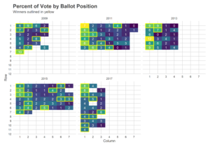
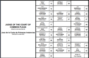
First, what do I mean by ballot order? Here’s a picture of the 2017 Democratic ballot for the Court of Common Pleas.

There are so many candidates that they need to be arranged in a rectangle. In 2017, candidates were organized into 11 rows and 3 columns. Six of the nine winners came from the first column. (The empty spaces are candidates who dropped out of the race after seeing their lottery pick.)

The shape of the ballot changes wildly over years. Sometimes it’s short and wide, in 2017 it was tall and thin. But in every year, candidates in the first column fare better than others. The results year over year show that the first column consistently receives more votes:

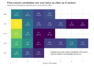
As the above makes clear, candidates do win from later columns every year. But first-column candidates win more than twice as often as if all columns won equally. Below, I collapse the columns for each year, and calculate the number of actual winners from each column, compared to the expected winners if winners were completely at random. The 2011 election marked the high-water mark, when more than three times as many winners came from the first column than should have.

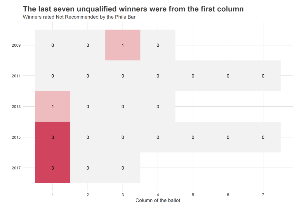
This effect means that Philadelphia ends up with unqualified judges. Let’s use recommendations by the Philadelphia Bar Association as a measure of candidate quality. The Bar Association’s Judicial Commission does an in-depth review of candidates each cycle, interviewing candidates and people who have worked with them. They then rate candidates Recommended or Not Recommended. A Bar Association Recommendation should be considered a low bar; on average, they Recommend two thirds of candidates and more than twice as many candidates as are able to win in a given year. While the Bar Association maintains confidentiality about why they Recommend or don’t Recommend a given candidate (giving candidates wiggle room to complain about its decisions), my understanding is that there have to be serious concerns to be Not Recommended: a history of corruption, gross incompetence, etc.

In short, it’s worrisome when Not Recommended candidates win. But win they do. In the last two elections, a total of six Not Recommended candidates won. They were all from the first column.

Note that, from a causal point, this analysis could be done. Ballot position is randomized, so there is no need to control for other factors. The effect we see has the benefit of combining the various ways ballot position might matter: clearly because voters are more likely to push buttons in the first column, but also perhaps if endorsers take ballot position into account, or candidates campaign harder once they see their lottery result. This analysis is uncommonly clean, and we could be done.

But clearly other factors affect who wins, too. How does the strength of ballot position compare to those others?

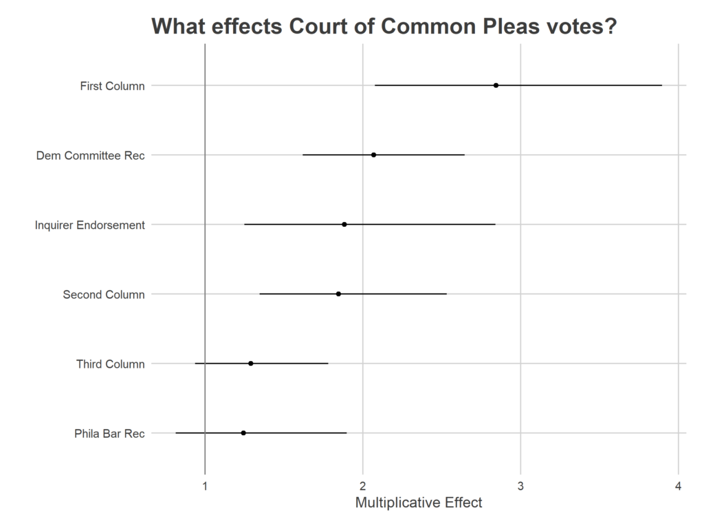
Let’s compare the strength of ballot position to three other explanatory features: endorsement by the Democratic City Committee, recommendation by the Philadelphia Bar Association, and endorsement by the Philadelphia Inquirer. (There are two other obvious ones, Ward-level endorsements and money spent. I don’t currently have data on that, but maybe I’ll get around to it!)

​I regress the log of each candidate’s total votes on their ballot position (being in the first, second, or third column, versus later ones, and being in the first or second row), endorsements from the Democratic City Committee and the Inquirer, and Recommendation by the Philadelphia Bar, using year fixed effects.

Being in the first column nearly triples your votes versus being in the fourth or later. The second largest effect is the Democratic City Committee endorsement, which doubles your votes versus not having it. (Notice that the DCC correlation isn’t plausibly causal, the Committee certainly takes other factors into its consideration. Perhaps this correlation is absorbing candidate’s abilities to raise money or campaign. And it almost certainly is absorbing some of the first-column effect: the DCC is known to take ballot position into consideration!)

The Philadelphia Bar Association’s correlation is sadly indistinguishable from none at all, but with a *big* caveat: the Philadelphia Inquirer has begun simply adopting the Bar’s recommendations as its own, so that Inquirer correlation represents entirely Recommended candidates.

​While this analysis doesn’t include candidate fundraising or Ward endorsements, those certainly matter, and would probably rank high on this list if we had the data. Two years ago, I found tentative evidence that Ward endorsements may matter even more than the first column. And Ward endorsements, in turn, cost money.

What are the solutions?
There are obvious solutions to this. I personally think holding elections for positions that no-one pays attention to is an invitation for bad results. It’s better to have those positions be appointed by higher profile officials; it concentrates power in fewer hands, but at least the Mayor or Council know that voters are watching.

A more plausible solution than eliminating judicial elections altogether might be to just randomize ballot positions between divisions, rather than use the same ones across the city. That would mean that all candidates would get the first-column benefit in some divisions and not in others, and would wash away its effect, allowing other factors to determine who wins.

Unfortunately, while these are easy in theory, any changes would require a change to the Pennsylvania Election Code, and may be a hard haul. But one thing everyone seems to agree on is that our current system is bad.